What is eBay?
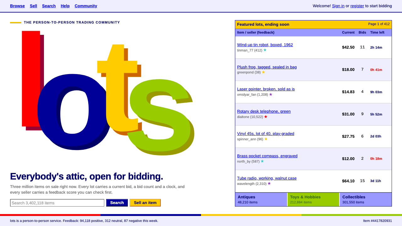
The eBay four-colour style is the dot-com flea market on screen: a white page of fixed-width tables, four bouncing letters in web-safe colours, and rows packed with bids, counts and countdowns.
eBay in brief
The eBay four-colour style is a design language taken from the eBay website between 1999 and 2012. It is a white page laid out in fixed-width tables, topped by a wordmark whose letters are red, navy, yellow and green and bounce slightly off the baseline, overlapping one another. Section header cells are yellow, periwinkle and green, cut to web-safe values, the limited colour set that early browsers could be trusted to display consistently.
The style is about density, not elegance. It was made for lists. Each row of a listing carries a title, the current bid, a bid count and the time left, and next to the seller's ID sits a feedback score in brackets and a small coloured star. Blue underlined links do all of the navigation, and a single plain sans-serif face, here Arimo, the open stand-in for Arial, sets every word on the page.
In practice this produces a look that feels more like a classified-ads section than a modern marketplace. It is crowded, honest and slightly clumsy, and it conveys something that polished design often hides: a community of real people buying and selling real objects, each with a reputation attached.

Where does eBay come from?
The story begins in 1995 in San Jose, California, when Pierre Omidyar launched AuctionWeb, a person-to-person online auction site. It was renamed eBay in 1997. Jeff Skoll is listed among the key figures for his early role in building the company, and Meg Whitman for leading it through its growth. Elissa Davis is also named in the source material among the people associated with its identity. The staggered four-colour wordmark that this design system is built around was in use from 1999 to 2012, and the Buy It Now option was added in 2000.
Visually, the style belongs to the era of dot-com table-layout web design. Before modern layout techniques existed, designers arranged pages by nesting invisible tables of fixed width, which is why the site looks like a grid of boxes with tightly controlled column widths. Colour choices came from the web-safe palette, a small set of values that early monitors and browsers could reproduce reliably, which explains the slightly flat, saturated yellows, purples and greens of the header cells.
The wordmark had its own logic. Four primary-flavoured colours and letters that bounced up and down, as if tossed, gave the site a toy-like friendliness at a time when most online commerce looked corporate and cold. The bounce also suggested a marketplace stall with hand-painted lettering rather than a bank branch, which suited a service built on strangers trading with strangers.
The deeper design idea was trust through visible reputation. The feedback score and coloured star after every seller's name made community feedback part of the interface itself, so each row was both a product listing and a character reference. The source material identifies person-to-person online auctions and community feedback reputation as movements behind the style, and these explain why the pages feel populated by people rather than by products alone.
What defines the eBay look?
Four-colour staggered wordmark
The logo is four lowercase letters in red, navy, yellow and green, each sitting slightly higher or lower than its neighbour and touching or overlapping the next. The effect is playful and instantly recognisable, and it sets the colour tone for the entire page without the need for any other decoration.
Fixed-width table layout
Content sits in a centred column of fixed width, divided into cells by thin rules. Columns line up, rows repeat, and nothing flows or reflows. The strictness of the table is what lets a visitor scan a hundred rows quickly, because the eye learns where each piece of information will be.
Web-safe header cells
Section headers are filled with yellow, periwinkle and green, chosen from the web-safe set. These colours are flat, slightly chalky and unmistakably of their time. They divide the page into zones, with each colour acting as a quiet wayfinding signal rather than a mood.
Listing rows built for density
Every row aligns a title, a current bid, a bid count and time remaining, and each field is short and scannable. The countdown is as important as the price, because urgency is part of the auction. The design never hides information behind a click when it can fit it in a row.
Seller ID, feedback score and star
Next to each seller name sits a bracketed number and a small coloured star that grows with reputation. This small cluster is the style's trust signal. It turns a stranger into someone with a record, and it is one of the most imitated details of early online marketplaces.
Blue underlined links and Arimo
Navigation is made of blue underlined text links rather than buttons, and one plain sans-serif face, Arimo, the open substitute for Arial, sets the entire page. The typographic uniformity keeps a crowded page from becoming chaotic and reinforces its utilitarian, no-nonsense character.

Who shaped eBay?
Omidyar launched AuctionWeb in San Jose in 1995, the site that became eBay in 1997. His founding idea, a place where individuals could auction goods to one another, created the person-to-person marketplace logic that the interface still communicates.
Skoll is listed among the key figures for his early role in building the business around the auction site. His involvement is part of the transition from a hobby project into a company with a coherent brand and interface.
Whitman is named among the key figures for leading eBay through its growth years. The staggered four-colour wordmark and table-based design were in use during that period, which made her era the most visible face of the style.
Davis is named in the source material among the people associated with the site's identity. Her name is a reminder that the playful wordmark was a deliberate design decision, not an accident of early web culture.
How do you use eBay today?
For slides, this style suits presentations about the early web, internet history, online marketplaces, reputation systems and nostalgia for the dot-com era. A title slide can be a white page with a four-colour staggered wordmark-style title and a yellow header strip. On content slides, use fixed-width table layouts with thin rules and coloured header cells to compare items. On data slides, tables are the native form: put figures in aligned columns, and let one cell carry a countdown or a count the way an auction row would.
For websites and product interfaces, it is a natural fit for price comparison pages, auctions, second-hand trading, collectibles catalogues, directories and any interface where many items must be compared quickly. Show title, current price, number of bids and time left in every row, and give each seller or contributor a score and a star. Navigation should stay in underlined blue links, and the layout should hold a fixed-width column rather than stretching to fill the window.
For editorial and marketing work, it makes a convincing millennium-era pastiche. A poster, a retro campaign, a newsletter or a long-form article about the early internet can borrow the staggered colour letters, the web-safe header cells and the dense listing rows. The result reads immediately as an early web page, which is exactly the point.
The most common mistake is to modernise it halfway. Rounded cards, generous whitespace, soft shadows and large friendly buttons all dilute the density that gives the style its character. The second mistake is to use arbitrary colours: the strength of the palette comes from its limited, web-safe flatness, and adding gradients or subtle tints makes it look like a mockup. The third is to forget the reputation cluster. Without the seller ID, score and star, the rows lose their human dimension and the page looks like any generic list.
The practical rule is to commit to information density. Fixed width, aligned columns, short fields, underlined links and one typeface. When everything that matters fits in a row, and the eye can run down the page and compare, the style is doing its job.

eBay — FAQ
When was the eBay four-colour wordmark used?
The staggered four-colour wordmark was used from 1999 to 2012. The site began in 1995 as AuctionWeb, was renamed eBay in 1997, and added the Buy It Now option in 2000.
What does web-safe colour mean?
Web-safe colours are a small set of values that early monitors and browsers could display consistently. The yellow, periwinkle and green header cells in this style are cut to those values, which is why they look flat and slightly chalky.
Why is the layout built from fixed-width tables?
Before modern layout techniques, web pages were arranged with nested tables of fixed width. The style keeps that structure because it makes dense lists easy to scan: columns line up and every field appears in the same place on every row.
What is the star next to a seller name?
It is part of the feedback reputation system. A bracketed score after the seller ID shows accumulated feedback, and a small coloured star reflects how established the seller is. Together they act as the trust signal in each listing row.
What kinds of projects suit this design style?
It suits information-dense pages such as price comparisons, auctions, second-hand trading and collectibles catalogues, and it works well for nostalgia projects about the turn of the millennium. It is a poor fit for minimalist or luxury brands.
Related design styles
 Club PenguinA snow-white island that talks like a kid. Sky-blue panels, navy outlines on…
 CluelessCandy colour on white. Yellow plaid, a bouncing magenta ellipse, bevelled 199…
 Minions (Despicable Me, 2010)Indestructibly cheerful. Minion yellow, denim blue, and chunky goggle geometr…
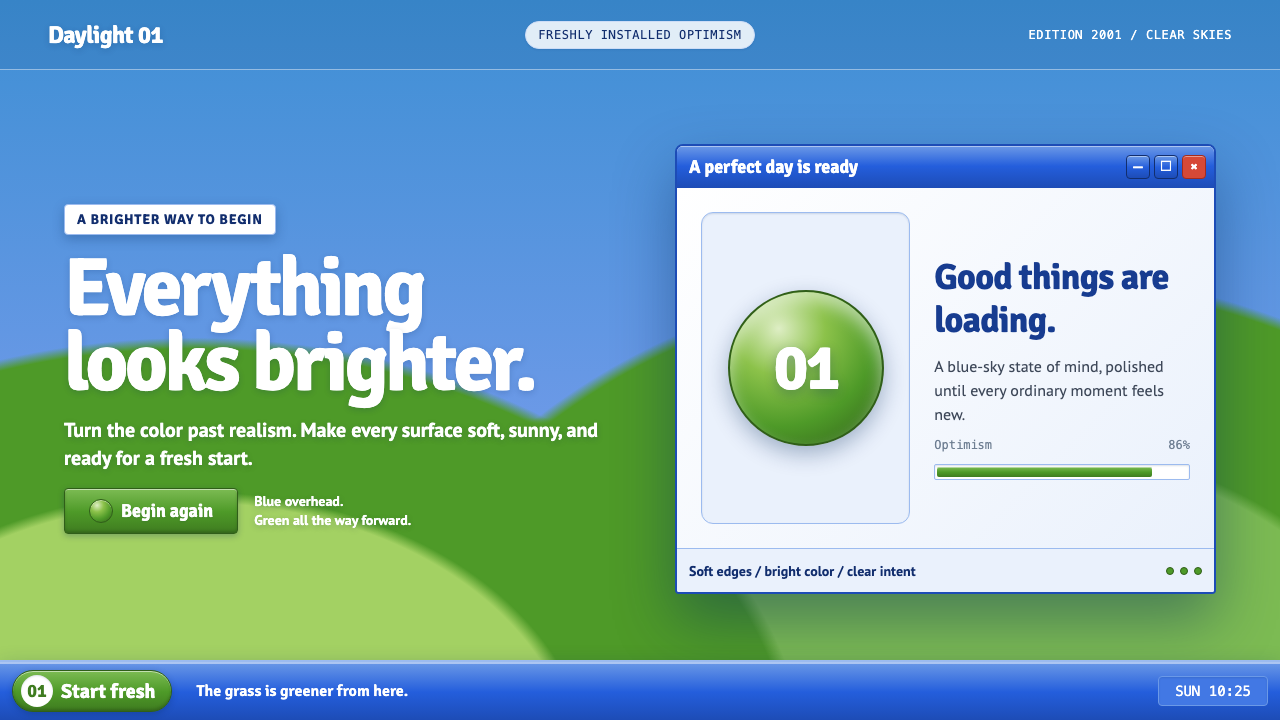 Windows XP Bliss (2001)Fresh-install optimism. Sky blue, hill green, and glossy gel chrome turn real…
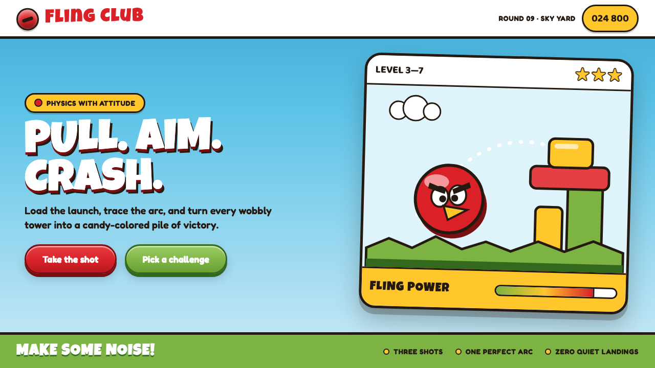 Angry Birds (2009)Adorable aggression takes flight. Candy primaries, chunky outlines, and a dot…
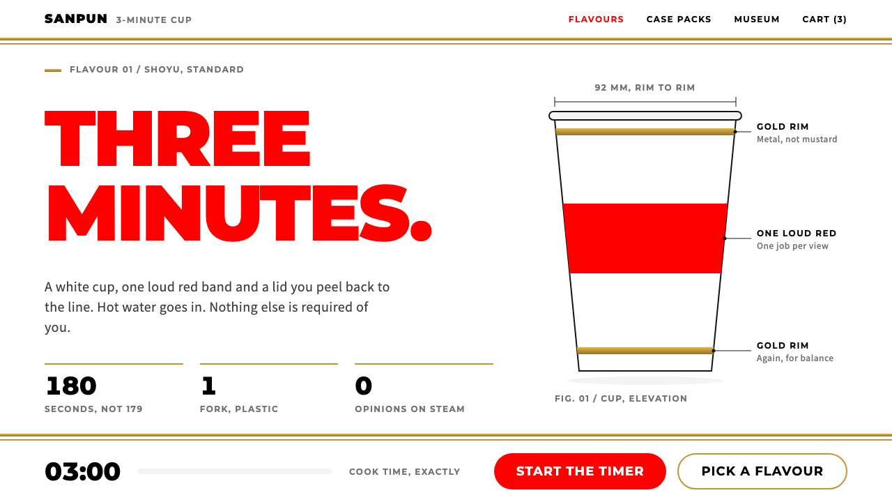 Cup NoodleA straight face on a three-minute meal. White cup, one loud red, gold rim ban…