What is Clueless?
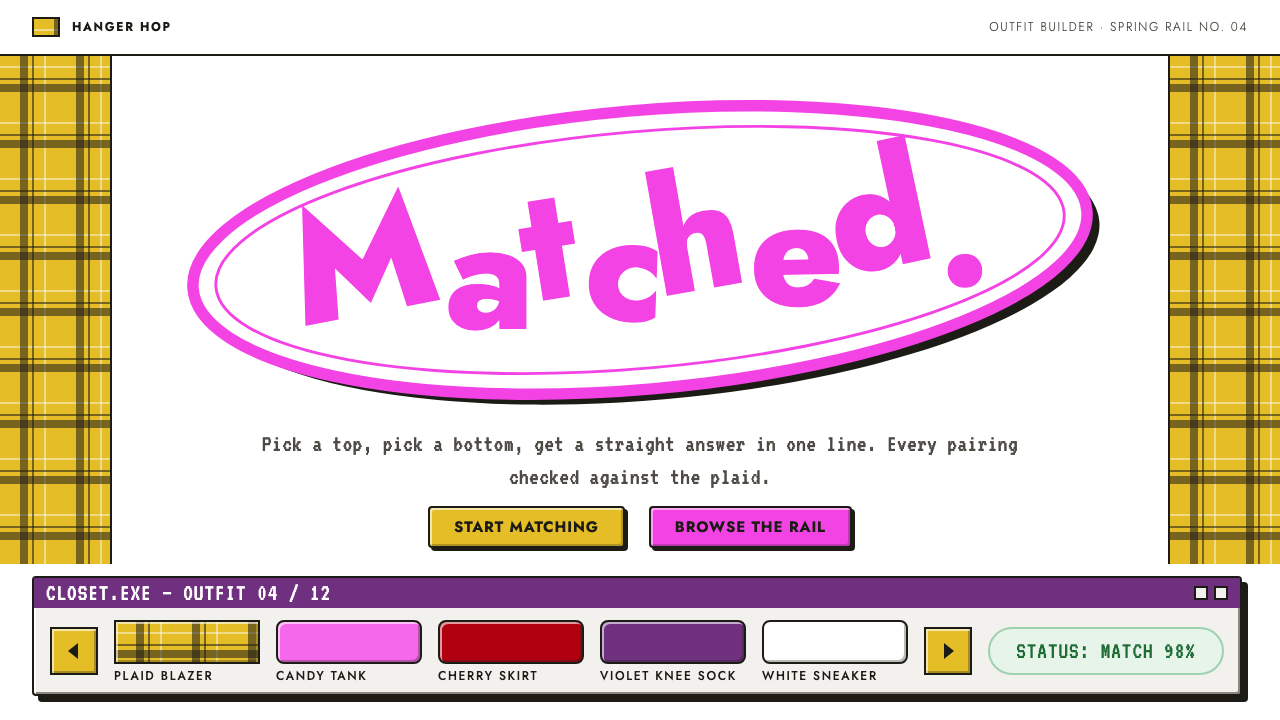
Clueless dresses the screen like a Beverly Hills wardrobe: candy colour on a plain white studio, yellow plaid, a bouncing magenta title and the satisfying click of a bevelled 1995 button.
Clueless in brief
The Clueless style is a design language cut from the wardrobe and marketing of Clueless, Amy Heckerling's 1995 film, a retelling of Jane Austen's Emma set in a Beverly Hills high school. It is not a realistic portrait of the decade. It is a bright, deliberately artificial pop vision: a plain white studio ground, golden yellow plaid checked with black, a hot-magenta logo bouncing inside an ellipse, and darker red and purple accents lifted from the film's key art.
The interface logic comes from one of the film's most memorable props, the closet program on the heroine's computer. Outfit tiles scroll like a carousel, tops in one row and bottoms in another, with arrows to flip through them. A status line comments on each pairing, announcing a match or a mismatch. Buttons are the rectangular, bevelled kind that early home-computer software used, with a lit top edge and a shaded bottom edge, so they look pressable.
Typography is playful rather than precise. A geometric sans-serif with a condensed feel stands in for the film's credit lettering, and headline letters tilt and hop off the baseline as if each one had its own personality. The overall impression is fashion magazine meets mall arcade: sweet, loud, and sure of itself without ever being serious about it.

Where does Clueless come from?
Clueless reached cinemas in July 1995. Writer and director Amy Heckerling took Austen's novel about a well-meaning matchmaker and moved it to a high school in Beverly Hills, so the social comedy of nineteenth-century manners became a comedy of malls, cars and fashion. The film starred Alicia Silverstone as Cher, a rich, cheerful teenager who organises everyone else's lives. It became a defining teen comedy of the mid-1990s and a continuing reference point for fashion and pop culture.
The look of the film was inseparable from its costumes. Costume designer Mona May worked from a deceptively simple brief: it had to be Californian, it had to be bright, and it had to be fun. The result was a vocabulary of matching sets, plaid suits, knee-high socks and layered accessories that the film made iconic. The famous yellow plaid outfit became shorthand for the whole movie, and the style borrows it directly as a pattern and a palette.
The film's graphic identity completed the picture. Freeman Craw is among the names associated with typography and title design for this era of film marketing, and the poster used a plain white studio background that let colour and costume carry everything. The bouncing, tilted title lettering, retained when the film was repackaged on DVD in 2005, gave later designers a recognisable logotype to riff on.
Two cultural currents sit underneath. One is the valley-girl mall culture of the late twentieth century, with its slang, shopping and social ritual. The other is early home-computing fantasy: the idea that a computer could be a personal stylist, not a calculator. Together they produced an aesthetic that feels like a time capsule of mid-1990s optimism, and that has been revived repeatedly by fashion and graphic design since.
What defines the Clueless look?
Color
Everything sits on a clean white studio ground. Golden yellow, paired with black as a plaid, is the signature; hot magenta carries the logo and key emphasis; deep red and purple, taken from the poster's key art, provide darker accents. The palette is candy-bright but disciplined, with white doing the work of keeping it fresh.
Typography
A geometric, slightly condensed sans-serif handles labels and body copy, echoing the lettering of film credits. Headline letters are deliberately uneven: tilted, bouncing and hopping off the baseline so that the title looks animated even when it is still.
Plaid pattern
Yellow-and-black plaid is the single decorative device. It appears as banners, dividers, tile backgrounds and badges. It works because it is used as a pattern, never as a gradient or texture, and always against plain white around it.
Bevelled buttons
Controls follow 1990s desktop software conventions: rectangular, with a bright top and left edge, a darker bottom and right edge, and a visible pressed state. This gives the interface a tactile, slightly nostalgic click that feels deliberately retro rather than accidental.
Carousel layout
Content is arranged like the film's closet program: rows of tiles scroll horizontally, with arrows to flip through options and a single status line commenting on the current choice. It turns browsing into dressing up.
Voice
Copy is chatty, confident and self-amused. Status messages praise or tease, labels sound like a friend giving advice, and nothing is written in corporate language. Tone is part of the visual style, not an afterthought.

Who shaped Clueless?
Writer and director of Clueless (1995), who relocated Austen's Emma to a Beverly Hills high school.
Costume designer whose brief of Californian, bright and fun produced the film's iconic plaid and matching sets.
Lead actress who played Cher and gave the style its voice and posture.
Associated with typographic and title design for mid-century and later film marketing, including this era's poster lettering.
How do you use Clueless today?
In slides, the style suits fashion decks, retail pitches, youth-brand strategy, event recaps and anything that needs warmth and a wink. A cover slide can use a plain white page with a single yellow plaid band and a tilted magenta title. Content slides should stay light: a few tiles in a row, one bold headline and the status-line idea reused as a one-sentence takeaway. Data slides work well when numbers are put in bevelled boxes, one idea per box.
In web interfaces it is a natural fit for fashion and retail storefronts, styling tools, quiz and personality products, and playful onboarding. Carousel rows are the ideal pattern for browsing outfits or products, and the status line can become a live recommendation message. Keep forms and checkout simple, using the bevelled buttons for primary actions and the magenta for the single most important step.
In editorial and marketing work, it is strong for campaigns that want a nostalgic, mid-1990s optimism: lookbooks, pop-up shop announcements, newsletters for fashion brands, and social posts. Tilted headlines work in large sizes, but keep body copy straight and calm so the page does not become unreadable.
The main mistake is to treat plaid as wallpaper. If the pattern covers entire pages, the white studio ground disappears and with it the freshness. The second mistake is to overdo the bounce: when every letter, button and icon is tilted, nothing stands out. Choose one place per screen for tilt, such as the headline, and let the rest sit calmly on the grid.

Clueless — FAQ
What is the Clueless design style?
It is a candy-bright pop style drawn from the 1995 film: a white studio ground, yellow-and-black plaid, a bouncing magenta logo, bevelled mid-1990s software buttons and a carousel of outfit tiles.
Who made Clueless and when?
Amy Heckerling wrote and directed the film, released in July 1995 as a Beverly Hills retelling of Jane Austen's Emma. Mona May designed the costumes that gave the style its look.
Which projects suit this style?
Fashion and retail sites, styling and quiz tools, youth-oriented brands, nostalgic campaigns and playful onboarding. It is less suited to serious financial or medical products.
Why is the background plain white?
The poster used a plain white studio ground so that costume and colour could carry the image. Keeping the page white lets the yellow plaid and magenta feel fresh rather than crowded.
How do I avoid it looking dated?
Use the plaid and tilted title as accents in a few places, keep layout and spacing modern and clean, and write copy in a warm, confident voice. Treat the nostalgia as seasoning, not as the whole dish.
Related design styles
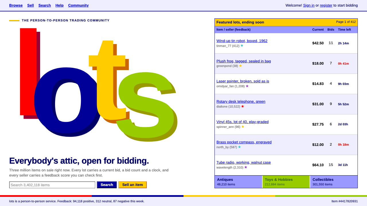 eBayThe dot-com flea market. Four off-baseline letters in web-safe colours over d…
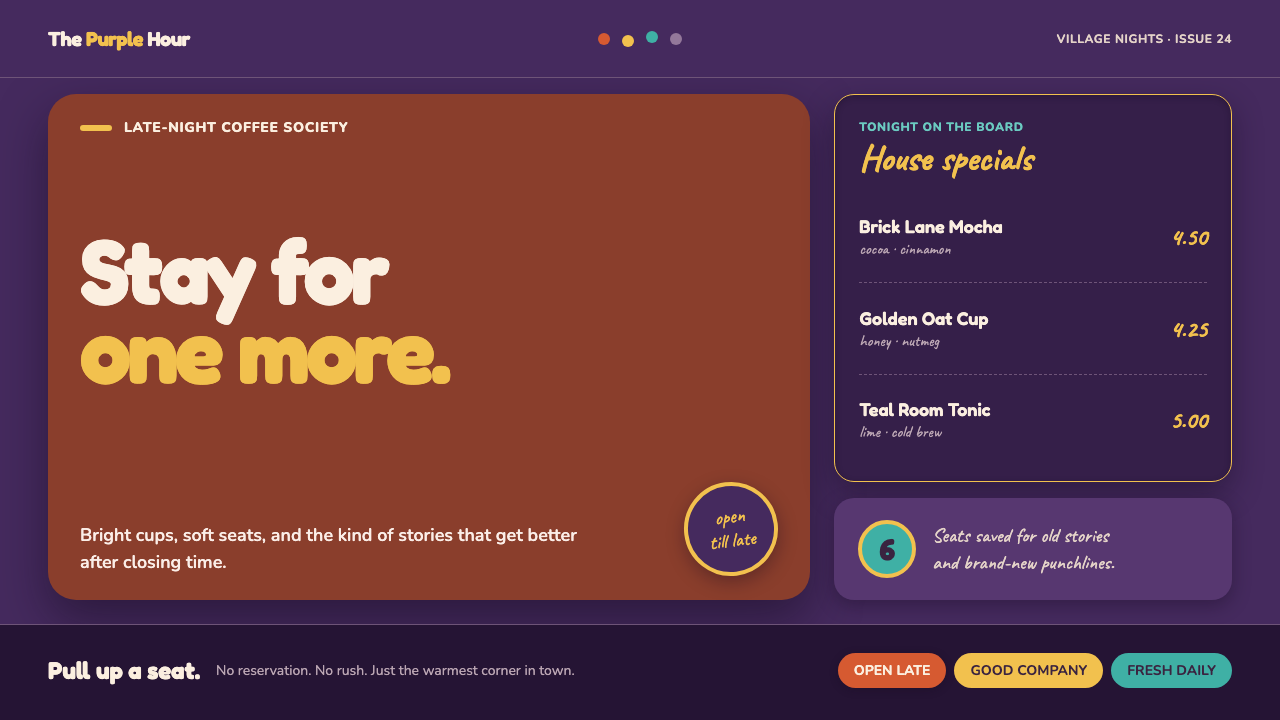 Friends Central Perk (1994)Sitcom warmth, turned TV-bright. Grape walls, couch orange, and bouncing colo…
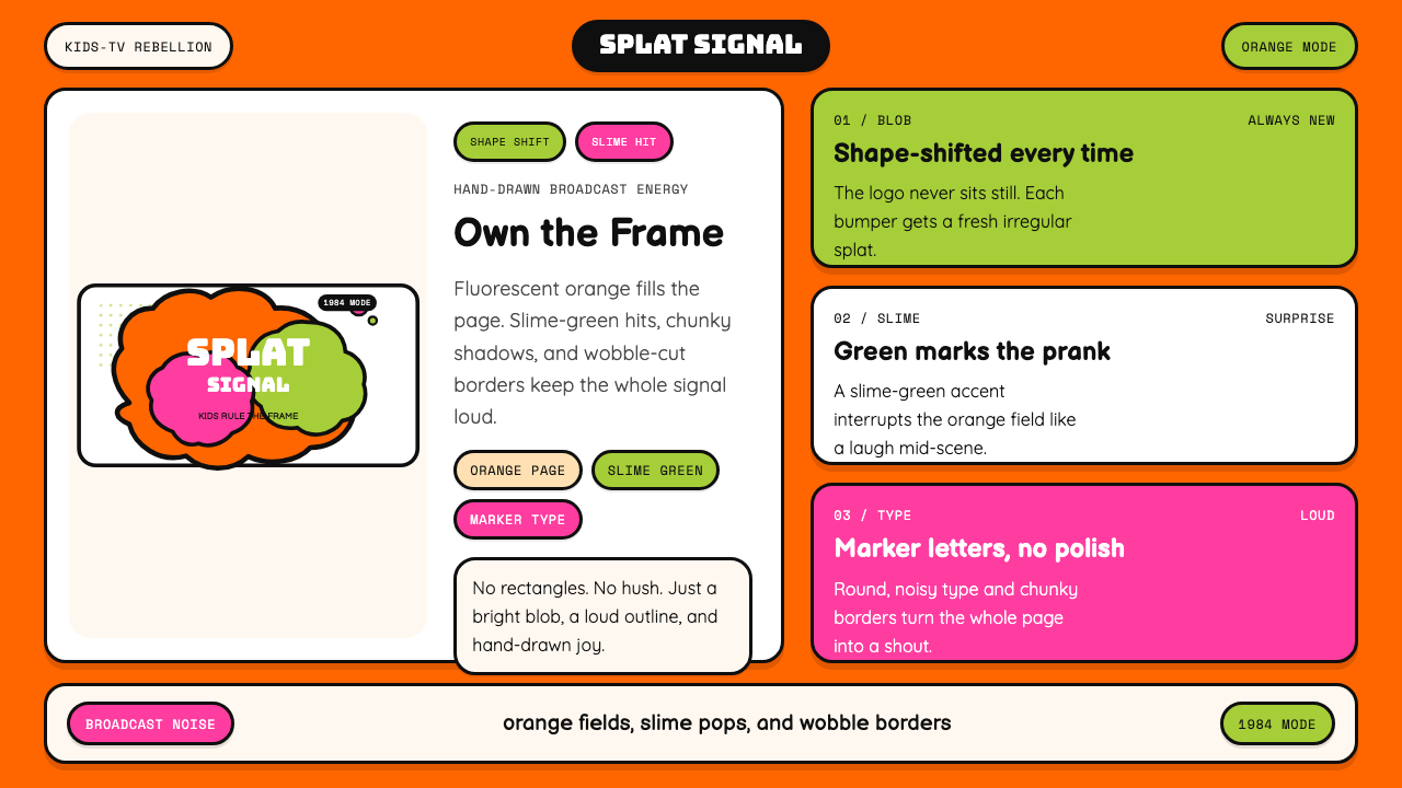 Nickelodeon Orange Splat (1984)Kids own the screen. Orange fields, slime-green pops, and wobble borders do t…
 Philippines Jollibee Bee MascotJoy shouts first. Red ground, Fredoka curves, yellow pills, chunky grid.
 SpongeBob Bikini Bottom (1999)Undersea suburbia shouts with joy. Banana yellow and cyan bounce inside fat,…
 Sprite — Obey Your ThirstCitrus hits like asphalt heat. Saturated green, lemon yellow, and 15° slashes…