What is Minecraft Creeper?
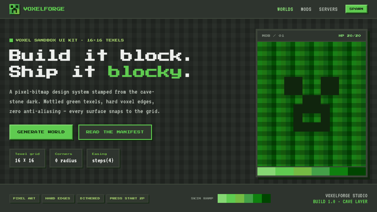
Minecraft Creeper turns a coding accident into a complete visual language: cave-dark grounds, mottled green texels, and edges that insist every object was built block by block.
Minecraft Creeper in brief
The Minecraft creeper is the game’s most recognizable mob: a silent four-legged figure covered in a patchwork of lime and grass greens. Its visual identity is inseparable from the voxel sandbox world around it. Cubes do not pretend to be smooth, shading breaks into discrete texels, and diagonal or curved forms accept their stair-stepped silhouette rather than hiding it. The creeper therefore works as more than a character reference; it is shorthand for a whole way of making digital surfaces feel constructed.
A Creeper-derived interface begins in darkness. Cave-stone gray grounds create the sense of an underground game world, while several neighboring greens form a mottled ramp rather than a clean, uniform fill. Panels, badges, controls, and illustrations should read as assembled chunks. Borders are thick and square, corners remain uncompromisingly hard, and every highlight or shadow behaves like a placed pixel cluster instead of a soft lighting effect.
The style depends on deliberate reduction. Period pixel bitmap type gives words the same authored, low-resolution character as the imagery. There is no anti-aliasing to soften a contour and no atmospheric blur to disguise hierarchy. Texture, contrast, and repetition do the work normally assigned to glossy surfaces. When used well, the result feels playful and immediately legible, but also materially consistent: text, icons, cards, and decorative scenery all appear to belong to one voxel-built world.
Where does Minecraft Creeper come from?
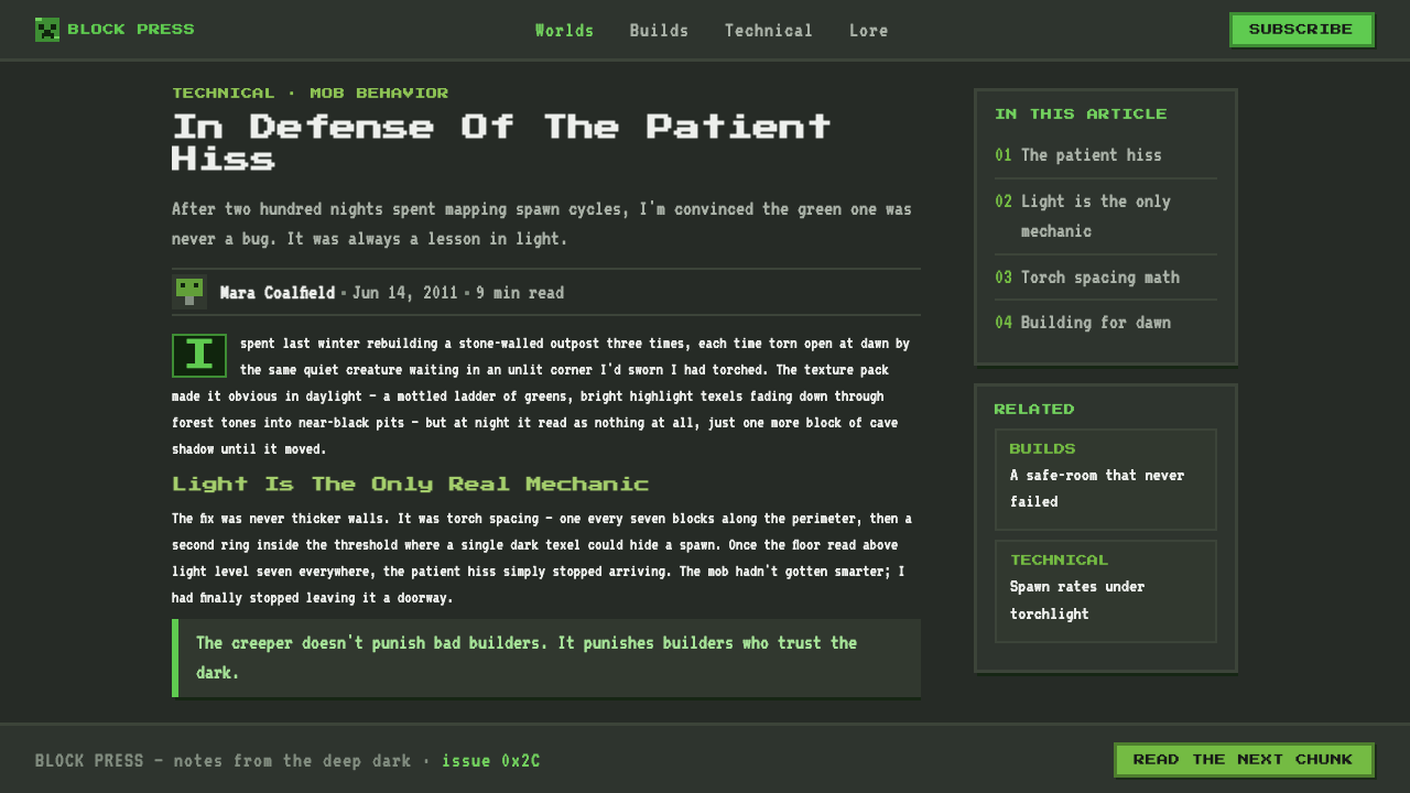
The creeper originated in 2009 through a coding accident by Markus “Notch” Persson. That accidental beginning matters to the aesthetic because the form does not read as a polished mascot conceived outside the game’s rules. It reads as a creature that belongs to a world of cubes, sparse texture, and visible construction. Its strange, silent presence became the visual emblem through which many people recognize Minecraft’s broader world.
Minecraft emerged from Western Europe through Mojang in Stockholm, Sweden. Its public alpha appeared in 2009, and the full release followed in 2011. Across that arc, the creeper moved from an in-game mob into an instantly recognizable symbol of the project’s voxel-and-sandbox identity. The look retains the directness of an independent game texture: limited visual ingredients, carefully placed variation, and a strong willingness to let the grid remain visible.
The associated movements are voxel and sandbox gaming, alongside indie pixel-texture aesthetics. Both value a world that is readable as a system rather than as seamless illusion. A voxel surface exposes its units; a pixel texture lets a small cluster imply roughness, light, grass, stone, or wear. The Creeper design language brings those ideas into graphic work by treating every visual decision as a small placed block with a clear role.
Jens Bergensten is also identified as a key figure in the theme’s origin context. Together with Markus Persson, that association anchors Creeper imagery in Minecraft’s continuing life from public alpha to the present. The style is consequently not nostalgia for an obsolete technical limitation. It is a living visual shorthand for a game world whose coarse surfaces, dark caves, green fragments, and cubic construction remain culturally immediate.
What defines the Minecraft Creeper look?
Cave-Stone Ground
The dominant field is dark cave-stone gray, not empty black. It should feel mineral, enclosed, and receptive to green contrast. Small blocky tonal changes can suggest depth or rough stone, but the background remains a supporting world surface rather than a dramatic cinematic backdrop.
Mottled Green Ramp
Green is never a single flat signal. Lime and grass-adjacent tones are distributed in clusters so the surface feels patched, textured, and slightly unpredictable. The variation should describe material character, not turn into decorative noise. A Creeper surface looks assembled from neighboring texels with related but unequal roles.
Voxel Edge
Edges stay square, abrupt, and visible. Curves are translated into stepped silhouettes, while outlines and frames act like cut blocks placed against the cave ground. This is not merely a retro treatment: the hard edge establishes the style’s central promise that every object is a constructed unit.
Texel Shading
Light and shade appear as discrete patches rather than smooth transitions. A darker cluster can recess a panel, while a lighter cluster can make a form feel exposed, but neither should suggest realistic studio lighting. The image gains depth through placement, adjacency, and contrast between blocks.
Pixel Bitmap Type
Typography should carry the same period pixel logic as the surrounding surface. Letterforms look plotted onto a grid, with an emphatic rhythm and limited softness. Large headings can feel like signage in a game world; smaller text needs generous separation and clean contrast so the bitmap character remains readable.
Zero Smoothing
No anti-aliasing, soft blur, or polished gradient should dissolve the block structure. Texture may be dense, but it must remain legible as individual decisions. This restraint separates Creeper-derived design from generic game-themed decoration: the visual language stays tactile because it refuses to hide its pixels.

Who shaped Minecraft Creeper?
Persson is the Minecraft creator identified in the source material as the person whose coding accident produced the creeper in 2009. That origin gives the character an unusually useful design lesson: a memorable visual system can emerge from constraints and accidents when its internal logic is strong enough to be repeated consistently.
Bergensten is named as a key figure in the theme’s Minecraft origin context. His inclusion places the Creeper language within the game’s continuing history rather than limiting it to a single founding moment. For designers, that continuity matters: the style is recognized as an enduring world language, not as a one-off character skin.
The Creeper itself is the central figure: a silent four-legged mob whose mottled lime and grass-green skin became shorthand for Minecraft. Its blocky body, texel variation, and absence of softened detail make it an unusually complete visual reference for dark, constructed, pixel-texture design.
How do you use Minecraft Creeper today?
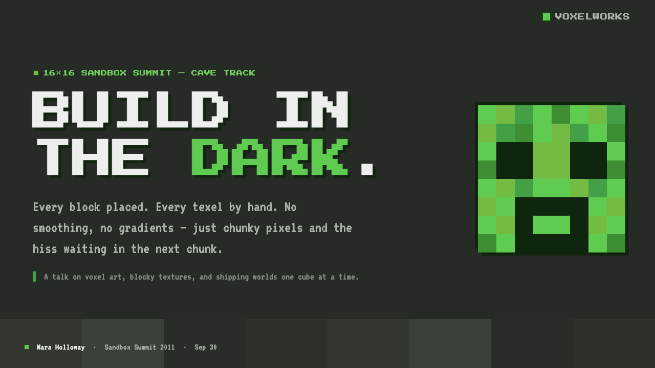
For presentation covers, let a dark cave-stone field carry one dominant Creeper-like silhouette, patch of green texture, or block-built title treatment. The composition should feel like an opening view into a game space, not a collage of screenshots. On content slides, use chunky frames to separate ideas and allow headings to act as signposts. Keep explanatory copy calmer than the title treatment so the pixel character remains an accent rather than a reading obstacle.
Data slides benefit when charts are rebuilt as block structures. Bars can rise as stacked voxel columns, comparison markers can become square tokens, and legends can use mottled green fragments against the stone ground. The crucial rule is honest encoding: texture may establish the theme, but it must not obscure category differences, labels, trends, or the relationship between values.
For web interfaces, the style is especially effective for dashboards, inventories, status views, community tools, and pricing pages that benefit from a visible system of containers and states. Use the cave-stone ground to hold sharply bordered panels, reserve the mottled green ramp for selected states or important progress, and make controls feel placed rather than floating. A pricing page can distinguish plans with different block assemblies while preserving a common visual world.
Editorial and marketing work can use the style’s atmosphere without turning every page into a game screen. Feature stories work well with a stone-dark opening panel, a pixel-texture pull quote, and modular image crops. Campaign pages can frame a product as something to discover, craft, or collect. The language should remain direct and concrete, matching the visual promise of blocks, tools, caves, and building.
The common mistake is to confuse pixel texture with indiscriminate clutter. Filling every surface with green noise, tiny icons, and faux game artifacts makes hierarchy collapse. Another frequent error is smoothing the key forms with rounded corners, glossy depth, or soft effects; that imports an unrelated visual logic. Choose a few high-value voxel moments, preserve quiet cave-stone space around them, and let the hard edges do the recognition work.
Minecraft Creeper — FAQ
Is Creeper style simply generic pixel art?
No. Pixel art is the broader medium language; Creeper style is a specific dark voxel-sandbox interpretation of it. Its identifying combination is cave-stone gray space, patchy lime and grass-green texture, cubical construction, and a refusal to smooth edges. A bright arcade palette or hand-drawn sprite treatment may be pixel art without feeling recognizably Creeper-derived.
Can this style work without green?
It can retain a voxel character, but it loses its most immediate Creeper reference. Green is not decorative here; the mottled lime-and-grass relationship is central to the creature’s identity. If another accent must lead, keep the cave-stone ground, block construction, and texel shading intact, then use green sparingly enough to preserve the connection.
How should pixel typography be used without harming readability?
Use bitmap display type where its block rhythm is most valuable: titles, labels, counters, short calls to action, and navigational landmarks. Give smaller supporting text more space and stronger contrast, and avoid making dense paragraphs compete with texture. The goal is not to make every word look retro; it is to let key language participate in the same constructed world as the interface.
Where does the style struggle?
It struggles when a product needs softness, luxury polish, or a calm neutral atmosphere. The dark ground and hard voxel edge create strong character, which can overwhelm delicate editorial subjects or emotionally sensitive experiences. It also becomes tiring when every component receives the same texture intensity. Use it where construction, discovery, play, systems, or collecting are meaningful product ideas.
Related design styles
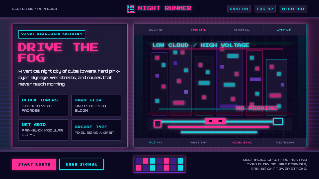 CloudpunkNeon-noir goes voxel. Pink-cyan glow cuts deep-indigo grids and blocky tower…
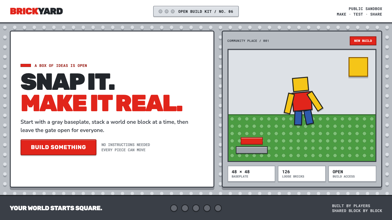 Roblox (2006)Play begins with a click. Fire-engine red cuts through a hard-edged gray stud…
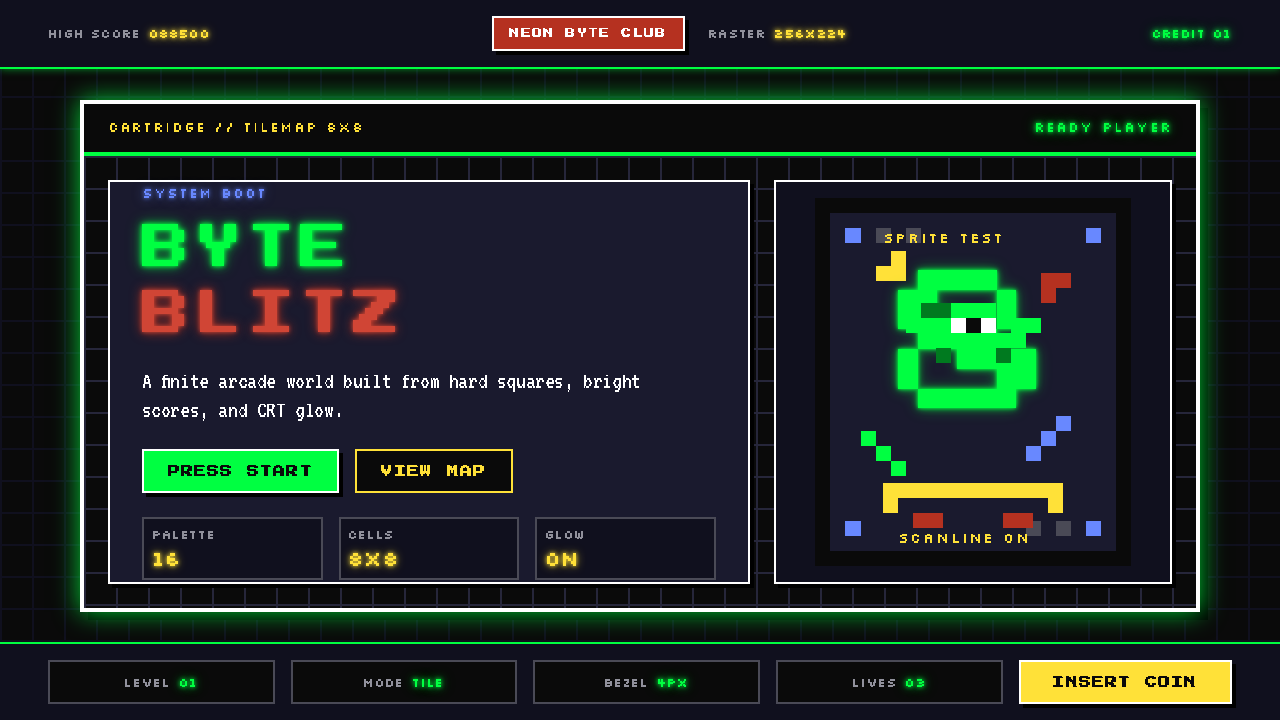 Pixel Art / 8-bit RetroHard-edged digital joy. CRT black, phosphor green, and 8x8 grids snap every p…
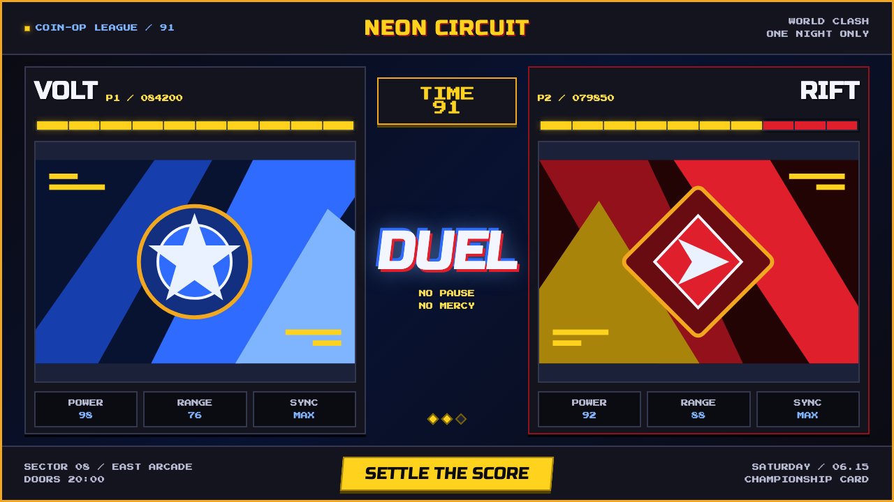 Street Fighter II (1991 Arcade)Pixel muscle hits hard. Hadouken blue, gold HUD bars, and outlined type blaze…
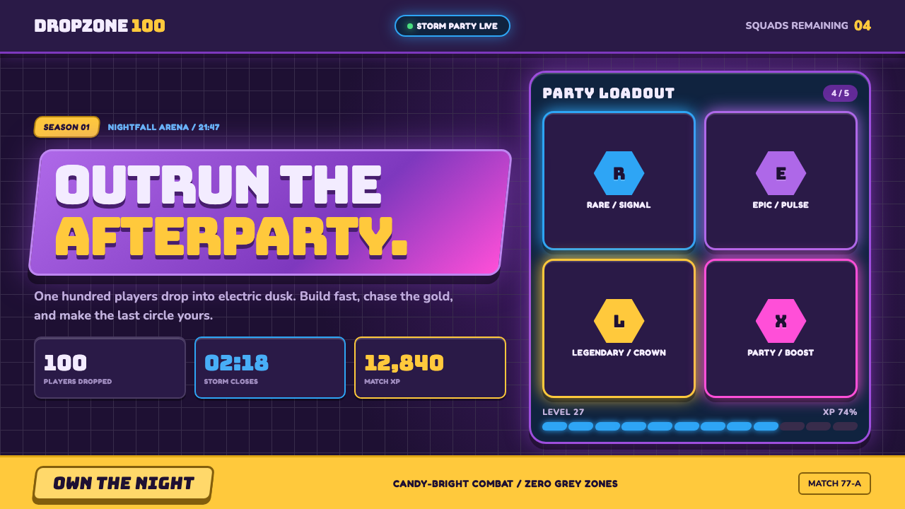 Fortnite (2017 Battle Royale)Battle royale becomes a neon party. Chunky caps and rarity glows electrify st…
 Funk Carioca FavelaMaximalist and unruly. Magenta, cyan, and chrome slam into black at thumbnail…