What is Cloudpunk (Nivalis)?
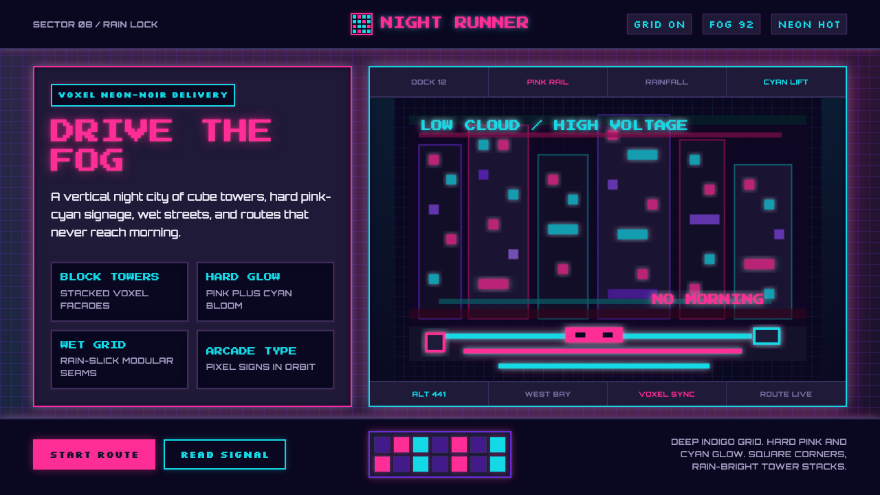
Cloudpunk turns a voxel delivery game's neon sky-city into an interface language — a fog-drowned indigo ground, hard pink-and-cyan glow, and blocky pixel-grid edges standing in for smoke and drizzle.
Cloudpunk (Nivalis) in brief
Cloudpunk (Nivalis) is a voxel cyberpunk aesthetic lifted from ION LANDS' 2020 delivery game Cloudpunk, which is set in Nivalis, a vertical megacity built almost entirely out of stacked, blocky cube forms. The defining visual tension of the style is the contrast between its construction material and its mood: everything in the world is built from simple, toy-like cubes, yet the atmosphere surrounding those cubes is soaked in the melancholy, rain-slick glow of classic cyberpunk noir. The result reads less like a polished science-fiction render and more like a miniature architectural model left running under real neon at midnight.
Visually, the system narrows its color logic to almost nothing but a dark ground and two competing neon accents — a hot, saturated pink and an electric, cold cyan — pushed against each other rather than blended. Surfaces are flat and faceted rather than curved, and their outlines are deliberately hard-edged and stepped, echoing the visible 'blockiness' of voxel geometry instead of the smooth anti-aliased curves more common in digital interfaces. Where light appears, it behaves as a glowing solid rather than a soft gradient — a pink sign or cyan strip reads as a block of pure color with a halo around it, not a diffuse wash.
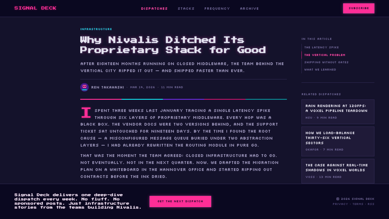
Typography follows the same blocky discipline: letterforms are squared off, high-contrast against the dark ground, and closer in spirit to an arcade cabinet's character set than to a refined editorial typeface. Scale is used aggressively — oversized, chunky headlines dominate, while supporting text stays plain and utilitarian. Layered together, the effect is a city built from children's blocks that somehow still manages to feel vast, wet, anonymous, and a little sad — density and repetition standing in for scale, since no single tower needs to be ornate when a thousand identical ones stacked into the fog will do the work instead.
Where does Cloudpunk (Nivalis) come from?
The term 'cyberpunk' and the visual grammar it now describes crystallized in the early-to-mid 1980s, most famously through William Gibson's 1984 novel Neuromancer and the earlier film Blade Runner (1982), both of which imagined future megacities as vertical labyrinths of rain, smoke, and saturated neon signage rising above social and technological decay. That lineage — darkness pierced by hard-edged colored light, density outpacing any sense of civic order, melancholy folded into spectacle — is the direct ancestor of the 'cyberpunk neon-noir' sensibility this style draws on. Cloudpunk situates itself squarely within that tradition: a courier navigating a vertical, rain-soaked, neon-lit metropolis at night is a scene lifted almost intact from the genre's founding imagery.
Voxel art, the second lineage named in the style's origin, is a distinct modeling tradition that constructs three-dimensional forms out of stacked cube units — volumetric pixels — rather than the freeform curved surfaces typical of polygonal 3D modeling. The technique has roots in early scientific and medical visualization, where volumetric data was naturally represented as a grid of cubes, and was later adopted widely by hobbyist and independent game developers because it lets small teams build large, coherent worlds quickly with a consistent, recognizable visual unit. Unlike flat 2D pixel art or smooth 3D rendering, voxel construction keeps its 'block' visible at every scale, which is why a Cloudpunk skyscraper reads simultaneously as a toy and as a monument.
ION LANDS, the Berlin-based independent studio behind Cloudpunk, released the game in 2020 for PC and consoles. Its city, Nivalis, is built almost entirely from these stacked voxel forms — towers, gantries, and neon-plastered facades assembled cube by cube — and the studio's choice to render a cyberpunk megacity in this blocky idiom, rather than in smooth photorealistic 3D, is what gives the world its particular character: a city that is dense and oppressive in scale but handcrafted and almost toy-like in texture, drenched throughout in deep-indigo night fog cut by colored light.
The third lineage, retro arcade and pixel aesthetics, reaches back to the coin-operated arcade cabinets and early home consoles of the 1980s, whose displays were constrained to a small number of colors and a coarse pixel grid. Designers working within those limits developed a visual shorthand of blocky, high-contrast letterforms and simplified iconography that has since become its own recognizable style, independent of the hardware limitations that originally produced it. This design system channels that same economy-of-means blockiness into its own typography and interface chrome, so that the screen itself feels like an artifact that could plausibly exist inside Nivalis — an arcade cabinet's aesthetic logic applied to a modern interface, closing the loop between the game's world and the way its own systems would present information.
What defines the Cloudpunk (Nivalis) look?
Color
The palette is deliberately narrow: a deep, saturated indigo-violet ground carries almost the entire composition, with hot pink and electric cyan used as the only two accent colors, pushed against each other rather than blended into a gradient. Tertiary hues appear rarely and only as small punctuation, never as a third structural color competing for attention.
Form & Geometry
Every surface is built from stacked, faceted cube units rather than curved or freeform shapes, giving buildings, signage, and vehicles a consistent 'blocky' construction logic. Scale is conveyed less through ornament than through repetition — identical modular tower forms stacked and multiplied until the skyline reads as dense and vast, the way a city of toy blocks can still feel oppressive when there are enough of them.
Typography
Letterforms are squared off and blocky, closer in spirit to an arcade cabinet's character set than to a refined editorial typeface, and they sit at high contrast against the dark ground. Scale does the organizing work: oversized, chunky headline lettering dominates, while supporting text stays plain and unadorned rather than competing for attention.
Edge Treatment
Outlines are deliberately hard and stepped rather than smoothed, echoing the stair-stepped silhouette that voxel construction produces at every scale. Where a conventional interface would soften a corner or blur a boundary, this system keeps the edge visibly blocky — the grid is never hidden, it is the point.
Light & Glow
Neon is treated as a glowing solid rather than a soft ambient wash — a sign or strip of light reads as a block of pure saturated color surrounded by a halo, not as a diffuse gradient fading into the dark. This keeps individual light sources legible as discrete graphic elements even when many of them appear together across a dense composition.
Atmosphere
The mood is nocturnal, damp, and dense rather than sleek or optimistic: surfaces read as rain-slick, layered fog and smoke soften distant forms, and the overall register leans melancholic. Density and repetition, not ornament, are what make the world feel vast — the same blocky forms recur endlessly into the haze.
Who shaped Cloudpunk (Nivalis)?
The Berlin-based independent studio that designed and built Cloudpunk, including Nivalis itself. Its decision to render a full cyberpunk megacity in stacked voxel form, rather than smooth photorealistic 3D, is the single choice that defines this entire visual system — a city that is dense and vast in scale but handcrafted and toy-like in construction.
A three-dimensional modeling tradition that builds forms from stacked cube units instead of curved polygonal surfaces, with roots in scientific and medical visualization before its adoption by independent game developers. It gives worlds a handcrafted, architectural-model quality even at monumental scale, which is the core visual identity this style borrows.
The genre lineage established by 1980s science fiction such as William Gibson's Neuromancer and the film Blade Runner, which pictured future cities as vertical labyrinths of rain, smoke, and saturated colored light rising above social decay. This style channels that same darkness-pierced-by-hard-edged-light grammar directly into its interface logic.
The visual shorthand developed by designers working within the color and resolution limits of 1980s arcade cabinets and early home consoles — blocky, high-contrast letterforms and simplified iconography that has since become a recognizable style in its own right, independent of the hardware constraints that originally produced it.
How do you use Cloudpunk (Nivalis) today?
Cloudpunk's voxel-cyberpunk grammar travels well into any product that wants to feel technical, nocturnal, and a little melancholic, but applying it well means understanding what does the work: a near-black ground carrying almost the whole composition, exactly two neon accents held in tension rather than blended, and hard blocky edges standing in for texture instead of smooth gradients or soft shadows.
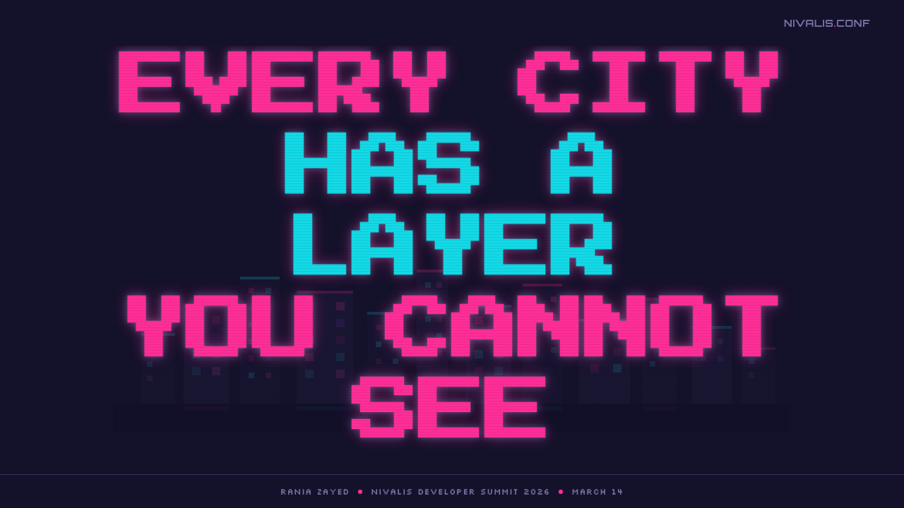
On presentation slides, a cover page benefits from a large silhouette of stacked, blocky tower forms rendered flat against the dark ground, with the title set in oversized, chunky lettering lit by one of the two accent colors. Content slides should keep the same dark field and restrict color use to hierarchy markers — a pink rule under a section head, a cyan highlight on a single key term — rather than decorating every element. Data slides suit the system particularly well: bar charts read naturally as stepped, blocky stacks, and a single highlighted series can glow in the accent color while the rest of the data stays in muted outline, echoing the way one neon sign stands out against a field of darkened towers.
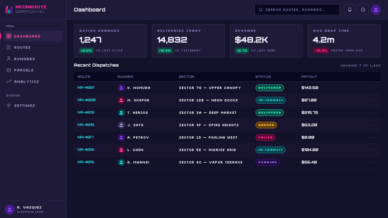
For web interfaces, this style suits dashboards, developer tools, and gaming-adjacent products where a dark, technical mood is an asset rather than a liability. Cards and panels should keep hard, squared corners rather than soft rounding, borders should read as visible pixel-grid lines rather than faint hairlines, and the two accent colors should be reserved for interactive states and status — one color for active or positive, the other for alerts or secondary actions — so that color always carries meaning rather than decorating idly. On a pricing page, tier differentiation works well when each tier is assigned one of the two accent colors rather than a full spectrum, keeping the palette disciplined even as the page adds visual variety.
In editorial and marketing contexts, the style is strongest for gaming, entertainment, and technology brands that want to evoke density, verticality, and nocturnal atmosphere without slipping into a cold, corporate register. A marketing key visual works well as a skyline silhouette built from repeated blocky tower units fading into fog, with a headline picked out in one glowing accent color; article layouts can use the same dark ground with pink or cyan section markers to guide the eye through long-form text without resorting to decorative rules or icons.
A common mistake is treating 'neon cyberpunk' as license to use a full rainbow of saturated colors at once — the discipline of this particular system depends on restricting accents to exactly two colors held in tension, not blending them into a gradient or adding a third competing hue. Equally common is smoothing every edge with anti-aliasing or soft drop shadows, which erases the stepped, blocky silhouette that gives the style its voxel identity in the first place; and choosing a delicate, thin typeface undermines the arcade-derived bluntness the lettering depends on.
Cloudpunk (Nivalis) — FAQ
Is this look tied specifically to the game Cloudpunk, or does it work as a general design style?
The palette, geometry, and typography described here are drawn from Cloudpunk's world, but the underlying grammar — a near-black ground, exactly two neon accents in tension, blocky voxel-derived edges, and arcade-descended lettering — is fully transferable. It works for any project that wants to evoke a dense, nocturnal, technology-forward mood, whether or not it has any connection to the game itself.
How is this different from a 'standard' cyberpunk neon look like Blade Runner's?
Blade Runner and its many descendants render their megacities with smooth, photorealistic surfaces and a broad, atmospheric color range. This style keeps the same rain-slick, neon-lit mood but constructs every surface from visible, stepped cube units and restricts its palette to just two accent colors against a dark ground. The result feels handcrafted and slightly toy-like even at monumental scale, rather than cinematic and smooth.
Does this style work on a light background?
Not comfortably. The entire logic of the system depends on neon reading as a glowing solid against near-total darkness — the glow is legible precisely because everything around it is dim. On a light ground, the same pink and cyan would read as flat, ordinary color rather than emitted light, and the atmospheric fog-and-night mood the style depends on would have nothing to sit against. This is a dark-ground system by necessity, not preference.
What kinds of products or brands does this style struggle to fit?
It struggles wherever warmth, trust, or daytime clarity are the priority — healthcare, banking, children's education, or any context where a dense, nocturnal, slightly melancholic mood would work against the brand's intent. It is also a poor fit for information-dense enterprise software where the restrained two-color accent system would need to expand well beyond what the style's discipline allows.
Why does the typography need to stay blocky rather than becoming more refined?
The blocky lettering is doing double duty: it echoes the voxel construction of the world itself, and it carries the retro-arcade lineage that ties the interface back to the game's own visual heritage. A refined, delicate typeface would read as belonging to a different, smoother design language entirely, breaking the consistency between the world's construction material and the way its own information is presented.
Related design styles
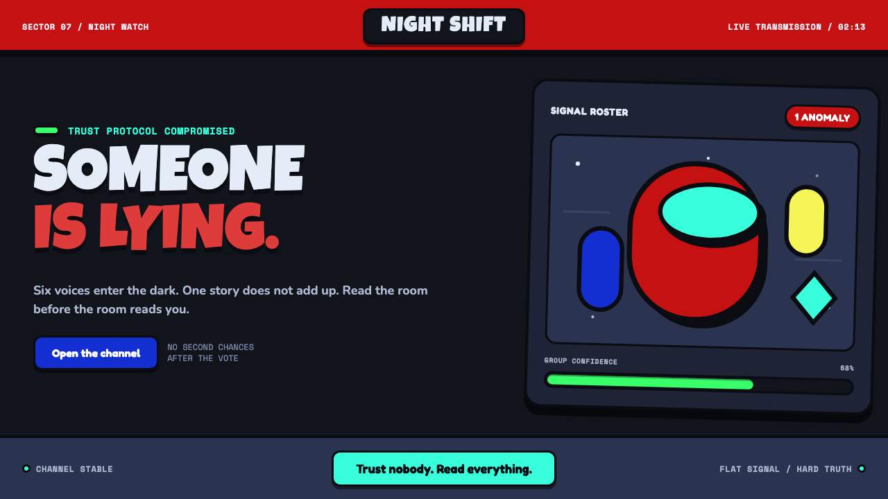 Among Us (crewmate space)Trust is ready to break. Loud capsule colors cut through a navy void with har…
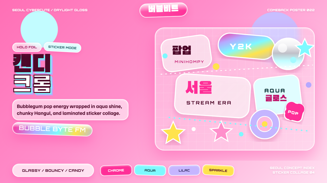 K-Pop Y2K SeoulCandy chrome goes maximal. Hot pink, aqua, Hangul type, and sticker collage s…
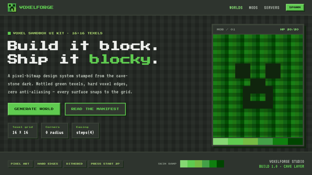 Minecraft CreeperBuild it blocky. Mottled lime texels on cave-stone gray, hard voxel edges, pe…
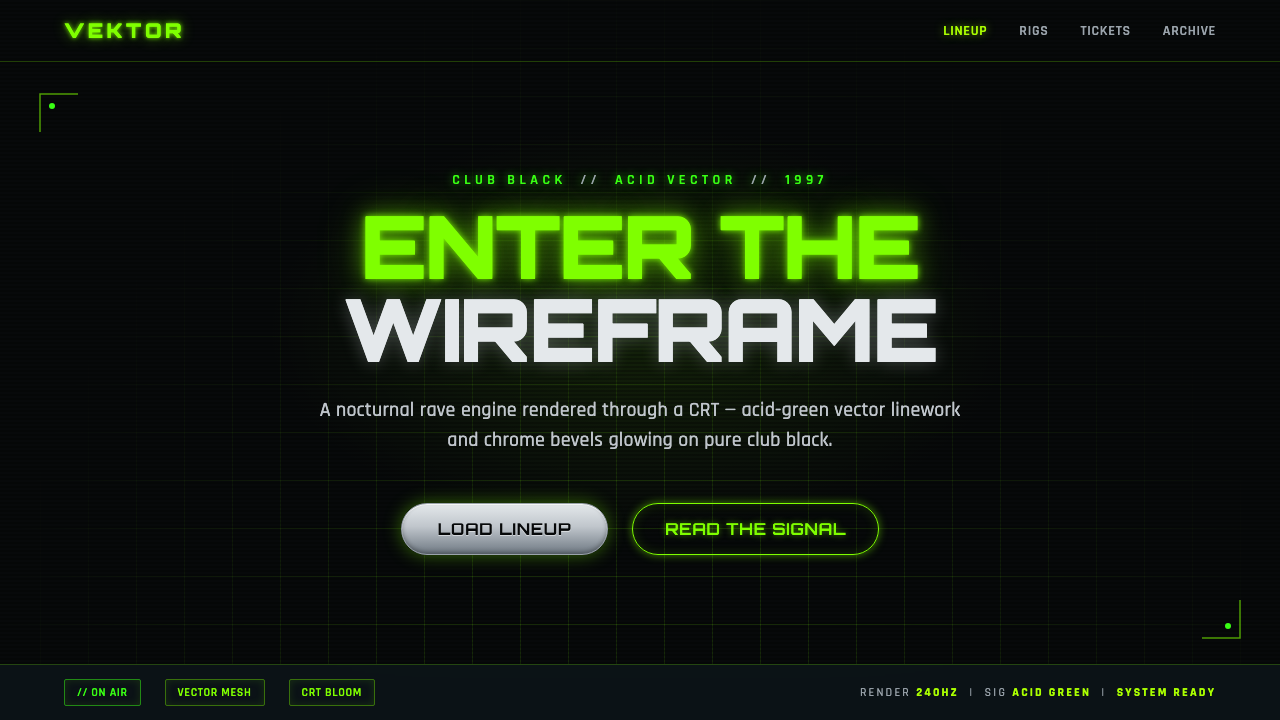 Playstation Rave Green 1997Enter the wireframe. Acid-green vector lines and chrome glow on club black, a…
 Alien: IsolationLo-fi dread glows. Amber phosphor and terminal green pulse through bordered C…
 Elite DangerousOne amber instrument. Star-orange wireframes, mono numerics, and black-glass…