What is Alien: Isolation (Sevastopol)?
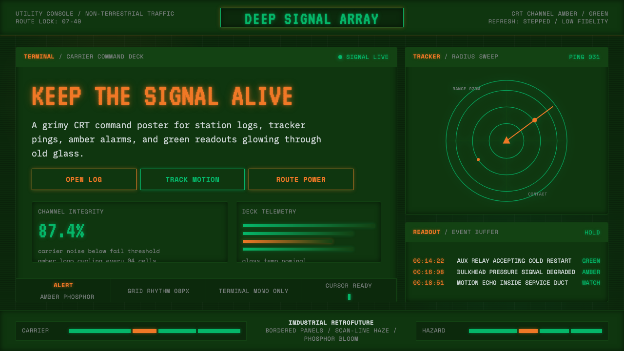
Amber phosphor glows through grime-stained glass — a retrofuture built from CRT terminals, blinking readouts, and the dread of a spaceship that was never designed to be beautiful.
Alien: Isolation (Sevastopol) in brief
Alien: Isolation (Sevastopol) is a design system drawn from the 2014 survival-horror video game's recreation of the 1970s retrofuture first established in Ridley Scott's 1979 film Alien. Its entire visual identity depends on treating obsolete technology as an aesthetic destination rather than an embarrassment: chunky monospaced terminal type, amber and green phosphor glow, scan-line haze, and blinking cursors — all rendered on a dark, grime-stained CRT ground that never looks clean.
The style's core discipline is a commitment to lo-fi as a design value in its own right. Nothing glows crisply or renders with modern clarity; every readout is slightly degraded, every screen surface carries visible dirt and wear, and every interface element behaves like a physical CRT tube rather than a flat digital pane. This is deliberately anti-sleek — a rejection of the smooth, frictionless interface language of contemporary software in favor of something that feels heavy, industrial, and slightly failing.
Visually, the palette narrows to amber-orange and terminal green against near-black, with occasional cold blue-white for motion-tracker or alert states. Typography is exclusively monospaced, evoking teletype and early computer terminals rather than modern proportional fonts. The overall effect is claustrophobic and tense: a station's worth of failing, decades-old machinery still doing its job, badly, in the dark.

Where does Alien: Isolation (Sevastopol) come from?
Alien: Isolation, released in 2014 by Creative Assembly, is a survival-horror video game set aboard the fictional space station Sevastopol in the year 2137, positioned within the Alien film franchise's timeline as a direct successor to events depicted in Ridley Scott's original 1979 film. Rather than following the increasingly sleek, weaponized aesthetic of later Alien sequels, the game's art team made a deliberate decision to return to and rebuild the visual world of the first film — a choice that shaped every subsequent design decision.
The 1979 Alien film itself drew heavily on the design work of concept artists Ron Cobb and Roger Christian, who imagined the crew of the commercial towing vessel Nostromo not as inhabitants of a gleaming futuristic utopia but as blue-collar workers operating aging, unglamorous industrial equipment. Christian in particular pushed for a 'lived-in' spaceship aesthetic — surfaces with visible grime, wiring left exposed, cathode-ray-tube monitors with chunky physical bezels — reasoning that a working freighter crew would have no reason or budget to maintain pristine, futuristic-looking technology. This philosophy, retroactively named 'retrofuture' or 'used future,' became one of the most influential visual ideas in science-fiction production design.
Creative Assembly, based in Horsham, England, spent years researching 1970s computer terminal design, teletype interfaces, and analog broadcast technology to recreate this aesthetic with historical fidelity rather than stylized pastiche. The team studied period CRT monitors, their phosphor decay characteristics, scan-line behavior, and the specific amber-and-green color signatures common to terminals of the era, aiming for a level of technical accuracy that made Sevastopol feel like an actual functioning artifact of the 1970s rather than a generic 'retro' skin.
The result, released to strong critical reception for its atmosphere and tension, cemented the amber-phosphor, grime-CRT aesthetic as a recognizable design vocabulary in its own right — distinct from later cyberpunk neon traditions and instead rooted in the specific technological limitations and visual culture of pre-digital, analog computing as imagined by 1970s production designers.
What defines the Alien: Isolation (Sevastopol) look?
Color
The palette centers on amber-orange phosphor glow and terminal green against a near-black, grime-tinted ground. Cold blue-white appears sparingly for alert states or motion-tracker imagery. There is no soft or pastel intermediary — every color reads as an emitted glow against darkness, never a printed or painted surface.
Typography
Type is exclusively monospaced, chunky, and blocky — evoking teletype output and early terminal fonts rather than modern proportional typefaces. Letterforms should feel mechanically printed rather than hand-drawn, with uniform character widths reinforcing the sense of an old computing system rather than a designed brand.
Scan-line Texture
Horizontal scan-line haze overlays screens and readouts, simulating the physical raster structure of a CRT tube. This texture should feel like an artifact of the display hardware itself — present across all glowing surfaces, not applied selectively as decoration.
Grime and Wear
Surfaces are never pristine. Visible dirt, scratches, and discoloration should mark every panel and screen bezel, reinforcing the sense of aging, poorly maintained industrial equipment rather than a showroom product. This is a deliberate anti-sleek principle at the heart of the style.
Blinking Cursors and Readouts
Interactive states favor blinking, flickering, or slowly-refreshing animations over smooth modern transitions — a cursor that blinks at a slightly irregular rate, a readout that stutters before settling, mimicking the imprecision of period hardware rather than the instant responsiveness of contemporary interfaces.
Chunky Physical Framing
Screens and readouts are framed by heavy, physical-feeling bezels rather than borderless modern displays. This bordered quality treats the screen as an object embedded in a larger machine, not a flat pane of glass floating in space.
Claustrophobic Darkness
The ground is consistently dark and near-black, with light sources — the phosphor glows themselves — providing the only illumination. This creates a claustrophobic, low-visibility atmosphere in which the glowing terminal becomes the sole focal point, echoing the tension of navigating a station by the light of failing equipment alone.

Who shaped Alien: Isolation (Sevastopol)?
The Horsham-based studio's art department researched period CRT technology, phosphor decay, and scan-line behavior with historical rigor, translating the retrofuture aesthetic of the 1979 film into a fully realized, technically accurate playable environment aboard Sevastopol station.
Concept artist for the original 1979 Alien film who helped establish the 'used future' philosophy — imagining the Nostromo's crew as blue-collar workers operating aging, unglamorous industrial technology rather than gleaming futuristic hardware, a foundational idea Alien: Isolation later rebuilt in playable form.
Set decorator on the original Alien film who pushed for a lived-in spaceship interior — visible grime, exposed wiring, chunky CRT monitors — reasoning that a working freighter would show wear rather than polish. His approach directly shaped the grime-CRT visual logic this style is built from.
Director of the original 1979 Alien film, whose commitment to industrial, unglamorous production design over sleek science-fiction spectacle established the retrofuture visual tradition that Alien: Isolation would later rebuild with amber phosphor, terminal green, and grime-stained CRT surfaces.
How do you use Alien: Isolation (Sevastopol) today?
Applying this style well starts with committing fully to lo-fi as a design value rather than a decorative gesture — the goal is to make an interface feel like functioning, aging hardware, not a modern flat design wearing a retro filter.
For presentation slides, the style suits cover pages built around a single glowing amber or green terminal readout against near-black, framed by a chunky physical bezel motif. Content slides work well as monospaced text blocks with scan-line texture, and data can be presented as blinking readouts or simple bar-style terminal graphics rather than polished modern charts.
For web interfaces, the style fits dashboards and technical tools that want to evoke a sense of legacy systems or industrial control panels — terminal-green or amber text on near-black backgrounds, monospaced labels throughout, and scan-line overlays applied consistently across all screens rather than as a one-off hero effect. Alert and warning states can use the cold blue-white accent sparingly to signal urgency against the warmer amber-green baseline.
For editorial and marketing contexts, the style supports atmospheric, tension-building imagery — full-bleed dark sections with a single glowing terminal readout as the focal point, credits or captions set in monospaced type, and minimal use of imagery beyond the glow itself. The style rewards restraint in how much screen 'real estate' actually glows; too much brightness undermines the claustrophobic darkness that defines it.
A common mistake is treating this as generic 'retro-tech' by using clean, crisp neon without grime or scan-line texture — the style specifically depends on degradation and wear, not polished glow. Another mistake is mixing in modern proportional typefaces, which immediately breaks the teletype-terminal illusion the entire system depends on.

Alien: Isolation (Sevastopol) — FAQ
Is this the same as generic cyberpunk neon aesthetics?
No. Cyberpunk neon traditions tend toward saturated magenta and cyan, sleek reflective surfaces, and a sense of dense urban future. Alien: Isolation's aesthetic is rooted specifically in 1970s analog computing — amber and green phosphor, monospaced teletype type, and grime — evoking obsolete, degrading technology rather than a hyper-advanced dystopian city. The mood is claustrophobic dread, not neon-lit spectacle.
Why does the style insist on grime and wear rather than a clean glow?
Because the retrofuture philosophy this style descends from — established by production designers Ron Cobb and Roger Christian for the 1979 Alien film — was built on the idea that working technology shows use. A commercial freighter's crew, or a station's maintenance staff, would have no reason to keep terminals pristine. Removing the grime removes the entire narrative logic the style is built to convey.
Can this style work with a bright, high-key background instead of near-black?
Not without losing its core identity. The style depends on darkness as the baseline against which phosphor glow reads as light being emitted rather than printed. A bright background removes the sense of a glowing CRT tube in a dark room and collapses the claustrophobic mood into something closer to generic retro branding.
What typography choices best support this style?
Monospaced typefaces are non-negotiable — they are the single most important signal of the teletype-terminal origin. Beyond that, favor chunky, slightly imprecise letterforms over crisp modern monospace fonts designed for code editors; the goal is a typeface that feels like it was rendered by period hardware, not one optimized for contemporary screen clarity.
Does this style suit consumer-facing products, or is it limited to technical/gaming contexts?
It works best where atmosphere, tension, or a sense of legacy machinery is a desired value — gaming interfaces, technical dashboards, sci-fi or horror-adjacent marketing, and any product wanting to evoke analog nostalgia. It struggles in contexts requiring warmth, approachability, or bright optimism, since the style's claustrophobic darkness and grime work directly against those qualities.
Related design styles
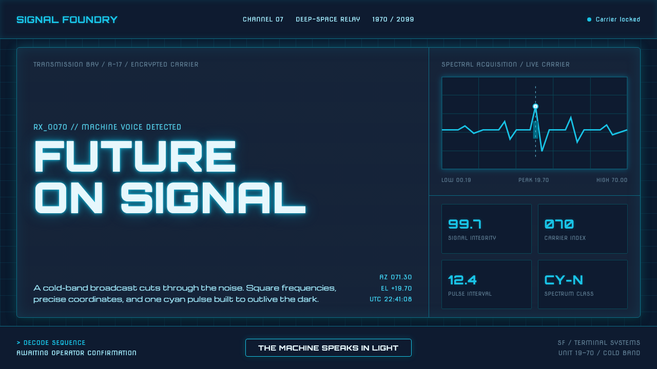 Data 70 Techno DisplayThe machine speaks in light. Cyan CRT type burns through a gridded blue-black…
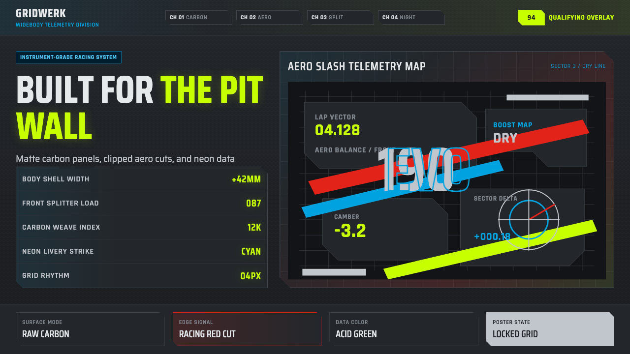 DTM Touring CarEngineered aggression. Carbon black grid, gunmetal type, cyan and acid teleme…
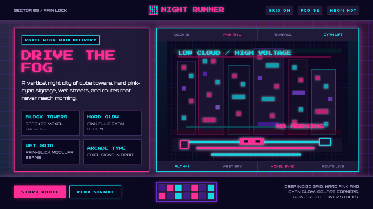 CloudpunkNeon-noir goes voxel. Pink-cyan glow cuts deep-indigo grids and blocky tower…
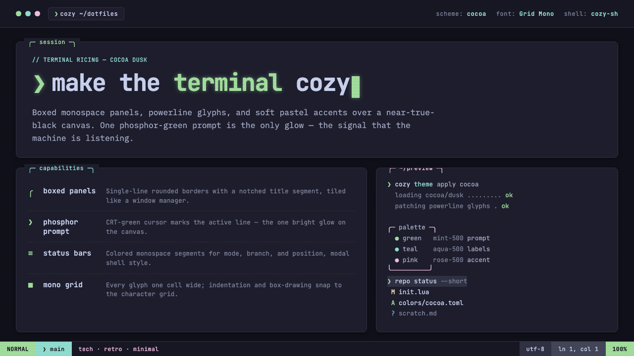 Cozy Terminal TUI RevivalMake the terminal cozy. Boxed mono panels in Catppuccin Mocha, lit by one pho…
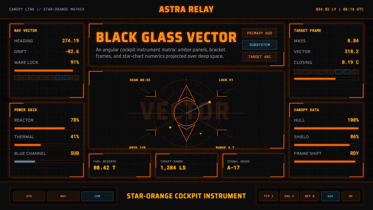 Elite DangerousOne amber instrument. Star-orange wireframes, mono numerics, and black-glass…
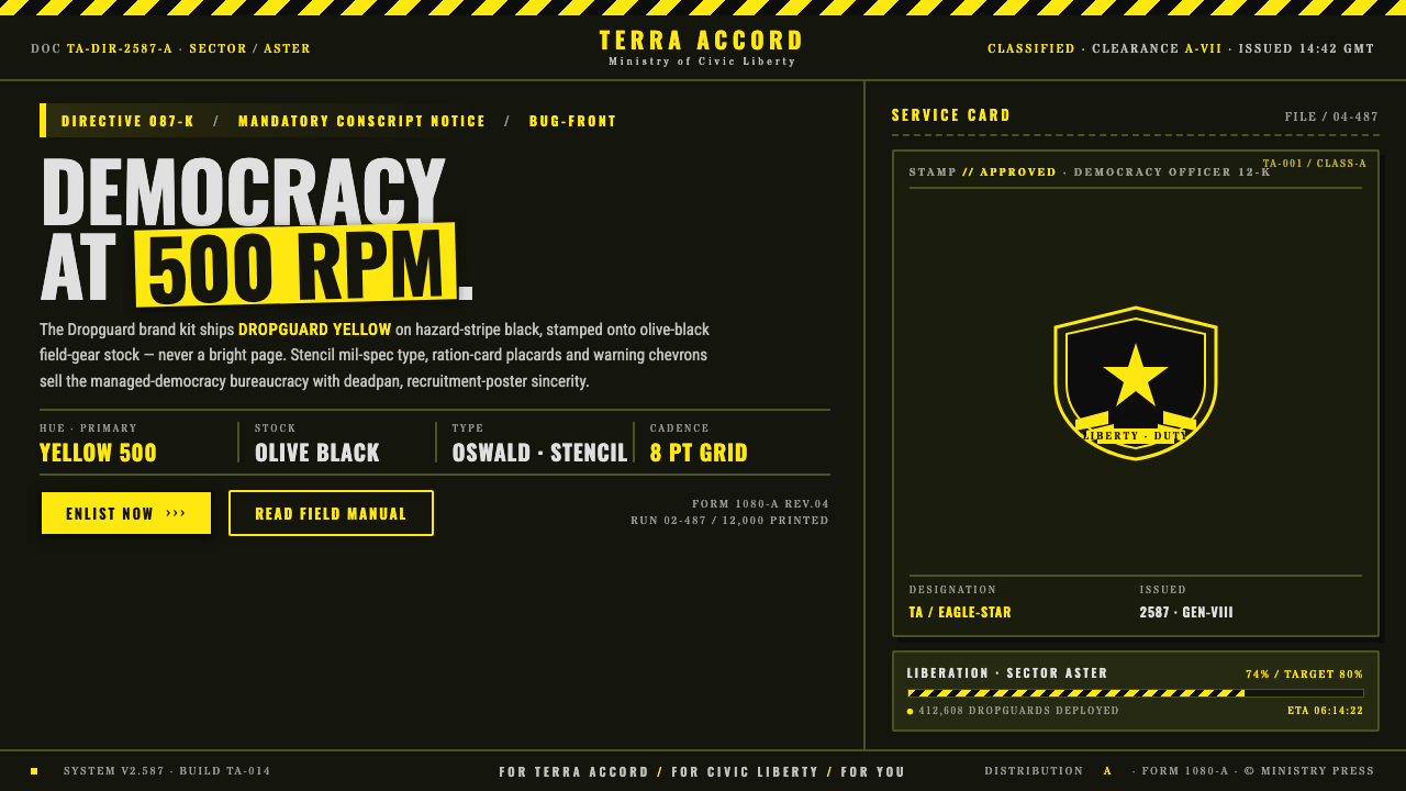 Helldivers (Super Earth)Democracy at 500 RPM. Helldivers Yellow stamped on hazard-stripe black, mil-s…