What is Data 70 Techno Display?
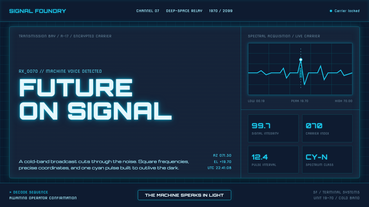
Data 70 makes the computer visible: cyan CRT lettering burns across a blue-black grid, turning a display face into a complete space-age console.
Data 70 Techno Display in brief
Data 70 is a techno display lettering style built around a square, machine-like face. Bob Newman drew it for Letraset in 1970, imitating the MICR E-13B magnetic-ink numerals scanned by bank cheque readers. Its notched stems and blocky terminals make every character feel manufactured rather than written, as if language has been cut from a piece of equipment.
The style became a defining expression of space-age display lettering. Its geometry suggests television consoles, machine readouts, and the clean technological future imagined around the era of Space: 1999. The typeface does not merely label a futuristic interface; it supplies the interface with a voice. Its forms imply that the machine is speaking through the display.
This interpretation places the lettering inside a single lit panel: a dark blue-black console ground, cyan CRT luminance, and deep teal structural lines. Headings carry the glow and command attention, while body copy recedes into the darker field. The result is not a general neon aesthetic but a disciplined display environment in which every element appears to belong to the same terminal.

Where does Data 70 Techno Display come from?
Data 70 belongs to the British Letraset dry-transfer era. In 1970, Bob Newman designed the face for Letraset as a display alphabet with an explicitly mechanical character. The historical setting matters because dry-transfer lettering was applied as a physical graphic material: the letters were selected for their visual presence, their clean transfer, and their ability to make a title feel engineered rather than handwritten.
Newman drew on MICR E-13B, the magnetic-ink numeral system used by bank cheque readers. That source explains the style's unusual balance of utility and spectacle. The forms are square and heavily constructed, but their notches and interrupted stems keep them from becoming ordinary geometric lettering. They preserve the evidence of a machine process while remaining immediately legible as display type.
The result entered the visual language of space-age techno display lettering. Data 70 was seen across television consoles and in the corridors of Space: 1999, where its hard geometry could signify an imagined technical future without needing illustration or ornament. The typeface carried the setting through its construction alone: a character looked like a component, a label like a system instruction.
The face was revived digitally from roughly the 1990s onward. In this reading, that revival is not treated as a neutral digitization of a historical alphabet. It becomes the basis for a complete illuminated panel: a deep console ground, cyan light from within the lettering, and dark teal lines that organize the surrounding space. The historical dry-transfer object becomes a screen-native atmosphere while retaining its original machine logic.
What defines the Data 70 Techno Display look?
Machine Geometry
Data 70 is built from square, block-like forms rather than fluid strokes. Its geometry feels assembled, measured, and manufactured. The letterforms should read as parts of a machine, with each terminal and interruption contributing to the impression of engineered construction.
Notched Stems
The notched stems are one of the face's defining signatures. They interrupt the otherwise solid construction with deliberate cuts, recalling the magnetic-ink numerals that informed the design. The effect is technical without becoming ornamental.
Block Terminals
Terminals end with a firm, squared-off character. They give the alphabet a sense of weight and make individual letters resemble pieces of hardware. Rounded, calligraphic endings would weaken the display face's mechanical authority.
CRT Luminance
The lettering is imagined as light emitted from within a display rather than paint placed on a surface. Cyan is the primary luminous voice. It should feel concentrated and electrically active, while the surrounding structure remains deeper and quieter.
Blue-Black Console
The ground is a dark blue-black console field that gives the cyan lettering somewhere to burn. Darkness is not merely a background choice; it establishes the visual condition of a terminal viewed in operation, with the display face carrying the atmosphere.
Gridded Structure
Deep teal lines organize the console as a system of measured relationships. The grid should support the display rather than compete with it, giving labels, panels, and readouts a shared technical order without introducing decorative complexity.
Recessive Body Copy
The display face is the dominant voice, so body text must recede. Supporting copy belongs in a quieter register, allowing the headings to burn brighter and preserving the hierarchy between machine signal and explanatory detail.

Who shaped Data 70 Techno Display?
Bob Newman designed Data 70 for Letraset in 1970. His contribution established the face's square, machine-like construction and connected display lettering to the visual logic of MICR E-13B magnetic-ink numerals.
Letraset was the dry-transfer context in which Data 70 first appeared. The lettering belongs to a period when a display face was also a physical graphic material, selected and transferred as part of the act of making a title or console-like composition.
MICR E-13B is the magnetic-ink numeral system that Data 70 imitated. Its association with bank cheque readers explains the alphabet's notched stems, blocky terminals, and sense of machine-readable construction.
Space: 1999 is one of the cultural settings in which Data 70 appeared. Its presence in television consoles and corridors helped establish the face as a shorthand for the space-age technological future.
How do you use Data 70 Techno Display today?
For presentation covers, treat the slide as a single operating console. Let a large Data 70 title carry the cyan glow against the blue-black ground, with deep teal lines establishing the panel structure around it. Content slides should preserve that relationship: headings remain the active signal, while explanatory text sits farther back and never competes with the display face.
For data slides, use the grid as the organizing intelligence. Readouts, labels, and values should appear as parts of one technical panel rather than as separate decorative cards. Cyan can identify the primary signal, while deep teal can separate regions and supporting information. The result should feel like a machine reporting state, not a conventional chart decorated with futuristic color.
For web interfaces, the style is especially suited to dashboards, monitoring tools, and pricing pages that want a technical, operational mood. Keep the page dark, use the grid to establish relationships between navigation, panels, and readouts, and reserve the strongest cyan luminance for the most important action or status. Pricing tiers can be distinguished through hierarchy and controlled light rather than a collection of unrelated accent colors.
For editorial and marketing work, Data 70 works best when the page behaves like a transmission surface. A campaign headline can burn brightly, while supporting copy remains subdued and structured by deep teal rules. Product announcements, launch pages, and technology stories can use the face to suggest a machine-era future without relying on illustrations, provided the surrounding composition stays disciplined.
The common mistake is to treat Data 70 as generic neon styling. Adding bright glow everywhere, using many competing colors, or allowing body copy to shine as strongly as the headline destroys the console logic. The style depends on controlled contrast: the display face speaks, the grid organizes, the dark field absorbs, and every other element supports that hierarchy.

Data 70 Techno Display — FAQ
What is Data 70?
Data 70 is a square, machine-like display face drawn by Bob Newman for Letraset in 1970. It imitates MICR E-13B magnetic-ink numerals and is recognized by its notched stems, blocky terminals, and strong association with space-age technology.
Why does the style use cyan on a dark ground?
The dark blue-black ground creates the condition of an operating console, while cyan suggests CRT luminance emitted from within the display. The contrast lets the display face carry the atmosphere and keeps the interface focused rather than generally luminous.
Should every element use the Data 70 display face?
No. The display face should remain the dominant signal. Supporting body copy needs to recede so that headings, labels, and key readouts retain their machine-like authority. Applying the strongest lettering everywhere removes the hierarchy that makes the console feel operational.
How important is the grid?
The grid gives the illuminated lettering a system to belong to. Deep teal rules can organize panels, labels, and readouts without competing with the cyan signal. Without that structure, the treatment risks becoming a collection of glowing type rather than a coherent terminal.
What separates Data 70 from generic futuristic neon?
Data 70 is grounded in a specific lettering history: Letraset dry-transfer production, MICR E-13B numerals, and the space-age techno display context. Its atmosphere comes from controlled relationships between a dark console, cyan display light, deep teal structure, and a dominant machine-like face, not from brightness alone.
Related design styles
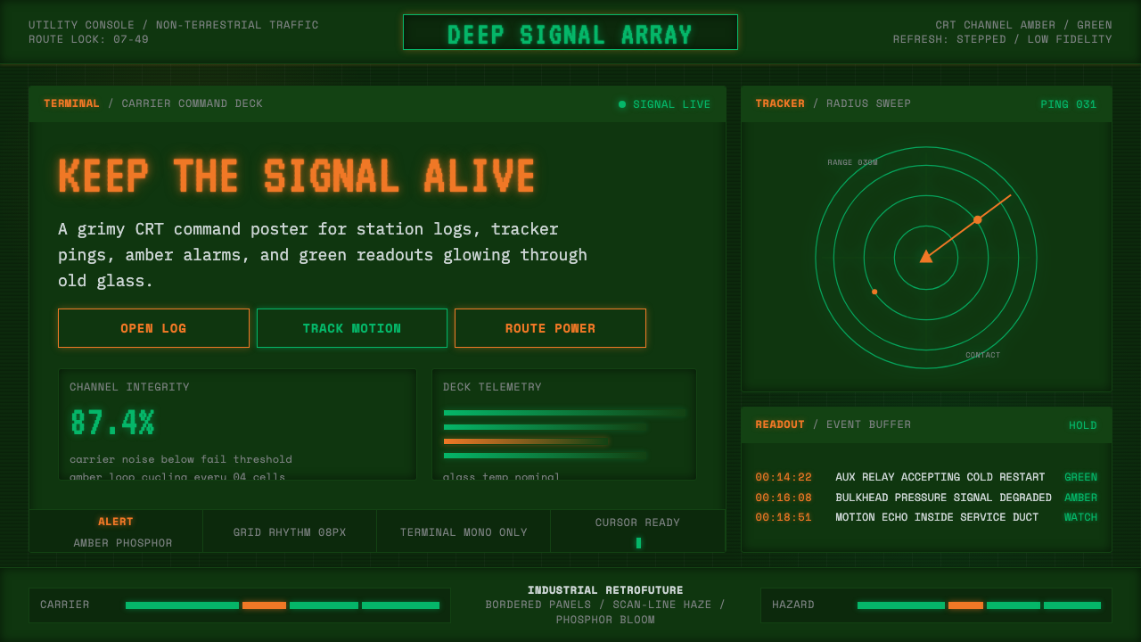 Alien: IsolationLo-fi dread glows. Amber phosphor and terminal green pulse through bordered C…
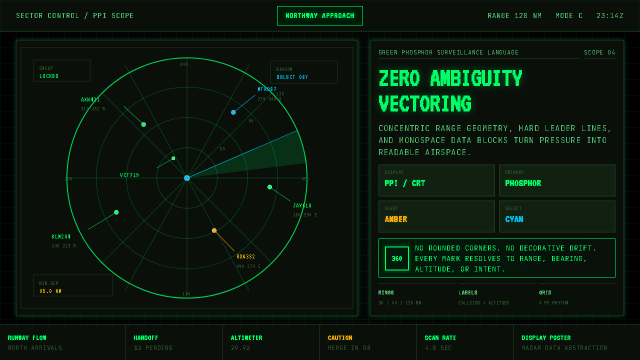 Air Traffic Control RadarOperational gravity. Phosphor green rings, sweep wedges, and monospace blips…
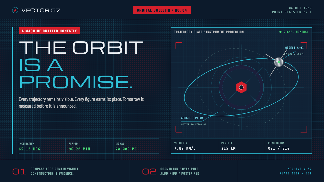 Atompunk Sputnik EraTomorrow, drafted precisely. Cyan orbits cross cosmic ink with red poster blo…
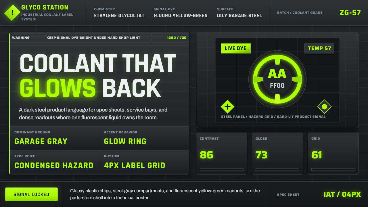 Fluorescent Antifreeze GreenCoolant becomes hazard signal. Fluoro green burns through steel-gray label gr…
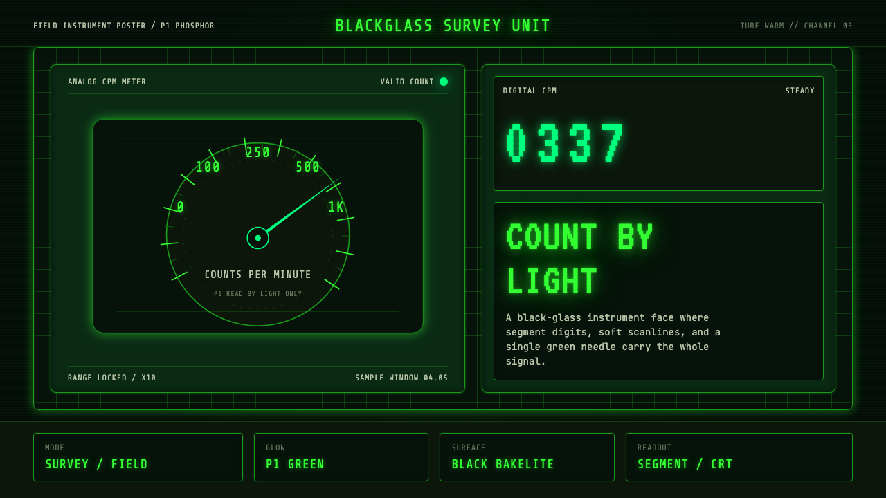 Geiger Counter Green ReadoutReads by glow. P1 green digits, scanlines, and a bordered black instrument gr…
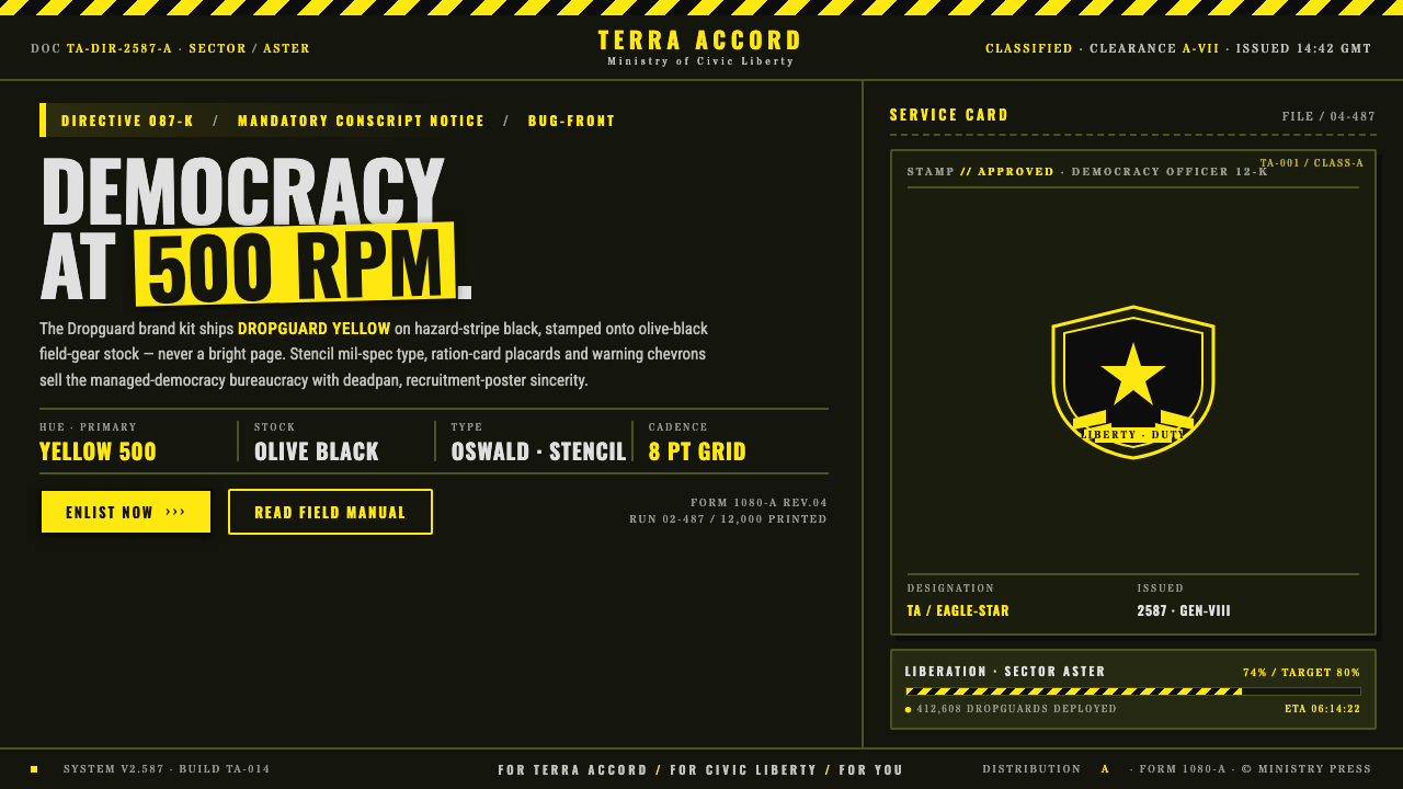 Helldivers (Super Earth)Democracy at 500 RPM. Helldivers Yellow stamped on hazard-stripe black, mil-s…