What is Atompunk Sputnik Era?
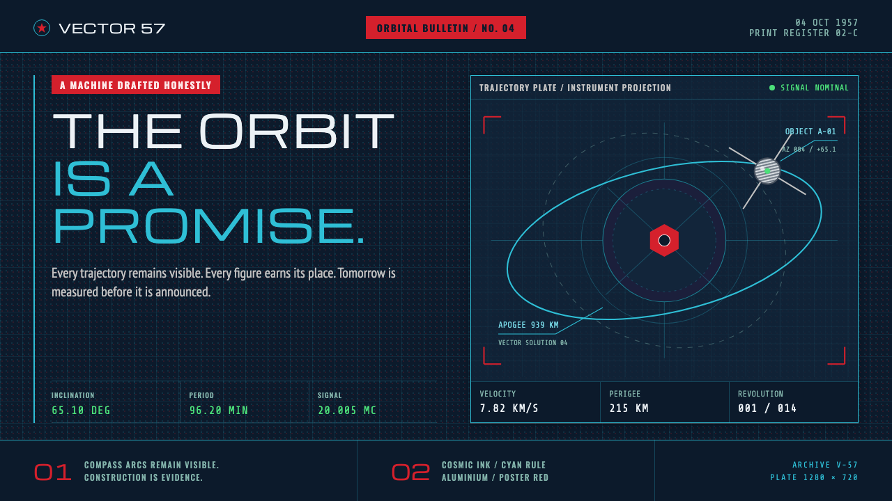
This is the Atomic Age as drafted with a compass and ruler in Moscow rather than lounged in at an American diner — a machine drawn honestly, then sold to the public as a promise.
Atompunk Sputnik Era in brief
Atompunk Sputnik Era is the Eastern-Bloc branch of the mid-century Atomic Age, and it lived primarily on the printed page rather than in curved chrome furniture. Its ground is an ink-blue so deep it reads as cosmic space itself, across which orbital ellipses and ballistic trajectory arcs are ruled in a bright instrument cyan. Brushed-aluminium hardware — a rocket hull, a satellite body — catches exactly one hard specular highlight rather than a soft rendered glow, and headline blocks arrive in a flat, saturated poster red reserved almost entirely for titles and a single iconic star.
Everything in this visual language is drawn the way an engineer or a technical illustrator would draw it: with instruments. Compass arcs are left visible rather than erased, trajectory rules run to the full edge of the frame as if extending beyond it, and telemetry numbers sit in a monospaced face directly beside the diagram they describe, the way a caption sits beside a blueprint. Coarse halftone dots and a slight, deliberate misregistration between printed color layers are treated as honest evidence of offset lithography rather than flaws — marks of ink on paper, not a screen's glow.
The underlying temperament is Cold War engineering optimism rendered as graphic design: a machine drafted with total technical honesty, then packaged and sold to the public as a vision of the future. Nothing here is softened for comfort — the style does not ask to be made prettier, only to be drawn more precisely.
Where does Atompunk Sputnik Era come from?
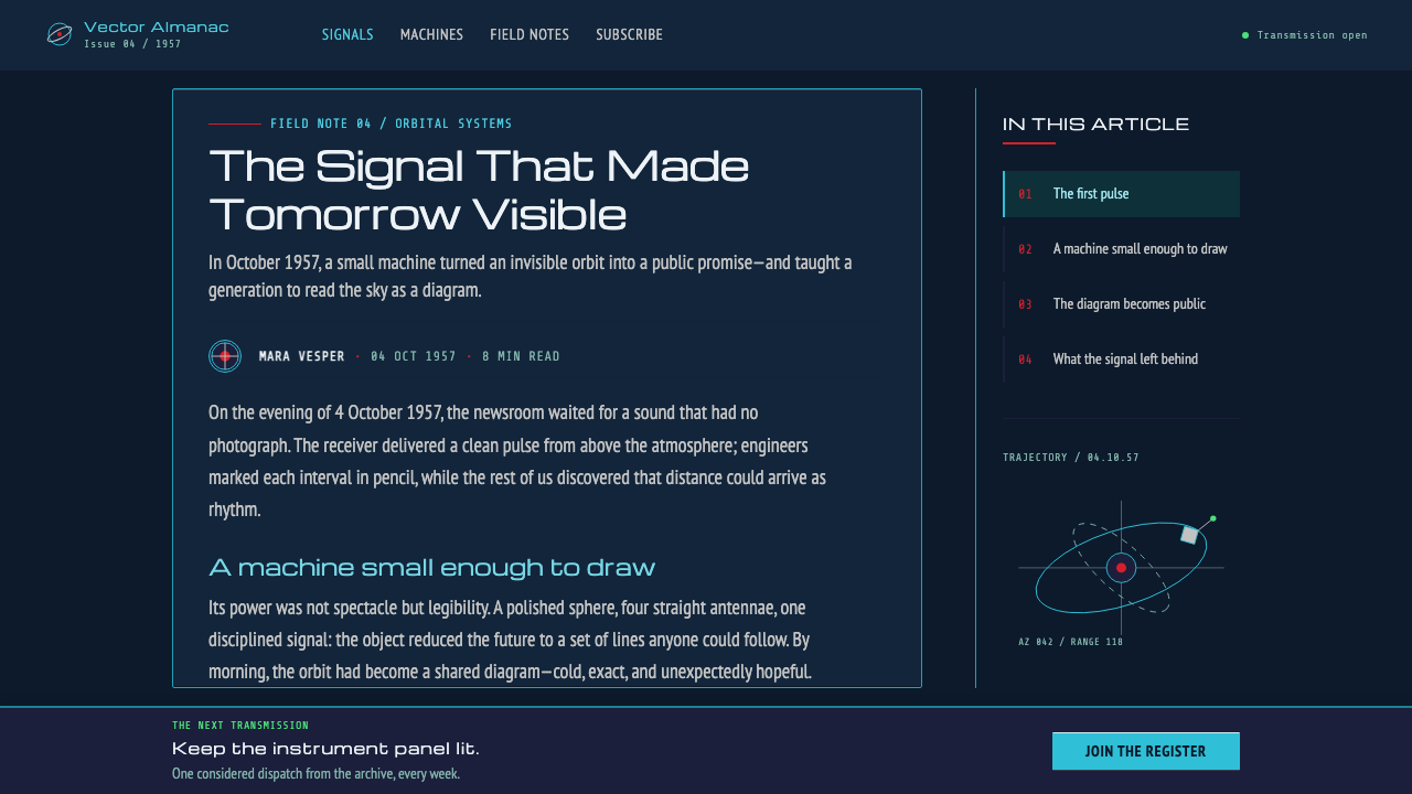
The reference period runs from the early 1950s through the mid-1960s, with a single, precisely dated ignition point: the launch of Sputnik 1 on 4 October 1957. Sputnik's success reoriented Soviet and Eastern European visual propaganda almost overnight, turning space travel from speculative fiction into a subject that state publishing houses, popular-science magazines, and poster studios treated with documentary seriousness and technical confidence.
This visual tradition ran alongside, but separately from, the Western Atomic Age — the version most familiar internationally, built around curved automobile tailfins, atomic-diner interiors, and a consumer-product optimism about nuclear power. The Eastern-Bloc branch had a different relationship to its own imagery: it needed to convince a public of genuine state achievement in rocketry and space science, so its visual language leaned toward instrument-drawn precision and technical illustration rather than consumer styling.
One of the figures credited with shaping this look, Nikolay Kolchitsky, produced spacecraft and space-scene illustrations for popular Soviet science publications of the period — the kind of technical-yet-visionary imagery that appeared on magazine covers aimed at young, technically minded readers eager to see exactly how a satellite or a spacecraft was put together, not merely to imagine one existing.
The typographic backbone of this look draws from a parallel European tradition: the geometric sans-serif faces developed by Aldo Novarese and Alessandro Butti at the Nebiolo type foundry in Turin. Their squared, mechanical letterforms — built from architectural, ruler-and-compass geometry rather than calligraphic gesture — supplied the kind of confident, technical-looking headline type that this era's poster designers reached for when they needed a typeface that looked like it belonged next to a rocket diagram rather than a piece of advertising copy.
What defines the Atompunk Sputnik Era look?
Ink-Blue Cosmic Ground
The base surface is a deep, ink-saturated blue so dark it reads as space itself rather than a background applied behind content. Everything else in the composition is understood to be floating within this cosmic depth, not sitting on top of a page.
Instrument-Cyan Orbits
Orbital ellipses, trajectory arcs, and ballistic rules are drawn in a bright, clean cyan that reads as instrument-precise rather than decorative. These lines behave like the ruled construction lines of an engineering drawing — present to explain motion and path, not to add visual flourish.
One Hard Specular Edge
Brushed-aluminium hardware is rendered with a single, hard-edged specular highlight rather than a soft, ambient sheen. The metal reads as genuinely reflective and mechanical, catching light the way a real polished hull would under a single directional source.
Poster-Red Headlines
A flat, highly saturated red is reserved almost exclusively for headline text and a small set of iconic symbols such as a star. It never spreads across large background areas, which is exactly what keeps it reading as an urgent, deliberate signal rather than a general accent color.
Visible Construction Marks
Compass arcs, guide circles, and trajectory rules are left visible rather than erased after use, so the viewer can see the drawing being built rather than only the finished result. This turns the illustration into a demonstration of method as much as a depiction of a subject.
Caption-Style Monospace Telemetry
Numerical data and telemetry readouts sit in a monospaced typeface placed directly beside the diagram they describe, functioning like a caption on a blueprint rather than a decorative data display. The numbers are meant to be read as real measurements, not styled as ornament.
Honest Print Grain
Coarse halftone dots and slight misregistration between printed color layers are kept rather than smoothed away, marking the image as a genuine product of offset lithography rather than a clean digital rendering. This grain is a period fact, not a nostalgic effect layered on afterward.

Who shaped Atompunk Sputnik Era?
Kolchitsky illustrated spacecraft and space scenes for popular Soviet science publications during the Sputnik era, producing the kind of technically detailed yet visionary imagery — visible construction geometry, confident instrument-drawn hardware — that this system draws its illustrative logic from directly.
Working at the Nebiolo type foundry in Turin, Novarese helped develop the geometric, squared sans-serif letterforms that supply this style's confident, technical-looking headline typography — type built from ruler-and-compass logic rather than calligraphic gesture.
Butti worked alongside Novarese at Nebiolo, contributing to the same lineage of geometric sans-serif type design whose architectural precision made it a natural match for instrument-drawn Atomic Age illustration.
How do you use Atompunk Sputnik Era today?
This system is a strong fit for presentation decks about technology, science, aerospace, or any subject that benefits from projecting engineering confidence rather than corporate polish. A cover slide works well built from a single dominant piece of hardware or a trajectory diagram rendered in instrument cyan against the ink-blue ground, with the deck's title set in a squared geometric sans and treated with the same poster-red restraint used for headlines. Content slides should keep diagrams visibly constructed — arcs and guide lines left in place — with telemetry-style captions in monospace sitting beside charts rather than beneath them. Data slides benefit enormously from this treatment: a number presented as a piece of telemetry reads as more credible than the same number in a generic chart style.
For web interfaces, the aesthetic suits developer tools, technical documentation, aerospace and engineering products, and platforms that want to communicate precision over friendliness. Keep the ink-blue as the dominant canvas rather than a dark-mode option, use cyan exclusively for lines that represent paths, connections, or process flow, and reserve poster red strictly for the single most important call to action on a screen. Metrics and status readouts should be set in monospace and positioned adjacent to the element they describe, echoing the caption-beside-diagram convention rather than being pulled into a separate dashboard panel.
In editorial and long-form content, the style supports feature writing about the history of spaceflight, Cold War technology, or engineering achievement, where visible construction marks and instrument-drawn diagrams reinforce the sense that the reader is looking at real technical material rather than an illustrator's fantasy. Pull quotes can borrow the poster-red headline treatment sparingly, and any diagram used as a section break should retain its compass arcs and guide lines rather than being cleaned into a polished icon.
For posters, launch pages, and event identity — its native register — the style rewards total commitment: one dominant piece of drafted hardware, orbital lines running to the full bleed of the frame, a single red headline block, and a star used once, not repeated as a pattern. Restraint on the red is what keeps the urgency legible.
The most common mistake is treating this as generic 'retro-futurism' and mixing in warm oranges, curved chrome, or diner-style Americana details that belong to the Western Atomic Age rather than this Eastern-Bloc technical-illustration tradition. A second common error is over-cleaning the print texture — removing the halftone grain and misregistration in the name of a crisper digital look erases exactly the evidence that makes this style read as an authentic period artifact rather than a modern pastiche.

Atompunk Sputnik Era — FAQ
Is Atompunk Sputnik Era the same as general 'retro-futurism'?
No. Retro-futurism is a broad umbrella that includes many different visual traditions, including the Western Atomic Age of curved chrome and diner interiors. This style is a specific branch tied to Eastern-Bloc technical illustration and space-program propaganda following Sputnik 1's 1957 launch, defined by instrument-drawn precision, visible construction marks, and a restrained poster-red-and-cyan palette rather than warm consumer styling.
Why does this style insist on leaving compass arcs and construction lines visible?
Because the tradition it draws from is technical illustration meant to demonstrate real engineering, not decorative art meant to evoke a mood. Leaving the construction marks visible shows the viewer that the image was built with instruments and rigor, reinforcing the sense that what's depicted is a genuine machine rather than a fantasy. Erasing those marks would make the illustration look styled rather than drafted.
Why is red used so sparingly against so much blue?
Because poster red here functions as an urgent, attention-carrying signal — for headlines and iconic symbols like a star — much the way it did in the original Soviet space posters this style draws from. If red were spread broadly across the composition, it would lose its capacity to direct the eye immediately to the most important element, and the ink-blue cosmic ground would lose its role as the dominant, defining color of the entire system.
Does this style require Cyrillic or Russian-language type to feel authentic?
No. The style's authenticity comes from its structural logic — instrument-drawn diagrams, a restrained palette, monospace telemetry, visible construction marks — rather than from any specific language or alphabet. The geometric sans-serif letterforms it draws from, developed by Novarese and Butti in Turin, were Latin-alphabet designs, so the style translates naturally into Latin-script contexts without needing Cyrillic to feel legitimate.
What kinds of products or brands should avoid this style?
Products that need to feel warm, soft, or approachable — children's products, wellness apps, food and hospitality brands — are a poor fit, since the style's cold ink-blue ground and instrument-grade precision read as clinical rather than inviting. It is also a mismatch for anything that wants a light, airy visual mood, since the entire system depends on a deep, dark cosmic ground to function.
Related design styles
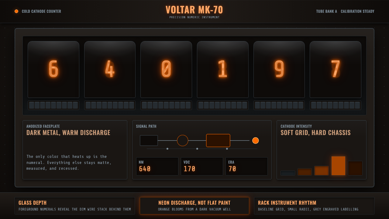 Nixie Tube DisplayHeat inside the machine. Neon-orange digits glow over black metal gridwork.
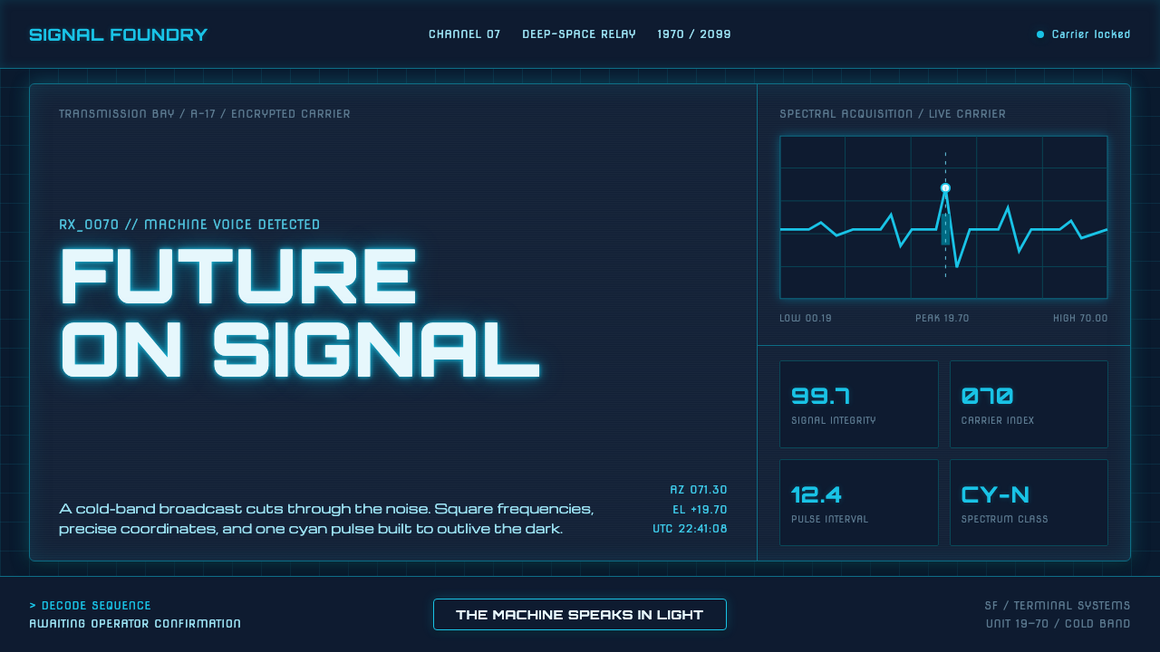 Data 70 Techno DisplayThe machine speaks in light. Cyan CRT type burns through a gridded blue-black…
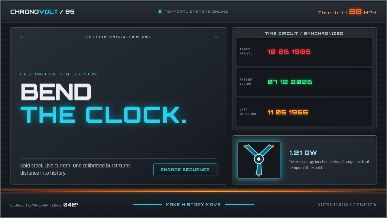 Back to the Future (1985)Cold steel, live current. Cyan circuits and orange trails turn the dashboard…
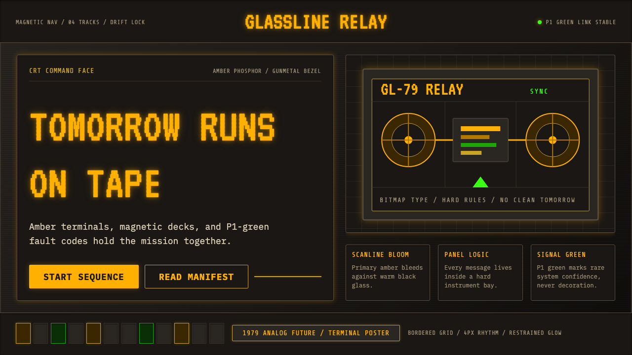 Cassette FuturismThe future hums in amber. VT323 glow, scanlines, and gunmetal grids make anal…
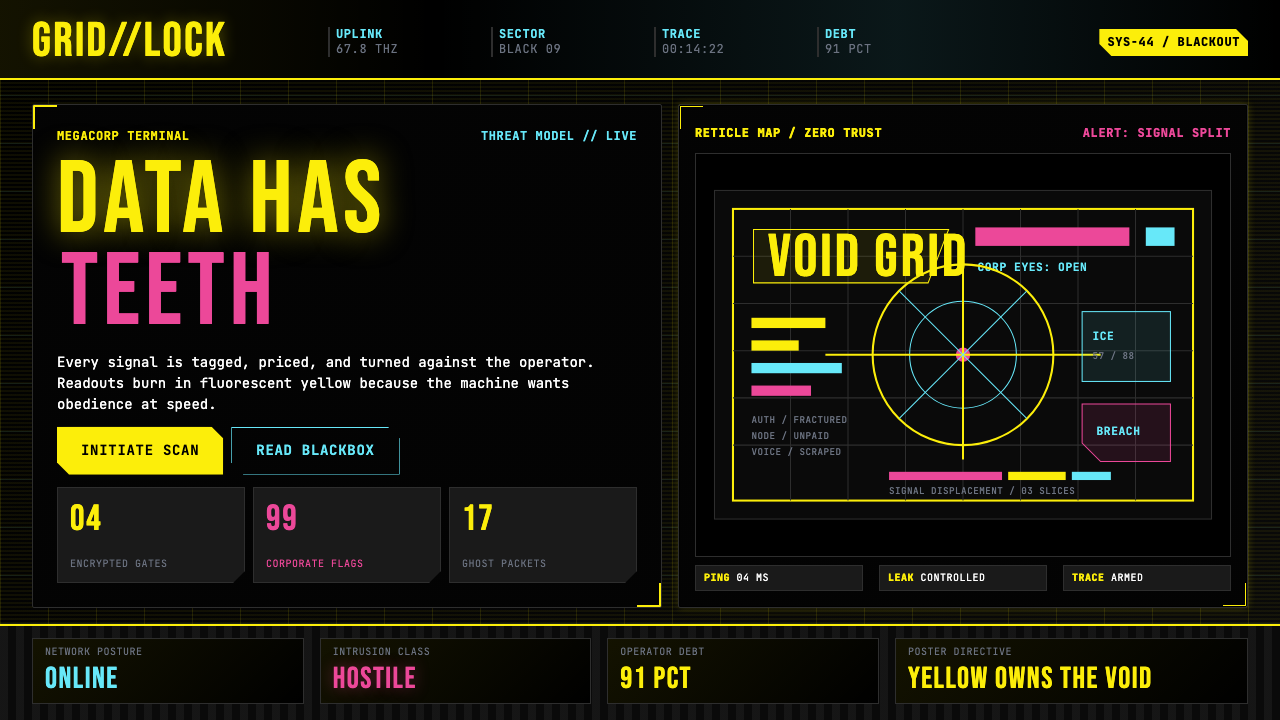 Cyberpunk 2077 (Screen UI)Weaponized terminals. Fluorescent yellow on black, scanlines and bracketed HU…
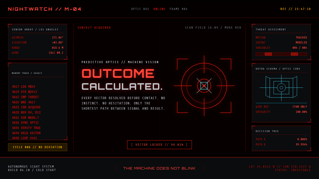 Terminator HUD (1984)The machine never blinks. Blood-red reticles and mono data burn across absolu…