What is Helldivers (Super Earth)?
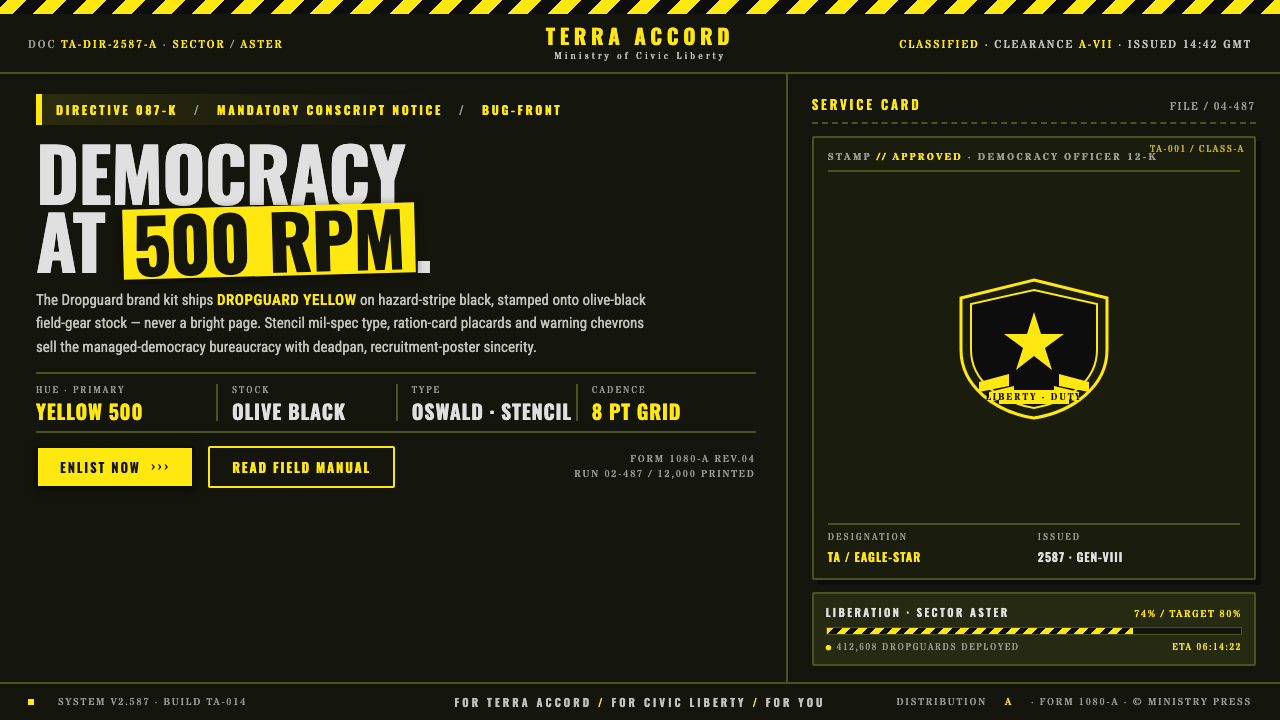
Helldivers turns military order into comedy: Helldivers Yellow, warning chevrons, and stamped insignia sell managed democracy with absolute bureaucratic confidence.
Helldivers (Super Earth) in brief
Helldivers is the visual language of Super Earth, the future-fiction regime at the center of Arrowhead Game Studios’ satirical cooperative shooter franchise. It combines mid-century military propaganda, field-equipment graphics, hazard markings, and bureaucratic placards into an identity that appears completely sincere about its own authority. That sincerity is the joke. Every eagle, star, stencil label, and warning stripe celebrates managed democracy so forcefully that patriotic confidence tips into authoritarian kitsch.
The style is built around a severe dark field rather than a bright heroic page. Olive-black equipment tones establish the atmosphere, while Helldivers Yellow operates like a flare, command marker, or official stamp. Black-and-yellow hazard stripes frame important information, and eagle-and-star insignia convert ordinary panels into declarations of institutional legitimacy. The result feels less like decorative science fiction and more like a military supply system that has absorbed an entire civilization’s propaganda apparatus.
Its graphic force comes from repetition and procedural clarity. Stencil typography implies equipment crates and regulated inventories; ration-card panels divide information into approved compartments; chevrons signal danger, direction, and urgency. These devices are delivered with deadpan conviction rather than playful exaggeration. The interface never admits that it is satire. It behaves as though democracy truly must be administered through ammunition, forms, warnings, and relentless visual discipline.
Where does Helldivers (Super Earth) come from?
The Helldivers identity belongs to a contemporary future-fiction setting developed by Arrowhead Game Studios in Sweden. The franchise appeared in 2015 and returned in 2024, using cooperative military action as the stage for a satire of patriotism, obedience, and managed democracy. Its visual system therefore has two jobs at once: it must make the fictional military organization feel coherent enough to inhabit, while also revealing the absurdity of a society that packages violence as civic duty.
Its principal historical reference is mid-century military propaganda, particularly the commanding posters, instructional placards, equipment labels, and recruitment language associated with mass mobilization. Helldivers does not reproduce a single historical campaign. Instead, it extracts the shared grammar of propaganda: simplified emblems, declarative slogans, strong contrast, regulated typography, heroic symbols, and a refusal of ambiguity. These devices promise that authority is organized, purposeful, and morally certain.
That grammar is filtered through a Starship Troopers-style pastiche of managed democracy. Heroic service, civic virtue, and overwhelming firepower are treated as parts of the same administrative process. The design supports this fusion by making military markings and government identity nearly indistinguishable. A hazard panel can function as patriotic messaging; an insignia can authenticate both a weapon system and a political belief. Bureaucracy becomes theatrical, while propaganda takes on the practical appearance of field equipment.
The Arrowhead design teams sharpened the satire through tonal restraint. Rather than signaling comedy through whimsical decoration, the identity maintains the voice of an institution that never doubts itself. Its eagle-and-star seal, ration-card structures, stencil labels, and warning chevrons are repeated until they feel like mandatory standards. The dark equipment ground keeps the world materially severe, while yellow emphasis supplies the triumphant note. Humor emerges from the gap between the system’s polished certainty and the brutal proposition it is presenting as democracy.
What defines the Helldivers (Super Earth) look?
Color
Helldivers Yellow is the commanding accent, but it does not become the page itself. It burns against hazard-stripe black and olive-black equipment grounds, behaving like a warning, authorization mark, or patriotic flare. The palette succeeds through unequal roles: darkness supplies mass and seriousness, while yellow identifies what the institution wants noticed immediately. Broad bright backgrounds weaken the field-gear character and make the style feel cheerful rather than coercive.
Typography
Stencil and mil-spec lettering dominate because type must appear issued rather than personally composed. Headlines read like commands, classifications, or slogans stamped onto crates and placards. Supporting copy is compact, procedural, and subordinate to the declaration above it. The typography should feel reproducible under rough conditions, with blunt shapes and deliberate interruptions suggesting templates, labeling systems, and regulated production rather than editorial elegance.
Insignia
The eagle-and-star insignia is more than a logo. Repeated across placards, panels, and equipment, it acts as a seal of official truth. Its recurrence suggests that every instruction belongs to one total system of command. The emblem works best when treated as a stamp, badge, or authentication device rather than a decorative illustration. Slightly blunt, forceful presentation supports the fiction of mass-issued authority.
Hazard Geometry
Diagonal stripes and warning chevrons provide the style’s primary geometry. They frame restricted zones, point toward actions, and turn empty boundaries into active signals. Their rhythm should be firm and repetitive, like infrastructure designed to remain legible during an emergency. Because these patterns already carry intense visual energy, they are most effective around decisive moments rather than across every available surface.
Panel Structure
Information is contained in ration-card panels, equipment labels, and compartmentalized placards. Borders, tabs, stamps, and classification bands make content feel processed by an administrative machine. The best compositions distinguish a dominant order from supporting evidence: slogan first, operational detail second, certification last. Too many equally loud compartments destroy the hierarchy and turn purposeful bureaucracy into undirected visual noise.
Material Tone
The identity belongs on field gear, warning plates, and issued documentation, so surfaces should feel functional and handled rather than luxurious. Olive-black grounds evoke coated equipment stock; stamped marks imply repeated use and institutional ownership. The style can tolerate wear and bluntness, but not ornamental nostalgia. Material cues should support deployment, storage, and command, preserving the impression that every graphic exists because an organization required it.
Deadpan Satire
The defining characteristic is tonal rather than purely visual. Every element must believe in Super Earth. Slogans are delivered as policy, danger markings as civic pride, and military force as democratic service. Winking jokes, cartoon exaggeration, or visibly ironic decoration weaken the effect because they release the tension. The satire becomes sharpest when the design remains disciplined, triumphant, and unaware of how much it reveals.
Who shaped Helldivers (Super Earth)?
The Swedish studio’s design teams created the franchise identity and its balance of playable military coherence with political parody. Their central achievement is tonal control: equipment graphics, warning systems, insignia, and propaganda language appear to belong to one functioning institution. Because the presentation never steps outside the official voice to explain the joke, players encounter the satire through participation in the system rather than through detached commentary.
Super Earth is the fictional authority that gives the visual system its voice. It presents managed democracy as an unquestionable civic achievement and treats military deployment as its natural form of delivery. Graphically, the regime is made present through repeated seals, classifications, slogans, and hazard markings. Its identity demonstrates how institutional branding can convert ideology into routine procedure, making every panel feel like both an instruction and a loyalty test.
The Helldivers embody the identity’s ideal citizen-soldier. They are positioned at the intersection of heroic service, civic obedience, and spectacular firepower, allowing the propaganda system to speak through action as well as graphics. Their surrounding visual language continually authenticates sacrifice as procedure: warnings establish danger, insignia establish legitimacy, and triumphant yellow emphasis reframes violent deployment as a celebratory public mission.
How do you use Helldivers (Super Earth) today?
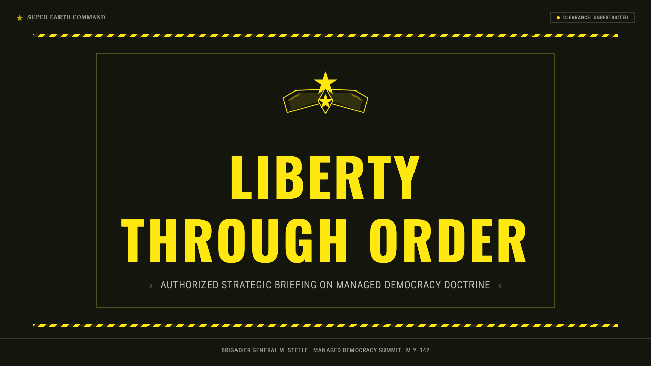
For presentation slides, the style is strongest when the deck behaves like an official Super Earth briefing. A cover should establish a dark equipment field, one commanding yellow declaration, a restrained eagle-and-star seal, and a band of hazard geometry that directs the eye rather than surrounding everything. Content slides can use ration-card compartments for objectives, evidence, and operational notes. Headings should sound issued and decisive, while supporting text remains sober enough to preserve the deadpan institutional voice.
Data slides benefit from the system’s affinity with command displays and regulated reporting. Charts should be treated as mission evidence rather than neutral decoration: dark grounds establish the field, yellow marks the decisive series or threshold, and supporting categories recede into quieter equipment tones. Classification bands, warning chevrons, and stamped labels can clarify priority, but each must perform a real informational task. If every number receives emergency treatment, the presentation loses both analytical hierarchy and satirical authority.
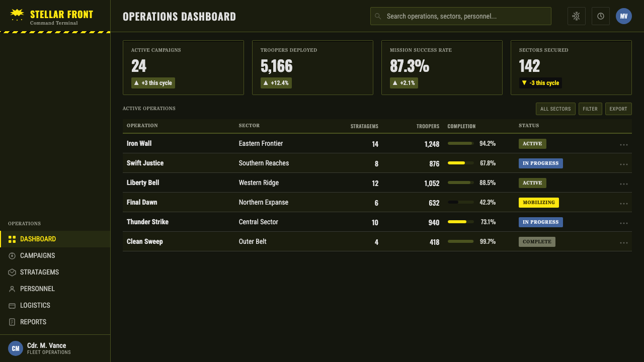
For web interfaces, Helldivers suits dashboards, operational consoles, status monitors, and pricing pages framed as tiers of authorized service. Navigation can resemble a compact command strip, while cards behave like issued placards with clear classifications and forceful action labels. Yellow should be reserved for primary actions, active states, and urgent system messages. Pricing tiers can be differentiated through rank, clearance, or mission framing, provided the parody remains legible and does not obscure costs, limits, or user choices.
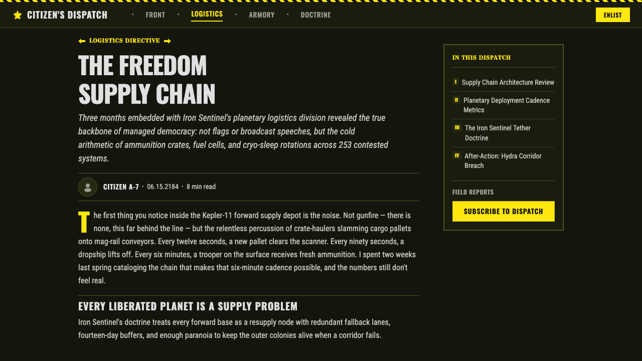
Editorial and marketing work can exploit the style’s propagandistic confidence. Article openings benefit from a declarative headline, a narrow field of explanatory copy, and one institutional emblem that establishes the speaker. Campaign sections can alternate between severe dark expanses and concentrated yellow announcements, with chevrons carrying readers toward the next claim or action. The language should remain proudly procedural: benefits become duties, features become approved equipment, and calls to action become invitations to serve managed democracy.
The common mistake is reducing the style to yellow-and-black stripes applied everywhere. Hazard markings alone produce a generic industrial or construction aesthetic; they do not create Super Earth. The identity depends equally on olive-black field material, stencil typography, ration-card bureaucracy, eagle-and-star authentication, and unwavering official tone. Another failure is making the joke too explicit. Once the design laughs at itself, its authoritarian confidence collapses, and the distinctive black satire becomes ordinary themed decoration.
Helldivers (Super Earth) — FAQ
Is the Helldivers style simply a military user interface?
No. A military interface may use dark surfaces, warnings, stencils, and compact information because they suggest operational efficiency. Helldivers uses those same devices to construct political satire. The eagle-and-star seal, managed-democracy language, heroic yellow emphasis, and relentless official confidence turn functional military grammar into propaganda. Without that ideological layer, the result may look tactical or industrial, but it will not feel distinctly Super Earth.
Why should Helldivers Yellow remain an accent rather than the main background?
The identity depends on yellow appearing as an event within darkness. Against olive-black field stock and hazard black, it reads as warning, command, and patriotic spectacle at once. If yellow becomes the continuous ground, it loses urgency and shifts the mood toward brightness or novelty. The dark field also anchors the material fiction of issued equipment, allowing yellow to behave like something stamped, illuminated, or officially approved.
How can the style remain readable when it is intentionally loud?
Loudness should be concentrated at the level of commands and warnings, not distributed evenly. Establish one dominant declaration, a small number of supporting panels, and a clear route through the page. Reserve yellow and chevrons for moments of genuine priority, while body information stays quieter on the dark equipment ground. The bureaucracy may look dense, but its hierarchy must remain unmistakable; disciplined control is part of the fictional authority.
Does the satire require humorous copy?
Not necessarily. The most characteristic humor comes from contradiction rather than punchlines: democratic language attached to overwhelming force, civic optimism printed like a hazard warning, and triumphant symbols placed on severe field equipment. Copy should sound sincere, procedural, and proud. Overt jokes can work sparingly, but if the institution appears aware of its own absurdity, the deadpan tension that defines the style begins to dissolve.
Where does the Helldivers identity work poorly?
It struggles where warmth, reassurance, softness, or political neutrality are central goals. The combination of authoritarian insignia, warning geometry, dark field gear, and command language can make ordinary consumer experiences feel hostile or coercive. It is better suited to entertainment, themed campaigns, game-adjacent products, operational dashboards, and editorial work that can sustain satire. In practical interfaces, clarity and informed choice must remain more important than maintaining the fiction.
Related design styles
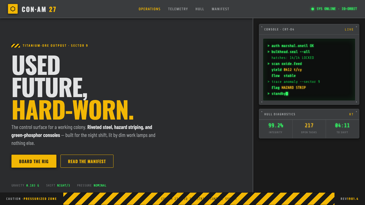 Outland (1981)Used-future industrial grit. Dim steel, caution-yellow hazard stripes, green-…
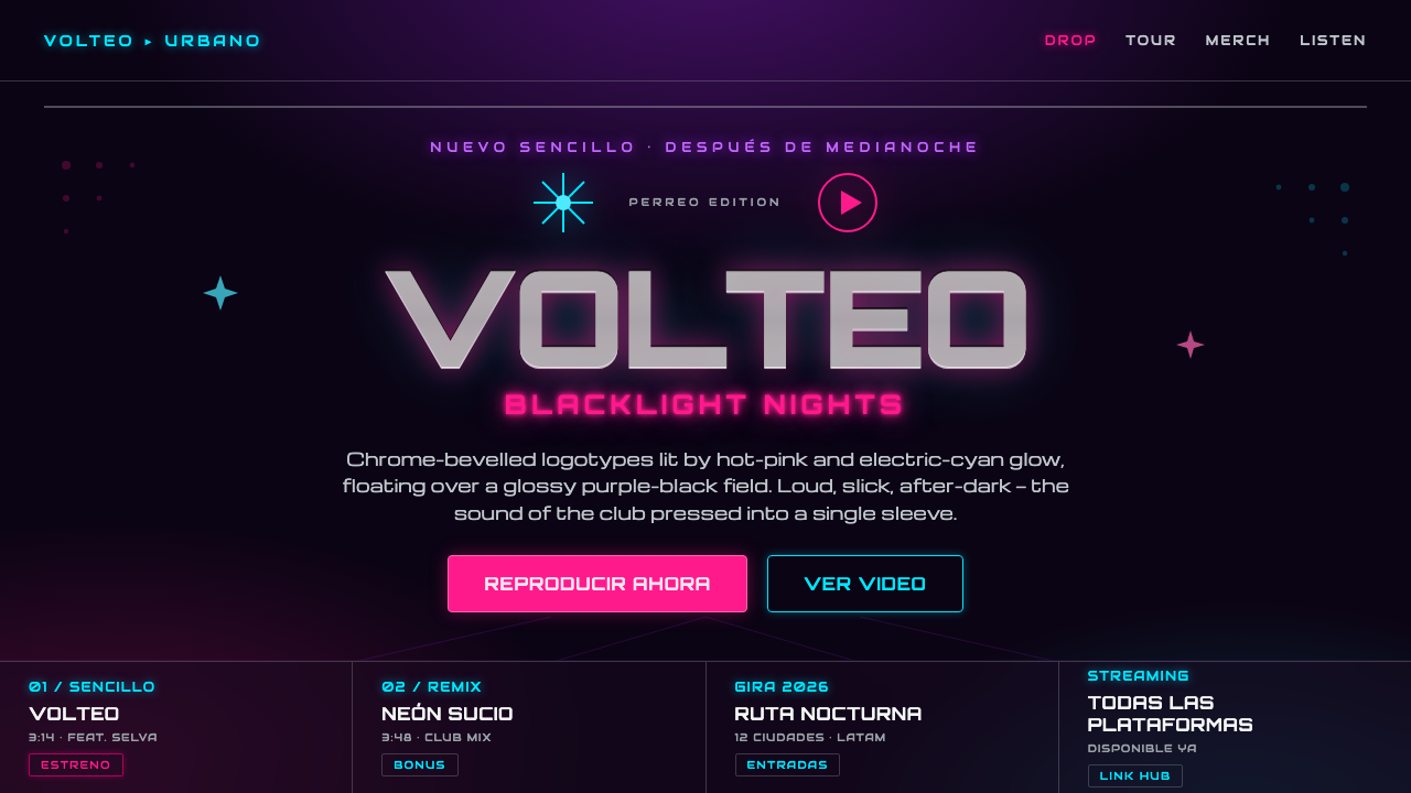 Reggaeton Album CoverAfter-dark, unapologetic. Chrome Orbitron logotypes glow pink and cyan on bla…
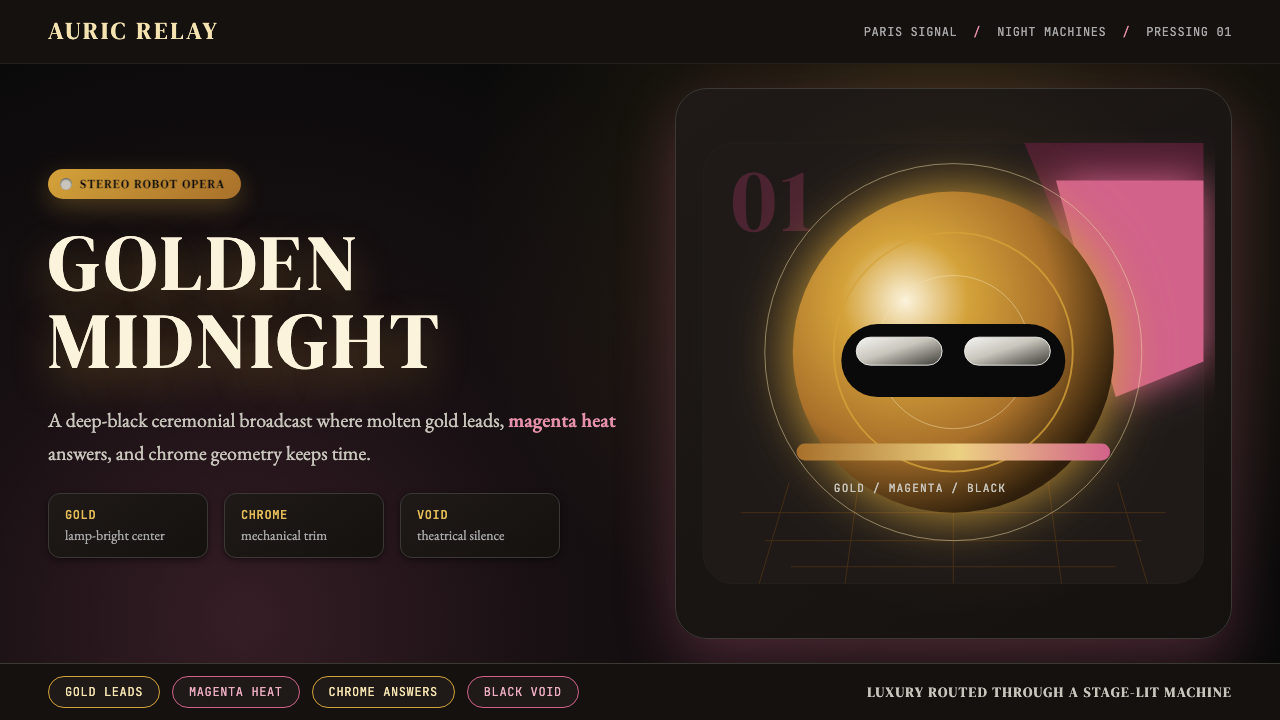 Daft Punk Discovery (Gold-Helmet)Warm sci-fi disco. Gold serif caps orbit a magenta void with chrome-disc geom…
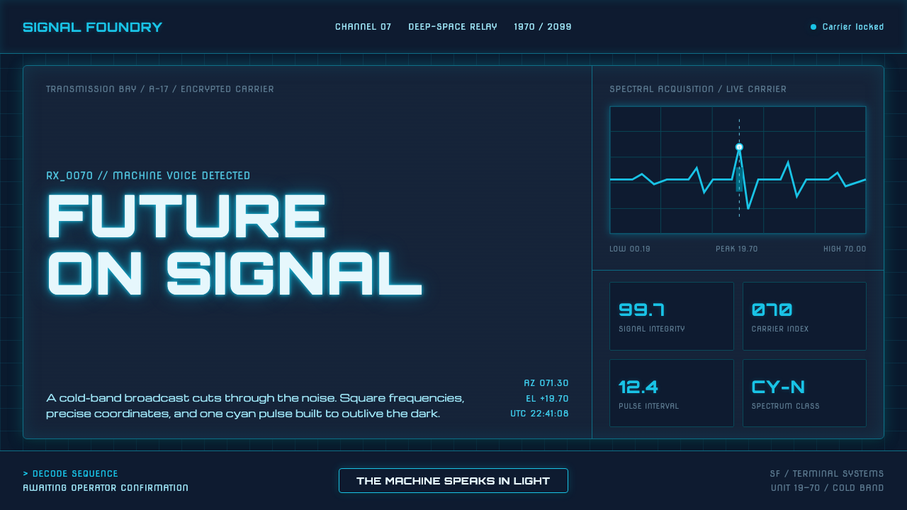 Data 70 Techno DisplayThe machine speaks in light. Cyan CRT type burns through a gridded blue-black…
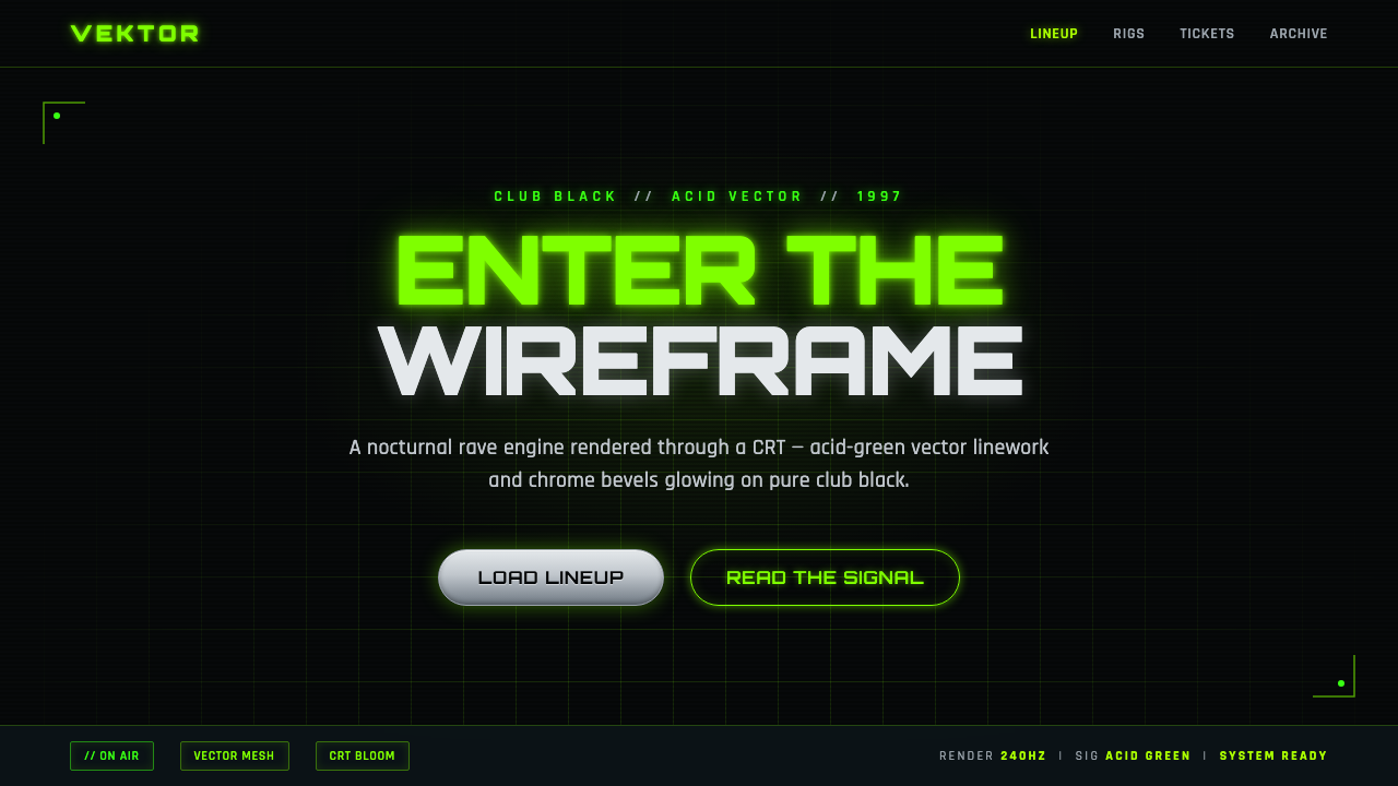 Playstation Rave Green 1997Enter the wireframe. Acid-green vector lines and chrome glow on club black, a…
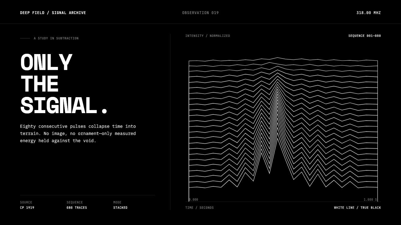 Pulsar CP1919 Stacked PlotPure signal becomes a totem. Stacked white pulse lines rise through a true-bl…