What is Pulsar CP1919 Stacked Plot?
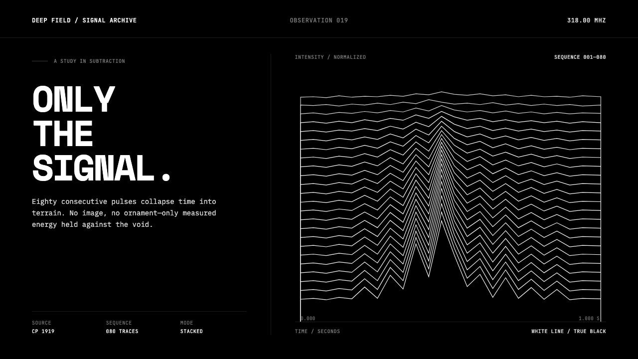
A scientific trace becomes an icon: white pulse-lines climb through black space until data reads like a monument.
Pulsar CP1919 Stacked Plot in brief
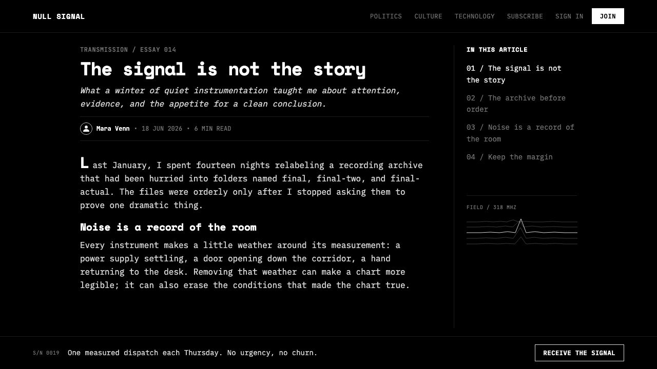
Pulsar CP1919 Stacked Plot is a dark visual system built around one decisive image: a series of white pulse traces stacked into a ridge-like field against an absolute black ground. The image does not behave like decoration or illustration. It is evidence made visible, arranged so that repetition, interruption, density, and empty space are all legible at once. Each line suggests a received signal; together, the lines become a concentrated visual event.
Its cultural force comes from a transformation of context. Harold D. Craft Jr. created the original figure as scientific data visualization in 1970, stacking consecutive radio pulses from pulsar CP1919 so nearer waves obscure those behind. Peter Saville later inverted the image into white on black for Joy Division’s 1979 Unknown Pleasures cover. A figure that began as a thesis image became a post-punk emblem without losing its sense of precision, distance, or mystery.
The resulting aesthetic is austere but not empty. Black space is not merely background; it creates the conditions under which the white lines can feel isolated, luminous, and almost physical. There are no ornamental frames, illustrative scenes, or expressive flourishes competing for attention. The system asks the viewer to look at signal itself: its recurrence, its instability, and the quiet drama produced when measured information is allowed to occupy space with absolute clarity.
Where does Pulsar CP1919 Stacked Plot come from?
The source image belongs first to scientific observation. In 1970, Cornell doctoral student Harold D. Craft Jr. assembled 80 consecutive radio pulses from CP1919 into a single stacked plot for a PhD thesis. The construction is central to the image’s character: it does not present one isolated waveform, but a sequence of related observations. The front waves conceal portions of those behind, turning accumulated measurement into a field with depth, rhythm, and visual compression.
CP1919 links the image to the study of pulsars, and Jocelyn Bell Burnell is among the key figures associated with its origin story. Yet the plot’s later visual life depends less on explanatory astronomy than on the formal clarity of the graphic itself. The repeated traces make a pattern without becoming an ornament. Their apparent irregularity remains disciplined by the act of stacking, so the image can be understood simultaneously as data, landscape, interference, and a record of time passing through a receiver.
Nine years after Craft’s thesis figure, Peter Saville adopted the image for the cover of Joy Division’s Unknown Pleasures. The cover placed the signal into the visual culture of England’s post-punk moment and Factory Records, converting an obscure research diagram into a widely recognized cultural object. The crucial alteration was inversion: white lines emerged from black rather than dark marks sitting on a pale page. That reversal intensified the image’s isolation and made its stacked waves feel less like a chart and more like an apparition.
This history explains why the system should not be treated as generic retro-futurism. Its authority comes from a specific chain of translation: observation became a thesis figure, the figure became an album cover, and the album cover became minimal data-graphic iconography. A convincing application preserves that chain by retaining the image’s discipline. It should feel measured rather than decorative, severe rather than theatrical, and emotionally charged because the signal is left intact rather than embellished.
What defines the Pulsar CP1919 Stacked Plot look?
True Black Ground
The black field is expansive, uninterrupted, and active. It removes environmental context so the pulse-lines appear suspended in a void rather than printed on a conventional page. This darkness is not moody decoration; it is the system’s primary instrument of focus. Large areas remain deliberately unoccupied, giving the plotted form authority without making it feel crowded or loud.
White Signal Lines
White is reserved for the trace and for essential information. Against black, the lines read as direct emissions: crisp, exposed, and difficult to ignore. Their value lies in continuity rather than expressive variation. A line should preserve the impression of recorded information, not become a hand-drawn flourish, a glowing effect, or a decorative contour.
Stacked Occlusion
The ridge form is created through accumulation. Consecutive pulses are arranged in bands, with front waves concealing parts of the waves behind them. This occlusion creates depth without perspective rendering, shading, or scenic illusion. The image feels spatial because the sequence has been layered, not because it has been made to imitate a landscape.
Totemic Scale
The plot works best when treated as a singular presence rather than a background pattern. It may sit centrally with generous black space around it, or occupy a broad horizontal field with supporting text held at a respectful distance. The composition should make the waveform feel discovered, preserved, and presented, as though the viewer has encountered a rare transmission rather than a decorative motif.
Minimal Information Hierarchy
Typography must remain subordinate to the plotted signal while still providing clear orientation. Short labels, restrained metadata, and direct titles suit the system because they acknowledge the image’s scientific origin. The hierarchy should rely on placement, contrast, and silence around text. Dense explanatory copy, competing display treatments, and multiple visual accents dilute the concentration that makes the plot powerful.
No Ornament, No Simulation
The visual language gains force by refusing additions that explain, soften, or dramatize the signal. It does not need ornamental borders, atmospheric textures, illustrative stars, simulated screen noise, or theatrical depth. Black and white already establish its full emotional range. Any added element must clarify the signal’s identity or guide reading; otherwise it interrupts the severe calm that makes the system memorable.
Who shaped Pulsar CP1919 Stacked Plot?
Craft was a Cornell doctoral student when he assembled the CP1919 radio observations into the stacked figure in 1970. His contribution is the system’s factual foundation: the repeated ridge-lines originate in a research image rather than an invented graphic motif. That provenance is why the form carries unusual authority even after its migration into popular culture.
Saville took the thesis figure and made it the defining image of Joy Division’s Unknown Pleasures in 1979. By presenting the traces as white lines on black, he created the version that became culturally iconic. His intervention demonstrates how an existing data image can be reframed through editing and placement without requiring ornamental reinvention.
Bell Burnell is a key figure named in the CP1919 origin context. Her presence anchors the image in the wider story of pulsar observation rather than allowing it to be understood only through its later music-industry fame. In this system, that scientific context matters: the image’s mystery is strongest when it remains connected to real observation and received signal.
How do you use Pulsar CP1919 Stacked Plot today?
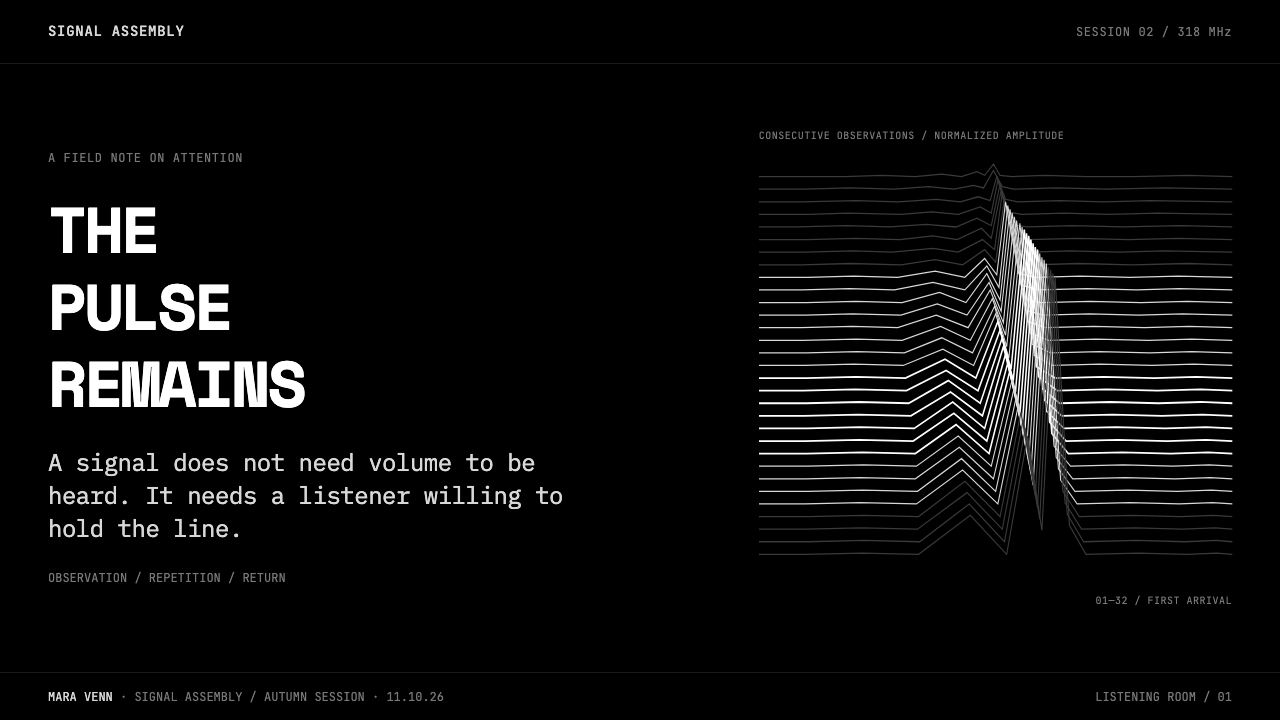
For presentation covers, let the stacked plot carry the visual burden. A black field, a single white waveform presence, and a concise title can establish a sense of focus before any content begins. Avoid treating the graph as a decorative strip behind large display text. The stronger composition gives it room to remain legible as signal, with the title positioned as a quiet identification rather than an interruption.
Content and data slides should inherit the system’s discipline rather than repeat the cover mechanically. Use black space to separate ideas, keep labels short, and introduce information in small, deliberate clusters. On data slides, charts and tables should be simplified until their structure is immediately visible. The pulse plot can serve as a recurring sectional marker, but the actual data should remain distinguishable from the signature image instead of being forced to imitate it.
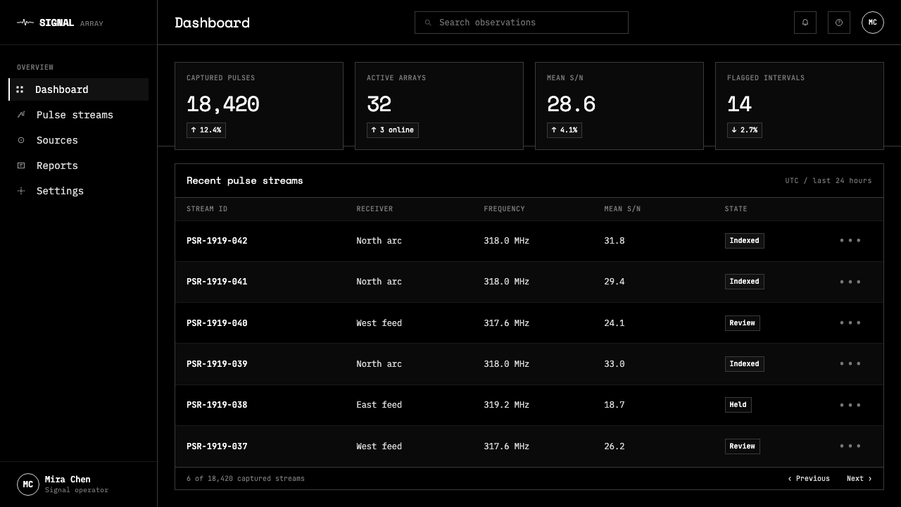
For web interfaces, the style is well suited to dashboards, listening tools, analytical products, archives, and pricing pages that benefit from concentration and high-contrast hierarchy. A dark canvas can make navigation, status, and key metrics feel precise when only essential elements receive white emphasis. The plot should appear as a hero element, a contextual divider, or a sparse data-related illustration, never as a continuously tiled surface that makes reading exhausting.
In editorial and marketing work, the system works especially well when the subject concerns sound, science, records, transmission, discovery, archives, or cultural history. An article can open with the plot as an arresting field, then move into restrained columns of text and carefully isolated captions. A campaign page can use the waveform to establish atmosphere while allowing the message to remain factual and sparse. The mood should be investigative and reverent, not nostalgic for its own sake.
The common mistake is to confuse this system with generic dark futuristic design. Adding neon-like effects, stars, technical clutter, noisy textures, or many unrelated graphs turns a singular scientific image into visual scenery. Another mistake is stretching, recoloring, or overprocessing the pulse-lines until they no longer read as measured traces. The essential rule is simple: preserve the white signal, preserve the black silence, and let the image’s origin supply the drama.
Pulsar CP1919 Stacked Plot — FAQ
Is this style only appropriate for music-related work?
No. Unknown Pleasures made the image famous in music culture, but its source is scientific data visualization. The system can work for research, archives, audio tools, analytical interfaces, publishing, and cultural projects whenever a subject benefits from ideas of observation, transmission, repetition, or discovery. Its connection to music should be acknowledged, but it does not have to dictate every application.
Why must the background remain so dark?
The black ground is what allows the white traces to read as isolated signal rather than ordinary line art. It removes distraction, creates a sense of distance, and gives the stacked form its totemic presence. A lighter setting changes the balance fundamentally: the plot becomes more informational and less suspended, losing much of the visual tension created by Saville’s inversion.
Can the pulse plot be recolored or heavily stylized?
It can be adapted, but heavy stylization weakens the system’s central idea. White on black is not an incidental palette choice; it makes the trace feel direct, exact, and luminous. Recoloring, glow effects, texture overlays, or expressive distortion tend to shift the image from signal toward decoration. If adaptation is necessary, keep the line structure clear and preserve the contrast between trace and void.
How should typography relate to the waveform?
Typography should identify, orient, and support rather than compete. Direct titles, concise labels, and restrained metadata suit the graphic because they retain a connection to its thesis-figure origin. Give text its own quiet territory in the black field, and avoid elaborate type treatments that make the page feel more expressive than the signal itself.
What makes an application feel authentic rather than like a reference to an album cover?
Authenticity comes from preserving the image’s logic, not merely its silhouette. Use the plot as a measured object with room around it; let black space perform structural work; keep supporting information sparse and purposeful; and avoid decorative science-fiction cues. When the application respects the passage from observation to data figure to cultural icon, the result can acknowledge Unknown Pleasures while still standing on its own.
Related design styles
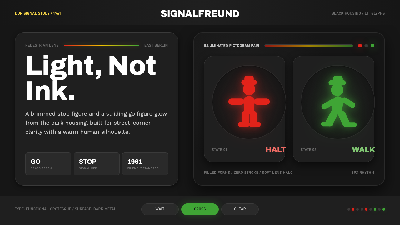 East German AmpelmännchenLight, not ink. Grass-green and signal-red silhouettes glow inside black lens…
 Radioactive Trefoil SignToxic-barrel glow, not the official sign. Neon-green trefoils on matte-black…
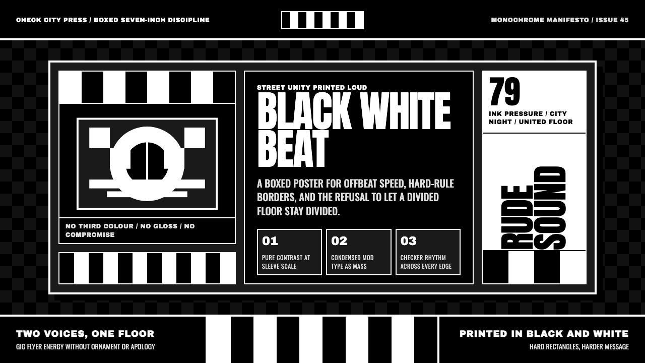 2 Tone SkaContrast as manifesto. White Anton type locks into a near-black checkerboard…
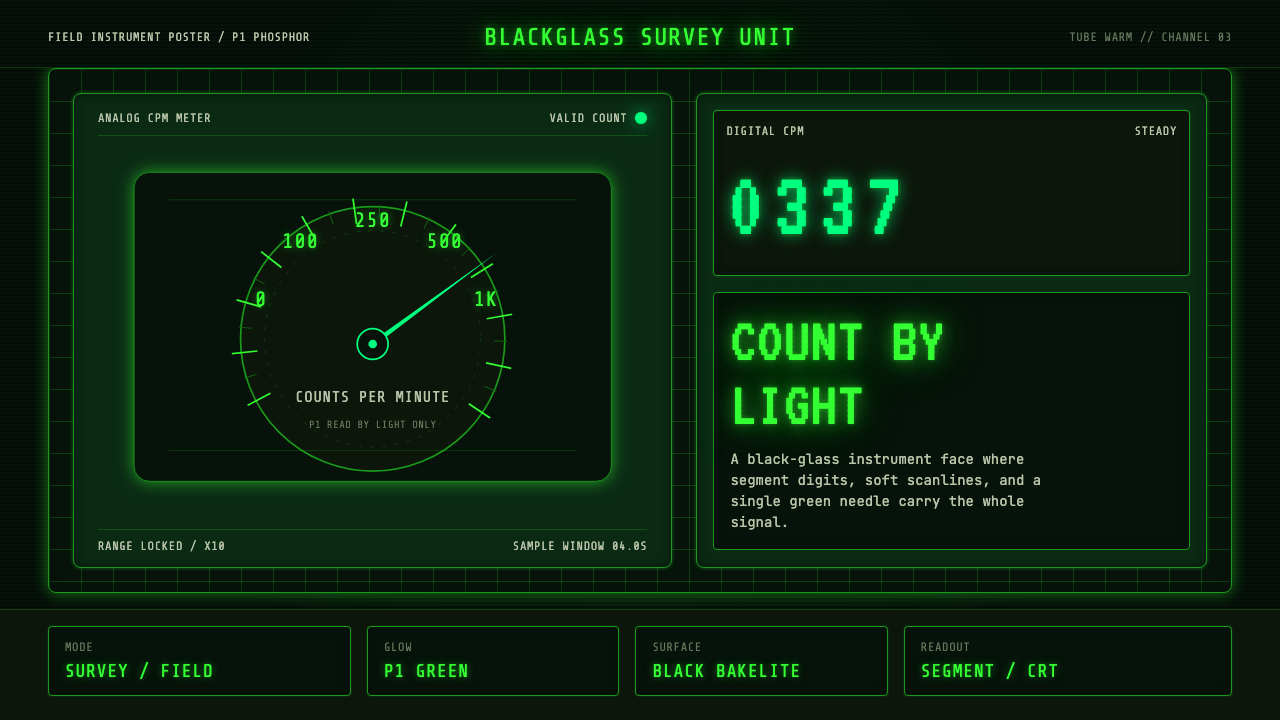 Geiger Counter Green ReadoutReads by glow. P1 green digits, scanlines, and a bordered black instrument gr…
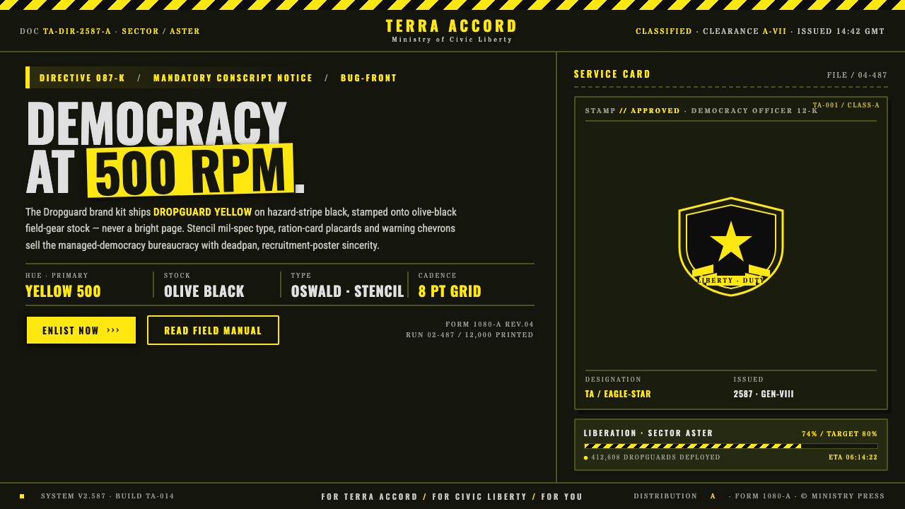 Helldivers (Super Earth)Democracy at 500 RPM. Helldivers Yellow stamped on hazard-stripe black, mil-s…
 NASCAR Stock CarLoud as a rolling billboard. Blue, red, and sponsor yellow collide in a hard-…