What is Space Invaders (1978)?
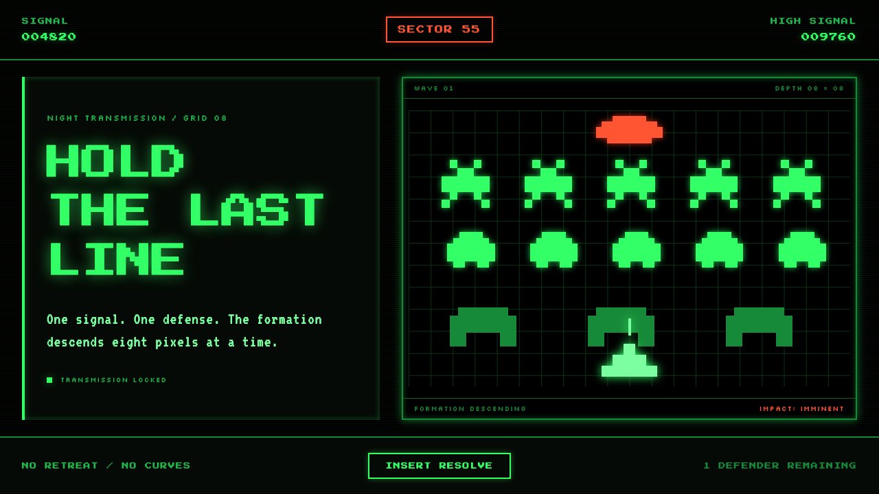
Space Invaders turns technical scarcity into dread: phosphor-green ranks descend across a black CRT field with the calm, mechanical certainty of a countdown.
Space Invaders (1978) in brief
Space Invaders is a foundational visual language of the arcade era. Released by Taito in 1978, it established a world made from a single glowing green against near-total blackness: alien formations at the top, defensive bunkers across the middle, and one laser cannon holding the bottom edge. Its imagery is not illustrative in the traditional sense. Squid, crab, and octopus aliens are reduced to blocky signs, legible at a glance because every silhouette is built from firm, orthogonal units.
The style derives its power from severe limitation. There is no soft rendering, no decorative surface treatment, and no attempt to imitate the visual complexity of the real world. The dark screen is not merely a background; it is an active expanse of silence around the playfield. Against it, the green image feels electrically present, as if the cabinet has produced light rather than simply displayed a picture. The result is both spare and hostile: every illuminated mark has a tactical role.
Its composition gives the player a clear vertical drama. The alien mass occupies the upper zone and advances downward in lockstep. The player remains exposed below, separated from the invaders by bunkers that visibly erode under fire. Above all of it sits the monospace SCORE / HI-SCORE display, turning the screen into a compact system of threat, defense, and measurement. Space Invaders therefore reads as more than retro pixel art. It is a visual grammar in which order itself becomes menace.
Where does Space Invaders (1978) come from?
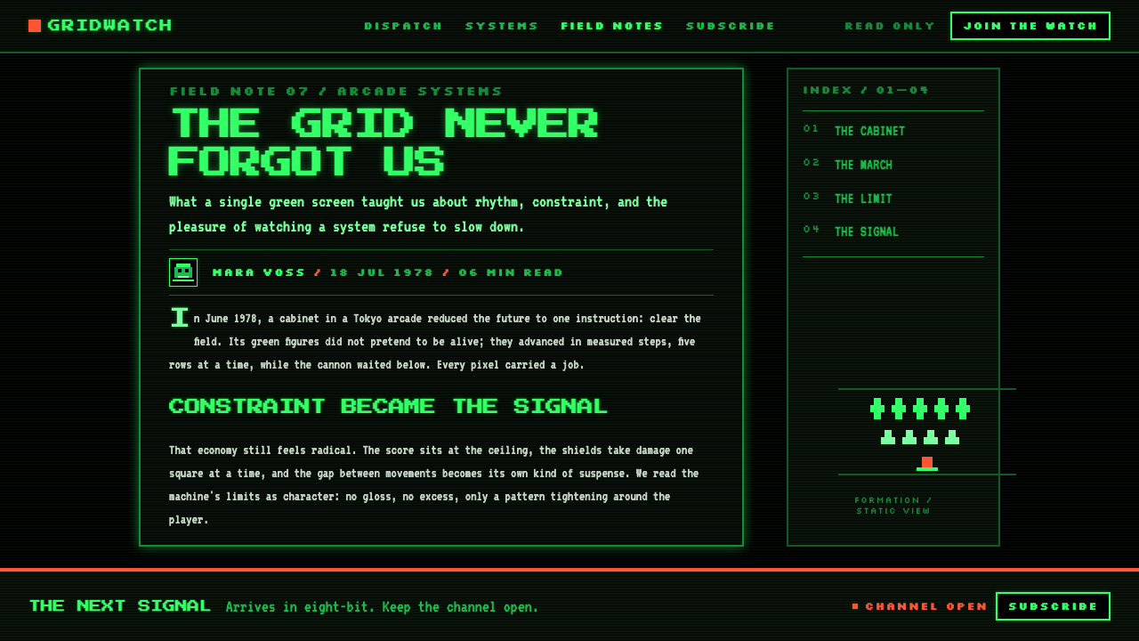
Space Invaders emerged in 1978 from Taito in Tokyo, Japan, during the first generation of arcade video games. Its arcade release arrived in June of that year, and its visual identity was inseparable from the machine conditions of the period. The cabinet had no color hardware in the contemporary sense, so the game was formed around one phosphor-like green on a black CRT display. Instead of disguising that constraint, the design makes it the central event: the screen is almost empty until the game gives it a reason to glow.
Tomohiro Nishikado designed the game for Taito. The imagery he established is exceptionally economical: descending rows of distinct alien types, a lone cannon, destructible bunkers, laser shots, and a score display. Each component is recognizable because it has been forced into a rigid pixel lattice and stripped of incidental detail. This was not an aesthetic of abundance. It was an aesthetic of deciding exactly which visual information had to survive in order for motion, collision, danger, and scorekeeping to remain immediately understandable.
The game belongs to the fixed shooter genre, a structure that reinforces its visual discipline. The player does not roam a large environment or encounter richly varied scenery. The action takes place on one bounded field, where the primary change is the downward pressure of the alien formation and the gradual destruction of the protective line. Because the field remains stable, even small shifts in position and missing chunks of bunker material become meaningful. The design teaches players to read pattern, distance, and erosion rather than pictorial atmosphere.
From Tokyo, Space Invaders moved into North America through Midway Manufacturing and became part of the global Invader boom of 1978–1980. Its influence rests not on a dense visual world but on a concentrated set of reusable ideas: bright sprites on darkness, strong silhouettes, an information-first HUD, repeated enemy ranks, and motion that turns a static grid into anxiety. These qualities place it at the meeting point of early arcade design, 8-bit sprite art, and phosphor-monitor aesthetics.
What defines the Space Invaders (1978) look?
Phosphor Green and Black
The palette is a confrontation rather than a decoration: one P1-phosphor green appears against dead black. Green is not used to distinguish brands, categories, or moods within a broad palette. It is the entire visible world. Black creates the depth by withholding information, while green marks everything that can act, threaten, protect, or be counted. A Space Invaders-derived composition succeeds when darkness remains substantial enough for the illuminated elements to feel rare and electrically charged.
Pixel Lattice
Every figure is snapped to a coarse, square pixel lattice. Curves are not smoothed into natural contours; they are implied by stepped edges and repeated blocks. This produces silhouettes with a carved, mechanical character. The important discipline is consistency: a cannon, alien, bunker fragment, numeral, and projectile should appear to belong to the same underlying grid. Introducing polished curves or finely rendered detail breaks the illusion that the whole screen is governed by one limited machine language.
Descending Formation
The alien ranks are the style's dominant compositional device. Repetition creates an army before individual creatures need personality, and orderly horizontal rows make their descent feel inevitable. The visual tension comes from the formation's collective movement toward the player rather than from expressive gestures or cinematic perspective. In a modern interpretation, repeated modules should feel coordinated and slightly oppressive: they are not decorative patterning, but a system advancing through the available space.
Monospace HUD
SCORE / HI-SCORE establishes a terse information layer above the battle. Monospace lettering fits the world because every character occupies an equal, grid-bound territory, echoing the sprites below. The HUD should read as instrumentation rather than branding: direct labels, stable alignment, and figures that can be scanned without interrupting play. Its restraint is essential. Decorative display type, floating badges, or verbose explanatory copy would weaken the machine-like clarity that makes the score feel consequential.
Eroding Defense
The shield bunkers give the composition a material story. They begin as a protective band but are gradually removed in blocky fragments, making damage visible as subtraction. This is a crucial distinction from smooth damage effects or abstract progress indicators. In Space Invaders, loss is spatial: the player sees safe cover become perforated, then unreliable. A related design should use omission, broken edges, and deliberate gaps to communicate pressure, instead of adding ornamental warnings or simulated debris.
Orthogonal Motion
The visual language rejects fluidity. Laser fire travels as a compact vertical event, aliens march in lockstep, and the player cannon occupies a firm horizontal base. There is no need for soft trails, atmospheric blur, or ornamental motion. Movement is understood through discrete positional change against a stable black field. This gives the screen its stern rhythm: every shift is observable, every gap in the ranks matters, and every surviving block of defense becomes part of the tactical picture.
Who shaped Space Invaders (1978)?
Tomohiro Nishikado designed Space Invaders for Taito in 1978. The game’s visual system reflects the discipline of his design problem: make alien ranks, defensive structures, player fire, and scoring readable within a severely limited arcade display. The resulting language is unusually coherent because its imagery, movement, and information display all submit to the same pixel-bound logic.
Taito Corporation released the arcade cabinet in Tokyo in June 1978. The company provided the technical and arcade context in which a single-hue CRT world could become a complete visual identity. Rather than treating the display’s limits as an obstacle to be concealed, the cabinet presents them directly: black field, luminous marks, strict geometry, and a game state visible with exceptional economy.
Midway Manufacturing carried Space Invaders into North America, extending the game from its Tokyo release into a broader arcade audience. That passage helped make the Invader boom global during 1978–1980. In design terms, the game’s portability mattered: its visual premise required neither local scenery nor elaborate narrative explanation, only an immediately legible confrontation between descending ranks and a player holding the line.
How do you use Space Invaders (1978) today?
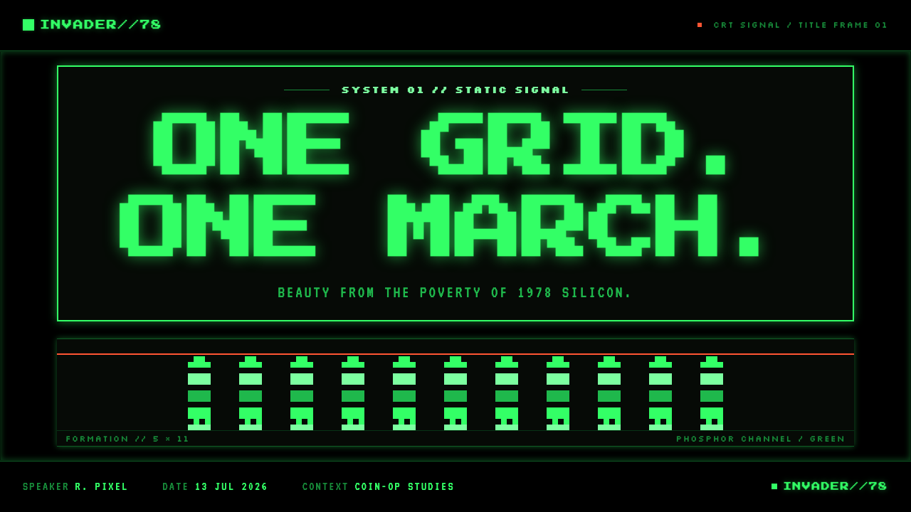
For presentation slides, Space Invaders works best when the cover treats empty darkness as the principal compositional resource. Set a compact, grid-bound title against black, then allow one green formation, cannon-like marker, or score-line motif to establish the theme. The cover should feel like an arcade attract screen: direct, slightly ominous, and instantly readable. Avoid filling every edge with retro references. One advancing formation has more force than a collage of cabinets, stars, and game icons.
Content slides should use the language as an information system rather than a costume. A monospace heading layer can establish sections, while horizontal rank structures organize comparisons or sequences. For data slides, transform bars, counters, and status markers into crisp pixel-like units on black. Use the green signal sparingly to identify the active series, crucial threshold, or current state; leave secondary information subdued so the audience can read the hierarchy as quickly as they would read SCORE / HI-SCORE during play.
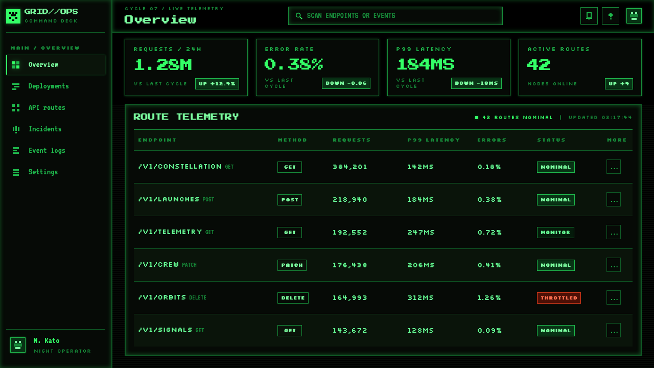
For web interfaces, the style is especially effective for dashboards, monitoring tools, launch pages, and pricing experiences that benefit from a sense of live status. A dark field, a strict modular grid, direct labels, and bright green indicators can make a product feel alert and instrument-like. Cards should behave more like bounded terminal zones than soft containers. On pricing pages, plan names and comparisons should remain sober and structured, with the invader language used to frame progression or competitive tension rather than to make financial information feel playful or obscure.
For editorial and marketing work, Space Invaders supports headlines about pressure, scale, systems, countdowns, defense, or technical constraint. Repeated pixel ranks can separate sections, while broken bunker motifs can visualize loss, depletion, or resilience. Keep copy concise and place it in disciplined blocks; the style is strongest when the page appears to have been assembled by a limited display system. The common mistake is to confuse the aesthetic with generic neon nostalgia. Adding many colors, glowing gradients, rounded futuristic panels, starscapes, or ornamental scanline effects replaces the original’s cold economy with a different kind of retro spectacle.
Space Invaders (1978) — FAQ
Is Space Invaders style simply pixel art?
Pixel construction is essential, but it is only one part of the system. Space Invaders also depends on the black CRT field, the single phosphor-green signal, descending repeated ranks, direct monospace scoring, and visible erosion of defense. Pixel art without those relationships can be colorful, illustrative, playful, or nostalgic in entirely different ways. The style becomes recognizable when its pixels participate in a disciplined scene of pressure and response.
Why is the black background so important?
Black supplies the style’s negative space, depth, and contrast all at once. It makes green read as emitted light and prevents the screen from becoming a decorative pattern. More importantly, it turns absence into part of the playfield: the empty area between aliens, bunkers, and cannon is where the player perceives distance and approaching danger. Replacing black with a busy texture or illustrated backdrop removes the visual silence that gives the formation its force.
Can this style use additional colors?
Additional color changes the premise quickly, because the original visual world is defined by one hue burning against black. A contemporary adaptation may introduce restrained secondary signals when clarity requires them, but green should remain the dominant active light and the field should remain overwhelmingly dark. If several bright hues compete at once, the design moves away from phosphor-monitor austerity and toward generalized arcade nostalgia.
What kinds of products suit Space Invaders-inspired design?
It suits products that benefit from clear status, competition, technical tension, or a strong sense of progression: dashboards, monitoring experiences, developer tools, game-adjacent products, launch campaigns, and data displays. It is less suitable where warmth, abundance, softness, or nuanced visual storytelling are central to the experience. The style works when its severity supports the product’s message, not when pixel motifs are added merely to make an otherwise unrelated interface look retro.
Related design styles
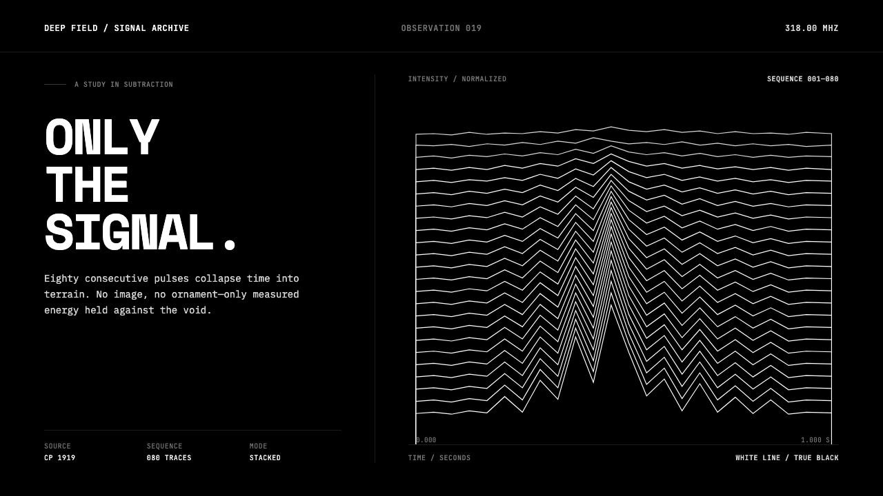 Pulsar CP1919 Stacked PlotPure signal becomes a totem. Stacked white pulse lines rise through a true-bl…
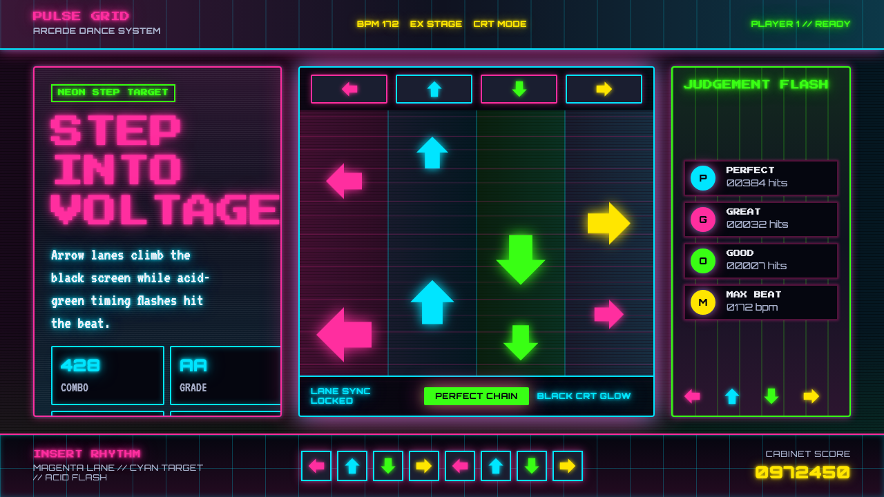 Dance Dance Revolution ArrowsPure arcade voltage. Magenta, cyan, and acid-green arrows climb a black CRT g…
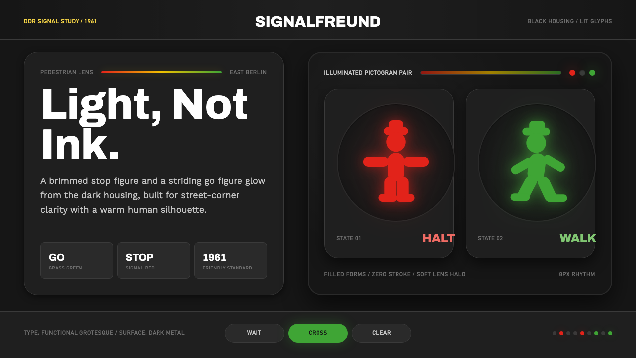 East German AmpelmännchenLight, not ink. Grass-green and signal-red silhouettes glow inside black lens…
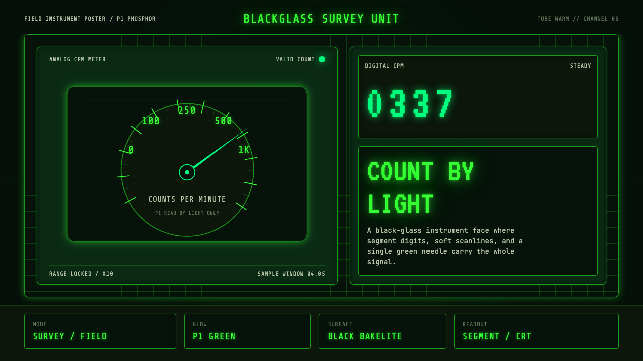 Geiger Counter Green ReadoutReads by glow. P1 green digits, scanlines, and a bordered black instrument gr…
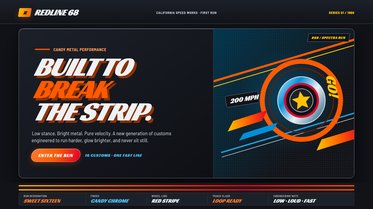 Hot Wheels (1968)Velocity in candy metal. Flame-orange tracks and fat italic type tear across…
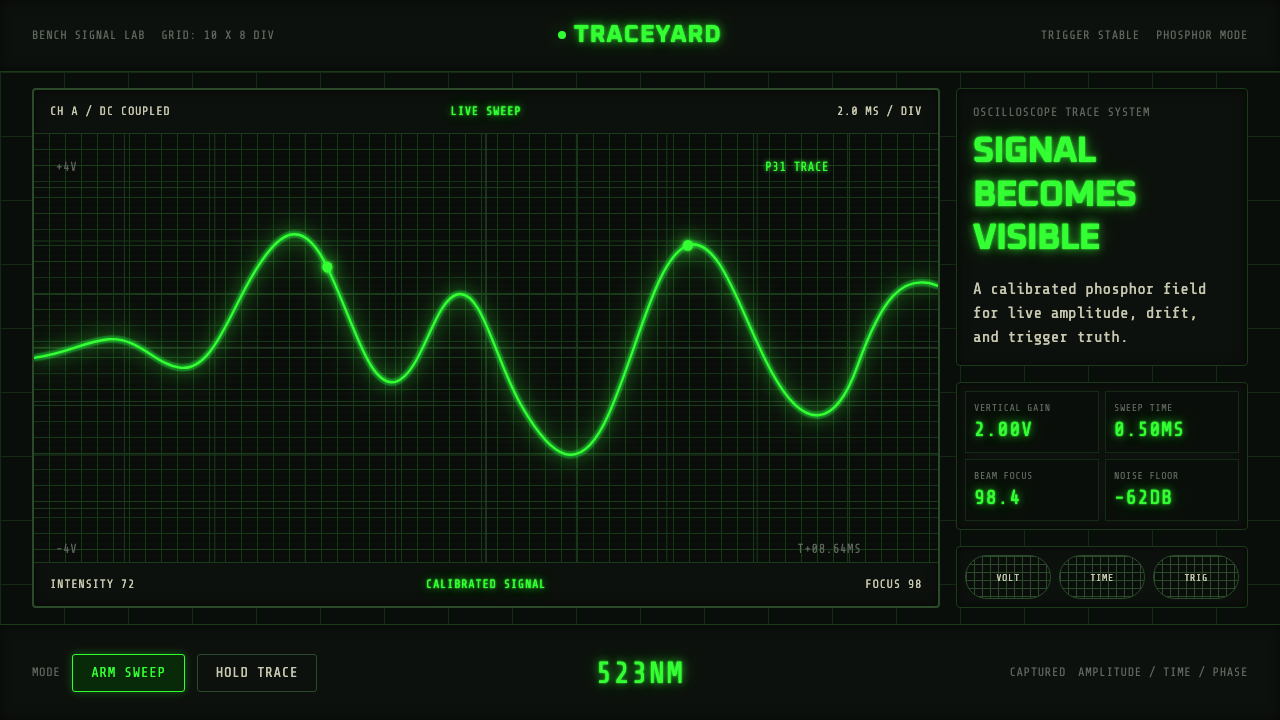 Oscilloscope TraceMeasurement glows. P31 green waveforms burn through a black graticule.