What is Dance Dance Revolution Arrows?
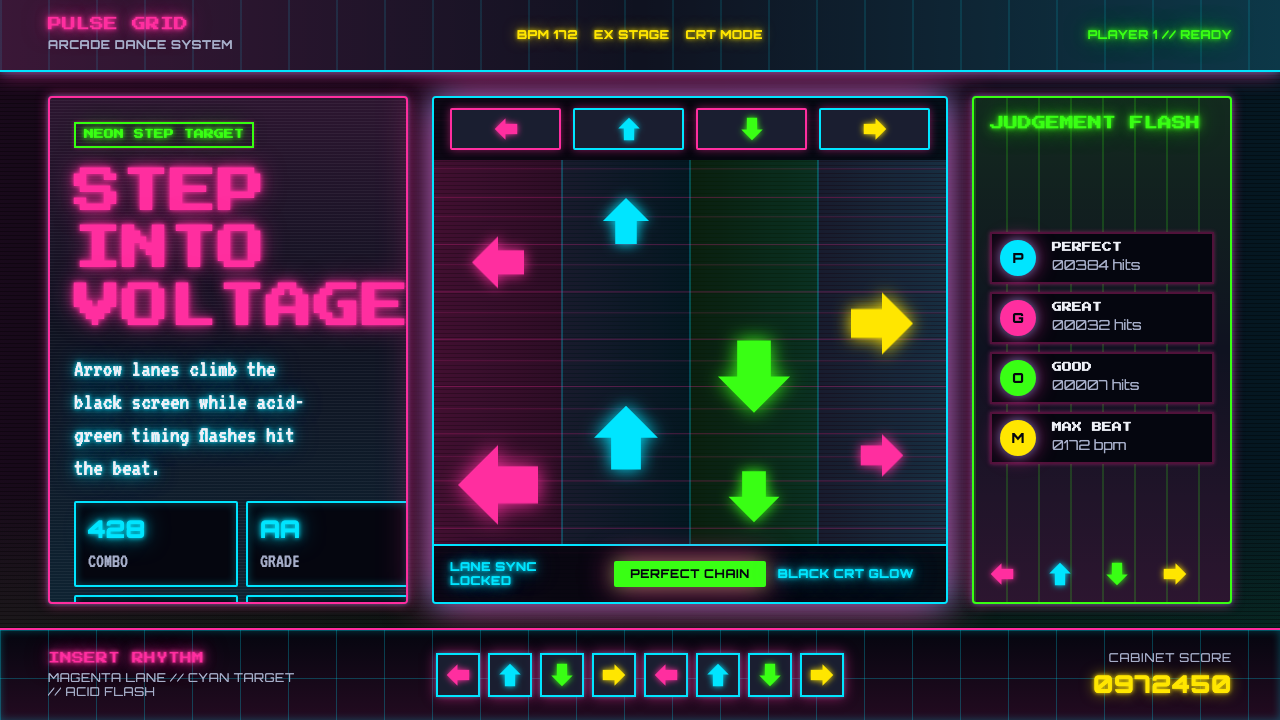
Dance Dance Revolution Arrows turns the screen into an electrified dance floor — neon direction, pixel rhythm, and relentless upward motion against the absolute darkness of the arcade.
Dance Dance Revolution Arrows in brief
Dance Dance Revolution Arrows is a visual style distilled from Konami's 1998 rhythm game and the wider Y2K culture of East-Asian arcades. Its essential image is a set of saturated magenta, cyan, and acid-green arrows climbing through vertical lanes on a pure-black CRT display. The arrows move toward a fixed step target while the cabinet's illuminated floor grid pulses beneath the player, joining screen, music, body, and machine into one rhythmic system.
The style communicates through direction and anticipation. Every arrow is both an instruction and a moving graphic: its orientation tells the player what to do, while its upward travel announces when the action must happen. Repetition creates tempo, spacing becomes rhythm, and alignment produces the satisfying instant in which movement resolves into a successful step. Unlike decorative Y2K nostalgia, this language is built around performance feedback; visual excitement always serves the cycle of seeing, preparing, moving, and scoring.
Visually, the system combines neon club energy with the hard constraints of CRT pixel interfaces. Black space acts as a stage for luminous color, blocky bitmap type gives scores and labels a machine-readable authority, and scanline shimmer keeps otherwise flat elements electrically alive. Forms remain sharply defined even when surrounded by glow. The result is loud without becoming shapeless: a disciplined grid carries an atmosphere of speed, pressure, celebration, and arcade spectacle.
Where does Dance Dance Revolution Arrows come from?
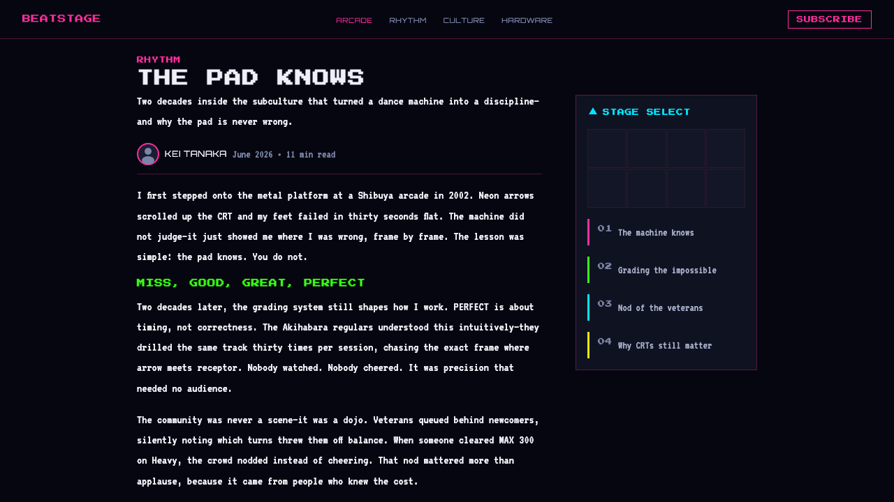
The style begins with Dance Dance Revolution, released by Konami in 1998. The game transformed the familiar rhythm-game interface into a public physical performance: instructions appeared as scrolling directional arrows, and the player answered them by stepping on a lit floor platform. The arcade cabinet was therefore more than a display surrounding a game. It was a coordinated environment in which the CRT screen delivered timing, the floor registered movement, and illumination made the act visible to both player and spectators.
Its historical setting spans the game's debut and the arcade peak of the 2000s, when Konami's Bemani culture connected electronic music, machine interfaces, and embodied play. East Asian in origin but global in reach, the cabinet carried a recognizable Japanese arcade intensity into venues around the world. The visual language had to work amid darkness, music, competing machines, and constant movement. Saturated neon color separated active signals from black space, while large directional forms remained legible at a glance and under pressure.
The look also belongs to a broader Y2K graphic environment shaped by rhythm games, neon club flyers, and CRT pixel interfaces. Club-flyer graphics supplied the sense of nightlife voltage: vivid artificial color, energetic repetition, and an atmosphere closer to a dance event than a conventional software screen. CRT display culture contributed bitmap lettering, hard-edged icons, luminous bloom, and visible scanline character. DDR joined these influences to a strict gameplay grid, converting the visual noise of the arcade into ordered lanes and timed destinations.
Within that history, the Konami Bemani division, Naoki Maeda, and the designers of DDR arcade cabinets represent complementary dimensions of the style. Bemani established the rhythm-game culture and its machine-centered identity; Maeda is a key figure associated with its musical energy; the cabinet designers gave that energy a physical stage of screen, controls, light, and floor geometry. The enduring design language comes from this unity. Remove the music, and the arrows still imply tempo. Remove the player, and the rising lanes still suggest an imminent performance.
What defines the Dance Dance Revolution Arrows look?
Neon on Black
Pure black is not merely a background but the electrical silence from which every signal emerges. Magenta, cyan, and acid green appear intensely artificial, echoing illuminated arcade controls and club lighting rather than natural color. The palette works best when each hue has a clear role across lanes, status, or emphasis. Dark space must remain visible between bright elements; without that separation, neon loses both its luminosity and its urgency.
Directional Arrows
Arrows are the primary alphabet of the system. Their geometry must be immediately recognizable by orientation, even when repeated, glowing, or moving through a busy composition. They should feel like commands rather than illustrations: frontal, compact, and decisive. Rotation changes meaning, while position and repetition change timing. Decorative arrow fragments can support atmosphere, but the strongest compositions preserve a distinction between actionable direction and ambient pattern.
Upward Motion
The characteristic movement is a continuous climb toward a stable target. This creates visual suspense because the destination is known while the moment of arrival remains pending. Static applications can imply the same rhythm by arranging arrows at staggered heights, cropping some forms at the lower edge, and concentrating attention near an upper alignment zone. Motion should feel metered and lane-bound, not like objects drifting freely through space.
CRT Pixel Surface
Bitmap edges, scanline shimmer, and restrained luminous bloom give the interface its CRT identity. Pixel character should remain structural: stepped contours and grid-aligned marks communicate the display technology more convincingly than a blanket layer of artificial noise. Glow belongs closest to active signals and should never dissolve their silhouettes. The tension between crisp pixel construction and radiant display softness is essential to the style.
Bitmap Score Type
Typography resembles information generated by an arcade machine: blocky, modular, and optimized for rapid recognition. Scores, status labels, and short commands suit this treatment especially well. Hierarchy comes from contrast in scale, brightness, and placement rather than from mixing unrelated type personalities. Longer reading text needs calmer spacing and cleaner rhythm, but it should retain the squared, technical voice of the display.
Lane Grid
Vertical lanes organize visual energy that might otherwise become chaotic. Repeated boundaries establish predictable paths, while horizontal markers create moments of comparison and arrival. The grid can be visible as a luminous floor-like structure or implied through alignment alone. Either way, it should control the composition without becoming inert: asymmetrical clusters, changing arrow density, and interruptions in repetition keep the system feeling musical rather than bureaucratic.
Pulsed Feedback
The style depends on visible response. A target can flare when reached, a score can intensify after success, and a floor-grid motif can pulse as if answering the player's step. In static work, concentric echoes, repeated outlines, and alternating bright and dark bands suggest the same feedback loop. Effects should gather around an event; indiscriminate glow turns meaningful response into constant noise.

Who shaped Dance Dance Revolution Arrows?
Konami's Bemani division supplied the cultural framework in which Dance Dance Revolution emerged: rhythm understood not only as music but as an interface, a physical challenge, and an arcade spectacle. Its significance to this style lies in that integration. Visual signals, electronic sound, scoring, cabinet illumination, and bodily input were treated as coordinated parts of one experience, establishing the broader Y2K rhythm-game identity from which the arrow language draws its authority.
Naoki Maeda is identified with the musical energy of DDR and the Bemani arcade culture surrounding it. Within the design history of the arrow aesthetic, his relevance is the inseparability of image and beat: rising symbols feel urgent because they are understood as carriers of music, not simply moving icons. The visual system translates rhythmic expectation into spacing, repetition, approach, and impact, allowing even a silent composition to retain the sensation of a track about to peak.
The designers of DDR arcade cabinets turned a screen-based rhythm game into a spatial performance system. Their contribution was the coordination of the black CRT interface, illuminated floor grid, directional controls, and conspicuous machine presence. The cabinet made feedback physical and public: light moved between display and floor while the player's body completed the composition. Contemporary adaptations inherit this principle whenever interface elements appear to activate a surrounding environment rather than remain trapped inside a flat screen.
How do you use Dance Dance Revolution Arrows today?
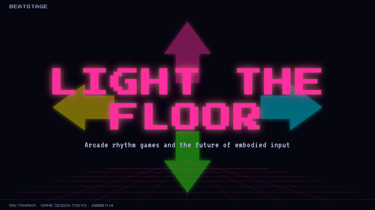
For presentation slides, the style is strongest when the deck behaves like a staged arcade sequence. A cover can place a bold arrow formation low in a black field, aimed toward a luminous title target above, creating anticipation before any content begins. Content slides should retain lanes as an organizing device: headings occupy target-like positions, supporting points rise through aligned columns, and generous black intervals keep the neon accents intelligible. The visual pace can intensify across sections without changing the underlying grid.
Data slides benefit from the style's natural relationship between value, direction, and timing. Bars can behave like rising step lanes, progress markers can approach fixed targets, and categories can be separated through magenta, cyan, and acid-green signals. Labels should resemble concise score readouts rather than ornamental captions. The important discipline is to preserve comparison: glow must not obscure endpoints, repeated arrows must not masquerade as quantities, and the arcade metaphor should clarify movement through the data rather than compete with it.
For web interfaces, Dance Dance Revolution Arrows suits live dashboards, performance views, event pages, and pricing experiences that benefit from urgency and theatrical contrast. A dashboard can treat active metrics as luminous score panels connected by a dark lane grid. Pricing tiers can be distinguished through controlled neon identities, while the selected tier occupies a target state or receives a pulse-like outline. Navigation should remain compact and machine-like. Because the background is visually severe, body copy needs calm spacing and stable alignment to prevent the entire interface from feeling like an alarm.
Editorial and marketing layouts can use the language as a rhythm rather than imitate a game screen literally. An article opener might combine a large directional symbol, a bitmap-like headline, and a narrow column of contextual text on black. Section transitions can be marked by rising arrow sequences or floor-grid horizons, while campaign calls to action can occupy fixed target zones. The style is particularly effective when the subject involves music, nightlife, movement, competition, arcade culture, or Y2K memory, because the visual system already carries those associations.
The most common mistake is applying neon glow to every element and calling the result DDR. Constant brightness destroys timing, while arrows scattered without lanes lose their instructional force. Another error is treating pixel character as random degradation: excessive noise, blur, and generic retro distortion weaken the precise interface logic. A convincing application keeps the black field dominant, reserves the strongest color and bloom for meaningful moments, and ensures that every arrow appears to be going somewhere. Electricity needs a circuit; rhythm needs a destination.
Dance Dance Revolution Arrows — FAQ
Is Dance Dance Revolution Arrows simply a general cyberpunk neon style?
No. Both may use saturated light on dark grounds, but DDR Arrows is defined by a specific functional grammar: directional symbols move through lanes toward fixed targets, and visible feedback answers a timed physical action. General cyberpunk imagery often emphasizes atmospheric cities, machinery, or technological unease. This style is more diagrammatic, celebratory, and performance-oriented. If the arrows have no destination and the grid establishes no rhythm, the result may be neon retro-futurism, but it is not convincingly DDR-derived.
Can the style work without animation?
Yes, because its motion can be encoded compositionally. Arrows placed at different stages of an upward path imply approach; repeated outlines suggest a recent pulse; cropped forms entering from below indicate continuation beyond the frame. A stable target near the top gives these clues a destination. Static work becomes weak only when every symbol sits at the same visual state. Variation in position, density, brightness, and alignment can preserve rhythm without literal movement.
How should photography be used with the arrow system?
Photography should support the arcade environment rather than compete with the interface. Images of movement, performance, illuminated machinery, or dark nightlife can sit behind a strong black veil or be isolated into lane-like crops. Neon arrows should remain readable as foreground signals, and the subject should not be covered at its expressive focal point. The most coherent treatment makes photography feel like another input entering the machine: framed, scanned, segmented, and synchronized with the grid.
Does the palette always require magenta, cyan, and acid green together?
No. Those hues define the source atmosphere, but using all of them at equal intensity can flatten hierarchy. One color can lead as the active signal, another can identify a secondary lane or state, and the remaining hue can appear only at moments of success or emphasis. The pure-black ground is as important as the neon colors because it creates separation and makes illumination meaningful. A reduced palette often feels more controlled while remaining recognizably tied to the source.
Where does this style struggle?
It struggles when long, quiet reading or emotional softness is the primary goal. The black field, urgent arrows, and luminous contrast naturally suggest action, competition, and heightened attention; applied without restraint, they can fatigue readers or make ordinary information feel falsely critical. The style is therefore better for focused moments, performance summaries, launches, music-related experiences, and strong sectional framing than for uninterrupted reading. When calm comprehension matters, retain the grid and pixel voice but reduce the frequency of pulses and active signals.
Related design styles
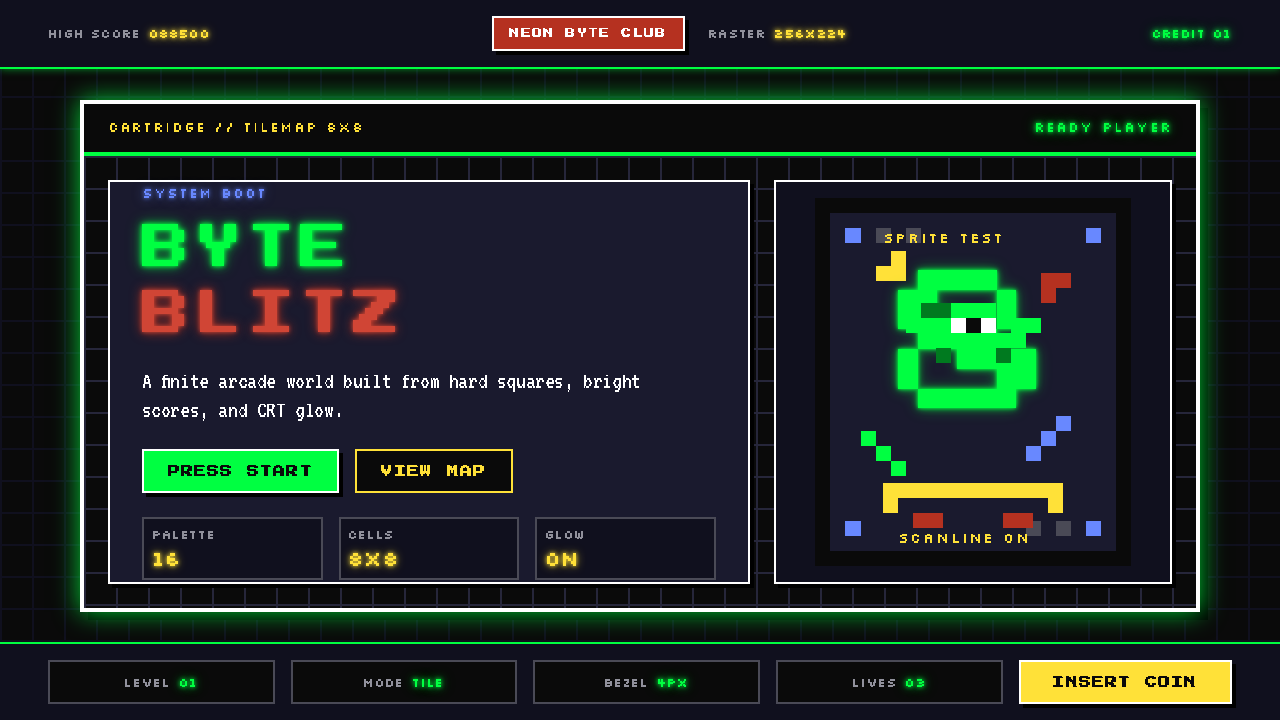 Pixel Art / 8-bit RetroHard-edged digital joy. CRT black, phosphor green, and 8x8 grids snap every p…
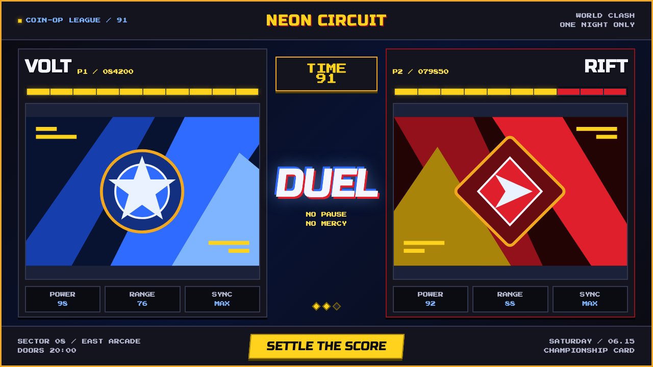 Street Fighter II (1991 Arcade)Pixel muscle hits hard. Hadouken blue, gold HUD bars, and outlined type blaze…
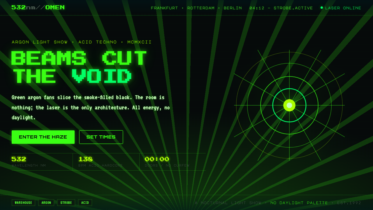 Acid Rave Laser Show 1992Beams cut the void. Argon green on pitch-black smoke, pixel marquee type, add…
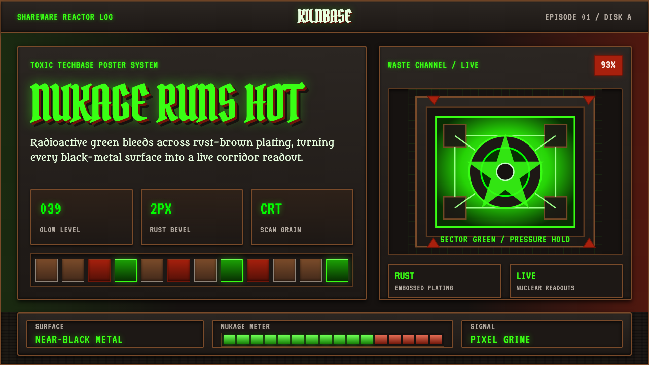 Doom 1993 Toxic GreenRadioactive metal bites. Toxic green readouts glow over rust bevels and CRT g…
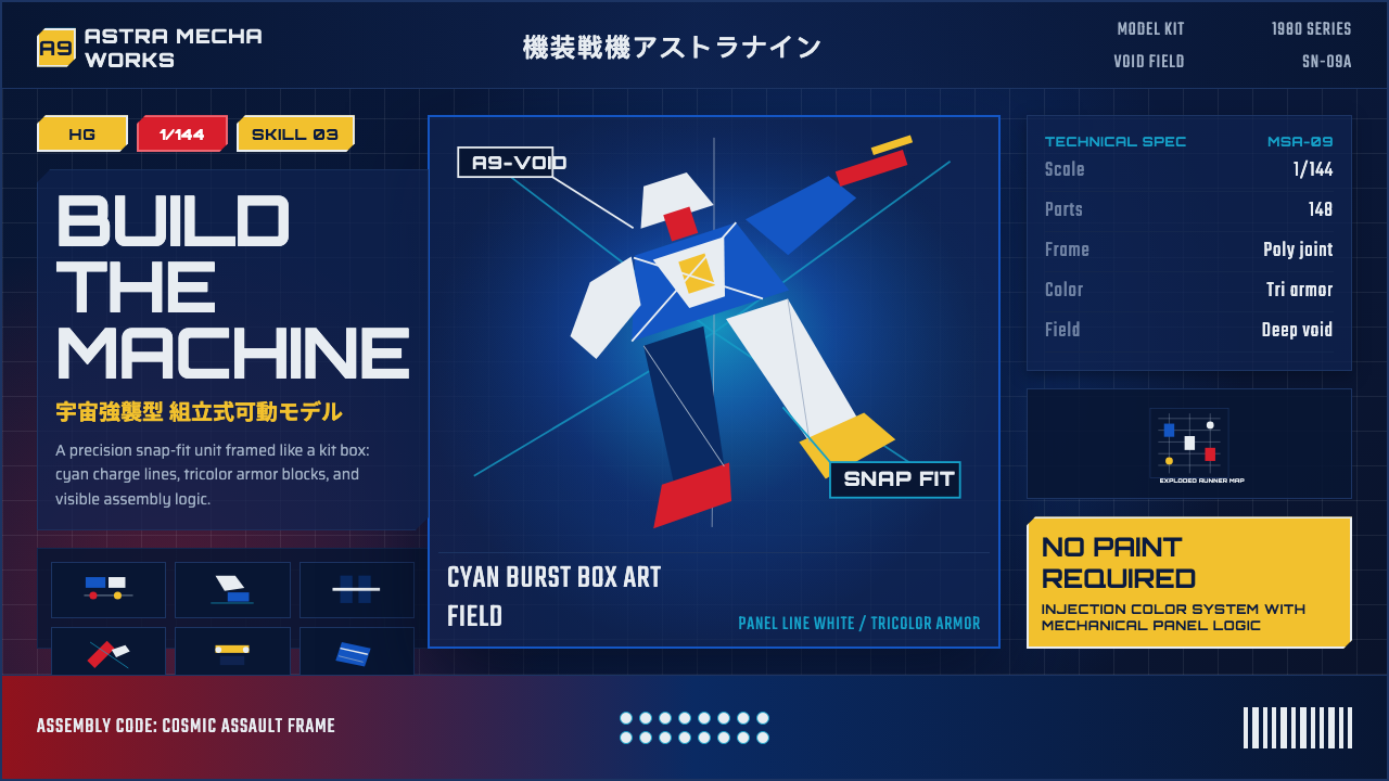 Gunpla Model BoxBuild-sheet drama. Cosmic navy, cyan burst, tricolor armor, and spec-panel gr…
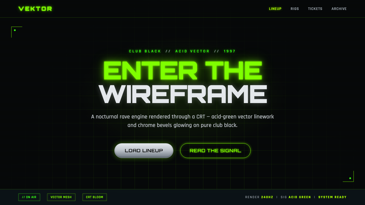 Playstation Rave Green 1997Enter the wireframe. Acid-green vector lines and chrome glow on club black, a…