What is Acid Rave Laser Show 1992?
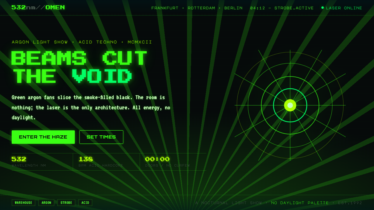
Acid Rave Laser Show 1992 turns darkness into a stage: radioactive green beams, pixel signals, and smoke make the night feel engineered for collective release.
Acid Rave Laser Show 1992 in brief
Acid Rave Laser Show 1992 is the visual language of early-1990s continental European rave: warehouse interiors and big tents reduced to black space, suspended smoke, and green argon laser fans. It belongs to the post-acid-house moment associated with hardcore, acid techno, and rave culture, but it does not attempt to describe the music through nostalgic decoration. Instead, it makes light itself the event. A beam enters the void, divides it into planes, then disappears; a strobe-like halo briefly gives structure to bodies, equipment, and air.
The style is nocturnal, hypnotic, and unapologetically machine-made. Its central contrast is extreme: pitch black absorbs almost everything, while a single intense laser green behaves as additive light rather than painted color. Green does not merely sit on a surface. It appears to emit, spread, flare, and leave a visual afterimage. The darkness is therefore active, not empty. It is the condition that allows every fan, line, glow, and pixel cluster to register with force.
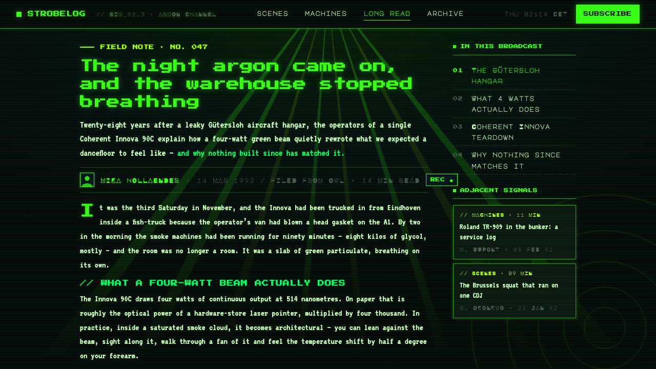
Its graphic language draws from dot-matrix rave flyers, arcade terminals, and early digital display culture. Pixel lettering and monospaced type make information feel transmitted rather than elegantly composed. Text can resemble a venue readout, a set-time board, or a low-resolution broadcast emerging through haze. Combined with fan-shaped lasers and hard-edged halos, this creates an atmosphere that is less like a conventional poster and more like a fragment of a live system: signals, energy, and direction arriving in the dark.
Where does Acid Rave Laser Show 1992 come from?
The style belongs to the peak continental rave period of 1990–1994, after acid house had established a new dance-floor vocabulary and as rave culture expanded across Western Europe. Its geographic frame is Germany, the Netherlands, and Belgium, where warehouses and tent events supplied a physical setting unlike the polished social spaces of conventional nightlife. These were environments where darkness, volume, haze, and lighting could become architectural materials. The visual identity had to work at a distance, in motion, and under conditions where the room itself was only intermittently visible.
Acid Rave Laser Show 1992 grows from the meeting of hardcore and acid techno with laser light-show design. The music-oriented side supplies urgency, repetition, and a sense of sustained pressure; the light-show side translates those qualities into radiating lines, repeated fans, and pulses of visibility. Rather than framing a performer with theatrical scenery, the laser system treats the entire room as an instrument. Smoke gives the beams volume, blackness removes competing detail, and movement turns abstract geometry into an experience shared across the floor.
The era’s printed and screen-based graphics contributed another essential layer. Eight-bit flyer aesthetics, dot-matrix lettering, and terminal-like displays offered a visual shorthand for machine culture without requiring complex illustration. Their low-resolution character was not a deficiency to be concealed; it was a recognizable texture of communication. In this style, pixel structure gives typography a rhythmic, electronic presence. A line of information can feel as percussive as a laser fan, especially when it is isolated against black and allowed to glow rather than behave like ordinary ink.
Sven Väth and Westbam are key figures within the period’s rave landscape, while the organizers of Mayday and Love Parade represent the event infrastructure through which the culture became visible at scale. Their significance here is not as a set of individual visual signatures, but as part of the scene that linked music, gatherings, promotion, and spectacle. Acid Rave Laser Show 1992 distills that wider world into a tightly controlled vocabulary: black ground, laser green, smoke, pixel communication, and an atmosphere in which technology feels immediate, collective, and alive.
What defines the Acid Rave Laser Show 1992 look?
Total Darkness
Black is not a neutral background or a fashionable dark mode. It is the spatial medium of the composition: a void that conceals boundaries, absorbs secondary detail, and makes every luminous element appear physically present. Large unlit areas should remain genuinely empty. Filling them with texture, muted decoration, or extra interface chrome weakens the illusion that light is carving a room out of darkness.
Additive Laser Green
The palette is governed by a single radioactive green that behaves as emitted energy. It is brightest at beam cores and signal edges, then opens into restrained halos where light meets smoke or darkness. The green should establish hierarchy through intensity and concentration, not through a collection of competing hues. Because the system is so limited, a small luminous mark can carry the authority of a headline, button, warning, or focal point.
Laser Fans and Beams
Fan-shaped beams are the signature geometry. They radiate from a plausible source, spread through haze, and imply direction, expansion, and sound pressure without illustrating any of them literally. Straight lines should remain sharp and deliberate; arcs and curves are most effective when they read as a sweep from a lighting system rather than as decorative flourishes. Overlap creates depth through accumulation of light, not through simulated perspective.
Smoke-Born Halos
Glow is not a generic softening effect. It represents light becoming visible in smoke. Halos should stay attached to beams, pixel clusters, or critical symbols, with a controlled falloff that preserves the hard signal at the center. When every element glows equally, the page loses the contrast between source and atmosphere. The intended feeling is a dark venue in which visibility is earned locally, not a uniformly illuminated screen.
Pixel and Mono Type
Typography channels dot-matrix flyers and arcade terminals. Pixel forms create an intentionally stepped, low-resolution voice; monospaced forms create the measured rhythm of equipment readouts and transmitted messages. Type should be compact, high-contrast, and direct. It works best when it looks operational: event information, status text, directional cues, and short declarations rather than long passages arranged as luxurious editorial display.
Signal Hierarchy
The layout behaves like a live signal system. One dominant beam, title, or luminous mark establishes the first read; secondary labels and smaller pixel details arrive afterward. Space is organized by direction and interruption rather than by tidy decorative boxes. This hierarchy preserves the style’s sense of urgency: the viewer should feel that information is being received through darkness, not presented in a calm office document.
Who shaped Acid Rave Laser Show 1992?
Sven Väth is named among the key figures of the early-1990s continental rave context from which this style draws. His presence represents the scene’s club and rave energy: music, extended nocturnal gatherings, and the culture of sound systems and light as one continuous environment. In a design interpretation, he is a reminder that the visual system should feel event-driven and physical rather than merely retro-digital.
Westbam is a key figure in the same rave landscape, connecting the style to the harder, more direct momentum associated with rave culture and acid-techno energy. His relevance is atmospheric rather than biographical: the design should communicate propulsion, repetition, and a public gathering built around machine rhythm. That favors decisive beams, terse labels, and visual patterns that feel activated rather than ornamental.
The Mayday organizers stand for the production side of rave culture: the people and structures that make a large collective night possible. Their inclusion points to the style’s public scale. It is not an isolated bedroom-computer aesthetic; it is designed for announcements, movement through space, and shared anticipation. Strong hierarchy and instantly legible signal language matter because the visual world must operate amid noise, smoke, and crowds.
The Love Parade organizers represent another organizing force within the period’s continental rave culture. They reinforce the connection between dance music, collective movement, and visible public spectacle. For designers, that association helps define the proper emotional scale: Acid Rave Laser Show 1992 should feel communal and expansive, even when used on a small screen or a single printed surface. Its light language implies a crowd beyond the frame.
How do you use Acid Rave Laser Show 1992 today?
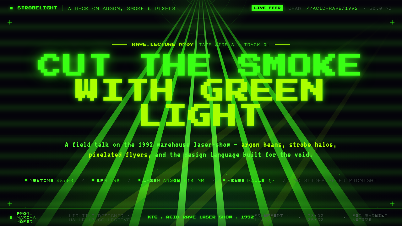
For presentation covers, treat the slide as a dark venue before a set begins. Let one laser fan, diagonal beam, or concentrated green flare establish the composition, then place the title as a crisp transmitted signal rather than a decorative headline. A short subtitle or date line can sit nearby in monospaced type, while the remaining black area gives the light room to operate. The cover should promise energy without trying to depict every aspect of rave culture at once.
Content slides need more restraint than covers. Use the same black ground and laser-green hierarchy, but let headings act as primary signals and body copy remain clear, compact, and calm. Section dividers can be created by a beam crossing the field, a small glowing marker, or a pixel-rule motif. For data slides, transform charts into light instruments: use the green as the active series, let inactive information recede into the dark, and use laser-like lines to guide comparison. Avoid decorative grids that compete with the data.
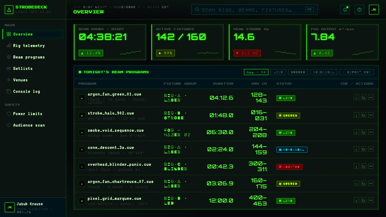
For web interfaces, the style suits music platforms, event pages, night-oriented dashboards, launch experiences, and any product that benefits from an immediate sense of live energy. Navigation can resemble a terminal readout, with concise labels and clear active states. Status, attendance, schedule, and queue information are especially natural applications because the signal-system metaphor already supports them. Interactive states should feel like a beam acquiring focus: brighter, sharper, and more concentrated, never merely louder through extra colors.
For editorial and marketing work, use the style to create a campaign atmosphere rather than to decorate an article. A feature story can open with a beam cutting through a large black field, then move into readable sections whose captions and metadata retain the pixel or mono voice. Promotional pages benefit from short declarative statements, event-style lineups, and directional visual flow. The aesthetic is strongest when copy, hierarchy, and graphics all imply transmission, arrival, or movement through a shared night space.
The common mistake is to confuse this style with generic neon futurism. Adding many saturated colors, glossy synthetic surfaces, cyberpunk city imagery, or constant ambient glow abandons the specific discipline of the source material. Acid Rave Laser Show 1992 depends on scarcity: total darkness, one radioactive green, beams made visible by smoke, and typography that reads as a machine signal. If the green no longer feels earned by the black around it, the design has become merely neon.
Acid Rave Laser Show 1992 — FAQ
Is Acid Rave Laser Show 1992 simply a neon style?
No. Neon is a broad visual category, often built from many bright colors and continuous decorative glow. This style is much narrower: it is based on pitch-black space, a single laser green, smoke-visible beams, and pixel or monospaced signal typography. The important idea is additive light entering darkness. If a design would look equally convincing on a bright background, it has probably lost the style’s central spatial logic.
Why is smoke so important to the look?
Smoke gives light volume. Without it, a laser may register only as a source point or a line on a surface; with it, the beam becomes a visible plane moving through space. In a digital interpretation, haze and halo should therefore explain visibility rather than add softness for its own sake. They tell the viewer that the green light occupies air, which is what makes the dark composition feel like a warehouse or tent rather than an abstract black page.
Can the style support readable long-form information?
Yes, provided the rave treatment is concentrated in hierarchy and atmosphere rather than imposed on every paragraph. Use pixel or monospaced type for labels, metadata, short calls, and navigation; use a highly legible companion text treatment for sustained reading. Keep the black field generous, preserve contrast, and let the laser green mark navigation, emphasis, and active data. The style works best when reading feels guided by signals rather than challenged by them.
Does it work for a dashboard or pricing page?
It can, especially when the product already involves schedules, live status, music, events, monitoring, or energy-intensive performance. Dashboards benefit from the signal metaphor: one active metric can glow while supporting values recede. Pricing pages can use a focused green marker to identify the primary choice, but they should not turn every tier into competing laser art. The system requires disciplined hierarchy, because too many equally bright calls to action erase the distinction between signal and noise.
What most quickly makes an interpretation feel inauthentic?
Overproduction is the fastest route. Dense interface panels, many accent colors, polished chrome-like surfaces, generic futuristic icons, and glow around every edge replace the source material’s starkness with spectacle. Keep asking whether each luminous element has a source, a direction, or an information role. If it does not, remove it. The intended effect is not an overloaded future city; it is a dark rave space where a limited light system makes the entire world appear.
Related design styles
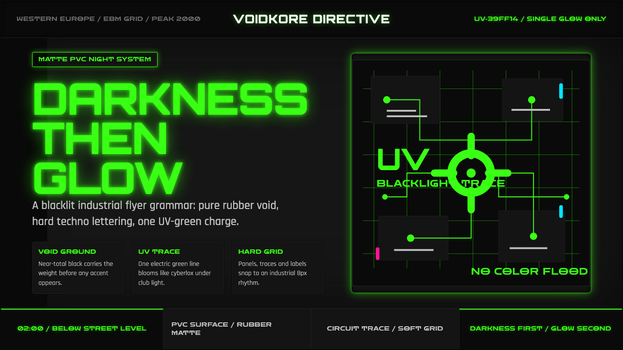 Cybergoth RaveDarkness rules. Pure black PVC is split by one UV-green circuit glow.
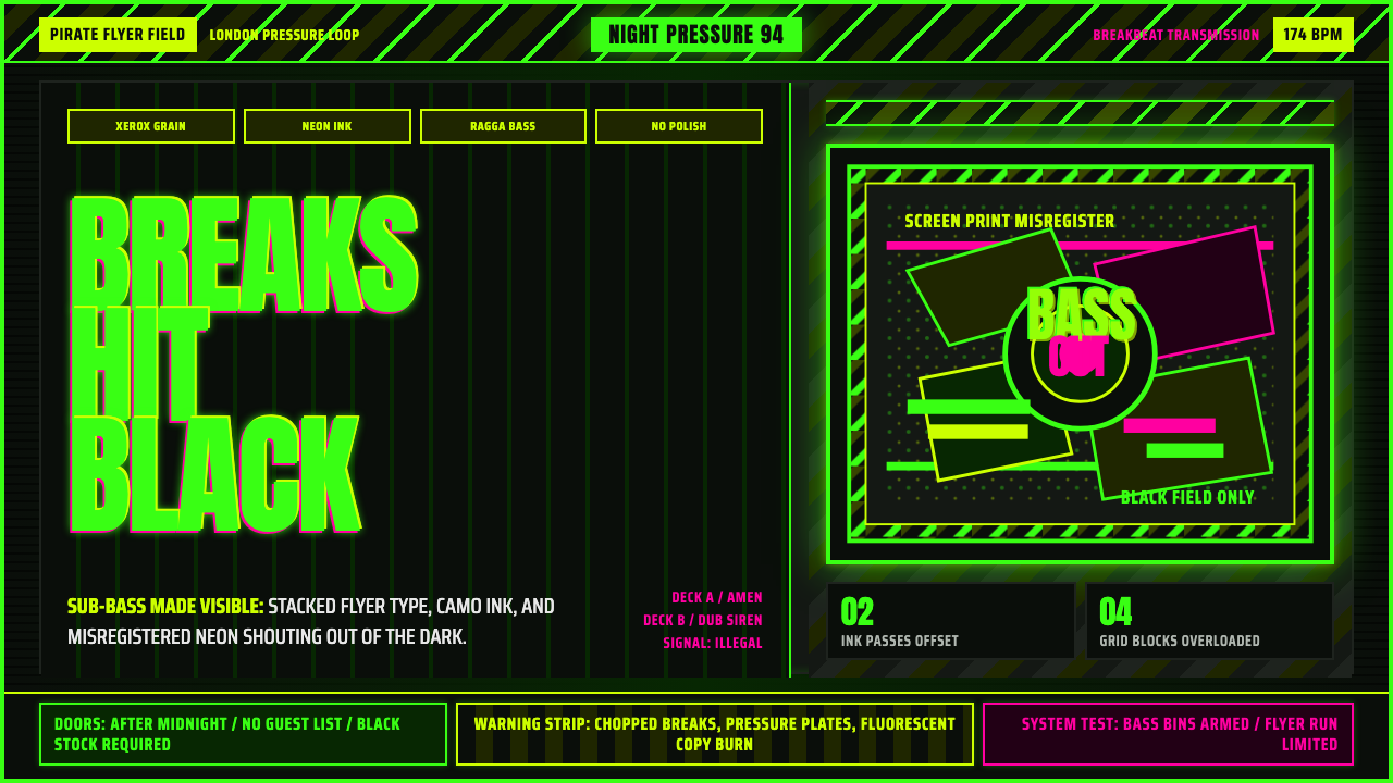 Jungle / Drum & BassRaw rave voltage. Neon green Anton, camo strips, and xerox grain hit black.
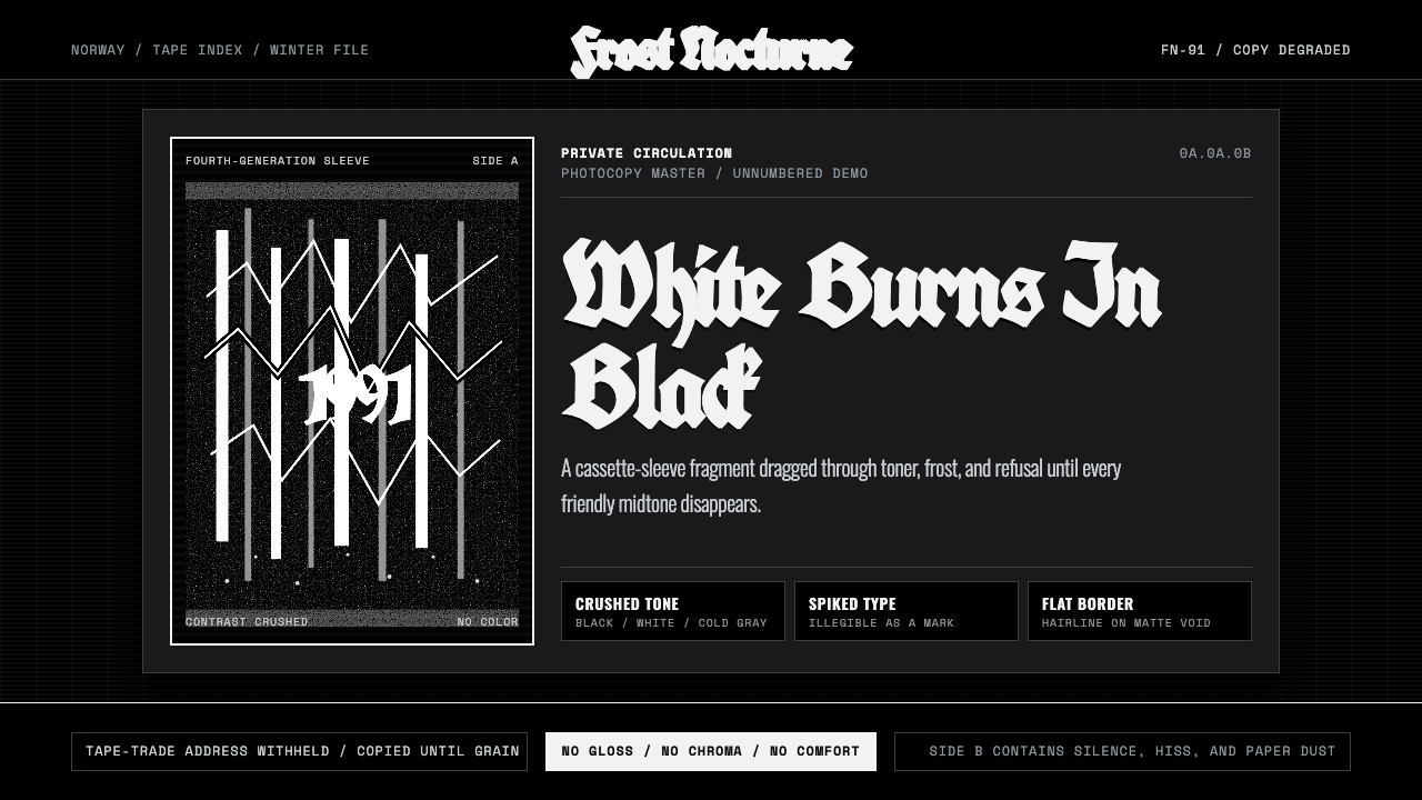 Nordic Black MetalUncompromising monochrome. Blackletter, hairline frames, and xerox grain crus…
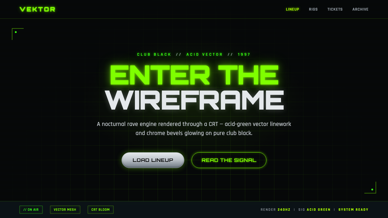 Playstation Rave Green 1997Enter the wireframe. Acid-green vector lines and chrome glow on club black, a…
 Dance Dance Revolution ArrowsPure arcade voltage. Magenta, cyan, and acid-green arrows climb a black CRT g…
 Detroit TechnoCold machines dream. Electric cyan circuits and chrome display type lock to a…