What is Nordic Black Metal?
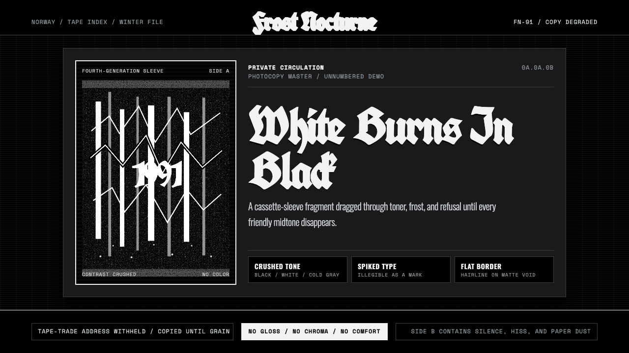
Nordic Black Metal is the sound of a Norwegian winter forest translated into ink — a xeroxed, uncompromising monochrome born from cassette tapes traded hand to hand.
Nordic Black Metal in brief
Nordic Black Metal names the visual language that grew up around the early-1990s Norwegian black metal scene: grainy black-and-white photographs of frostbitten pine forest and corpse-painted musicians, degraded through repeated photocopying until whites bloom and blacks crush into near-total darkness. There is no color register here, no gradient, no soft midtone — only the harsh binary of ink and paper.
The style did not originate as a marketing exercise. It came out of tape-trading culture, where bands recorded on cheap four-track equipment, dubbed cassettes at home, and mailed them to strangers found through classified ads in metal fanzines. The cover art had to be produced the same way the music was — cheaply, quickly, without access to professional printing — and that constraint became the aesthetic. A photocopier pushed past its intended contrast range does something no printing press does: it eats detail and spits out pure graphic shapes, and black metal bands leaned into that accident rather than fighting it.
Visually, the style reads as violent restraint. Band logos are built from spiked, interlocking letterforms so illegible that fans often could not read the band name without being told — legibility was never the point, texture and menace were. Photography favors low, oblique light: bare branches against a white sky, a lone figure in white-and-black face paint standing in snow, church silhouettes at dusk. Every element pushes toward the same emotional register — cold, isolated, and hostile to anything decorative.
Where does Nordic Black Metal come from?
The scene crystallized in Oslo around 1991, centered on a small record shop called Helvete (Norwegian for 'Hell'), opened by Øystein Aarseth, guitarist of the band Mayhem, who performed and worked under the name Euronymous. Helvete's basement became a meeting point for a loose network of musicians who called themselves the 'Inner Circle' — Mayhem, Burzum, Emperor, Darkthrone, and a handful of others — bound less by a shared sound than by a shared visual and ideological austerity: anti-commercial, anti-Christian, deliberately unwelcoming to outsiders.
The genre's visual roots reach back to the Swedish band Bathory, whose early-1980s albums, largely the work of one musician recording under the name Quorthon, established the raw, lo-fi production and stark cover imagery — wolves, shields, frost — that the Norwegian scene would push further. What Bathory suggested, Darkthrone and Mayhem radicalized: band photographs shot in black and white, faces painted in white greasepaint with black around the eyes and mouth (so-called 'corpse paint'), forests photographed in flat winter light with no attempt at composition beyond starkness.
The scene's history is inseparable from a wave of arson attacks on historic wooden stave churches across Norway between 1992 and 1996, and from the August 1993 killing of Euronymous by Varg Vikernes, the sole member of Burzum, following a dispute within the circle. These events brought international press attention to a subculture that had, until then, existed almost entirely through underground tape trading and photocopied zines — and the resulting media coverage, ironically, spread the visual language far beyond Norway, into scenes across Europe, North America, and Latin America.
By the late 1990s the raw xerox aesthetic had become a self-aware convention rather than an accident of poverty — later bands deliberately imitated the degraded photocopy look using digital tools, treating the grain and contrast crush as a genre signifier in its own right, the same way surf rock musicians later imitated the tape hiss of the 1960s on purpose.
What defines the Nordic Black Metal look?
Extreme Contrast
The style operates almost entirely at the two ends of the tonal range. Blacks are pushed to their absolute limit and whites are allowed to blow out completely, with almost nothing preserved in between. This is not a stylistic choice made at the design stage so much as an inherited artifact of photocopying photographs past the point where a copier can hold gray — but the effect became so central to the genre's identity that designers now recreate it deliberately.
Degraded Reproduction
Grain, streaking, and photocopy artifacts are treated as texture rather than flaws to be cleaned up. A photograph copied, then copied again from the copy, accumulates a specific kind of noise — clumped rather than even, with dropout in the shadows and smearing at edges. This layered degradation gives surfaces an aged, handmade quality that a clean digital scan can never replicate on its own.
Illegible Wordmarks
Logotypes are built from thorny, interlocking strokes that deliberately resist reading. Letters merge into one another, spikes extend past the letterform's natural boundary, and negative space is treated as hostile territory rather than a resting point for the eye. A logo that can be read at a glance is considered a failure of the form — the genre prizes the labor of decoding over instant recognition.
Bare Winter Landscape
Forest photography favors leafless trees, frost, and flat overcast light rather than dramatic sunsets or lush greenery. The landscape is presented as hostile and indifferent, never picturesque. Compositions are often centered and static rather than dynamically framed, echoing the genre's rejection of anything that reads as polished or commercially appealing.
Corpse Paint Iconography
The human figure, when it appears, is masked rather than portrayed — white greasepaint covering the face with black smeared around the eyes and mouth, erasing individual identity in favor of a shared, anonymous mask. This is portraiture that refuses to be a portrait: the point is not to show who the person is, but to show that the person has become something else.
Cluttered, Thicket-Like Composition
Where Bauhaus or Swiss design organizes a page through open grids and generous negative space, this style does the opposite: logos, band names, and small type tangle across the surface like bare branches, leaving little room to breathe. The density is intentional — it mimics the visual chaos of a forest thicket, resisting the clean hierarchy that most graphic design aims for.
Zero Warmth
No warm tones appear anywhere in the system — no cream, no amber, no earth color. Even when the underlying medium is paper rather than pure digital black and white, the paper itself is treated as cold, bleached, and indifferent. Warmth of any kind would undercut the isolation the style is built to communicate.
Who shaped Nordic Black Metal?
Recording alone under the name Quorthon, this Swedish musician produced Bathory's early-1980s albums with cover art built from wolves, shields, and stark cold imagery, establishing the raw, lo-fi visual and sonic template that Norwegian black metal would later push into a far more extreme register.
Guitarist of Mayhem and proprietor of the Helvete record shop in Oslo, Euronymous served as the scene's organizing figure, founding the label Deathlike Silence Productions and shaping the visual and ideological austerity of the so-called Inner Circle before his death in 1993.
The sole member of Burzum, Vikernes recorded stark, minimal black metal and produced cover imagery notable for its starkness and isolation; his 1993 killing of Euronymous remains the scene's most widely reported historical event.
Drummer and co-founder of Darkthrone, Fenriz was instrumental in defining the deliberately raw, photocopy-degraded cover aesthetic on albums that became reference points for the genre's visual identity, treating cheapness of production as an artistic principle rather than a limitation.
As Darkthrone's guitarist and vocalist alongside Fenriz, Nocturno Culto co-shaped the band's visual output across decades, sustaining the raw monochrome look long after the initial Oslo scene had fragmented, helping the style outlive the specific historical moment that produced it.
How do you use Nordic Black Metal today?
Nordic Black Metal is a high-risk, high-reward style to apply outside its native musical context, because its entire visual grammar is built around hostility to legibility and polish — qualities most commercial design exists to maximize. Used well, it signals uncompromising authenticity and cold intensity; used carelessly, it simply reads as illegible or amateurish.
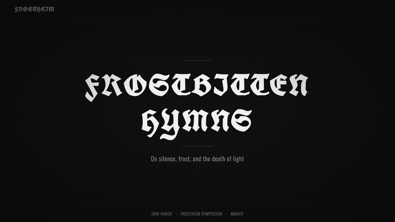
For presentation slides, the style works best on cover and section-break slides rather than dense content pages — a full-bleed grainy monochrome forest image with a tangled wordmark overlay makes a striking title slide, but body text needs to break from the aesthetic's illegibility principle and use a plain, high-contrast typeface so the audience can actually read it. Data slides should avoid the style almost entirely; charts demand clarity this system is built to resist.
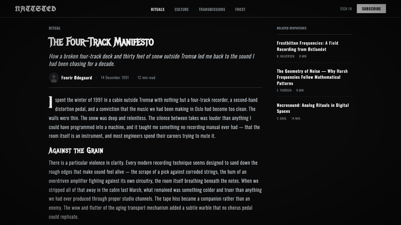
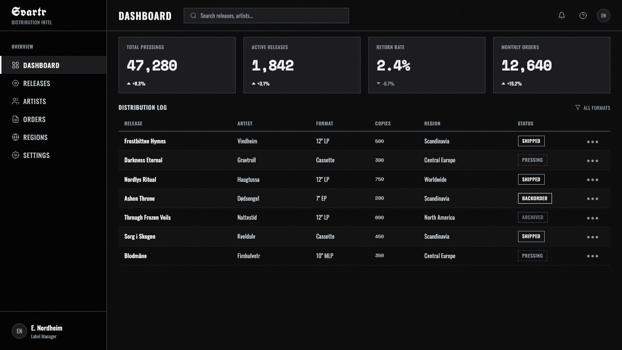
For web interfaces, the style suits editorial or archive-like experiences — a music label's site, a zine archive, a portfolio for something intentionally raw — more than transactional interfaces like dashboards or checkout flows. A dashboard rendered in this aesthetic would actively frustrate users trying to read numbers; the style's core value, illegibility as texture, is directly at odds with a dashboard's core job.
For editorial and marketing work, the style is most effective as an accent — a grainy monochrome photograph as a section divider, a spiky wordmark reserved for a single hero moment — rather than applied uniformly across an entire layout. Long-form body copy should stay in a clean, readable face even when everything around it commits fully to the degraded aesthetic, because readers need somewhere to rest their eyes.
The most common mistake is treating this as simply 'grunge' or 'distressed' design and softening the contrast to make it more palatable. That compromise erases the exact quality that makes the style recognizable — its refusal to be comfortable. A second common mistake is pairing the aesthetic with warm or saturated color; the style has no register for warmth, and introducing it collapses the mood the whole system depends on.
Nordic Black Metal — FAQ
Why does this style deliberately make its own logos hard to read?
Because legibility was never the goal of the scene that produced it. Tape-trading bands were communicating with an audience already inside the subculture, not recruiting outsiders — a logo that took effort to decode functioned as a kind of gatekeeping, signaling that the listener was committed enough to bother. Applied outside that context, illegible type should be used sparingly, since most design goals require the opposite.
Is the photocopy-grain look something you have to recreate physically, or can it be done digitally?
It began as a physical accident — photographs copied and recopied on office photocopiers until detail collapsed into pure graphic noise — but the look has long since become a deliberate digital technique. Designers now recreate the specific character of that degradation (clumped grain, edge smearing, blown highlights) using grain and threshold filters, because the visual result matters more than the literal production method that first produced it.
Can this style be adapted for something that is not dark or aggressive in tone?
It resists that kind of adaptation more than most historical styles do, because its entire logic — extreme contrast, illegibility, cold isolation — is built to communicate hostility and intensity. Softening those qualities to fit a friendlier context tends to produce something that reads as neither the original style nor a coherent new one. It is better suited to contexts that genuinely want a cold, uncompromising register than to a gentle reinterpretation.
What is the historical relationship between this design style and the darker events associated with the early scene?
The style emerged from the same small, tightly wound Oslo scene that also produced a wave of church arsons in the early-to-mid 1990s and the 1993 killing of Euronymous by Varg Vikernes. These events are part of the documented history of the genre and explain why the visual language carries such uncompromising intensity, but the aesthetic itself — grain, contrast, illegible type — can be, and widely has been, used by later bands and designers with no connection to that history.
Does this style require a full monochrome treatment, or can any color be introduced?
The canonical form is strictly black and white with no intermediate color at all — that binary starkness is close to the defining trait. A very small amount of desaturated, cold accent (a muted steel gray, for instance) can be introduced without breaking the mood, but any warm or saturated color reads as a foreign intrusion and undermines the isolation the whole system is built to communicate.
Related design styles
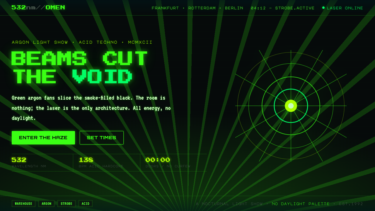 Acid Rave Laser Show 1992Beams cut the void. Argon green on pitch-black smoke, pixel marquee type, add…
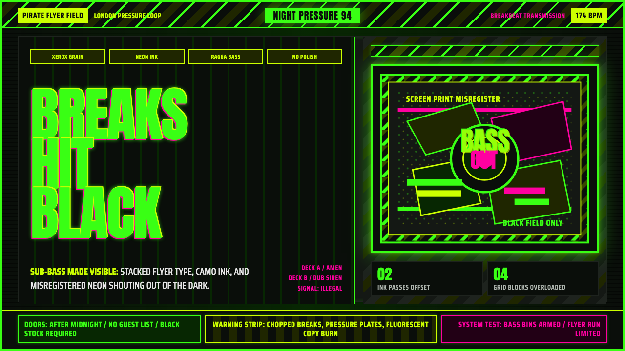 Jungle / Drum & BassRaw rave voltage. Neon green Anton, camo strips, and xerox grain hit black.
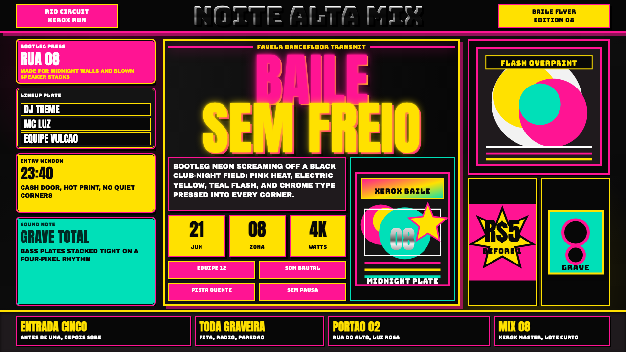 Funk Baile MixtapeNight refuses subtlety. Neon pink/yellow flyer plates cram chrome type on bla…
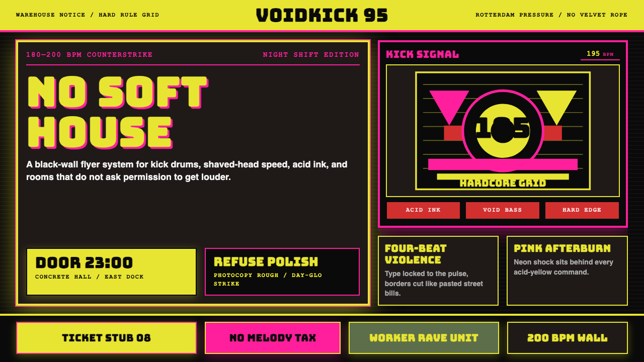 Rotterdam Gabber HardcoreHardcore refuses polish. Acid yellow, neon pink, black grid, and brutal Bunge…
 Slimer Ghostbusters GreenBlacklight goo shouts. Ecto-green Bungee type, drips, and proton streaks hit…
 UK Rave Glow-Stick FlyerIllicit euphoria. Acid yellow, rave pink, and laser green slam into photocopi…