What is Doom 1993 Toxic Green?
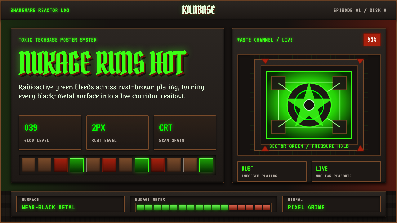
Doom 1993 Toxic Green turns the screen into a radioactive machine room — corroded metal, blackened pixels, and poisonous readouts glowing with the promise that something below the floor is still alive.
Doom 1993 Toxic Green in brief
Doom 1993 Toxic Green is a dark techno-gothic design style derived from the visual world of id Software's 1993 first-person shooter. It combines industrial techbase metal with hellfire, radioactive waste, and the coarse artifacts of the PC shareware era. Near-black floors and oily panels establish the darkness; rust-brown plating supplies material weight; saturated nukage green becomes the active light that reveals controls, edges, and threats.
The style does not treat green as a cheerful accent. It is chemical, unstable, and almost hostile: the color of a contaminated pool, a malfunctioning readout, or radiation leaking through a seam. Metal is equally important. Panels appear embossed, beveled, bolted, stained, and worn, as though every interface were part of the same STARTAN-clad facility rather than a clean digital layer placed above it.
Its visual character comes from friction between legibility and decay. HUD information must remain immediate, yet it appears through scanline grain, pixelated darkness, grungy titling, and radioactive bloom. The result is neither ordinary retro computing nor generic horror. It is a machine-age inferno in which technology still functions, but every functioning surface seems contaminated.
Where does Doom 1993 Toxic Green come from?
The style begins with Doom, released in 1993 by id Software in Mesquite, Texas. It belongs to the North American PC shareware FPS era, when a game could arrive as a digital artifact rather than a polished physical luxury object. That context matters aesthetically. The image language is compressed, direct, and built for forceful recognition: dark corridors, assertive status displays, hard material boundaries, and luminous hazards that remain unmistakable amid visual noise.
Doom fused two environments that might otherwise have remained separate. One was the industrial techbase, expressed through metal plating, machinery, HUD panels, and functional readouts. The other was infernal: hellfire, danger, bodily threat, and spaces that feel morally as well as physically corrupted. Radioactive waste forms the bridge between them. Nukage green is technological and monstrous at once, turning an industrial facility into an ecosystem of contamination.
The theme also reflects techno-gothic game art and demoscene-adjacent pixel craft. Its surfaces are assembled from strongly differentiated fragments rather than smooth illusion: rust beside black, luminous green beside dead metal, crisp status information beside grain and damage. Pixelation is not merely a limitation to imitate. It establishes a visual rhythm in which small blocks, jagged transitions, and repeated surface marks make architecture and interface feel fabricated from the same finite vocabulary.
As a contemporary design system, Doom 1993 Toxic Green distills those qualities rather than reproducing a game screen literally. Embossed grungy titling carries the aggression of the original artifact; beveled HUD panels turn content containers into machinery; scanline grain evokes an aged display; toxic readouts cast apparent light across oily metal. The historical source remains visible, but the system becomes usable for slides, dashboards, editorial layouts, and marketing surfaces.
What defines the Doom 1993 Toxic Green look?
Toxic Illumination
Saturated nukage green is the defining signal. It should appear to emit energy rather than merely fill shapes, illuminating nearby edges and separating essential information from the near-black field. Its emotional register is contamination, urgency, and malfunction. Broad green coverage weakens that effect; concentrated pools, readouts, warning marks, and active states make the color feel dangerous.
Corroded Metal
Rust-brown plating gives the system its physical body. Surfaces should feel oily, scorched, stained, and repeatedly repaired, with brighter wear along exposed ridges and deeper grime in recesses. The metal is never elegant or neutral. It belongs to an overworked facility where every panel has absorbed heat, impact, and radioactive residue.
Beveled Machinery
Containers resemble HUD housings and armored access panels. Hard bevels, inset wells, segmented frames, and embossed edges create depth without softness. A card should look mounted, latched, or cut into a bulkhead, not floated above a page. Repeated construction logic makes separate interface regions feel like connected modules in one hostile machine.
Grungy Display Type
Headlines are dense, forceful, and treated like stamped or embossed markings on equipment. Distress may chip their edges or interrupt their surfaces, but the silhouette must remain immediate. Supporting text behaves more like a technical readout: compact, restrained, and sharply separated from the display lettering. The contrast is between an armored title and an instrument panel.
CRT Grain
Scanlines, coarse pixel grain, and slight luminous bleed make the image feel observed through an aging display. These artifacts should bind the composition together rather than obscure information. They are most convincing when distributed unevenly: stronger in dark fields and glowing regions, quieter around dense text. Perfectly clean surfaces break the shareware-era atmosphere.
Pixelated Darkness
The background is not empty black. It contains near-black floors, blocky tonal changes, oily reflections, and barely visible structural seams. Darkness behaves like material, allowing the green light to carve out only what matters. Subtle variation suggests unseen corridors and machinery without turning the background into descriptive illustration.
Who shaped Doom 1993 Toxic Green?
John Carmack is listed among the key figures associated with Doom and its Mesquite, Texas origin. Within the history of this design language, his name belongs to the collective context that produced the 1993 artifact: a PC first-person shooter whose technological spaces, radioactive hazards, and dark material vocabulary became inseparable from its identity.
John Romero is named among Doom's key figures. His association places him within the group behind the source work from which the Toxic Green system is distilled. That source joined the immediacy of shareware-era action with a distinctive visual opposition: readable machinery against corrupted darkness, and functional technology against an encroaching infernal world.
Adrian Carmack is included among the key figures connected to Doom. In the theme's historical frame, that connection matters because the style depends on a unified artifact rather than an isolated color choice. Rust plating, hellfire, pixel craft, near-black architecture, and radioactive green operate together as one techno-gothic environment.
Tom Hall appears in the source history as a key figure associated with Doom. His inclusion situates the style within a collaborative North American game-making context centered on id Software. The resulting visual vocabulary crossed interface and environment so thoroughly that readouts, walls, hazards, and title treatments all seemed manufactured by the same contaminated world.
Sandy Petersen is also identified among Doom's key figures. For designers studying the Toxic Green theme, the relevant legacy is the coherence of the finished atmosphere: industrial structure, infernal threat, radioactive illumination, and coarse digital texture do not compete as separate motifs. They reinforce one another until the entire screen feels hazardous.
How do you use Doom 1993 Toxic Green today?
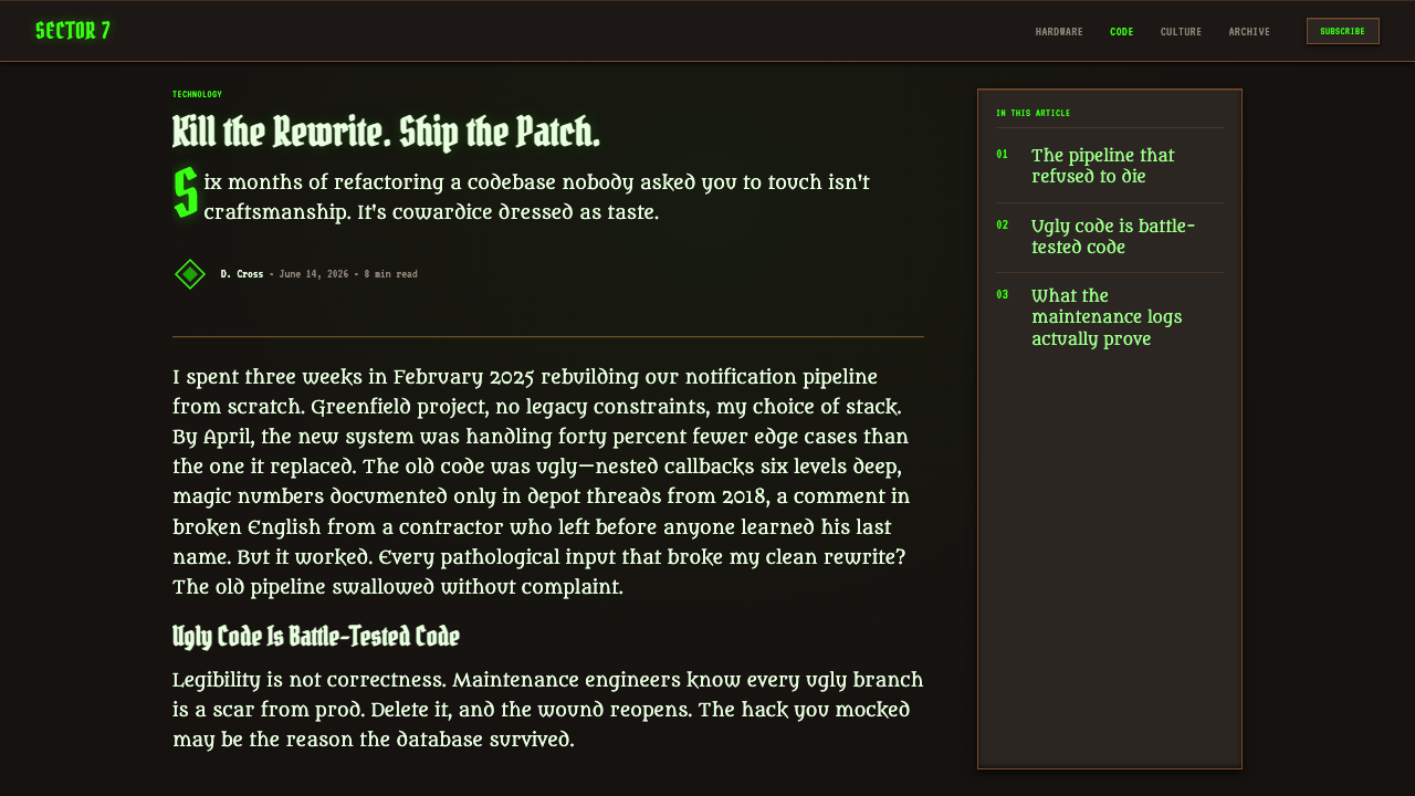
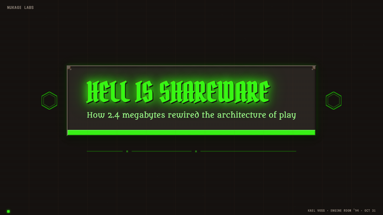
For presentation covers, build a single dramatic encounter between darkness and radioactive light. Let a corroded title plate or embossed wordmark dominate the frame while a concentrated green source cuts through one edge or seam. Content slides should become machinery bays: text sits inside beveled modules, section markers resemble equipment labels, and generous dark zones prevent the metal treatment from becoming visually suffocating.
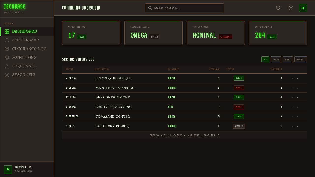
Data slides work best when values resemble live system telemetry. Toxic green can identify current, successful, or critical readings, while rust and subdued metal tones organize secondary series. Charts should be blocky, high contrast, and direct, with grid lines behaving like panel markings rather than delicate decoration. Do not distress the data itself; preserve crisp numerals and labels against the damaged enclosure.
For web dashboards and pricing interfaces, reserve the brightest green for actions, selected states, alerts, and decisive numbers. Navigation can resemble a narrow control strip, while cards take the form of inset HUD compartments. Pricing tiers benefit from material differentiation rather than a rainbow of accents: one may appear sealed, another active, and another contaminated, all within the same black, rust, and green world.
Editorial and marketing layouts can use the theme's poster-like aggression without turning every paragraph into a game prop. Pair an embossed display headline with calm, compact body copy, then place photographs or illustrations inside hard-edged observation windows. Feature sections may alternate between near-black voids and rusted machinery surfaces, with green recurring as a narrative signal for danger, activation, or transformation.
The common mistake is reducing the style to neon green text on black. Without rust-brown plating, beveled construction, CRT grain, pixel darkness, and techno-gothic contamination, the result becomes a generic terminal interface. The opposite mistake is excessive damage: if every letter flickers, every panel is heavily corroded, and every edge glows, hierarchy collapses. The style needs disciplined pockets of clarity inside decay.
Doom 1993 Toxic Green — FAQ
Is Doom 1993 Toxic Green simply a cyberpunk style?
No. Both can use dark environments and luminous technology, but this theme is grounded specifically in Doom's industrial techbase, hellfire, radioactive waste, shareware-era pixel craft, and rusted armor. Its green light signals contamination more than urban spectacle. The world feels like a hostile facility invaded by infernal forces, not a polished city saturated with futuristic media.
Why is rust-brown as important as toxic green?
Rust gives the green something physical to contaminate. Without brown plating, scorched seams, and oily metal, luminous green loses its radioactive meaning and becomes an abstract digital accent. The warm corrosion also creates a material counterweight to the cold readouts. Their opposition makes the interface feel like old machinery still operating under dangerous illumination.
Can the style support long-form reading?
Yes, if the atmosphere remains around the text rather than inside every line. Use quiet near-black reading fields, restrained light text, and occasional green markers for navigation or emphasis. Concentrate bevels, rust, scanlines, and distressed lettering in headers, side panels, and section transitions. Long passages need stable contrast and clean letterforms even when their container looks damaged.
How should imagery be treated in this system?
Imagery should feel captured by the same hostile display as the interface. Crop it firmly, darken nonessential regions, emphasize coarse tonal separation, and let green illumination identify the narrative focus. A hard frame or inset metal housing can integrate the image into the system. Smooth lifestyle photography presented without mediation will usually conflict with the techno-gothic world.
Where does Doom 1993 Toxic Green work poorly?
It struggles when trust depends on softness, serenity, cleanliness, or domestic warmth. The language of contamination and hostile machinery can make wellness, family, food, or gentle service experiences feel unsafe. It is strongest for entertainment, technical dashboards, campaign pages, game-adjacent products, and narratives built around danger, survival, machinery, or transformation. The product's emotional promise must tolerate aggression.
Related design styles
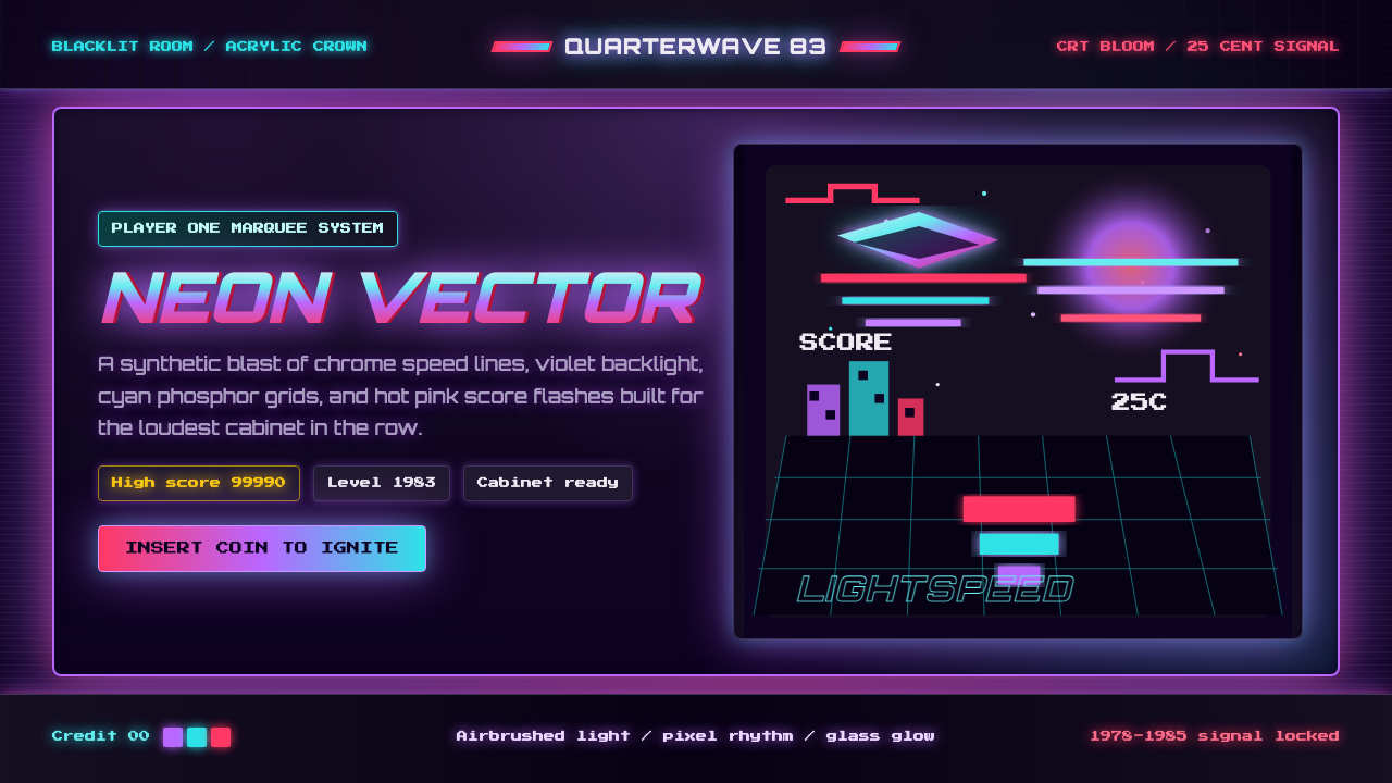 Arcade Cabinet MarqueeToo loud to ignore. Black-indigo glass, violet glow, cyan grids, hot-pink arc…
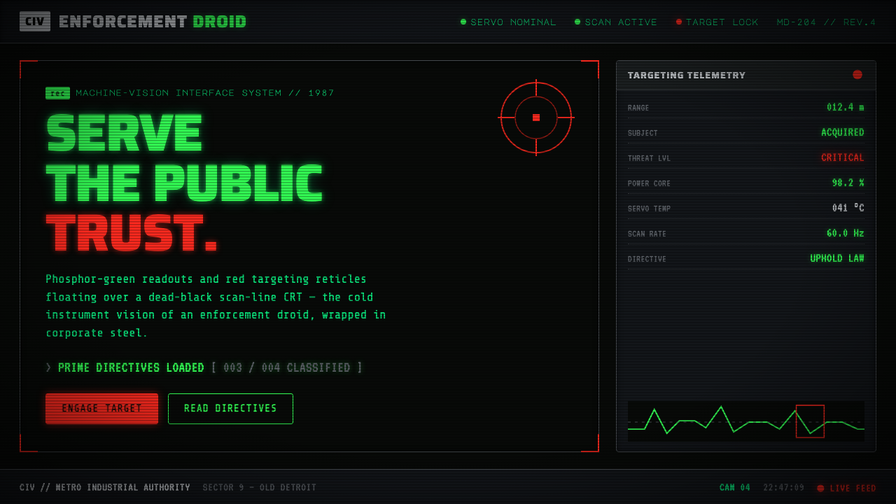 RoboCop (1987)Machine vision as interface. Phosphor-green readouts on dead-black CRT, red r…
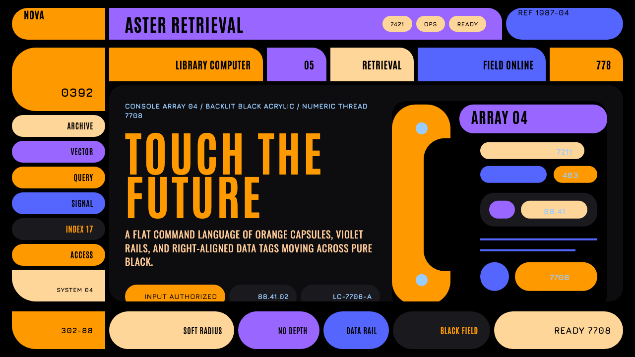 Star Trek LCARSFuture as flat command. Orange-violet elbows and Jura numbers glow on black.
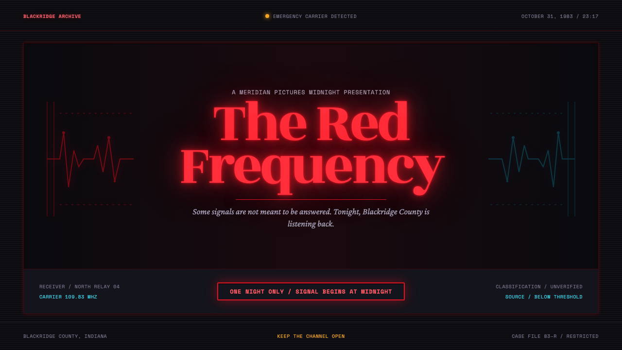 Stranger Things (1983)Red light breaks the void. A spurred serif blooms through VHS static and cold…
 Tech-NoirAlways night. Blue-black asphalt reflects hot pink and electric cyan neon.
 The Mask 1994 Green FaceLoud, theatrical, ssssmokin'. Lawn-green and canary-yellow scream against dec…