What is Street Fighter II (1991 Arcade)?
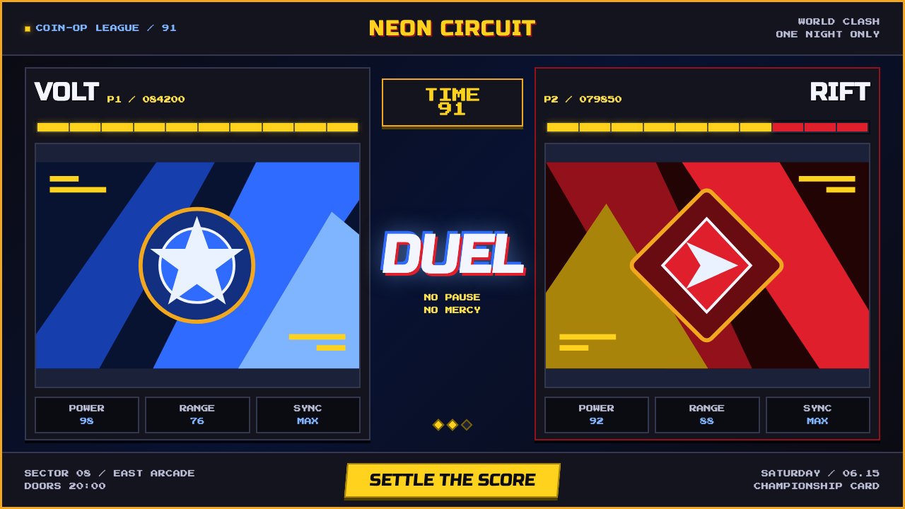
Street Fighter II turns the arcade screen into a floodlit fight card: pixel muscle, electric blue impact, championship gold, and black CRT space pushed to maximum intensity.
Street Fighter II (1991 Arcade) in brief
Street Fighter II is the visual language of the early-1990s arcade floor: a dark CRT field, hand-pixeled fighters, bright stage color, and an interface built to make every match feel immediate. Its central image is confrontation. Two character portraits face one another, a heavy VS mark occupies the middle, and the screen presents the coming bout with the directness of a championship poster.
The style gains its force through contrast. Arcade black creates a deep field behind the fighters, while hadouken blue, yellow health bars, gold HUD details, and flag-bright stage colors arrive as concentrated bursts of light. The resulting image is not calm or atmospheric. It is loud, energized, and deliberately overdriven, as though the screen itself is responding to the force of a hit.
Its pixel language is equally important. Fighters read as hand-built clusters of color and contour rather than smooth illustrations; titles and HUD elements use large outlined forms that hold their own against busy stages. Street Fighter II does not conceal the screen's technical character. Scanline bloom, hard framing, glow, and the implied curve of a tube display are part of the aesthetic rather than defects to be removed.
Where does Street Fighter II (1991 Arcade) come from?
Street Fighter II: The World Warrior arrived in 1991, with Champion Edition following in 1992 and Turbo and Hyper developments spanning 1992 to 1994. The source material places this visual system in Osaka, Japan, and identifies it with Japanese arcade fighting games, CPS-1 pixel art, and coin-op cabinet culture. These contexts explain why the style is designed for instant recognition rather than quiet, prolonged inspection.
On an arcade floor, a screen had to declare itself amid surrounding machines, movement, and noise. Street Fighter II answers that condition with emphatic visual signals: a nearly black field, strong title outlines, vivid status bars, and portraits arranged around a decisive central confrontation. The screen is organized less like a neutral utility panel than like a public invitation to watch, challenge, and play.
CPS-1 pixel art gives the style its physical density. The source describes hand-pixeled fighters and pixel muscle, language that points to forms assembled visibly from discrete marks. This is why the aesthetic remains convincing when it is chunky and sharp. Its edges should feel constructed, its highlights should feel struck into the image, and its action should read as a graphic event rather than a polished simulation.
The approved source names Takashi Nishitani, Akira Yasuda Akiman, Yoshiki Okamoto, and Yoko Shimomura among the key figures associated with this origin. Together with the era, Osaka setting, and arcade movements listed in the record, those names locate the style within a specific production culture: an arcade-facing visual system whose drama comes from fighters, scorekeeping, stage color, and the heightened spectacle of direct competition.
What defines the Street Fighter II (1991 Arcade) look?
CRT Black
The ground should feel like an arcade screen switched on in a dark room: dense, nearly lightless, and receptive to flashes of color. Black is not empty background here. It is the pressure chamber that makes fighters, HUD bars, and energy effects appear illuminated from within.
Electric Energy
Hadouken blue is the clearest energy cue in the source material. Use blue-white intensity as a concentrated impact signal, with a controlled glow that suggests scanline bloom instead of soft modern atmosphere. Energy should look charged, immediate, and graphic.
Fight-Card HUD
Yellow health bars, championship gold, hard rectangular framing, and a strong central VS create a hierarchy that reads before any fine detail. Status information is theatrical rather than discreet. It frames the fighters as contestants and the screen as an active arena.
Outlined Block Type
Titles should be fat, block-like, outlined, and forceful enough to survive a visually busy stage. The outline gives letters the separation of a sprite or badge, keeping them legible while making them feel struck, stamped, and arcade-native rather than editorially refined.
Pixel Muscle
Forms need mass. Fighters, buttons, and interface panels should use chunky silhouettes, decisive contours, and highlights that reinforce volume without dissolving the pixel structure. The style is muscular because each shape feels pressed into place, not feathered into smoothness.
Cabinet Overdrive
Brightness, glow, and contrast are intentionally pushed beyond restrained interface conventions. This is not an excuse for visual disorder: the black field and rectangular HUD keep the image controlled. The goal is the sensation of a coin-op cabinet demanding attention across an arcade floor.
Who shaped Street Fighter II (1991 Arcade)?
Nishitani is named in the approved source material as a key figure connected to Street Fighter II. In an educational account of the style, his inclusion anchors the visual language to its listed production context rather than treating arcade imagery as a generic retro surface.
Akiman appears among the source material's key figures. His presence in the approved record reinforces the importance of hand-pixeled fighters, pronounced silhouettes, and character imagery that can carry the visual pressure of a versus screen.
Okamoto is listed as a key figure in the Street Fighter II source record. That association keeps attention on the style's arcade framework: the match, the status display, the stage, and the cabinet-facing need for immediate visual clarity.
Shimomura is also named among the approved key figures. Within this visual study, that listing helps preserve the work as a complete arcade production culture rather than reducing it solely to interface decoration or pixel technique.
How do you use Street Fighter II (1991 Arcade) today?
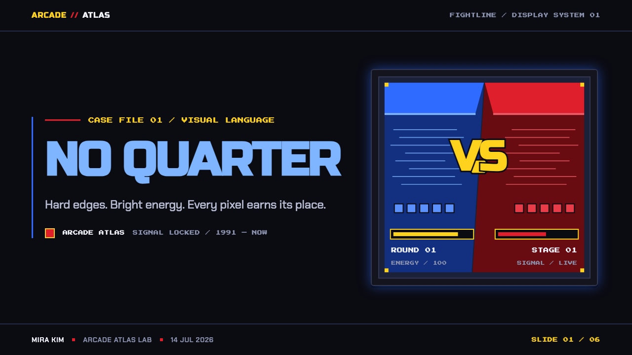
For presentation covers, treat the slide as a fight card. Let a dark field carry one large character-like silhouette, an energy burst, or a forceful title treatment, then introduce gold or yellow as a status accent. Keep the composition confrontational and directional. The cover should feel as though an event is about to begin, not as though a brand is quietly introducing itself.
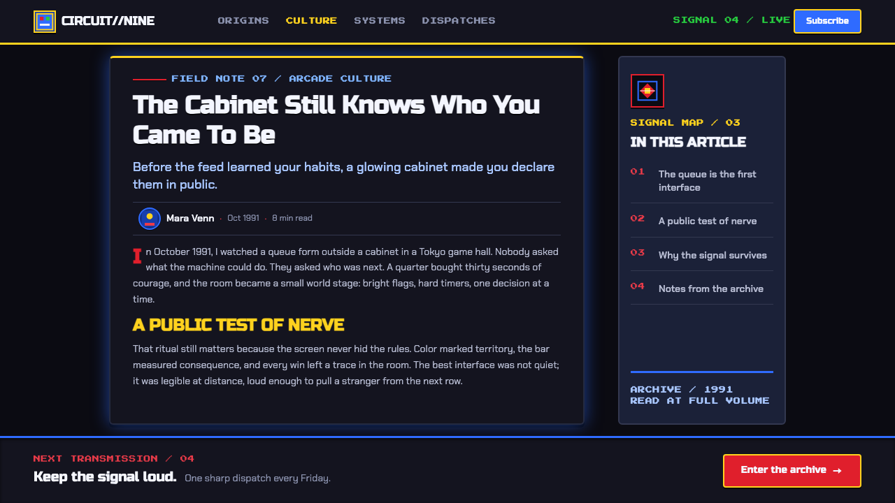
For presentation content and data slides, retain the hard HUD logic. Use rectangular frames to separate facts, let section labels behave like match indicators, and reserve the brightest accents for the most important state or finding. Charts should feel built from bars, panels, and score displays rather than softened with atmospheric decoration. Dense information works when the dark field remains calm and the hierarchy stays unmistakable.
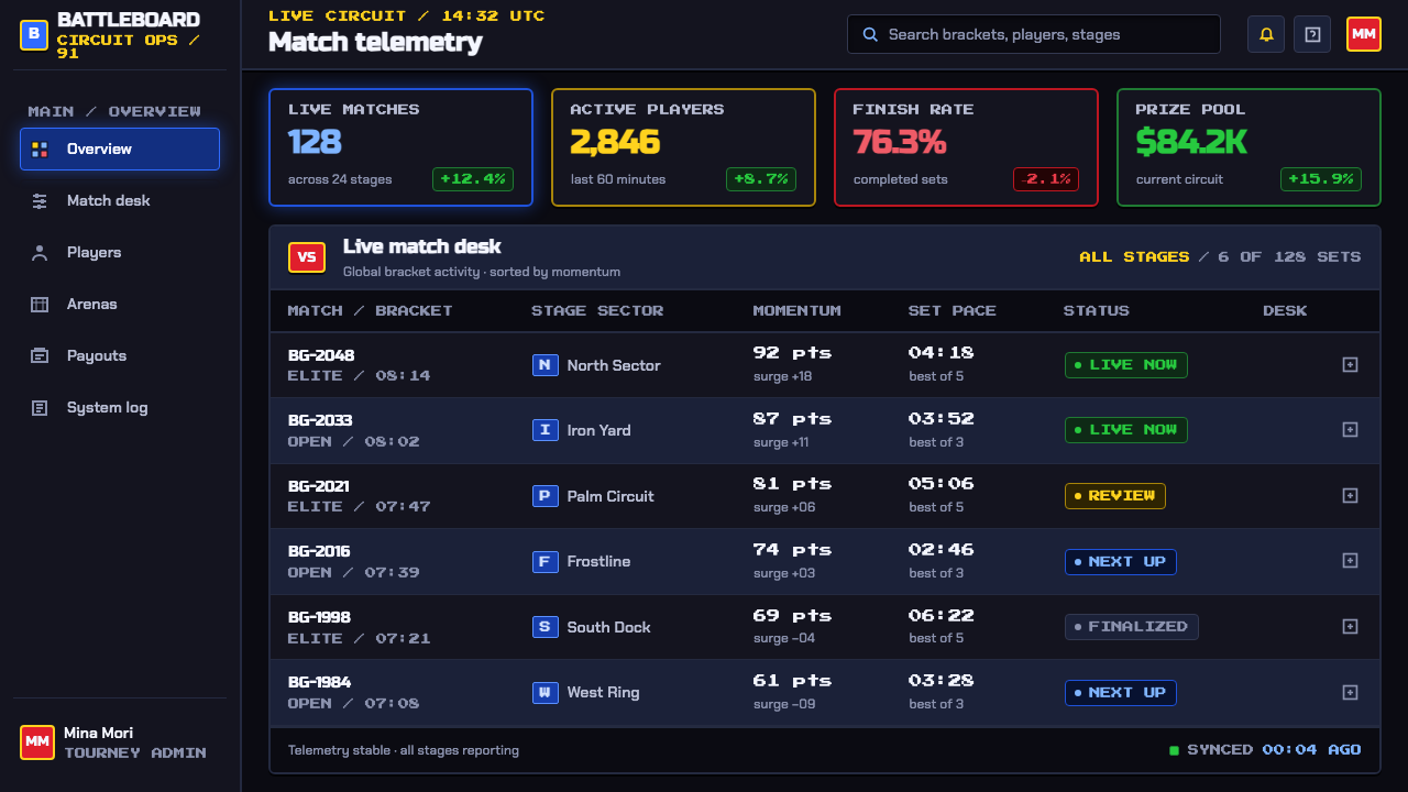
For web UI, the style fits dashboards, performance views, competitive communities, launch pages, and pricing experiences that benefit from visible momentum. A dark interface can use gold status elements, bright energy accents, outlined headings, and beveled controls to make interaction feel tactile. Important actions should read like committed inputs, while secondary controls recede into the cabinet-like frame.
For editorial and marketing work, use the style's poster energy selectively. A campaign page can open with a bold matchup composition, then move into framed proof points, stage-like imagery, and concise high-contrast calls to action. Editorial layouts should preserve readable text areas within the drama; the arcade influence is strongest when it directs attention to the story instead of turning every paragraph into visual combat.
The common mistake is to mistake Street Fighter II for any collection of pixels, neon, and black. The source system depends on disciplined contrast: dark space, legible outlined type, hard HUD structure, controlled gold and yellow, and blue energy used as an event. Too many competing glows, gradients, decorative icons, or unrelated retro references erase the match-ready clarity that makes the style work.
Street Fighter II (1991 Arcade) — FAQ
Is this style simply generic retro pixel art?
No. The Street Fighter II system is specifically tied in the approved material to Japanese arcade fighting games, CPS-1 pixel art, and coin-op cabinet culture. Generic pixel art can be quiet, pastoral, comic, or technical. This style is competitive and theatrical: fighters face off, status bars drain, the central matchup matters, and light behaves like arcade intensity on a CRT display.
Can the Street Fighter II look work without character art?
Yes, provided the interface preserves the fight-card structure. A dark field, hard rectangular HUD zones, large outlined headings, championship-like status accents, and one concentrated blue energy cue can carry the language into data, product, or event design. Character art is memorable, but confrontation and hierarchy are the deeper transferable principles.
Why are yellow bars and gold details so important?
The source material identifies draining yellow health bars and championship gold as central visual cues. Against CRT black, these warm signals make status information feel valuable, urgent, and publicly visible. They also counterbalance the colder hadouken blue, producing a fight-screen relationship between energy, reward, and danger rather than a single-color neon effect.
Does the aesthetic require a dark interface?
Its defining source language is arcade-black and CRT-lit, so a dark field is the most faithful foundation. A lighter adaptation can borrow outlined type, pixel construction, hard frames, and match-card hierarchy, but it will lose part of the tube-screen drama. If adapting it, preserve a concentrated dark stage somewhere in the experience rather than distributing color evenly everywhere.
What makes a modern interpretation feel wrong?
It feels wrong when modern softness replaces arcade pressure. Low-contrast text, diffuse shadows, delicate controls, and decorative glow remove the force of the source system. The better interpretation is not a literal cabinet replica; it keeps the loud contrast, tactile framing, pixel-built confidence, and clear competitive hierarchy while allowing the content itself to remain contemporary.
Related design styles
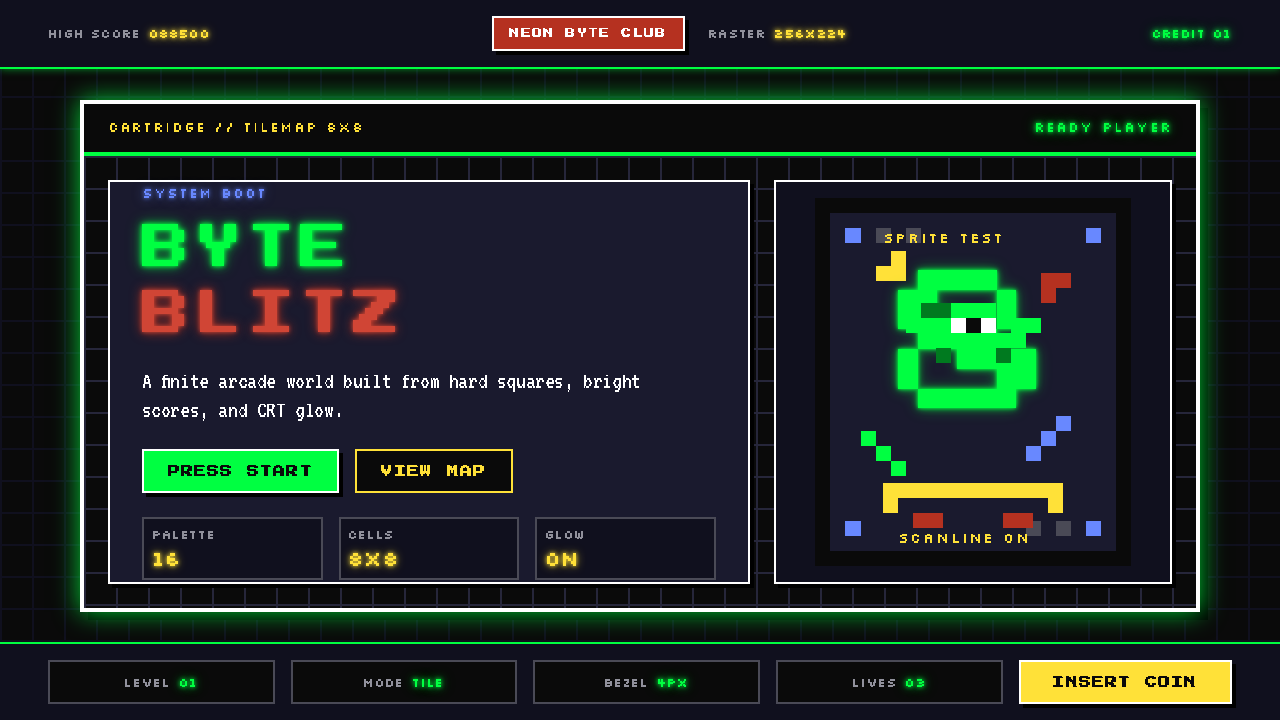 Pixel Art / 8-bit RetroHard-edged digital joy. CRT black, phosphor green, and 8x8 grids snap every p…
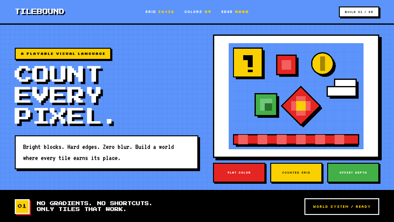 Super Mario Bros (1985)Every pixel earns its place. Sky blue, four-color tiles, and hard black outli…
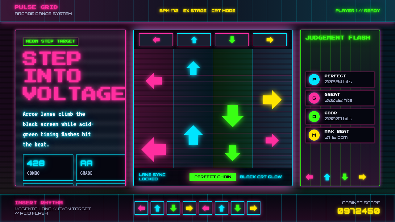 Dance Dance Revolution ArrowsPure arcade voltage. Magenta, cyan, and acid-green arrows climb a black CRT g…
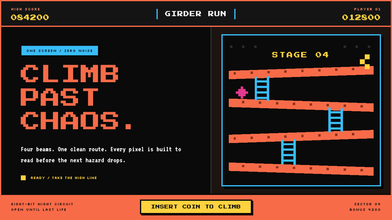 Donkey Kong (1981 Arcade)Built to read through the smoke. Coral girders and cyan ladders cut across a…
 Taiwanese Raohe Night Market NeonTaipei night reads vertically. Neon red, cobalt panels, and acid-yellow numbe…
 Acid Rave Laser Show 1992Beams cut the void. Argon green on pitch-black smoke, pixel marquee type, add…