What is Super Mario Bros (1985)?
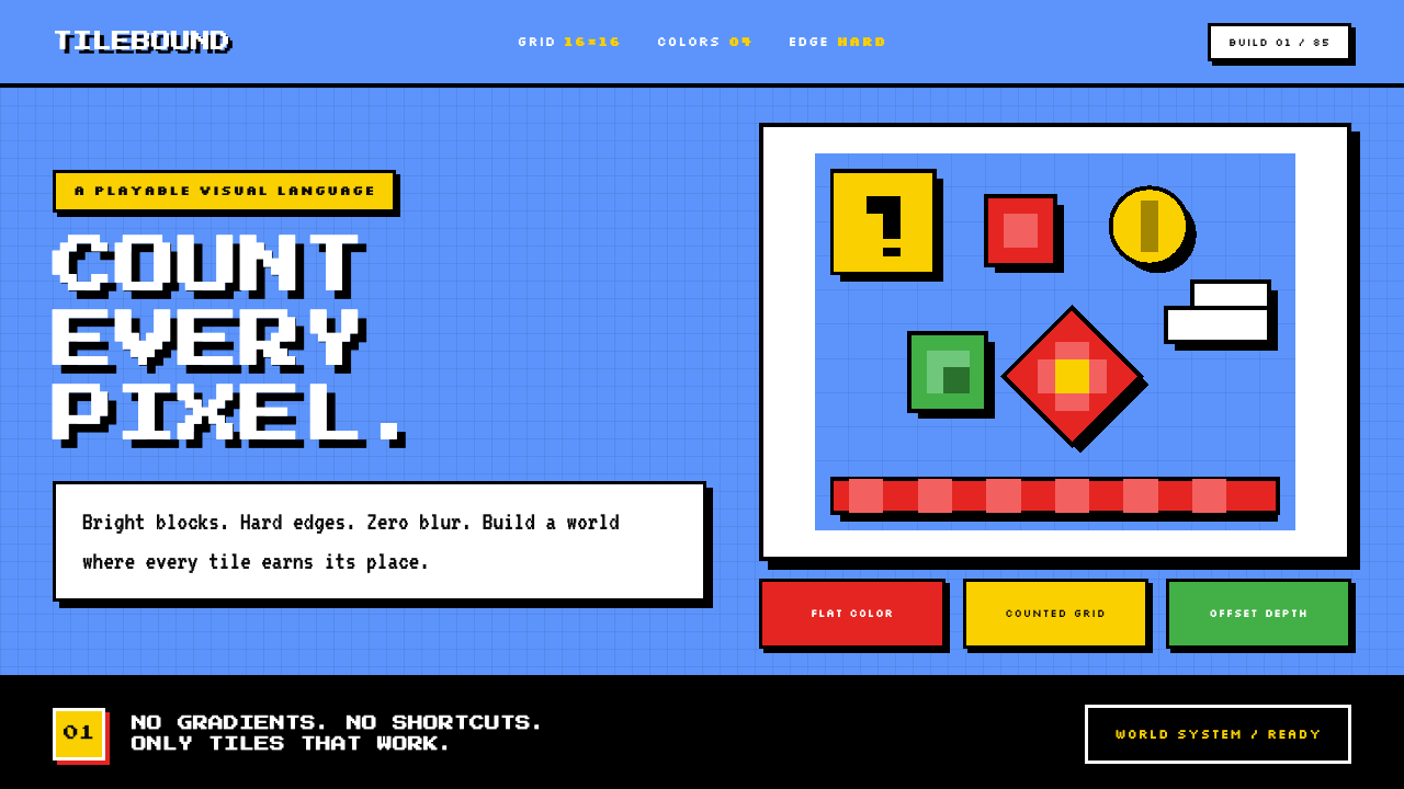
Super Mario Bros turns severe technical limits into a world of immediate clarity: counted pixels, bold silhouettes, and a sky-blue stage where every mark has a job.
Super Mario Bros (1985) in brief
Super Mario Bros is the visual language of the 1985 NES and Famicom release, treated as a reusable design system rather than merely a nostalgic game screen. Its world is assembled from small, repeated tiles aligned to an uncompromising grid. Platforms, clouds, coins, blocks, pipes, and characters all feel constructed rather than painted. The result is legible at a glance because every object is reduced to the minimum arrangement of pixels needed to identify it.
The style is defined by saturated sky blue, compact fields of red, green, gold, white, and earth-like tile colors, and decisive black outlines. There is no softened edge to hide a weak silhouette, no gradient to create atmosphere, and no anti-aliasing to blur the boundary between forms. A character, object, or interface component has to communicate through placement, contrast, and a tightly limited set of colored regions.
What makes this aesthetic enduring is not simply that it looks old. It is an example of visual economy with unusually high consequences: a single tile can establish terrain, a coin can signal reward, and a black contour can keep a moving sprite distinct from a busy background. Recreating the style means preserving that economy. It should feel like a paused frame from World 1-1, with a clear foreground, open sky, floating platforms, and the suggestion that the scene can begin moving again at any moment.
Where does Super Mario Bros (1985) come from?
The reference point is the 1985 NES and Famicom release of Super Mario Bros., developed during 1984 and 1985 in Kyoto, Japan. Its visual identity belongs to the early console era, when a game world had to be readable through a restricted display vocabulary. That constraint is not an incidental technical detail in the style; it is the reason the style has such a strong internal discipline.
Its foundation is 8-bit pixel art. Pixel art here does not mean a generic low-resolution filter applied after the fact. It means designing directly through discrete units, with edges stepping visibly across the grid and each colored area assigned a clear role. The hard grid gives the scene its rhythm. It also makes visual decisions inspectable: viewers can see where an edge begins, where it turns, and which pixels carry the identity of an object.
The second foundation is tile-based game design. Repeated tiles make environments coherent and practical: a platform is part of a system, not an isolated illustration; a block belongs to a family of blocks; clouds and ground share a common visual grammar. This repeatable construction creates the characteristic sense that the landscape is made from rules. A modern interpretation should keep that logic visible rather than disguising it with painterly texture or irregular ornament.
The third foundation is the NES 2C02 PPU color constraint, expressed in the source material as a palette the console could actually render and a disciplined limit on colors within a sprite. The effect is a hierarchy built from necessity. Mario red, Luigi green, coin gold, cloud white, black outlines, and sky blue are not a broad decorative palette. They are working signals. The listed key figures are Shigeru Miyamoto, Takashi Tezuka, Koji Kondo, and Gunpei Yokoi, whose names place this visual system within the Kyoto development context of the original release.
What defines the Super Mario Bros (1985) look?
Hard Pixel Grid
Every form should appear snapped to a visible grid. Curves are built as deliberate steps, corners turn decisively, and alignment is more important than naturalistic smoothness. The grid is not a hidden production aid; it is part of what the viewer is meant to see.
Limited Working Palette
Color is used as a functional vocabulary. Sky blue establishes the stage, red and green distinguish key character signals, gold identifies reward, white opens the scene, and black locks forms into focus. A color should clarify an object, state, or layer rather than merely make the page busier.
Black Contours
Hard black outlines give sprites and tiles their authority. They separate foreground from background, protect small forms from dissolving into adjacent colors, and make the composition readable under movement. The outline should feel structural, never like a delicate decorative stroke.
Tile Logic
Objects belong to repeatable families. Ground, platforms, blocks, pipes, and clouds gain force from consistent construction rules and purposeful repetition. Variation is possible, but it should read as a controlled change within the same system rather than a new illustration style appearing without warning.
Flat Depth
Depth comes from overlap, scale, vertical placement, and contrast, not from realistic lighting. Elements may feel layered because they occupy distinct visual planes, yet they remain flat, graphic, and countable. There is no soft atmospheric transition between those planes.
Immediate Game Signals
The style excels when each motif communicates quickly. A coin reads as value, a platform as support, a pipe as a distinct destination or obstacle, and open sky as traversable space. Interfaces derived from the style should preserve that instant recognition: symbols need clear silhouettes and a single primary job.
Who shaped Super Mario Bros (1985)?
Shigeru Miyamoto is listed among the key figures associated with the Kyoto development context of Super Mario Bros. His name anchors the article’s visual system to the original 1985 release rather than to a later nostalgia imitation.
Takashi Tezuka is named in the supplied key-figure list for the original project. Within this design account, that association matters because the style is understood as part of a specific game-development context, not an anonymous collection of retro motifs.
Koji Kondo is included as a key figure in the source material. The association reinforces that Super Mario Bros. should be approached as a complete 1985 game-world reference, whose visual language is inseparable from its original release context.
Gunpei Yokoi is also listed among the key figures. His inclusion situates the aesthetic within the hardware-conscious culture implied by the NES and Famicom release, where a renderable palette, tiles, sprites, and visual constraints shaped the final look.
How do you use Super Mario Bros (1985) today?
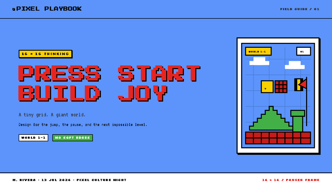
For presentation covers, treat the page as a game scene with one unmistakable visual objective. Set a strong title against an open sky-blue field, place a tile-built platform or block cluster low in the composition, and let a compact character-like silhouette or coin-shaped accent establish the focal point. Keep the empty field genuinely open. The cover should feel playable and directional, not crowded with references.
For content slides, use the tile system to organize information rather than to decorate it. Build section markers, dividers, labels, and containers from a consistent family of pixel-edged units. Headings should be bold and highly distinct from body copy; body text needs generous breathing room so its contemporary readability is not sacrificed to the visual theme. Avoid filling every margin with bricks, clouds, or coins. In this style, repetition only works when it also explains hierarchy.
Data slides can turn the visual grammar into a simple information game. Use a limited set of high-contrast colors consistently for categories, preserve black contouring around small graphical marks, and allow bars, markers, or badges to behave like tiles. Reserve gold-like coin cues for the most valuable metric or positive focal point only when that association is meaningful. The aim is fast scanning, not literal game simulation.
For web interfaces, this language is particularly effective in dashboards, progress views, lightweight tools, pricing comparisons, and product surfaces that benefit from visible states. Build cards, counters, navigation items, and alerts as firm pixel-aligned components with clear boundaries. A sky-blue background can create a memorable stage, but large areas of open color should be balanced with quiet reading surfaces so dense information remains usable. Interaction states should change through obvious color, silhouette, or tile-pattern shifts.
For editorial and marketing work, use the style to make a story feel constructed, energetic, and accessible. An article can use tile-based section markers, pixel illustrations, strong black rules, and broad sky fields to give long-form material rhythm. Marketing pages can frame features as worlds, rewards, or routes, provided those metaphors clarify the offer. The common mistake is mistaking the style for a pile of random retro assets. Blur, glossy effects, excessive colors, mismatched pixel scales, and decorative sprites with no informational job weaken the discipline that makes the original reference convincing.
Super Mario Bros (1985) — FAQ
Is this style just generic retro pixel art?
No. It belongs specifically to the visual logic of Super Mario Bros. on NES and Famicom: tile-based construction, a hard grid, a console-renderable palette, black outlines, saturated sky blue, and disciplined sprite colors. Generic retro imagery may borrow visible pixels while ignoring the system that makes those pixels readable.
Why are black outlines so important?
They preserve recognition. In a small tile-based world, adjacent colors can merge quickly, especially when characters and objects move against patterned terrain. A hard black contour separates layers and gives sprites a stable silhouette. Removing it often makes an imitation feel softer, less game-like, and less immediately readable.
Can gradients or smooth edges be added for a modern interpretation?
They can be added, but they move the work away from the supplied Super Mario Bros. reference. The original system derives its force from hard pixel boundaries, flat color, and countable forms. If modern refinement is needed, improve spacing, hierarchy, and readability around the pixel system instead of softening the pixel system itself.
Does every element need to look like a game sprite?
No. The transferable principle is functional clarity, not constant literal reference. Text, charts, controls, and layouts can remain contemporary as long as their edges, color roles, repeated units, and visual hierarchy follow the tile-based discipline. A restrained system usually feels more authentic than a page crowded with familiar game objects.
Where does this style work poorly?
It is less suitable when a product depends on soft atmosphere, subtle realism, or dense long-form reading without visual interruption. Its high-contrast outlines and game signals can become distracting when every screen requires emotional nuance or quiet concentration. Use it where speed of recognition, playful structure, and a constructed world are useful values, then reduce the visual vocabulary where content needs to recede.
Related design styles
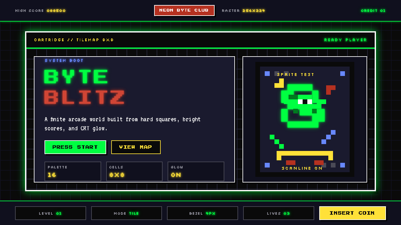 Pixel Art / 8-bit RetroHard-edged digital joy. CRT black, phosphor green, and 8x8 grids snap every p…
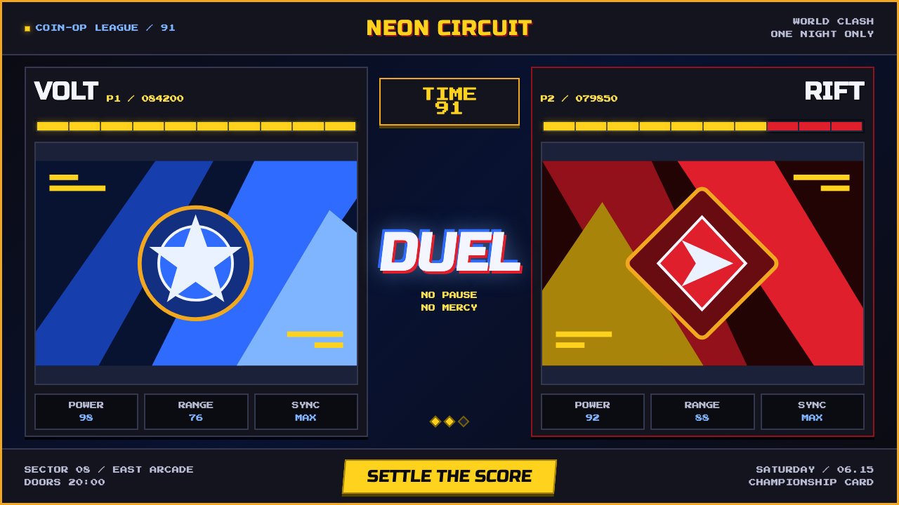 Street Fighter II (1991 Arcade)Pixel muscle hits hard. Hadouken blue, gold HUD bars, and outlined type blaze…
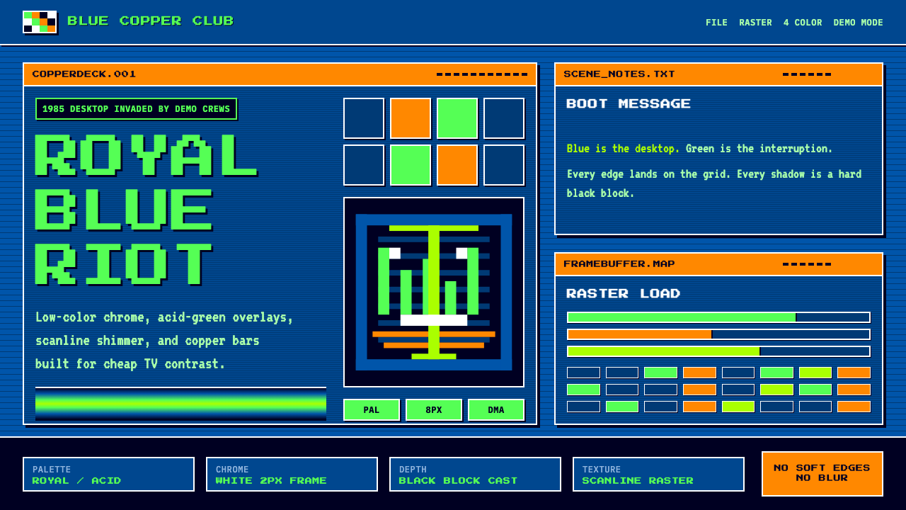 Commodore Amiga WorkbenchBlue desktop gets hijacked. Acid-green bitmap type, white chrome, and copper…
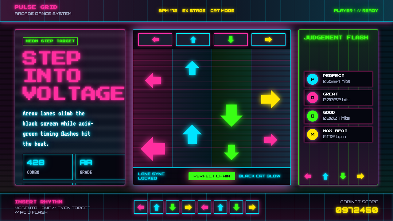 Dance Dance Revolution ArrowsPure arcade voltage. Magenta, cyan, and acid-green arrows climb a black CRT g…
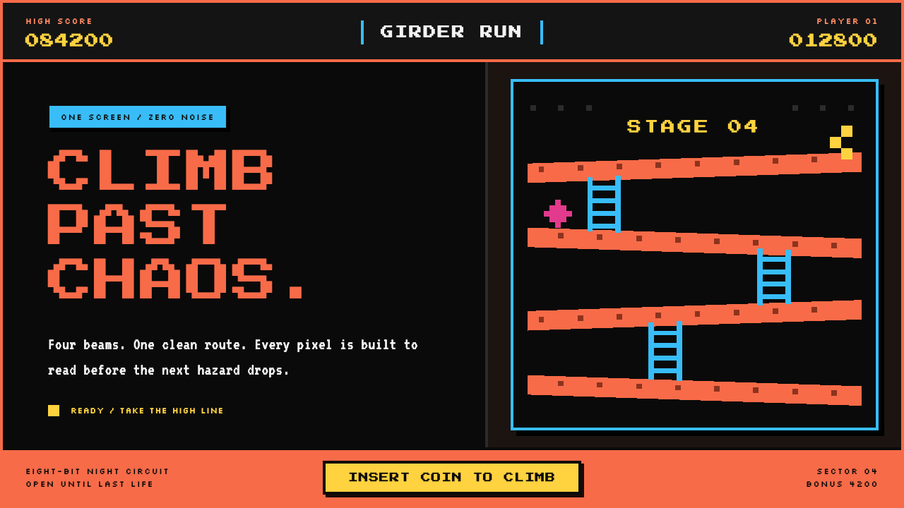 Donkey Kong (1981 Arcade)Built to read through the smoke. Coral girders and cyan ladders cut across a…
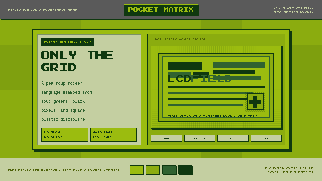 Game Boy DMG Green ScreenOnly the grid remains. Olive LCD tones, pixel type, and hard black borders.