What is Commodore Amiga Workbench?
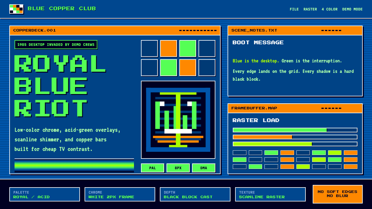
A royal-blue desktop gets hijacked by acid-green bitmap type and shimmering copper bars — the collision of official operating-system chrome and underground cracktro rebellion.
Commodore Amiga Workbench in brief
Commodore Amiga Workbench is a design system drawn from two intertwined visual worlds that emerged from the same 1980s home computer: the official graphical desktop of Commodore's Amiga operating system, built around a strict four-color palette of royal blue, orange, white, and black, and the underground demoscene culture of cracking groups who used that same machine's graphics hardware to produce dazzling, unauthorized intro screens.
The official Workbench interface was engineered specifically for high contrast on cheap consumer television sets, which meant bold, blocky forms and a deliberately limited color count rather than subtle gradation. Out of the same hardware constraints grew the demoscene: bedroom programmers and 'cracking groups' who stripped copy protection from commercial software and appended their own signature intro screens, competing to push the Amiga's custom graphics chips — nicknamed 'Copper' and 'Blitter' — beyond what official software ever attempted.
This design system fuses both worlds deliberately: the blocky, high-contrast panels and chrome of the legitimate operating system, combined with the underground's signature effects — shimmering copper-bar color gradients that cycle and pulse, fine horizontal scanline shimmer, and acid-green bitmap type rendered in the demoscene's beloved Topaz font, all splashed defiantly across the deep royal-blue desktop ground.

Where does Commodore Amiga Workbench come from?
The Commodore Amiga launched in 1985 as one of the most technically advanced home computers of its era, built around custom graphics and sound chips that far outpaced contemporary rivals in color depth, animation capability, and audio synthesis. The system was developed largely under the leadership of chip designer Jay Miner, who had previously worked on the Atari 2600 and brought a similar philosophy of squeezing dramatic capability out of specialized custom hardware rather than relying on the general-purpose processor alone.
Workbench, the Amiga's graphical operating environment, shipped through several major versions — 1.1, 1.2, and 1.3 — between 1985 and 1990, establishing a visual identity built around a strict, high-contrast four-color palette: royal blue as the desktop background, white and black for window chrome and text, and orange reserved for selected or highlighted elements. This restraint was a direct engineering response to the limitations and quirks of consumer television displays common in home computing at the time, where subtler color gradations often failed to render cleanly.
Simultaneously, the Amiga's advanced custom chipset — including the graphics coprocessor nicknamed 'Copper,' capable of changing screen color values mid-scanline to produce smooth gradient bar effects — attracted a global community of hobbyist programmers who formed 'cracking groups,' initially organized to remove copy protection from commercial software for unauthorized distribution. These groups began competing to attach increasingly elaborate, self-authored intro screens — 'cracktros' — to the software they cracked, turning technical demonstration into a competitive art form.
This cracking-group activity evolved by the late 1980s into the broader 'demoscene,' an international subculture of programmers and artists producing real-time audiovisual demonstrations purely to showcase technical and artistic skill, unconnected to any cracked software. Demoscene productions became known for signature visual effects — copper-bar gradients, scrolling bitmap text set in the widely-used Topaz font, and shimmering scanline overlays — executed with an underground, competitive bravado entirely distinct from Commodore's own official, more restrained Workbench interface. The design system draws from both traditions simultaneously, recognizing that the Amiga's visual legacy is inseparably both corporate and countercultural.
What defines the Commodore Amiga Workbench look?
Color
The official palette is a strict four-color system: deep royal blue as the dominant ground, white and black for structure and text, and orange reserved for selection or highlight states. The demoscene layer adds acid-green as a defiant overlay accent, used specifically to signal underground rebellion against the official chrome.
Bitmap Typography
Type is blocky, pixel-based bitmap lettering, most iconically the Topaz font beloved by the demoscene — hard pixel edges with no anti-aliasing, giving letterforms a chunky, unmistakably digital-1980s quality rather than a smooth modern typeface feel.
Copper-Bar Gradients
A signature demoscene effect: horizontal bands of color that shift and cycle in a smooth gradient, technically named after the Amiga's Copper coprocessor. These bars should feel animated and shimmering, cycling through a spectrum rather than sitting static.
Blocky Window Chrome
Panels and windows use hard, rectangular chrome with thick borders and minimal rounding, reflecting the constraints of early graphical operating systems. This blockiness should feel like a genuine early-GUI artifact, not a stylized retro pastiche.
Scanline Shimmer
Fine horizontal scanline texture overlays screens, evoking the CRT display technology of the era. This should be subtle enough not to obscure content but present enough to signal the specific hardware-and-display context the style descends from.
High-Contrast Blocking
Large flat color areas are used with maximum contrast between adjacent blocks, a direct consequence of the era's limited color palette and television display constraints. Subtle gradation is avoided in favor of bold, distinct fields of color.
Countercultural Overlay
The demoscene elements — acid-green type, cycling gradients — should feel deliberately imposed over the official blue-and-orange chrome, like graffiti on a clean wall, rather than blended seamlessly into it. This tension between official and underground is central to the style's identity.

Who shaped Commodore Amiga Workbench?
The lead chip designer behind the Amiga's custom graphics and sound hardware, whose engineering philosophy of extracting dramatic capability from specialized chips rather than the general processor alone enabled both the official Workbench interface and the demoscene effects built on the same hardware.
The engineering and design team at Commodore International, based in West Chester, Pennsylvania, who built the Workbench operating system's strict four-color, high-contrast visual identity engineered specifically for cheap consumer television displays.
International communities of hobbyist programmers who used the Amiga's Copper and Blitter chips to produce competitive intro screens and demos, establishing the copper-bar gradient, scanline shimmer, and Topaz bitmap typography that define the style's underground half.
How do you use Commodore Amiga Workbench today?
Applying this style well starts with holding both halves of its identity in tension — the official blocky blue-and-orange chrome and the underground green-and-gradient rebellion should feel like two forces colliding, not a single homogenized palette.
For presentation slides, the style makes an energetic cover treatment with a copper-bar gradient band animated or implied across the top of the frame, acid-green Topaz-style bitmap title type layered defiantly over a royal-blue ground. Content slides work best as blocky, high-contrast panels with hard rectangular window-chrome borders, keeping data presentation equally blunt — simple bar blocks rather than smooth modern charts.
For web interfaces, the style suits retro-gaming products, developer tools with a nostalgic or countercultural sensibility, and any brand wanting to evoke 1980s home-computing energy — royal-blue backgrounds with white-and-black window chrome for structure, acid-green reserved for interactive highlights or hover states, and copper-bar gradient accents used sparingly for hero moments rather than throughout.
For editorial and marketing contexts, the style rewards a sense of competitive one-upmanship echoing the demoscene's own culture — bold claims set in bitmap type, scanline texture overlaying imagery, and copper-bar gradient dividers between sections rather than plain rules. The tone should feel proud and a little defiant, not polished and corporate.
A common mistake is smoothing the bitmap type into a modern anti-aliased font, which erases the specific 1980s hardware reference the style depends on. Another mistake is blending the green demoscene accent evenly into the blue-orange base palette rather than keeping it visually distinct, which loses the tension between official chrome and underground rebellion that gives the style its energy.

Commodore Amiga Workbench — FAQ
Is this the same as generic 1980s retro or synthwave aesthetics?
No. Synthwave and generic 1980s retro tend toward magenta-and-cyan sunset gradients and glossy chrome typography, evoking Miami and arcade culture broadly. This style is specifically rooted in one machine's actual hardware and software history — the Amiga's four-color Workbench palette and its Copper/Blitter chip capabilities — producing a more blocky, bitmap-specific, and technically grounded aesthetic rather than a generalized retro mood.
Why does the style combine official operating-system chrome with underground demoscene effects?
Because both grew from the same machine and the same era, and their tension is historically real — Commodore's official Workbench interface and the demoscene's unauthorized cracktro screens shared identical hardware but pursued opposite goals: corporate usability versus competitive technical bravado. Combining them captures the full cultural reality of the Amiga rather than sanitizing it into either a corporate-only or underground-only story.
Can this style be simplified to just the blue-orange-white-black palette without the demoscene elements?
Yes, and this would still be historically accurate — it represents the official Workbench desktop on its own. However, doing so loses the energy and rebellious contrast that the acid-green and copper-bar layer contribute, resulting in a calmer, more purely 'operating system' feel rather than the full collision of cultures the complete style captures.
What imagery or motifs pair well with this style?
Pixel art, bitmap icons, floppy disk and CRT monitor imagery, and abstract geometric shapes rendered with hard pixel edges all reinforce the style's identity. Smooth vector illustration or photorealistic imagery works against the grain, since it contradicts the blocky, low-resolution hardware constraints the style is built to evoke.
Does this style suit a modern, high-resolution product, or is it limited to nostalgia projects?
It can suit modern products specifically wanting to signal a developer-culture, gaming, or countercultural sensibility — the blocky bitmap aesthetic reads as a deliberate stylistic choice rather than a technical limitation when applied at high resolution. It struggles in contexts requiring a polished, universally approachable corporate feel, since its entire identity is built around a specific, niche hardware-and-subculture reference.
Related design styles
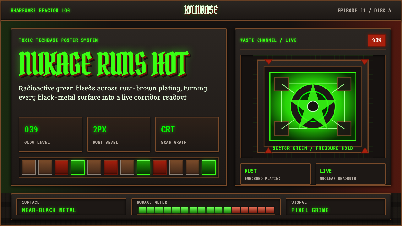 Doom 1993 Toxic GreenRadioactive metal bites. Toxic green readouts glow over rust bevels and CRT g…
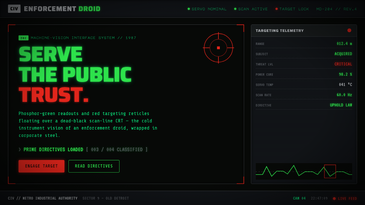 RoboCop (1987)Machine vision as interface. Phosphor-green readouts on dead-black CRT, red r…
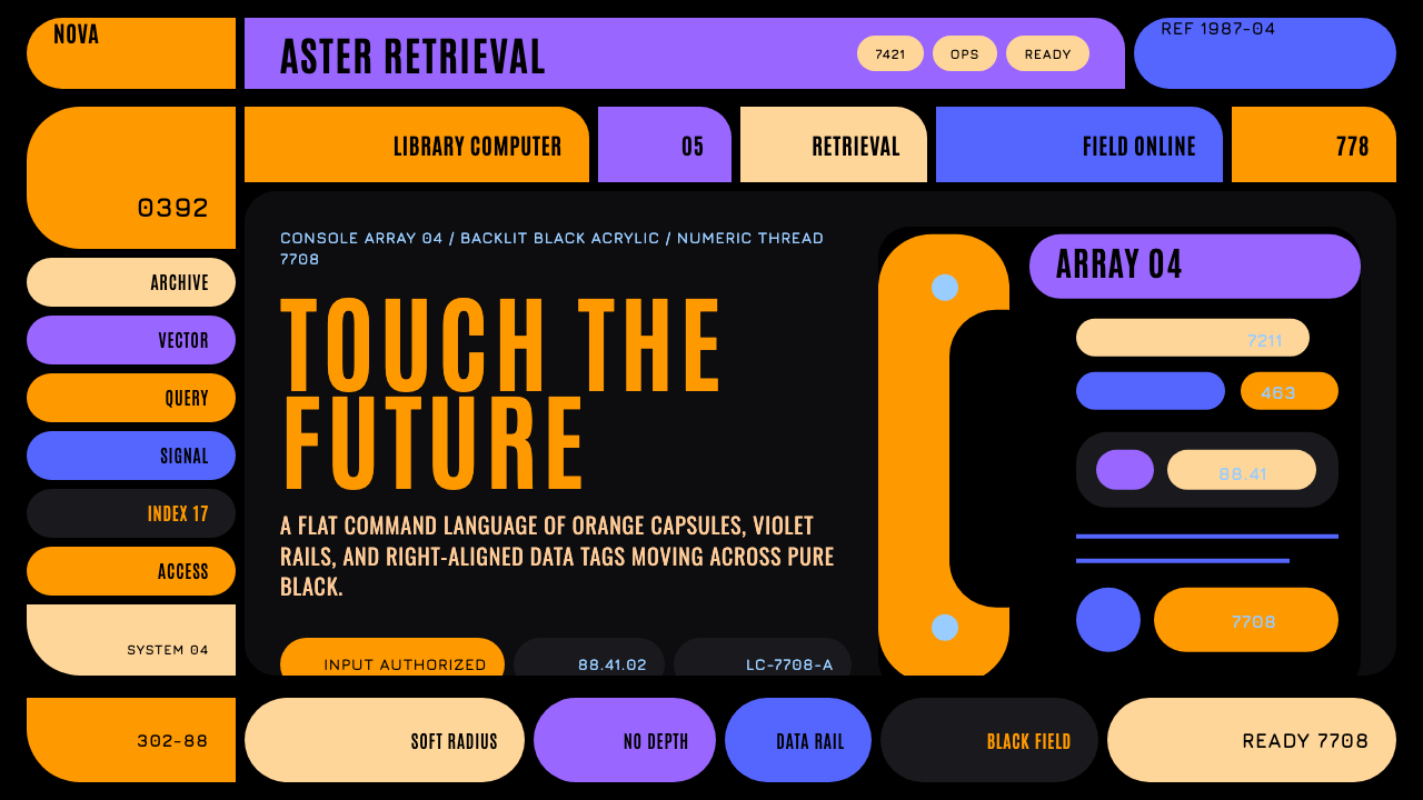 Star Trek LCARSFuture as flat command. Orange-violet elbows and Jura numbers glow on black.
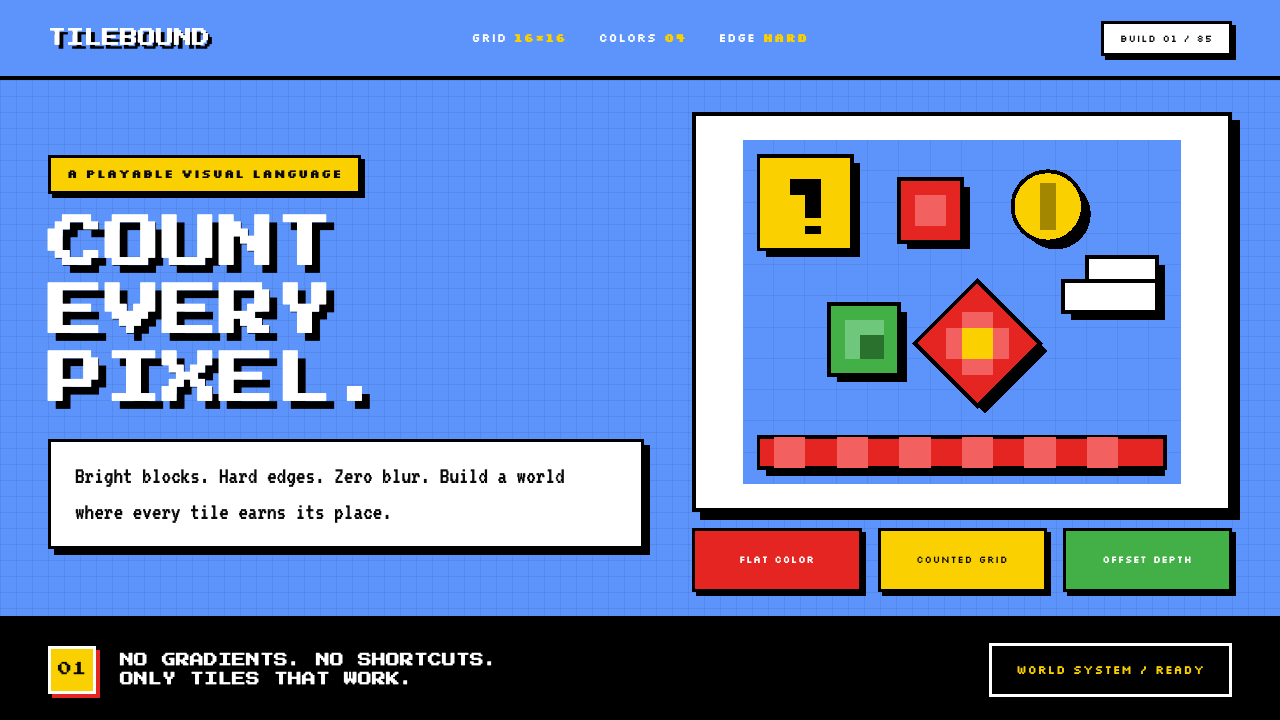 Super Mario Bros (1985)Every pixel earns its place. Sky blue, four-color tiles, and hard black outli…
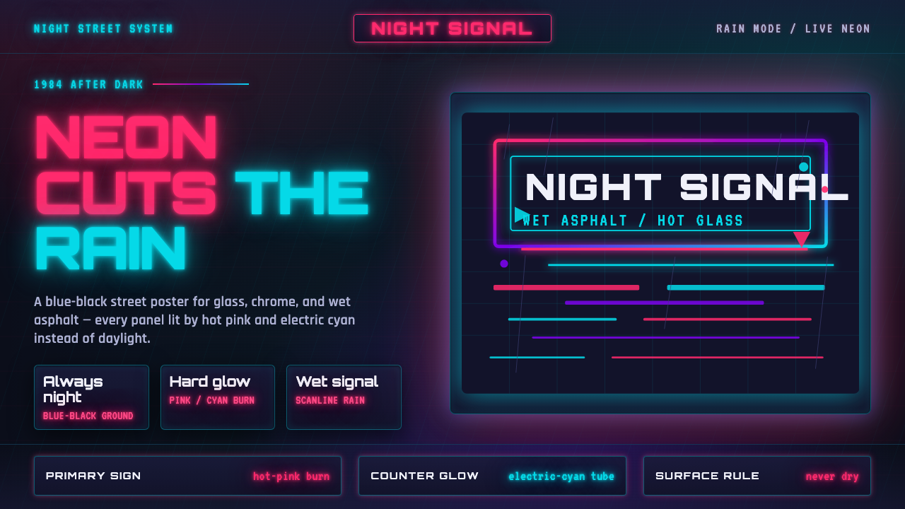 Tech-NoirAlways night. Blue-black asphalt reflects hot pink and electric cyan neon.
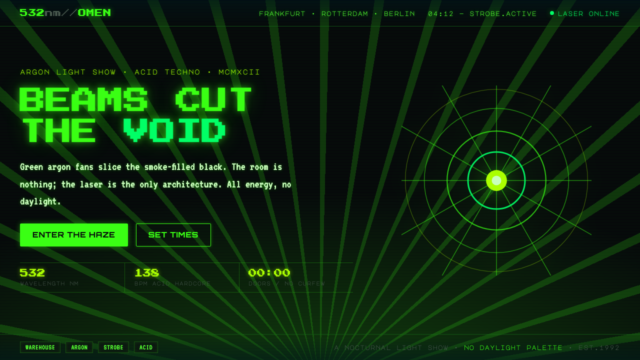 Acid Rave Laser Show 1992Beams cut the void. Argon green on pitch-black smoke, pixel marquee type, add…