What is Game Boy DMG Green Screen?
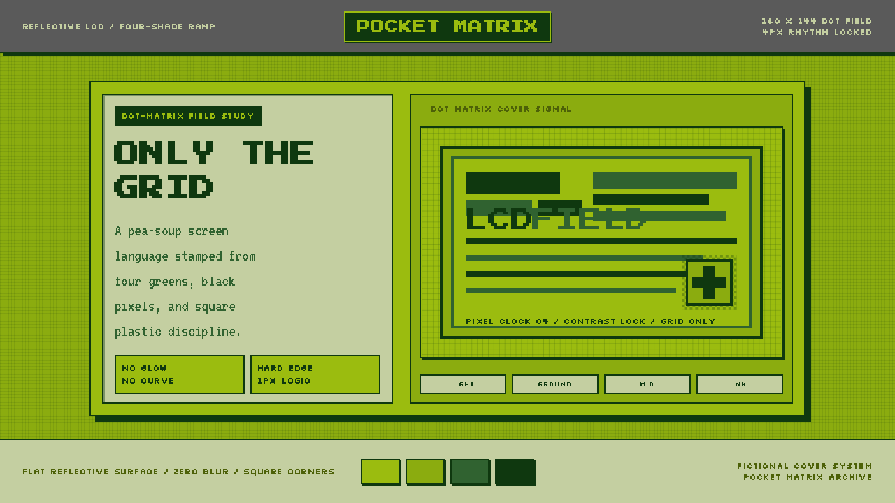
The Game Boy DMG green screen turns technological constraint into atmosphere — muted olive light, stamped dark pixels, and a grid that makes every decision visible.
Game Boy DMG Green Screen in brief
Game Boy DMG Green Screen is an interface style derived from the original Nintendo Game Boy, the DMG-01 released in Japan in April 1989. Its visual identity comes from the handheld's reflective dot-matrix LCD: a muted olive field carrying a tightly limited progression of green tones, with the darkest pixels appearing almost black. The surrounding gray shell belongs to the physical object, but the screen itself supplies the style's essential vocabulary.
The aesthetic is defined by quantization. Color changes in visible steps rather than smooth transitions; letters and icons are assembled from square cells rather than flowing contours; panels terminate in hard borders rather than softened corners. This is not merely retro decoration. The grid governs how information is drawn, spaced, grouped, and emphasized, giving the interface the same sense of finite visual resources as an early handheld game.
Unlike modern dark interfaces, the DMG screen does not suggest emitted light. It depends on the idea of ambient light falling across a reflective surface, so its background feels dusty, subdued, and material rather than luminous. Near-black marks sit on top of that field with the directness of ink. Gradients, glow, translucency, and atmospheric depth would contradict this logic; the style gains character precisely by refusing them.
Where does Game Boy DMG Green Screen come from?
The source object is the Nintendo Game Boy DMG-01, released in Japan in April 1989 during the era of dot-matrix handheld gaming. Developed by Nintendo R&D1 in Kyoto, the machine carried portable games on a reflective LCD set into a gray plastic body. The display did not produce a bright white field. Ambient light revealed a murky olive surface on which darker pixels formed characters, scenery, menus, and motion.
That display technology imposed a compact tonal vocabulary. Images had to be constructed from a small stepped range, so differences in silhouette, density, pattern, and placement mattered more than subtle color variation. A sprite could not depend on a soft shadow or delicate highlight to remain legible. It needed a recognizable outline and deliberate internal marks. The same condition shaped lettering: forms were fitted to the dot matrix, making the underlying cell structure part of their appearance.
Gunpei Yokoi, Satoru Okada, and Nintendo R&D1 are the figures and group identified with the system's origin. Within the supplied history, their relevance is inseparable from the DMG-01 itself: a Kyoto-developed handheld whose screen established a distinctive relationship between hardware constraint and visual expression. The resulting look belongs to the broader culture of bitmapped handheld gaming and pixel-art aesthetics, where individual cells are not concealed but treated as the basic units of representation.
As a contemporary design language, Game Boy DMG Green Screen is an act of distillation rather than a reconstruction of the complete console. It removes the casing, controls, branding, and physical proportions, retaining the olive field, stepped greens, near-black marks, rigid panels, and pixel lettering. What survives is the screen's grammar: finite tones, hard boundaries, visible cells, and a disciplined refusal of effects that the original display could not express.
What defines the Game Boy DMG Green Screen look?
Reflective Olive Field
The background should feel like a physical LCD surface receiving ambient light, not a lamp shining toward the viewer. Its olive cast is muted and slightly murky, never clean white or electric green. This subdued field creates the style's atmosphere and gives dark pixels the appearance of marks resting on material.
Stepped Green Ramp
Color is organized as a short sequence from pale olive through deeper greens to near-black. Each tone has a distinct role, and transitions remain visibly stepped. Midtones can separate secondary information or describe simple image regions, while the darkest tone carries text, outlines, active states, and structural emphasis.
Visible Pixel Grid
Forms acknowledge the square cell as their smallest visual unit. Icons use blocky silhouettes, illustrations rely on clustered pixels, and patterns align to a shared grid. The pixel is not an overlay added to make ordinary graphics look old; it is the construction rule from which every graphic decision follows.
Dot-Matrix Typography
Letterforms appear assembled rather than drawn. Their corners are abrupt, curves become stepped contours, and spacing is regular enough to expose the matrix beneath the text. Headlines can be broad and emblematic, but body copy must remain open and carefully grouped so that pixel texture does not overwhelm reading.
Hard Panels and Borders
Containers are rectangular, firmly outlined, and visually attached to the grid. Borders do real organizational work: they define inventory-like groups, status areas, menus, and data regions. Rounded corners would introduce softness foreign to the display, while delicate hairlines would weaken the stamped, mechanical character.
Flat Symbolic Depth
Depth is expressed through overlap, borders, alternating tones, and pixel patterns rather than atmospheric lighting. A darker block may indicate selection or foreground status, but it does not pretend to cast a natural shadow. Every layer remains legible as a flat arrangement of cells on one display plane.
No Optical Effects
Gradients, glow, blur, transparency, and soft shadows are excluded because they imply continuous light and color. The DMG language instead depends on edges that resolve immediately and tones that change decisively. Its restraint is technological in origin but communicative in effect: the viewer always knows where one region ends and another begins.
Who shaped Game Boy DMG Green Screen?
Gunpei Yokoi is identified in the supplied material as a key figure in the origin of the DMG-01. In the context of this style, his significance rests on the handheld itself and the visual world produced by its reflective display. The design language preserves that relationship between a constrained screen and an immediately recognizable identity.
Satoru Okada is named alongside Yokoi and Nintendo R&D1 in the source history. His place in the theme is therefore tied to the creation of the Kyoto-developed handheld rather than to a separate decorative theory. The screen's olive field, stepped tones, and dot-matrix construction form the enduring visual evidence of that origin.
Nintendo R&D1 is the Kyoto group identified with the DMG-01. For designers, the group's relevant legacy here is a coherent visual condition created by the machine: reflective rather than emissive light, a compact tonal range, and imagery built from an exposed matrix. Those conditions became recognizable enough to function as a complete contemporary style.
How do you use Game Boy DMG Green Screen today?
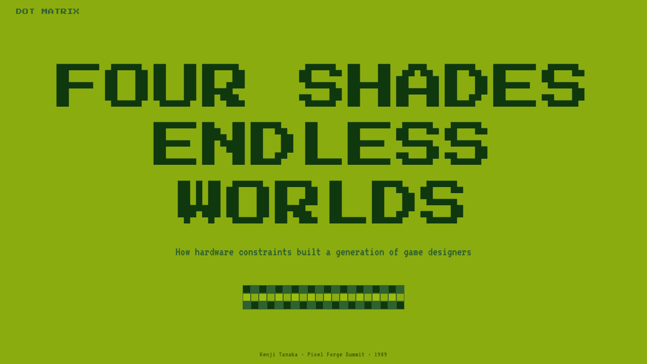
For presentation slides, the style works best when the cover behaves like a title screen. Place a compact pixel headline inside a strong rectangular field, leave a generous area of uninterrupted olive around it, and use one darker tone for a small status line or edition marker. Content slides should resemble organized game menus: bordered sections, short labels, clear selection states, and restrained clusters of body text. The grid should guide alignment without becoming decorative noise.
Data slides benefit from the system's stepped tonal logic. Bars, cells, maps, and progress indicators can move through the green ramp while near-black outlines preserve separation. Patterns made from alternating pixels can distinguish categories when neighboring tones feel too similar. Avoid smoothing chart edges or adding conventional dimensional effects; the data should look plotted directly onto the display matrix, with labels treated as integral screen elements.
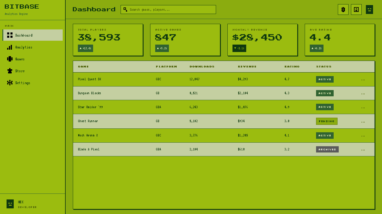
In web interfaces, Game Boy DMG Green Screen suits focused dashboards, system monitors, compact tools, and pricing comparisons that benefit from a deliberate game-like frame. Navigation can use menu rows with a dark block or cursor-like marker for the active item. Cards become hard-bordered modules, tables become cell-based inventories, and alerts become inverted tonal regions. Pricing tiers should be distinguished through borders, patterns, labels, and tonal priority rather than unrelated accent colors.
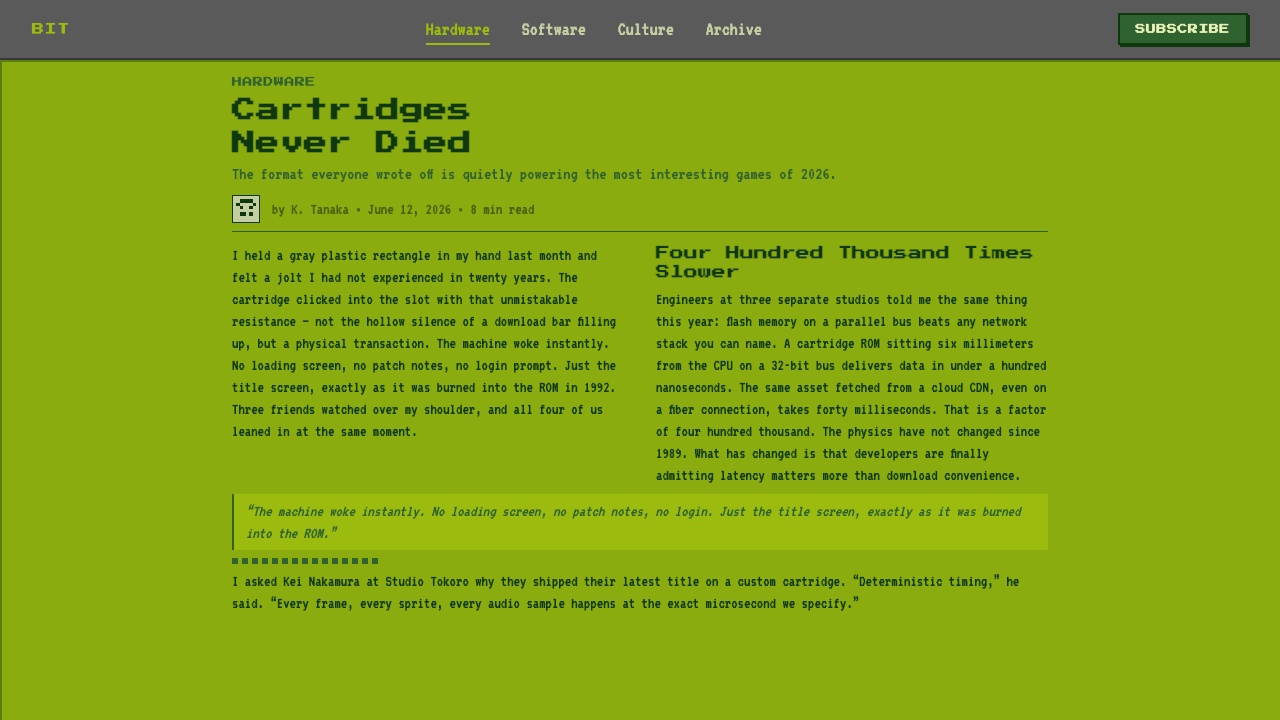
Editorial and marketing applications should use the theme as a framing system, not as a texture pasted over every surface. An article can pair a pixel display headline with calmer, highly readable paragraphs arranged in rigid columns. Pull quotes may appear as dark message boxes, while metadata can resemble a compact status readout. Marketing pages can borrow the rhythm of opening screens and selection menus, using concise commands and sequential panels to lead toward an action.
The most common mistake is confusing pixelation with authenticity. Applying a pixel font to a generic modern layout while retaining soft cards, glowing accents, smooth gradients, and loosely aligned icons produces contradiction rather than DMG character. Another error is making every region equally dense with tiny squares. The original visual logic depends on scarcity: a quiet olive field makes each dark mark matter. Build from the grid, limit the tones, and allow empty screen space to remain visible.
Game Boy DMG Green Screen — FAQ
Is Game Boy DMG Green Screen simply a monochrome style?
Not quite. It uses a narrow family of related greens, but its identity depends on the ordered steps between them and on the olive character of the reflective background. A generic monochrome design might use smooth shading, neutral gray, or luminous contrast. The DMG style requires visibly quantized tones, near-black pixels, and a material-looking field that never behaves like pure white or emitted light.
Why should the background not be bright white?
Because the source display was reflective. Its visible field depended on ambient illumination and retained a muted olive cast instead of becoming a blank white plane. Bright white would erase the material character that separates this theme from ordinary black-and-white pixel art. The subdued ground is not secondary decoration; it is the visual environment in which every darker pixel acquires meaning.
Can the style use photographs or detailed illustrations?
Only after they are translated into the screen's limited language. Continuous tones should become distinct tonal regions or pixel patterns, fine contours should be simplified, and silhouettes should carry most of the recognition. A photograph left smooth and naturalistic will look pasted into the system. An image rebuilt as clustered cells can belong, provided it remains legible without gradients, glow, or subtle color nuance.
How is this different from a generic retro arcade aesthetic?
Generic arcade styling often emphasizes luminous color, dramatic darkness, energetic motion, and the impression of an electronic display glowing in a room. The DMG language is quieter and more tactile. Its olive screen reflects ambient light, its tonal range is tightly related, and its shapes feel stamped into a dot matrix. The mood is portable, contained, and deliberate rather than spectacular.
Where does Game Boy DMG Green Screen work poorly?
It struggles when a product depends on photographic richness, delicate tonal comparison, luxurious softness, or large volumes of uninterrupted reading. The pixel texture and restricted ramp can also reduce clarity if every element is equally compact. The style works best when information can be grouped into short, purposeful modules. If the content requires subtle imagery or extended prose, use the DMG language for framing and hierarchy rather than forcing every detail through the matrix.
Related design styles
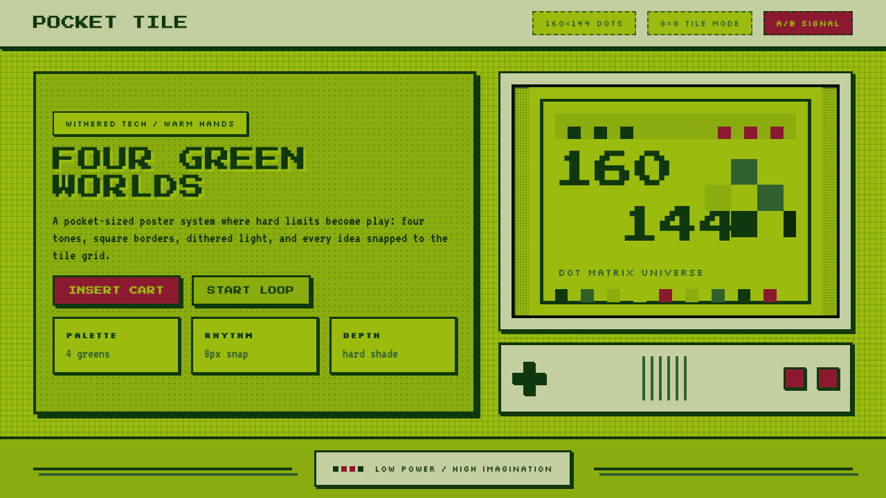 Nintendo Game BoyConstraint becomes play. Four swamp greens, pixel type, and an 8×8 grid do th…
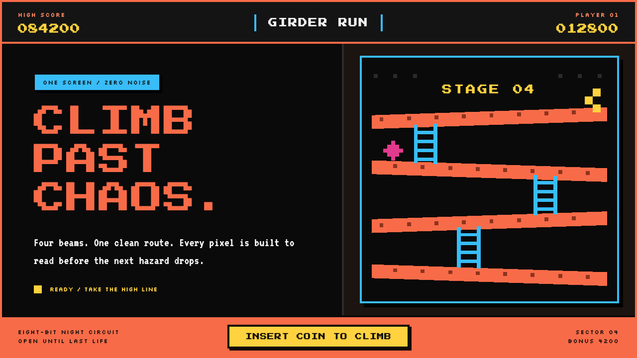 Donkey Kong (1981 Arcade)Built to read through the smoke. Coral girders and cyan ladders cut across a…
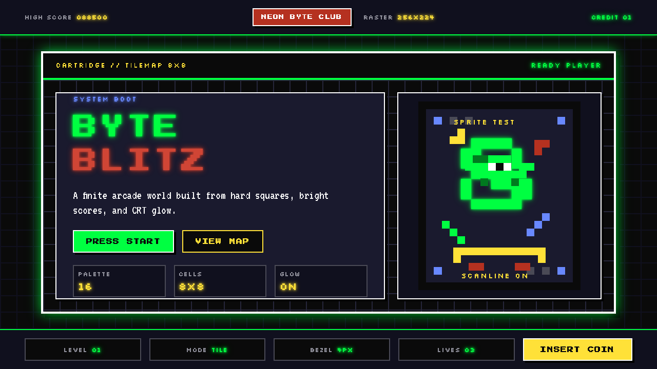 Pixel Art / 8-bit RetroHard-edged digital joy. CRT black, phosphor green, and 8x8 grids snap every p…
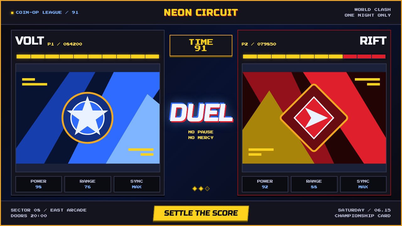 Street Fighter II (1991 Arcade)Pixel muscle hits hard. Hadouken blue, gold HUD bars, and outlined type blaze…
 Super Mario Bros (1985)Every pixel earns its place. Sky blue, four-color tiles, and hard black outli…
 Rubik's Cube (1974)One twist from order. Six pure colors snap into a black-guttered 3×3 grid.