What is Rubik's Cube (1974)?
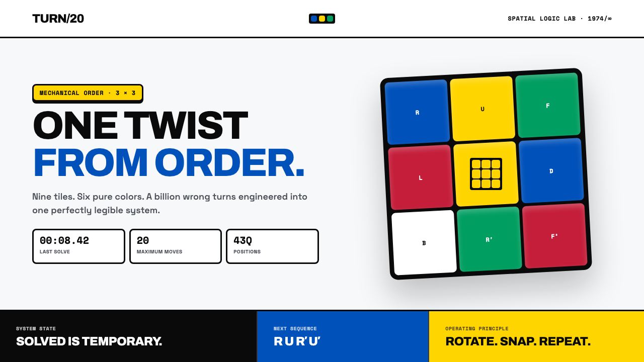
Rubik’s Cube turns pure color, black structure, and mechanical rotation into a visual language that is always one twist away from order.
Rubik's Cube (1974) in brief
Rubik’s Cube is a design language drawn from the object invented in Budapest in 1974 by Hungarian architect Ernő Rubik: a small block that could rotate without coming apart. Its defining image is immediately legible. Glossy colored tiles sit in a strict 3×3 field, separated by dark gutters that make every square distinct. Six saturated colors remain discrete rather than blending into a continuous surface, so the viewer reads both the individual tile and the face it belongs to at the same time.
The style treats the cube as a machine-like toy rather than a soft or whimsical object. A solved face is not merely decorative; it is evidence of alignment. Crisp edges, orthogonal divisions, clear bezels, curved rotation arrows, and stopwatch-like numerals all express a shared idea: motion is possible, but every moving part belongs to a larger system. Disorder is visible because the system is visible.
Visually, the language is clean, glossy, diagrammatic, and highly bounded. It favors cool-white presentation grounds, hard-edged colored planes, dark separations, and direct visual cues for turning, timing, sorting, or solving. It does not depend on blended color, atmospheric depth, or decorative texture. Instead, it creates energy through contrast between fixed geometry and implied rotation: a stable square field interrupted by an arrow, a nearly solved face missing one tile, or a sequence of faces that shows order becoming permutation.
Where does Rubik's Cube (1974) come from?
The origin of the style is inseparable from the object’s 1974 invention in Budapest, Hungary. Ernő Rubik built a small wooden block capable of twisting while remaining intact. That physical premise supplied the visual premise: the cube had to reveal separable parts, yet those parts had to read as one coherent body. The dark channels between tiles therefore matter as much as the colored faces. They make rotation, adjacency, and mechanical assembly understandable at a glance.
The 1980 global launch transformed the puzzle from a local invention into a worldwide visual event. Its strongest visual materials carried the same basic proposition across packaging, photography, instructions, and promotional imagery: saturated color was organized, not expressive in a painterly sense; the grid was strict, not merely decorative; and a turn changed the arrangement without changing the underlying object. The cube’s identity was unusually portable because its form, logic, and color system could be recognized before any explanatory text was read.
The peak craze from 1980 to 1983 established the Cube as a central object of 1980s toy culture. In that setting, its appearance could communicate challenge, collectibility, speed, and mastery with very little additional imagery. A single solved face signaled completion. A scrambled face signaled a problem. A curved arrow made the next action obvious. The visual language therefore developed around states and transitions rather than around illustration: order, scramble, turn, sequence, and solve.
The speedcubing revival from 2003 to the present keeps the system active as a language of combinatorial recreation. In this contemporary context, the Cube’s visual vocabulary naturally expands toward timing displays, move notation, face diagrams, progress indicators, and high-clarity instructional layouts. Yet the central principle remains unchanged from the original object: each tile is part of a face, each face belongs to a rotating whole, and apparent complexity can be made legible through disciplined structure.
What defines the Rubik's Cube (1974) look?
Six Discrete Colors
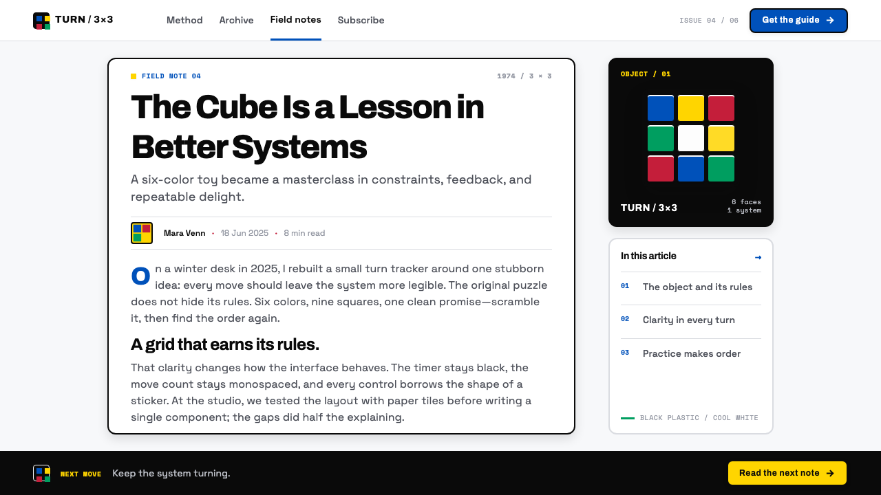
Color is saturated, glossy, and categorical. Each hue belongs to a tile rather than diffusing across a background, so color functions as a marker of position, face identity, and state. The important quality is separation: adjacent colors meet cleanly, never fading into one another. A composition should feel assembled from distinct pieces whose relationships can be inspected immediately.
Black Gutters
Dark gutters are the structural voice of the style. They separate tiles, preserve legibility under intense color, and make the face read as an engineered grid rather than a patchwork. These divisions should be crisp and consistent, creating a visible framework that can survive scrambling, rotation, cropping, and close inspection.
Orthogonal Faces
Squares are not generic containers here; they are faces of a rotating object. Their alignment creates the satisfying visual condition of a solved side, while misalignment communicates permutation and challenge. Layouts should favor direct horizontal and vertical relationships, straight-edged modules, and compositions that make every element appear to occupy an intelligible position.
Glossy Mechanical Surface
The reference surface is glossy plastic photographed with hard clarity on a cool-white seamless ground. It suggests a toy made with mechanical precision: clean, durable, tactile, and manufactured. Highlights may clarify the surface, but they should never turn into misty atmosphere or obscure the crispness of the colored planes.
Rotation Cues
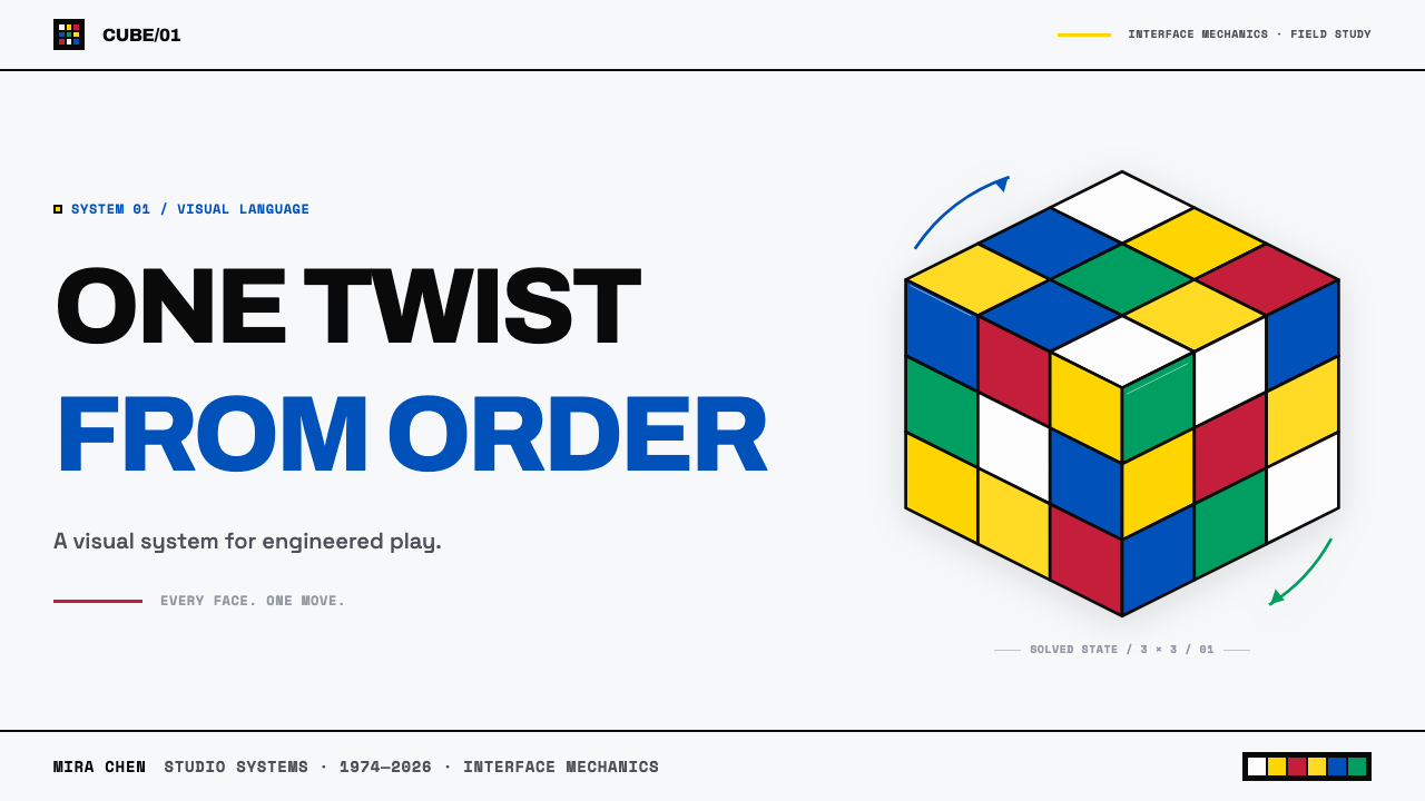
Curved arrows are the natural motion graphic of the Cube language. They should wrap around a face or edge with enough clarity to show direction, not float as generic decoration. A rotation cue is most convincing when it links a stable face to an imminent change, making the viewer sense that the object can move while its system remains intact.
Timed Precision
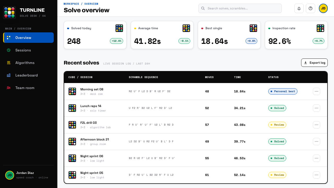
Monospace stopwatch numerals fit the style because they turn completion into a measurable event. They introduce the speedcubing association without requiring visual clutter: a clean timer, move sequence, or compact result marker can sit beside the grid as evidence of process. The tone is exact and energetic, never luxurious or nostalgic.
Who shaped Rubik's Cube (1974)?
Rubik is the Hungarian architect identified in the source material as the inventor of the Cube in Budapest in 1974. His small wooden block established the central condition behind the visual language: a form that twists while remaining whole. Everything stylistically distinctive about the Cube follows from that visible relationship between independent parts and coherent structure.
Tibor Laczi is identified in the source material as one of the key figures associated with the Cube’s origin landscape. Within this educational account, the name belongs alongside the shift from invention toward the 1980 global launch and the wider public life of the puzzle.
Tom Kremer is identified in the source material as a key figure in the Cube’s historical landscape. His inclusion places the object not only within mechanical puzzle design, but also within the global toy culture that made the Cube’s colors, grid, and turning logic familiar far beyond its original setting.
Jessica Fridrich is identified in the source material as a key figure associated with the Cube and its speedcubing community. Her inclusion connects the object’s visual system to its later life as a practice of speed, sequencing, notation, and repeatable problem solving during the revival from 2003 to the present.
How do you use Rubik's Cube (1974) today?
For presentation covers, build around the tension between one stable face and one implied turn. Place a dominant solved or nearly solved grid against a cool-white field, then let a concise title and a curved rotation cue establish the topic. The composition should have the certainty of an object photographed in a studio: colored squares are the focal event, dark separations hold them together, and surrounding space is deliberately quiet. Avoid filling every area with tiles; a Cube-derived cover needs room for the mechanism to read.
For content slides, use the grid as an organizational model rather than as a literal repeating decoration. Divide information into clear modules, give each module an assigned color role, and use dark rules to make boundaries explicit. Headings can behave like face labels, while short explanatory text occupies stable cells beside diagrams or process steps. For data slides, the style is especially effective when values are presented as ordered states: categories can become colored tiles, progress can move from scrambled to aligned, and timing information can use stopwatch-like numeral treatment.
For web interfaces, the style works best in dashboards, challenge trackers, learning tools, configurators, and pricing pages where users benefit from immediate state recognition. Use a light, cool field to keep the interface open; reserve saturated colors for categories, statuses, and actions; and use dark borders or gutters to separate interactive modules. A pricing page can treat each plan as a face within a larger system, making comparison feel structured instead of ornamental. A dashboard can use grids and face-like modules to show what is complete, what is in motion, and what remains unresolved.
For editorial and marketing work, lean into the Cube’s unusual ability to make abstraction feel tactile. An article can open with a large square field, then use diagrams, arrows, numbered sequences, and cropped face details to guide the reader through an idea. Marketing should emphasize transformation rather than generic excitement: show a state before a turn, the turning action, and the ordered result after it. This makes the visual system useful for campaigns about systems, learning, organization, speed, logic, and visible progress.
The common mistake is to treat Rubik’s Cube style as a random rainbow grid. That loses the object’s central discipline. Colors need distinct roles, tiles need visible separation, and any arrow or timer must explain motion or process. Another mistake is making every component glossy, colorful, and equally prominent; the result becomes toy-like without becoming Cube-like. The strongest applications preserve the contrast between a restrained presentation field and a tightly organized core of color, structure, and possible rotation.
Rubik's Cube (1974) — FAQ
Is Rubik’s Cube style only appropriate for children’s products?
No. The Cube comes from toy culture, but its strongest design qualities are structural: immediate state recognition, clear modular boundaries, visible sequence, and the relationship between complexity and order. Those qualities suit educational products, analytical dashboards, learning systems, challenge-based experiences, and pricing or comparison pages. It becomes childish only when every element is treated as decorative play rather than as part of an understandable mechanism.
How should color be used without making the layout feel chaotic?
Treat color as a system of assignment. A color should identify a tile, category, state, or face, then retain that meaning throughout the composition. Keep the surrounding field restrained and let dark gutters perform the separating work. The visual goal is not to display every available color in every section; it is to make the viewer understand why each colored element occupies its particular place.
Can the style use photography?
Yes, especially product photography that preserves the Cube’s hard-edged, studio-like clarity. A solved cube on a cool-white seamless ground is the most direct photographic expression of the style. Photography should make the grid, glossy tiles, dark bezels, and physical rotation legible. Busy scenes, soft atmosphere, or colors that blend into the environment weaken the central relationship between discrete parts and visible order.
Why are curved rotation arrows more appropriate than generic motion effects?
Because the Cube’s motion has a specific mechanical meaning. A curved arrow can show which face turns, around which edge the action is understood, and how a stable arrangement becomes another arrangement. Generic motion effects may add energy, but they do not explain the object’s logic. Rotation arrows turn movement into instruction, which keeps the style connected to solving rather than mere spectacle.
Where does Rubik’s Cube style struggle?
It struggles where the main need is softness, ambiguity, organic texture, or quiet emotional warmth. The language is built on crisp boundaries, saturated categories, mechanical precision, and the promise that a problem has an intelligible structure. If a product needs to feel atmospheric, handmade, natural, or deliberately open-ended, the Cube’s black-guttered order can feel too insistent. Its best use comes when the product genuinely benefits from clarity, process, and visible transformation.
Related design styles
 Donkey Kong (1981 Arcade)Built to read through the smoke. Coral girders and cyan ladders cut across a…
 Mountain Dew Citrus GreenDo the Dew, loud. Electric lime glows off a near-black can field, slashed by…
 Radioactive Trefoil SignToxic-barrel glow, not the official sign. Neon-green trefoils on matte-black…
 Super Mario Bros (1985)Every pixel earns its place. Sky blue, four-color tiles, and hard black outli…
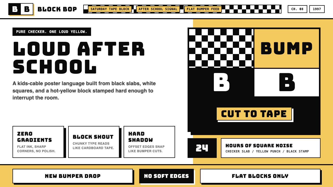 Cartoon Network 90s BlocksKids-cable noise, squared. Black-white checkerboards crash into hot-yellow Bu…
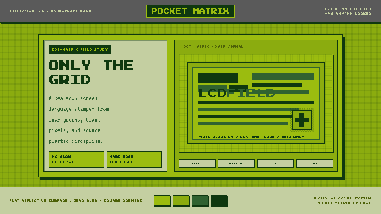 Game Boy DMG Green ScreenOnly the grid remains. Olive LCD tones, pixel type, and hard black borders.