What is Mountain Dew Citrus Green?
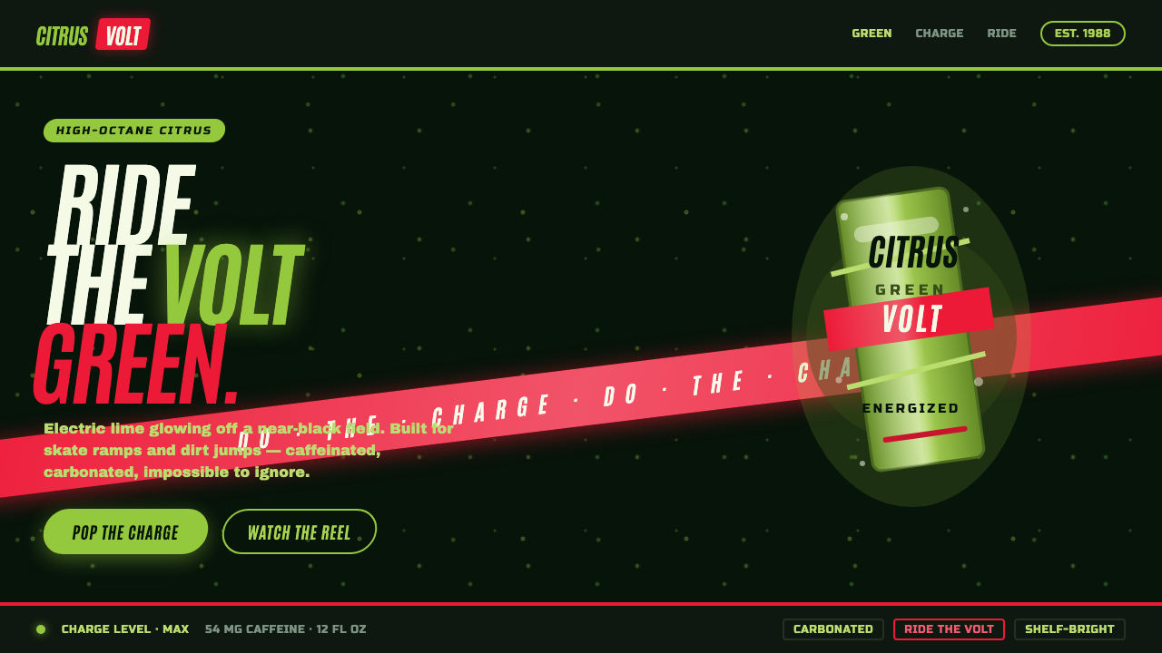
Mountain Dew Citrus Green turns a soda can into an adrenaline signal: electric lime bursting from near-black, cut through by a red DEW swoosh and a spray of fizz.
Mountain Dew Citrus Green in brief
Mountain Dew Citrus Green is a dark, carbonated brand aesthetic built around electric yellow-green liquid, a red DEW swoosh, and a near-black field that makes the lime appear to glow. It takes the soda aisle as its natural visual environment: bright under retail lighting, immediately legible at a glance, and designed to interrupt calmer packaging around it. The result is not refined refreshment. It is caffeinated visual impact.
Its character comes from collision. Saturated citrus green meets red in a deliberately confrontational pairing, while the dark background supplies contrast rather than quiet. Fizz speckle, sharp slashes, and an italic logotype create the sense that the surface is under pressure. The design should feel carbonated even when viewed as a flat graphic: compressed energy waiting to break loose.
The style carries the late-1980s through 1990s soda vocabulary into any surface that needs speed, youth, and immediate recognition. Its voice is “Do the Dew”: loud rather than tasteful, kinetic rather than composed, and aimed at skateboards and BMX rather than boardrooms. Muted palettes, handmade restraint, and craft-product softness run directly against its premise.
Where does Mountain Dew Citrus Green come from?
Mountain Dew Citrus Green belongs to the period from 1988 through 2005, spanning the late-1980s reformulation and the extreme-sports-focused “Do the Dew” era. Its setting is North American soda branding, where a package has to communicate from a crowded shelf and where color, logotype, and can field operate as a single high-speed message. The citrus green is not a decorative accent added after the fact; it is the central recognition device around which the darker field and red mark are organized.
PepsiCo and Mountain Dew brand marketing established the commercial frame for this language. The visual system presents a caffeinated, high-octane personality rather than a restrained beverage identity. Its red swoosh does more than identify the word DEW: it introduces directional force across the surface. Against electric lime, that sweep makes the logo feel fast, competitive, and slightly unstable in a purposeful way.
The “Do the Dew” campaign gave the style its cultural posture. Extreme-sports advertising supplied a world of acceleration, airborne movement, abrasion, and public visibility, making the package read less like a label and more like equipment for an active scene. The style therefore depends on excess that remains organized: fizz may scatter, green may flare, and forms may slash diagonally, but the central citrus signal and DEW mark must remain unmistakable.
This is also a 1990s logotype design language. Italic energy is essential because it makes words appear to lean into motion rather than sit passively on a field. The near-black ground performs an equally important role: it gives the bright elements a visual stage and stops the whole composition from becoming uniformly loud. The contrast is the system’s engine—dark containment, lime release, and red interruption.
What defines the Mountain Dew Citrus Green look?
Electric Citrus Color
Electric yellow-green is the dominant sensation, treated as illuminated liquid rather than a calm brand color. It should appear highly charged against a dark field, with enough clear surrounding contrast to read as a burst. The green carries the flavor signal, the caffeine-like intensity, and the shelf-stopping force of the entire composition.
Near-Black Can Field
The dark ground is active containment, not minimalist emptiness. It makes lime appear brighter, gives red a sharper cut, and recalls the visual mass of a can rather than an airy editorial page. Large uninterrupted dark areas are useful because they let the bright graphics hit with greater force when they arrive.
Red DEW Swoosh
Red functions as a slash of motion across the citrus field. It should feel swept, italic, and decisive rather than decorative or friendly. The red mark creates a directional counterforce to the green glow, giving the composition a competitive, high-speed edge and keeping the identity from becoming merely flavor-led.
Carbonated Texture
Fizz speckle and scattered fragments translate carbonation into graphics. These marks should suggest bubbles breaking and energy dispersing, not paper grain, dust, or handmade texture. Their role is to activate otherwise flat areas and to make the surface feel pressurized, supermarket-bright, and freshly opened.
Italic Velocity
Typography and wordmark treatment should lean forward. Italic forms, oblique cuts, and diagonal trajectories make the identity feel as if it is moving through the frame. Centered, static, conventionally calm type weakens the effect; this style needs visual momentum even when no literal action scene is present.
Retail-Scale Loudness
The aesthetic is designed to be noticed quickly and from a distance. Contrast must remain simple enough to survive a crowded commercial environment: dark field, citrus burst, red interruption, readable wordmark. It is not a subtle reward for close inspection. Its first job is recognition, and its second is to make recognition feel exciting.
Who shaped Mountain Dew Citrus Green?
PepsiCo provides the corporate context for Mountain Dew Citrus Green. Within this style, its importance is the construction of a beverage identity that reads as high-octane and mass-visible: a dark can field, electric citrus signal, red DEW motion, and an attitude built for immediate recognition rather than quiet sophistication.
Mountain Dew brand marketing defines the visual voice as loud, caffeinated, and kinetic. It turns packaging cues into a larger personality system: lime is not simply flavor, fizz is not incidental texture, and the italic mark is not merely a logo treatment. Together they present a brand built to feel active before the product is opened.
The “Do the Dew” campaign supplies the style’s extreme-sports posture. Its significance is not a separate decorative motif but a behavioral frame for every visual decision: surfaces should feel made for skateboards and BMX, with speed, visibility, abrasion, and bold public energy taking precedence over corporate polish.
How do you use Mountain Dew Citrus Green today?
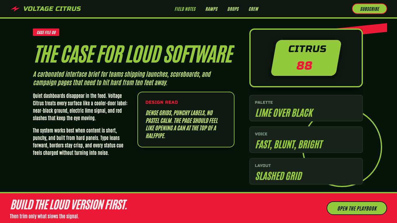
For presentation covers, use the near-black field as a stage and let an electric citrus shape, word, or burst establish the first impression. A red diagonal intervention can carry the title area or cut across the composition, while fizz fragments create controlled pressure around the focal point. Content slides need more restraint than covers: retain the dark-and-lime hierarchy, but give explanatory text calm zones so the energy remains legible rather than exhausting.
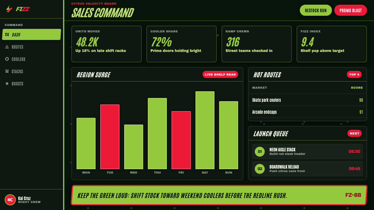
Data slides can borrow the style’s contrast without turning every chart into decoration. Keep the dark ground as the organizing field, use citrus green for the main signal, and reserve red for a competing, urgent, or exceptional reading. Graphic elements should retain the sharpness of the brand language, while labels remain clear and stable enough to support actual comparison. Carbonation texture belongs at the edges, not over values that need to be read.
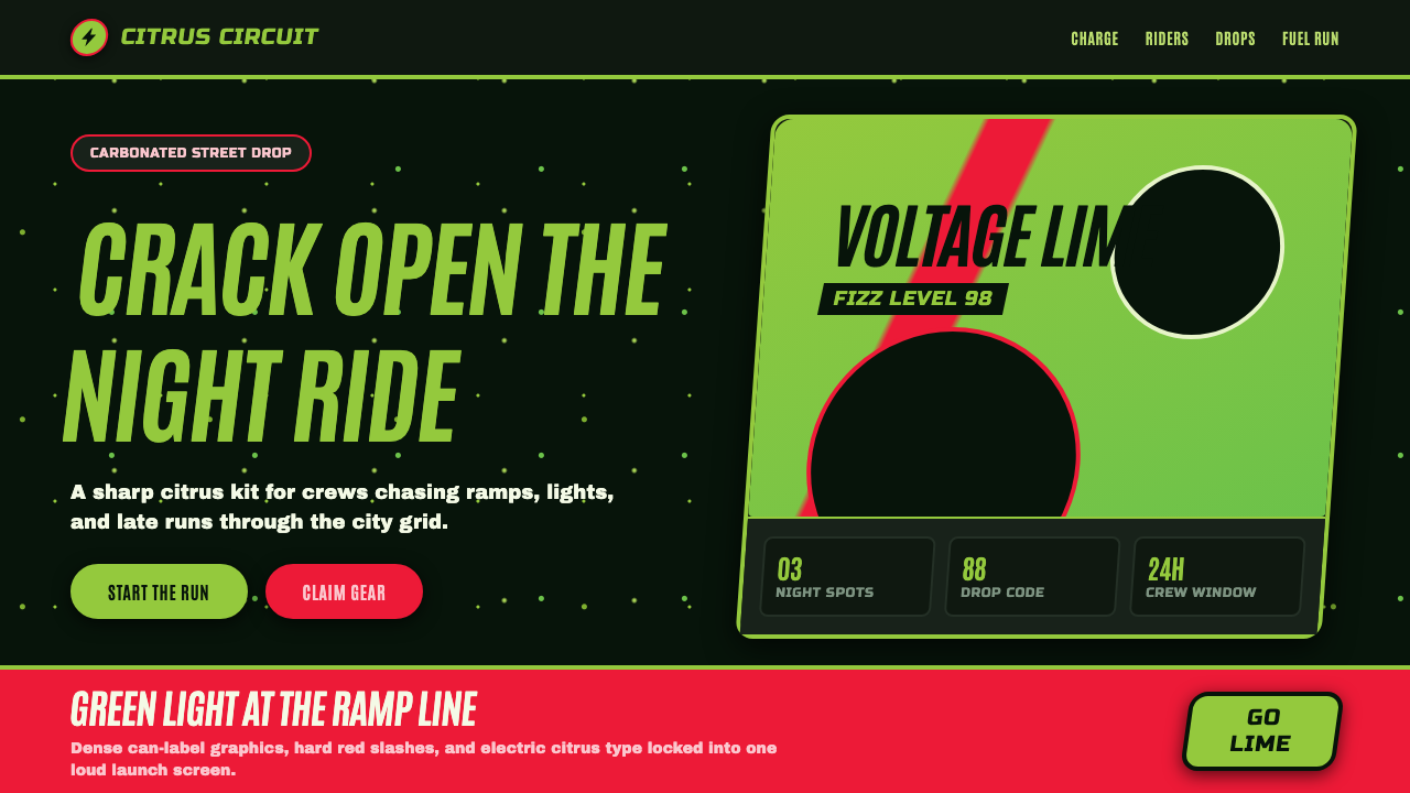
For web interfaces, the style is strongest in dashboards, campaign pages, product launches, and pricing experiences aimed at an energetic audience. Dark panels can frame bright actions, status moments, or featured options; citrus green should mark the most important path rather than every available control. A red swoosh-like directional gesture can help introduce a hero area or promotion, but functional navigation still needs a reliable reading order beneath the visual excitement.
For editorial and marketing work, treat the system like a high-impact sports poster rather than a craft beverage label. Use sharp image crops, fizz fragments, tilted headline energy, and strong dark negative space to create a sense of acceleration. The common mistake is to make every element lime, red, tilted, and speckled at once. That produces noise, not carbonated force. Let the dark field create pauses, choose a clear primary signal, and use the remaining effects as interruptions with a job to do.
Mountain Dew Citrus Green — FAQ
Is Mountain Dew Citrus Green just a neon-green color palette?
No. The citrus green is essential, but the aesthetic depends on its relationship to a near-black can field, a red DEW swoosh, carbonation speckle, and italic motion. Green used alone can read as generic energy branding. The full system makes it feel specifically carbonated, loud, and built for immediate shelf recognition.
Why is the background so dark if the style is meant to be loud?
Because loudness requires contrast and containment. The near-black field gives the lime somewhere to flare and lets the red swoosh cut through with authority. If the entire surface is bright, the citrus signal loses its special intensity. The dark ground is what makes the other elements feel electrically charged.
Can this style work for a serious dashboard or pricing page?
Yes, when the product genuinely benefits from speed, activation, and competitive energy. Use the visual language to establish hierarchy, featured actions, and exceptional states, then protect reading areas for tables, labels, and decisions. It is less suitable when the product needs calm reassurance, quiet luxury, or a handmade sense of care.
What is the most common mistake when applying the style?
Treating intensity as a substitute for structure. Adding lime, red, bubbles, diagonals, and italic type everywhere makes the result busy but not energetic. Authentic use assigns each device a role: dark space contains, citrus signals, red redirects attention, and fizz activates selected moments. The tension comes from their controlled clash.
Related design styles
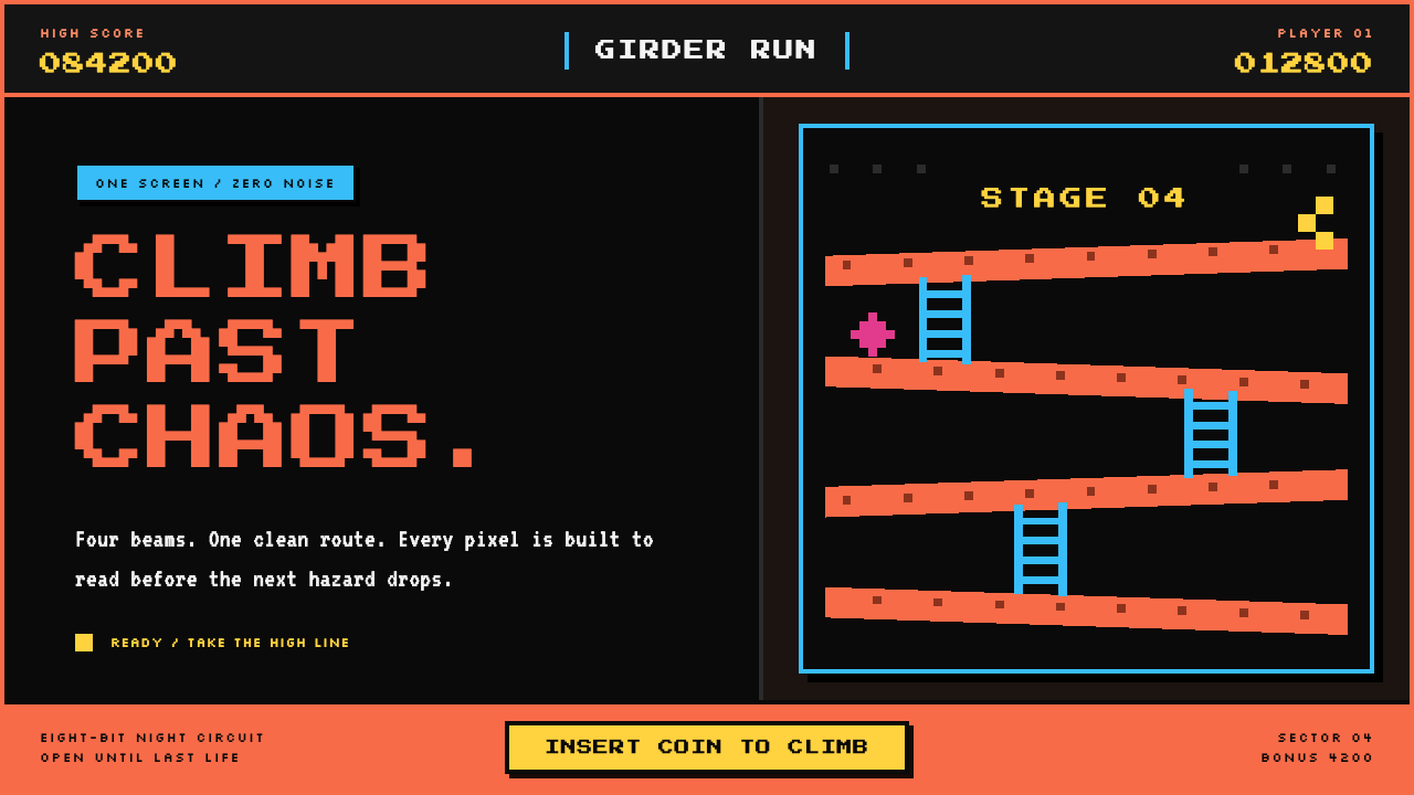 Donkey Kong (1981 Arcade)Built to read through the smoke. Coral girders and cyan ladders cut across a…
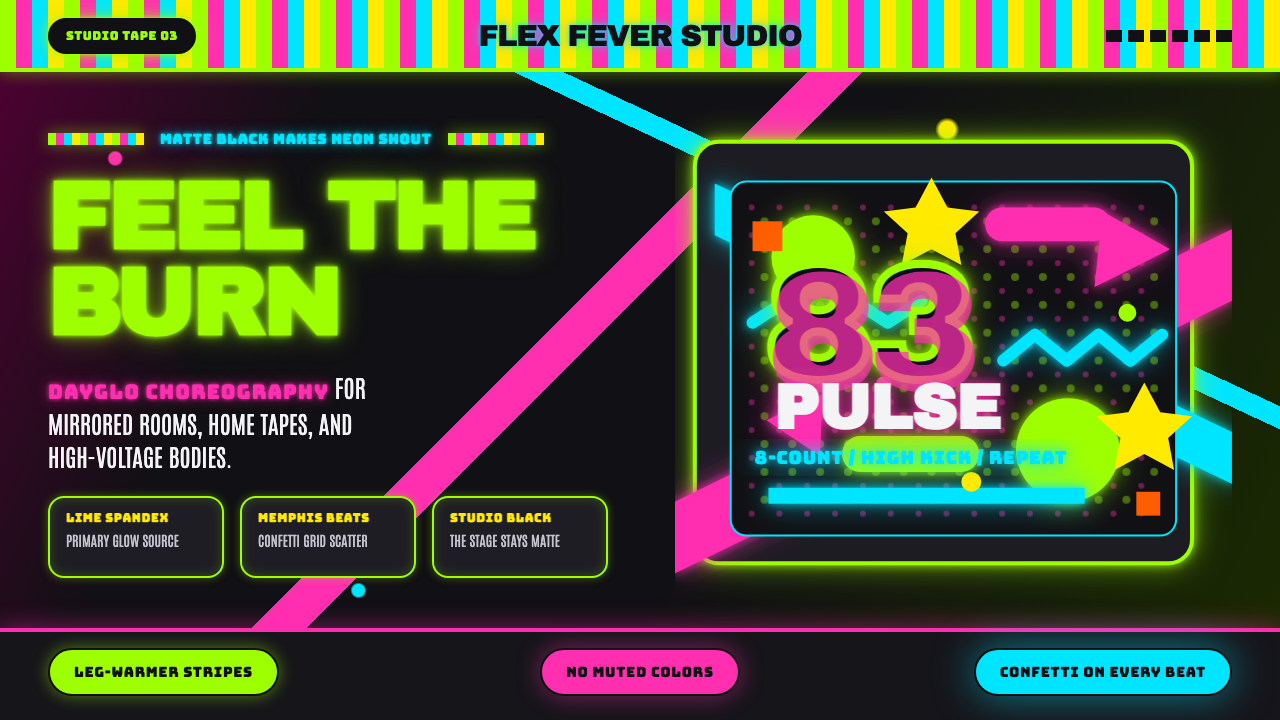 80s Aerobics Fluoro SpandexNeon refuses restraint. Lime spandex, pink-cyan confetti, and black-stage typ…
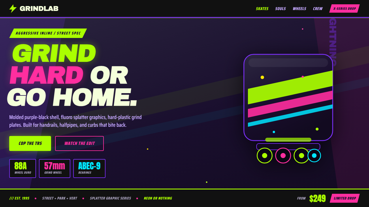 90s Aggressive Inline SkateX-Games attitude in plastic and paint. Fluoro lime and magenta slash across m…
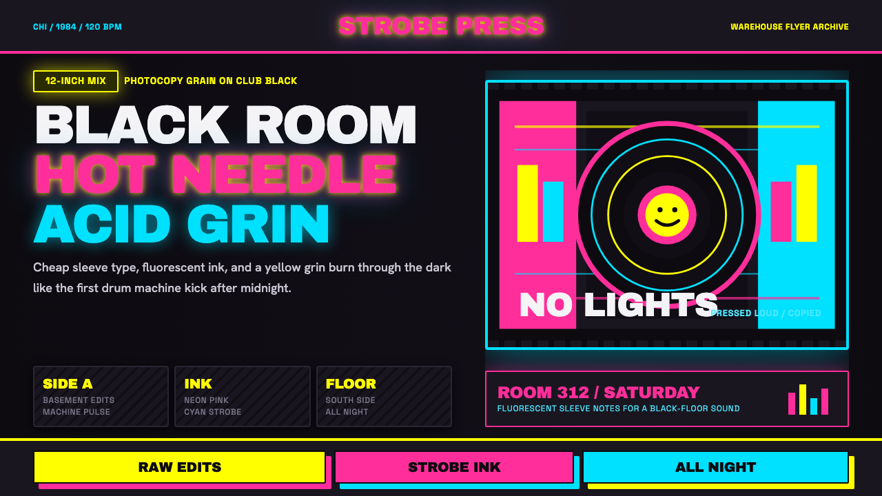 Chicago HouseDarkness starts the track. Neon pink, yellow and cyan hit black like Xerox st…
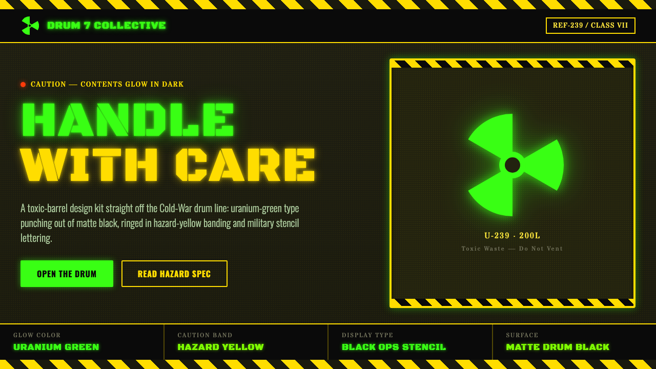 Radioactive Trefoil SignToxic-barrel glow, not the official sign. Neon-green trefoils on matte-black…
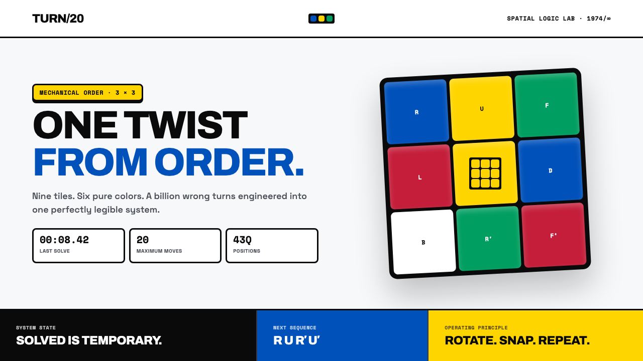 Rubik's Cube (1974)One twist from order. Six pure colors snap into a black-guttered 3×3 grid.