What is Radioactive Trefoil Sign?
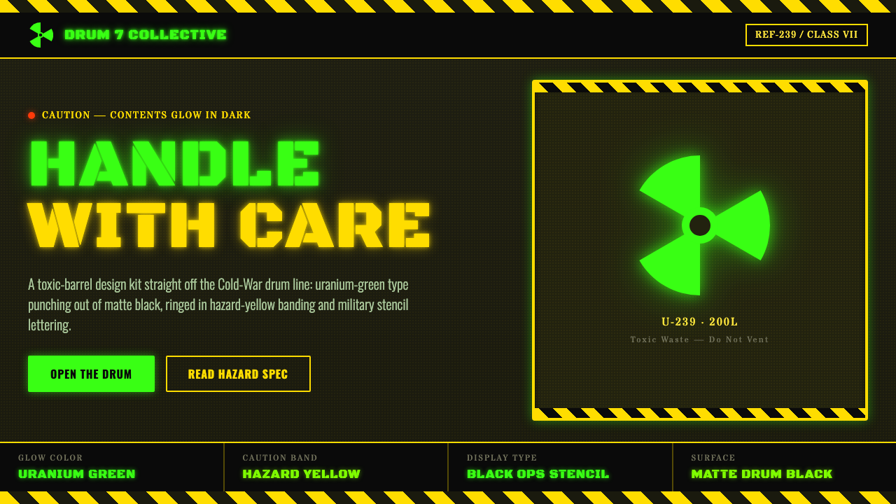
Radioactive Trefoil Sign turns the anxiety of atomic-age warning into a pop-culture surface: toxic glow, black industrial mass, and danger made deliberately theatrical.
Radioactive Trefoil Sign in brief
Radioactive Trefoil Sign is a dark industrial design language derived from a familiar cultural transformation of the radiation-warning emblem. Its subject is not the official safety placard itself. Instead, it draws from the later image of toxic-waste storage: a matte-black drum, a neon-green trefoil that appears to glow or leak through its surface, and warning-yellow bands that make the object read as hazardous before any copy is read.
The system belongs to the visual overlap between atomic-age safety signage and the toxic-waste trope developed by comics, animation, games, posters, and internet culture. In this version, radiation is no longer only an abstract technical condition. It becomes a material fantasy: fluorescent contamination, sealed industrial containers, stencilled warnings, and an ominous promise that something unstable is contained just beneath the surface.
Its visual force comes from compression. Deep black creates a heavy, absorptive field; electric green becomes the unnatural active element; hazard yellow adds a second, more conventional warning signal. The trefoil is treated less as a neutral symbol than as a graphic event. Military-stencil typography, banding, scuffs, cutouts, and drum-like framing turn the composition into an industrial artifact rather than a clean informational sign.
Where does Radioactive Trefoil Sign come from?
The radioactive trefoil began in 1946 at the UC Berkeley Radiation Laboratory as a safety symbol using magenta on a yellow ground. That origin matters because it establishes the distinction at the center of this style: the historical sign was created for safety communication, while the design language described here is a later cultural interpretation. It borrows the recognition and tension of a warning emblem, but it does not claim to reproduce the official sign.
From the atomic age through the period from 1950 to 1990, radiation became a durable public image of invisible danger. In popular culture, the emblem migrated from the world of controlled safety information into stories about mutation, contamination, secrecy, industrial neglect, and hazardous materials. Comics and The Simpsons are explicitly part of the supplied cultural frame: they helped establish the image of a neon-green trefoil associated with black toxic-waste drums rather than a magenta-and-yellow safety placard.
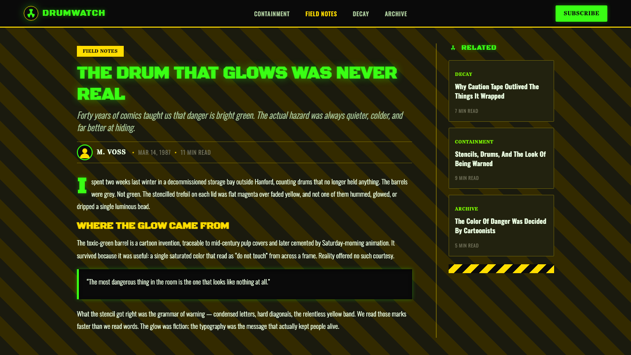
The resulting trope is global and now strongly shaped by internet circulation. Its language combines atomic-age warning imagery with industrial hazard stencils: a bright mark against black, yellow caution banding, and typography that looks stamped onto a container. The design is legible because it activates several cultural memories at once: official caution, military surplus, chemical drums, nighttime fluorescence, and exaggerated fictional contamination.
UC Berkeley Radiation Laboratory, the NRC, and the IAEA are the institutional reference points named in the source material. Their presence keeps the distinction visible between formal radioactive-safety communication and a pop-cultural visual system that borrows its emotional charge. A responsible use of this theme preserves that boundary: the style can evoke fictional toxic-barrel danger, but it should not be presented as authoritative operational signage.
What defines the Radioactive Trefoil Sign look?
Toxic Glow
Electric green is the signature accent. It should feel chemically unnatural against the darkness: luminous, radioactive in the fictional sense, and slightly invasive. The strongest compositions let green appear to emerge from cutouts, seams, splatters, or the trefoil itself. It works best as a concentrated source of energy, not as a broad background wash that removes the black field’s sense of containment.
Matte Industrial Black
Black is not empty space here. It is the imagined material of the barrel: heavy, stencilled, soot-dark, and deliberately non-reflective. It gives the green something to contaminate and the yellow something to interrupt. A nearly featureless dark field can be effective, but subtle drum seams, restrained wear, or panel divisions help establish the feeling of fabricated industrial mass without turning the surface into decorative texture.
Trefoil as Threat
The trefoil is the central visual trigger. In this cultural treatment it is enlarged, cropped, repeated, cut through a surface, or made to appear as a glowing stencil. Its role is immediate recognition rather than technical explanation. Keep its silhouette forceful and uncluttered; surrounding detail should frame its menace, not compete with the mark or make it resemble an official instruction panel.
Hazard Banding
Warning yellow functions as an interruption across the black mass. Bands may wrap horizontally, divide a panel, frame a label, or cross a corner with the blunt authority of industrial caution tape. The yellow should read as a warning convention rather than a cheerful accent. Its value lies in tension with the green: one color is recognizable danger, while the other is the fantastical glow of contamination.
Stencil Typography
Typography should look stamped, cut, or marked onto industrial equipment. Military-stencil forms carry the right associations of inventory, containment, transport, and restricted access. Use short, declarative copy with forceful hierarchy: warning terms, classified-feeling labels, batch-like identifiers, or terse instructions. The style becomes less convincing when type is elegant, delicate, conversational, or overly polished.
Containment and Wear
The visual story is not an explosion but a sealed threat. Rings, seams, panel edges, labels, and bands suggest that hazardous material has been packaged and controlled, even if the glow implies imperfect containment. Wear should remain purposeful: abrasion, scratches, drips, and distressed marks can signal use and risk, but excessive grime turns industrial tension into generic apocalypse styling.
Who shaped Radioactive Trefoil Sign?
The UC Berkeley Radiation Laboratory is the historical origin point named for the radioactive trefoil. In 1946, the symbol began there as a magenta-on-yellow safety mark. That fact provides the essential reference for designers using this theme: the popular neon-green toxic-barrel version is a cultural reinterpretation, not the original official visual treatment.
The NRC is named in the source material as an institutional reference alongside the historical and pop-cultural layers of the theme. Within this article’s design context, it represents the formal safety world from which the trefoil’s emotional authority is borrowed. Its inclusion reinforces the need to separate expressive fictional imagery from real-world safety communication.
The IAEA is likewise named as a key institutional reference. For this style, its significance is contextual rather than decorative: it reminds viewers that radiation symbols have a serious safety function beyond their cinematic and comic-book afterlife. The more deliberately a design embraces toxic-waste fantasy, the more clearly it should avoid masquerading as an official notice.
How do you use Radioactive Trefoil Sign today?
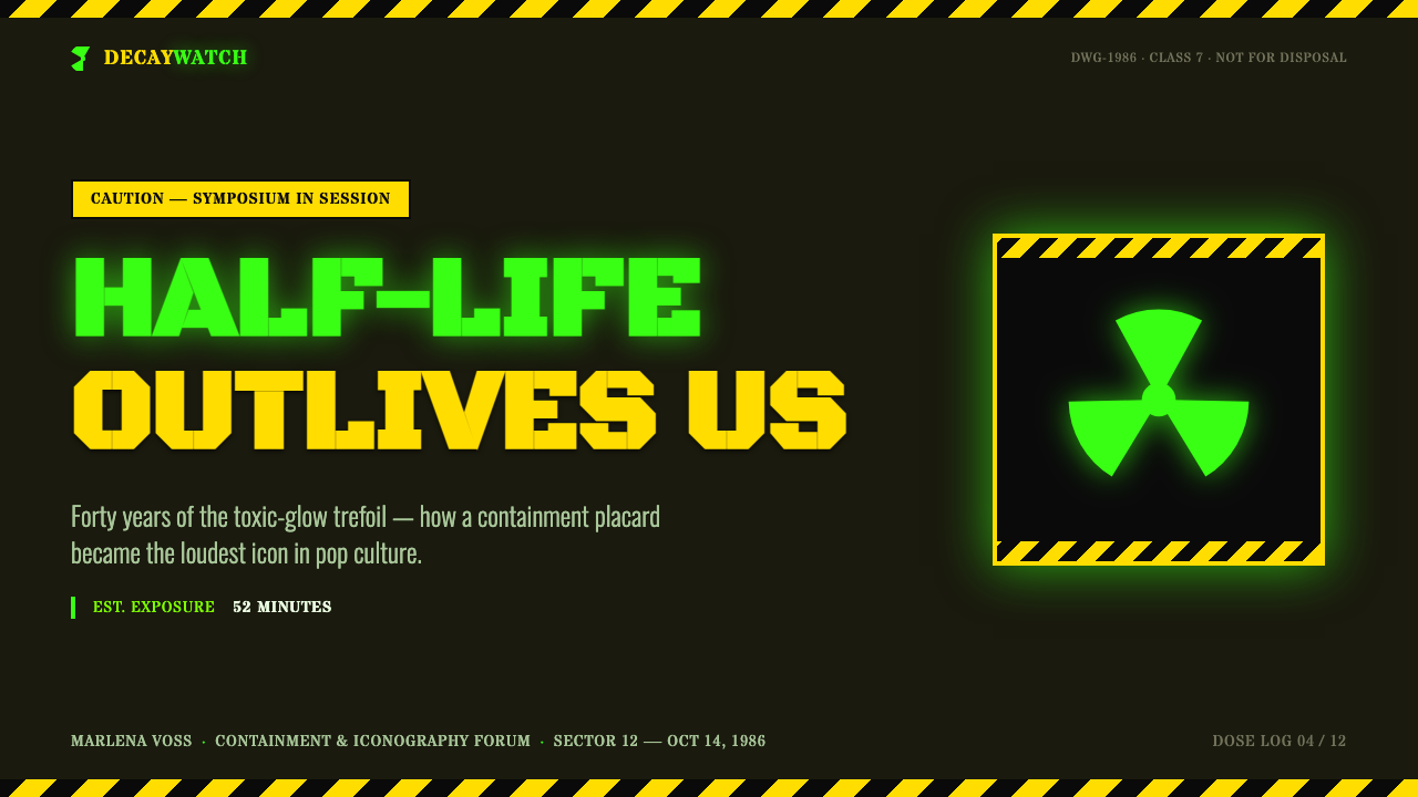
For presentation slides, use the style to establish stakes quickly. A cover can behave like a drum label: a dark field, one cropped or oversized green trefoil, a yellow warning band, and a terse stencilled title. Content slides should become controlled industrial panels rather than noisy posters. Keep one dominant marker, use clear text zones, and reserve the toxic glow for section anchors or urgent concepts. On data slides, charts should remain readable first; the trefoil and banding can frame the information without converting every data mark into decoration.
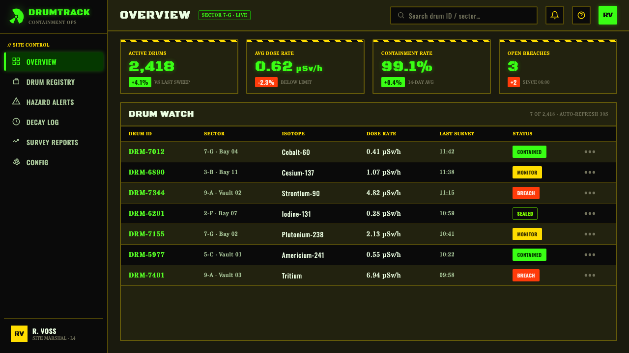
For web interfaces, the strongest fit is a dashboard, monitoring surface, security tool, incident page, or pricing page for a product intentionally positioned as powerful and high-risk. Black panels can imply contained systems, green can identify active or anomalous states, and yellow can signal caution or limited access. Navigation and controls should be direct, label-led, and industrial in tone. The interface must still preserve ordinary usability: fictional hazard atmosphere is valuable only when it strengthens hierarchy rather than making every interaction feel equally urgent.
For editorial and marketing work, treat the theme as a campaign language with a clear narrative premise. It is especially effective for launches, event posters, experimental technology stories, gaming culture, science-fiction releases, and bold product announcements. A large trefoil or drum-like crop can carry a page, while smaller stencilled labels organize captions, metadata, and calls to action. Let black space do the heavy work; too many glowing fragments can make the page feel like a collage instead of an object with industrial authority.
A common mistake is confusing radioactive-trefoil pop culture with real radioactive safety signage. The green-on-black toxic-barrel look is expressly not the official sign described in the source material. Avoid using it where a real warning must be unambiguous, regulated, or trusted as operational information. Visually, another common error is making everything glow: if green, yellow, type, borders, icons, and textures all demand attention, the contained-threat narrative collapses into visual noise. Choose one alarming focal point, then let the black field and sparse warning structure sustain it.
Radioactive Trefoil Sign — FAQ
Is this the official radioactive warning sign?
No. The source material distinguishes the original 1946 UC Berkeley Radiation Laboratory safety symbol, which used magenta on yellow, from the neon-green trefoil on black toxic-waste drums. This style is based on the latter: a pop-cultural interpretation shaped by comics, The Simpsons, and broader toxic-waste imagery. It should not be represented as an official safety design.
Why are green, black, and yellow so effective together?
They divide the emotional work clearly. Matte black supplies weight, concealment, and industrial containment. Yellow reads as familiar caution banding. Electric green introduces the fictional element: a glow that feels chemically abnormal and visually unstable. The palette works because yellow signals danger people recognize, while green suggests that the danger has escaped ordinary control.
Can the style work without a literal barrel illustration?
Yes. The barrel is a useful cultural reference, not a compulsory illustration. A dark panel with a seam-like division, a stencilled label, a cropped trefoil, and a warning band can imply containment without depicting a drum. This is often more flexible for interfaces and editorial layouts, where the industrial material logic can remain present while the composition stays clean.
What makes a design feel industrial rather than merely dark?
Industrial feeling comes from evidence of fabrication and containment. Use panel logic, seams, bands, stamped type, restricted labels, and purposeful wear. These elements should imply that a surface was made, filled, marked, moved, and sealed. Darkness alone is atmospheric; industrial design adds the operational story of an object built to hold something dangerous.
Where should this style not be used?
Do not use it for real-world radioactive safety communication, emergency instructions, regulated notices, or any setting in which viewers must distinguish factual hazard information without ambiguity. It also struggles where warmth, calm, care, or everyday trust are central to the experience. The style is intentionally forceful and theatrical; it is most successful when the product or story genuinely benefits from that pressure.
Related design styles
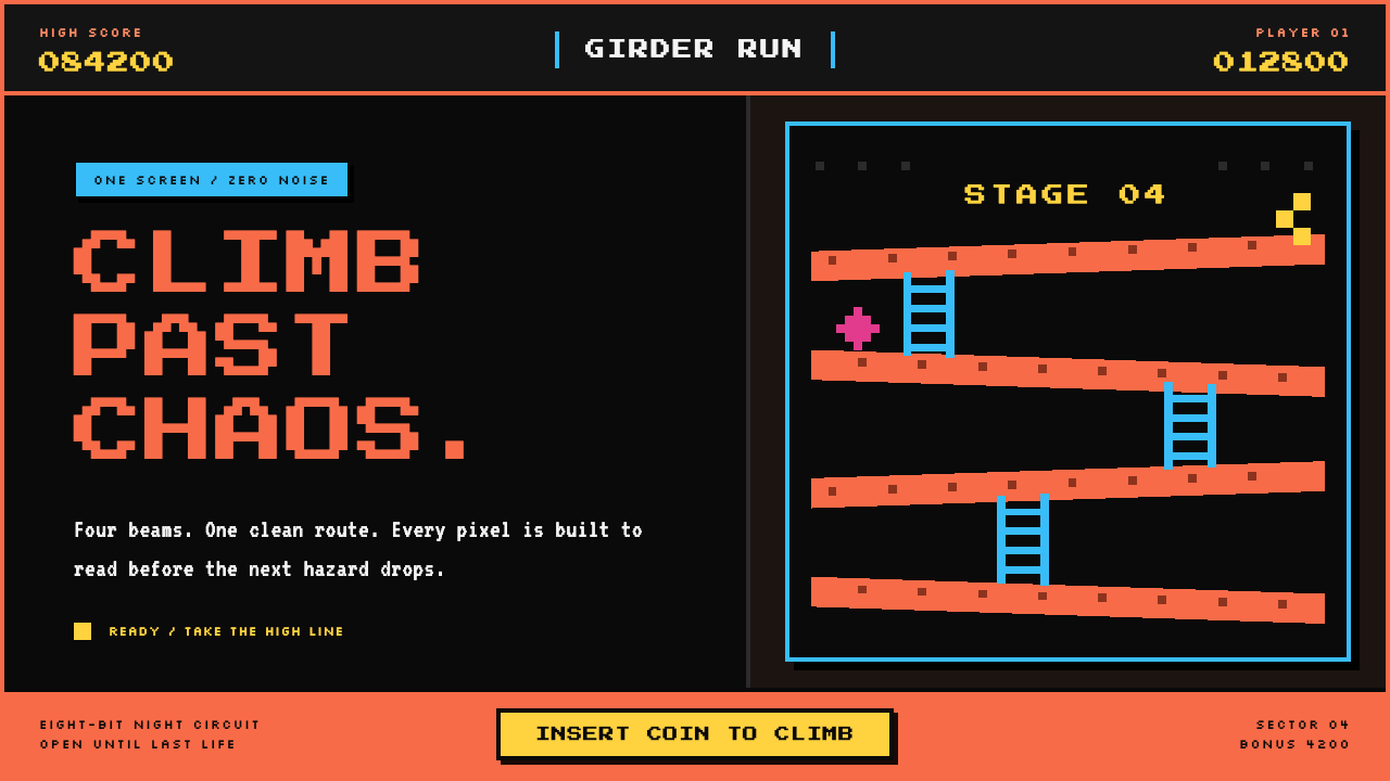 Donkey Kong (1981 Arcade)Built to read through the smoke. Coral girders and cyan ladders cut across a…
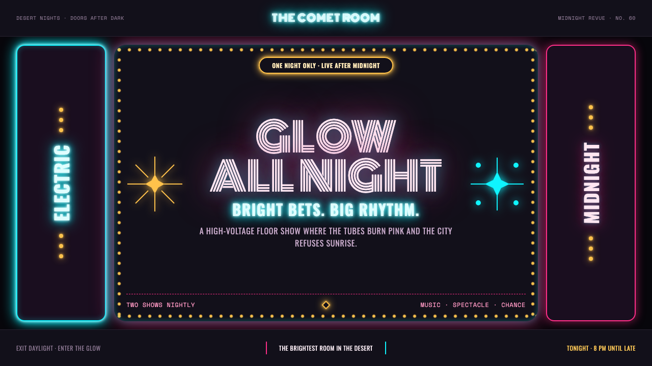 Las Vegas Neon (1960)Night refuses to dim. Hot-pink tubes, cyan bloom and amber bulbs turn black i…
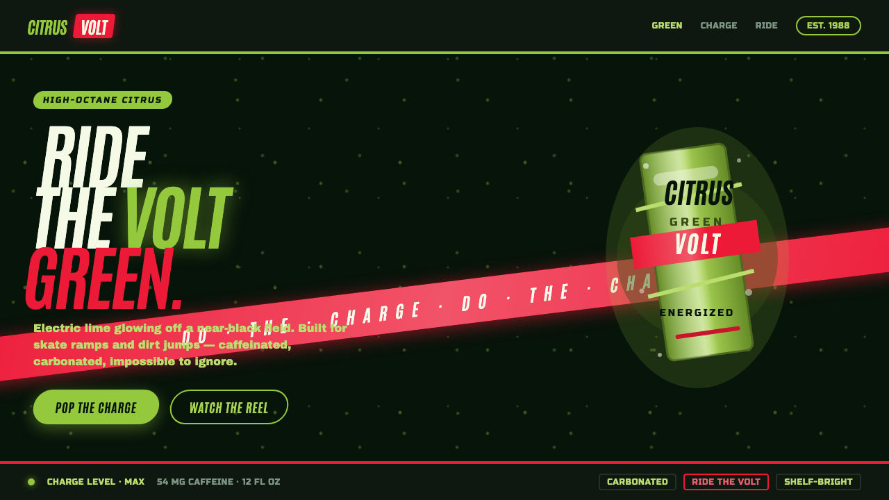 Mountain Dew Citrus GreenDo the Dew, loud. Electric lime glows off a near-black can field, slashed by…
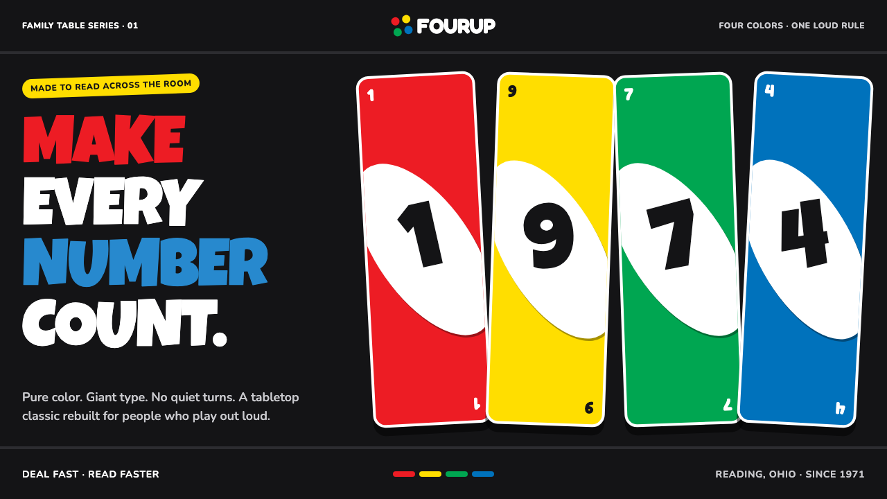 UNO (1971)Every number shouts. Four pure primaries punch through black with tilted whit…
 Hot Wheels (1968)Velocity in candy metal. Flame-orange tracks and fat italic type tear across…
 Mexican Lucha Mask GraphicComic-book lucha, lit from above. Silver-blue mask out of arena-night dark, h…