What is Donkey Kong (1981 Arcade)?
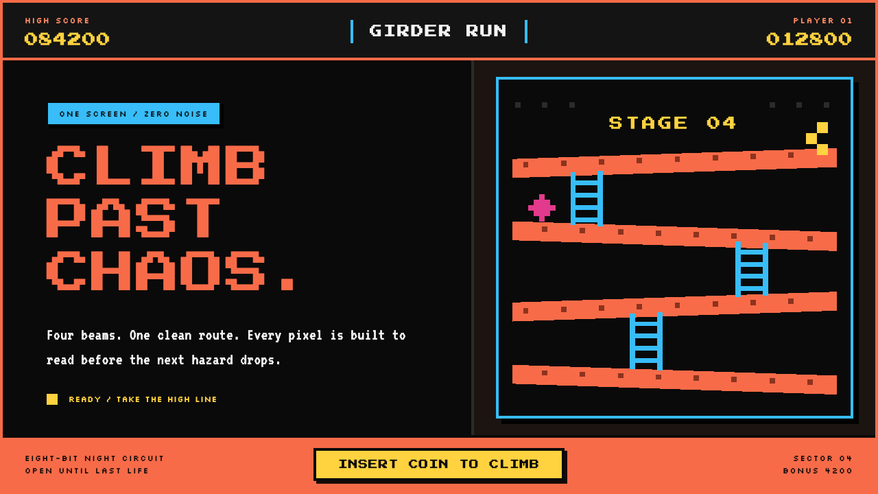
Donkey Kong turned a black arcade screen into a construction site so clear that girders, ladders, barrels, and score could all be understood at a glance.
Donkey Kong (1981 Arcade) in brief
Donkey Kong is the visual language of the original arcade cabinet released in 1981: a single-screen platformer built from sloped coral girders, cyan ladders, rolling barrels, a small climbing figure, and an emphatic score display. Its setting is not rendered as a realistic construction site. It is a readable diagram of one. The dark screen creates a void around a compact set of play elements, making the route upward feel immediate, exposed, and perilous.
The style belongs to golden-age arcade design, 8-bit sprite art, and the single-screen platformer. Its strength comes from ruthless visual separation. Girders establish the main path, ladders interrupt it vertically, and moving hazards cross those structures without ever dissolving into the background. The result is energetic but never cluttered: every color, outline, and shadow exists to support rapid recognition during play.
Recreating Donkey Kong for a contemporary screen means preserving that hierarchy rather than copying isolated retro ornaments. Start with a deep black ground, place structural elements in warm coral, reserve cyan for routes and traversal, and make information glow in a bright marquee yellow. The finished composition should feel flat, loud, mechanical, and decisively pixel-built rather than nostalgic in a soft or decorative way.
Where does Donkey Kong (1981 Arcade) come from?
Donkey Kong reached arcades in July 1981, arriving from Kyoto, Japan and becoming part of the North American arcade landscape in its original US cabinet form. Its visual system was shaped for a public machine rather than a private, close-range display. A cabinet had to communicate quickly in a noisy room, across distance, and through the visual competition of neighboring games. That environmental demand is visible in every major choice: the black field is absolute, the structural colors are forceful, and the playfield has almost no expendable scenery.
The game sits squarely within the golden age of arcade design, when an entire game premise had to announce itself from one fixed screen. Four sloped construction girders create the essential spatial problem: climb upward while navigating hazards moving down. This is a remarkably economical image. The player does not need a map, a cinematic introduction, or a dense instruction panel to understand the central action. Direction, elevation, obstruction, and destination are embedded in the playfield itself.
Its 8-bit sprite-art character is central to that clarity. Forms are deliberately chunky and tile-based, with strong color blocks and hard edges instead of atmospheric transitions. The display does not simulate material, weather, depth of field, or soft illumination. A ladder reads as a ladder because its repeated cyan segments establish a climbable vertical rhythm; a girder reads as a girder because its coral plates stretch decisively across the screen. The constraints become a design method: reduce the object until its game function is unmistakable.
Shigeru Miyamoto, Gunpei Yokoi, Hirokazu Tanaka, and Ikegami Tsushinki are named among the key figures associated with the original context. The resulting visual identity demonstrates how collaborative arcade production could make technical limitation feel purposeful. What survives is not merely an old-game look, but a disciplined system for showing action, danger, progress, and score with uncompromising economy.
What defines the Donkey Kong (1981 Arcade) look?
Black Void
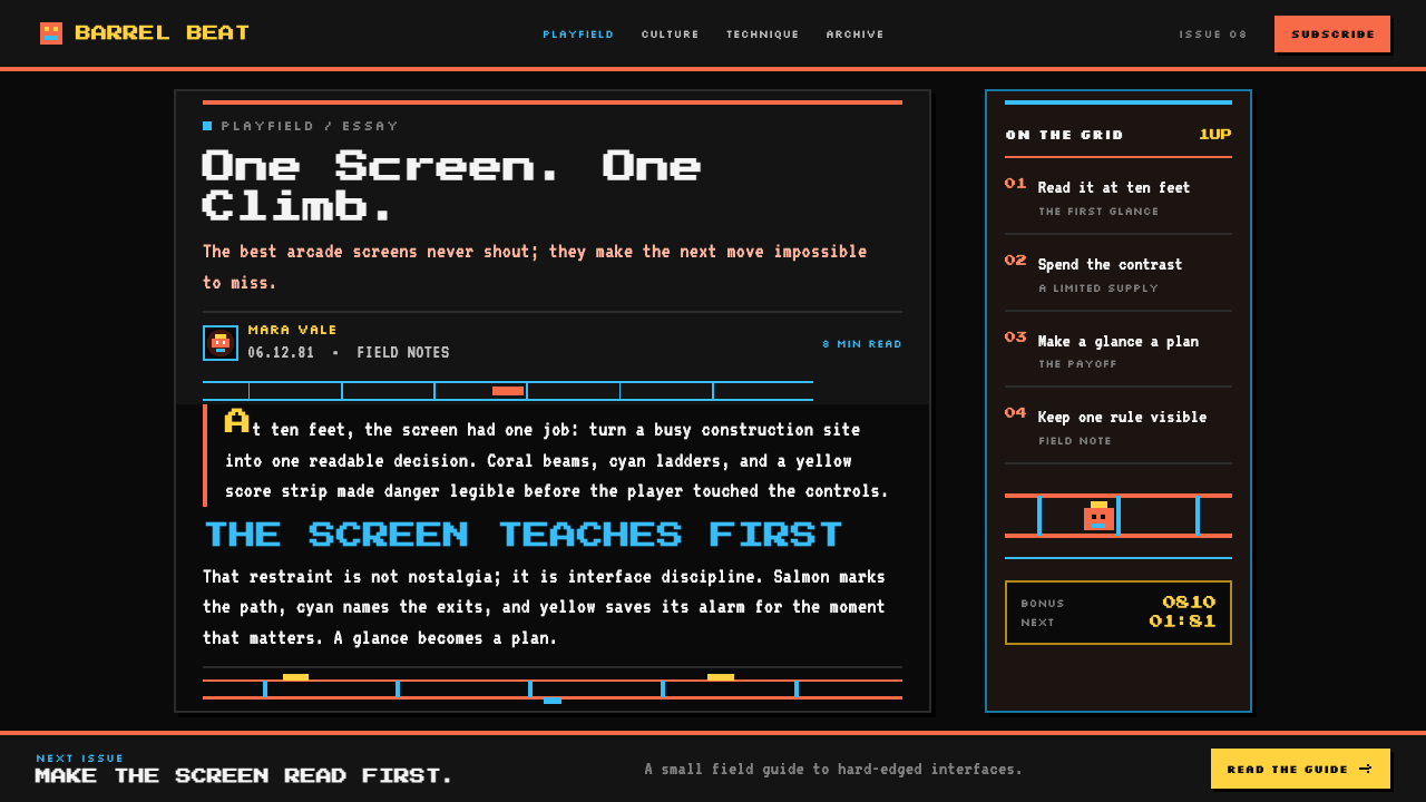
The background is not a neutral canvas; it is a near-total void that removes visual competition from the playfield. Against it, every coral beam, cyan ladder, yellow numeral, and moving sprite becomes a signal. Use black expanses confidently, allowing the active construction to occupy a concentrated zone rather than filling every corner with texture, stars, noise, or environmental detail.
Coral Structure
Warm salmon-coral girders define the world’s physical logic. They are broad, repeated, and sloped, reading less like decorative architecture than a set of visible rails governing motion. Their hue creates urgency against the black field without being confused with the cool traversal color. In adapted work, coral should carry structure: frames, dividers, route bands, active boundaries, and major visual anchors.
Cyan Traversal
Cyan ladders create the vertical exception to the sloped girder system. Their cool color and repeated segments distinguish possible movement from the terrain that contains it. This is semantic color at its clearest: the eye understands not simply what the object is, but what it permits. Use cyan sparingly for routes, navigation, upward movement, selectable paths, and actions that change a user’s position within a system.
Pixel Silhouette
Objects are built as chunky silhouettes with hard, square decisions at their edges. The style does not ask a viewer to infer form from subtle shading. A barrel, climber, ladder, or numeral must be legible through its outer contour and its contrast with neighboring elements. Contemporary treatments should preserve this confidence through blocky forms, stepped diagonals, crisp cutouts, and deliberate gaps between adjacent signals.
Marquee HUD
The HUD uses blinding yellow numerals with the assertiveness of an illuminated arcade marquee. Information is not tucked away in translucent panels or softened into ambient interface furniture. Score and status are part of the spectacle, placed where they can be scanned instantly and treated as visual events. Use this approach for primary counters, stage labels, urgent totals, and progress states that deserve immediate attention.
Hard Pixel Shadow
Depth is expressed with offset blocks, never blur. A shadow acts as a second silhouette that reinforces separation and gives an object arcade weight without introducing naturalistic lighting. The offset should feel mechanical and consistent, as though another layer of tiles has been placed beneath the first. This keeps interfaces loud and readable while avoiding the glossy, soft-focus mood that contradicts the cabinet’s directness.
No Softening
Nothing rounds, gradients, or whispers. The system gains its character from decisive contrast, flat fills, and visible boundaries. Decorative haze, glass-like transparency, gentle tonal transitions, and ornamental micro-detail all weaken the immediate read that the original screen depends on. Restraint here is not minimalism for its own sake; it is a commitment that every visual distinction must remain useful under pressure.

Who shaped Donkey Kong (1981 Arcade)?
Miyamoto is named among the key figures connected with Donkey Kong’s original 1981 arcade context. The game’s enduring visual lesson is the power of a compact, instantly readable playfield: construction girders, ladders, hazards, and a climber are organized as a direct statement of the game’s action.
Gunpei Yokoi is listed as a key figure in the original context. Within the visual system, economy is the governing value: a small set of high-contrast signals creates a complete sense of route, risk, and progress without requiring elaborate environmental illustration.
Hirokazu Tanaka appears among the key figures associated with the original arcade release. Donkey Kong’s visual identity remains a useful model for screen work because it treats every visible component as part of an active game signal rather than as passive atmosphere.
Ikegami Tsushinki is named among the key figures in the original production context. The as-shipped cabinet visual system demonstrates an enduring arcade principle: technical constraint can produce stronger hierarchy when color, silhouette, and placement are assigned clear responsibilities.
How do you use Donkey Kong (1981 Arcade) today?
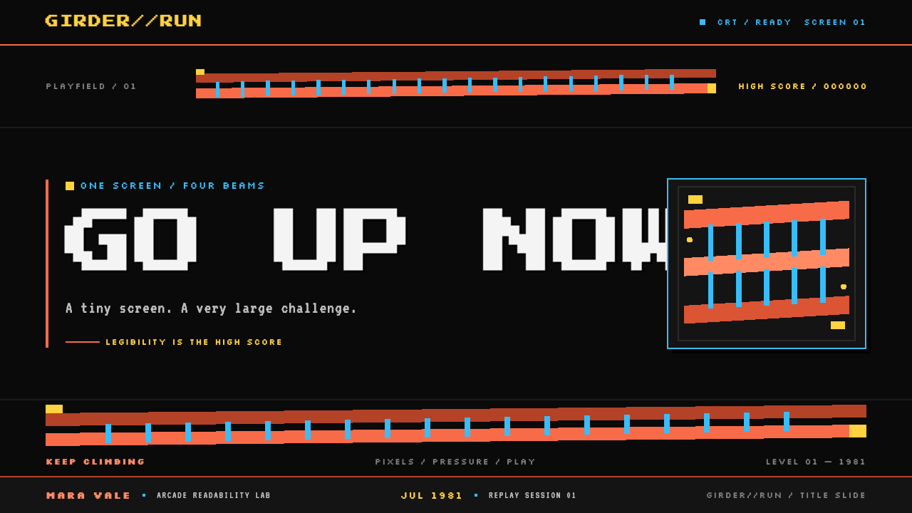
For presentation covers, use the Donkey Kong system as a stage rather than as wallpaper. Let a black field dominate, place a coral diagonal or stacked structural motif across one portion of the slide, and position the title like an arcade event rather than a quiet caption. A cyan route element can guide the eye toward the subject, while a yellow counter-like label can hold date, issue number, or key category. Keep the composition intentionally sparse so the directional structure remains visible.
On content slides, treat the girder-and-ladder relationship as an information architecture. Coral bands can separate major ideas or carry section headings; cyan vertical links can show dependencies, transitions, or paths through a process. For data slides, avoid soft charts and muted legends. Turn bars, milestones, and comparative markers into firm pixel-like blocks, and use yellow only for the number or result that should land first. The dark field should make the hierarchy feel concentrated, not gloomy.
For web interfaces, this style is especially effective for dashboards, activity views, monitoring tools, and game-adjacent products where state must be scanned quickly. Establish a black foundation and make each color mean one thing consistently: coral for structure or active danger, cyan for navigation and movement, yellow for decisive status. Cards should feel like discrete game panels with hard boundaries and pixel shadows, not floating sheets of frosted glass. Preserve generous empty space so alerts and totals remain visible.
Pricing pages can borrow the cabinet’s theatrical clarity without turning commerce into a literal game screen. Use the dark background to separate plan groups, give the recommended or current plan a coral structural frame, and use cyan for the path toward selection or comparison. Reserve yellow for the price, key total, or most consequential callout. The page should still explain terms calmly; the arcade influence should sharpen hierarchy, not make essential information feel like a flashing reward.
For editorial and marketing work, use the style when a subject benefits from momentum, technical confidence, or a sense of upward challenge. A feature story can use diagonal rails to lead from headline to sections, cyan markers for related links, and yellow numerals for chapters or highlighted findings. The common mistake is to scatter every arcade color, sprite, and pixel decoration across the layout. Donkey Kong works because its signals are few and functional. If barrels, ladders, shadows, and bright numerals do not clarify a route, state, or hierarchy, leave them out.
Donkey Kong (1981 Arcade) — FAQ
Is Donkey Kong style simply a generic retro-game aesthetic?
No. Its identity comes from a specific visual organization: a black CRT-like ground, coral sloped girders, cyan ladders, bright yellow HUD information, chunky sprites, and hard pixel shadows. Generic retro work often adds scanlines, random noise, or many unrelated colors. A Donkey Kong-derived composition is more disciplined: each element must explain terrain, traversal, danger, action, or score.
Why is the black background so important?
The black ground gives the game’s small palette its force. It creates maximum separation around the playfield and makes the colored structures appear as illuminated signals rather than decorative objects. Replacing it with a busy illustration, textured dark surface, or softly colored atmosphere weakens the original logic because the eye must work harder to locate the route and the moving hazards.
Can this style work without literal barrels or character sprites?
Yes. The transferable part is the system of semantic contrast, structural diagonals, pixel silhouettes, and visible state. A dashboard can use coral rails for categories, cyan links for navigation, and yellow counters for urgent totals without depicting any game object. Literal references work best when they reinforce the subject; otherwise they can turn a clear visual language into costume.
How should typography behave in a Donkey Kong-inspired layout?
Typography should behave like cabinet information: compact, high-contrast, and immediately scannable. Treat headlines as bold signals, body copy as a clearly separated reading layer, and key numbers as events. Avoid delicate lettering, ornamental scripts, softly faded labels, or dense passages competing with the playfield. The type does not need to imitate a game font, but it must share the game’s decisiveness.
Where does this style struggle?
It can struggle where softness, calm, luxury, or emotional intimacy are the central values. Its black void, sharp contrast, and urgent signals naturally create pressure and forward motion. It is strongest for action-oriented information, technical products, events, challenges, and playful editorial systems. If a product needs sensory warmth or quiet reassurance, borrow only its hierarchy and clarity rather than its full arcade intensity.
Related design styles
 Mountain Dew Citrus GreenDo the Dew, loud. Electric lime glows off a near-black can field, slashed by…
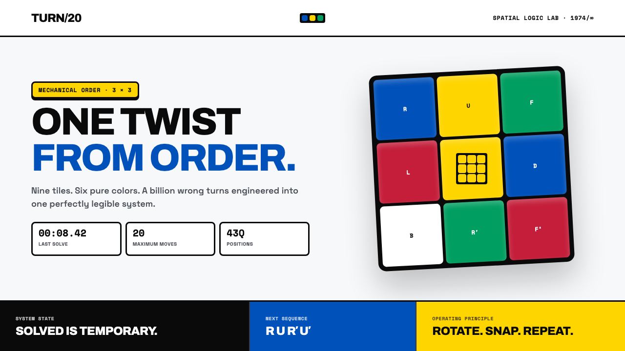 Rubik's Cube (1974)One twist from order. Six pure colors snap into a black-guttered 3×3 grid.
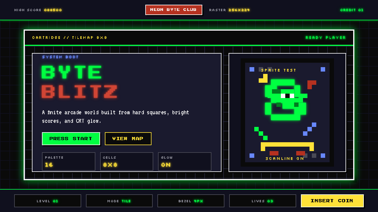 Pixel Art / 8-bit RetroHard-edged digital joy. CRT black, phosphor green, and 8x8 grids snap every p…
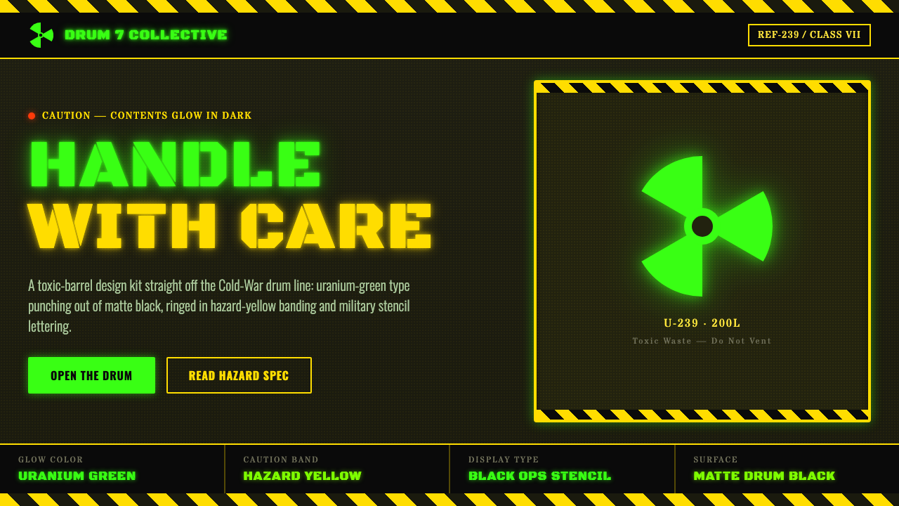 Radioactive Trefoil SignToxic-barrel glow, not the official sign. Neon-green trefoils on matte-black…
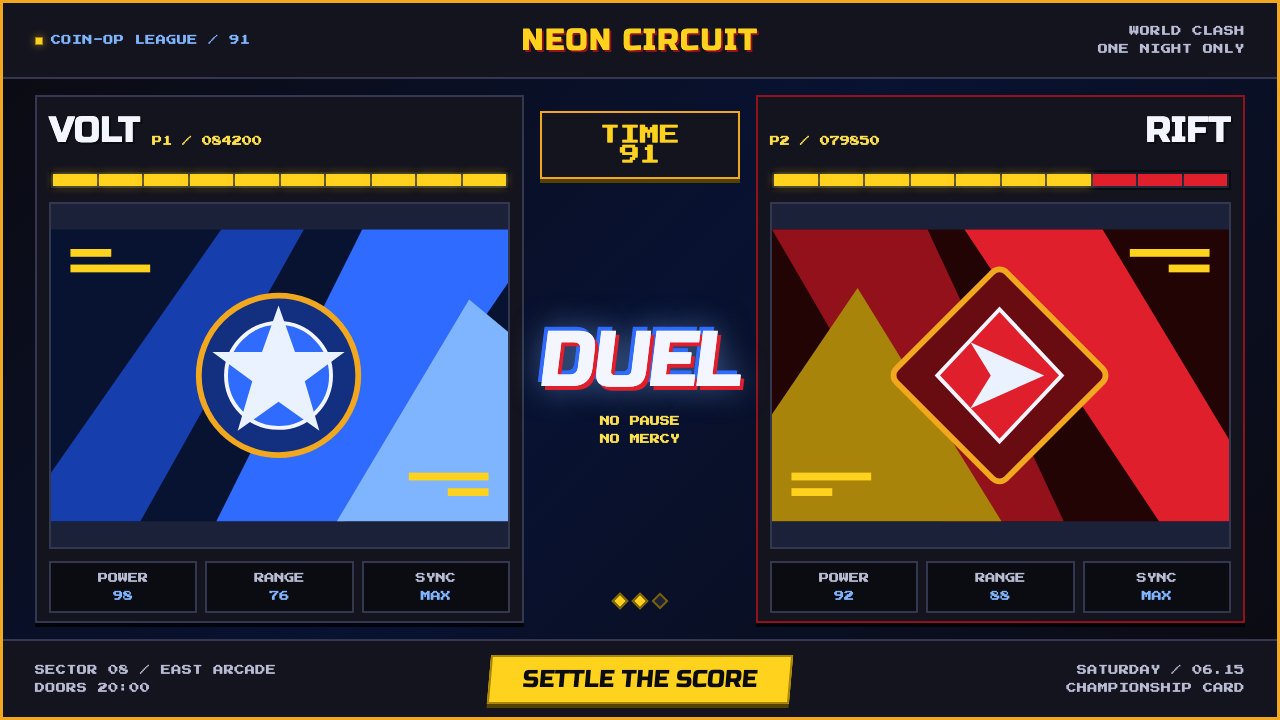 Street Fighter II (1991 Arcade)Pixel muscle hits hard. Hadouken blue, gold HUD bars, and outlined type blaze…
 Taiwanese Raohe Night Market NeonTaipei night reads vertically. Neon red, cobalt panels, and acid-yellow numbe…