What is Hot Wheels (1968)?
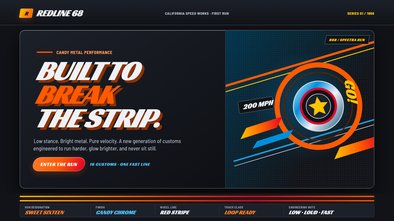
Hot Wheels turns the garage into a launch ramp: candy-metal speed, flame-orange track, and lettering already leaning into the next corner.
Hot Wheels (1968) in brief
Hot Wheels began in 1968 with a promise of speed made visible. Its original sixteen die-cast customs sat low over redline mag wheels, carried torsion-bar suspension, and wore Spectraflame candy-metal paint. The visual language was inseparable from that miniature engineering: bodies looked compressed toward the ground, wheels read as mechanical hardware, and reflective color made each car seem more like a hot rod than a conventional toy.
As a design style, Hot Wheels translates the mint-on-card charge of those early cars into an interface system. Near-black garage grounds create the stage; flame orange behaves like track, route, and warning signal; electric chrome blue supplies a colder flash of metal. Fat italic headlines, forward slants, curved dividers, and low-slung silhouettes keep the composition in motion even when nothing literally moves.
The style is not simply automotive nostalgia. It is a compact visual argument about acceleration, customization, and display. A surface should feel stamped, chromed, painted, or laid across a track. Information should arrive like a car entering a straightaway: legible at a glance, strongly directional, and charged by contrast rather than by ornamental complexity.
Where does Hot Wheels (1968) come from?
Hot Wheels launched in 1968 from Mattel headquarters in El Segundo, California, within Southern California hot-rod country. That setting matters because the style takes its emotional cues from customized cars: lowered bodies, gleaming finishes, exposed wheel identity, and an attitude of mechanical individuality. The object was small, but its reference world was expansive — garage culture, strip racing, and the appeal of a car built to look faster than everything beside it.
Harry Bentley Bradley brought GM styling to the die-cast body, connecting the original cars to automotive form-making rather than generic toy decoration. The first sixteen castings established the core image: low customs in candy-metal Spectraflame paint, with redline mag wheels and torsion-bar suspension. Their design compressed engineering, color, and silhouette into a single instant of recognition.
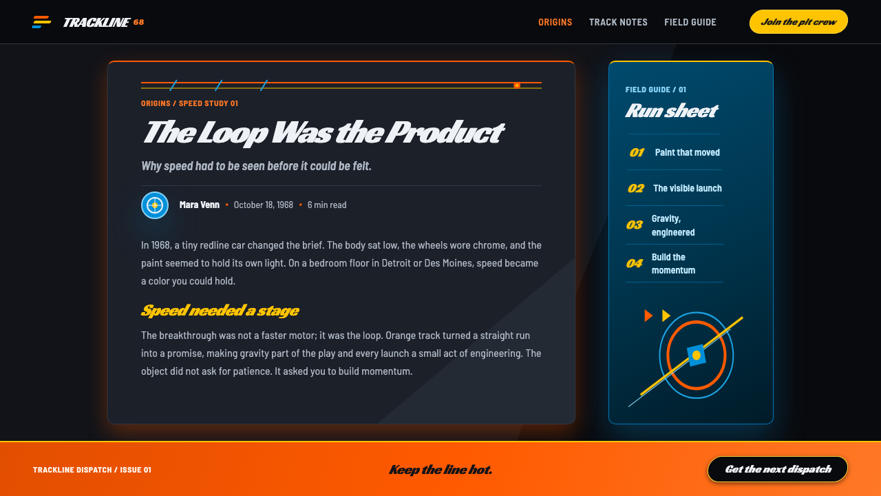
The orange loop track completed the system. It let children build a strip across a living-room floor, so the product was never only a vehicle or only a package; it was also a route, a curve, and a scene of action. This is why orange track geometry remains central when the style is adapted for digital work: it carries the original idea of motion through space, not merely an accent color.
The redline wheel era ran from 1968 to 1977, giving the earliest Hot Wheels image a defined historical frame. Elliot Handler, Ira Gilford, and Larry Wood are named among the key figures alongside Bradley. Together with Southern California hot-rod culture, die-cast miniature engineering, and the toy-graphics packaging of the 1960s, these origins explain why the style reads as both engineered object and high-voltage display.
What defines the Hot Wheels (1968) look?
Garage Darkness
The ground is near-black, like a garage interior or the deep recess behind a carded car. It is not a neutral absence of color. It creates a dense field against which painted metal, orange track, and bright type appear to generate their own light. Large dark areas also give the layout room to accelerate: an element entering that field feels staged, isolated, and fast.
Track Orange
Flame orange is structural before it is decorative. It recalls the loop track and should guide attention as a route: a curved section break, a directional underline, a sweeping edge, or a control that marks the next action. Its energy comes from its relationship to darkness and metal. Used everywhere, it loses the sense that a track is carrying something forward.
Candy Metal
Spectraflame candy-metal paint supplies the style's essential contradiction: the finish is polished and playful, while the body beneath it remains low, hard, and engineered. Digital surfaces can echo this by suggesting reflective depth and clean automotive curvature, but they should retain a sense of manufactured form. The goal is not generic luxury gloss; it is the charged finish of a custom die-cast car.
Forward Type
Headlines are fat, italic, and visually loaded toward the front. Their job is to perform velocity before the reader has processed the words. Use a compact, heavy typographic voice for names, launches, and primary messages, then let quieter supporting copy stabilize it. The contrast should feel like a wide-bodied custom paired with the discipline of a track.
Low-Slung Form
The original cars were low-slung customs, and the interface equivalent is horizontal compression. Important objects should feel planted close to the baseline rather than floating at the center of empty space. Wide cards, stretched labels, shallow image crops, and silhouettes with visible forward direction all reinforce the impression that the composition has been lowered for speed.
Chrome Flash
Electric chrome blue acts as a cool counterpoint to the heat of orange. It suggests polished hardware, reflected light, and the precision of die-cast miniature engineering. It is strongest in short, concentrated appearances: selected information, a mechanical detail, a linked state, or a visual flash beside a warmer track element. Its restraint keeps the palette from becoming costume-like.
Who shaped Hot Wheels (1968)?
Handler is named among the key figures connected to the 1968 Hot Wheels launch. In the style's origin story, his presence belongs to the Mattel context in El Segundo: the point where a new toy system entered a Southern California culture already fluent in hot rods, customization, and speed as visual theater.
Bradley brought GM styling to the die-cast body. That contribution is central to Hot Wheels as a visual language because it places proportion, stance, and body character ahead of generic toy styling. The original customs feel designed to be looked at from a low angle, admired as metal objects, and then sent down a track.
Gilford is listed among the key figures of the original Hot Wheels context. His inclusion locates the look within a collaborative launch rather than a single isolated gesture: the car, wheel, paint, package, and track had to read as parts of one fast, recognizable system.
Wood is also named among the key figures associated with the launch-era identity. Within the visual system, that era matters because it made the custom car itself the hero: low-slung, vividly finished, mechanically legible, and ready to become the focal object of a card, a track scene, or a digital composition.
How do you use Hot Wheels (1968) today?
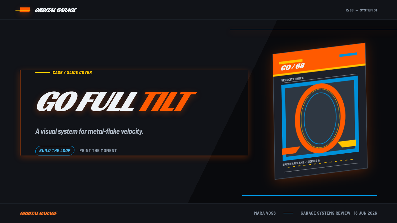
For slides, treat the cover as a carded-car reveal. Set the title in a fat italic voice against a near-black field, then let a flame-orange curve or band establish a route through the page. Content slides should use the same directional logic more quietly: place headings as entry points, keep supporting copy orderly, and use a track-like divider to carry the eye between sections. On data slides, bars, comparisons, and callouts can become a lineup of cars or lanes, with orange marking the active run and chrome blue reserved for a secondary reading.
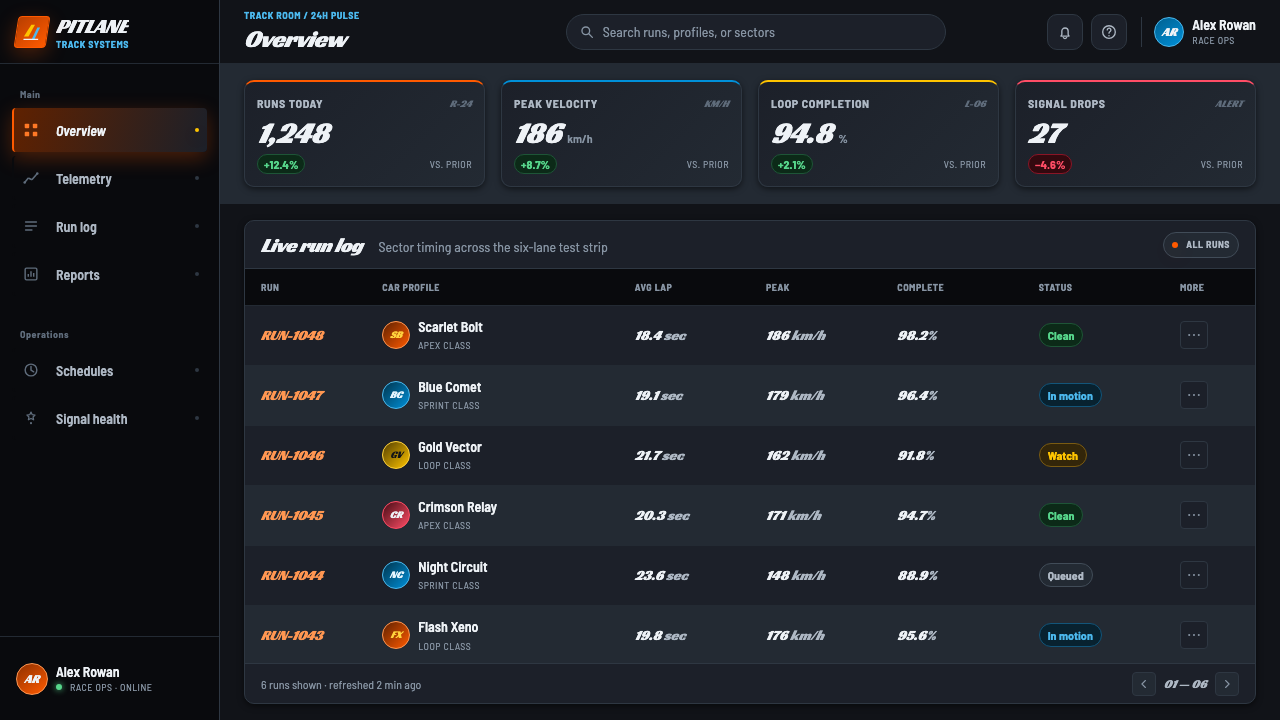
For web interfaces, the style suits dashboards, product launch pages, collection browsers, and pricing views that benefit from clear momentum. A dark garage field can hold dense information without losing drama when the most important numbers, states, or controls receive the orange route treatment. Cards should feel low and planted rather than soft and floating. Navigation works best when it behaves like signage at a track: short labels, firm hierarchy, and obvious direction.
For editorial and marketing work, use the style to make an object, release, or offer feel collectible. A hero image can be cropped like a die-cast display, while metadata sits nearby as if it belongs to a card back or garage tag. Long-form pages need quieter zones between high-energy moments; otherwise every section competes at full throttle. Orange curves are especially effective as chapter transitions because they connect the page to the original loop-track idea.
The common mistake is to reduce Hot Wheels to dark backgrounds plus orange accents. That produces a generic racing look and misses the product system that gave the style its force. Preserve the relationship between candy-metal finish, low custom stance, redline-era mechanical identity, packaging display, and track direction. Equally important, do not make every element slanted or glowing. A fast object needs a stable road around it, or its speed becomes visual noise.
Hot Wheels (1968) — FAQ
Is this style only appropriate for automotive projects?
No. Its strongest use is any project that genuinely benefits from velocity, collectibility, customization, or mechanical confidence. Product launches, creator tools, game-related collections, event pages, and performance-oriented dashboards can use the system effectively. The subject does not need to be a car, but the message should be comfortable with a visual language that is bold, directional, and intentionally loud.
Why are orange track curves more important than ordinary orange accents?
Because the original orange loop track was an active part of the Hot Wheels system. It turned a die-cast vehicle into an experience of route and motion across a room. In a layout, a curved orange element should therefore do work: connect sections, establish reading direction, frame an object, or signal progression. When it only decorates empty space, it loses its historical and functional charge.
How should a design use candy-metal effects without becoming generic?
Anchor the finish to a recognizable manufactured form. In the original Hot Wheels image, Spectraflame paint belonged to low-slung die-cast customs with visible wheels and suspension, not to an abstract glossy surface. In digital work, pair reflective color with purposeful silhouette, mechanical detail, or display framing. The effect should suggest a custom object that has been engineered and collected, not a decorative shine applied after the layout is complete.
Can the style support dense information such as pricing or dashboard data?
Yes, provided motion is used as hierarchy rather than as clutter. The near-black ground can support compact data, while orange identifies the current route, active choice, or primary comparison and chrome blue marks a secondary state. Keep the most animated visual ideas around key decisions, then let labels and supporting information remain steady. The result should feel like a well-marked track, not a garage wall covered in competing decals.
Related design styles
 Varsity LettermanEarned, not printed. Navy wool ground, school-gold chenille and block varsity…
 Ant Farm InflatablesTemporary architecture glows. Vinyl-blue domes swell over dark desert teal.
 Elvis Presley (1956)Rock learned to shout. Bubblegum pink, acid green and jailhouse type land wit…
 Pink Flamingo Lawn OrnamentLoud on purpose. Hot flamingo pink staked into lawn green, glossy molded plas…
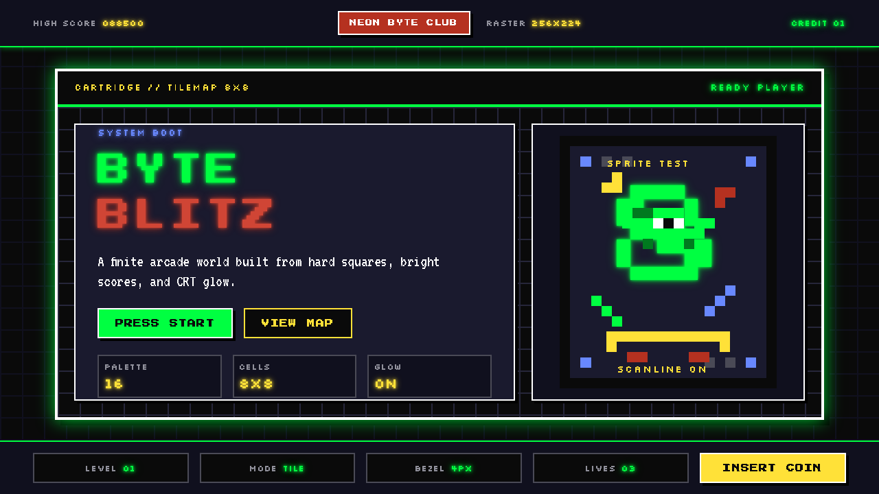 Pixel Art / 8-bit RetroHard-edged digital joy. CRT black, phosphor green, and 8x8 grids snap every p…
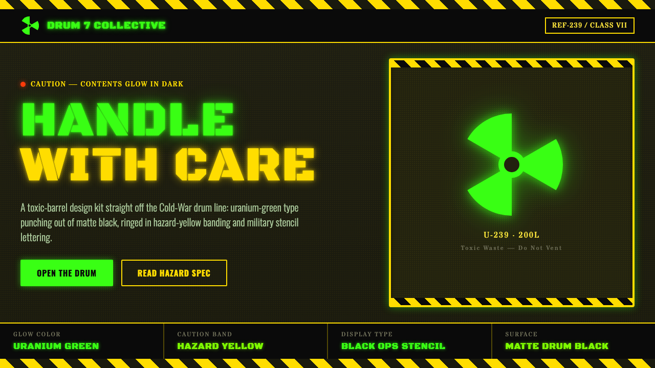 Radioactive Trefoil SignToxic-barrel glow, not the official sign. Neon-green trefoils on matte-black…