What is Varsity Letterman?
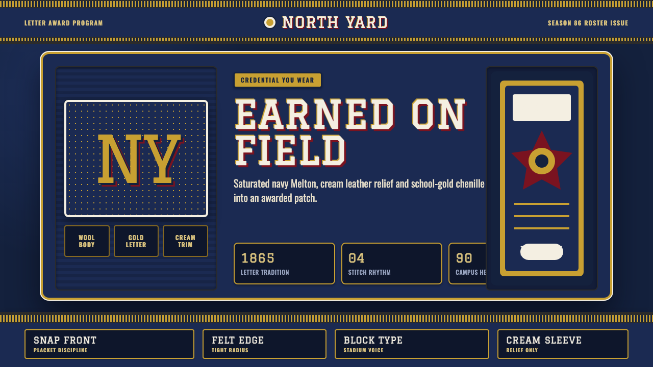
A letterman jacket is not a garment you buy off a rack — it is a credential you earn, and its design language reads like an award rather than a print.
Varsity Letterman in brief
Varsity Letterman is a design system drawn from the American collegiate letterman jacket — the wool-bodied, leather-sleeved jacket awarded to student athletes for making a school team, decorated with a large chenille letter representing the school's initial. The style's defining trait is that it treats every visual element as if it had to be physically earned and constructed, rather than simply printed onto a flat surface. A patch is stitched, a letter is felted, a stripe is knitted — nothing is a flat graphic standing in for an object.
Visually, the system is built around a deep, saturated school color — most often navy, though crimson and other collegiate hues appear as well — used as the dominant ground rather than a mere accent. Against this wool-toned base, contrasting leather (traditionally on the sleeves) and ribbed knit trim (at the collar, cuffs, and waistband) create a two-material composition that reads as tailored and structured rather than uniform in texture. Cream or off-white appears only in the specific zones where leather or ribbing would naturally sit — never as a general page background — which keeps the aesthetic feeling like an actual garment rather than a stationery template dressed in jacket colors.
Typography follows the same logic: heavy, blocky collegiate lettering styled after the chenille letter patches awarded to athletes, rather than a generic bold sans-serif. The overall effect aims for the emotional register of achievement and belonging — a jacket announces which team you made, and this design language tries to carry that same sense of hard-won status into any interface or document it is applied to.

Where does Varsity Letterman come from?
The tradition traces back to 1865, when Harvard University's baseball team began awarding flannel letters to players — a large 'H' sewn onto a sweater or shirt to mark membership on the varsity squad. This practice of the sewn-on letter as a symbol of athletic achievement spread from Harvard to other American colleges and universities over the following decades, and eventually made its way down into high school athletic programs as well, becoming a broadly recognized marker of school pride and personal accomplishment.
The jacket form itself — as opposed to the earlier sweater — developed gradually through the early twentieth century, with the wool-body-and-leather-sleeve combination becoming standardized by the mid-1900s. The leather sleeves served a practical purpose (durability against the wear of athletic activity and outdoor wear) as well as a status-signaling one, since leather was a more expensive material than the wool used for the body, making the finished jacket visibly more substantial than a plain sweater.
The style's cultural peak ran roughly from 1950 to 1990, the decades in which the letterman jacket became a near-universal fixture of American high school and college campus culture — worn by athletes, but also earned in some programs by achievement in music, academics, or other extracurricular activities, broadening the jacket's meaning from purely athletic to a more general symbol of institutional recognition. Saturated school colors — deep navy, school gold, crimson — became the visual shorthand audiences associate with the style, since these were the colors most commonly chosen by American schools for their official identities.
Because the letterman jacket is fundamentally a garment of American scholastic and collegiate athletic culture, its visual vocabulary is inseparable from that institutional context: the letter is awarded, not chosen; the color is the school's, not the wearer's; and the jacket as a whole functions as a public record of participation and achievement within a specific community, which is why the design system built from it aims to evoke earned status rather than arbitrary decoration.
What defines the Varsity Letterman look?
Wool Body as Ground
The deep, saturated school color — typically navy — functions as the entire background field, treated as a wool-textured ground rather than a flat digital color swatch. Unlike systems that use a neutral page background with color as accent, here the color itself is the ground, echoing the way a jacket's body defines the whole garment rather than being one decorative element among several.
Leather Contrast Zones
Cream or tan leather appears only in specific, bounded zones — sleeves, shoulder yokes, or trim areas — never spread across the whole composition. This zone discipline mirrors actual jacket construction: leather is a distinct panel sewn to the wool body, not a general surface treatment, and the design system respects that boundary rather than blending the two materials into a gradient.
Ribbed Knit Trim
Collar, cuffs, and waistband are rendered with a ribbed-knit texture and treatment distinct from both the wool body and the leather panels — a third material logic that appears only at garment edges. In the design system, this translates to border and edge treatments that carry a distinct textural quality from the main content areas, marking transitions the way an actual knit trim marks the edge of a jacket.
Chenille Letter Typography
Headline and title type is heavy, blocky, and collegiate in character, styled to evoke the felt-and-chenille letter patches awarded for team membership rather than a generic condensed sans-serif. Letterforms carry visible weight and slight texture rather than crisp vector cleanliness, reinforcing the sense that type here represents something stitched and awarded rather than printed.
Earned-Patch Iconography
Icons and badges within the system are treated as awarded patches — bounded shapes with a felt or embroidered edge quality, arranged the way achievement patches accumulate on a jacket's chest or sleeve over a career. This differs from generic flat icon systems by implying that each mark had to be earned individually rather than selected from a uniform icon library.
Restricted, Saturated Palette
The color range stays deliberately narrow — one dominant school color, a contrasting metallic or cream accent for the letter and trim, and little else. This restraint mirrors how a real jacket's color scheme is fixed by institutional identity rather than open to arbitrary choice; introducing many additional colors would undercut the sense of a single, specific school's official palette.

Who shaped Varsity Letterman?
Harvard's baseball program is credited with originating the sewn-on letter award in 1865, awarding a flannel letter 'H' to varsity players. This single institutional decision is the direct ancestor of the entire letterman-jacket tradition, making Harvard's early athletic program the historical starting point for a visual custom that would spread across American education over the following century.
The broader system of American college athletic programs adopted and standardized the letter-award custom through the early twentieth century, developing the shared conventions — wool body, leather sleeves, chenille letters — that make a letterman jacket instantly recognizable regardless of which specific school issued it. This institutional layer is what turned a single Harvard tradition into a nationwide visual language.
The administrative programs within schools that formally govern who earns a letter — based on athletic performance, and later expanded in many institutions to include academic or artistic achievement — are what give the jacket its meaning as a credential rather than a purchasable garment. These award programs are the reason the aesthetic reads as earned status: without a formal awarding process, the jacket would just be a color combination.
How do you use Varsity Letterman today?
Varsity Letterman suits products and brands built around achievement, membership, and belonging to a specific group — alumni networks, sports and fitness platforms, gamified learning products with earned badges or levels, or any brand that wants to communicate 'you made the team' rather than 'anyone can join.' The style's emotional core is exclusivity earned through effort, and it works best where that framing is genuinely true of the product.
For presentation slides, a cover slide benefits from committing fully to the wool-ground treatment with the chenille-style title lockup centered as if it were the jacket's chest letter — bold, singular, and confident. Content slides should keep the wool-color background but reserve the leather and knit-trim textures for section dividers or emphasis blocks, since applying heavy material texture across every slide would slow reading and feel visually noisy in a data-dense context.
For web interfaces, the style fits membership tiers, achievement or rewards systems, and alumni or community platforms particularly well — a 'badges earned' page or a loyalty-tier dashboard can use the earned-patch iconography and chenille typography to reinforce the sense that a user's status was won rather than simply assigned. Navigation and buttons should lean on the ribbed-knit trim treatment for edges, keeping large content areas in the flatter wool-ground color to preserve legibility.
For editorial and marketing work, the aesthetic supports storytelling around tradition, achievement, and institutional pride — recruitment materials, alumni newsletters, or brand campaigns built around heritage and belonging. Feature openers can use the full wool-and-leather composition; body copy should sit on a calmer version of the ground color so the dense material texture doesn't compete with long-form reading.
A common mistake is using the school-color palette and chenille-style type without the material distinction between wool, leather, and knit zones — the result reads as generic 'collegiate' color and type without the structural logic that makes the style feel earned rather than decorative. Another frequent error is spreading cream across the whole background as if it were a neutral canvas color, when in the source garment cream only ever appears in the bounded leather and trim zones.

Varsity Letterman — FAQ
Why does the style insist on treating cream as a bounded accent rather than a background color?
Because in the physical garment, cream or tan only ever appears where the leather sleeves or knit trim actually sit — it is never the color of the wool body itself. Using cream as a general page background would contradict the material logic the entire style is built on, turning a garment-inspired system into a generic color scheme that happens to include navy and cream. Respecting the boundary is what keeps the aesthetic legible as 'a jacket' rather than 'a color palette.'
Is this style the same as generic 'preppy' or 'Ivy League' aesthetics?
They overlap in cultural territory but are not identical. Preppy aesthetics draw on a broader wardrobe — oxford shirts, tartan, boat shoes — and a general upper-class collegiate lifestyle signal. Varsity Letterman is narrower and more specific: it is built entirely around the earned-award logic of a single garment, the letterman jacket, with its particular wool-leather-knit material construction and chenille lettering. It carries connotations of athletic achievement specifically, rather than a broader social class signal.
Can this style work with colors outside the traditional navy, gold, and crimson range?
Yes, since American schools use a wide range of official colors — green, maroon, royal blue, black — and the underlying material logic (wool ground, leather contrast zones, ribbed trim, chenille type) is independent of any specific hue. What matters is keeping the palette restricted to one dominant saturated color plus a contrasting metallic or cream accent, mirroring how a single school commits to its own specific colors rather than mixing many.
Does this style require the achievement to be athletic specifically?
No. While the jacket's origin is athletic, many schools expanded letter-award eligibility to academic, musical, and other extracurricular achievement well within the style's historical period. When applying the aesthetic to a product, the underlying logic — a mark of status that had to be earned through participation and effort — transfers cleanly to non-athletic contexts like professional certifications, learning platforms, or community recognition systems.
Why is the typography described as heavy and blocky rather than elegant or delicate?
Because it mimics the actual construction of a chenille letter patch, which is built from thick, looped yarn stitched densely onto a felt backing — a technique that physically cannot produce fine, delicate strokes. The letterforms in real letterman jackets are therefore always simple, heavy, and blocky by material necessity, and the design system preserves that constraint rather than substituting a more conventionally 'elegant' typeface that would break the connection to the source craft.
Related design styles
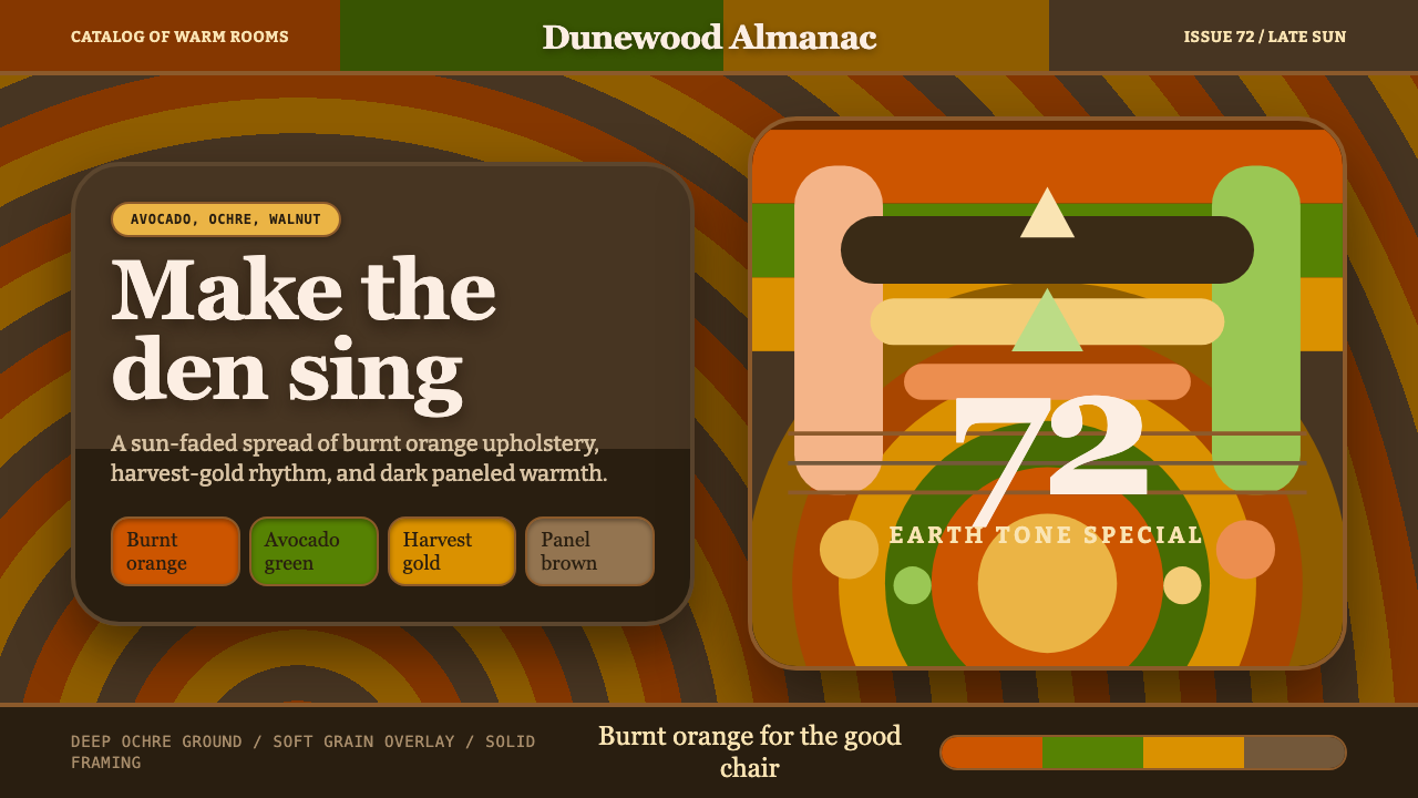 1970s Earth TonesWarm maximalism stays muddy. Bulbous slabs, avocado bands, and harvest-gold r…
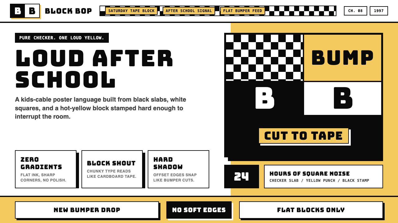 Cartoon Network 90s BlocksKids-cable noise, squared. Black-white checkerboards crash into hot-yellow Bu…
 Hot Wheels (1968)Velocity in candy metal. Flame-orange tracks and fat italic type tear across…
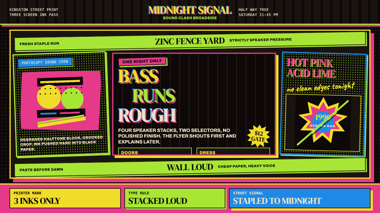 Jamaican Dancehall 1990 PosterMidnight volume. Acid lime and hot pink type stack like screenprint ink on bl…
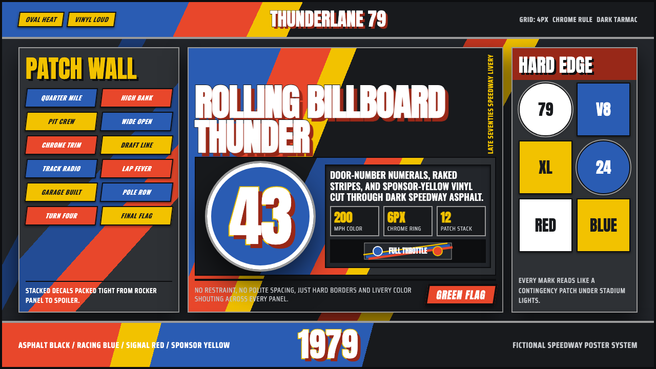 NASCAR Stock CarLoud as a rolling billboard. Blue, red, and sponsor yellow collide in a hard-…
 1950s Brush Script AdSells tomorrow in one swoop. Turkey red script, tan paper, starbursts, and ha…