What is 90s Aggressive Inline Skate?
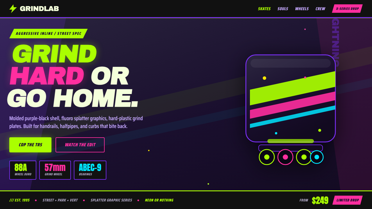
The 90s aggressive inline skate aesthetic turned molded plastic into a street-level dare: fluoro lime and hot magenta slash across purple-black hardware with the velocity of a halfpipe wall.
90s Aggressive Inline Skate in brief
90s aggressive inline skate design, especially the Rollerblade Lightning TRS era, belongs to the visual world of extreme sports, X-Games culture, and street skating. Its foundation is not polished luxury or technical restraint but visible impact: glossy black-and-purple molded boot shells, fluorescent lime and hot magenta accents, and splatter graphics that make the object look as though it has just passed through a painted concrete landscape.
The aesthetic depends on contrast. Dark plastic hardware creates the physical ground, while fluoro color supplies energy and direction. Italic condensed sport lettering cuts diagonally across the surface, giving the boot a sense of forward motion even when it is standing still. Spray-paint splatter breaks the clean industrial shell with an improvised, rebellious surface language.
This is equipment designed to look active, loud, and difficult to ignore. It borrows the visual confidence of skate subculture without becoming soft or handmade: the shell remains molded, hard, and engineered, while the graphics suggest speed, risk, and public performance. Every mark feels capable of becoming a motion trail, a warning sign, or a challenge.
Where does 90s Aggressive Inline Skate come from?
The style belongs to the period from the 1990s into 2010, with its clearest identity formed during the peak of 90s aggressive inline skating and the X-Games era. Its strongest regional association is North America, where street and skate subcultures gave aggressive inline equipment a visual language that was public, competitive, and unapologetically expressive.
Rollerblade Inc. and the Lightning TRS line are central reference points for the style. The equipment’s molded boot shell provided a dark, substantial base rather than a neutral canvas. Against that base, fluorescent lime green and hot magenta created an immediately legible signal of motion and attitude. The graphics did not merely decorate the hardware; they announced the cultural position of the object.
The surrounding movement was 90s extreme sports culture, amplified by X-Games visibility and the energy of early aggressive-skating riders. The result was a design vocabulary built for recognition at a glance: dark protective forms, radical color contrast, diagonal sport typography, and splatter marks that connected manufactured equipment to skate-spot walls and halfpipe surfaces.
Its influence is best understood as a meeting of opposites. Industrial plastic suggested durability and control, while fluorescent paint and irregular spray marks suggested speed, improvisation, and risk. That tension made the style distinctive. It was neither clean sports minimalism nor pure graffiti; it was engineered equipment carrying the visual charge of a street subculture.
What defines the 90s Aggressive Inline Skate look?
Dark Molded Ground
The visual foundation is glossy black and purple-black molded plastic. It should feel substantial, protective, and manufactured, with the boot shell treated as a physical object rather than a flat graphic field. Dark hardware gives the fluorescent accents somewhere to strike against and keeps the overall mood aggressive rather than playful.
Fluoro Energy
Fluorescent lime green and hot magenta carry the emotional charge. They are not evenly distributed as a soft palette; they appear as sharp accents, slashes, and signals against the dark shell. Lime feels electric and kinetic, while magenta adds heat, attitude, and a distinctly 90s sense of spectacle.
Diagonal Motion
Composition moves diagonally. Italic condensed sport type, angled color bands, and slashing graphic marks imply acceleration and direction. The diagonal is not ornamental; it makes the equipment appear to lean into motion and gives even a static product image the visual posture of a trick, a launch, or a fast pass through a skate space.
Splatter Surface
Paint-spray splatter interrupts the molded shell with irregular particles and scattered marks. It creates the impression of a halfpipe wall or street spot carrying layers of use and expression. The marks should feel spontaneous and physical, but remain subordinate to the boot’s main silhouette and the larger directional graphics.
Condensed Sport Type
Typography is narrow, italic, and built for impact. It behaves like equipment labeling crossed with a racing graphic: compact enough to fit the hard shell, forceful enough to read as a gesture. Type should cut across the composition rather than sit politely inside it, reinforcing the style’s sense of speed and controlled aggression.
Engineered Rebellion
The style works because manufactured precision and street irregularity remain visible at the same time. The shell, seams, and hardware suggest control; fluorescent slashes and splatter suggest improvisation. Removing either side weakens the identity. Without the molded base it becomes generic graffiti, and without the rebellious marks it becomes ordinary sports equipment.

Who shaped 90s Aggressive Inline Skate?
Rollerblade Inc. is the company most directly associated with this visual territory in the supplied reference material. Its equipment provides the industrial foundation: molded protective shells that become expressive through dark plastic, fluorescent accents, diagonal graphics, and splatter treatment.
The Lightning TRS line is the clearest product reference for the era’s aggressive inline identity. Its black-and-purple molded shells, radical neon color treatment, and extreme-sports graphic language establish the balance between hard equipment and loud street attitude.
Early aggressive-skating riders represent the living energy around the style. They connect the visual system to movement, public performance, and street practice, making diagonal graphics and fluorescent accents feel like extensions of skating itself rather than decoration applied afterward.
How do you use 90s Aggressive Inline Skate today?
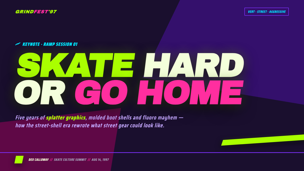
For presentation slides, use the style as a sequence of impact and release. A cover can place a dark molded-looking field behind a large diagonal title, with one fluorescent slash acting as the visual entry point. Content slides should preserve a strong directional rhythm: compact italic headings, dark structural zones, and splatter used selectively around key transitions. Data slides can treat bars, arrows, or labels as pieces of skate equipment, using fluorescent color to mark movement, priority, or the most important comparison.
For web interfaces, the aesthetic suits dashboards, activity trackers, event pages, and pricing systems that want to feel energetic rather than corporate. Keep the main interface dark and let lime or magenta mark active states, selected plans, progress, or urgent actions. Cards can feel like molded hardware through firm edges and strong contrast. Diagonal labels and condensed headings should guide scanning, while splatter remains a restrained surface accent rather than a background texture everywhere.
For editorial and marketing work, the style is strongest when the page feels like a poster from a skate spot or extreme-sports broadcast. Use a large directional headline, a dark field, one dominant fluoro accent, and irregular paint marks that appear to have been sprayed onto the surface. Product stories can alternate close views of hard shell, graphic detail, and action-oriented typography. Marketing calls to action should feel like invitations to move: short, bold, and placed along the composition’s main diagonal.
The style also works for launch graphics, event identities, campaign covers, and merchandise systems where recognition at a glance matters. A consistent relationship between dark hardware, fluorescent accents, diagonal type, and splatter can stretch across screens, posters, packaging, and apparel without losing its identity. The key is to make every medium feel like part of the same aggressive equipment family.
The common mistake is confusing loudness with indiscriminate excess. Covering every surface with lime, magenta, splatter, multiple type treatments, and competing diagonals destroys the hierarchy. The dark molded ground must remain visible, one accent should lead, and irregular marks should support motion rather than become visual noise. Another mistake is making the equipment look soft or toy-like; the attitude depends on hard plastic, controlled structure, and the friction between engineered form and street expression.
90s Aggressive Inline Skate — FAQ
Is this style simply a neon sports aesthetic?
No. Neon is only one component. The identity comes from the relationship between dark molded hardware, fluorescent accents, diagonal condensed sport type, and splatter graphics. Remove the dark engineered ground and the result becomes generic neon. Remove the irregular street marks and it becomes ordinary performance equipment.
Why are diagonal graphics so important?
The diagonal supplies implied motion. It makes a static shell feel as though it is leaning, launching, or passing quickly through a skate space. It also gives typography and color a directional role, so the composition communicates speed rather than merely displaying bright decoration.
Can the style work without splatter?
It can, but the result will be cleaner and more purely equipment-focused. Splatter is what connects the molded object to street and skate-subculture surfaces. If it is omitted, another irregular graphic gesture should carry that cultural friction; otherwise the design may drift toward generic technical sports branding.
Does a dark interface need to use both lime and magenta?
No. The source aesthetic is defined by their contrast, but a usable interface benefits from assigning them different roles. One can lead interaction and emphasis while the other supports secondary signals or campaign moments. Using both everywhere weakens hierarchy and turns the visual system into noise.
What makes the style feel authentically 90s rather than contemporary cyberpunk?
Keep the emphasis on physical molded plastic, extreme-sports attitude, condensed italic type, and spray-paint irregularity. Contemporary cyberpunk often depends on luminous digital atmosphere and futuristic interfaces. This style is more tactile and public: a hard boot shell, a fluorescent slash, and a wall-like splatter mark tied to street skating and the X-Games era.
Related design styles
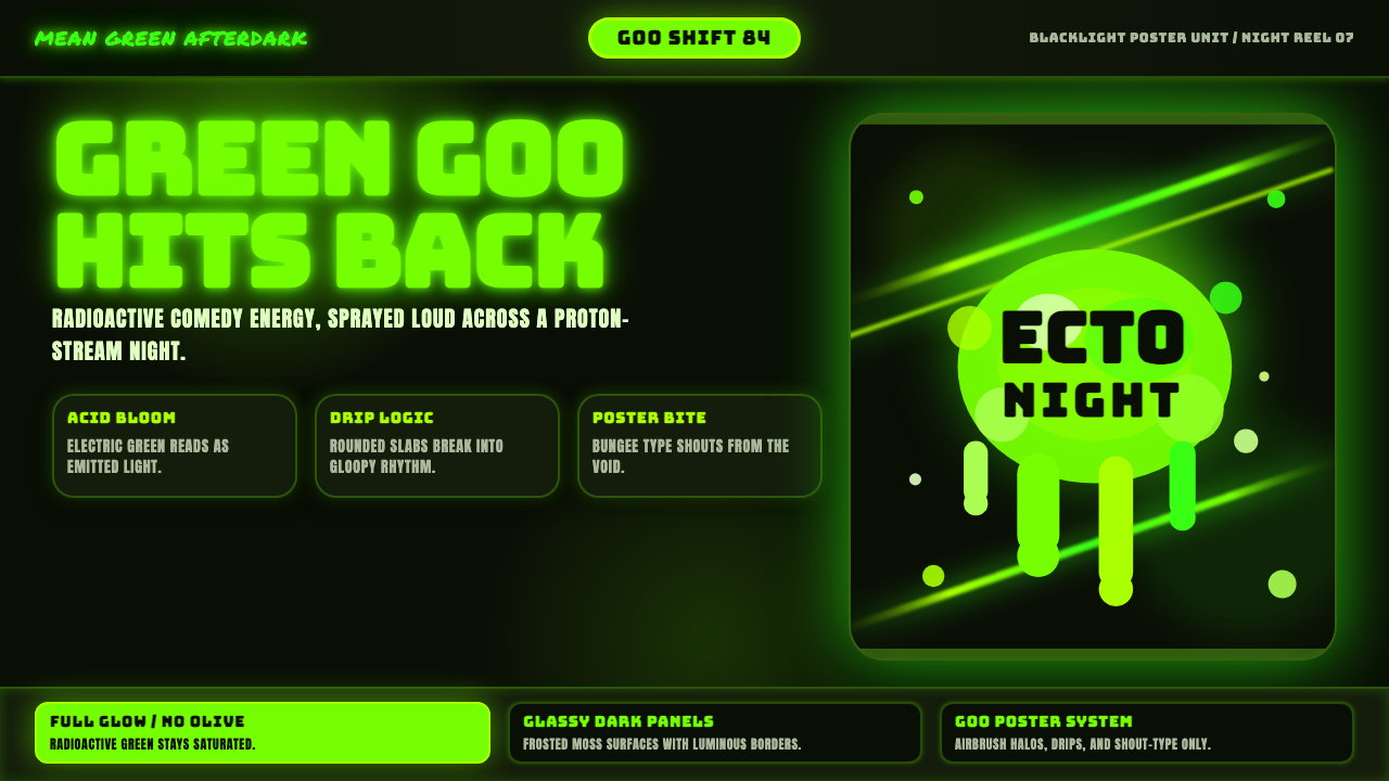 Slimer Ghostbusters GreenBlacklight goo shouts. Ecto-green Bungee type, drips, and proton streaks hit…
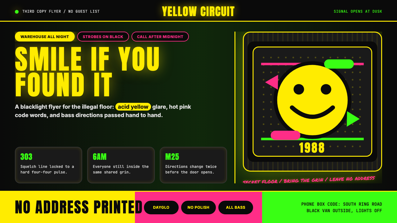 Acid House Smiley (1988)Rave energy hits first. Acid yellow on black, Anton caps, smiley glow.
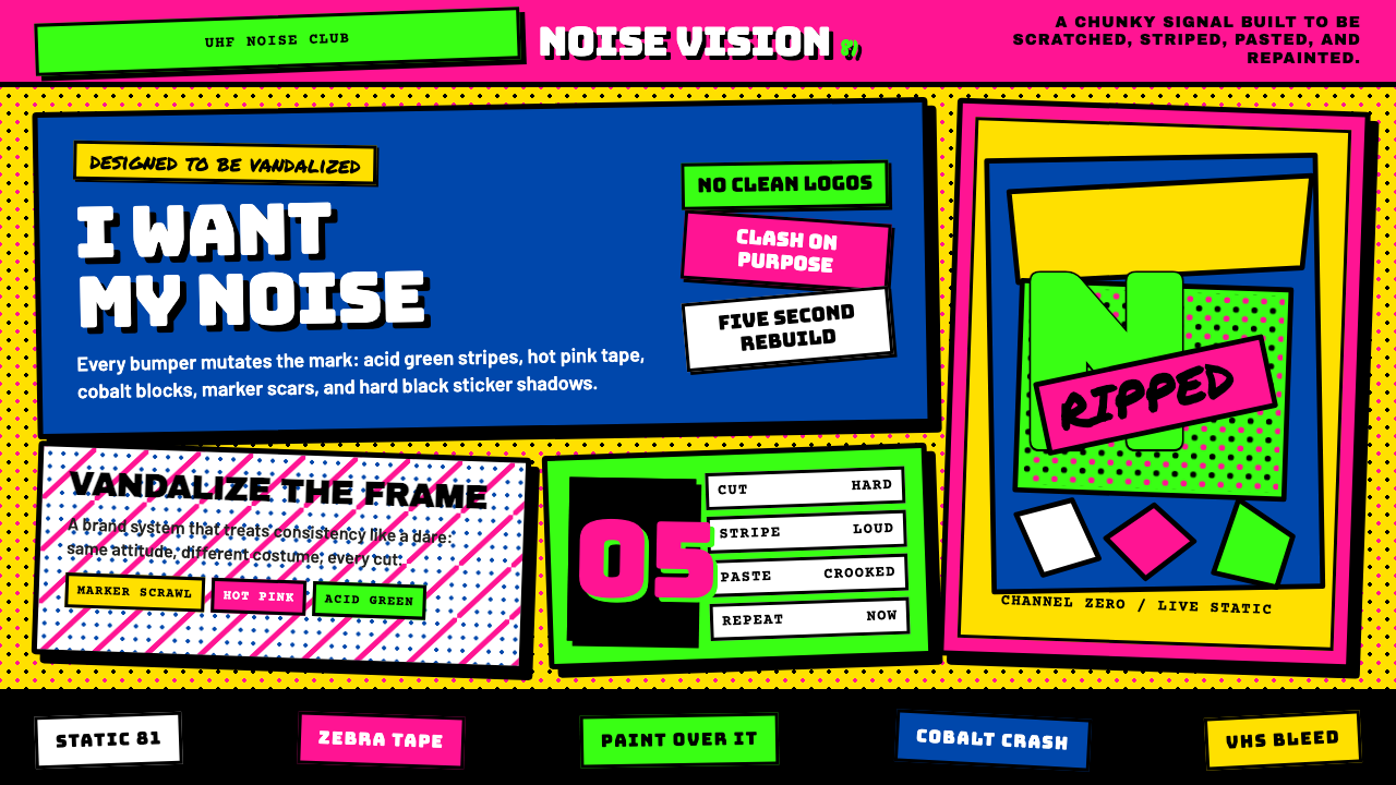 MTV Launch Identity (1981)Built to be vandalized. Hot pink, acid green, Bungee blocks, and crooked stic…
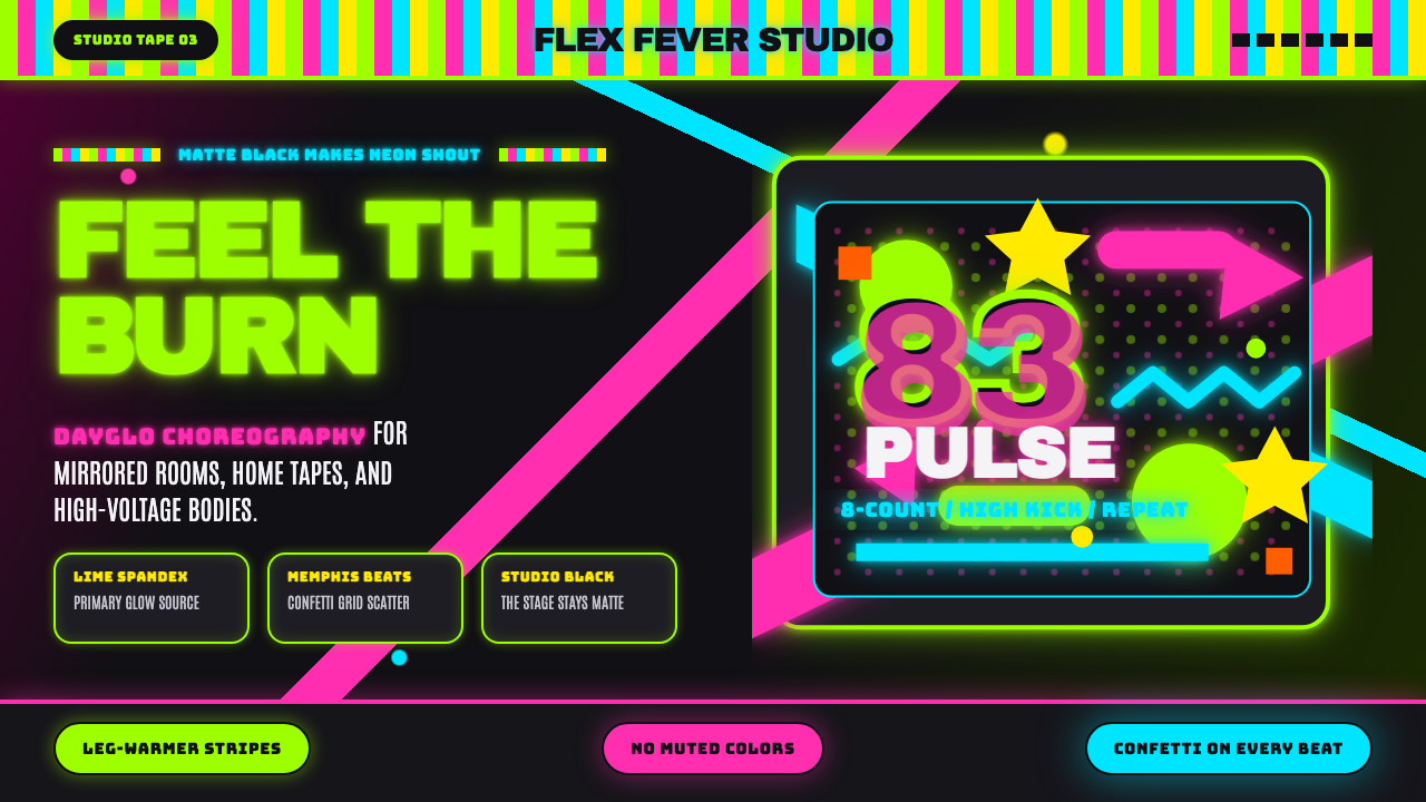 80s Aerobics Fluoro SpandexNeon refuses restraint. Lime spandex, pink-cyan confetti, and black-stage typ…
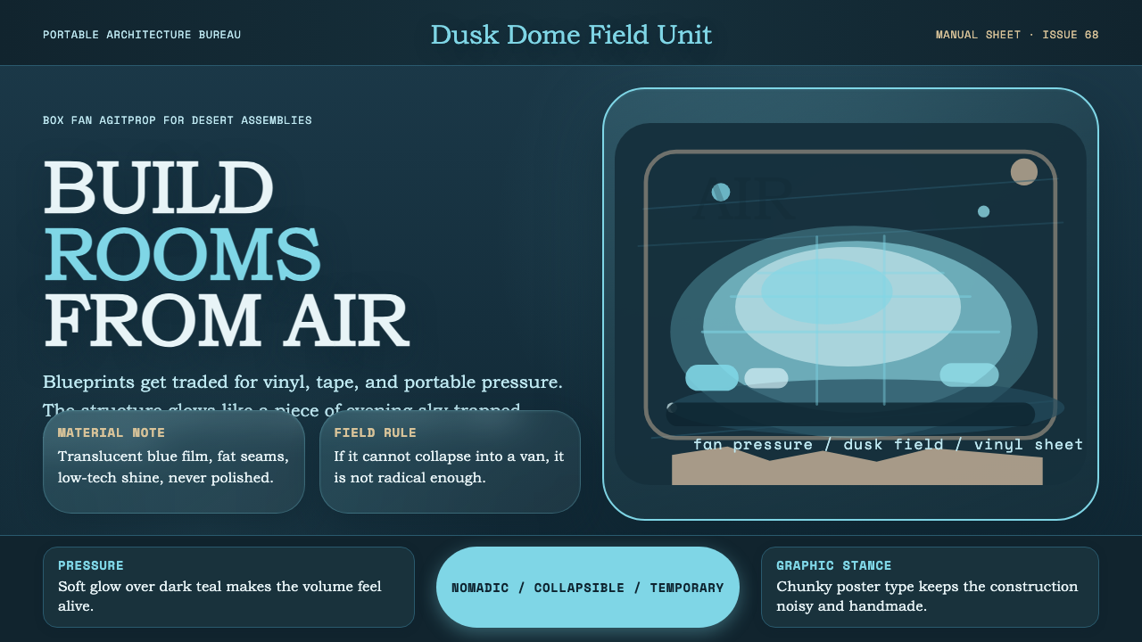 Ant Farm InflatablesTemporary architecture glows. Vinyl-blue domes swell over dark desert teal.
 Chicago HouseDarkness starts the track. Neon pink, yellow and cyan hit black like Xerox st…