What is Slimer Ghostbusters Green?
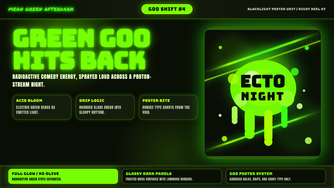
Slimer Ghostbusters Green turns the dark into a stage for radioactive comedy — luminous ecto-green goo, ecstatic drips, and spectral energy that refuses to stay contained.
Slimer Ghostbusters Green in brief
Slimer Ghostbusters Green is a dark visual style derived from the glowing, dripping presence of Slimer, the “Mean Green Ghost” introduced in Ghostbusters in 1984. Its defining image is a mass of electric acid green suspended against pure black: part creature, part stain, and part light source. The darkness is not empty background space. It is the condition that allows the supernatural green to become visible.
The style combines three strands named in its source material: 1980s blockbuster creature effects, spectral airbrush poster art, and retro horror-comedy. Goo gives it physical weight, radiant halos make that matter appear paranormal, and proton-like streaks introduce speed and confrontation. The result moves between disgust and delight. It can feel monstrous for an instant, then immediately become exuberant, silly, and inviting.
Everything depends on intensity. The green must remain luminous rather than earthy, dusty, or military; forms should look swollen, wet, and unstable rather than neatly geometric. Bold Bungee-like display lettering belongs naturally to the system because its inflated shapes can hold their own beside splatter and glow. Against the void, typography, slime, and energy trails behave less like separate decorations than different states of the same ectoplasmic substance.
Where does Slimer Ghostbusters Green come from?
The style is anchored in the North American visual culture surrounding Ghostbusters in 1984, while its broader reference era stretches from 1950 to 1990. Its immediate source is Slimer, also identified as the Onionhead ghost: a radioactive-looking green blob whose dripping body becomes legible through contrast with pure black. That simple opposition established the essential grammar — darkness as environment, green as apparition, and irregular fluid form as character.
Slimer belongs to the tradition of 1980s blockbuster creature effects, where a supernatural figure needed a memorable silhouette, a strong material presence, and enough personality to support comedy as well as horror. The Ghostbusters creature and effects team is therefore central to the style's lineage. The ghost is not merely colored green; its goo, glow, and unstable outline make the color appear alive. Physical mess and spectral light occupy the same body.
Spectral airbrush poster art supplied a complementary language. Soft radiant halos, vaporous edges, and concentrated beams could suggest forces that ordinary illustration could not contain. Against a nocturnal ground, airbrushed light made the paranormal seem simultaneously cinematic and graphic. Proton streaks extended that logic into motion: energy could cross the field, bend attention, frame a title, or appear to strike the ectoplasmic mass.
Retro horror-comedy completes the system by preventing the darkness from becoming solemn. The void may evoke danger, but the shouting green, comic bulk, and unruly drips repeatedly puncture fear with excess. Ivan Reitman, Slimer, and the creature and effects team form the approved constellation of key figures around this identity. Together, they locate the aesthetic not in pure horror but in a popular spectacle where the grotesque can be funny, highly visible, and immediately recognizable.
What defines the Slimer Ghostbusters Green look?
Ecto-Green
The palette is dominated by electric acid green against black or near-black space. This green should appear to emit light rather than merely reflect it. Pale luminous passages suggest hot centers, while deeper green areas give the goo body and thickness. Muted, olive, mossy, or natural greens weaken the supernatural premise. Supporting colors should remain subordinate to the ectoplasmic signal.
Inflated Typography
Display lettering is heavy, rounded, and boisterous, with Bungee-like forms capable of surviving beside intense glow and splatter. Headlines should feel inflated or packed with pressure, as though the letters share Slimer's blobby anatomy. Body text must be calmer and highly legible, allowing the expressive title to perform without turning the entire page into noise.
Drips and Splatter
Edges rarely remain clean. Rounded drips descend under imagined weight, droplets break away from larger masses, and splatter marks imply impact just beyond the frame. The liquid behavior should feel gloopy rather than watery: thick, elastic, and slow enough to retain swollen contours. Repetition without variation makes the effect decorative; convincing slime needs irregular rhythm and unequal shapes.
Spectral Glow
Airbrushed halos surround solid green forms and dissolve gradually into the void. This atmospheric glow separates the apparition from ordinary flat graphics, making the object appear radioactive, spectral, or electrically charged. The brightest area belongs close to the form, while the outer haze should become quieter. If every element glows equally, the night loses depth and nothing feels supernatural.
Proton Streaks
Concentrated energy trails cut through the dark as directional forces. They may arc around a title, enter from outside the composition, or converge on a focal blob. Their function is not only cinematic reference but visual routing: a streak can pull the eye from headline to subject and onward to an action. Curvature and interruption keep the energy volatile rather than diagrammatically neat.
Void Composition
Black space is active, not leftover. Large regions of darkness isolate luminous subjects, establish suspense, and prevent the acid green from becoming visually ordinary. Compositions work best when a concentrated cluster of goo, lettering, and streaks meets a generous field of quiet. Filling every corner with slime destroys the reveal; the apparition needs darkness in which to arrive.
Comic Grotesque
The emotional register balances revulsion with fun. Wet surfaces, shapeless anatomy, and radioactive brightness supply the grotesque; exaggerated bulk, exuberant lettering, and unruly motion make it comic. Leaning entirely into menace produces generic supernatural horror, while excessive cuteness removes the ectoplasmic bite. The style succeeds when viewers can recoil and grin at almost the same moment.

Who shaped Slimer Ghostbusters Green?
Ivan Reitman is named among the key figures connected to the Ghostbusters source from which this style draws. Within the article's visual lineage, his significance lies in the identity of the 1984 film as retro horror-comedy rather than unbroken terror. That tonal frame permits radioactive goo, nocturnal spectacle, and comic personality to coexist without canceling one another.
Slimer is the style's central figure and its most complete visual instruction. The ghost supplies the electric green, dripping mass, glowing contour, and comic grotesqueness that organize the entire system. Treating Slimer only as a mascot misses the point: its body demonstrates how color, material, silhouette, light, and personality can become one indivisible graphic idea.
The Ghostbusters creature and effects team represents the collective craft behind the source aesthetic. Its relevance is visible in the union of tangible goo and intangible glow: the supernatural presence must feel materially messy while remaining impossible. For designers, that combination is the enduring lesson. Texture alone looks like slime; light alone looks like energy; together they become ectoplasm with character.
How do you use Slimer Ghostbusters Green today?
For presentation covers, place a compact eruption of luminous lettering, goo, and proton energy against a broad black field. The title should be the loudest solid form, with slime interacting with its contours rather than floating nearby as unrelated decoration. Content slides need more restraint: keep reading areas calm and use small drips, green rules, or isolated glow as recurring signals. Darkness should organize the hierarchy, not conceal information.
Data slides should translate the style into emphasis instead of coating every chart in effects. Use bright green for the decisive series, threshold, or result and allow secondary information to recede into the night. A proton streak can indicate movement or connection, while a concentrated halo can identify the main finding. Avoid placing glow around every mark, because blurred radiance can compromise comparison and make the data feel less trustworthy.
For web dashboards and pricing pages, the style is strongest when ecto-green identifies active, urgent, or premium states. Panels can emerge from the dark through restrained halos, while major actions use bold inflated type or a contained slime edge. Navigation and dense metrics should remain crisp. Pricing tiers may differ through degrees of luminous emphasis, but the brightest treatment must be reserved for the intended focal offer.
Editorial and marketing layouts can embrace the poster heritage more aggressively. Open with an oversized headline struck by a proton trail, then alternate theatrical black fields with quieter reading passages. Product launches, entertainment campaigns, seasonal horror promotions, and playful cultural features can use cropped goo masses as section transitions. The comic tone should remain visible in rounded forms and exaggerated motion, preventing the night setting from becoming generically ominous.
The most common mistake is treating fluorescent green on black as sufficient. Without viscous form, spectral airbrush atmosphere, proton movement, and horror-comedy tension, the result becomes an ordinary neon theme. Another failure is indiscriminate glow: when text, panels, icons, and charts all radiate at once, hierarchy collapses. Build one apparition at a time, preserve real darkness around it, and let intensity mark what matters.
Slimer Ghostbusters Green — FAQ
Is Slimer Ghostbusters Green simply a neon-on-black style?
No. Neon contrast is only the outermost resemblance. The style requires a specific material and emotional logic: acid green behaves like thick ectoplasmic goo, airbrushed light makes it spectral, proton streaks supply cinematic motion, and comic exaggeration keeps the darkness playful. A clean green line on black may look futuristic, but it does not become Slimer-like until it feels wet, unstable, luminous, and mischievously alive.
Can the style work on a light background?
Only with substantial loss of its defining effect. The source image depends on glowing green becoming visible against pure black, so darkness is part of the subject rather than an optional presentation choice. A light-ground adaptation can preserve goo shapes and comic typography, but the spectral halo will read more like paint or candy. For authentic impact, return to a dark field and let the green appear from it.
How much slime is enough?
Use slime where it explains interaction: hanging from a headline, pooling beneath a focal object, breaking into droplets after impact, or marking a transition. It should not become a uniform border around every component. A concentrated irregular mass feels like an event; repeated identical drips feel like a decorative pattern. The surrounding clean darkness is what allows the mess to remain legible and surprising.
Does every headline need Bungee-like lettering?
No. The inflated display voice is most effective when reserved for covers, campaign lines, major section openings, and decisive calls to action. Repeating it at every level turns personality into friction. Supporting headings can remain bold but simpler, while body text should prioritize sustained reading. The hierarchy works when the loud type feels like Slimer entering the scene, not like a permanent alarm.
Where does Slimer Ghostbusters Green struggle?
It struggles wherever neutrality, daylight calm, institutional restraint, or long-form reading is the primary requirement. Its blacklight intensity and comic grotesqueness naturally demand attention, so applying them across a sober report or a densely operational interface can exhaust the reader. The style is better used for entrances, focal states, entertainment contexts, and concentrated campaigns than as a constant coating over every screen and paragraph.
Related design styles
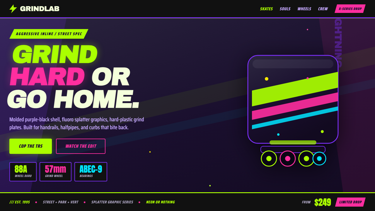 90s Aggressive Inline SkateX-Games attitude in plastic and paint. Fluoro lime and magenta slash across m…
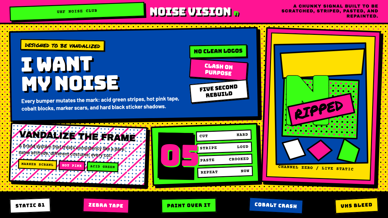 MTV Launch Identity (1981)Built to be vandalized. Hot pink, acid green, Bungee blocks, and crooked stic…
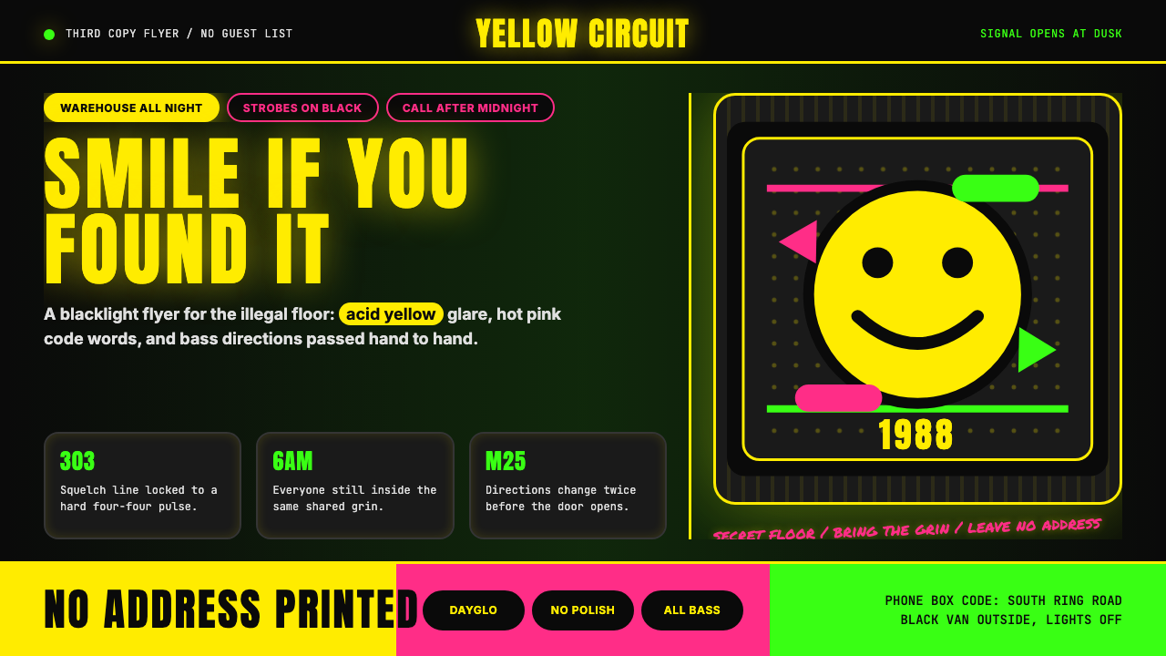 Acid House Smiley (1988)Rave energy hits first. Acid yellow on black, Anton caps, smiley glow.
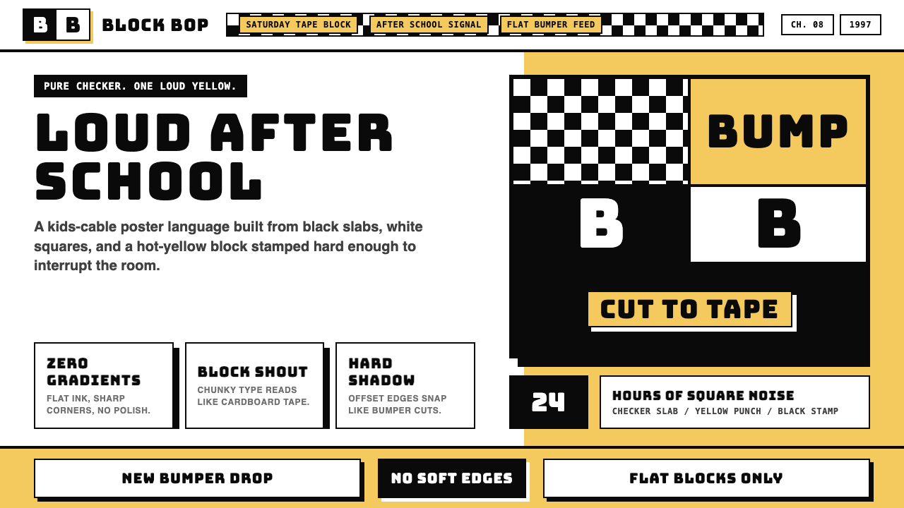 Cartoon Network 90s BlocksKids-cable noise, squared. Black-white checkerboards crash into hot-yellow Bu…
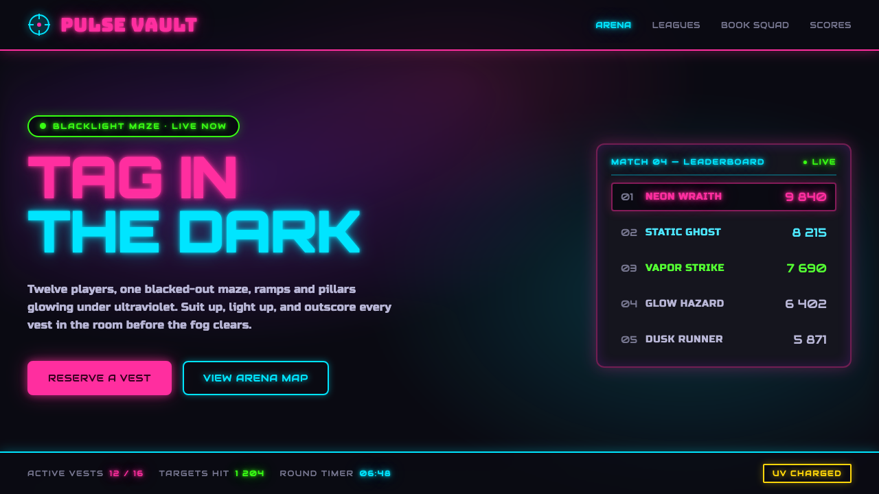 Laser Tag Arena BlacklightSuit up in the dark. UV pink, acid green and cyan glow on matte arena black,…
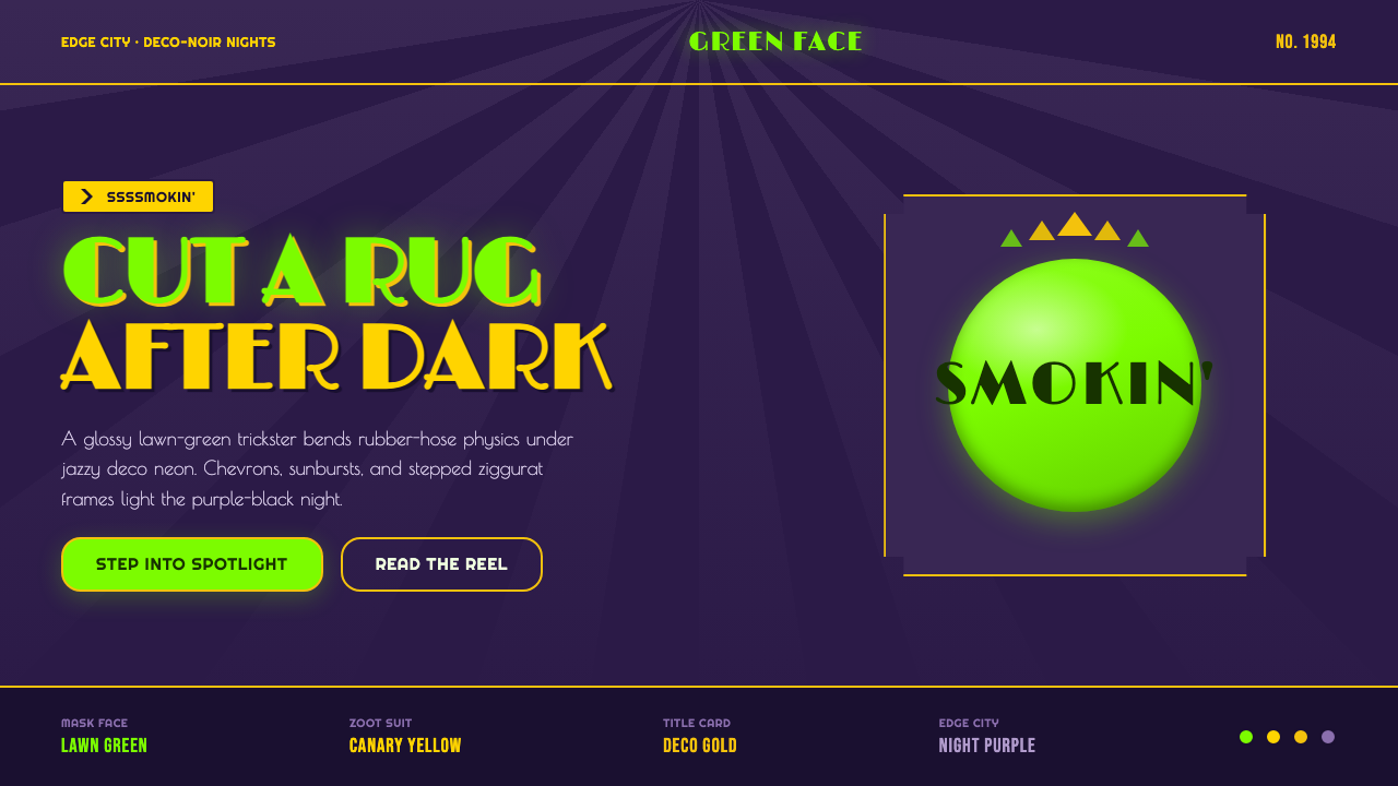 The Mask 1994 Green FaceLoud, theatrical, ssssmokin'. Lawn-green and canary-yellow scream against dec…