What is Laser Tag Arena Blacklight?
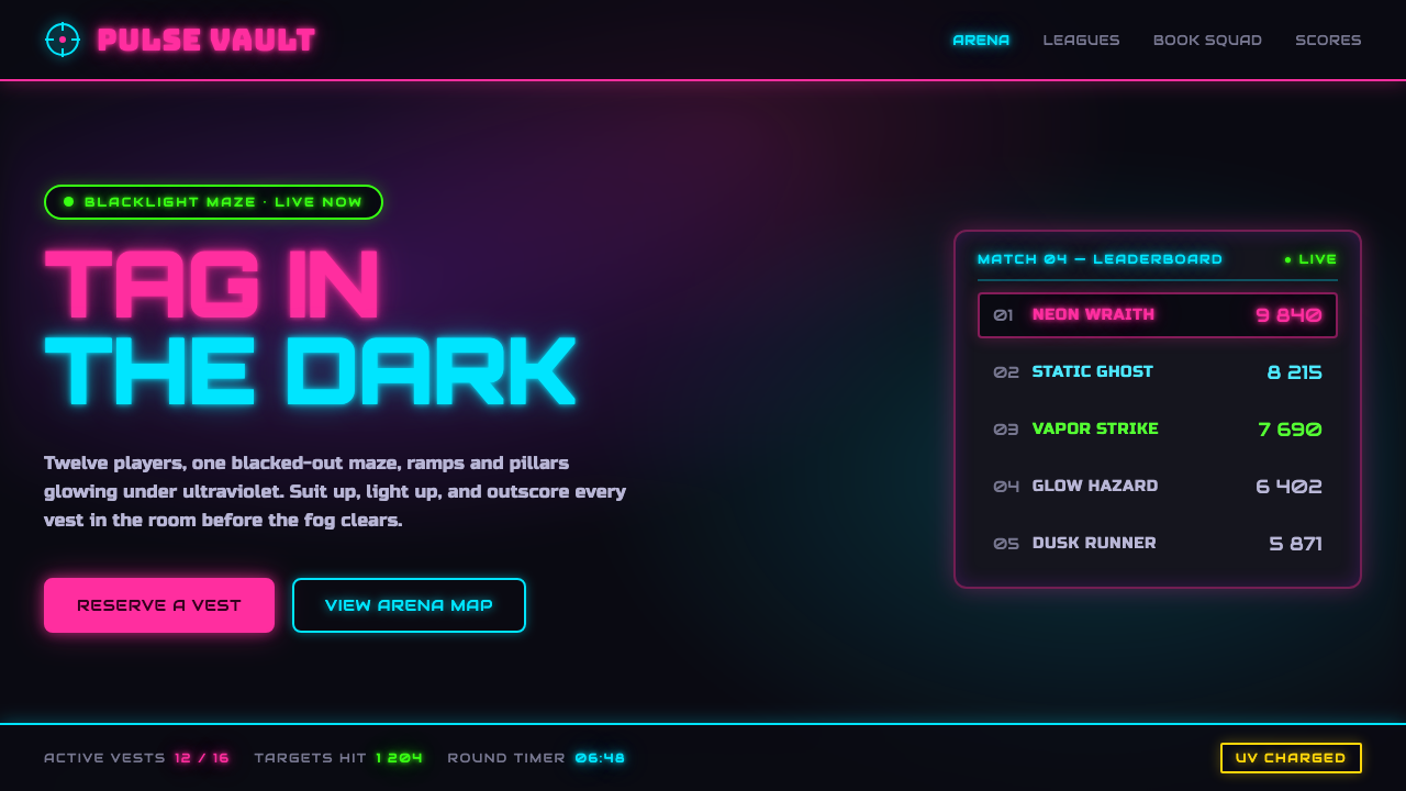
Laser Tag Arena Blacklight turns darkness into a stage, where UV pink, acid green, and electric cyan flare against matte black with the restless energy of an arcade battle.
Laser Tag Arena Blacklight in brief
Laser Tag Arena Blacklight is the visual language of the 1990s–2000s laser-tag arena: a blacked-out maze, UV blacklight, fluorescent murals, glowing vests, drifting fog, ramps, score panels, and chunky science-fiction branding. Its emotional register is not sleek space-age minimalism but arcade futurism — loud, kinetic, playful, and designed to make a family entertainment center feel like an alternate world.
The system works through contrast. UV-fluorescent hot pink, acid green, and electric cyan appear to emit light because the surrounding surfaces are matte near-black. The black ground is not empty background; it is the condition that makes every fluorescent mark legible as energy. Neon outlines, score displays, and blocky signage create a visual environment that feels illuminated from within, even when the underlying forms remain flat.
Everything belongs to the arena: the palette should feel painted onto walls, vests, barriers, and equipment; typography should feel large enough to read through haze and motion; and composition should suggest routes, targets, warnings, and changing score states. The result is a deliberately heightened world in which information behaves like equipment and decoration behaves like arena infrastructure.
Where does Laser Tag Arena Blacklight come from?
The style emerged from the peak laser-tag franchise era between 1990 and 2010, especially in North American malls and strip-mall entertainment centers. These venues were built around the promise of temporary transformation. A visitor could enter an ordinary commercial setting, pass into a darkened attraction, and become part of a brightly marked game space. The design therefore had to announce entertainment immediately while remaining readable in an environment governed by blacklight, darkness, movement, and noise.
Its cultural roots lie in 1990s arcade culture and the broader design of family entertainment centers. Arcade graphics favored strong silhouettes, luminous accents, energetic display type, and interfaces that made points and status visible at a glance. Laser-tag arenas adapted those signals to an immersive environment: the wall was no longer merely a backdrop, the vest became part of the identity system, and signage had to function as both wayfinding and atmosphere.
The science-fiction dimension came through blacklight graphics and arcade futurism rather than through realistic technological detail. Fluorescent paint supplied the visual material, while near-black architecture supplied the darkness that activated it. Franchise operators such as Laser Quest and Q-Zar helped establish the recognizable commercial setting, while UV-reactive paint and vest makers provided the physical means for the palette to appear luminous across murals, clothing, and arena surfaces.
What survived from this era is less a fixed logo system than a repeatable mood. The ingredients remain stable: blackout conditions, fluorescent color, chunky sci-fi lettering, neon contours, score-oriented information, and a sense of motion through ramps and maze-like routes. Applied today, the style recalls the shared memory of the entertainment center rather than reproducing a single venue. Its power comes from turning familiar interface cues into a complete spatial fantasy.
What defines the Laser Tag Arena Blacklight look?
Blacklight Contrast
The palette is built on a matte near-black ground that allows UV-fluorescent colors to read as illumination. Hot pink, acid green, and electric cyan should feel exceptionally vivid, but their intensity depends on restraint around them. Black areas provide visual rest, depth, and the sense that the colored elements are glowing inside a darkened arena rather than simply being brightly printed.
Fluorescent Triad
Hot pink, acid green, and electric cyan form the signature color family. They are not interchangeable decoration; each should help create a different signal within the arena. Pink can carry heat and competitive excitement, green can suggest active routes or targets, and cyan can establish a cooler technological counterpoint. The palette is strongest when one color leads and the others punctuate.
Chunky Sci-Fi Type
Typography should feel engineered for signage, equipment, and score panels. Chunky Orbitron type brings squared construction, mechanical rhythm, and a clear connection to arcade futurism. Headings need a strong silhouette and generous separation so they remain readable against black surfaces and glowing accents. Type is part of the arena's hardware language: it should announce, label, warn, and energize rather than behave like quiet editorial text.
Neon Outlines
Outlines turn ordinary forms into arena signals. A fluorescent contour around a panel, button, route, or title can imply activation without requiring realistic glow effects. The line should feel deliberate and graphic, as though painted onto a barrier under blacklight. Outlining is especially useful for separating content from the dark field while preserving the flat, poster-like quality of the system.
Score-Driven Hierarchy
Information should inherit the urgency of a game interface. Scores, team states, alerts, and calls to action deserve the clearest contrast and the most assertive type. Supporting information can recede into quieter cyan or pale text, but it should never become ornamental filler. The hierarchy feels authentic when every emphasis resembles something a player might need to notice while moving through the maze.
Arena Motion
Compositions should suggest movement through ramps, corridors, barriers, and changing lines of sight. Diagonal accents, offset panels, cropped shapes, and directional arrows can imply a route without illustrating a literal map. The visual field should feel assembled for action: a title may lock into a corner like a sign, while a colored streak or contour pulls the eye toward the next point of interest.

Who shaped Laser Tag Arena Blacklight?
Laser Quest franchise operators helped define the commercial identity of the North American laser-tag arena during the peak franchise era. Their venues belong to the world of blacked-out mazes, fluorescent markings, score-oriented play, and family entertainment center design. In this style system, their significance is less individual authorship than the repeatable environment they helped make recognizable.
Q-Zar franchise operators belong to the same entertainment-center tradition that connected sci-fi blacklight graphics with active, team-based play. Their presence in the source tradition reinforces the style's combination of maze-like space, glowing equipment, chunky branding, and arcade futurism. The visual language is therefore experiential: it must make a visitor feel already inside the game before play begins.
UV-reactive paint and vest makers supplied the physical surfaces through which the style became visible. Fluorescent pigment on wall murals and player vests is not merely a color choice; it is the material mechanism that makes the blacklight world work. Their contribution explains why the palette feels tactile and spatial, as though the same glowing marks could move from a sign to a barrier to a piece of equipment without losing identity.
How do you use Laser Tag Arena Blacklight today?
For presentation slides, the style is strongest when the cover behaves like an arena entrance. Use a matte near-black field, a large block of Orbitron type, and a single fluorescent shape or outline that establishes the active color. Content slides should feel like score panels or wall signage: clear labels, assertive headings, compact information groups, and visual routes that guide the eye. Data slides can treat charts as game instrumentation, using fluorescent accents to distinguish teams, states, or changes while leaving enough black space for the signal to remain legible.
For web interfaces, Laser Tag Arena Blacklight suits dashboards, scoreboards, analytics tools, event systems, and pricing pages that want to feel energetic rather than corporate. Keep the main surface near-black and reserve hot pink, acid green, and electric cyan for active states, selected plans, alerts, progress, or competitive comparison. Cards should feel like equipment modules, with strong outlines and clear labels. Navigation can borrow from arena wayfinding: short, blocky names, directional cues, and a visible distinction between ready, active, and locked states.
For editorial and marketing work, the style turns ordinary information into an event announcement. A campaign page can open with a blackout field, fluorescent headline, and a cropped neon contour that suggests a corridor or target. Editorial layouts can use dark panels, score-like call-outs, and brightly marked section labels, provided the reading text remains calm enough to sustain attention. Marketing benefits from the style's spatial memory: product benefits can be framed as missions, plans as loadouts, and calls to action as illuminated entry points.
For covers, content, and data alike, the central principle is controlled activation. A cover should make the world feel immediate; a content page should make the route through information obvious; a data page should make status and comparison visible. The visual language works best when the fluorescent accents are treated as signals with jobs, not as a general-purpose decoration layer. Black provides the arena, typography provides the instruction, and color provides the moment of action.
The common mistake is to make every element glow at once. If the background, borders, headings, icons, buttons, charts, and illustrations all compete in hot pink, acid green, and cyan, the design loses the darkness that gives the palette its force. Another mistake is replacing the chunky, readable sci-fi character with a delicate futuristic typeface. Keep the black field quiet, let one fluorescent color lead, and make every bright mark explain where to look or what to do.
Laser Tag Arena Blacklight — FAQ
Is Laser Tag Arena Blacklight the same as cyberpunk?
They overlap in their use of darkness, fluorescent color, and futuristic cues, but they create different worlds. Cyberpunk usually suggests dense urban technology, decay, surveillance, and social tension. Laser Tag Arena Blacklight comes from family entertainment centers, arcade culture, and playful team competition. Its mood is active and theatrical rather than dystopian. Use the laser-tag language when the experience should feel like entering a game, not surviving a dark future.
Can this style work without actual UV blacklight?
Yes, but the contrast must do the work that blacklight would normally do. Use a quiet matte near-black field and treat fluorescent color as a scarce signal. The illusion weakens when the background becomes glossy, pale, or equally colorful. Neon outlines can suggest activation, but they should remain graphic marks rather than becoming a blanket of realistic light effects. The style depends more on controlled contrast than on literal lighting technology.
How should the three fluorescent colors be balanced?
Choose a lead color and assign the others supporting roles. Hot pink is effective for competitive heat and prominent calls to action, acid green can mark routes, targets, or active conditions, and electric cyan can provide a cooler technological counterpoint. These associations are flexible, but the hierarchy should remain clear. When all three colors occupy the same visual level, the page starts to resemble uncontrolled arcade noise rather than a designed arena system.
Does the style suit serious dashboards or pricing pages?
It can, especially when the product benefits from energy, competition, progress, or clear state changes. Dashboards can use the score-panel logic to make status visible, while pricing pages can use fluorescent accents to distinguish plans or emphasize the active choice. The risk is treating playfulness as an excuse for weak information design. Keep labels direct, preserve strong contrast, and let the game-like atmosphere support comprehension rather than compete with it.
What imagery belongs in a Laser Tag Arena Blacklight design?
The most fitting imagery suggests the arena itself: fluorescent wall murals, glowing vests, score panels, neon contours, maze-like barriers, ramps, and fog drifting through blacklight. Images should feel cropped, active, and spatial rather than polished like conventional product photography. Even when no literal arena is shown, a dark field with luminous marks can carry the same memory. Avoid imagery that introduces soft luxury, natural warmth, or unrelated realism, since those qualities pull the system away from its arcade environment.
Related design styles
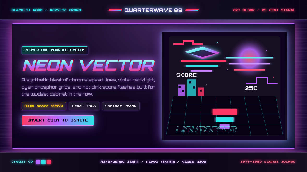 Arcade Cabinet MarqueeToo loud to ignore. Black-indigo glass, violet glow, cyan grids, hot-pink arc…
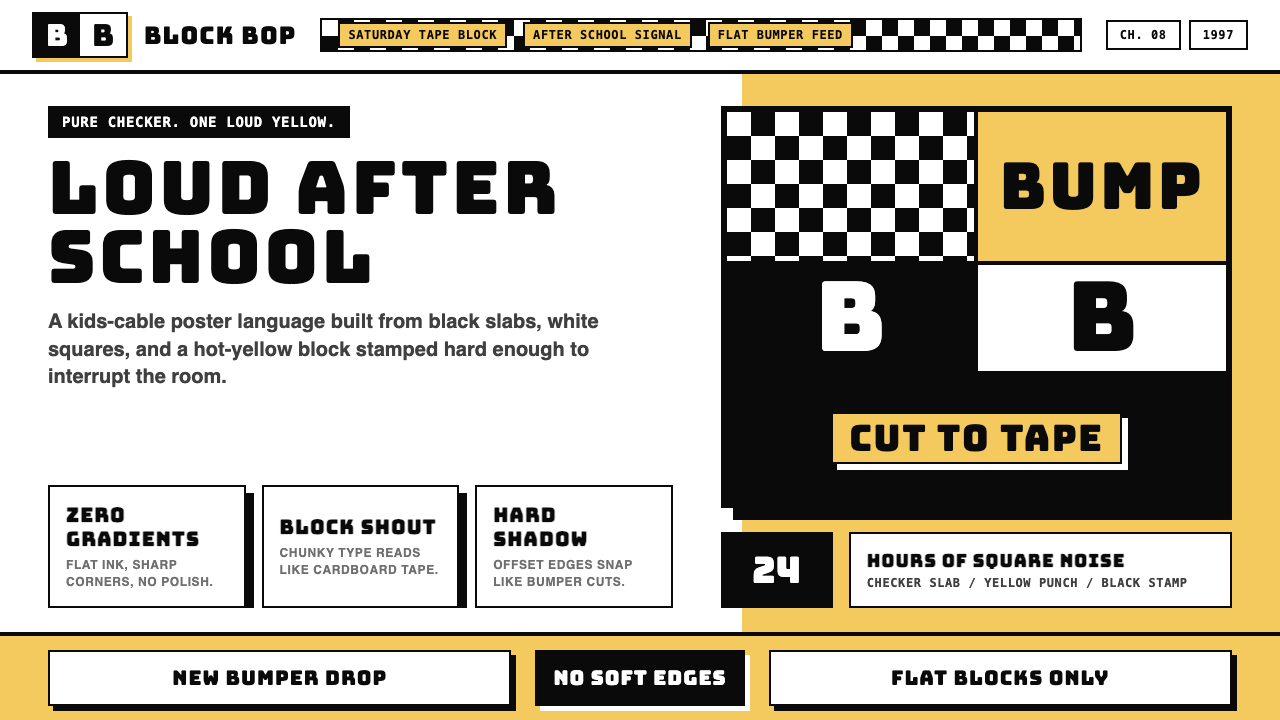 Cartoon Network 90s BlocksKids-cable noise, squared. Black-white checkerboards crash into hot-yellow Bu…
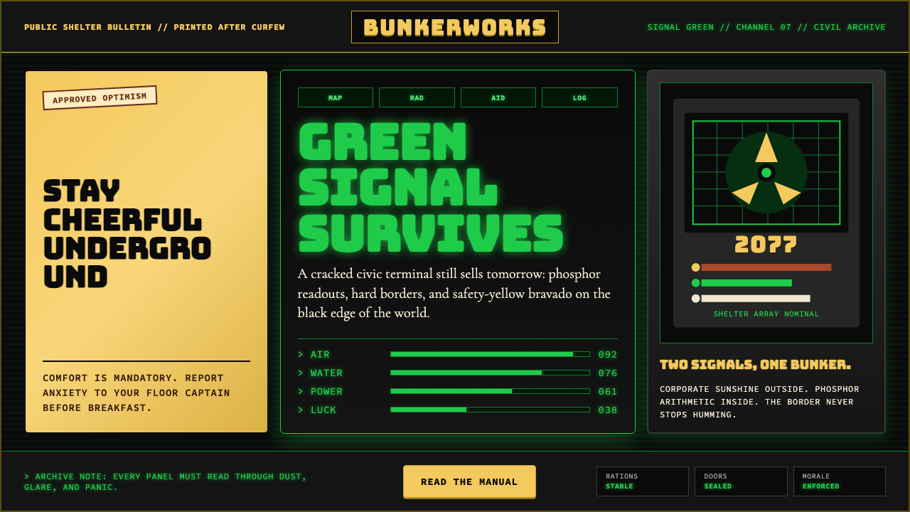 Fallout Vault-Tec Pip-BoyIrradiated optimism. Vault yellow and CRT green lock into a bordered bunker g…
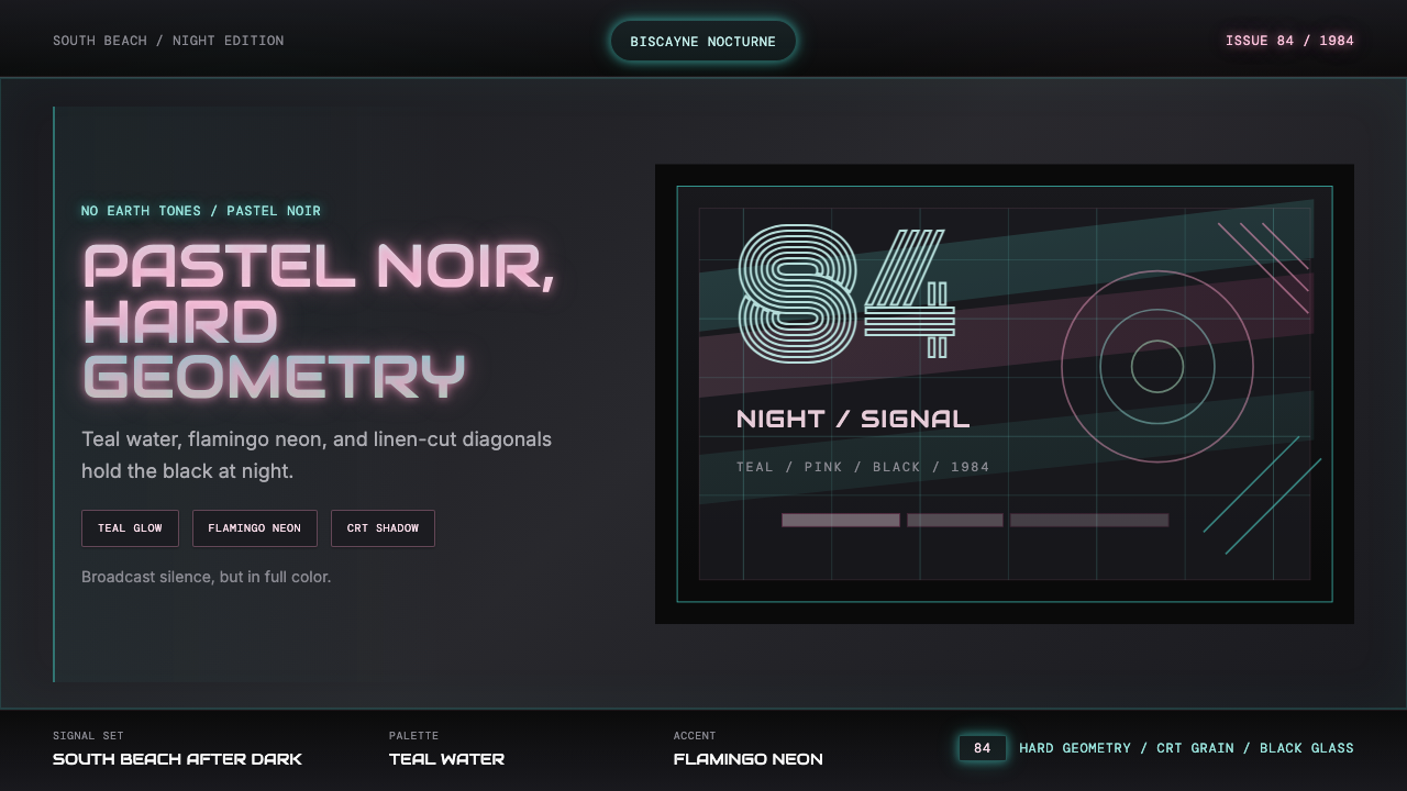 Miami Vice Pastel Teal (1984)Pastel noir, not nostalgia. Teal glow and flamingo pink slice black with geom…
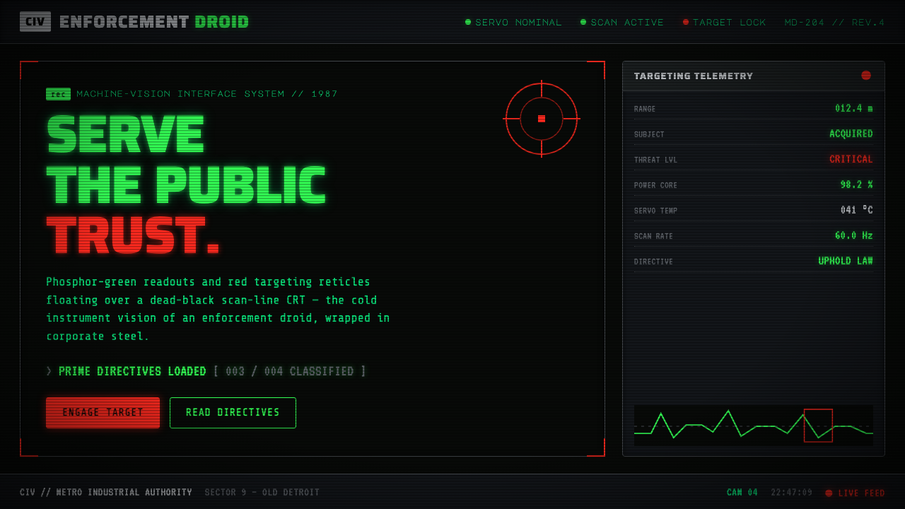 RoboCop (1987)Machine vision as interface. Phosphor-green readouts on dead-black CRT, red r…
 Slimer Ghostbusters GreenBlacklight goo shouts. Ecto-green Bungee type, drips, and proton streaks hit…