What is East German Ampelmännchen?
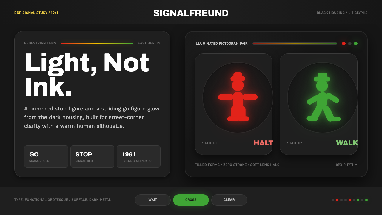
The Ampelmännchen is not a graphic — it is a lamp. Karl Peglau's 1961 pedestrian signal figure exists purely as a glowing coloured silhouette inside a black lens housing, which means its entire design logic is built around legibility as light rather than as ink. After the Berlin Wall fell, this hatted little figure outlived the state that made it and became one of the most recognisable design objects to emerge from the Cold War East.
East German Ampelmännchen in brief
The East German Ampelmännchen (literally 'little traffic-light man') is the pedestrian signal figure designed in 1961 by Karl Peglau for the traffic lights of the German Democratic Republic. It appears in two states: a stocky red figure standing with arms outstretched — commanding stop — and a striding green figure with a brimmed hat, mid-step, signalling walk. The dark signal housing is not background; it is part of the design. These figures are light, not print.
As a visual system, the Ampelmännchen is defined by extreme silhouette legibility. Every formal decision — the wide hat brim, the pronounced stride, the outstretched arms — was made to maximise recognition at a glance, in peripheral vision, at distance, and under adverse weather. No internal detail, no linework, no shading: the figure reads entirely through its outline, which must be unambiguous at the moment a pedestrian needs to act.
After German reunification in 1990, many East German institutions, brands, and products vanished within years. The Ampelmännchen survived — partly through grassroots campaigns to preserve it in Berlin, partly through its adoption as an Ostalgie ('East-nostalgia') icon, and eventually through commercial licensing that put the figure on everything from mugs to crosswalk simulations in other countries. It is now studied as a case of functional public design that achieved the paradox of being both strictly anonymous and deeply beloved.
Where does East German Ampelmännchen come from?
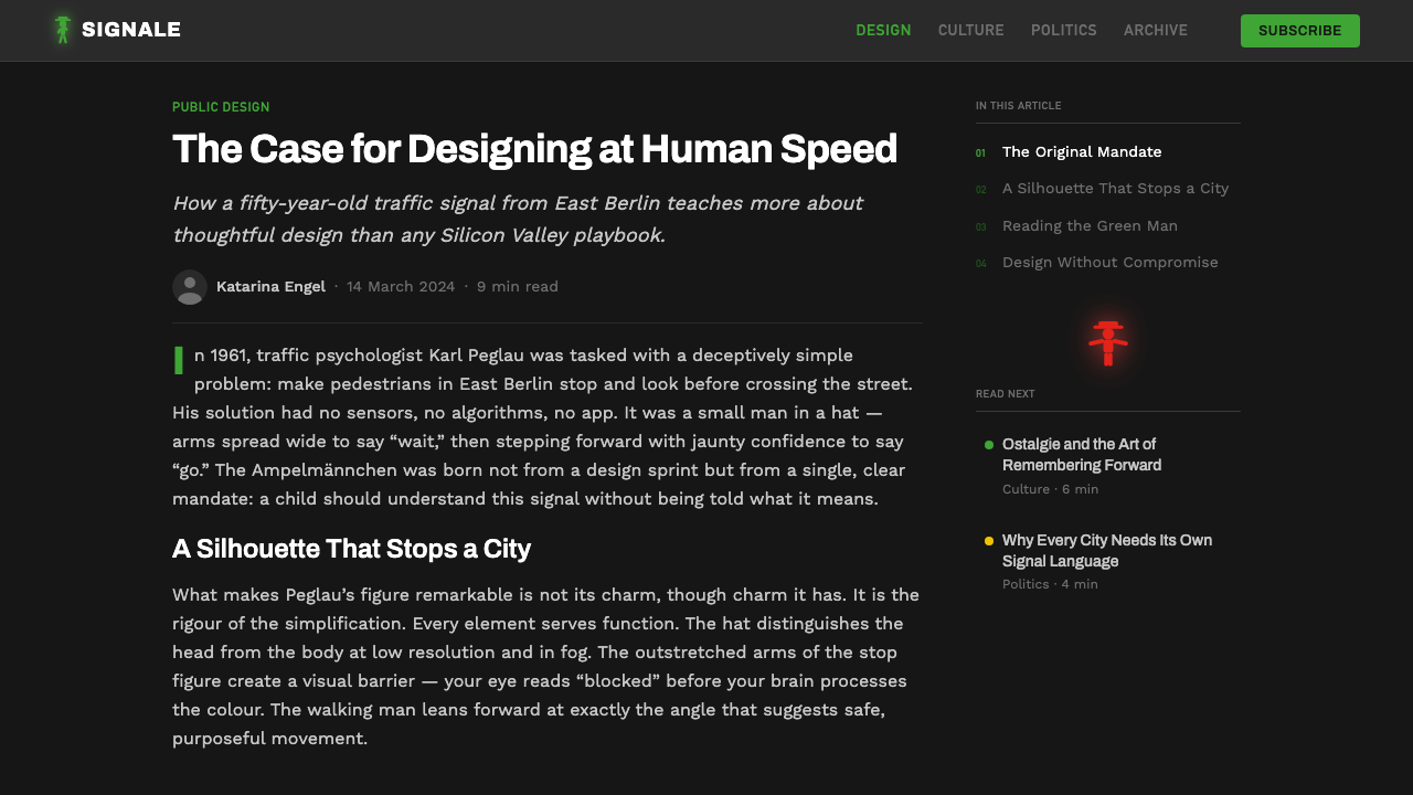
In 1961, the GDR's Ministry of Transport commissioned traffic psychologist Karl Peglau to redesign East Germany's pedestrian signal system. Peglau's research focus was not aesthetics but accident reduction. He studied what made pedestrian signals fail: figures that were too abstract, outlines insufficiently distinct from one another in low-light conditions, and stop-go signals that offered no mnemonic beyond color. His solution was to design figures that communicated through posture and silhouette, not color alone — so that even a colour-blind pedestrian, or one caught in glare, could parse stop from go.
The design debuted on East Berlin's streets in 1969 under the name 'Ampelmännchen,' the diminutive form of Ampelmann (traffic-light man). Peglau gave the walking figure a brimmed hat and a pronounced stride for two reasons: the hat extended the figure's silhouette into a distinctive shape that no other signal element would share, and the stride created a sense of forward momentum that reinforced the permissive meaning without relying on the word 'walk.' The standing red figure's outstretched arms created a physical barrier gesture, readable as prohibition even in cultural contexts unfamiliar with German traffic law.
Within the GDR, the figures appeared on traffic lights across the country and became part of the visual fabric of daily life for East Germans across two generations. Peglau also developed a pedestrian safety education programme built around the same characters, which meant that East German children encountered the Ampelmännchen in schools, on illustrated road-safety cards, and in public campaigns before they ever crossed a road. This pedagogical saturation — unusual for a functional signal icon — is one reason the figures acquired the emotional weight they did.
After reunification, West German Ampelmänner (which used a different, more abstract figure) were installed in much of the formerly East German urban infrastructure as a matter of standardisation. Berlin residents pushed back. A grassroots campaign argued that the East German figure was demonstrably more legible by Peglau's own criteria, and traffic safety researchers at the time produced studies supporting the claim. Several Berlin boroughs retained the figure; others reinstated it after brief replacement. By the late 1990s, the Ampelmännchen had become an Ostalgie brand — licensed by a Berlin entrepreneur — and by the 2000s it was exported globally as a motif. Peglau, who lived until 2015, saw his functional signal become a cultural icon.
What defines the East German Ampelmännchen look?
Silhouette as the primary design unit
Every element of the Ampelmännchen's form is determined by its silhouette performance. No detail is meaningful at the signal's operating distance; only the outline is. The wide hat brim, the raised arms, the mid-stride posture — these are not stylistic choices but legibility decisions. The figure must be instantly decodable in the interval between seeing a signal and stepping off a kerb. This makes the Ampelmännchen an extreme case of a principle that applies to all public signage: information must survive reduction to its simplest possible form.
Light as medium, not surface
The Ampelmännchen is designed to be seen as illuminated light within a dark housing, not as a printed mark on a light surface. This distinction has formal consequences: the figure's forms are slightly heavier and more rounded than they would need to be in print, because illuminated areas tend to bloom and spread at their edges when the eye adapts to the dark surround. The dark housing is structural — it maximises the luminance contrast ratio between figure and ground, which is the single most important variable in the legibility of a signal. Designs derived from the Ampelmännchen that flatten the figures onto light backgrounds lose this constitutive relationship.
Two-state clarity
The entire system operates with exactly two figures: stop and walk. The formal challenge is that they must be maximally different from each other while sharing the same size, the same housing, and the same underlying humanoid structure. Peglau achieved this through posture contrast — a static, spreading form for stop; a directional, striding form for walk — and through color assignment that reinforced rather than created the distinction. Red is culturally coded as danger or prohibition in most of the world's traffic systems; green as permission. The Ampelmännchen system uses color to confirm what the silhouette already says, not as the primary carrier of meaning.
Characterful anonymity
The Ampelmännchen is a figure with recognisable personality — jaunty, purposeful, slightly squat — yet it represents no individual and belongs to no cultural moment in the way an illustrated character would. This is the productive tension at the heart of its enduring appeal: specific enough to be memorable, generic enough to be universal. The hat is the detail that tips the figure from abstract signal toward character, without pushing it into the territory of mascot or cartoon. Contemporary designers working in this vernacular frequently underestimate how narrow this balance point is.
Warm signal palette
The Ampelmännchen's colours are not the pure saturated primaries of international signal standards. The green used in GDR-era signals was a warm grass-green — with a perceptible yellow shift — rather than the cooler, more saturated green of most Western traffic systems. The red leaned toward a warmer orange-red rather than a cool crimson. These choices were partly a function of the lamp technologies available in the 1960s GDR and partly Peglau's deliberate decision to prioritise warmth and legibility over technical purity. The warm green in particular has become the identifying colour of the Ampelmännchen as a brand, distinguishing it visually from traffic signals worldwide.
Functional redundancy as design principle
Peglau designed the Ampelmännchen so that meaning was encoded at multiple levels simultaneously: colour (red/green), posture (static/striding), gesture (outstretched arms/purposeful walk), and — through the pedagogical programme — narrative (the figure is a recurring character with a known behavioural code). This redundancy means the signal is robust against the failure of any single channel. If you cannot see the colour, posture disambiguates. If you cannot make out posture at a distance, colour guides. This layered approach to a single communication act is applicable to any design context where the stakes of misreading are high.
Post-socialist cultural afterlife
Unlike most functional design objects, the Ampelmännchen acquired a second life as a cultural symbol distinct from its original function. The Ostalgie phenomenon — the nostalgic revaluation of everyday GDR objects after reunification — elevated the figure from traffic infrastructure to icon. This transformation was enabled by the figure's design: it was distinctive enough to be recognisable out of context, simple enough to reproduce across media, and charged with collective memory in a way that a more generic signal figure would not have been. Designers working with the Ampelmännchen as a reference today are working with both a functional icon and a cultural memory object simultaneously.

Who shaped East German Ampelmännchen?
Peglau (1927–2015) was a traffic psychologist at the Research Institute for Road Transport in East Berlin, not a trained graphic designer. His commission was to reduce pedestrian accidents, and he approached the figure design as an ergonomic and perceptual problem: how does a person process a signal at the edge of their attention, at speed, under time pressure? His training in psychology rather than visual design may explain why the Ampelmännchen operates on redundant perceptual channels in a way that formally trained illustrators of the era rarely achieved. Peglau later became an advocate for the figure's preservation after reunification, publishing research supporting its superior legibility over the West German alternative.
The decision to retain the East German Ampelmännchen in Berlin was not made by a designer or an institution — it emerged from informal resistance by residents, transit workers, and local politicians who objected to the replacement of the figure with the West German alternative during infrastructure standardisation. Traffic researchers, when asked to adjudicate, found the East German figure performed measurably better on legibility tests. The campaign's success established a precedent: functional public design could be preserved on merit, not just on heritage grounds. It also generated the media attention that enabled the Ampelmännchen's commercial licensing as an Ostalgie product.
Heckhausen was the Berlin entrepreneur who negotiated the commercial licensing of the Ampelmännchen in the 1990s and founded the brand and retail operation that brought the figure to global audiences as a souvenir object. His intervention transformed the figure from a contested infrastructure remnant into a commercially active design property. While his role was commercial rather than creative, the licensing operation he established documented and standardised the figure's visual specifications at a moment when the original technical drawings from the GDR era were not publicly accessible, creating a reference corpus for the contemporary Ampelmännchen visual identity.
The Ampelmännchen represents a broader strain of GDR functional design that emphasised clarity, pedagogy, and mass legibility over aesthetic ambition. East German industrial and graphic design of the 1950s–1980s was constrained by material shortages and ideological directives that discouraged personal expression, but it produced a distinct vernacular: flat figures, bold outlines, warm earthy palettes, and an investment in communicative redundancy that reflected both the socialist emphasis on public education and the practical realities of print and signal production in a resource-limited economy. The Ampelmännchen is the most globally visible example of this typology.
How do you use East German Ampelmännchen today?
The Ampelmännchen visual system offers contemporary designers a vocabulary built around three interlocking principles: extreme silhouette legibility, functional colour warmth, and communicative redundancy. Applying it well means understanding these principles rather than simply reproducing the hatted figure in new contexts. The style is most naturally suited to interfaces, signage, and communication systems where users must act on information quickly and where misreading carries cost.
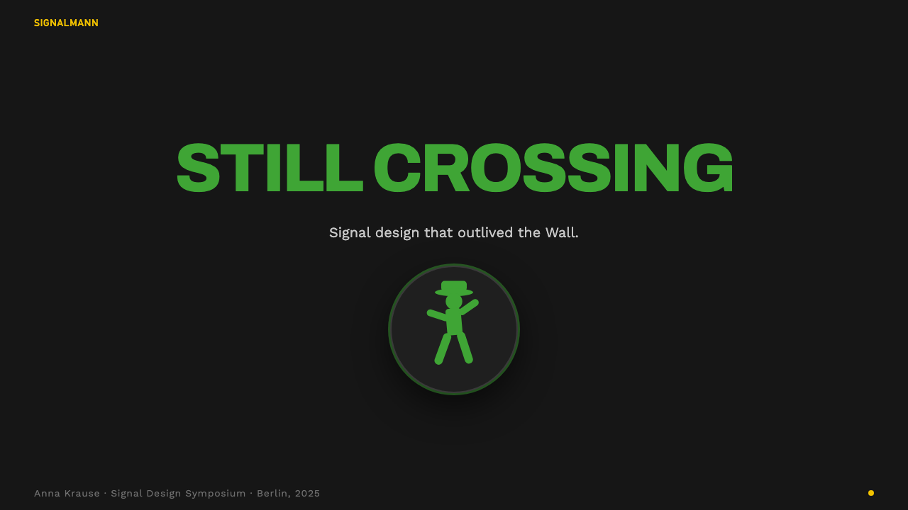
For presentation slides, the Ampelmännchen aesthetic translates into high-contrast compositions that rely on figure-ground reversal and silhouette rather than on typographic elaboration. Cover slides work well with a single bold figure or icon on a near-black ground, the figure rendered in warm grass-green or signal-red against darkness — a direct quotation of the original medium. Content slides should follow the redundancy principle: any important distinction (status, priority, category) should be encoded in both shape and colour simultaneously, not colour alone. Data slides benefit from this approach especially for status indicators and state changes.
For web and app interfaces, the style suits notification systems, onboarding flows, and any interface that guides users through a sequence of states with clear decision points. The visual language: dark panels or cards as the 'signal housing', warm-tinted figures or icons as foreground elements, and a strict two-state visual logic for interactive controls. Avoid soft shadows and gradients entirely — the style's authority comes from the hard edge between figure and dark ground. The warm palette extends naturally to button and badge systems where status must be instantly readable without being harsh.
For editorial and marketing work, the Ampelmännchen vernacular supports illustrated content that needs to communicate across language barriers or to non-specialist audiences. Instructional graphics, safety materials, wayfinding systems, and social media assets that need to be legible at small sizes all benefit from the style's silhouette discipline. When used in marketing, the style carries an implicit narrative of clarity and trustworthiness — associations earned by its original function rather than invented. This makes it well-suited to civic organisations, public health campaigns, and platforms that want to position themselves as clear and reliable rather than sophisticated.
The most common mistake when working with the Ampelmännchen as a design reference is confusing the figure with its Ostalgie brand identity — treating it as a retro-novelty style rather than as a functional design system. Designers who borrow only the hat and the squat proportions, without internalising the legibility principles that generated those features, produce nostalgia pastiche rather than functional design. The style's lesson is that strong personality and rigorous function are not opposites: Peglau achieved character through solving a perceptual problem, not by imposing aesthetic preferences. That inversion — character as the byproduct of function, not its antagonist — is the Ampelmännchen's real design contribution.
East German Ampelmännchen — FAQ
Is the Ampelmännchen a trademark, and can designers use it freely?
The Ampelmännchen as a specific commercial image is protected by trademarks held by the licensing company established in Berlin in the 1990s. However, the underlying design principles — silhouette-based figures, two-state communication systems, high-contrast figure-ground compositions — are not proprietorial. Designers working in the Ampelmännchen vernacular without reproducing the specific licensed figure are on solid ground. The distinction is between quoting a trademark and working within a design tradition. The former requires licensing; the latter does not.
Why did the West German Ampelmännchen lose the legibility competition?
The West German pedestrian signal figure was designed according to international standardisation norms that prioritised neutrality and cross-system consistency over ergonomic performance. It is a more abstract, less characterful figure — a simplified outline without the hat, the stride emphasis, or the arm gesture redundancy. When researchers tested the two figures in the 1990s Berlin debate, the East German figure consistently outperformed on reaction time and correct interpretation, particularly for older pedestrians and those with reduced visual acuity. The paradox is that the more 'designed' figure — the one with the personality — proved more functional than the more standardised one. International standardisation bodies have since studied the GDR figure as an example of how functional requirements and distinctive character can reinforce rather than compete with each other.
How does the Ampelmännchen relate to other socialist-era public design systems?
The Ampelmännchen belongs to a broader tradition of socialist-era public communication design that prioritised mass legibility, pedagogical clarity, and production constraints over aesthetic refinement. Similar approaches appear in Soviet public poster design, Czech and Polish pictographic systems, and the wayfinding work produced by various Eastern Bloc transport authorities. Common features across these systems include: bold outlines, flat colour fills, redundant communication channels, and a preference for figures in action rather than static symbols. What distinguishes the Ampelmännchen within this tradition is its survival and commercialisation after the political context that produced it collapsed — a trajectory unusual in the history of public design.
Can the Ampelmännchen visual system work for digital-first products, or is it inherently tied to physical signage?
The principles that make the Ampelmännchen work — silhouette legibility, redundant state encoding, dark-ground figure clarity — translate directly to digital interfaces, and in some ways perform better in digital contexts than in print. Digital screens can replicate the original medium: a figure that glows against a dark ground, rather than sitting on a light surface. Status icons, notification badges, onboarding illustrations, and interactive state indicators are all natural digital analogues to the signal function. The style's constraint — two clearly distinct states, no ambiguity — is actually a design virtue in notification and status UI, where user confusion about current state is a persistent problem. The hatted-figure aesthetic is optional; the underlying perceptual system is genuinely portable.
What is the right context for the Ampelmännchen style, and where does it fail?
The style works wherever clarity, speed of comprehension, and trust are the primary values: public service interfaces, civic platforms, health and safety communication, transportation systems, and any product whose users are under time or cognitive pressure when processing information. It fails in contexts that call for warmth, ambiguity, or sensory complexity — luxury products, entertainment, hospitality, or any brand whose appeal depends on visual richness rather than visual clarity. The style's personality comes from its function, which means that when divorced from a functional purpose, it risks reading as either cold-bureaucratic or nostalgic-ironic, depending on execution. Using it for decorative purposes without the underlying functional logic produces the least successful results.
Related design styles
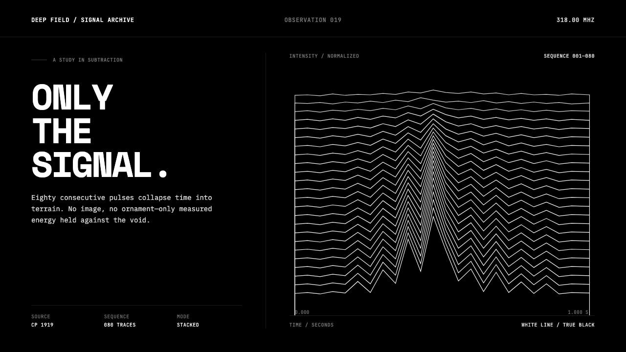 Pulsar CP1919 Stacked PlotPure signal becomes a totem. Stacked white pulse lines rise through a true-bl…
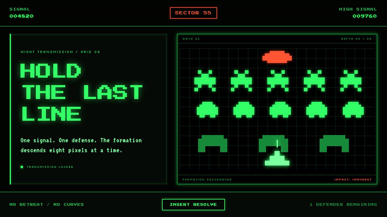 Space Invaders (1978)Constraint becomes menace. Phosphor green pixel ranks descend through a dead-…
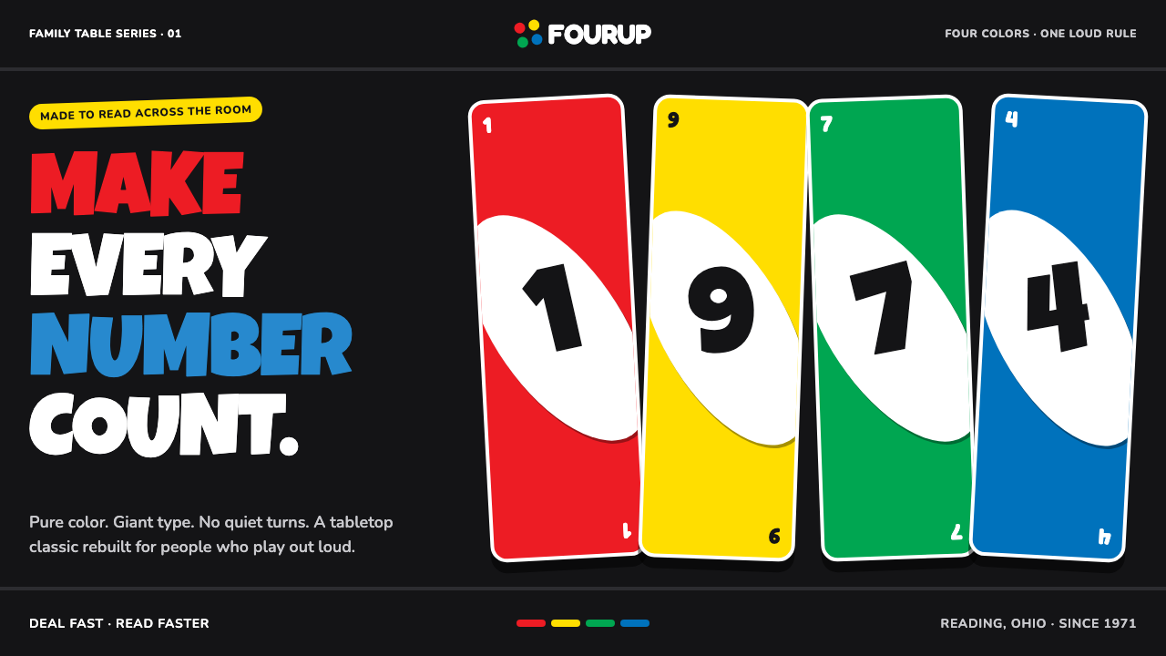 UNO (1971)Every number shouts. Four pure primaries punch through black with tilted whit…
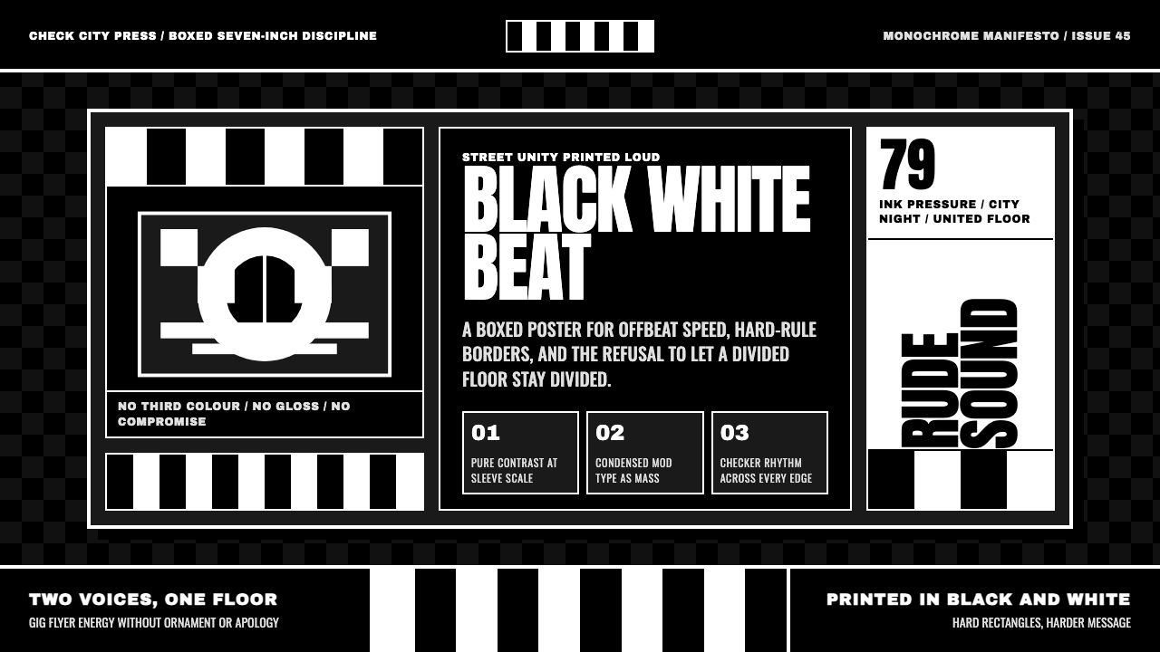 2 Tone SkaContrast as manifesto. White Anton type locks into a near-black checkerboard…
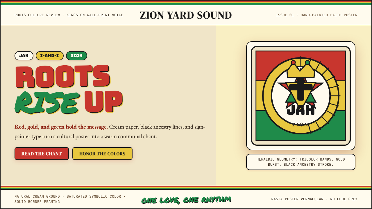 Caribbean Rastafarian (Jamaica)Warm faith, loud color. Red-gold-green bands and black poster type carry the…
 Converse Chuck TaylorPopulist and loud. Saturated red circles, Bungee type, black stitch lines on…