What is Converse Chuck Taylor?什么是 Converse Chuck Taylor?
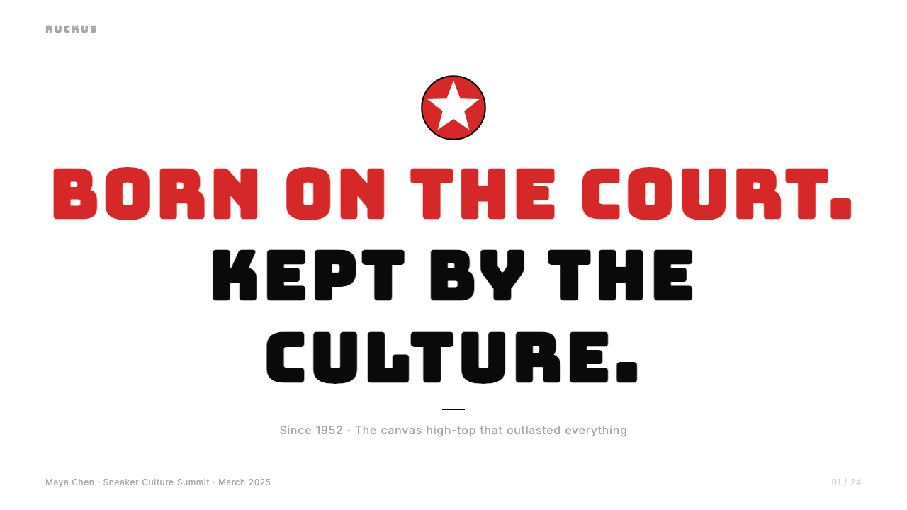
A century of red, white, and black on canvas — the Chuck Taylor All Star turned a basketball shoe into the world's most democratic design icon.帆布上一个世纪的红、白与黑——Chuck Taylor All Star 将一双篮球鞋变成了世界上最平民化的设计图腾。
Converse Chuck Taylor in briefConverse Chuck Taylor 速览
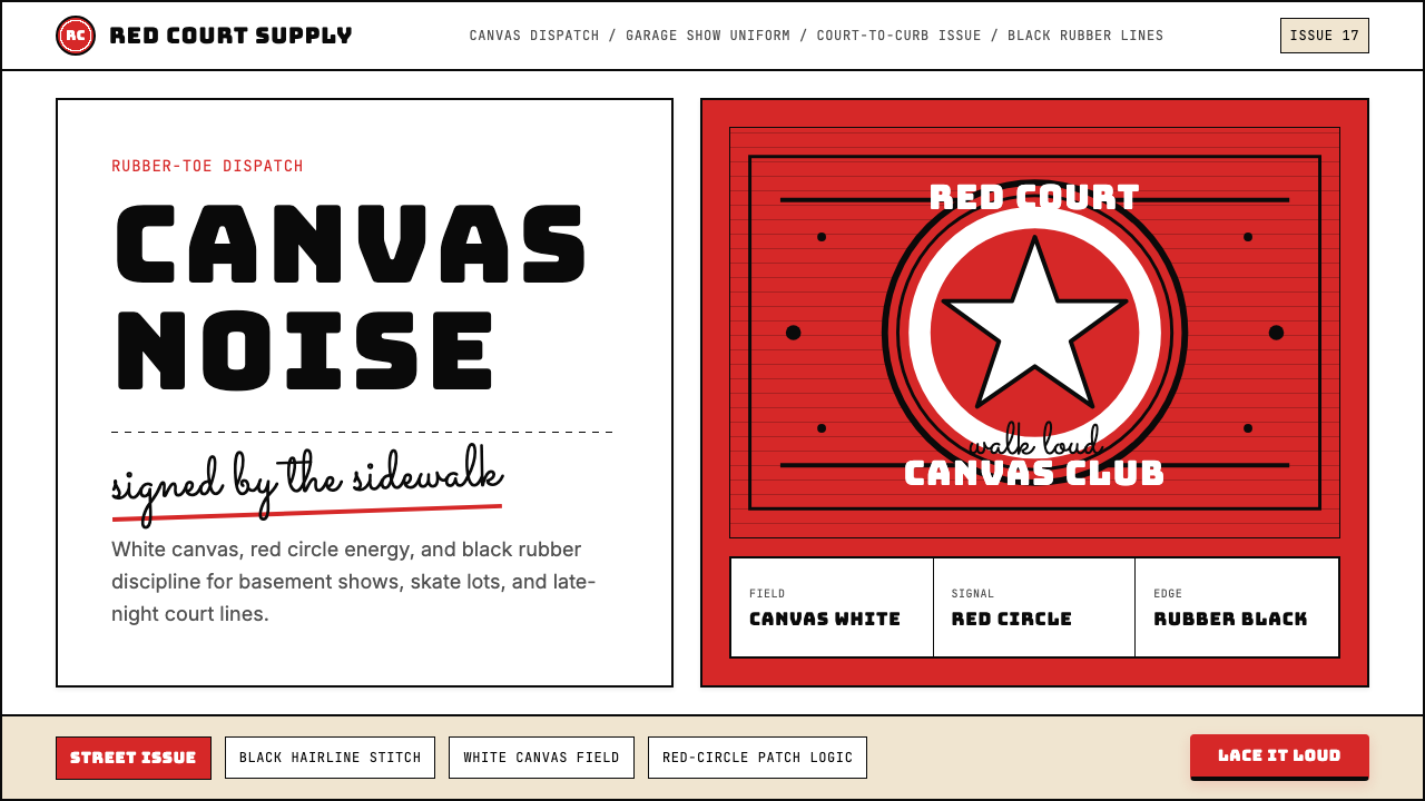
Converse Chuck Taylor All Star is not merely a sneaker — it is one of the most immediately recognizable visual systems in American material culture. The design vocabulary is ruthlessly economical: saturated red against white canvas, anchored by deep black rubber at the toe and a bold circular ankle patch bearing a five-pointed star. Everything in the system is load-bearing. Remove the red circle and it becomes a different shoe; replace the canvas texture with synthetic smoothness and the warmth disappears. The constraint is the identity.Converse Chuck Taylor All Star 不仅仅是一双运动鞋——它是美国物质文化中辨识度最高的视觉系统之一。其设计语汇极为简洁:饱和的红色对抗白色帆布,由鞋头深黑橡胶与踝部印有五角星的粗圆形徽章共同锚定。系统中的每一个元素都是承重的。去掉红色圆形,它就成了另一双鞋;将帆布质感替换为合成材料的光滑,温度便消失殆尽。约束本身就是身份。
As a design language, Chuck Taylor operates on populist principles that are almost the inverse of high modernism. Where Bauhaus or Swiss Style pursued rational order and institutional clarity, the Chuck Taylor system carries the warmth of hand-craft: visible stitching lines, a cursive script signature at the ankle, a canvas ground that absorbs wear and character over time. The type is chunky and loud rather than geometric and precise. The star is a badge, not a symbol. The overall effect reads as something signed, personal, and deeply American.作为设计语言,Chuck Taylor 遵循的是平民主义原则,几乎与高度现代主义背道而驰。包豪斯或瑞士风格追求理性秩序与机构清晰,Chuck Taylor 系统却带有手工艺的温度:可见的缝线、踝部草书体签名、随时间吸收磨损与性格的帆布底面。字体粗重嘈杂,而非几何精确。那颗星是徽章,不是符号。整体效果读起来像是被某人签过名的东西——个人的、深刻的、美国的。
The three-color discipline — Converse red, white, and black — is what makes the system translatable into other media. Strip away the physical shoe and the color logic still holds: a saturated warm red at full intensity, a pure or near-pure white field, and black used exclusively for definition and structure. No gradients, no pastels, no neutral grays diluting the contrast. The system works because it refuses to negotiate.三色纪律——Converse 红、白与黑——使这套系统得以迁移至其他媒介。剥离实体鞋身,色彩逻辑依然成立:一种全强度的饱和暖红、一片纯净或近乎纯净的白色底面,以及仅用于界定与结构的黑色。没有渐变,没有粉彩,没有稀释对比度的中性灰。这套系统之所以奏效,正因为它拒绝妥协。
See the Converse Chuck Taylor design system查看 Converse Chuck Taylor 完整设计系统
Where does Converse Chuck Taylor come from?Converse Chuck Taylor 从何而来?
The story begins in 1908 in Malden, Massachusetts, when Marquis M. Converse founded the Converse Rubber Shoe Company. The early business made galoshes and winterized footwear, but by 1917 Converse had introduced its first athletic canvas shoe — a high-top designed specifically for basketball, a sport that was itself less than three decades old. The design was functional and unadorned: vulcanized rubber sole, white canvas upper, a distinctive circular rubber patch protecting the ankle. That patch, originally a structural reinforcement, would become the most important piece of real estate in sneaker history.故事始于1908年的马萨诸塞州莫尔登,Marquis M. Converse 在此创立了 Converse 橡胶鞋业公司。早期业务以雨靴和冬季鞋类为主,但到1917年,Converse 推出了首款运动帆布鞋——一双专为篮球运动设计的高帮鞋,而彼时篮球这项运动本身诞生尚不足三十年。设计功能至上,毫无装饰:硫化橡胶外底、白色帆布鞋面,以及一个保护踝部的独特圆形橡胶贴片。那块贴片,最初是结构性加固,后来成为运动鞋历史上最重要的方寸之地。
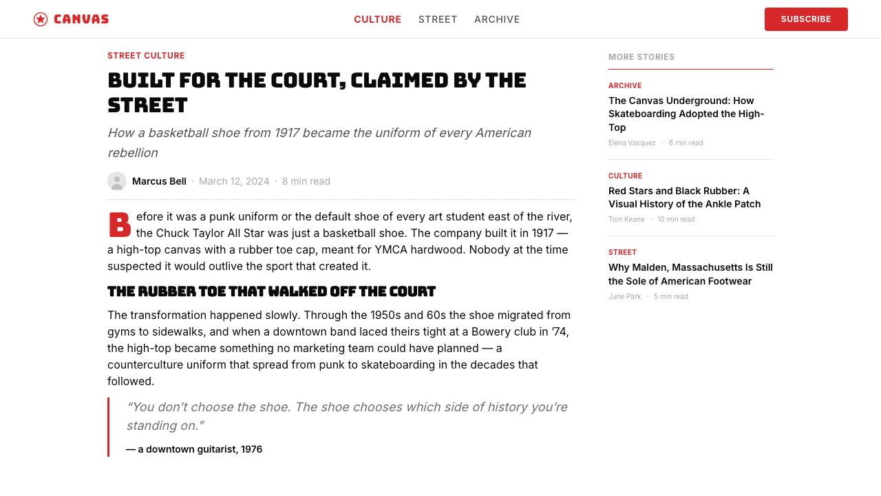
The transformation from athletic shoe to cultural icon began in 1921 when Charles 'Chuck' Taylor, a traveling salesman and semiprofessional basketball player from Indiana, walked into the Converse offices in Chicago complaining that his feet hurt. Rather than simply fitting him with a new pair, Converse hired him. Taylor spent the next four decades crisscrossing America in a car packed with shoes, running basketball clinics at high schools and YMCAs and military bases, teaching the game while selling the shoe. In 1932, Converse added Taylor's signature to the ankle patch — a cursive script that transformed a rubber reinforcement into a personal endorsement. No one paid Taylor royalties for decades; what he got instead was his name on every shoe.从运动鞋到文化图腾的蜕变始于1921年。来自印第安纳州的旅行推销员兼半职业篮球运动员查尔斯「Chuck」泰勒走进 Converse 在芝加哥的办公室,抱怨脚痛。Converse 没有只给他换一双鞋,而是雇用了他。此后四十年,泰勒驾着塞满鞋子的汽车走遍美国,在高中、基督教青年会和军营办篮球训练营,一边传授运动技术,一边推销这双鞋。1932年,Converse 将泰勒的签名加到踝部贴片上——一笔草书签名将橡胶加固件变成了个人代言。数十年间,泰勒未曾收到任何版税;他得到的回报,是每一双鞋上都印着自己的名字。
Through the mid-twentieth century, the Chuck Taylor was the dominant basketball shoe in America. By the 1960s and 1970s, as professional athletes migrated toward leather high-performance alternatives, the Chuck began its second life — not as the best shoe for the sport but as the shoe of the counterculture. Punk musicians wore them on stage. Skateboarders discovered that the flat sole gave precise board feel. Art students wore them as a uniform rejection of corporate footwear. The shoe's affordability, its blankness as a canvas (often literally decorated with marker or paint), and its refusal to signal status made it the default shoe of people who distrusted defaults.二十世纪中叶,Chuck Taylor 是美国篮球运动中最主流的运动鞋。进入1960至1970年代,随着职业运动员转向皮革材质的高性能鞋款,Chuck 开始了它的第二段生命——不再是这项运动的最佳装备,而是成为反主流文化的鞋。朋克音乐人穿着它登台,滑板少年发现平底鞋面能提供精准的板感,艺术院校的学生将其作为拒绝企业鞋履文化的制服。这双鞋的平价、作为帆布的空白感(常被马克笔或颜料直接在鞋身作画),以及它拒绝标榜地位的姿态,使它成为不信任默认选项的人们的默认选项。
The visual language solidified through decades of consistent production rather than deliberate brand strategy. Converse's red-circle-on-white remained essentially unchanged from the 1930s through the early 2000s. In 2003, Nike acquired Converse for 305 million dollars, but retained the original design language intact — the acquisition validated rather than altered the visual identity. Since then, the Chuck Taylor has become a platform for collaboration, with Comme des Garçons PLAY, Off-White, and hundreds of other designers reworking the silhouette while the ankle-patch system and three-color discipline remain constant. The heritage is the constraint, and the constraint is what makes it legible.这套视觉语言经过数十年如一日的稳定生产固化下来,而非出于刻意的品牌策略。Converse 白底红圆的外观从1930年代延续至2000年代初,几乎原封不动。2003年,耐克以3.05亿美元收购 Converse,却保留了原始设计语言的完整性——这次收购是对视觉身份的认可,而非改造。此后,Chuck Taylor 成为联名合作的平台,Comme des Garçons PLAY、Off-White 等数百位设计师先后重新演绎这一廓形,而踝部贴片系统与三色纪律始终不变。传承是约束,约束使它永远清晰可读。
What defines the Converse Chuck Taylor look?Converse Chuck Taylor 的视觉特征是什么?
The Three-Color Discipline三色纪律
The entire visual system rests on three colors used at full intensity: a saturated warm red, pure white, and deep black. No tints, no shades, no graduated transitions between them. Red commands attention and carries the identity; white provides the canvas ground and breathing room; black defines structure, silhouette, and legibility. In application, the three colors are always deployed in the same relational hierarchy — red as focal point, white as field, black as line — which is why the system remains coherent whether it appears on a shoe, a poster, or a screen.整套视觉系统建立于三种全强度色彩之上:饱和暖红、纯白与深黑。没有色调过渡,没有明度变化,三色之间没有渐变衔接。红色主导注意力并承载身份;白色提供底面与呼吸空间;黑色界定结构、轮廓与可读性。在应用中,三种颜色始终以相同的关系层级部署——红色为焦点,白色为底面,黑色为线条——正因如此,无论出现在鞋身、海报还是屏幕上,这套系统都保持连贯。
The Circular Badge圆形徽章
The red circle with its star and wordmark is the visual anchor of the entire system — a logo that predates modern branding theory by decades. Its geometry is blunt and direct: a bold red disc with a centered star and stacked sans-serif lettering in black and white. The circle functions as a seal rather than a symbol, conferring authenticity the way a wax stamp or a hand-signed label does. In design applications, referencing this badge motif — a contained circular form with interior type — imports the Chuck Taylor's sense of handmade authority.印有星形与文字标识的红色圆形,是整套系统的视觉锚点——一个比现代品牌理论早数十年的标志。其几何形态直白而有力:醒目的红色圆盘,居中的五角星,黑白叠排的无衬线字体。这个圆形的功能更像印章而非符号,赋予产品的认证感如同蜡封或手写标签。在设计应用中,引用这种徽章母题——内嵌文字的圆形容器——能带入 Chuck Taylor 特有的手工权威感。
Script Warmth Against Block Volume草书温度与粗体音量的对照
The typographic tension that gives Chuck Taylor its personality is the pairing of opposing registers: a flowing cursive script — Taylor's actual signature — against chunky, high-contrast display type. The script carries intimacy and human presence; the block type carries volume and broadcast energy. Neither would work alone. In contemporary design applications that reference this system, this opposition translates to pairing a handwritten or calligraphic element with something blunt and industrial — the combination signals both personal origin and mass confidence.赋予 Chuck Taylor 个性的排版张力,来自两种截然对立的字体风格并置:流动的草书体(泰勒的真实签名)与粗重高对比的展示体。草书带来亲密感与人的在场;块状字体带来音量与广播能量。两者单独存在都不奏效。在当代设计应用中引用这套系统时,这种对立转化为:将手写或书法元素与某种直白工业化的字体配对——这种组合同时传递个人起源与大众自信。
Canvas Texture as Honest Ground帆布质感作为诚实底面
The white canvas of the All Star is not a neutral surface — it is a material declaration. Canvas shows wear, holds ink, takes paint, and records use over time. Its woven texture is visible at close range, lending a warmth and tactility that polished or coated surfaces cannot replicate. In two-dimensional design work referencing the Chuck Taylor aesthetic, a slight paper or textile grain in the background field achieves the same effect: the ground feels lived-in rather than clinical, receptive rather than finished.All Star 的白色帆布不是中性表面——它是一种材料宣言。帆布显露磨损痕迹,能够接受墨水与颜料,随使用时间记录历史。其编织纹理在近距离下清晰可见,带来一种抛光或涂层表面无法复制的温度与触感。在引用 Chuck Taylor 美学的二维设计作品中,背景底面略带纸张或织物纹理能达到同样的效果:底面感觉像是被使用过的,而非临床洁净的;像是接纳的,而非完成的。
Stitch Lines as Structural Ornament缝线作为结构性装饰
The black stitching that runs along the canvas panels of the Chuck Taylor is functional — it holds the shoe together — but it also reads as drawn line, marking seams and transitions with the rhythm of craft rather than the precision of machining. These visible construction lines are one of the few decorative elements in the system, and they are permitted precisely because they are also structural. In graphic applications, this principle argues for making structural elements visible: grid lines that double as design elements, borders that mark genuine content boundaries, and rules that appear where information actually breaks.沿帆布鞋面延伸的黑色缝线具有功能性——它将鞋身缝合在一起——但也被解读为绘制的线条,以手工艺的节奏而非机械的精度标记接缝与过渡。这些可见的构造线是系统中为数不多的装饰元素,而它们之所以被允许存在,正是因为它们同时也是结构性的。在图形应用中,这一原则主张让结构性元素可见:兼作设计元素的网格线、标记真实内容边界的边框,以及在信息真正中断之处才出现的分割线。
Populist Scale and Flatness平民化的尺度与平面性
Unlike luxury sneaker aesthetics — which rely on material scarcity, complex colorways, and exclusive silhouettes — the Chuck Taylor visual system is deliberately accessible. Forms are bold enough to read at a distance; colors are primary enough to survive reproduction in any medium; the overall composition is flat rather than dimensional. This populist flatness means the design system translates well across contexts: it is as legible on a poster across the street as on a phone screen held at arm's length. Accessibility of perception is a core aesthetic value, not an afterthought.与依赖材质稀缺性、复杂配色和限量廓形的奢侈运动鞋美学不同,Chuck Taylor 的视觉系统是刻意平易近人的。形态足够粗犷,可在远处清晰识读;色彩足够基础,能在任何媒介中经受再现;整体构图平面而非立体。这种平民化的平面性使设计系统在各种场景中都具有良好的移植性:在街对面的海报上与在手持屏幕前都同样清晰。感知的可及性是核心美学价值,而非事后补充。
Counterculture Openness反主流文化的开放性
One of the Chuck Taylor's most distinctive design qualities is its blankness — the white canvas is literally a surface for personal expression. Artists, musicians, and teenagers have drawn on, painted, and customized their Chucks for decades, and this culture of modification is baked into the aesthetic. The design system tolerates addition: a marker drawing on a Chuck is not vandalism, it is participation. In design applications, this translates to leaving deliberate space for user-generated content, handwritten annotation, or visible revision — the system should feel like an invitation rather than a finished statement.Chuck Taylor 最独特的设计品质之一是它的空白性——白色帆布字面意义上就是个人表达的表面。数十年来,艺术家、音乐人和少年们在自己的 Chucks 上涂画、上色、个性改造,这种改造文化已深植于其美学之中。这套设计系统接受叠加:在 Chuck 上画马克笔不是破坏,而是参与。在设计应用中,这转化为为用户生成内容、手写批注或可见修改刻意留白——系统应感觉像是一份邀请,而非一份已完成的声明。

See the Converse Chuck Taylor design system查看 Converse Chuck Taylor 完整设计系统
Who shaped Converse Chuck Taylor?谁塑造了 Converse Chuck Taylor?
Converse founded his rubber shoe company in Malden, Massachusetts in 1908, initially producing galoshes and winterized footwear. His decision to pivot toward athletic canvas shoes in 1917 — entering a market that barely existed — produced the All Star, the design that would outlast every other sneaker of its era. Converse's instinct that a sport-specific shoe could carry broad cultural meaning beyond its athletic function proved correct in ways he could not have anticipated, and the company he founded remained independent for nearly a century before its 2003 acquisition.Converse 于1908年在马萨诸塞州莫尔登创立了他的橡胶鞋业公司,最初生产雨靴和冬季鞋类。1917年,他做出转型决定,进入一个几乎尚不存在的运动帆布鞋市场——由此诞生了 All Star,一个比同时代所有运动鞋都更长寿的设计。Converse 的直觉——运动专用鞋能承载超越运动功能的广泛文化意义——以他无法预见的方式得到了印证。他创立的公司在独立运营近一个世纪后,于2003年被收购。
Taylor was a semiprofessional basketball player and natural salesman from Columbus, Indiana who joined Converse in 1921 after walking in to complain about foot pain. For the next four decades he drove across America conducting basketball clinics — teaching the game to coaches and players at schools, YMCAs, and military installations while fitting them with Converse shoes. His signature added to the ankle patch in 1932 turned a rubber reinforcement into a personal endorsement and created one of the earliest examples of athlete-brand fusion. Taylor never received royalties; he received something rarer — permanent nominal authorship of a design that would outlast him by generations.泰勒是来自印第安纳州哥伦布市的半职业篮球运动员和天生的推销员,1921年他因脚痛走进 Converse 投诉,此后被公司雇用。此后四十年,他驾车穿越美国,在学校、基督教青年会和军事基地为教练和运动员举办篮球训练营,边教球边销售 Converse 鞋。1932年添加到踝部贴片的签名,将一块橡胶加固件变成了个人代言,创造了运动员与品牌融合的最早案例之一。泰勒从未获得版税;他得到了更罕见的东西——对一个将比他本人长寿数代的设计的永久署名。
The Japanese fashion house's PLAY line — identified by its heart-with-eyes logo — began collaborating with Converse in the early 2000s and produced one of the most successful luxury-meets-populist design fusions of the era. The collaboration placed Rei Kawakubo's graphic icon directly on the Chuck Taylor silhouette, creating a shoe that simultaneously belonged to two radically different design vocabularies. The CDG PLAY Chuck demonstrated that the All Star's visual system was strong enough to absorb a completely foreign graphic element without losing coherence — a test that few design systems pass.这个以「眼睛爱心」标志著称的日本时装品牌旗下 PLAY 系列,在2000年代初开始与 Converse 展开合作,打造出那个时代最成功的奢侈与平民设计融合案例之一。这次合作将川久保玲的图形图标直接置于 Chuck Taylor 廓形之上,创造出一双同时属于两套截然不同设计语汇的鞋。CDG PLAY Chuck 证明了 All Star 视觉系统足够强大,能够吸收一个完全异质的图形元素而不失连贯——这是很少有设计系统能通过的测试。
Virgil Abloh's Off-White label approached the Chuck Taylor as a design-critical object — subjecting it to the same deconstructive analysis that Abloh applied to Nike Air Jordans in his landmark 'The Ten' collaboration. By making the shoe's construction language explicit through quotation marks, arrows, and text callouts, Abloh treated the Chuck as a readymade whose meaning could be reconfigured through annotation rather than redesign. The approach highlighted something already present in the original: the Chuck Taylor is a shoe that invites interpretation, and the visual system is robust enough to survive being read against itself.Virgil Abloh 的 Off-White 品牌将 Chuck Taylor 作为一个设计批评对象来处理——对其施以与他在「The Ten」联名合作中解构 Nike Air Jordan 同样的分析性审视。通过引号、箭头和文字标注使鞋的构造语言显性化,Abloh 将 Chuck 作为一个可以通过注解而非重新设计来重构意义的现成品。这种方式揭示了原作中本已存在的东西:Chuck Taylor 是一双邀请阐释的鞋,而这套视觉系统足够强健,能够经受被反读自身的考验。
No single designer accelerated the Chuck Taylor's transition from athletic wear to cultural symbol more than the musicians who adopted it as their de facto uniform. The Ramones wore matching black high-tops on stage and in photographs, fusing the shoe's working-class affordability with the confrontational aesthetic of early punk. Across subsequent decades — through new wave, grunge, indie rock, and DIY art scenes — the Chuck Taylor accumulated layer upon layer of subcultural meaning precisely because it was cheap, available everywhere, and carried no corporate fitness or performance aspiration. The absence of performance branding became the point.没有哪一位单独的设计师比那些将 Chuck Taylor 作为事实制服的音乐人更加速了这双鞋从运动装备到文化符号的转变。雷蒙斯乐队在舞台上和照片中穿着一致的黑色高帮,将这双鞋的工人阶级平价与早期朋克的对抗性美学融为一体。此后数十年——穿越新浪潮、垃圾摇滚、独立摇滚与 DIY 艺术场景——Chuck Taylor 积累了层层叠叠的亚文化意义,恰恰因为它价格低廉、随处可得,不带任何企业运动表现的期待与抱负。缺席运动品牌叙事,本身就是重点。
How do you use Converse Chuck Taylor today?今天怎么用 Converse Chuck Taylor?
The Chuck Taylor visual system is immediately applicable to any design context that benefits from bold populist energy, hand-crafted warmth, and high-contrast legibility at a distance. The key to applying it correctly is understanding that this is not a minimalist system — it is a maximum-impact system with a restricted palette. Every element should earn its place by contributing to the three-color hierarchy: red anchors, white breathes, black defines. When all three are present at full saturation, the composition should still read clearly from across a room or at thumbnail size.Chuck Taylor 视觉系统可立即应用于任何受益于大胆平民能量、手工温度与高对比度远距可读性的设计场景。正确应用的关键在于理解:这不是一套极简主义系统,而是一套受约束色板的最大冲击系统。每个元素都必须通过对三色层级的贡献来赢得自己的位置:红色锚定,白色呼吸,黑色界定。当三种颜色以全饱和度同时出现时,构图仍应能在隔着房间或缩略图尺寸下清晰识读。
For presentation slides, the Chuck Taylor language works powerfully on cover pages built around a single bold focal element — a large red circle, a chunky wordmark, or a star motif — set against a white or near-white field with all structural annotation in black. Content slides should resist the temptation to use red for every header; instead, reserve red for the single most important element per slide and let black-on-white carry the information hierarchy. Data slides translate naturally into this system: bar charts become red rectangles on a white field, sorted and annotated in black, with no background color muddying the signal.在演示文稿中,Chuck Taylor 语言在以单一粗犷焦点元素为中心的封面页上最为有力——一个大红圆、一个厚实的文字标识或一个星形母题,置于白色或近白色底面上,所有结构性标注使用黑色。内容页应抵制将红色用于每个标题的诱惑;相反,将红色保留给每页最重要的单一元素,让黑白承载信息层级。数据页自然适配这套系统:柱状图成为白色底面上的红色矩形,用黑色排序并标注,不使用背景色模糊信号。
For web interfaces — particularly dashboards, pricing pages, and product landing pages — the system's flat, high-contrast character suits contexts where scannability is paramount. Apply a white or very light warm ground, use black for all body text and labels, and deploy the saturated red only for primary calls to action, active states, and tier highlights. Card components work best with visible black borders rather than soft shadows, echoing the stitched-edge quality of the shoe itself. Navigation should be typographic and bold rather than icon-heavy, with labels large enough to feel confident rather than dense.对于网页界面——尤其是仪表板、定价页面和产品落地页——系统的平面高对比特质适合可扫描性至关重要的场景。采用白色或非常浅的暖色底面,所有正文与标签使用黑色,饱和红仅用于主要行动号召、激活状态和层级亮点。卡片组件最适合用可见的黑色边框而非柔和阴影,呼应鞋身缝边的品质。导航应当以排版为主、粗犷大方,标签足够大以传递自信感而非密集感,图标作用从属。
For editorial and marketing contexts — posters, social cards, event branding, print campaigns — the Chuck Taylor system licenses boldness that more restrained styles cannot. A full-bleed red panel with a white star and black type has instant stopping power. For longer editorial formats, use the white field as the primary reading surface, punctuate section breaks with a bold horizontal black rule, and drop in red as a chapter opener or pull quote accent. Marketing pages benefit from alternating content blocks: white-on-red for hero moments, black-on-white for detail sections, with the saturated red preventing the page from feeling neutral or corporate.在编辑与营销场景中——海报、社交媒体卡片、活动品牌、印刷推广——Chuck Taylor 系统授权了更保守风格无法实现的大胆感。全出血红色面板配白色星形与黑色字体,具有即时的视觉停顿力。对于较长的编辑格式,以白色底面作为主要阅读表面,用醒目的横向黑色线条标记段落分隔,以红色点缀章节开头或引用摘录。营销页面受益于交替的内容块:英雄时刻用红底白字,细节区域用白底黑字,饱和红防止页面感觉中性或企业化。
The most common mistake when applying this system is treating the red as a highlight color in a more conventional palette rather than as a structural primary. Adding coral, orange, or burgundy alongside the Converse red introduces color competition that the original system does not have room for. A second common error is softening the contrast by using off-whites, light grays, or warm neutrals as the background field — this immediately dilutes the populist intensity that makes the system work. The Chuck Taylor aesthetic depends on edges that are decisions, not accidents: keep the boundaries hard, keep the palette to three, and trust the star.应用这套系统时最常见的错误,是将红色当作更常规色板中的强调色,而非结构性原色。在 Converse 红旁边加入珊瑚色、橙色或暗红色,会引入原始系统没有空间容纳的色彩竞争。第二个常见错误是用米白、浅灰或暖中性色作为底面来软化对比——这会立即稀释使系统奏效的平民强度。Chuck Taylor 美学依赖于边界是决定而非偶然:保持边界硬朗,将色板维持在三色,相信那颗星。
See the Converse Chuck Taylor design system查看 Converse Chuck Taylor 完整设计系统
Converse Chuck Taylor — FAQConverse Chuck Taylor · 常见问题
How does the Chuck Taylor style differ from other American sportswear aesthetics?Chuck Taylor 风格与其他美国运动服饰美学有何不同?
Most American sportswear aesthetics — Nike, Adidas, Jordan Brand — evolved toward technological signaling: gradients, layered color panels, performance-derived forms that communicate speed, engineering, and innovation. The Chuck Taylor system moved in the opposite direction, becoming simpler and flatter as the culture around it grew more complex. Where competitor aesthetics accumulate visual complexity to justify premium pricing, the Chuck Taylor system proves value through refusal: it has had the same ankle patch since 1932 because the patch was correct. The result is a design language that reads as honest rather than aspirational — it does not promise to make you faster or stronger, it promises to be itself.大多数美国运动服饰美学——耐克、阿迪达斯、Jordan Brand——朝着技术信号的方向演进:渐变、多层色彩面板、传递速度、工程学与创新感的性能衍生形态。Chuck Taylor 系统向相反方向运动,在其周围文化日益复杂的同时变得愈发简洁与平面。竞争品牌的美学通过积累视觉复杂度来证明溢价定价的合理性,Chuck Taylor 系统则通过拒绝来证明价值:自1932年以来踝部贴片没有改变,因为贴片本身就是正确的。结果是一套被读作诚实而非抱负性的设计语言——它不承诺让你跑得更快或更强壮,它承诺成为它自己。
Can the Chuck Taylor aesthetic work in a premium or luxury positioning?Chuck Taylor 美学能用于高端或奢侈品定位吗?
It can, but only when the tension is made explicit. The most successful luxury applications of Chuck Taylor's visual language — the Comme des Garçons PLAY collaboration, certain Off-White treatments — work precisely because they acknowledge the populist origin and create deliberate friction with the premium context. A luxury brand that adopts the red-white-black three-color discipline without acknowledging the source reads as generic high-contrast branding rather than as a sophisticated reference. The system signals authenticity and accessibility; layering luxury on top of that requires the designer to be in on the joke, not above it.可以,但前提是张力必须被明确呈现。Chuck Taylor 视觉语言最成功的奢侈品应用——Comme des Garçons PLAY 联名、Off-White 的某些处理——之所以奏效,恰恰是因为它们承认了平民化的起源,并与高端语境创造了刻意的摩擦。一个采用红白黑三色纪律却不承认来源的奢侈品牌,读起来像是通用的高对比度品牌形象,而非精致的致敬。这套系统传递真实性与亲近性;在此之上叠加奢侈感,需要设计师参与其中,而非置身其上。
The source material is a canvas shoe. How does the tactile quality translate to screen or print?源材料是帆布鞋。那种触感品质如何转化到屏幕或印刷中?
Canvas texture is warm and woven — it has grain, slight irregularity, and the sense of something made by accumulation rather than precision. In screen contexts, this quality is best approximated through a very subtle paper or textile grain applied to the background field, keeping the overall ground warm rather than clinically white. In print, uncoated or lightly textured stock achieves it directly. The critical point is that the texture should read as ground character rather than decorative effect — the grain should be present at close range but not detract from the high-contrast foreground elements. A Chuck Taylor design that reads perfectly on a pure white background but gains warmth on a slightly textured one is correctly calibrated.帆布质感温暖而有编织感——它有纹理、轻微的不规则性,以及某种由积累而非精确制造出来的感觉。在屏幕场景中,这种品质最好通过在底面施加极为细微的纸张或织物纹理来近似,使整体底面温暖而非临床洁白。在印刷中,未涂层或轻微纹理的纸张能直接实现这一效果。关键点在于:质感应被读作底面性格而非装饰效果——纹理在近距离下存在,但不应干扰高对比度的前景元素。一套设计在纯白底面上完美呈现,但在略带纹理的底面上获得温度提升,就是正确校准的结果。
What contexts are a poor fit for the Chuck Taylor visual language?哪些场景不适合 Chuck Taylor 视觉语言?
The system performs poorly wherever subtlety, sophistication, or institutional gravitas are required values. Financial services, healthcare, and legal communications rely on visual languages that signal precision, stability, and expertise — the Chuck Taylor's boldness, handmade warmth, and populist energy read as too casual and too loud in those contexts. Similarly, the system is a poor fit for design work that requires a wide typographic range: because the visual identity depends on bold primary contrast, fine typographic gradations — such as the multiple gray-toned hierarchies used in dense editorial design — become invisible. When your content requires nuance, the Chuck Taylor palette will flatten it.凡是需要克制、精致或机构庄重感的场景,这套系统都表现欠佳。金融服务、医疗保健和法律传播依赖传递精确、稳定与专业感的视觉语言——Chuck Taylor 的粗犷、手工温度和平民能量在这些场景中被读作过于随意和嘈杂。同样,系统不适合需要宽泛排版层级的设计工作:因为视觉身份依赖于粗犷的主色对比,精细的排版渐变——如密集编辑设计中使用的多灰阶层级——会变得不可见。当你的内容需要细腻时,Chuck Taylor 色板会将其压平。
How should red be proportioned relative to white and black in a composition?在构图中,红色与白色和黑色应如何配比?
The authentic Chuck Taylor proportion treats red as accent rather than ground: the ankle patch covers a small fraction of the shoe's total white canvas surface, and the star within it covers a fraction of the patch. In application, this translates to a general principle: let white hold the majority of the spatial budget, use black to define edges and type, and deploy red for the single focal element or the primary call-to-action state. When red expands to cover more than roughly a third of a composition, it stops being a focal point and starts being a mood — the tension between ground and accent collapses. There are exceptions for intentional full-bleed red moments — a poster panel, a hero block — but even then, the white and black elements should feel like they are cutting through the red rather than floating on it.真实 Chuck Taylor 的比例将红色视为强调而非底面:踝部贴片覆盖的面积远小于鞋身白色帆布的总面积,其中的星形又仅占贴片面积的一小部分。在应用中,这转化为一条一般性原则:让白色持有空间预算的大部分,用黑色界定边缘与字体,将红色用于单一焦点元素或主要行动号召状态。当红色扩张至覆盖超过大约三分之一的构图面积时,它就不再是焦点,而变成了情绪——底面与强调之间的张力随之崩溃。全出血红色的刻意时刻存在例外——海报面板、英雄区块——但即便如此,白色与黑色元素也应感觉是在切穿红色,而非漂浮于其上。
Related design styles相关设计风格
 Marvel Comics (Kirby Era)Populist color hits hard. Red-blue-yellow panels, black rules, and halftone d…大众色彩直击眼球。红蓝黄画格、黑墨线与半调网点。
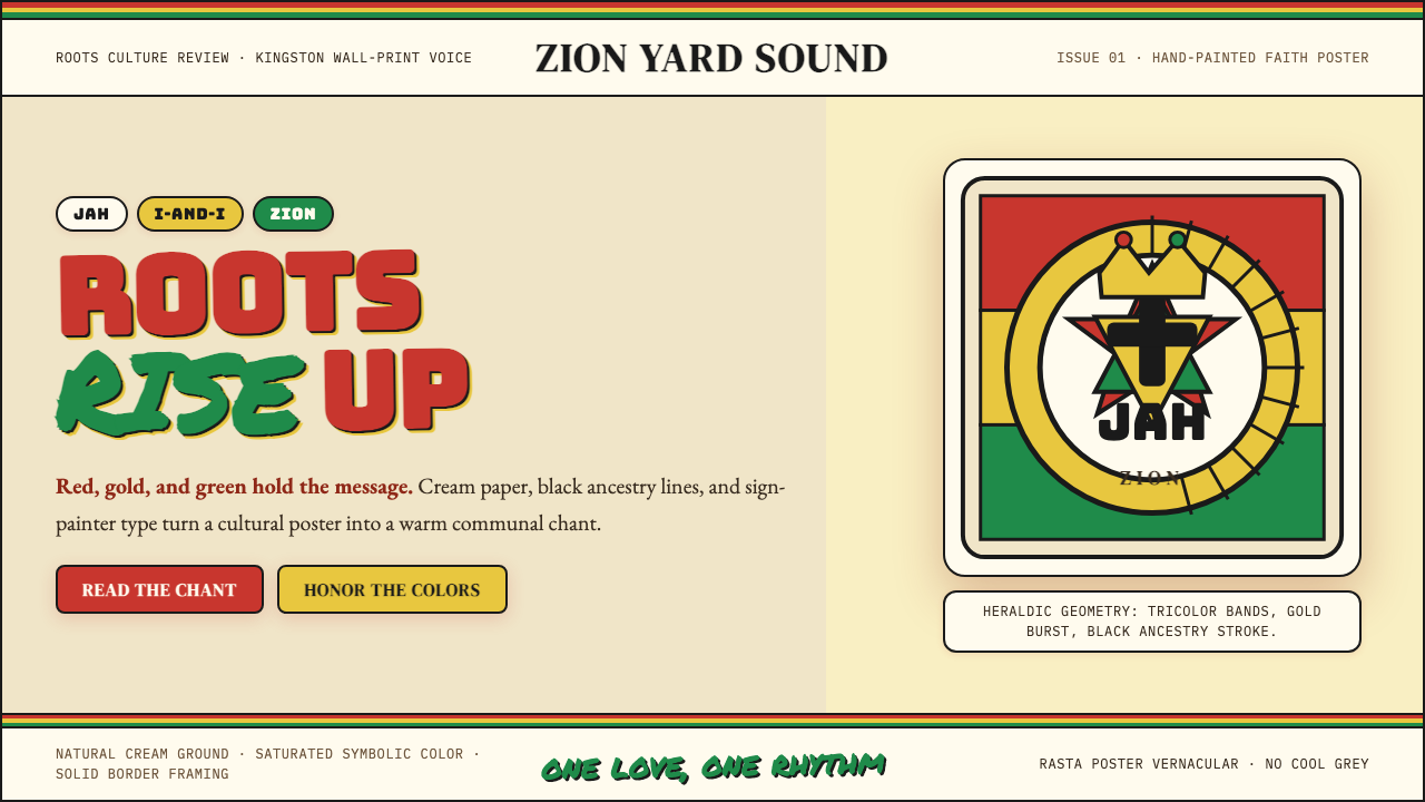 Caribbean Rastafarian (Jamaica)Warm faith, loud color. Red-gold-green bands and black poster type carry the…温暖信仰,高饱和发声:红金绿横带与黑色海报字承载吟唱。
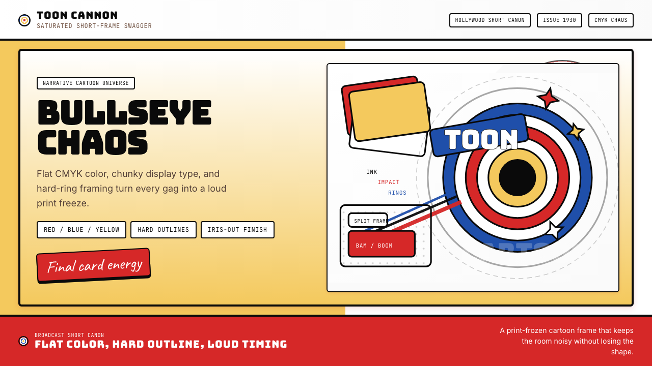 Looney Tunes (Warner Bros.)Pure cartoon chaos. Bull's-eye rings, Bungee type, and red-blue-yellow blocks.纯卡通混乱。牛眼环、粗壮标题字与红蓝黄块面。
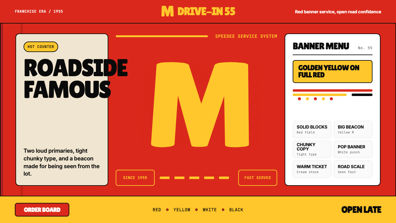 McDonald's Golden ArchesRoadside famous. Saturated red, hot yellow, and chunky type shout from 1955.路边即识别:饱和红、热黄与厚重字体喊出1955。
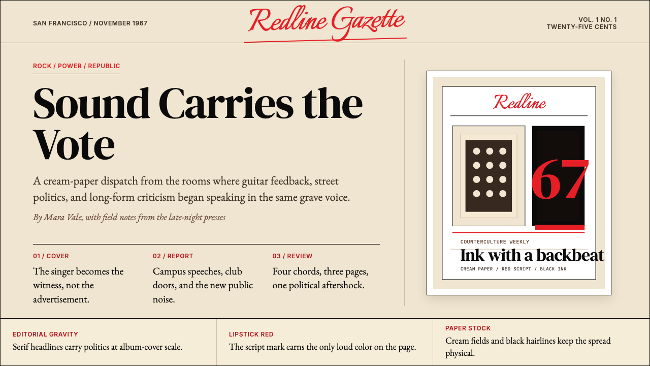 Rolling Stone MagazineCounterculture gets editorial weight. Cream paper, lipstick red script, serif…反主流文化有编辑重量:奶油纸、口红红手写体与粗衬线标题。
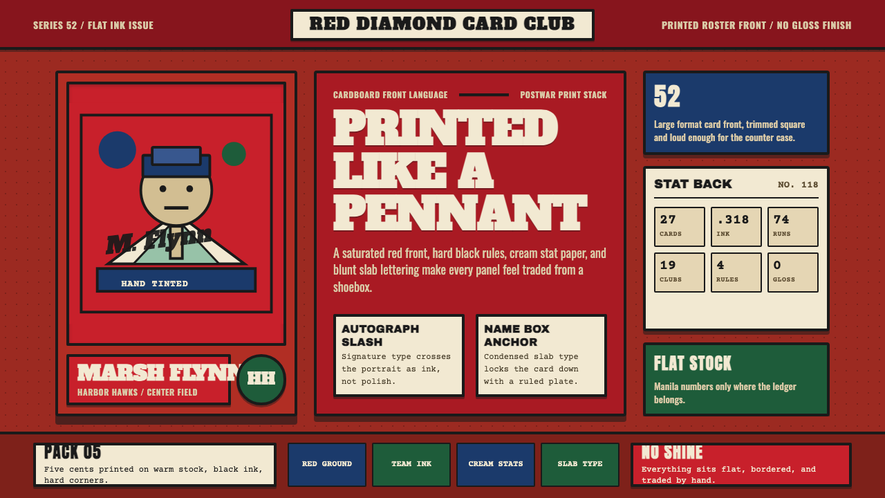 Topps Baseball CardCardboard heat. Brick-red slab panels, cream stats, and condensed type feel p…纸卡热度:砖红板块、米黄数据与压缩粗体,像平版印刷。