What is Reggaeton Album Cover?
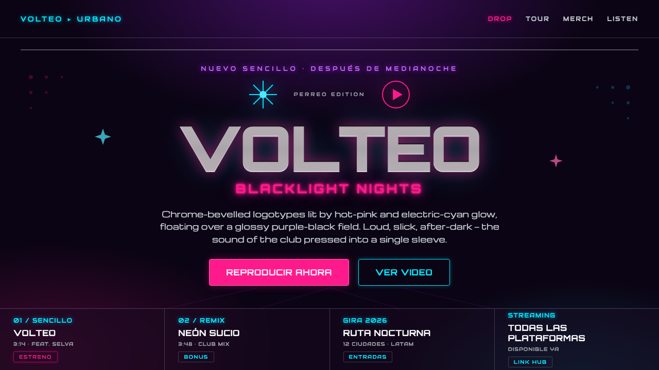
Reggaeton Album Cover turns the after-dark energy of urbano into a loud digital surface: violet-black space, neon heat, chrome type, and commercial confidence with nowhere to hide.
Reggaeton Album Cover in brief
Reggaeton Album Cover is a contemporary sleeve-design language associated with the urbano wave spanning Latin America and the Caribbean, especially Puerto Rico and its diaspora. It treats the cover as nightlife advertising as much as music packaging: a declaration intended to catch the eye in a crowded feed, on a streaming tile, or under club lighting. Its atmosphere is explicitly nocturnal, glossy, amplified, and unafraid of spectacle.
The visual field is usually a near-black purple rather than a neutral black. That colored darkness matters because it gives neon-pink and electric-cyan light somewhere to bloom. Wide chrome-tech logotypes, beveled lettering, glow, and Y2K-revival graphics create an artificial sheen that feels closer to a nightclub sign, a modified car detail, or a digital promo screen than to a restrained editorial cover.
This is not minimalism disguised as pop design. Its visual system uses contrast, shine, and scale to make the artist name or release title feel immediate and market-facing. The design can be sleek, but it should never become timid: the central message is that the music belongs to the night, to motion, and to a culture comfortable with glamour as a visible part of its identity.
Where does Reggaeton Album Cover come from?
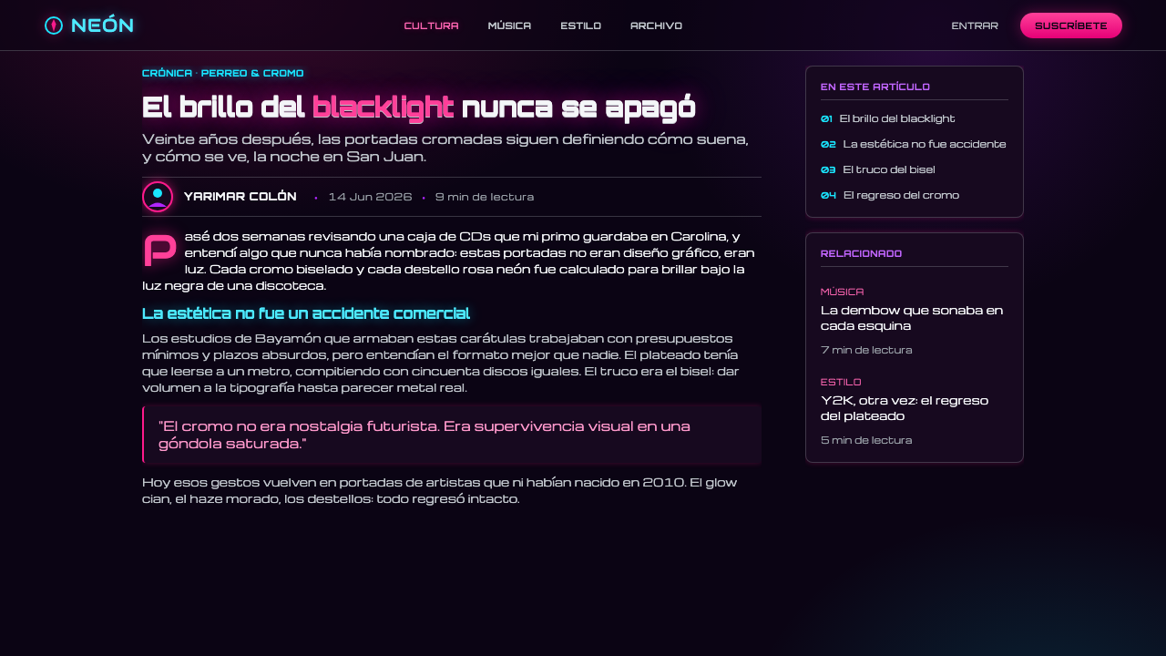
The style belongs to the Y2K-revival urbano wave that has developed from 2010 to the present. Its cultural setting is Latin America and the Caribbean, with Puerto Rico and the broader urbano diaspora providing the central frame. Rather than presenting reggaeton as a genre that needs visual translation into polite mainstream design, these sleeves foreground its own after-hours visual world: darkness activated by color, surfaces made to look polished, and typography that performs like a headline.
Daddy Yankee, Don Omar, and Wisin & Yandel are key figures in the reggaeton context from which this sleeve language is understood. Their presence establishes an era of urbano music whose imagery could be direct, glossy, and commercially assertive. The cover is therefore not merely an illustration of a song. It is part of the release’s public identity, designed to announce a name, a mood, and a place in nightlife culture before the listener presses play.
Early Bad Bunny marks a later point of reference within the approved urbano lineage. In this context, the style is not frozen as a historical artifact. It is a continuing visual vocabulary that can move across album art, digital promotion, and contemporary interface graphics while retaining its core signals: blacklight darkness, pink and cyan illumination, and loud metallic lettering.
Three adjacent movements clarify its construction. Reggaeton and urbano sleeve design supply the music-cultural setting; synthwave-adjacent neon supplies the electric glow and nocturnal atmosphere; the Y2K chrome revival supplies the reflective, beveled, tech-forward surface treatment. Their combination is specific. Neon alone can feel nostalgic or cinematic, and chrome alone can feel generic; together on a violet-black field they produce the slick, club-facing pressure of this album-cover language.
What defines the Reggaeton Album Cover look?
Violet-Black Ground
The foundation is a dark field with a violet cast, closer to blacklight darkness than neutral black. It creates depth without relying on scenery or realistic environments. The ground should feel like a room after sunset: empty enough for type and glow to dominate, but colored enough that the image has atmosphere before any foreground element appears.
Neon Heat
Hot pink and electric cyan act as illuminated accents rather than as an all-over rainbow. Their glow should appear to radiate into the violet-black field, creating an energized edge around type, symbols, or selected graphic forms. Pink brings heat and seduction; cyan brings voltage and coolness. The friction between them is more important than either color in isolation.
Chrome-Tech Typography
Logotypes are wide, assertive, and visibly treated as objects. Chrome and bevel effects give lettering a hard, reflective presence, while techno-inflected forms make the wordmark feel engineered for a digital nightscape. The type does not quietly label the cover; it performs on the cover, often becoming the main image and the clearest expression of the release’s commercial confidence.
Y2K Surface Drama
Y2K revival here is expressed through slickness, artificial shine, metallic dimensionality, and a willingness to make graphics look manufactured rather than handcrafted. Bevels, reflective cues, and synthetic highlights suggest a polished digital object. The desired effect is not historical reconstruction. It is the selective use of Y2K excess to make the artwork feel fast, expensive, and built for circulation.
Club-Scale Contrast
The composition reads at a glance because it privileges a few oversized signals over many small details. A dominant logotype, a concentrated glow, and a controlled graphic cluster can carry the cover. This scale logic suits an audience encountering the image rapidly in nightlife, promotion, or streaming contexts: the cover must retain its attitude before the viewer has time to inspect it closely.
Unapologetic Commercial Finish
The style treats polish as part of the message. It does not conceal branding, loud titles, or glossy effects in pursuit of artistic restraint. Instead, commercial finish communicates presence: this release wants to be noticed, remembered, and associated with a vivid nightlife world. The strongest work is controlled rather than cluttered, but it never apologizes for wanting attention.
Who shaped Reggaeton Album Cover?
Daddy Yankee is a key figure in the reggaeton context named by this visual system. His inclusion anchors the style in an urbano album-cover lineage where directness, nightlife energy, and recognizably commercial presentation are central. For designers, he represents the genre-facing reference point rather than a neutral pop-design influence.
Don Omar is another key figure in the approved reggaeton lineage. Within this theme, his relevance is the cover culture surrounding urbano music: visual identity is expected to carry intensity and public presence, not merely provide a quiet container for audio. That expectation supports the style’s neon, metallic, after-dark character.
Wisin & Yandel are listed as key figures for the urbano setting from which the sleeve language emerges. Their place in the reference frame reinforces that this is a shared music-cultural visual system, not the signature of one isolated artist. The cover’s loud title treatment and polished nightlife mood therefore serve genre recognition as well as individual branding.
Early Bad Bunny is the later reference point named in the source material. He situates the aesthetic within an ongoing urbano wave and helps explain why its Y2K-revival cues can function in contemporary digital culture. The style is current not because it abandons its earlier references, but because it reuses their club-oriented gloss in an evolving public image.
How do you use Reggaeton Album Cover today?
For presentation covers, use the style as an announcement rather than a decorative wrapper. Let a wide chrome-tech title take command against a violet-black field, with pink or cyan glow concentrated around the primary statement. Keep supporting information subordinate and avoid filling every area with effects. The cover should feel like a release poster seen under blacklight: one unmistakable name, one charged mood, and enough darkness to make the illumination convincing.
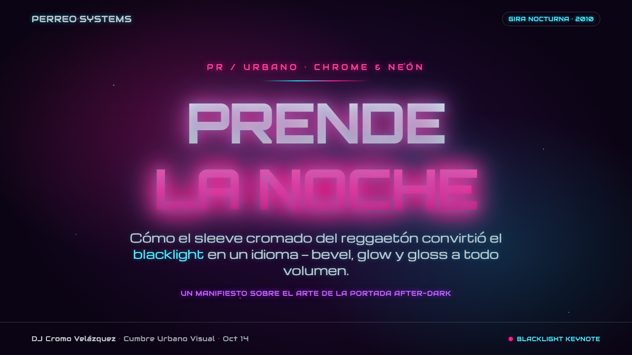
For presentation content and data slides, translate the cover logic into hierarchy rather than reproducing every effect. Use dark sections to frame major statements, reserve neon accents for emphasis, and make charts read as luminous graphic objects instead of neutral office diagrams. Titles can retain the wide, polished display treatment, while body copy should stay highly legible and calm. The contrast between restrained information and expressive headline graphics keeps the deck useful.
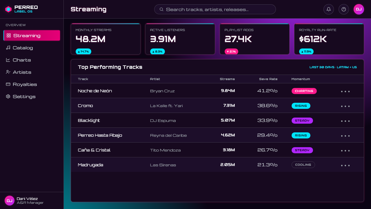
For web interfaces, the language is strongest in music dashboards, campaign pages, creator profiles, event discovery, and pricing experiences that benefit from nightlife energy. A dark violet interface can use pink and cyan to distinguish active states, featured releases, and calls to action. Cards, badges, and hero areas may carry controlled metallic shine, but navigation and everyday tasks should remain clear enough that the atmosphere does not interfere with finding music, comparing plans, or completing a purchase.
For editorial and marketing work, use the style to create a sense of launch, movement, and public visibility. A feature article can pair a glossy title treatment with quiet reading areas; a promotional landing page can alternate dense, glowing hero moments with dark breathing room. Photography or artist imagery, when present, should support the neon-chrome environment rather than pull the cover toward naturalistic lifestyle photography. The artwork should feel like part of the same nocturnal campaign system.
The common mistake is applying every available neon, glow, chrome treatment, and Y2K flourish at once. That produces noise rather than confidence. This style needs a dominant message, a limited set of illuminated focal points, and enough violet-black space for the effects to register. Another mistake is making the chrome lettering so elaborate that it becomes unreadable at small scale. Loudness is essential; legibility is the discipline that makes loudness work.
Reggaeton Album Cover — FAQ
Is this style only appropriate for reggaeton releases?
Its strongest and most authentic use is in reggaeton and urbano contexts because the visual language comes from that music-cultural setting. It can also support adjacent nightlife, event, creator, and digital-campaign work when the project genuinely needs a glossy, club-oriented, unapologetically commercial mood. It becomes less convincing when applied to subjects that need softness, quiet authority, or natural warmth.
How should pink and cyan be balanced?
Treat them as competing lights, not as background decoration. One can lead the composition while the other sharpens an edge, supports a secondary word, or marks an interactive moment. Both colors become most vivid when surrounded by violet-black space. If they appear everywhere with equal intensity, the cover loses the focused glow that gives it its blacklight character.
Does chrome typography need to look realistic?
No. The purpose of chrome is to signal polish, artificial shine, and tech-forward excess, not to simulate a photographed object perfectly. A convincing result needs a coherent metallic reading and strong letterform legibility. If realism makes the title difficult to read or overwhelms the surrounding composition, the surface treatment has stopped serving the cover.
Can the style work without artist photography?
Yes. The approved language is already built from atmosphere, typography, glow, and Y2K-revival graphics. A title-led cover can be especially effective because the logotype becomes the performance object. If imagery is introduced, it should join the violet-black, neon, and chrome system rather than compete with it as a separate naturalistic scene.
What makes a reggaeton-inspired cover feel polished instead of cluttered?
Make hierarchy visible. Choose one dominant wordmark or image, let the violet-black field provide real empty space, and use neon and chrome where they intensify that central signal. The style welcomes drama, but each effect should reinforce the same after-dark identity. When every object asks for equal attention, the result reads as decoration; when the elements move together, it reads as a release with presence.
Related design styles
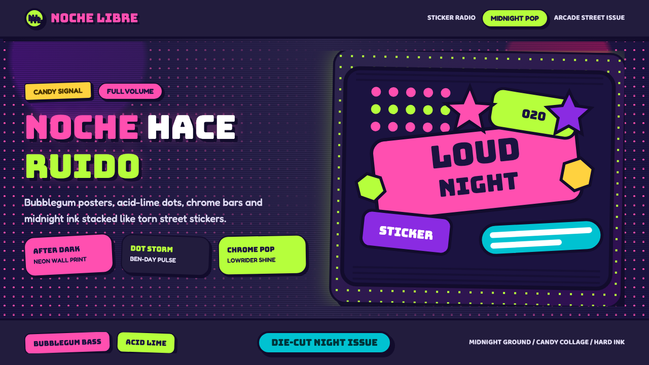 Bad Bunny YHLQMDLGMaximal night-pop collides. Bubblegum pink and acid lime stickers glow on mid…
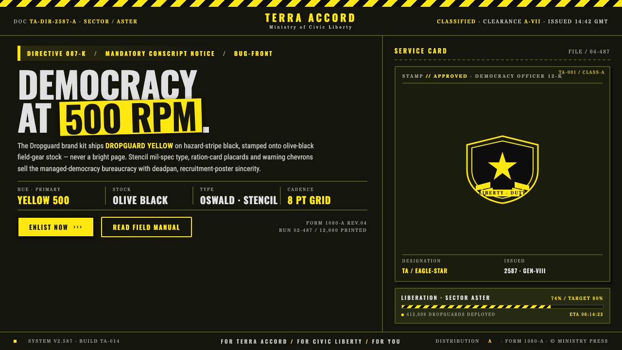 Helldivers (Super Earth)Democracy at 500 RPM. Helldivers Yellow stamped on hazard-stripe black, mil-s…
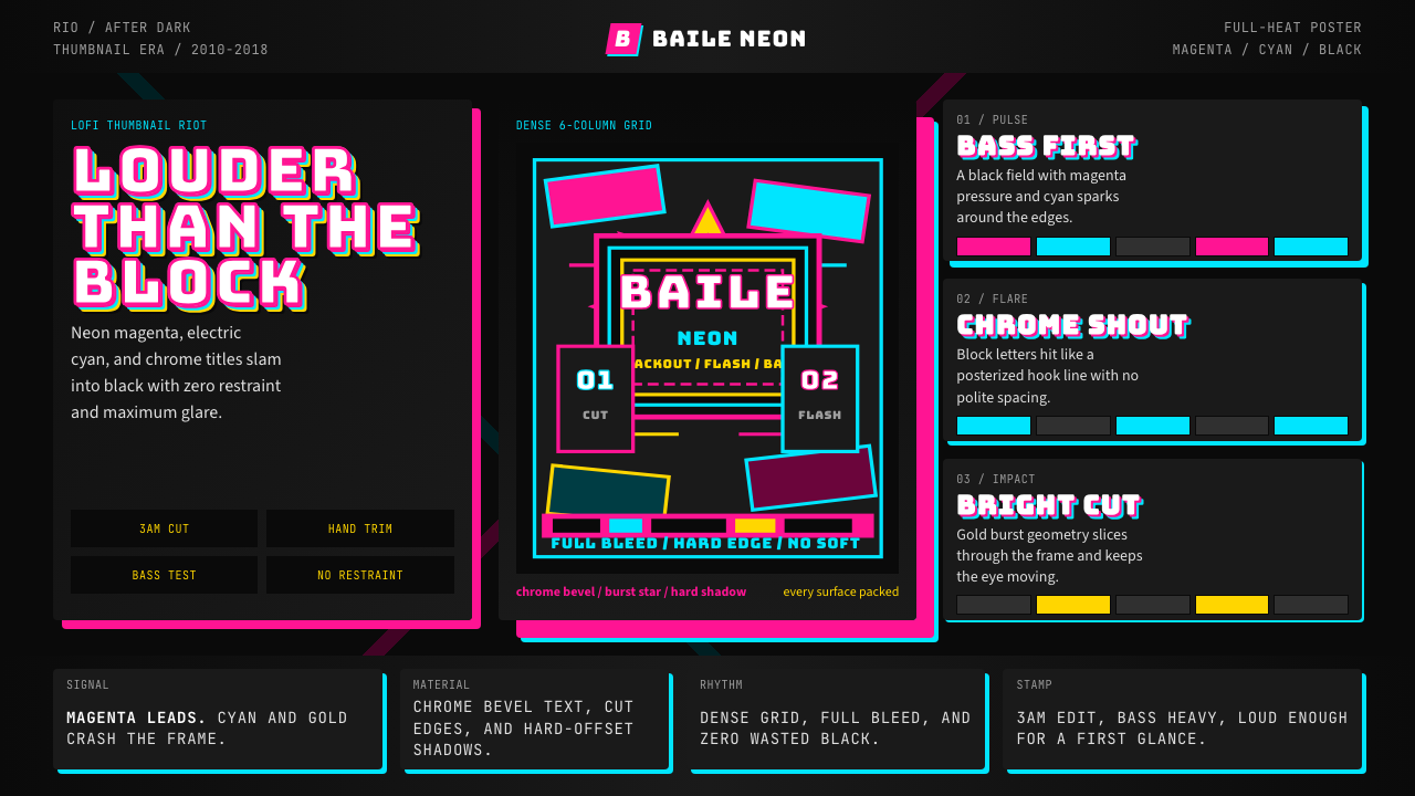 Funk Carioca FavelaMaximalist and unruly. Magenta, cyan, and chrome slam into black at thumbnail…
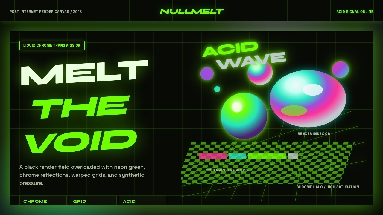 Acidwave 3D RenderPsychedelia hits the render engine. Neon green, chrome orbs, and warped grids…
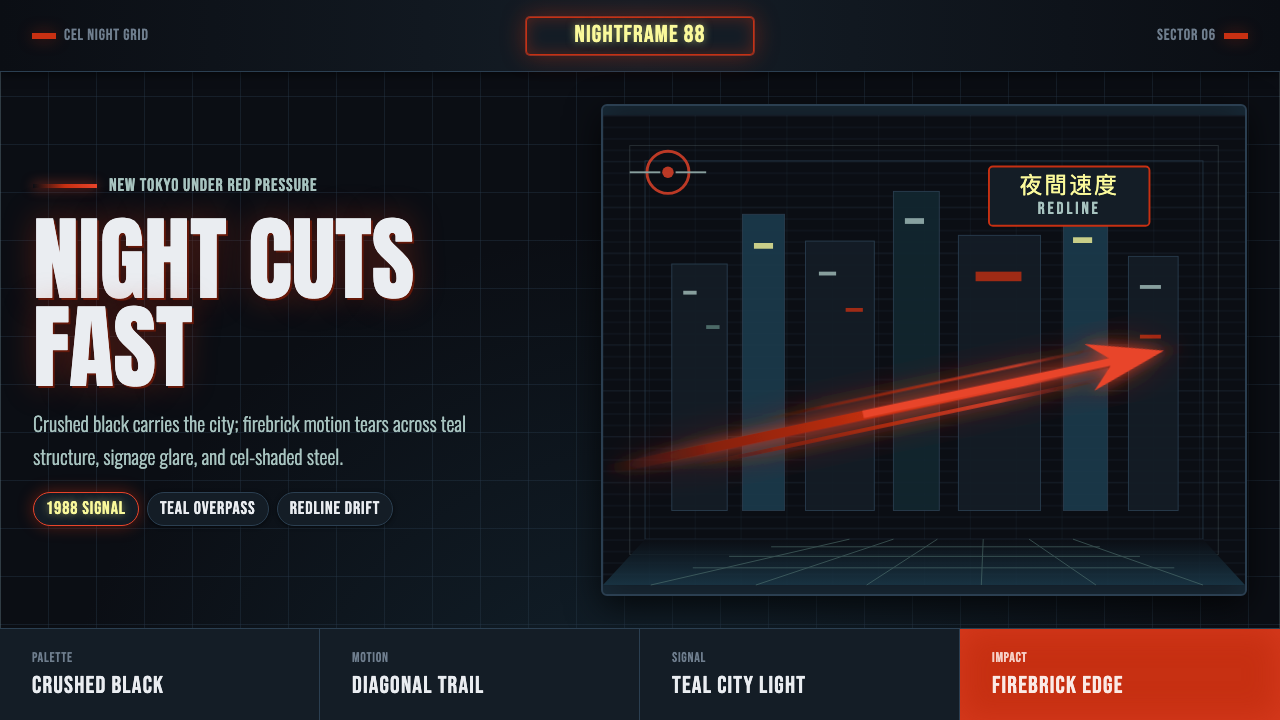 Akira Neo-TokyoNight moves fast. Firebrick trails cut crushed black, teal grids, and condens…
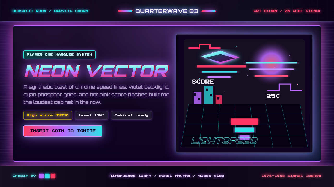 Arcade Cabinet MarqueeToo loud to ignore. Black-indigo glass, violet glow, cyan grids, hot-pink arc…