What is Bad Bunny YHLQMDLG?
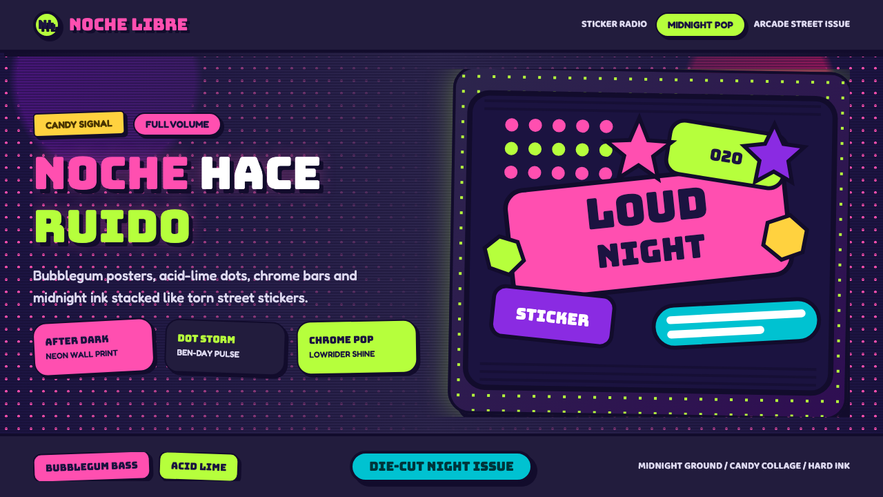
YHLQMDLG turns a midnight street into a comic panel: bubblegum pink and acid lime stickers, halftone dots, and chrome all glowing against a night sky that never goes black enough to hide anything.
Bad Bunny YHLQMDLG in brief
YHLQMDLG is the visual world built around Bad Bunny's 2020 album of the same name — a surreal, cartoonish nighttime street scene rendered in the language of sticker sheets and comic panels rather than a conventional album photo shoot. The signature image is a third-eye figure riding a bicycle past a car on fire and a sparking utility pole, all set against a deep midnight sky. Nothing about the scene is naturalistic; it reads like a psychedelic poster or a die-cut sticker pack that has been peeled apart and reassembled at large scale.
The visual language layers candy-bright pop-art elements — hot bubblegum pink, acid lime green, comic-style outlines, and rounded die-cut sticker shapes — directly onto that nocturnal ground rather than a clean white comic page. Halftone dot patterns, the kind associated with cheap newsprint comic printing and 1960s pop art, texture large flat areas instead of leaving them smooth. Fine horizontal scan lines, borrowed from old CRT television screens, run across sections of the composition, and chrome-and-reflection details lifted from lowrider car culture add a glossy, tactile shine on top of the flat color.
The overall register is maximal and unapologetically loud rather than tasteful or restrained — closer to a wall plastered with stickers than a single controlled illustration. It reads as both distinctly Caribbean, rooted in Puerto Rican street and car culture, and distinctly digital-arcade, as if the whole scene were glowing on an old screen in a dark room.
Where does Bad Bunny YHLQMDLG come from?
The style takes its name directly from Bad Bunny's second studio album, YHLQMDLG — an acronym for the Spanish phrase 'Yo Hago Lo Que Me Da La Gana,' roughly 'I do whatever I want' — released in February 2020. Bad Bunny, the stage name of Puerto Rican artist Benito Antonio Martínez Ocasio, had by that point become one of the defining voices of urbano music, the umbrella term for the reggaeton and Latin trap scene that grew out of Puerto Rico and the wider Caribbean through the 2000s and 2010s and went on to dominate global streaming charts.
Urbano music has always carried a strong, self-authored visual identity — album covers, music videos, and merchandise built by and for the genre's own artists and audience rather than filtered through a single mainstream aesthetic. YHLQMDLG pushed that visual identity toward something more surreal and illustrated than the photo-based covers common in the genre before it, trading a straightforward portrait for a fully imagined cartoon street scene.
The album's visual identity was shaped by collaborators working closely with Bad Bunny across illustration and video. The artist NAVS contributed to the surreal, illustrated world associated with the era — the kind of dense, sticker-and-comic-panel imagery that turned the album's central figures into a recognizable visual cast rather than a single static logo. The director Stillz, known for bold, saturated, pop-art-inflected music videos across Latin urbano artists of the period, helped extend that same visual sensibility into motion, reinforcing the connection between the album's still imagery and its videos.
Visually, the style also draws on a longer lineage that predates the album itself: the halftone Ben-Day dot technique associated with mid-twentieth-century newsprint comics and the pop art movement that borrowed from it, the scan-line texture of pre-flatscreen televisions and arcade cabinets, and the chrome detailing and lowered-car silhouettes of lowrider culture that has deep roots across Latino and Caribbean communities. YHLQMDLG folded all of these into a single, cohesive maximalist package, arriving at a moment — the 2010s into the 2020s — when urbano pop-art visuals were becoming one of the most globally recognized aesthetic exports of Latin American youth culture.
What defines the Bad Bunny YHLQMDLG look?
Color
Hot bubblegum pink and acid lime green carry most of the visual energy, glowing against a deep midnight ground rather than a light background. Colors are kept flat and saturated rather than shaded or blended, closer to printed sticker ink than to naturalistic lighting — every hue looks like it could be peeled off the page.
Comic Outlines
Every shape, figure, and object is bounded by a bold, uniform outline in the manner of a comic panel or sticker die-cut line, rather than fading softly into its surroundings. This outlining is what allows the maximal, densely layered composition to stay readable — each sticker-like element remains its own distinct object even when overlapping others.
Halftone / Ben-Day Dots
Flat color areas are textured with a pattern of small, evenly spaced dots rather than left as a solid, smooth fill — a technique inherited from cheap newsprint comic printing and the pop art movement that popularized it. The dot pattern gives large areas a slightly buzzing, mechanically reproduced texture instead of a digital, gradient-smooth surface.
CRT Scan Lines
Fine, evenly spaced horizontal lines run across sections of the composition, echoing the raster pattern of old cathode-ray-tube televisions and arcade screens. The effect reinforces the sense that the whole scene is being viewed on a glowing screen in a dark room rather than printed on paper.
Lowrider Chrome
Glossy metallic highlights and reflective surfaces, drawn from lowrider car culture, appear on vehicles and mechanical details throughout the composition. The chrome shine sits in deliberate contrast to the flat, matte sticker colors around it, giving specific objects — a car, a pole, a wheel — a tactile, polished focal weight.
Sticker Composition
Elements are arranged the way individual die-cut stickers might be layered onto a surface — overlapping, at slightly varied scales, without a single unifying perspective grid. This gives the composition a collaged, assembled quality rather than the coherent single-scene realism of a traditional illustration.
Surreal Night Scene
The subject matter itself leans surreal rather than documentary — a third-eye figure, a car on fire, a sparking pole, all treated with the same matter-of-fact confidence as an ordinary street corner. Nothing is explained or softened; the strangeness is presented as simply how this nighttime world looks.
Who shaped Bad Bunny YHLQMDLG?
Bad Bunny, the stage name of Puerto Rican artist Benito Antonio Martínez Ocasio, released YHLQMDLG in February 2020 as his second studio album. As one of urbano music's most globally prominent artists, his visual choices — the surreal street-scene cover art in particular — helped push the genre's imagery toward a more illustrated, maximalist direction than the photo-led covers common before it.
The illustrator NAVS contributed to the surreal, densely illustrated visual world associated with the YHLQMDLG era, helping shape recurring imagery — comic-outlined figures, sticker-like objects, a nocturnal street setting — into a recognizable and repeatable visual system rather than a single one-off cover image.
The music video director Stillz became known for bold, highly saturated, pop-art-inflected visuals across a number of Latin urbano artists in this period. His work helped carry the same sticker-and-comic visual sensibility associated with the album's cover art into motion, reinforcing a consistent visual identity across still image and video.
The halftone dot texturing used throughout this style traces back to Ben-Day dots, a printing technique developed for cheap newsprint reproduction in the late nineteenth and early twentieth centuries and later popularized as a fine-art device by pop artists in the 1960s. That lineage is part of why the dot pattern reads as instantly familiar — it borrows the visual shorthand of mass-produced comic printing.
How do you use Bad Bunny YHLQMDLG today?
This style works best when it commits fully to its maximal, layered density rather than being applied as a single flat color scheme — the appeal is in the collision of many loud elements at once, not in any one of them individually.
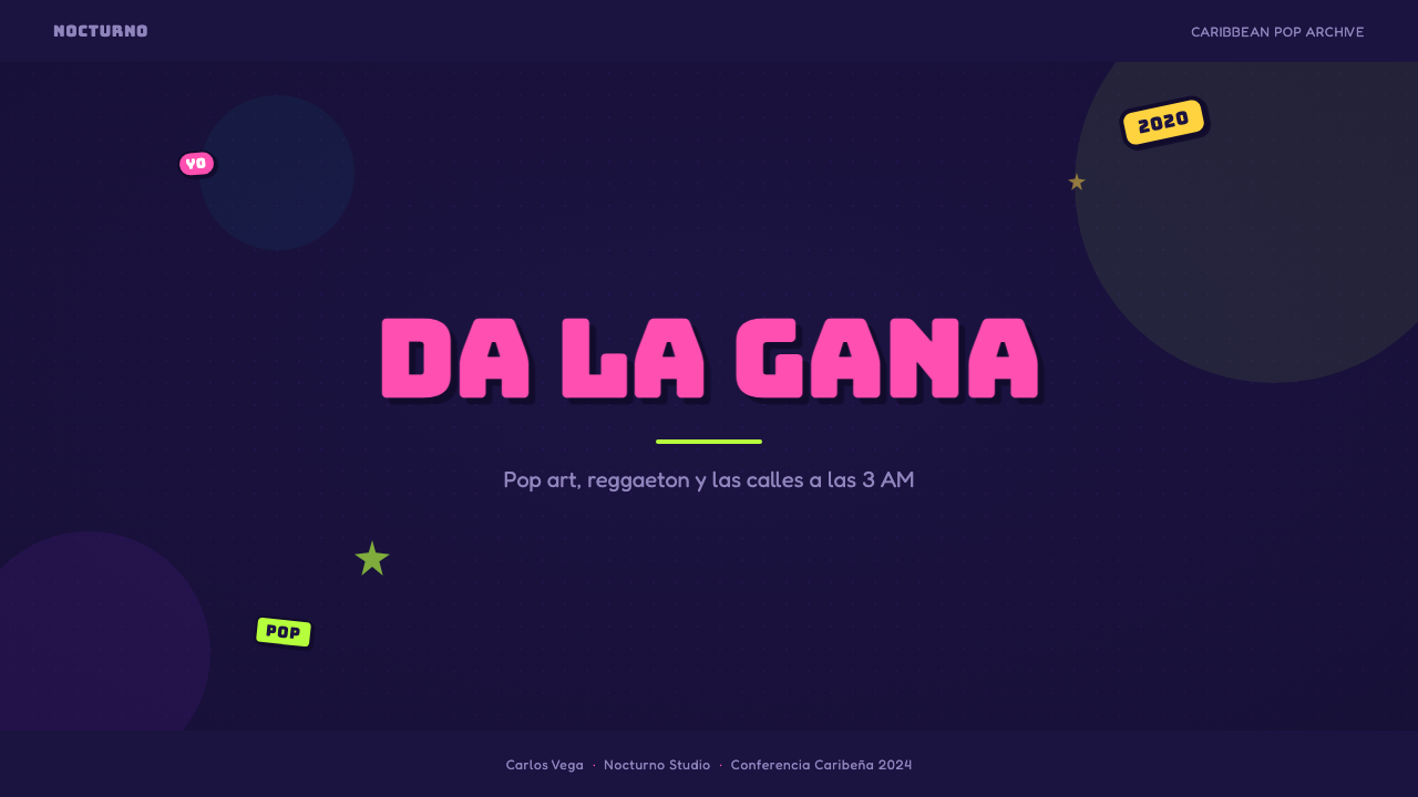
For presentation slides, the style suits a cover page built as a dense, sticker-collaged scene: a midnight-toned background, a bold illustrated centerpiece with comic outlining, and halftone or scan-line texture filling the surrounding space rather than leaving it empty. Content slides should pull back to a calmer register — a dark ground with one or two sticker-style accent shapes and comic-outlined icons — so the maximal energy of the cover does not overwhelm dense text. Data visualizations can borrow the chrome-and-outline treatment for individual highlighted figures, while keeping the underlying chart structure simple enough to stay legible against the busy texture.
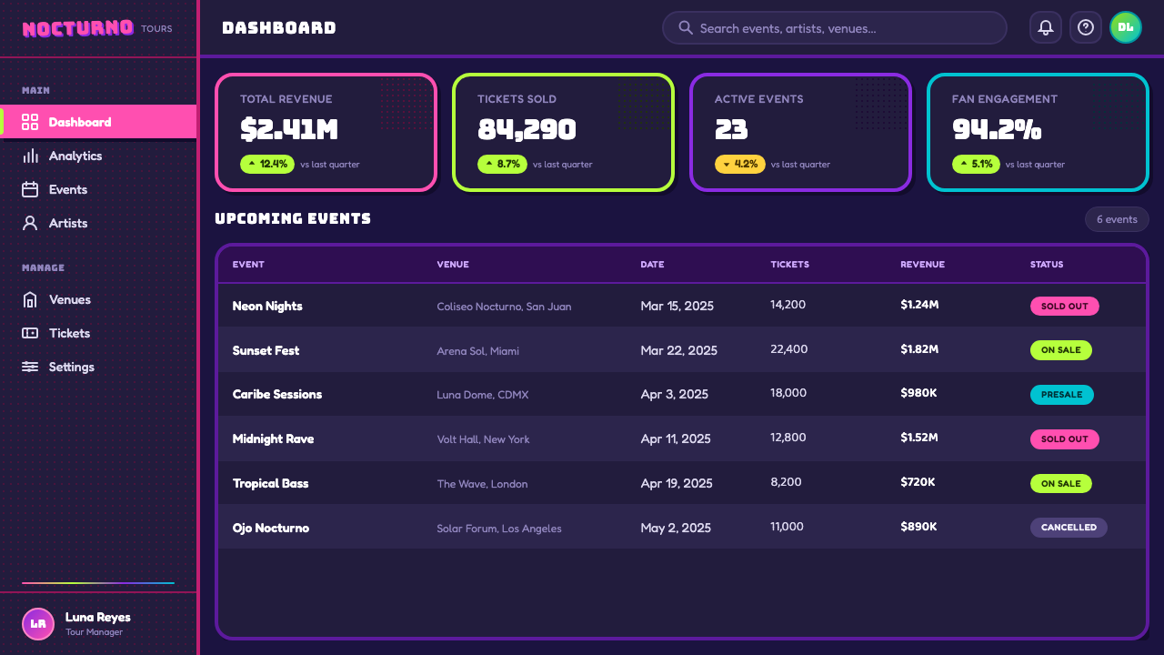
For web interfaces, the style is a natural fit for entertainment, music, and youth-culture-facing marketing pages rather than data-heavy dashboards. A pricing or landing page can use the midnight ground and bubblegum-and-lime accent pairing for hero sections and calls to action, with halftone texture reserved for background decoration rather than functional UI chrome, which should stay comparatively clean so buttons and forms remain usable.
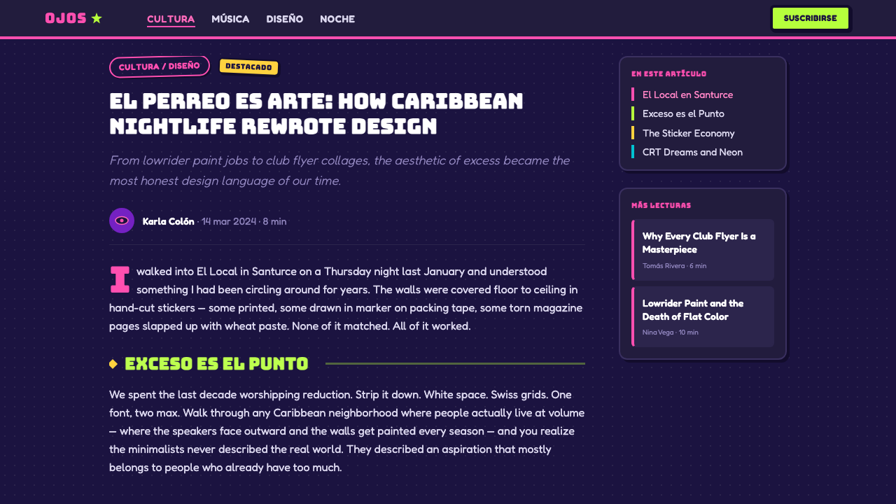
In editorial and marketing contexts, the style excels at feature content built around music, nightlife, streetwear, or youth culture — a magazine spread or campaign page can use the sticker-composition approach directly, layering comic-outlined photography or illustration fragments across a dark ground. Pull quotes and section breaks read well when treated as their own sticker-like object, complete with outline and a small chrome or halftone detail.
The most common mistake is diluting the palette into pastel or muted tones — the style depends on the collision of genuinely hot, saturated colors against a genuinely dark ground, and softening either side of that contrast collapses the neon-on-midnight effect the whole system is built around. A second common error is applying the halftone or scan-line texture uniformly everywhere, which flattens the composition; the texture reads best when it is reserved for specific surfaces, leaving other areas clean enough to anchor the eye.
Bad Bunny YHLQMDLG — FAQ
What does YHLQMDLG stand for, and does the meaning matter for the visual style?
YHLQMDLG stands for the Spanish phrase 'Yo Hago Lo Que Me Da La Gana,' meaning roughly 'I do whatever I want.' The defiant, unapologetic attitude behind that title lines up directly with the visual approach — a maximal, loud, rule-breaking collage of comic, pop-art, and lowrider references rather than a restrained or conventionally tasteful cover treatment. The name and the image share the same refusal to hold back.
Is this style the same as generic 'Y2K' design?
They overlap but are not identical. Generic Y2K design tends to draw on late-1990s and early-2000s consumer tech and chrome-bubble aesthetics broadly. This style shares some of that chrome-and-glow sensibility but is more specifically rooted in comic and pop-art printing techniques, Puerto Rican and Caribbean urbano music culture, and lowrider car detailing — a more geographically and culturally specific combination than the broader Y2K umbrella typically implies.
Why do the halftone dots and scan lines matter so much to the look?
Both textures are borrowed from specific, recognizable reproduction technologies — cheap comic-book printing and old cathode-ray-tube screens — rather than being arbitrary decorative patterns. Their presence signals a deliberate lineage: this is meant to look mass-reproduced and screen-lit rather than hand-painted or photographed. Removing them in favor of smooth, flat color or clean digital gradients erases that specific reference and pulls the style back toward generic flat illustration.
Can this style work in a light or pastel color scheme instead of the midnight ground?
Not without losing much of its impact. The entire effect depends on genuinely hot, saturated accent colors glowing against a genuinely dark field — the same way stickers and neon signage read most vividly at night. A light or pastel version can borrow the comic outlining and sticker composition as structural devices, but it will read as a different, gentler style rather than an authentic execution of this maximal night-pop language.
What kinds of products or brands does this style suit, and where does it not fit?
It suits music, nightlife, streetwear, gaming, and youth-culture brands that want to feel loud, current, and unafraid of visual noise. It is a poor fit for products that need to project calm authority, medical or financial trust, or a quiet, minimal reading experience, since the maximal density and neon contrast actively work against restraint and low visual noise. Applying it to a serious enterprise or institutional context would read as tonally mismatched no matter how well the individual elements are executed.
Related design styles
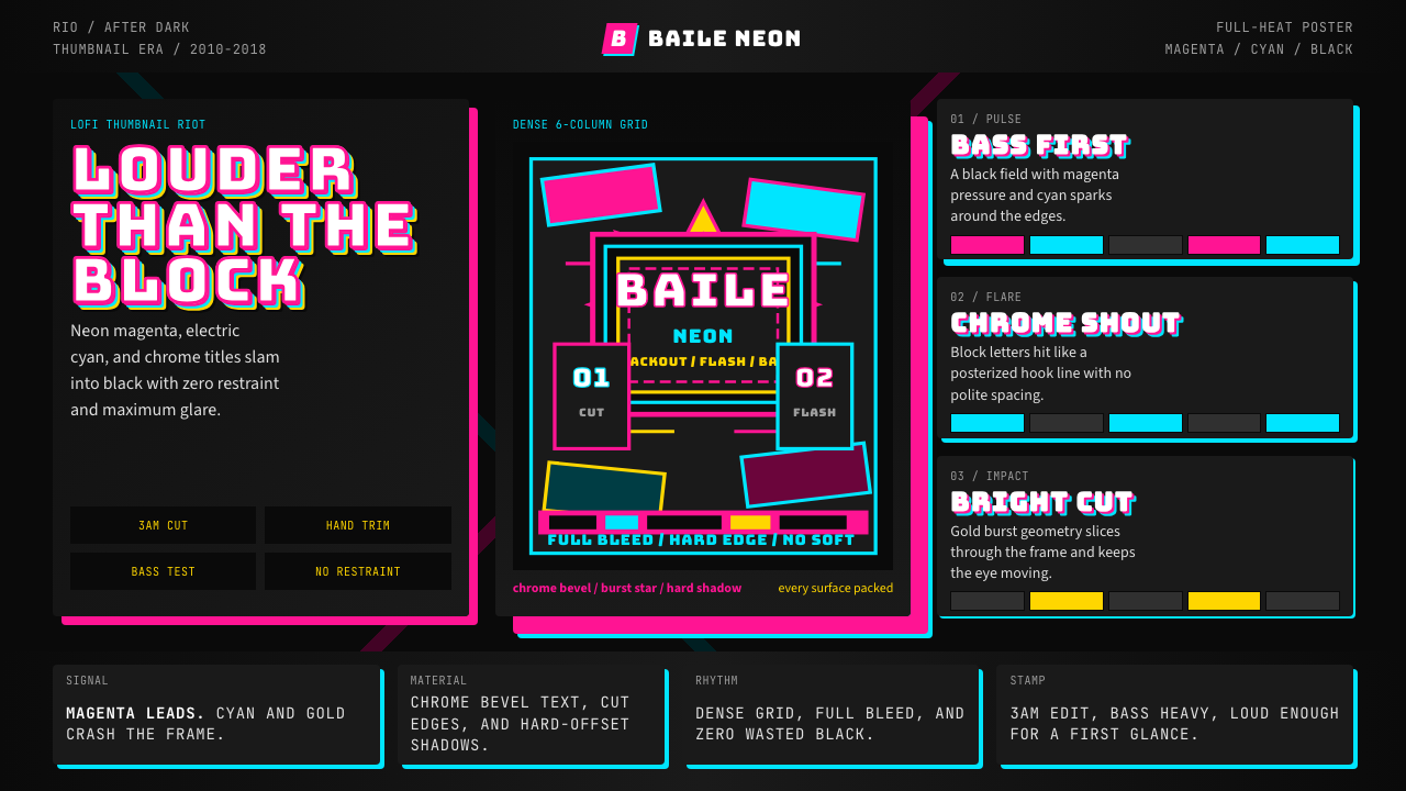 Funk Carioca FavelaMaximalist and unruly. Magenta, cyan, and chrome slam into black at thumbnail…
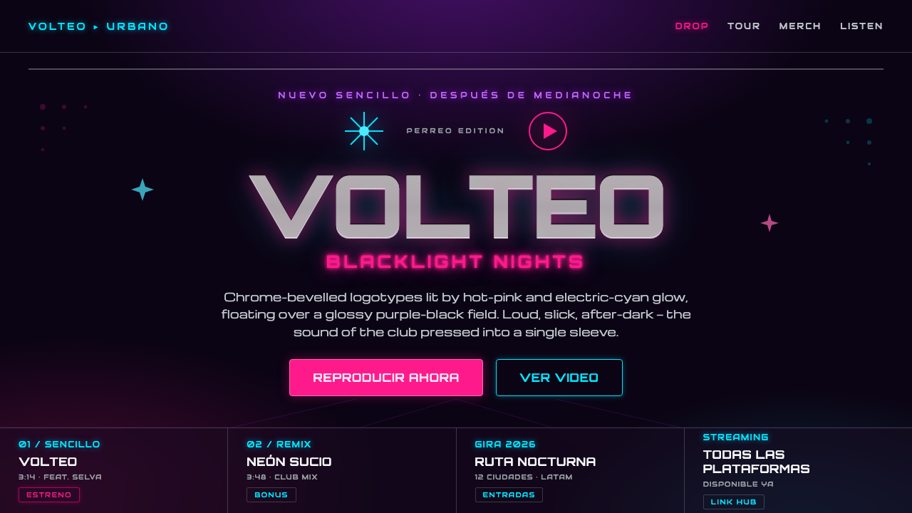 Reggaeton Album CoverAfter-dark, unapologetic. Chrome Orbitron logotypes glow pink and cyan on bla…
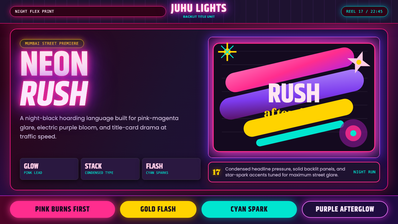 Bollywood Neon MumbaiMumbai pop burns bright. Khand stacks glow over night-black, with pink-purple…
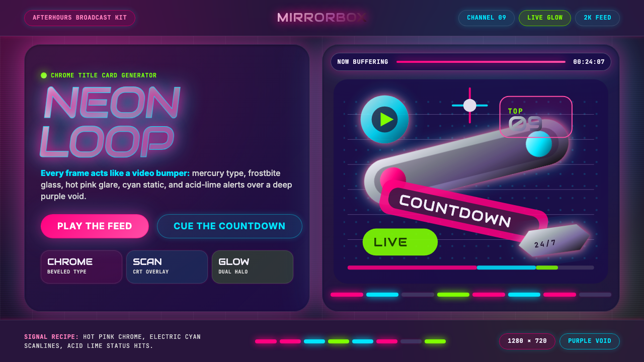 MTV Y2K (2000s)Maximum-volume Y2K. Hot pink chrome, cyan scanlines, and lime hits burn over…
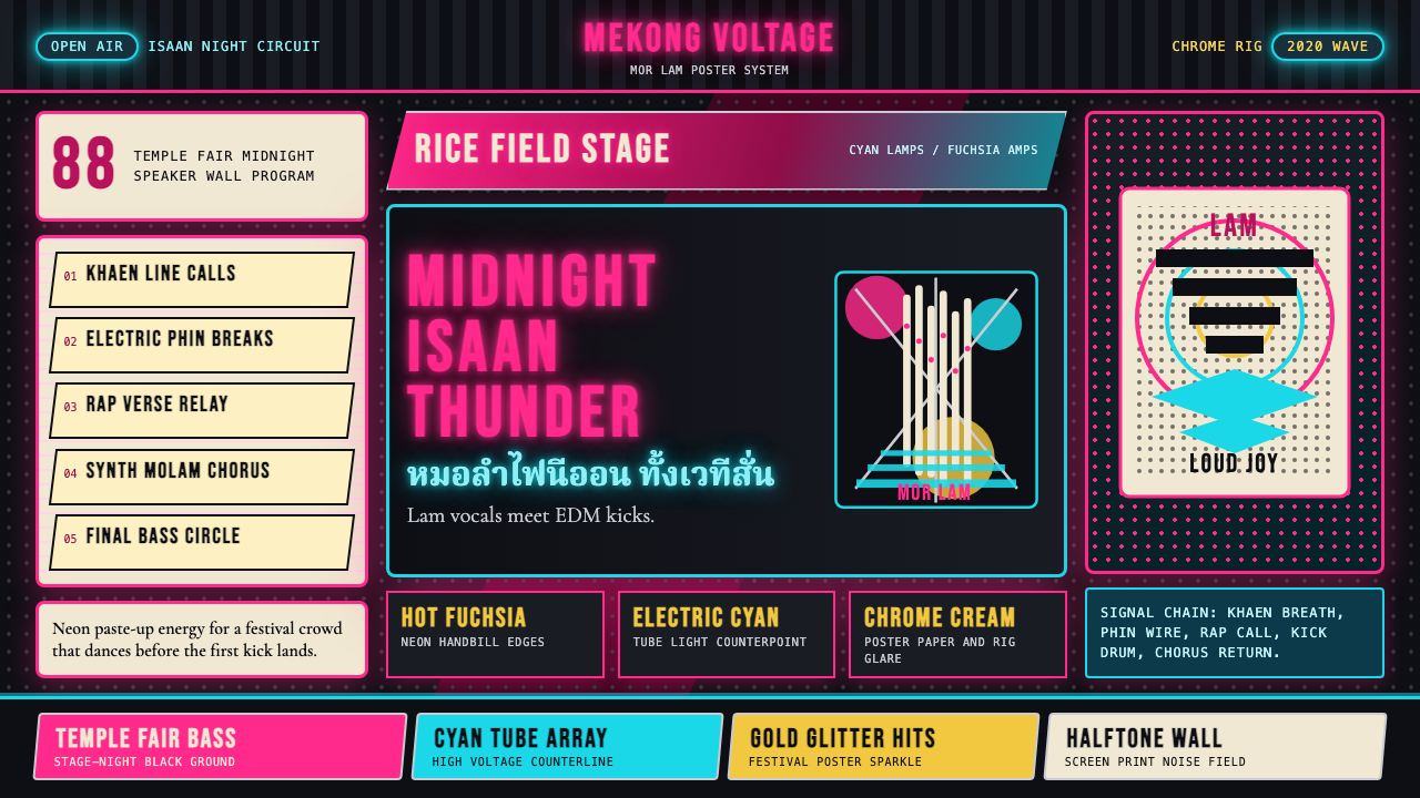 Thai Mor Lam Isaan (2020)Joy at maximum volume. Fuchsia-cyan neon, chrome type, and halftone grids hit…
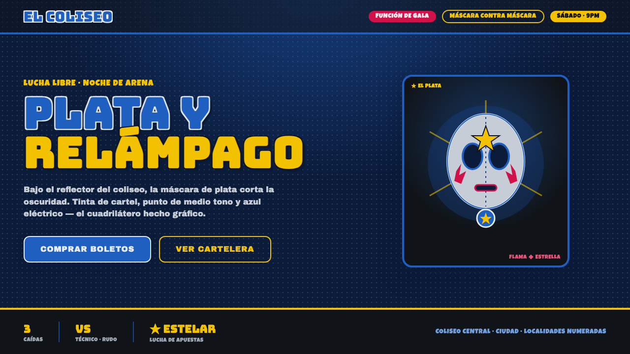 Mexican Lucha Mask GraphicComic-book lucha, lit from above. Silver-blue mask out of arena-night dark, h…