What is Zenless Zone Zero?
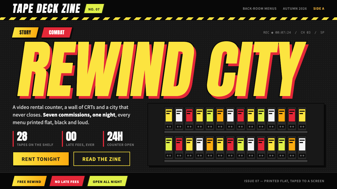
Zenless Zone Zero turns a game menu into a loud, slanted, hip-hop zine taped to a CRT, with lemon-yellow lettering, hazard tape and shadows that never blur.
Zenless Zone Zero in brief
Zenless Zone Zero is miHoYo's urban action game, and this style takes its interface at face value. The look is flat near-black panels, white numerals, lemon-to-amber lettering with a thick black outline, red combat tags, acid-lime markers for live states, and hazard tape cutting across the layout. Layouts are dense, slanted and loud, and they make no attempt to be polite.
The game is set in New Eridu, a city that grew up around catastrophic spaces called the Hollows. The player runs Random Play, a video rental store, and that premise colours everything. The interface is built from the materials of that shop and of the street outside it: VHS spines, CRT screens, arcade cabinets and spray paint. Nothing is frosted glass or softly lit; everything is printed, taped, stuck on or tagged.
The result reads like a hip-hop magazine taped to a cathode-ray television. Type is set big and heavy, angled against the grid, and stacked against thick outlines and hard offset shadows with no blur at all. It is the opposite of a quiet, minimal interface, and its energy comes from density, contrast and deliberate roughness.

Where does Zenless Zone Zero come from?
Zenless Zone Zero was announced in 2022 and released on 4 July 2024 by miHoYo, the Shanghai-based studio better known for earlier hit games. It belongs to the family the source material calls gacha action games, a genre of free-to-play action titles that release characters through collectible draws and rely heavily on distinctive character art and polished menus. The style described here reflects the game's presentation from 2024 onward.
The people named among its key figures are Li Zhenyu and Cai Haoyu. Cai Haoyu is associated with miHoYo as a founder, and Li Zhenyu is linked to the project itself. Their names mark the connection between a Shanghai studio and a game that looks, on the surface, as if it comes from a very different place. New Eridu is a fictional metropolis, but its visual language borrows from global street culture rather than from any single country.
The aesthetic draws on two clear sources. The first is retro-analog urban fantasy: the video rental shop, the cathode-ray screen, the arcade cabinet and the cassette-era object. These are physical, slightly worn technologies, and they give the interface its tactile and nostalgic character. The second is hip-hop and street-graffiti culture, with its slanted lettering, thick outlines, stickers, tape and tagging. Together they place the game in a city where old media and street art coexist.
The decision to build the menus from these materials makes the interface part of the setting rather than a layer on top of it. Hazard tape, spray paint and video-store labelling are not decorations added for style; they are the visual grammar of the world. That integration is why the look is so recognisable, and why it translates well into a standalone design system: it is a complete, self-consistent attitude rather than a collection of effects.
What defines the Zenless Zone Zero look?
Near-Black Panels
The ground is a flat near-black, and panels are solid shapes placed on it with no frosting and no translucency. There is no glass effect and no soft ambient light. Surfaces read like painted metal or printed cardboard, which keeps the screen heavy, dense and tactile. The darkness exists to make the bright lettering and tape colours hit hard.
Lemon-to-Amber Lettering
Headlines are set in heavy, condensed capitals filled with a gradient that runs from lemon yellow to amber, and each letter is wrapped in a thick black outline. The slant and the outline together make the type feel like a sticker or a movie-poster title. It is the clearest signature of the style, and it is meant to be read from across the room.
Hard Offset Shadows
Shadows are solid shapes pushed off to one side with no blur at all. They behave like a second printed layer slightly out of register rather than like a simulation of light. This gives panels and type a cut-out, sticker-like thickness. The absence of any soft shadow is one of the strictest rules of the system, and it is what separates it from glossy, frosted interfaces.
Hazard Tape
Alternating diagonal bands of yellow and black cut across layouts as dividers, borders and section markers. The tape is both decoration and structure: it separates areas, adds urgency and ties the interface to the street and the workshop. Used as a repeated motif, it gives the whole layout a taped-together, found-object character.
Functional Colour Tags
Colour is assigned by meaning. Red marks combat tags and danger, while acid lime marks live or online states. White is reserved for numerals and key data, which keeps numbers readable against the dark panels. Because each loud colour has one job, the interface stays legible even when it is crowded.
Dense, Slanted Layout
Layouts are packed rather than airy. Blocks overlap, edges tilt, and labels crowd against each other, with little of the generous whitespace that other styles prize. The slant gives motion to static screens, and the density gives the feeling of a magazine page or a wall covered in flyers. Disorder is controlled, though: elements still align to a shared angle and a clear hierarchy.
Analog Media Texture
References to VHS spines, CRT screens, arcade cabinets and spray paint run through the details. Labels look like tape stickers, screens suggest scanlines and tags look hand-sprayed. These cues are literal parts of the game's shop setting, so they never feel like arbitrary retro decoration. They anchor the style in the worn, physical technology of a video rental store.

Who shaped Zenless Zone Zero?
Li Zhenyu is listed among the key figures of this style for his connection with the creation of Zenless Zone Zero. His name stands for the project's direction at the studio, within which the video-store, CRT and street-culture identity of New Eridu took shape.
Cai Haoyu is associated with miHoYo as one of its founders. He is listed here because the studio he helped establish is the source of the game and, by extension, of an interface language that mixes Shanghai-based production with a global street-culture vocabulary.
The Shanghai studio behind the game, named here because the style is inseparable from its production. Its earlier hit games established the audience and the expectations for polished, character-driven menus, and Zenless Zone Zero shows the same studio choosing a deliberately rough, loud interface for a new setting.
How do you use Zenless Zone Zero today?
The Zenless Zone Zero style is for work that wants attitude, energy and a strong sense of place. It is a loud style that rewards confident, deliberate use, and it is best applied where a product, event or story has a youth, street or arcade character. Its tools are heavy type, hard shadows and tape, not subtle gradients.
For presentation slides, covers can use a near-black field, a huge slanted title in lemon-to-amber lettering with a thick outline, and a strip of hazard tape across one edge. Content slides use dense panels with white numerals and a red or lime tag for the key status. Data slides work well because the style already loves big numbers: set the figure large in white and mark states with colour tags. Keep one focal point per slide even though the surface is busy.
For web interfaces, it fits game sites, entertainment platforms, event pages, fan communities and playful consumer products. Build with flat near-black panels, hard offset shadows and slanted section headings. Use red tags for urgent or combat-like labels and lime for live or online states. Use hazard tape as a section divider rather than a full background. Keep body text plain and readable against the panels so the loud elements stay accents.
For editorial and marketing work, the style suits posters, launch teasers, music or street-culture features and limited-time campaigns. A cropped photo or illustration, a heavy title with a black outline, stickers, tape and a few strong colour tags can carry a whole layout. Let layouts overlap and tilt, but keep a consistent angle across the page so the disorder looks designed.
The common mistake is to soften it. Adding blur, frosted glass, gentle gradients or generous whitespace removes the dense, printed attitude that defines the style. Another frequent error is using the loud colours decoratively; red, lime and the lemon-amber lettering each have jobs, and spreading them around makes the screen unreadable. Finally, do not apply it to quiet or formal contexts such as finance, healthcare or legal products, where its volume will undermine trust.

Zenless Zone Zero — FAQ
What is the Zenless Zone Zero style?
It is a design style taken from the menus of miHoYo's urban action game, released in 2024. It is recognised by flat near-black panels, white numerals, lemon-to-amber lettering with a thick black outline, red combat tags, lime live-state markers, hazard tape and hard offset shadows. The overall effect is dense, slanted and loud, like a hip-hop magazine taped to a CRT.
Why are there no soft shadows or blur?
Because the interface is built from printed, taped and sprayed materials rather than from glass and light. Soft shadows simulate lighting and make surfaces feel digital and polished, while hard offset shadows behave like a misregistered print layer and make elements feel like stickers. Avoiding blur is a core rule, and breaking it removes the style's character.
Where does the retro look come from?
It comes from the game's setting. The player runs Random Play, a video rental store, in the city of New Eridu, so the interface borrows from VHS spines, CRT screens and arcade cabinets. Together with hip-hop and street-graffiti culture, these references give the style its retro-analog urban-fantasy mood.
How should the colours be used?
Give each loud colour a job. Use white for numerals and key data, lemon-to-amber for headline lettering, red for combat or urgent tags and acid lime for live or online states. Keep the ground near-black. If colours are used decoratively rather than functionally, the screen turns into noise and loses its hierarchy.
Is the style suitable for serious or professional products?
Generally not. Its volume, slant and density suit entertainment, games, events and youth-oriented brands. In finance, healthcare, legal or enterprise contexts it would feel out of place and could undermine trust. Choose it when attitude and energy are the goal, and choose a quieter style when calm credibility is.
Related design styles
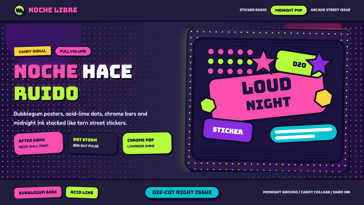 Bad Bunny YHLQMDLGMaximal night-pop collides. Bubblegum pink and acid lime stickers glow on mid…
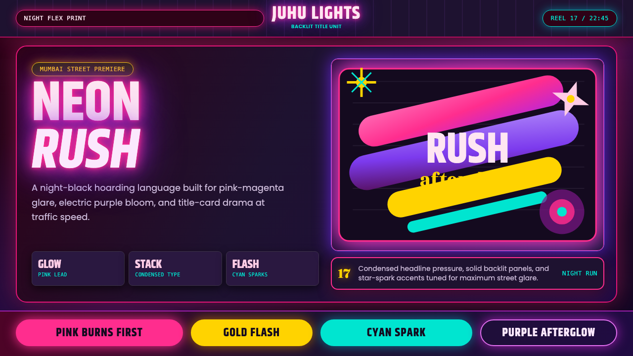 Bollywood Neon MumbaiMumbai pop burns bright. Khand stacks glow over night-black, with pink-purple…
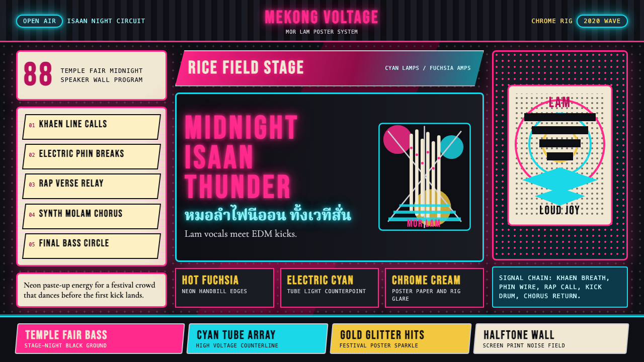 Thai Mor Lam Isaan (2020)Joy at maximum volume. Fuchsia-cyan neon, chrome type, and halftone grids hit…
 Donkey Kong (1981 Arcade)Built to read through the smoke. Coral girders and cyan ladders cut across a…
 Pixel Art / 8-bit RetroHard-edged digital joy. CRT black, phosphor green, and 8x8 grids snap every p…
 Street Fighter II (1991 Arcade)Pixel muscle hits hard. Hadouken blue, gold HUD bars, and outlined type blaze…