What is Outland (1981)?
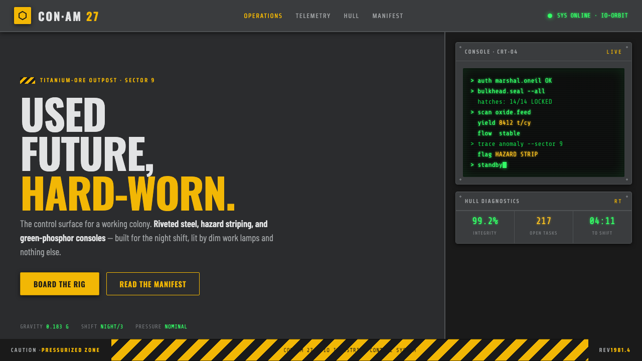
Outland turns space into a hard-shift workplace: riveted steel, failing light, hazard markings, and green CRT glow holding back an almost total darkness.
Outland (1981) in brief
Outland is the visual world of Peter Hyams’ 1981 science-fiction film, set in a mining colony on Jupiter’s moon Io. It is often framed as a space-bound version of a Western confrontation, but its design language is more important than its premise: this is not an elegant, frictionless future. It is a near-future industrial outpost where people work inside metal compartments, pass through connecting tubes, and rely on doors, lamps, controls, and warnings that appear designed to survive use rather than impress an audience.
The atmosphere is near-totally dark. Riveted dark-gray steel forms the basic environment; hexagonal connecting tubes and fire-control doors turn circulation into a sequence of enclosed thresholds. Dim work lamps do not beautify the space or erase its severity. They reveal only enough structure to keep labor moving, leaving machinery, walls, and human figures partly absorbed into gloom. The result is oppressive because it feels operational: darkness is not a mood layered over the setting, but a condition the setting must continually manage.
Its signature contrast is immediate and useful. Yellow-and-black hazard striping cuts across grimy metal, while green-phosphor CRT consoles emit a restrained electronic glow. The translation into interface design is therefore dark, functional, and deliberately workmanlike: stencil-like lettering, monospaced text, hard-edged indicators, structural borders, and warning color used where attention genuinely matters. Outland does not promise a clean technological future. It makes technology look maintained, necessary, and slightly hostile.
Where does Outland (1981) come from?
Outland belongs to 1981 and to a gritty utilitarian near-future rather than a polished fantasy of advanced technology. Its North American production context and its description as a space-based High Noon establish a world of pressure, isolation, duty, and confrontation. The future is not presented as an escape from ordinary labor. Mining, security, movement through restricted areas, and the management of dangerous infrastructure remain central to how the environment reads.
Peter Hyams directed the film and gave the setting its defining dramatic frame: a confrontation transplanted into an industrial colony on Io. That framing matters visually because it gives the environment a practical moral tension. The setting needs recognizable paths, boundaries, barriers, entrances, and places from which danger can emerge. Its darkness and enclosure do not merely decorate a science-fiction setting; they create the conditions for surveillance, suspicion, and difficult movement.
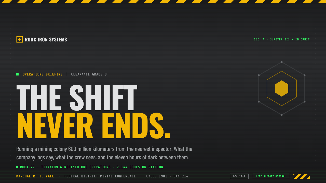
Production designer Philip Harrison built the colony as a dehumanizing industrial outpost. Riveted steel, connecting tubes, and fire-control doors make the colony feel assembled from systems rather than composed as a civic or domestic environment. The architecture communicates containment before comfort. Its surfaces are dark-gray, grimy, and visibly industrial; its lighting is supplied by dim work lamps rather than broad, reassuring illumination. This material discipline makes the setting feel blue-collar and physically demanding.
The resulting style sits between industrial science fiction and blue-collar space-western realism. It uses the ordinary visual logic of workplace safety and control systems—warning stripes, functional closures, instrument glow, and hard metal surfaces—to make a distant colony legible. The enduring design lesson is not that every interface should imitate an old screen. It is that visual decisions should expose the pressures of the world they serve: danger should look dangerous, controls should look accountable, and decorative softness should not disguise a system built for hard use.
What defines the Outland (1981) look?
Dark Industrial Ground
The dominant field is darkness interrupted by dark-gray steel rather than a neutral backdrop decorated with industrial details. Metal walls, seams, rivets, and enclosed surfaces establish the visual ground. Large quiet areas should feel like unlit structure, not empty space waiting for content. The darkness creates seriousness, but it also forces every illuminated element to justify why it is visible.
Hazard as Hierarchy
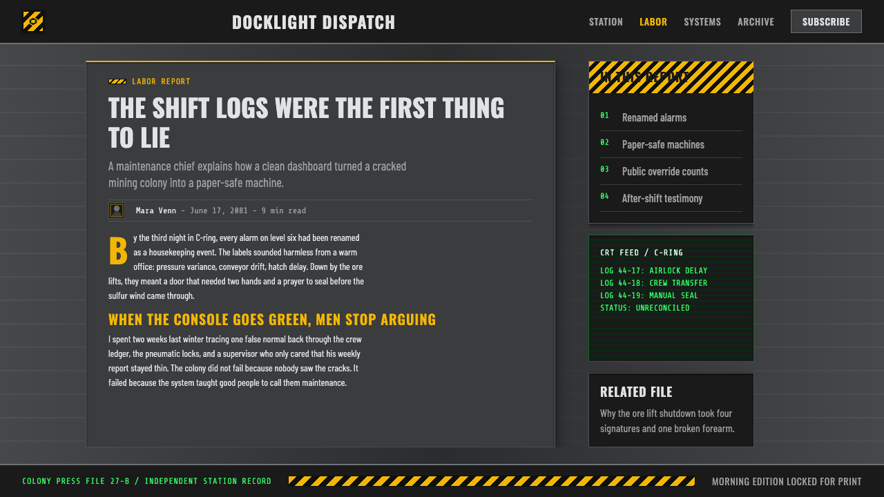
Yellow-and-black diagonal striping is the system’s sharpest signal. It belongs on boundaries, failure states, dangerous actions, restricted zones, and changes in operating condition—not as a general decorative pattern. Against grimy metal and darkness, the stripe carries immediate visual urgency. Its power depends on rarity: if it frames every card or panel, it stops communicating risk and becomes costume.
CRT Phosphor Glow
Green-phosphor console light provides the counterpoint to the warning stripe. It should read as emitted information: contained, electronic, and localized in the gloom. Use it for active readouts, selected states, system presence, and technical confirmation. The glow should feel like a console struggling through darkness, not a broad neon atmosphere. This keeps the interface functional and preserves the contrast between information and alarm.
Utility Typography
Stencil-like and monospaced type give language the character of labeling, routing, logging, and equipment control. Text should appear attached to a function: a door identifier, a system state, a location marker, or an operational instruction. Hierarchy comes from placement, contrast, grouping, and disciplined scale changes rather than expressive typography. The tone is procedural, legible, and impersonal without becoming unreadable.
Compartmental Structure
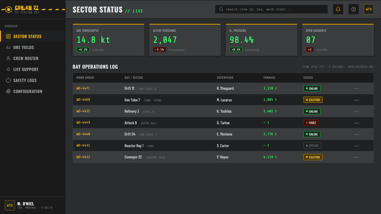
Hexagonal tubes, doors, and metal partitions suggest an interface organized as linked compartments. Panels should feel bounded by purpose, with clear transitions between monitoring, action, status, and warning. Separators are structural seams rather than ornamental dividers. This gives dense information a sense of containment and makes navigation feel like moving through a facility instead of drifting across a decorative surface.
Work-Lamp Contrast
Lighting is narrow in purpose. Dim work lamps reveal a control, an edge, a passage, or a human task while allowing the surrounding environment to remain heavy and obscure. In a digital layout, this becomes selective emphasis: illuminate the current task, keep secondary structure subdued, and avoid making every surface equally bright. The style gains tension from what remains unseen.
Who shaped Outland (1981)?
Peter Hyams directed Outland in 1981. The film’s space-based High Noon framing gives the industrial colony a visual logic of confrontation: routes, barriers, doors, darkness, and controlled access all become part of the pressure around its characters. His contribution establishes the setting as a working environment rather than a clean spectacle of future technology.
Philip Harrison served as production designer and built the dehumanizing industrial outpost on Io. The riveted dark-gray steel, hexagonal connecting tubes, fire-control doors, and dim work-lamp illumination are central to the style. His environment makes utility visible: material, closure, circulation, and safety are not hidden behind polished surfaces.
As a design reference, Outland is defined less by decorative futurism than by a coherent industrial system: grimy metal carries yellow-and-black warnings, CRT consoles supply green-phosphor information, and darkness makes visibility scarce. This combination is the source of its usable interface language—blue-collar, procedural, enclosed, and functional.
How do you use Outland (1981) today?
For presentation covers, use darkness as the dominant field and let one functional signal establish the subject: a cropped strip of hazard marking, a green console-like readout, or a steel compartment edge. The title should feel marked onto equipment or entered into an operational display, not set as a cinematic poster line. Content slides work best as restrained control panels, with a clear current topic, contained text blocks, and structural dividers that resemble seams or access boundaries rather than decorative frames.
For data slides, translate charts into monitored operating conditions. Keep the chart field dark and legible, use green-phosphor treatment for normal live information, and reserve yellow-and-black warning language for thresholds, anomalies, or high-consequence exceptions. Labels should be practical and aligned like instrument information. Do not turn every series into a luminous accent; the important contrast is between ordinary system readout and a state that requires attention.
For web interfaces, Outland suits dashboards, operations tools, monitoring surfaces, security views, industrial software, and pricing pages that want to communicate a serious, no-frills service posture. Organize navigation as named sections or facility-like zones. Treat cards as compartments with clear edges and responsibilities. Inputs, filters, statuses, and logs should look accountable and inspectable. A pricing page can use the same language by making tiers read like access levels or service conditions, while keeping warnings reserved for genuine limitations or risk.
For editorial and marketing work, the style is strongest when the subject already contains labor, infrastructure, risk, machinery, logistics, maintenance, or difficult conditions. Use dark editorial fields, precise captions, restrained console-like callouts, and one dominant warning or phosphor signal to organize attention. Marketing should emphasize capability, readiness, and operational clarity rather than luxury. The visual voice says that the product is built to keep working when the environment is not friendly.
The common mistake is treating Outland as generic cyberpunk: covering every surface in green glow, applying hazard stripes as wallpaper, and making darkness merely a fashionable background. That loses the source’s working logic. The style depends on scarcity—limited illumination, rare warning color, contained displays, and metal that feels used. If every element looks urgent, bright, or distressed, none of them can communicate function, danger, or control.
Outland (1981) — FAQ
Is Outland just another cyberpunk visual style?
No. Its defining idea is industrial utility, not visual excess. Green-phosphor CRT light and dark metal can overlap with familiar cyberpunk cues, but Outland is much more restrained. Its colony is organized around mining, safety, confinement, and work. The most faithful applications keep illumination limited, make warnings functional, and let the environment feel maintained rather than theatrically futuristic.
When should hazard striping appear in an Outland-inspired interface?
Use it at meaningful boundaries: dangerous actions, restricted areas, failure conditions, high-risk thresholds, or a clear transition in operating state. It should behave like a workplace safety signal, not a brand texture. The yellow-and-black pattern is effective precisely because it interrupts the dark steel environment. Repeating it on ordinary navigation, cards, and decorative edges weakens its authority.
Can the style work without using green console glow?
Yes, but the interface still needs a disciplined information light. The green-phosphor CRT glow is a signature reference because it distinguishes active electronic information from the dark industrial ground and from yellow-and-black alarm language. If it is omitted, preserve that relationship through another restrained, localized indication of system activity. Do not replace it with broad decorative illumination.
Which products are a poor fit for Outland?
It is a poor fit when warmth, softness, celebration, or effortless friendliness are the primary product values. A near-totally dark, dehumanizing industrial language can make playful, intimate, or comfort-oriented experiences feel unnecessarily severe. It works best where operational clarity, risk awareness, infrastructure, technical labor, or durable capability are genuinely part of the product’s story.
How can an Outland-inspired design remain readable?
Treat visibility as a hierarchy, not as an excuse to make everything bright. Establish a reliable text and structural contrast against the dark ground, group related information into compartments, and make active information distinct from warnings. Dimness should shape the atmosphere around the content, while labels, critical controls, and current system states remain unambiguous. The goal is controlled scarcity, not obscurity for its own sake.
Related design styles
 Terminator HUD (1984)The machine never blinks. Blood-red reticles and mono data burn across absolu…
 Arcade Cabinet MarqueeToo loud to ignore. Black-indigo glass, violet glow, cyan grids, hot-pink arc…
 DTM Touring CarEngineered aggression. Carbon black grid, gunmetal type, cyan and acid teleme…
 Fallout Vault-Tec Pip-BoyIrradiated optimism. Vault yellow and CRT green lock into a bordered bunker g…
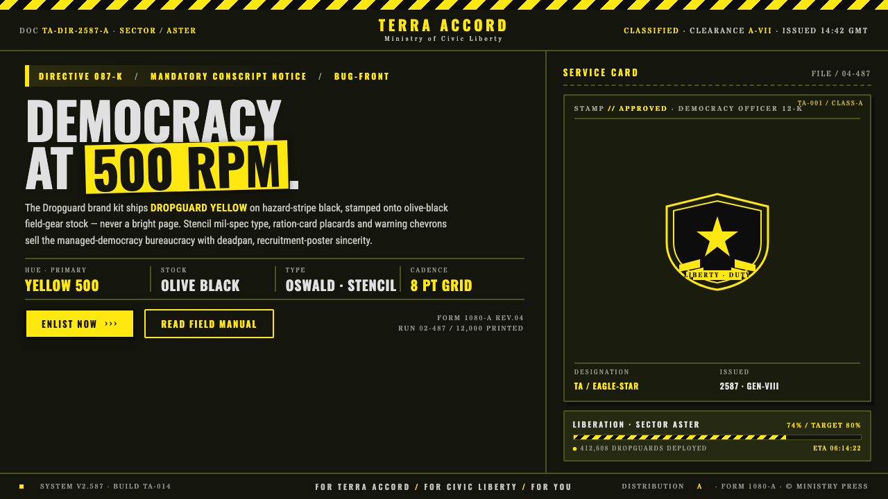 Helldivers (Super Earth)Democracy at 500 RPM. Helldivers Yellow stamped on hazard-stripe black, mil-s…
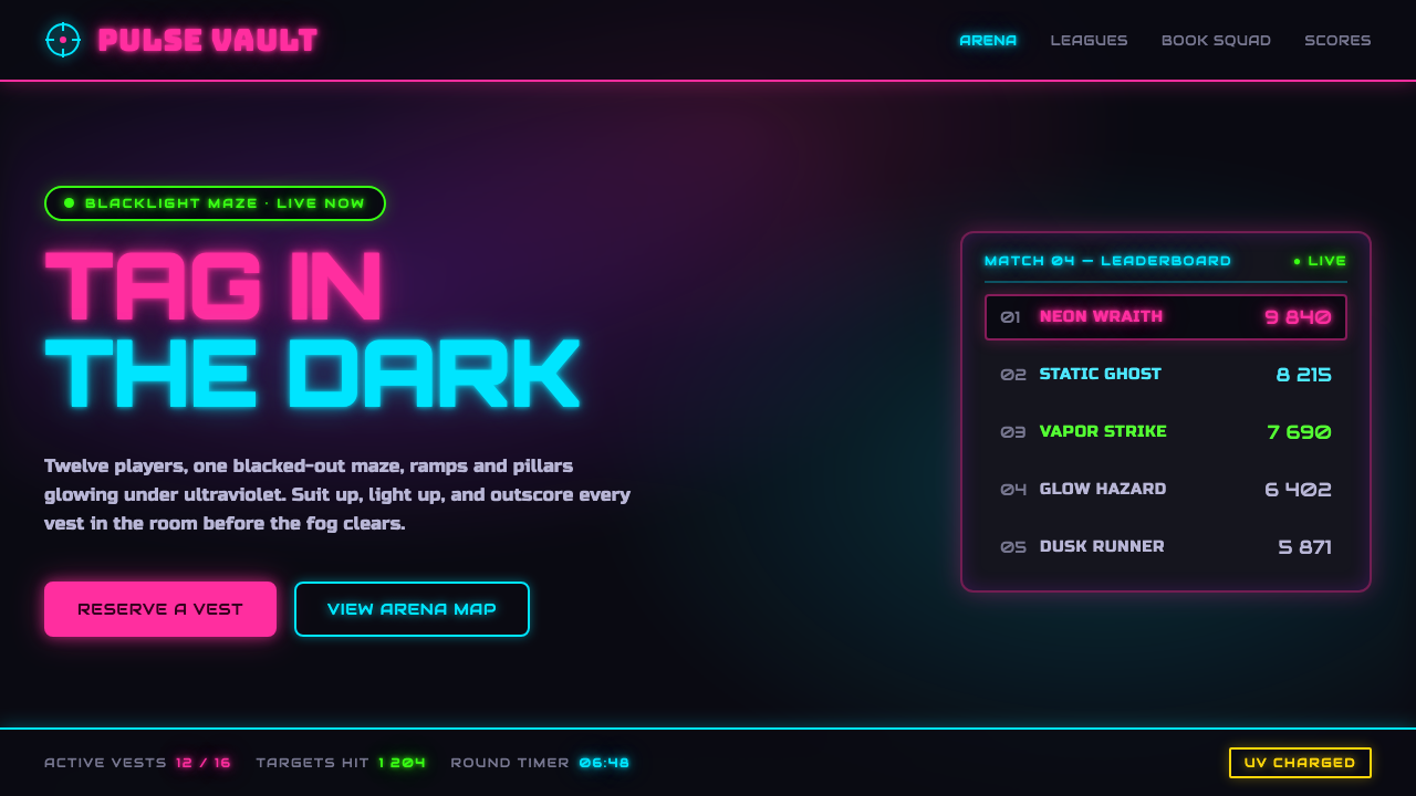 Laser Tag Arena BlacklightSuit up in the dark. UV pink, acid green and cyan glow on matte arena black,…