What is Kirby?
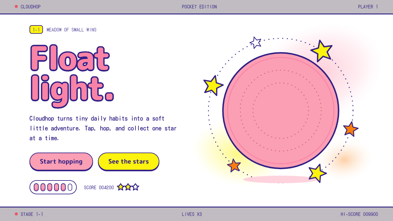
The Kirby look is a single pink puff floating in a sea of white paper, ringed by indigo outlines, rounded yellow stars and a grey handheld band.
Kirby in brief
The Kirby style is the visual language of the 1992 Japanese package for Kirby's Dream Land, the game that introduced the round, pink hero on Nintendo's Game Boy. A white artwork field carries a single pink puff floating off-center, loose splashes of watercolor, five-point stars with rounded tips, a few palm leaves, a soft fluffy logo outlined in indigo, and a grey strip of handheld packaging at the top and bottom.
Everything in it is round. Circles, soft ellipses and thick outlines replace corners, and the few straight edges belong to the grey band that frames the page. Pink carries the main action, star yellow marks rewards, indigo supplies text and outline, and bitmap captions recall the small black-and-white screen where the game actually ran.
The mood is light, safe and easy to pick up. It is a style for products that should make people relax at first glance, where the character, not the layout, does the talking. Its strength is that so few elements are required: one figure, one white field, a few stars and one frame are enough to make a complete page.

Where does Kirby come from?
Kirby's Dream Land was released in Japan on 27 April 1992 for the Game Boy, made by the studio HAL Laboratory. It was directed by Masahiro Sakurai, who was very young when he led the project, and Satoru Iwata, who later became president of Nintendo, was at HAL at the time. Jun Ishikawa, also listed among the key figures, is associated with the sound of the game. The aim was a gentle, easy platformer that beginners could finish and experts could replay for higher scores.
The Game Boy screen displayed only shades of a single color, so the character's pink was not visible in the game itself. It lived on the package. The Japanese box shows a large white field, a round pink creature drifting in the air, watercolor splashes behind him, stars and palm leaves, and a fluffy indigo logo above. The grey Game Boy band that frames the artwork is a reminder that the design is a physical object from the era of handheld cartridges. Pink was later confirmed on screen in Kirby's Adventure, released in 1993.
The style belongs to a Japanese tradition of character design that prizes simplicity and affection, often called kawaii minimalism. A character must be drawable from a handful of circles, readable at a very small size, and likeable even with no expression beyond two eyes. Kirby fits that test perfectly. Shigeru Miyamoto, also named among the key figures, represents the wider Nintendo context in which friendly, instantly legible characters were part of the company's identity.
Watercolor package illustration is the third root. Before screenshots dominated boxes, cover art had to carry the whole promise of a game, and artists used loose washes, simple silhouettes and generous white space to suggest a world. The Kirby box does that with confidence, and its softness contrasts deliberately with the hard pixel graphics inside the cartridge. A design system built from it keeps both worlds: painterly looseness for the surface, bitmap type for the small details.
What defines the Kirby look?
Color
The page is white, the way an artwork field on a box is white, and pink is used for the main button and the character-shaped elements. A warm star yellow and orange mark rewards and badges, indigo handles text and outlines, and a flat grey forms the handheld band. Watercolor washes are used softly behind the figure. Color is applied in a few clear roles, not scattered.
Type
Headlines use a rounded, fluffy lettering style with a thick indigo outline, as if the logo were made of cloud. Body text is a friendly rounded sans-serif. Small captions, scores and labels use a bitmap face that recalls the handheld's screen. The pairing of a soft display face with a pixel face is the most recognizable typographic move in the style.
Shape
Circles and soft ellipses dominate, with thick outlines of consistent weight. Stars have five points but their tips are rounded, so even the pointiest shape feels safe. Buttons are pill-like or circular, cards have generous radii, and nothing has a sharp corner except the grey band that frames the page.
Composition
A big field of white leaves room for one central subject, placed slightly off-center so that it appears to float. Stars and palm leaves drift around it without forming a pattern. The top and bottom bands frame the scene like a package. The page feels airy because the number of elements is small and the spacing around them is generous.
Surface
Surfaces are flat and slightly painterly. Watercolor splashes add warmth without heavy texture, and there are no hard shadows or glossy highlights. Depth is suggested by overlap and outline, not by lighting effects. The result feels like illustrated paper, which suits the printed-box origin of the style.
Tone
Gentle, cheerful and welcoming. Copy is short and friendly, rewards are celebrated with stars, and mistakes are never punished with harsh visuals. The style lowers the barrier to entry, which is why it reads as light and easy to pick up.

Who shaped Kirby?
Sakurai directed Kirby's Dream Land at HAL Laboratory and shaped the character who became the game's face. His approach, a hero simple enough to draw from a few circles and a game gentle enough for beginners, is the origin of the style's friendliness. The round pink figure on the package is the visual form of that approach.
Iwata was a senior figure at HAL during the making of the game, having started there as a programmer, and later became president of Nintendo. HAL's technical skill is what made a lively character possible on a small, limited handheld. The bitmap captions in the style acknowledge that world of small screens and tight constraints.
Ishikawa is listed among the key figures and is associated with the game's sound. The cheerful, bouncy tone of the music matches the visual softness of the package, and the combination explains why the style feels so coherent: the same lightness runs through what the player sees and hears.
Miyamoto represents the wider Nintendo context for the style. In that culture, characters were designed to be friendly, readable at a glance and appealing across ages. Kirby's place on a Nintendo handheld connects the style to that tradition of approachable character design.
How do you use Kirby today?
In presentations, the Kirby style works for cheerful covers and light, friendly decks: onboarding, children's education, community updates, product tours for small consumer apps and team celebrations. Put a white field on the slide, place one rounded pink shape off-center, add a few rounded stars and set the title in a fluffy, outlined face. A thin grey band at the top and bottom can frame each slide like a package.
For content slides, keep each page to one idea and let white space do the work. Use pink for the main call to action, star yellow for highlights or achievements and indigo for text. Data slides can use rounded bars and circular markers, with a bitmap face for numbers and labels. Avoid tight tables; a few large, soft figures are more in character than dense grids.
In web interfaces, the style fits casual games, children's apps, habit trackers, light productivity tools and anything where a gentle, rewarding tone helps. A hero section can be a big white area, one character-shaped pink element and a pill-shaped button. Cards should have large radii and thick outlines, and rewards can appear as small rounded stars. Pricing pages should be simple, with plain cards and friendly copy.
In editorial and marketing work, it suits packaging-like layouts, stickers, birthday and holiday graphics, and social posts that need to feel warm. The watercolor splash behind a central figure is an effective way to add softness to a photo-free layout. Use the grey band as a frame for posters or covers to evoke a boxed product.
The common mistake is to use the pink without the white. Crowding the page with competing colors and elements destroys the sense of a single figure floating in space. Another error is to sharpen the shapes: pointed stars, square buttons and thin outlines break the softness. A third is to apply the style to serious or high-stakes products, where its playfulness may undermine confidence. Keep it light, keep it simple and keep it round.

Kirby — FAQ
What is the Kirby design style?
It is a soft, playful style drawn from the 1992 Japanese box of Kirby's Dream Land: a white artwork field, one pink puff off-center, watercolor splashes, rounded five-point stars, thick indigo outlines and a grey handheld band. Pink marks main actions, yellow marks rewards, and bitmap captions recall the Game Boy.
Why is Kirby pink if the Game Boy screen had no color?
The Game Boy displayed shades of one color, so the pink appeared on the Japanese package art rather than on screen. It was later confirmed in the game itself in Kirby's Adventure in 1993. The style draws from the package, which is why pink and white lead the palette.
Who made the original game?
The studio HAL Laboratory made Kirby's Dream Land, directed by Masahiro Sakurai, with Satoru Iwata among the HAL staff and music associated with Jun Ishikawa. It was released in Japan in April 1992. The Nintendo context, including Shigeru Miyamoto, is part of the style's background.
Is the style only for children?
No. It suits any small, cheerful product that wants to feel approachable, including casual apps, light tools and friendly brands. It is less suitable for serious or high-stakes contexts. For adult audiences, use fewer decorative elements and rely on the white field, the single figure and the round shapes.
How do I keep it from looking childish?
Restraint. Use fewer stars, keep the white field generous, and limit pink to the main action and the central figure. Pair the soft display lettering with clean body text and keep spacing consistent. The style looks refined when it is sparse and looks chaotic when it is crowded.
Related design styles
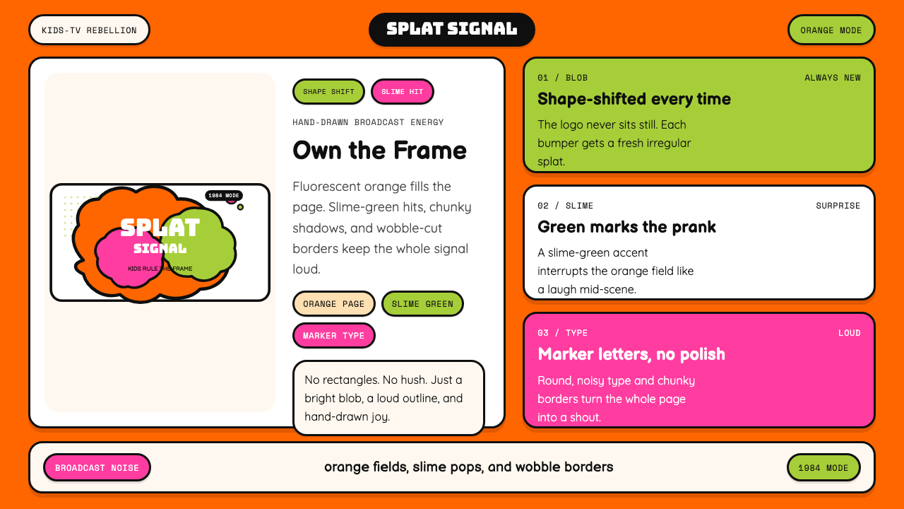 Nickelodeon Orange Splat (1984)Kids own the screen. Orange fields, slime-green pops, and wobble borders do t…
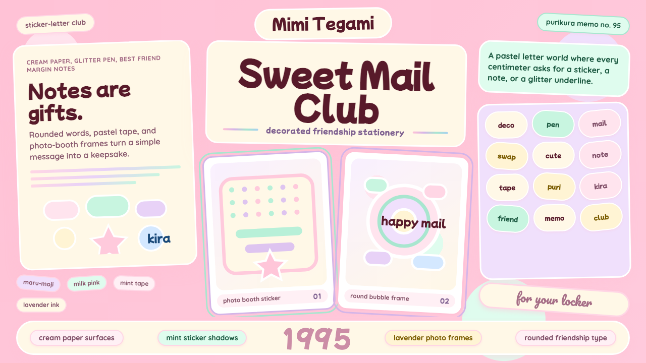 Kawaii Japanese Letter PurikuraCuteness fills every inch. Pink cream paper, mint stickers, lavender frames.
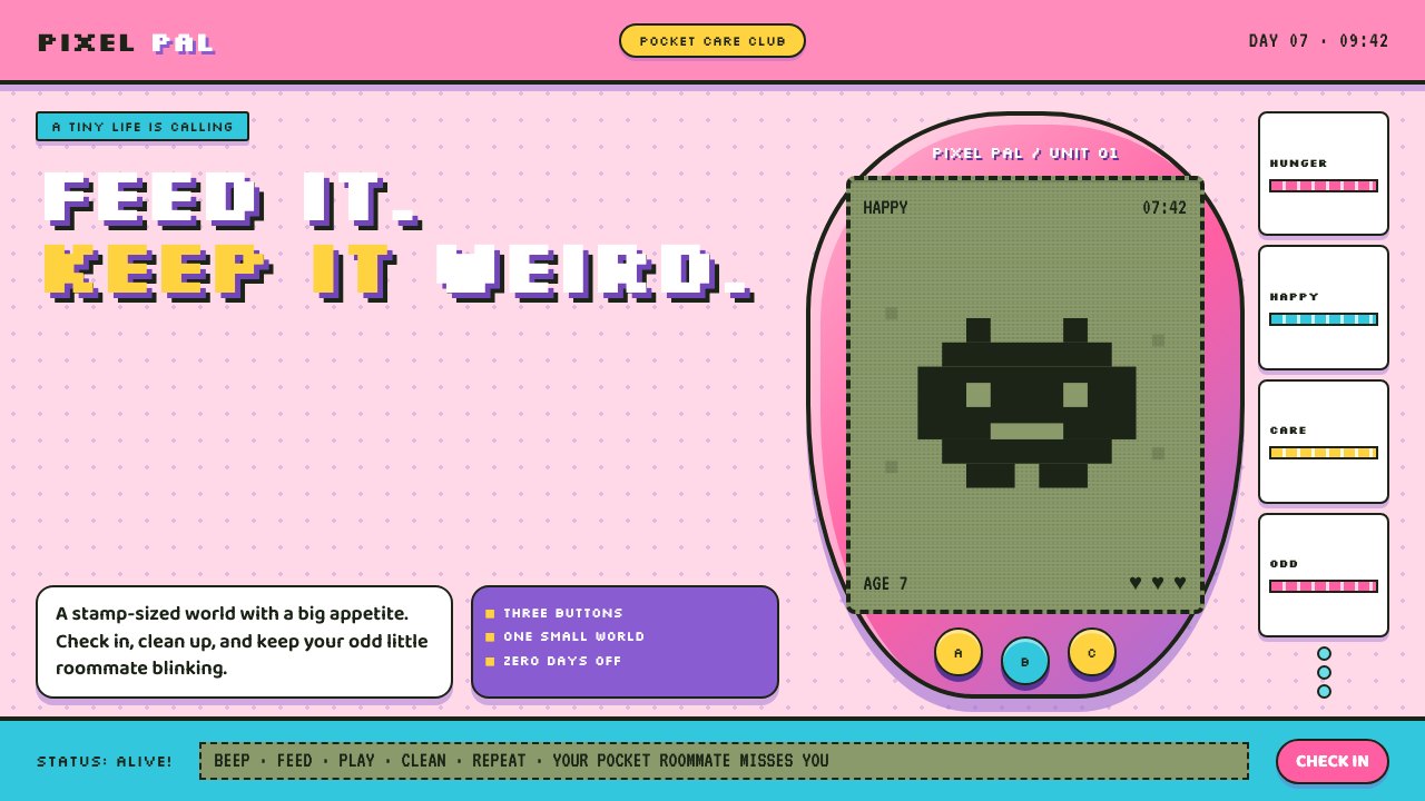 Tamagotchi (1996)Care gets candy-coated. Bubblegum plastic frames a crunchy pea-green pixel wo…
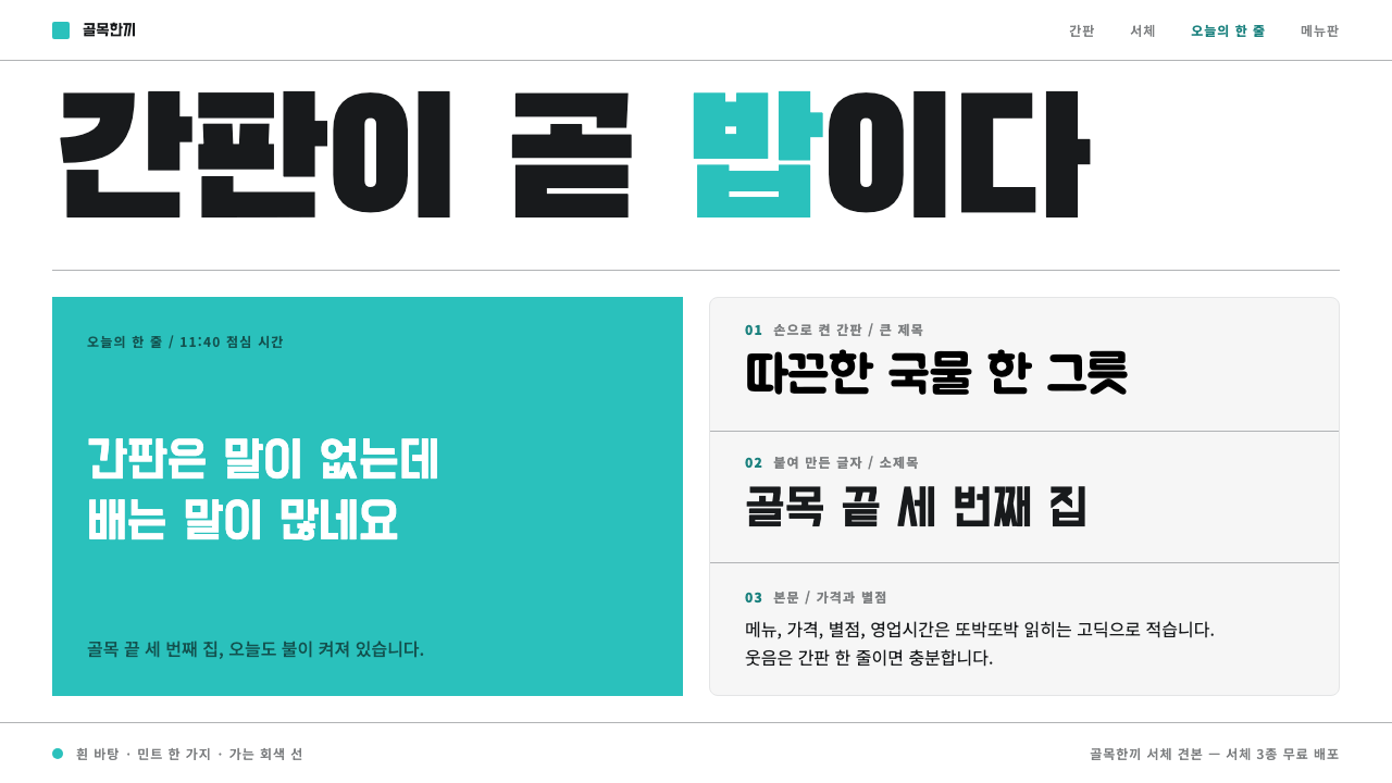 Baemin TypefacesShop-sign Hangul at billboard scale. Mint on plain white, flat hairline panel…
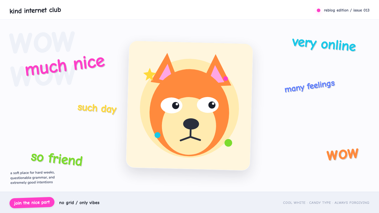 Doge Meme (2013)Anti-design becomes pure joy. Candy Comic Neue captions drift at lazy angles…
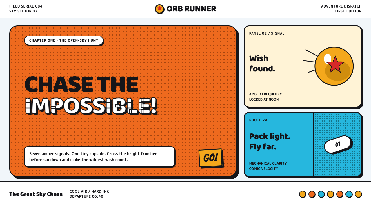 Dragon Ball (1984)Adventure lands with comic force. Gi-orange panels, amber spheres and crisp h…