What is Soviet Zefir Confectionery?
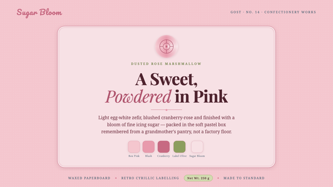
Soviet Zefir Confectionery turns a remembered sweet into a visual language of powdery pink, waxed-paper softness, berry-rose type, and the gentle authority of retro Cyrillic packaging.
Soviet Zefir Confectionery in brief
Soviet Zefir Confectionery is a nostalgic design system drawn from GOST-standard zefir and pastila sweets sold across the Soviet Union and Eastern Europe from the 1950s through the 1990s. Its defining image is not the confection alone but the pastel-pink waxed box that held it: a soft, powdery rose surface, retro Cyrillic labelling, and the suggestion of sugar dust settling over everything.
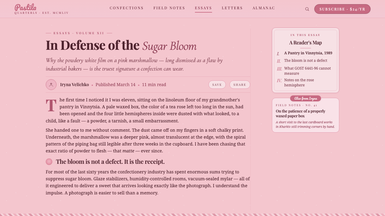
The digital interpretation keeps that memory tactile without becoming literal. Powdery sugar-pink establishes the ground, sugar-bloom near-white creates panels and resting areas, and berry-rose supplies the strongest accents. Matte waxed-paper surfaces temper the sweetness, while high-contrast Playfair serif headings give the system an editorial backbone. A small amount of retro script adds warmth, but the overall language remains composed rather than childish.
The style works through remembered material cues. It should feel wrapped, dusted, printed, and gently handled rather than glossy, luminous, or technologically polished. Contrast comes from the relationship between pale ground and dark berry type, between formal serif lettering and playful script, and between broad quiet surfaces and small confectionery details. The result is a soft retail nostalgia with enough structure for information-rich digital work.
Where does Soviet Zefir Confectionery come from?
The source culture is Soviet GOST confectionery: a standardized product world associated with Russia and the Soviet republics, and more broadly with Eastern European food packaging. Zefir and pastila appeared in white, pink, and white-pink forms. The pink version is especially important to the visual identity because it is remembered as a powdery, sugar-dusted rose rather than a sharp or glossy pink.
The confectionery box is the central artifact. Its pastel-pink waxed surface frames the sweet inside and gives the design system its unusual combination of delicacy and durability. The box is soft in color but not fragile in character; the waxed finish implies a practical package made to protect and contain. Retro Cyrillic labelling adds cultural specificity, turning a generic pastel sweet into an unmistakably regional object.
The visual language belongs to several overlapping movements: Soviet GOST product and package design, retro Cyrillic label graphics, and mid-century confectionery packaging. These references are not reproduced as a strict historical reconstruction. They are distilled into a contemporary system in which the box becomes a page, the sugar bloom becomes a panel, the berry-rose label becomes an action or heading, and the sweetness is balanced by typographic discipline.
The style also belongs to a current revival, roughly from 2018 through 2024, in which remembered food packaging became a source of identity, atmosphere, and emotional recognition. That revival is less about manufacturing a perfect replica than about recovering the feeling attached to an object. Soviet Zefir Confectionery therefore treats nostalgia as a design material: selective, tactile, and culturally located, with enough restraint to remain useful in modern interfaces and communications.
What defines the Soviet Zefir Confectionery look?
Sugar-Pink Ground
The dominant ground is a pale, powdery sugar-pink that recalls the waxed confectionery box rather than a cosmetic or candy-store neon. It should feel softened by dust and age, with enough visual quiet for darker type to remain legible. The pink establishes mood across the whole system, so it is more effective as an enveloping atmosphere than as a loud decorative accent.
Sugar-Bloom Panels
Near-white panels function like the powder coating on the sweet itself. They create calm compartments within the pink field and prevent the interface from becoming visually dense. The near-white should remain warmer and more confectionery than clinical white, allowing cards, text blocks, and product information to feel wrapped in a clean but tactile layer.
Berry-Rose Contrast
Berry-rose is the system's strongest chromatic voice. It gives headings, labels, buttons, and selected details enough authority to stand against the pale ground. The color should be concentrated rather than spread everywhere. Its role is closer to printed ink on a package than to a general background, which keeps the sweetness grounded and the hierarchy readable.
Serif and Script
High-contrast Playfair serif lettering supplies elegance, nostalgia, and editorial seriousness. It is best used for prominent titles and display moments where the rhythm of the letterforms can be appreciated. Retro script belongs in small doses: a greeting, a flavor-like note, or a human aside. The tension between formal serif and playful script is central to the style, but neither should overwhelm the other.
Waxed-Paper Matte
Surface treatment should suggest matte waxed paper: quiet, slightly tactile, and protective. Soft tonal variation can imply handling and material without becoming a literal paper texture. Gloss, glass, metallic shine, and luminous gradients work against the reference because they replace the memory of a wrapped sweet with the language of contemporary cosmetics or technology.
Retro Cyrillic Labeling
Cyrillic labelling is a cultural and compositional signal, not merely an exotic ornament. It can appear in product names, small captions, seals, or packaging-inspired metadata, supported by generous spacing and strong typographic framing. The label should feel printed and purposeful, with the surrounding pink and berry-rose structure doing as much work as the lettering itself.
Who shaped Soviet Zefir Confectionery?
The state confectionery factories are the collective makers behind the product world this style remembers. Their significance here is not an individual signature but the shared visual culture of standardized sweets, practical boxes, restrained pastel colour, and familiar labels. They represent the everyday scale of the reference: a sweet designed for ordinary circulation and remembered through its package.
The GOST standardization bureau provides the system's underlying idea of consistency. GOST connects the sweets to a recognizable standard rather than a one-off artisanal object, which is why the design should feel ordered even when it is soft and nostalgic. In digital use, that principle becomes repeated label logic, dependable hierarchy, and a coherent family of surfaces.
The Krasny Oktyabr, or Red October, factory is named in the source material as a key confectionery figure. Within this design language it functions as a landmark of the packaging tradition: a reminder that the reference is tied to real Soviet confectionery production, not an abstract pastel mood board. Its presence strengthens the historical and regional specificity of the system.
How do you use Soviet Zefir Confectionery today?
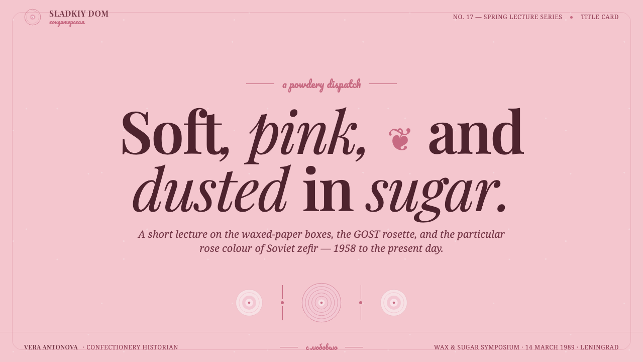
For presentation slides, use the sugar-pink ground as the continuous stage and let the cover behave like a confectionery box front: one memorable title, a berry-rose focal mark, and a small amount of Cyrillic-inspired labelling. Content slides should rely on warm near-white panels, strong Playfair headings, and quiet supporting text. Data slides can treat charts as printed package diagrams, using berry-rose selectively and leaving generous pink space around the information so the sweetness never competes with comprehension.
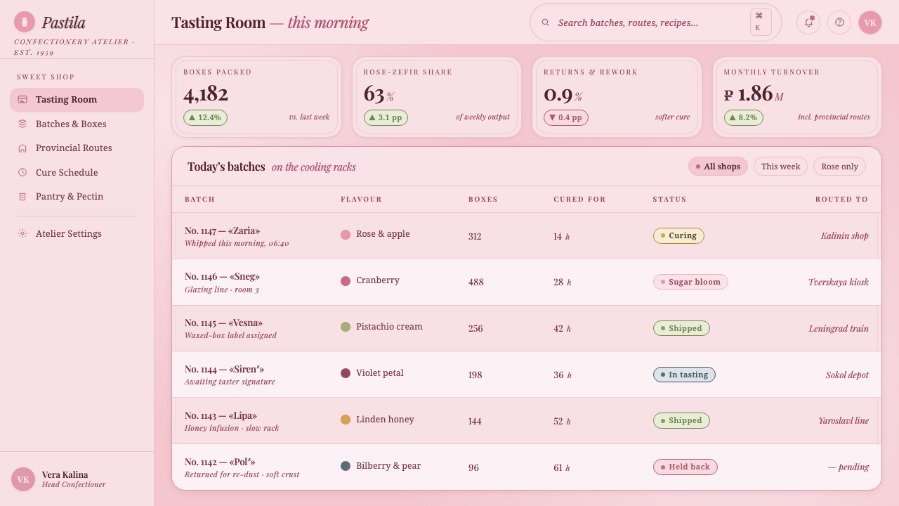
For web interfaces, the style suits dashboards, catalogs, and pricing pages that want to feel approachable, editorial, and product-aware rather than purely technical. Keep the main field pale and use near-white surfaces to separate tools, plans, or content groups. Berry-rose should identify active states, important prices, selected tabs, and primary actions. Serif display type can carry the brand voice while simpler supporting text protects usability. Panels should feel matte and contained, with hierarchy coming from contrast and grouping rather than glossy effects.
For editorial and marketing work, the system is strongest when it treats packaging as a narrative device. An article can open with a broad pink field, a large serif title, and a small label-like caption that establishes place or memory. Section transitions can use near-white cards, berry-rose rules, or restrained script notes. Marketing pages can alternate between soft package-like surfaces and concentrated berry-rose moments, using product names, short labels, and tactile language to make the reader feel that the offer has been wrapped and presented with care.
The common mistake is turning nostalgia into visual clutter. Adding many flourishes, excessive script, glossy effects, decorative Cyrillic, or several competing pinks makes the work look like generic candy branding. The system depends on restraint: one powdery ground, one warm panel language, one concentrated berry-rose voice, and a clear typographic relationship between Playfair and script. It should suggest a remembered box, not cover every surface with ornaments.
Soviet Zefir Confectionery — FAQ
Is Soviet Zefir Confectionery the same as generic candy branding?
No. Generic candy branding usually depends on brightness, gloss, abundance, and immediate appetite appeal. This system is quieter and more specific. Its powdery pink, matte waxed-paper suggestion, retro Cyrillic labelling, and berry-rose serif typography point to a remembered Soviet and Eastern European packaging culture. The emotional effect comes from recognition and material memory, not from sweetness alone.
Why is the pink described as powdery instead of bright?
The pink version of the remembered zefir is described as a soft, sugar-dusted rose. A bright or glossy pink would move the reference toward contemporary confectionery, cosmetics, or playful youth branding. Powdery pink preserves the visual link to the pastel waxed box and leaves enough calm around text, labels, and product information.
How should retro Cyrillic be used in a contemporary interface?
Use it as a label system with a clear compositional role: product naming, small captions, seals, or packaging-like metadata. It should be framed by spacing and hierarchy so that it feels printed and purposeful. Avoid scattering Cyrillic characters as unexplained decoration, because the style depends on cultural specificity and recognizable package logic rather than on an exotic visual effect.
Can the style be used with a dark background?
It can be adapted, but the source language is fundamentally light-ground. The pastel-pink box, sugar-bloom panels, and matte waxed-paper feeling all depend on softness and reflected light. A dark version should therefore remain occasional and carefully contained, with the pale pink and near-white surfaces still carrying the main identity. If the dark ground becomes dominant, the design may lose its confectionery-box memory and become a different kind of retro luxury.
What kinds of products benefit most from this design system?
It is strongest for food, hospitality, lifestyle, editorial, and commerce experiences that need warmth, memory, and a sense of presentation. It can also give dashboards or pricing pages a more human retail character when the product benefits from approachability. It is less suitable for contexts that require severe neutrality, aggressive technological authority, or a dark and highly polished atmosphere. The key question is whether the product wants to feel remembered, wrapped, and offered with care.
Related design styles
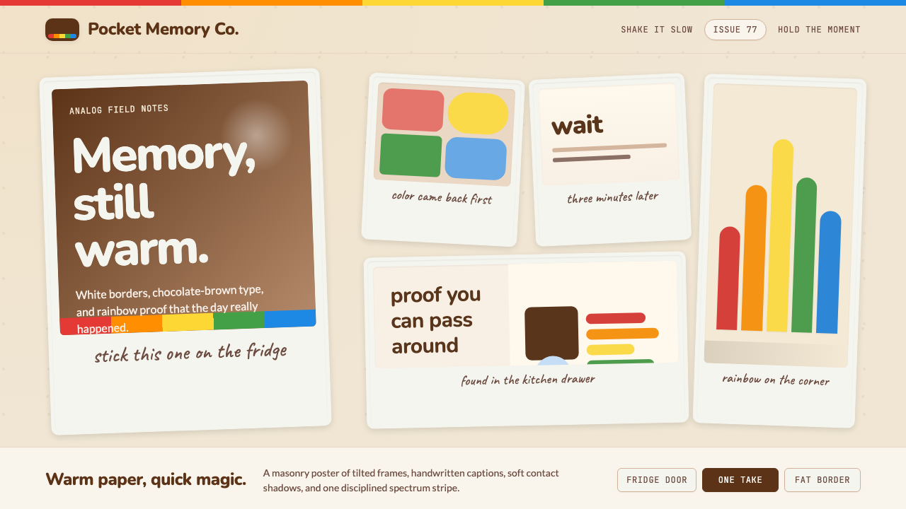 Polaroid InstantMemory made tangible. Photo-white frames tilt on aged paper with a warm rainb…
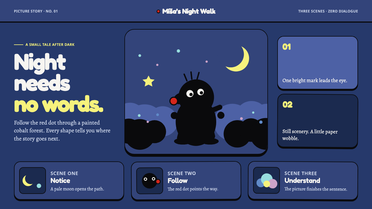 Krtek AnimationWordless wonder. Cobalt gouache stages black paper forms, guided by one red d…
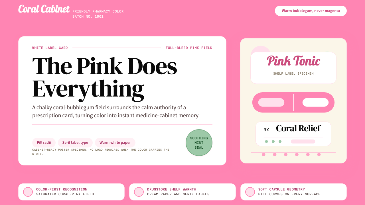 Pepto-Bismol Pink (1901)Color is the cure. Bubblegum pink floods the field; white label cards and pil…
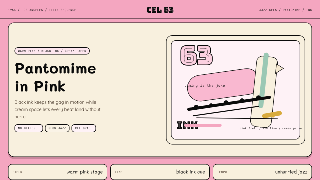 Pink Panther Cartoon (1963)Cool silence with a grin. Pink field, black ink, cream cel space.
 Soyuzmultfilm AnimationStorybook warmth feels alive. Matte amber-ochre, orange-olive accents, rounde…
 Trader Joe's Hand-LetteredHandmade grocery warmth. Cream chalkboards, red price tags, emerald accents.