What is Binggrae Banana Milk?
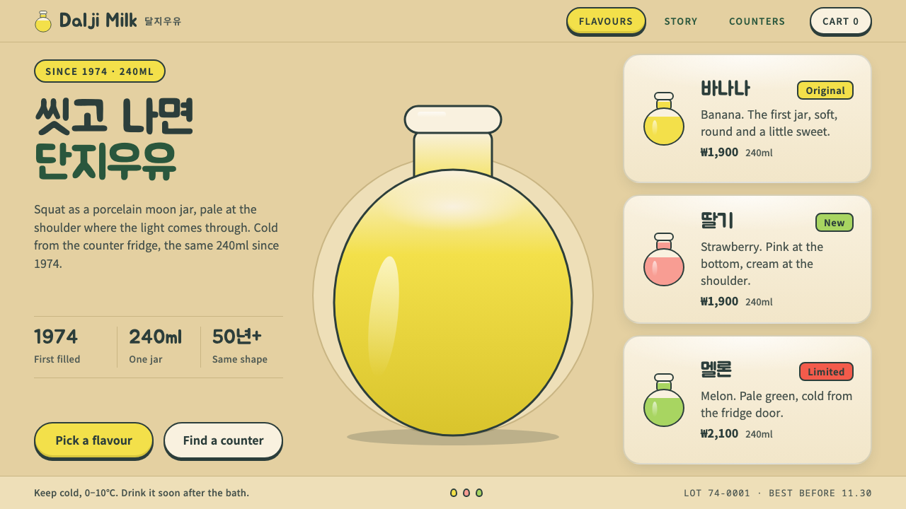
The Binggrae Banana Milk style turns a squat, translucent bottle into an interface: milky yellow ground, a jar silhouette, and fat rounded Hangul that feels like a bathhouse counter.
Binggrae Banana Milk in brief
The Binggrae Banana Milk style is a design language built from a single object: the squat, translucent bottle in which Binggrae's Banana Flavored Milk has been sold in South Korea since 1974. The bottle is modelled on the Joseon moon jar, a round white porcelain vessel, and generations of Koreans have called the drink jar milk. The style reads that object as a set of interface rules.
The rules are easy to see. The ground is a milky yellow, the colour of banana-flavoured milk seen through the wall of the bottle. The shoulder of the jar is a paler tint, where light passes through the plastic. Headlines are set in fat, rounded Hangul that looks as if it were written by a friendly hand. The jar silhouette is reused everywhere: as the shape of a card, as a badge, and as a mask for photographs.
The overall feeling is friendly, centred and symmetrical, with a little nostalgia. It is a light theme, soft and warm, with no sharp edges and no strong contrast. The look suits anything that wants to feel familiar and unthreatening, the way a corner store feels familiar, and it carries a distinct Korean cultural identity without becoming a costume.

Where does Binggrae Banana Milk come from?
Binggrae launched Banana Flavored Milk in 1974. At that time a banana was still a treat that most Korean families saw only on special days, so a bottle of milk that tasted of banana counted as a small luxury. The product arrived in the context of a 1970s Korean milk-drinking campaign, an effort to make dairy part of ordinary life, and it was designed to be fun and accessible to children and families who were not yet used to drinking milk every day.
The bottle is the central design decision. It is short and round, made of translucent polystyrene, and modelled on the white porcelain moon jars of the Joseon dynasty. A moon jar is a large, softly rounded white vessel that has become one of the most recognised symbols of Korean ceramics, and putting its shape on a supermarket shelf was a way of making a familiar cultural form part of daily life. The bottle has stayed almost unchanged through the 2020s, which is a rare consistency for a consumer product.
The drink is bound up with another piece of Korean culture, the mogyoktang, or public bathhouse. For many people, buying a bottle at the counter after a bath is a shared memory that stretches across generations, and the warm, gentle character of the style grows directly from that moment: wet hair, a quiet counter, a cool drink with a straw. The nostalgia in the design is not generic retro; it belongs to a specific, ordinary ritual.
The design system turns these three sources, the milk-drinking campaign, the bathhouse and the moon jar, into rules for a screen. The jar silhouette becomes the shape of cards and badges. The milky yellow becomes the ground and the pale shoulder becomes the highlight. Round Hangul replaces any sharp display type. The result gives a product, a brand or a story the feeling of a bottle held in the hand rather than a window on a monitor, and it is the clearest example of how a physical package can be translated into a digital identity.
What defines the Binggrae Banana Milk look?
Milky yellow ground
The page ground is a soft, creamy yellow, the tone of banana milk seen through a translucent wall. It is warm, but low in intensity, so large areas of it remain comfortable to read on. Text sits on it in a deep, warm brown rather than pure black, which keeps the contrast gentle.
Pale shoulder highlight
A paler band near the top of cards and panels imitates the shoulder of the jar, where light passes through the milk and the plastic. It is a subtle gradient of tint, not a shadow, and it gives flat surfaces a faint sense of the bottle's translucence.
Jar silhouette as a shape language
The moon-jar outline is reused as card shape, badge, avatar mask and image crop. Its round shoulders and slightly narrower top and base are the only decorative motif in the system. Because the shape is so recognisable, the design needs almost nothing else to feel branded.
Fat rounded Hangul headings
Headlines use a thick, rounded Hangul face with a friendly, hand-lettered feel. The soft terminals match the round shapes of the jar and the cards. The face carries a childlike, informal voice that suits product names, short slogans and section labels, but it is kept to display sizes.
Centred, symmetrical layout
Layouts are centred and symmetrical, like a label on a bottle. Content stacks vertically around a central axis, with generous space around the jar-shaped elements. The symmetry gives the design its calm, ritual feeling, and it makes pages easy to scan on both phones and large screens.
Soft, low-contrast warmth
There are no hard borders, no sharp shadows and no saturated accents competing with the yellow. Secondary colours are drawn from the same warm family, such as cream, pale peach and brown. The restraint creates a sense of a quiet corner store at the end of a bath, which is the emotional centre of the whole style.

Who shaped Binggrae Banana Milk?
The Korean dairy and food company that launched Banana Flavored Milk in 1974 and kept its jar bottle essentially unchanged through the 2020s. The design system takes its entire visual logic from that one product.
A large, round white porcelain vessel of the Joseon dynasty and one of the best-known forms in Korean ceramics. Its soft shoulders and slightly irregular roundness gave the bottle its shape and gave this style its silhouette.
An effort in the 1970s to make dairy part of ordinary Korean life. It is the historical setting in which a banana-flavoured milk for families made sense, and it explains the product's friendly, accessible tone.
Korea's public bathhouse tradition, where buying a bottle at the counter after bathing became a shared memory across generations. It supplies the nostalgic, gentle mood that this design system tries to reproduce.
How do you use Binggrae Banana Milk today?
On slides, the style works best for storytelling, brand history and cultural presentations. A cover can sit a jar-shaped badge on the milky ground with a round heading beneath it. Content slides use centred cards, one idea per card, and the pale shoulder highlight at the top of each card. Data slides should be simple: a single warm accent for the key series, soft rounded bars, and generous spacing, so numbers feel gentle rather than clinical.
In web interfaces, it suits landing pages for food, drink, family and lifestyle brands, cafes, small shops and anything that wants a friendly, local feel. Cards and badges can adopt the jar silhouette, while buttons remain simple rounded shapes so the jar does not become a gimmick. Navigation should stay quiet and centred. Pricing and product grids work well because the soft cards make the choices feel approachable, not pushy.
For editorial and marketing work, the style is strong in packaging stories, nostalgia campaigns, cultural features and seasonal promotions. A piece about a family-run bathhouse, a snack from childhood or a regional dessert would fit naturally. The key is to use real memories and real objects: the style is nostalgic because it is specific, and a vague retro feel will not hold it up.
The most common mistake is to use the jar silhouette as wallpaper, repeating it so often that it stops meaning anything. The second is to turn up the saturation so the yellow becomes a bright warning colour; the whole charm is that it is milky and low in intensity. The third is to pair the round Hangul with a hard, technical sans in the same headline, which breaks the friendly voice. Keep the shapes few, the colour soft and the type round.
A final point concerns attribution. The style comes from a real commercial product and its packaging, so it fits editorial, educational, fan and homage projects well. For your own brand, borrow the structure, a soft warm ground, a single distinctive silhouette and a round friendly headline face, and replace the shape with your own object. A design built from one real thing, held consistently, is what makes this style work.

Binggrae Banana Milk — FAQ
What is the Binggrae Banana Milk design style?
It is a soft, warm design language drawn from the jar-shaped bottle of Binggrae's Banana Flavored Milk, launched in South Korea in 1974. It uses a milky yellow ground, a pale shoulder highlight, the jar silhouette as card and badge shape, and fat rounded Hangul headings.
Why is it called jar milk?
Because the bottle is short and round, modelled on the white porcelain moon jars of the Joseon dynasty. People began calling the drink jar milk, and the nickname stuck for generations.
What kind of project suits this style?
Food, drink, family and lifestyle brands, cafes, nostalgic campaigns, cultural features and storytelling presentations. It suits anything that should feel familiar, gentle and a little retro, with a clearly Korean cultural flavour.
Can I use the jar shape as a pattern?
Use it sparingly. The silhouette works as a card shape, badge or image mask, but repeating it as wallpaper dilutes it. A single, consistent use makes the design feel branded, while overuse makes it feel like decoration.
What is the biggest mistake with this style?
Making the yellow too bright. The charm lies in a milky, low-intensity ground that feels translucent, so a saturated yellow turns it into a warning colour and loses the quiet bathhouse-counter mood.
Related design styles
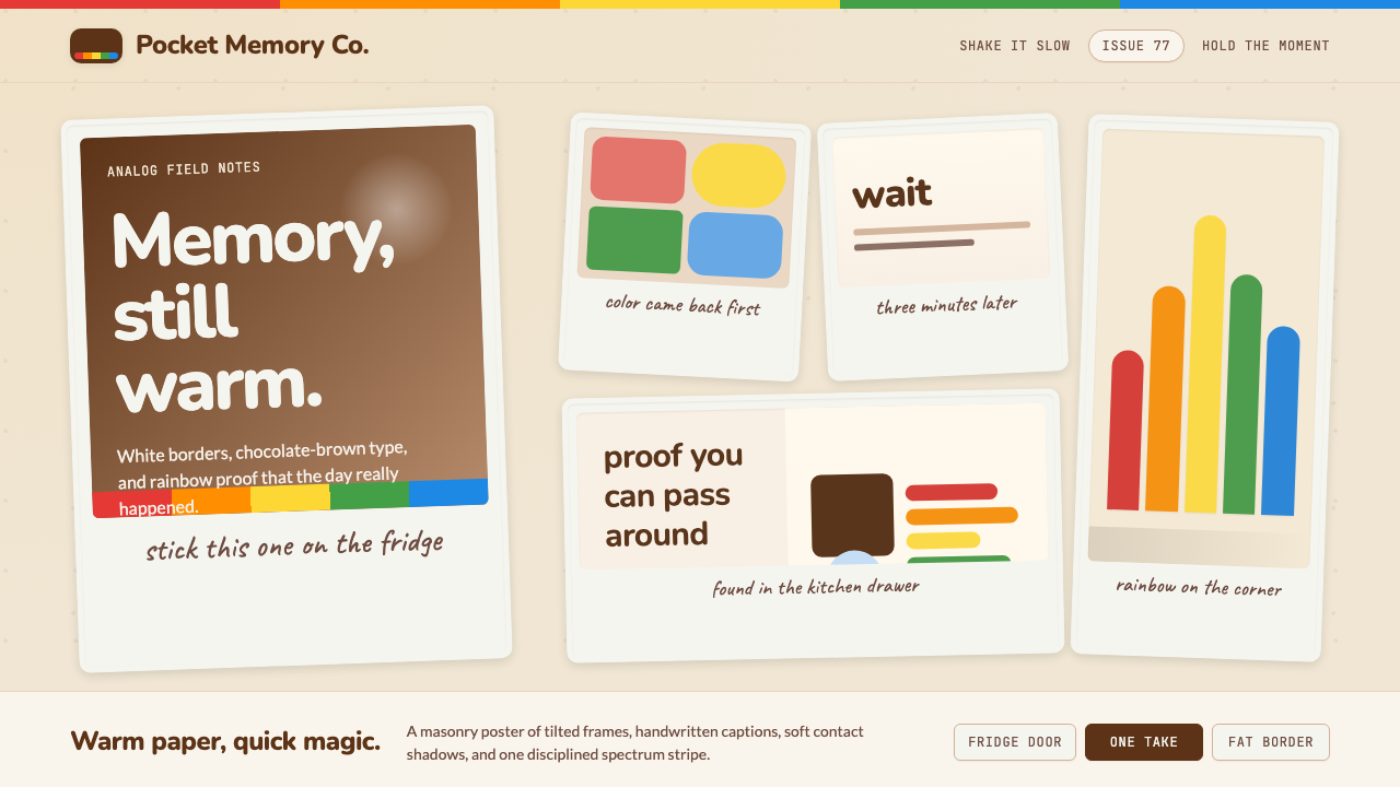 Polaroid InstantMemory made tangible. Photo-white frames tilt on aged paper with a warm rainb…
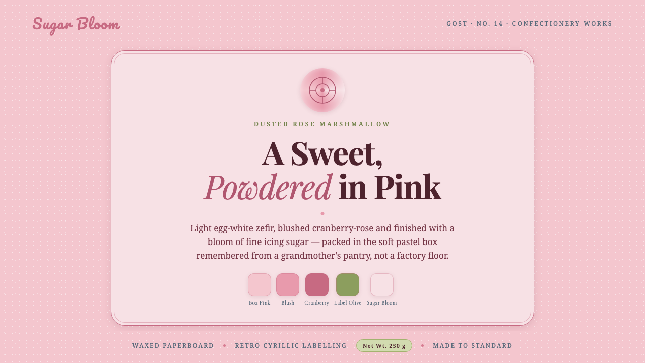 Soviet Zefir ConfectioneryA sweet remembered, not manufactured. Sugar-pink waxed-box ground, berry-rose…
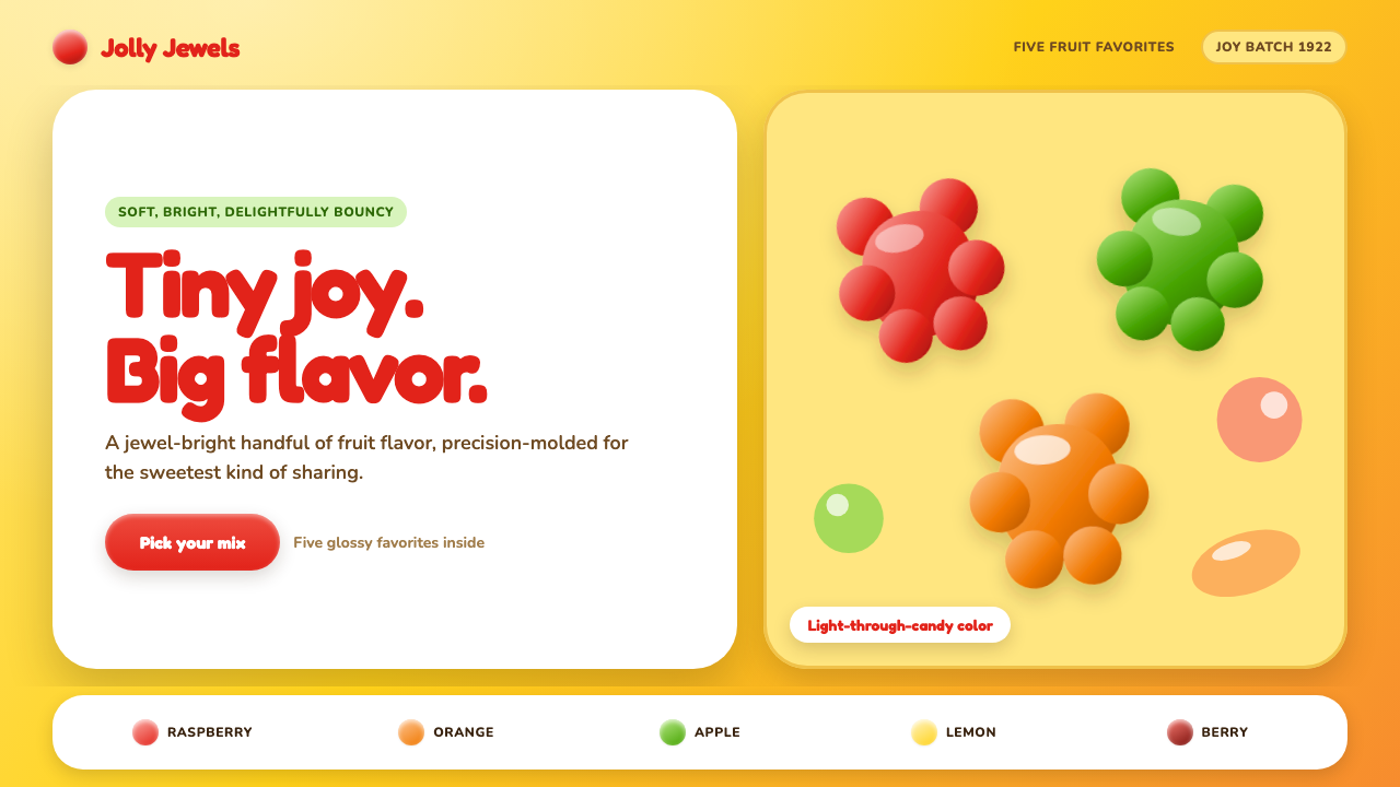 Haribo Goldbears (1922)Childhood joy, precision-molded. Glossy fruit colors tumble across a foil-gol…
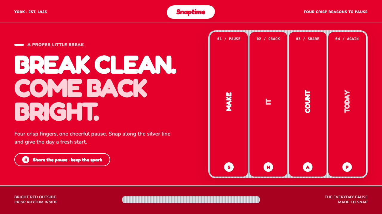 KitKat (1935)A break you can hear. Pillar-box red, plump white type, and silver grooves se…
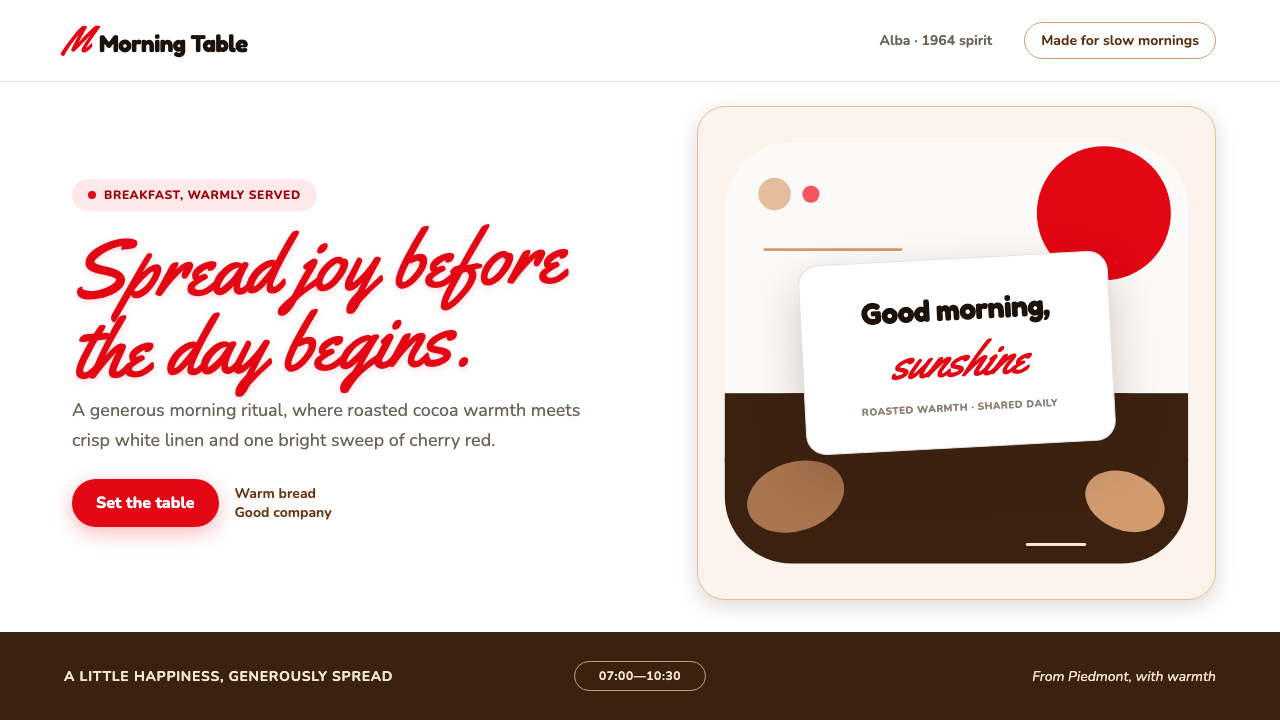 Nutella (1964)Breakfast feels brighter. Cherry script and roasted-hazelnut brown warm a cri…
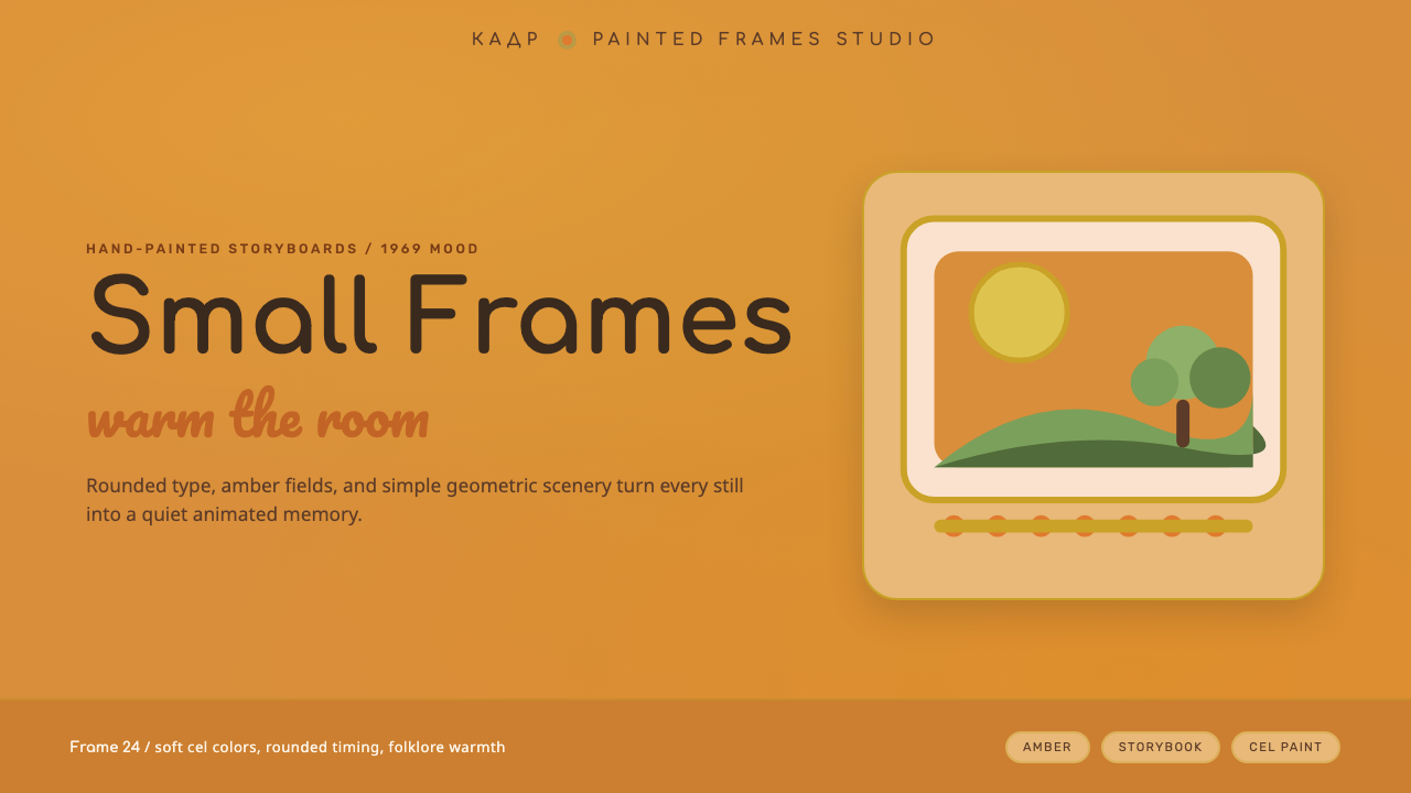 Soyuzmultfilm AnimationStorybook warmth feels alive. Matte amber-ochre, orange-olive accents, rounde…