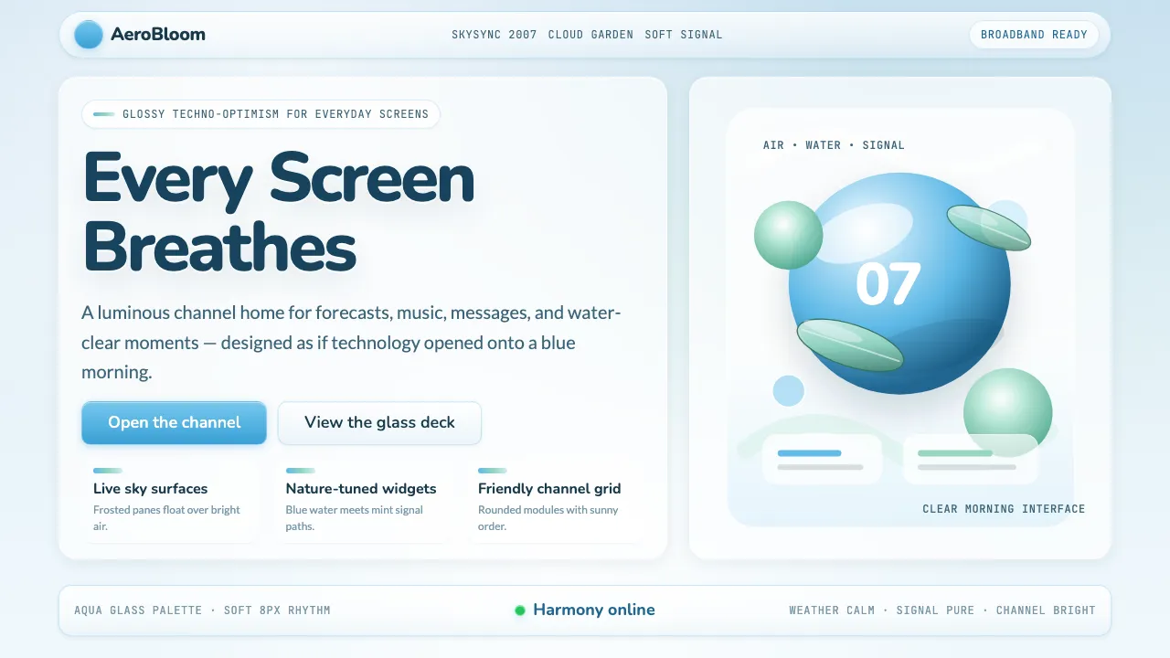
About Frutiger Aero 2007
Frutiger Aero is the glossy, sky-bright design language that dominated consumer technology from roughly 2004 to 2013. Named retroactively after Swiss typographer Adrian Frutiger, it married translucent glass surfaces, photorealistic skies, and blue-green palettes into an aesthetic of boundless techno-optimism.
From Windows Vista's Aero theme to the Wii Channel menu, from Sky Sports broadcasts to Vitaminwater packaging, this style believed technology and nature could coexist in luminous harmony. Killed by iOS 7's flat purge in 2013, Frutiger Aero now thrives as a nostalgia aesthetic among Gen Z on TikTok and Tumblr.
- Origin
- Global — emblematic in Microsoft (Redmond), Nintendo (Kyoto), British broadcasting (London)
- Era
- ~2004–2013, peak 2006–2010
- Key figures
- Adrian Frutiger · Microsoft Windows Vista team · Nintendo Wii UI team · Apple Aqua designers
- Movements
- Skeuomorphism · Glossy Web 2.0 · Techno-Optimism
Frutiger Aero 2007 design spec
Colors
Typography
The other 11 sections — buttons, cards, spacing, motion, techniques and more — open once you unlock. Download the DESIGN.md or send it to your AI in one click. Unlock once, yours forever.
Sign up nowStyles similar to Frutiger Aero 2007
Also inspired by design movements, with a close feel.
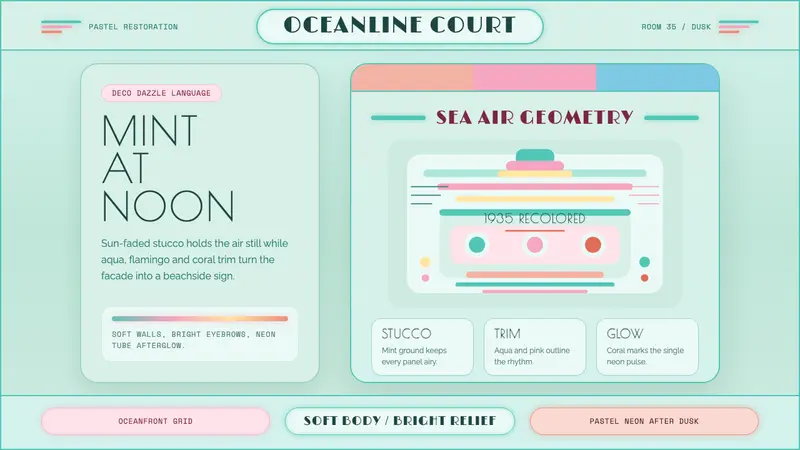 Miami Art Deco PastelSunlit Deco, not noir. Mint stucco, aqua bands and flamingo trim make it breathe.
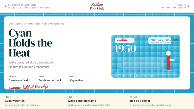 Swimming Pool Vintage Cyan Tile (1950)Leisure turned architectural. Cyan tile, white deck, and red accents set the frame.
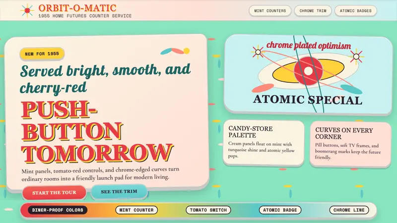 Populuxe Atomic AgeThe future grins. Mint Formica, tomato-red pills, Cooper Black, and atomic starbursts.
 Corporate Memphis (Alegria)Friendly by design. Violet flats and rubber-hose geometry soften the SaaS grid.