What is Iraq Petroleum Magazine?
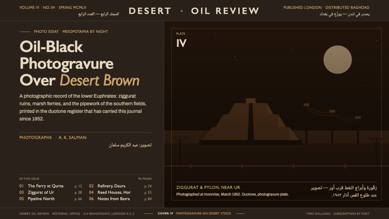
Iraq Petroleum turns corporate gravity into atmosphere — oil-black grounds, desert-brown photogravure, and bilingual type held in disciplined modernist margins.
Iraq Petroleum Magazine in brief
Iraq Petroleum was the London-produced corporate journal of the Iraq Petroleum Company, circulating across the Middle East from 1952. Its visual identity joined the authority of an oil-company publication with the visual seriousness of mid-century British corporate design: dark grounds, controlled photography, restrained typography, and a refusal of decorative excess.
The defining impression is tonal rather than ornamental. Oil-black ink creates a continuous, weighty field; desert-brown imagery introduces the landscape of Mesopotamia without breaking that gravity. Photogravure gives photographs a dense, tactile presence, allowing ancient sites and industrial subjects to occupy the page as evidence rather than illustration.
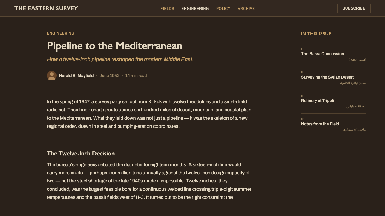
Its bilingual system is equally important. Refined Gill Sans English headlines meet naskh Arabic captions in carefully held margins, while thin rules separate image information from the surrounding darkness. The result is neither a decorative historical style nor a generic dark interface. It is a calm corporate language shaped by photography, bilingual reading, and the visual identity of Iraq and its petroleum industry.
Where does Iraq Petroleum Magazine come from?
The journal emerged from a specific institutional setting: the Iraq Petroleum Company, a major corporate presence connected to Iraq and the wider Middle East, commissioned a publication produced in London and circulated across the region. The journal era is identified as 1952–1990, placing its visual language within a long period when corporate magazines served as carefully managed instruments of information, reputation, and cultural presentation.
Its style belongs to the meeting point of mid-century British corporate house style and oil-company editorial design. British corporate graphics supplied the discipline: controlled type, clear rules, measured margins, and a preference for authority over spectacle. The petroleum context supplied the atmosphere: black ink, industrial seriousness, and a visual relationship to the desert-brown landscape of Mesopotamia.
Photography gave the publication its editorial center. Photogravure covers placed dense brown imagery over an oil-black field, while modernist photo essays moved between ancient Iraq and industrial Iraq. This pairing made history and infrastructure part of the same visual argument. The past was not treated as picturesque background, and industry was not presented as a purely technical subject; both were framed through a composed, corporate photographic language.
The journal also belongs to a wider family of bilingual and regionally focused editorial work. Gill Sans English headlines were set against naskh Arabic captions in bilingual margins, creating a visual encounter between London modernism and Arabic reading traditions. Latif Al Ani photographed for the sister magazine Ahl al-Naft in 1953–54, linking the publication's world to a broader photographic culture around Iraq Petroleum Company magazines. The result was a system that felt international in production yet geographically specific in subject.
What defines the Iraq Petroleum Magazine look?
Oil-Black Ground
Black is not merely a background color here; it is the atmosphere of the publication. It gives photographs, captions, and rules a shared field, producing corporate gravity without relying on ornament. The darkness should feel dense and printed rather than glossy or theatrical, with every lighter element appearing deliberately placed against it.
Desert-Brown Photogravure
The imagery carries a desert-brown cast that softens neither the subject nor the institution behind it. Photogravure suggests depth, density, and material contact: photographs feel pressed into the page, not placed above it as glossy content. The brown tone also binds ancient and industrial Iraq into a continuous geographic story.
Gill Sans Modernism
English headlines use Gill Sans for a refined, modern, and unmistakably corporate voice. Its presence should be composed rather than loud: clean forms, disciplined spacing, and a hierarchy carried by scale and placement. The type does not compete with the photography; it gives the photograph an institutional frame.
Naskh in the Margins
Naskh Arabic captions make the bilingual system visible as a designed relationship, not a secondary translation layer. Arabic occupies the margins with its own typographic dignity, balancing the Latin headline system through rhythm and script character. The pairing should remain calm and legible, allowing both languages to belong to the same editorial architecture.
Thin Caption Rules
Thin rules provide the small amount of visible infrastructure the layout needs. They separate captions from images, establish editorial boundaries, and make the dark field navigable without introducing decorative framing. Their authority comes from consistency: a rule should clarify a relationship, never become an independent graphic ornament.
Restrained Corporate Duotone
The system is most convincing when color behaves as an institutional decision. Desert-brown carries photographic and geographic meaning; oil-black carries authority and continuity. Additional accents should be rare and subordinate. The visual pleasure comes from repetition, tonal control, and the tension between a warm landscape register and a severe corporate ground.
Who shaped Iraq Petroleum Magazine?
Latif Al Ani is identified as a photographer for the sister magazine Ahl al-Naft in 1953–54. His inclusion places Iraq Petroleum within a wider photographic culture surrounding the Iraq Petroleum Company, where the landscape and life of Iraq could be presented through a modern editorial lens.
The corporate editors represent the institutional intelligence behind the journal: a publication produced in London, circulated across the Middle East, and organized around a consistent relationship between photography, bilingual captions, and corporate authority. Their contribution is visible in the coherence of the system rather than in individual signature.
These designers connect the journal to the mid-century British corporate house style. Their influence appears in the controlled typography, measured margins, thin rules, and preference for durable visual order over expressive decoration. The result is modernist but composed, international in manner yet tied to the journal's regional subject.
How do you use Iraq Petroleum Magazine today?
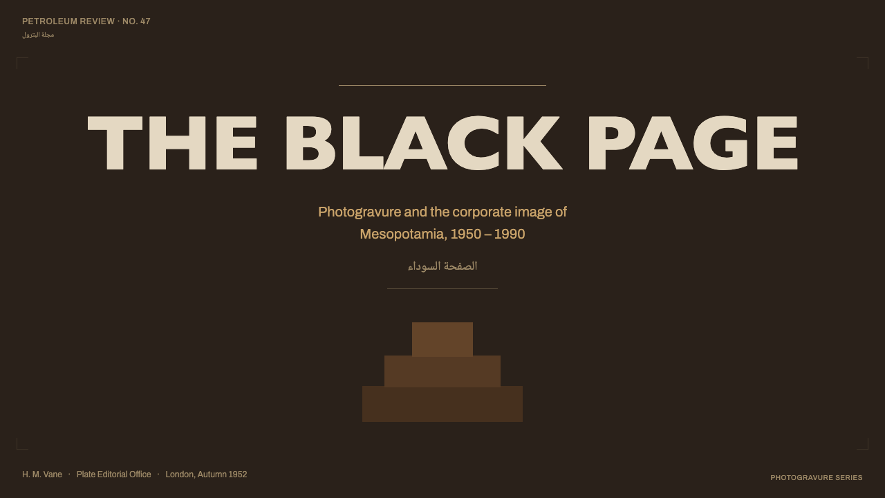
For presentation slides, use the style as an editorial sequence. A cover can place a tightly cropped desert-brown photograph within an expansive oil-black field, with a restrained Gill Sans title and a quiet naskh margin note. Content slides should preserve that composure through clear image-to-caption relationships, thin rules, and generous darkness around the text. Data slides should translate information into the same visual register: restrained charts, strong tonal grouping, and labels that feel like captions rather than interface decoration.
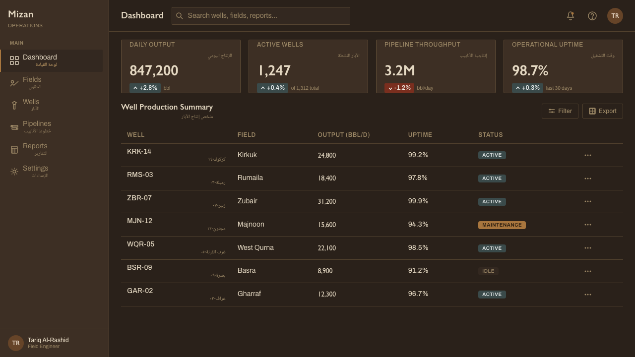
For web interfaces, Iraq Petroleum is especially effective for dashboards, reports, and pricing pages that need authority without technological gloss. Use oil-black as the structural ground, desert-brown for image-led context or selected emphasis, and Gill Sans for the primary interface voice. Naskh can support Arabic localization or regional metadata. Cards should feel editorial and grounded, with rules and tonal separation doing the work that excessive borders, gradients, or glowing effects would otherwise attempt.
For editorial and marketing work, the style supports organizations that want to appear established, serious, and geographically conscious. A feature page can pair modernist photography of landscape, infrastructure, or archival subject matter with concise captions and bilingual margins. Marketing pages should let the image carry atmosphere while the typography carries institutional confidence. The strongest applications feel like carefully edited corporate publications, not retro posters or luxury branding.
The common mistake is to interpret the reference as generic dark luxury or sepia nostalgia. Filling every surface with brown, adding glossy black gradients, or using decorative Arabic lettering loses the system's discipline. The correct balance depends on contrast between the oil-black ground and the desert-brown image register, the functional pairing of Gill Sans and naskh, and the quiet authority of captions and rules. The style should feel printed, bilingual, and editorial before it feels fashionable.
Iraq Petroleum Magazine — FAQ
Is Iraq Petroleum simply a dark-mode version of corporate design?
No. Its darkness is tied to oil-black ink, photogravure, and the institutional gravity of an oil-company journal. A generic dark interface usually treats black as a neutral surface for bright effects. Iraq Petroleum treats black as the primary field from which photography, captions, rules, and bilingual typography are organized. The distinction is editorial and material, not merely chromatic.
Can this style work for a product outside the oil industry?
Yes, when the product values authority, restraint, documentation, and regional awareness. It can suit research platforms, cultural institutions, infrastructure services, archival tools, and serious editorial products. It is less suitable when the experience depends on softness, playful energy, or highly expressive color. The transferable principle is not the petroleum subject itself, but the disciplined relationship between image, institution, and typography.
How should the style handle Arabic and Latin typography together?
Treat both scripts as structural participants in the same editorial system. Gill Sans can carry English headlines with a refined modernist voice, while naskh can carry Arabic captions with its own rhythm and dignity. Avoid making Arabic a decorative accent or squeezing it into leftover space. The bilingual margin should clarify the relationship between languages and images while preserving the distinct character of each script.
Do all images need to be rendered in desert brown?
No. Desert brown is the defining photographic register, not a demand for mechanical uniformity. It works best when it gives related images a shared atmosphere and allows ancient and industrial subjects to read as part of one geography. If every image is forced into the same treatment without regard to content, the result becomes a filter rather than an editorial system. The tone should support the photograph's role and the page's hierarchy.
What separates this style from generic mid-century modernism?
Its specificity comes from the combination of corporate restraint, oil-black atmosphere, desert-brown photography, and bilingual marginal typography. Remove the regional image register and the naskh captions, and the work may become an anonymous British corporate layout. Remove the corporate discipline, and it may become a nostalgic travel publication. Iraq Petroleum holds both identities together: London production and Middle Eastern subject matter, modernist order and photographic density.
Related design styles
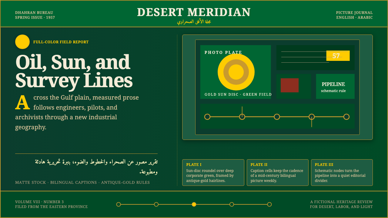 Aramco World MagazineMatte Gulf modernism. Desert green, gold sun-discs, classic serif, and naskh…
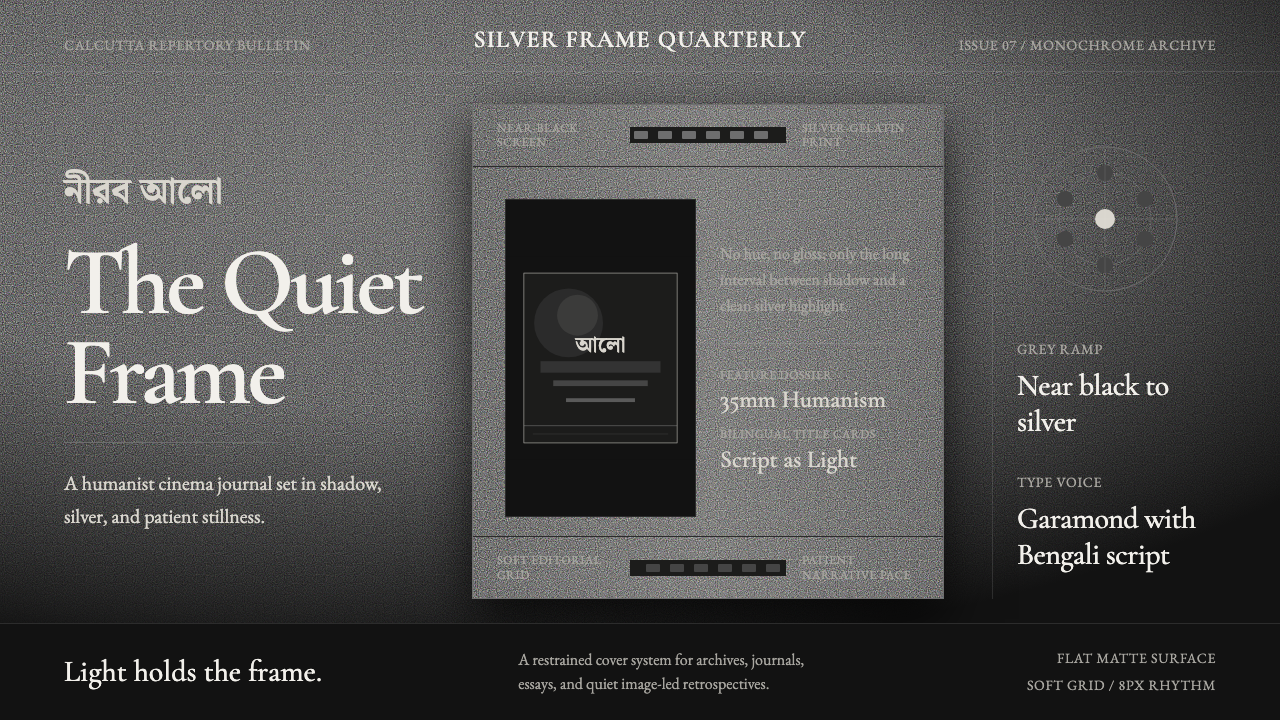 Bengali Art-House CinemaLight becomes restraint. Near-black ground, silver serif, and Bengali script…
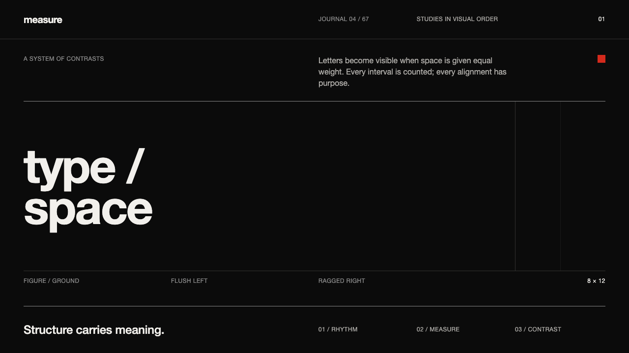 Emil Ruder TypografieDiscipline makes type visible. Near-white grotesque and measured space cut th…
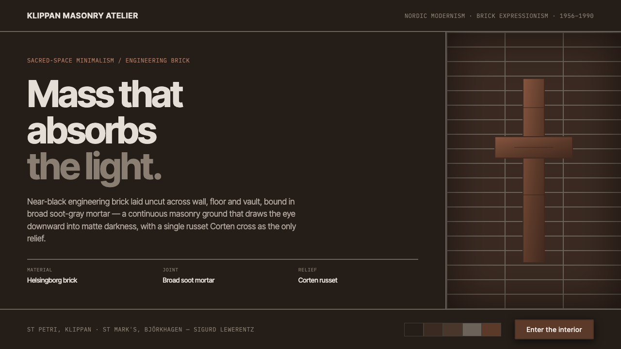 Lewerentz Dark BrickMass that absorbs light. Near-black engineering brick, broad soot mortar, one…
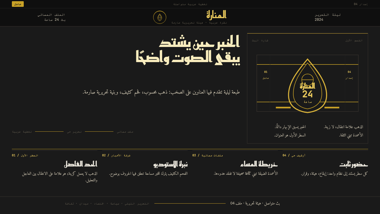 Al Jazeera Arabic NewsAuthority, stripped bare. Gold seal, dense Arabic type, matte charcoal.
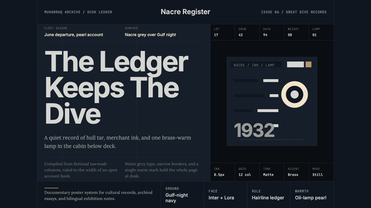 Bahraini Pearl Diving GreyQuiet authority at dusk. Nacre grey type and hairline grids hold one brass-wa…