What is Baikal-Amur Railway?
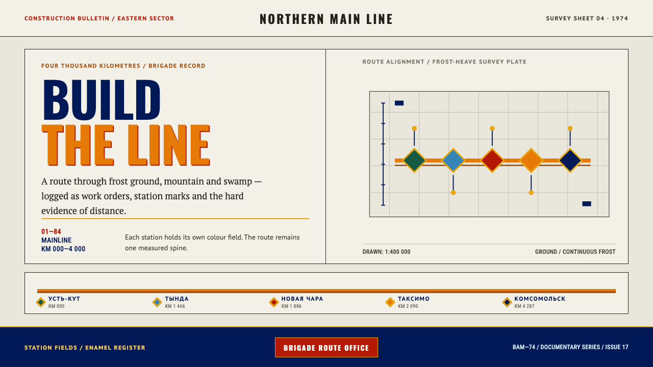
The Baikal-Amur Railway style makes infrastructure tangible: flat enamel colour, metal keylines and a single route line that runs like a spine through every station, all printed on warm survey stock.
Baikal-Amur Railway in brief
Baikal-Amur Railway is a design style drawn from the graphics around the Baikal-Amur Mainline, the railway the Soviet Union announced in 1974 as the construction project of the century. Its vocabulary comes from the printed matter that surrounded the build, such as enamel badges, recruitment sheets and frost-heave survey drawings, rather than from any official house style, because the project never had one.
Visually the style is warm, flat and structural. Colour arrives in solid fields like cloisonné enamel, with a thin metallic line pressed between neighbours. Headlines use narrow, capital-only sans serif letterforms that carry Cyrillic as comfortably as Latin. A route line runs across the page like a spine, and stations hang on it as nodes. The paper is warm, uncoated and a little yellowed, so even the background has the feel of an archive.
What distinguishes the style is its refusal of polish. There are no gradients, no scenic photographs and no glossy surfaces; the only decorative allowance is a green-and-yellow watered-silk pattern borrowed from a commemorative ribbon. The page reads like a document made to be pinned to a wall and read from across a room: legible, proud and slightly worn.
Where does Baikal-Amur Railway come from?
The Baikal-Amur Mainline, known everywhere as BAM, was announced in April 1974 at the Seventeenth Congress of the Komsomol, the Soviet communist youth league. It was presented as a Komsomol shock project, a second great trunk line running north of the Trans-Siberian, from Ust-Kut on the Lena to Komsomolsk-on-Amur, passing north of Lake Baikal. The route crossed some of the harshest terrain on any railway map, with permafrost, mountain ranges and swamp across roughly four thousand kilometres. Leonid Brezhnev, as General Secretary, lent the project the party's highest authority, while the Komsomol under Yevgeny Tyazhelnikov supplied the labour and the story.
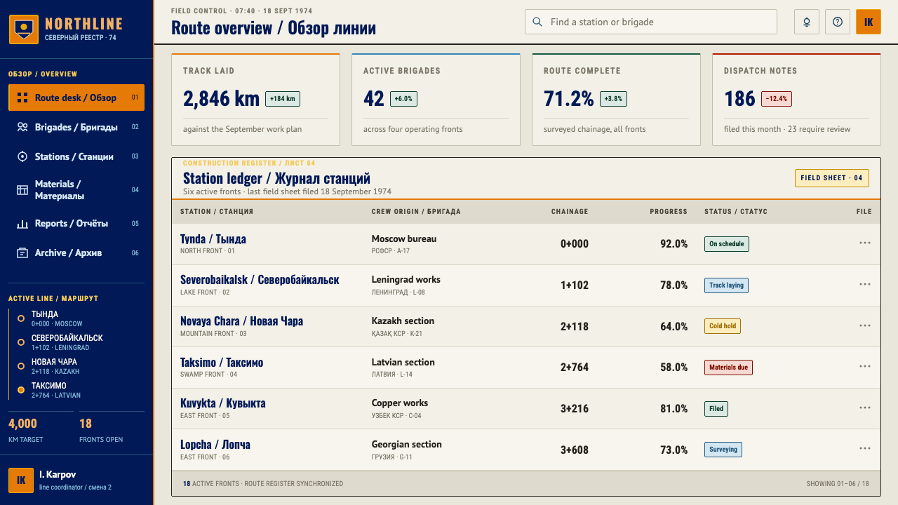
The main line was driven through between 1974 and 1984 by brigades of young volunteers, although the Severomuysky Tunnel, the long-delayed final link, was not completed until 2003. In a gesture typical of late Soviet mobilisation, the union republics were each assigned a station to build and sponsor. The result was a federation of settlements with regional accents. Tynda leaned toward Moscow, Severobaikalsk toward Leningrad, Novaya Chara toward Kazakhstan and Taksimo toward Latvia, and each station's signage was written in its sponsor's own language and alphabet.
That patchwork is why the graphics were never one house style. What survives from the era is a body of small, practical printed things. There are znachok badges, the pin-on enamel badges that Soviet citizens collected and were awarded for everything from tourism to labour service. There are recruitment sheets and mobilisation posters calling young people to the taiga. And there are survey drawings that record frost heave, the seasonal lifting of ground that damages track laid on permafrost. All of it was printed on inexpensive, warm-toned offset paper that has aged yellow. Three traditions meet in it: late Soviet agitprop, with its direct, imperative address; Komsomol mobilisation graphics, with their youthful optimism; and the badge tradition, with its enclosed enamel fields.
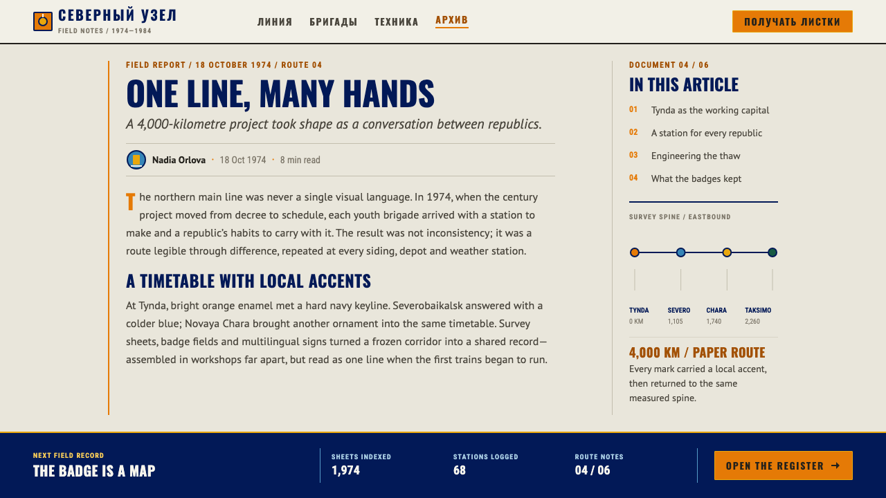
The design system chooses to take these artefacts literally rather than to invent a unified branding that the project never had. Enamel badges contribute the cloisonné logic, in which flat colour is sealed by metal walls so that each field is bounded by a keyline. Survey drawings contribute the route-as-spine idea, a single line with stations as nodes, read like a chainage diagram. Poster headlines and station signage contribute the condensed grotesque capitals. The pattern of a medal ribbon, in green and yellow, is the one ornament allowed.
What defines the Baikal-Amur Railway look?
Cloisonné Colour Fields
Colour is laid in flat, saturated fields with no gradient and no texture inside them, like the enamel on a pin badge. Each field is a separate region of meaning, a station, a section of track or a category, and adjacent fields never blend. The palette feels printed rather than rendered: a handful of inks on paper, with the paper itself acting as one of the colours.
Metal Keylines
A thin metallic line is pressed between colour fields, standing in for the metal walls that separate enamel colours on a badge. The keyline gives every shape a crisp edge, holds the flat colours apart and adds the only glint the page allows. It is a structural device, not an ornament: remove it and the fields lose their definition.
Route Spine and Station Nodes
A single orange route line runs horizontally across the page as the spine of the composition, with station nodes strung along it. Information hangs from the spine the way settlements hang from a railway: names above, details below, distances between. The route is the only strongly saturated linear element, so the eye always has a path to follow from one end of the page to the other.
Condensed Cyrillic-Capable Grotesques
Headlines are set in narrow, capital-only sans serif letterforms of the kind used on posters and station signs. Typefaces are chosen so that Cyrillic and Latin sit together comfortably, reflecting a project whose signage spoke many languages. The compressed proportions let long place names and slogans fit into tight bands without shrinking, and they give the page its poster-like insistence.
Warm Uncoated Survey Stock
The ground is a warm, slightly yellowed, uncoated paper tone, the colour of old offset stock in a survey office. It softens the saturated enamel colours, makes black type feel inked rather than displayed, and gives the whole page the character of an archive document. The paper is treated as a colour in its own right, and pure white is deliberately avoided.
A Federation of Accents
Because each republic sponsored its own station, the source material shows regional accents sitting side by side, with different ornament and different alphabets under one project. The system keeps this idea in a disciplined form: individual stations may carry their own marks or local patterns, but all of them are bound by the same flat colour, keyline and spine, so the variety stays inside a single order.
Medal-Ribbon Silk
The only ornament the system allows is the green-and-yellow watered-silk pattern of a medal ribbon, used as a border, band or divider. It is the single concession to decoration, and its meaning is specific: it recalls the honours given to those who built the line. Everything else on the page is structure, which is why this one pattern carries so much weight.
Who shaped Baikal-Amur Railway?
As General Secretary of the Communist Party, Brezhnev stood at the top of the system that adopted BAM as a national priority in 1974. The project carried his authority, and the rhetoric of the era, with its monumental ambition and shock-brigade language, shaped how the line was presented to the public. His name is attached to the project's political backing rather than to its visual design.
Tyazhelnikov led the Komsomol, the youth organisation to which the building of the line was entrusted. The Komsomol recruited the brigades, ran the mobilisation campaign and produced much of the printed material, from recruitment sheets to badges, whose look this system recalls. In design terms he stands for the organisation that made BAM a youth movement as well as a railway.
The brigades of young volunteers who laid the line through permafrost, mountain and swamp are the real subjects and audience of the era's imagery. Badges, posters and recruitment sheets celebrate their labour, and the visual language of this style is, in effect, theirs: direct, proud and practical. They explain why the system sounds like a collective voice rather than an individual designer's hand.
Each Soviet republic assigned a station brought its own architecture, ornament and alphabet, which is why BAM never had a single graphic identity. Muscovite, Leningrad, Kazakh and Latvian accents all appear in the source story. For a designer these republics are the reminder that a unified system can still hold regional voices, as long as the underlying order is firm.
How do you use Baikal-Amur Railway today?
Baikal-Amur Railway works for subjects in which a journey, a sequence or a chain of places is the story: infrastructure, logistics, engineering history, expedition reports, regional development and archival projects. The style carries a sense of collective effort and long distance, and it shines wherever a line with stops can organise the content.
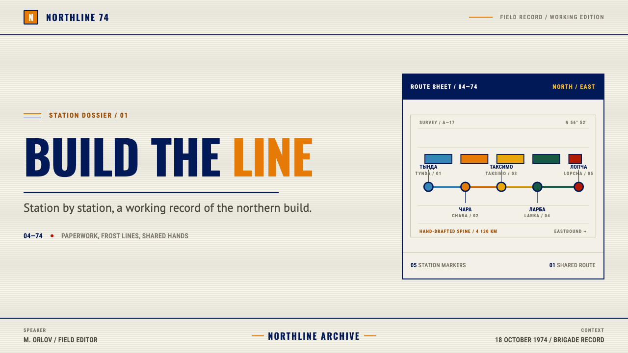
For presentation slides, a cover can show the route spine running across a warm paper field, with one or two enamel colour fields holding the title and a date and a thin metallic keyline between them. Content slides should use the spine as an organising device: a timeline along the top, with stations as milestones, and content blocks hanging underneath in flat colour fields. Data slides become survey sheets, with ruled tables, flat bar fills in enamel colours and a keyline around each chart, and the paper-toned background keeps the page feeling like a field report rather than a dashboard.
For web interfaces, the style suits itineraries, project timelines, status trackers and journey-based products, since the route spine maps naturally to navigation and progress. Use a horizontal spine as the primary progress indicator, flat enamel panels as cards separated by keylines and condensed capitals for section titles. Pricing or plan comparisons work well as a sequence of stations, one tier per node, with each tier's features hung below. Keep buttons flat and boxy with a keyline border, and avoid soft shadows entirely.
For editorial and marketing work, the style fits history features, photo-essay captions, exhibition posters and campaign pages with a rallying tone. A long article can use a thin route line in the margin to mark progress, with section heads set in condensed capitals and the medal-ribbon pattern as a rare divider. Marketing pages can adopt the poster logic of the era: a short imperative headline, a flat field of colour, and one clear call to join or begin.
The most common mistake is to read the style as generic retro or generic Soviet nostalgia and add stars, red banners or heroic figures that the system does not use. The second is to spread the ribbon pattern widely as decoration, which strips it of its role as the single exception. The third is to replace the warm paper with pure white, or to add gradients and drop shadows, which turns the enamel fields into glossy buttons and loses the printed, archival character.
Baikal-Amur Railway — FAQ
Is this Soviet Constructivism?
No. Constructivism belongs to the avant-garde of the 1920s, with its photomontage, diagonal compositions and revolutionary typography. This style draws on the graphics of the 1970s and early 1980s: late Soviet agitprop, Komsomol mobilisation material and the badge tradition. Its mood is less experimental and more official and practical, with flat enamel colour and condensed capitals instead of angled montage.
Does the style require Cyrillic text?
No, but it is prepared for it. The condensed grotesques are chosen so that Cyrillic and Latin sit together comfortably, which matches a project whose station signage spoke many languages. The style works perfectly well in Latin or Chinese text, and if your audience reads Cyrillic you will find that the letterforms and proportions already suit it.
Why is the route line orange?
The route is the spine of every composition, so it needs to be the most visible line on the page. A saturated orange stands out clearly against warm paper and against the cooler enamel fields, and it is distinct from the green-and-yellow of the ribbon pattern. Keeping the route the only strongly saturated linear element means the reader's eye can always find the thread of the story.
Is it appropriate to borrow the look of a state propaganda project?
The graphics behind BAM were part of a state mobilisation campaign, and the style borrows their form, not their message. It is best used for subjects where the form fits, such as infrastructure, long-distance journeys and archival storytelling, and where the context is clear. If you use it for a topic connected to the project or the era itself, acknowledge the history plainly rather than treating it as neutral decoration.
Can I use it on a white or dark background?
The warm paper tone is part of the colour logic, so pure white is not recommended: it makes the enamel colours look harsh and removes the archival feel. A dark ground would turn the system into something quite different, because the flat enamel fields and keylines depend on the printed-on-paper impression. If you need a darker variant, use a deep warm brown paper stock rather than a neutral black, and keep the keylines bright.
Related design styles
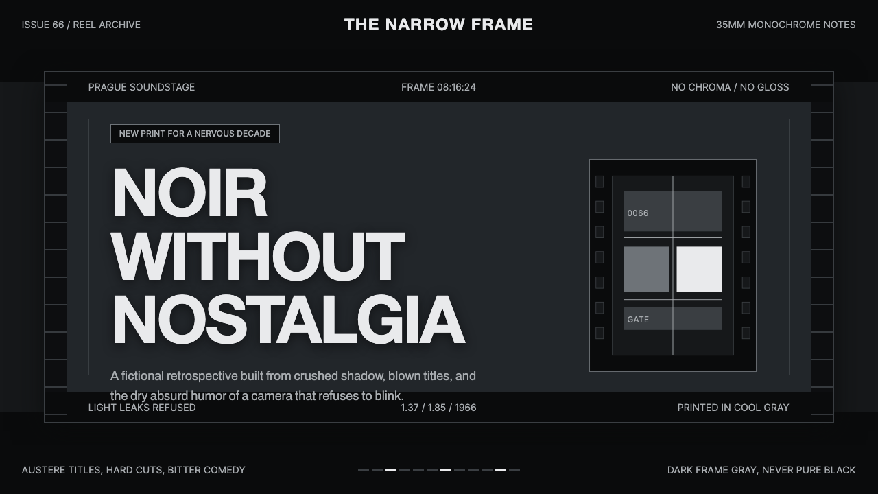 Czechoslovak New Wave CinemaNoir without nostalgia. Letterbox bars, off-white titling, and 35mm grain do…
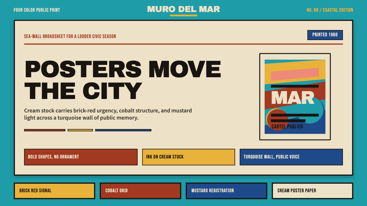 Cuban Malecón 1960 PosterPublic voice in flat ink. Turquoise wall, cream stock, brick red and cobalt b…
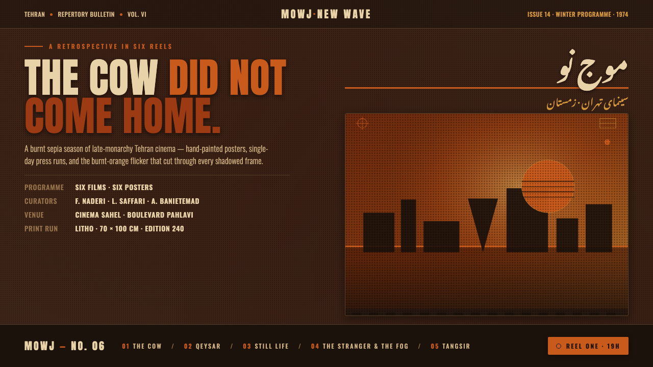 Iranian New Wave PosterPre-revolution Tehran cinema, burnt. Grainy ochre duotone over dark sepia, st…
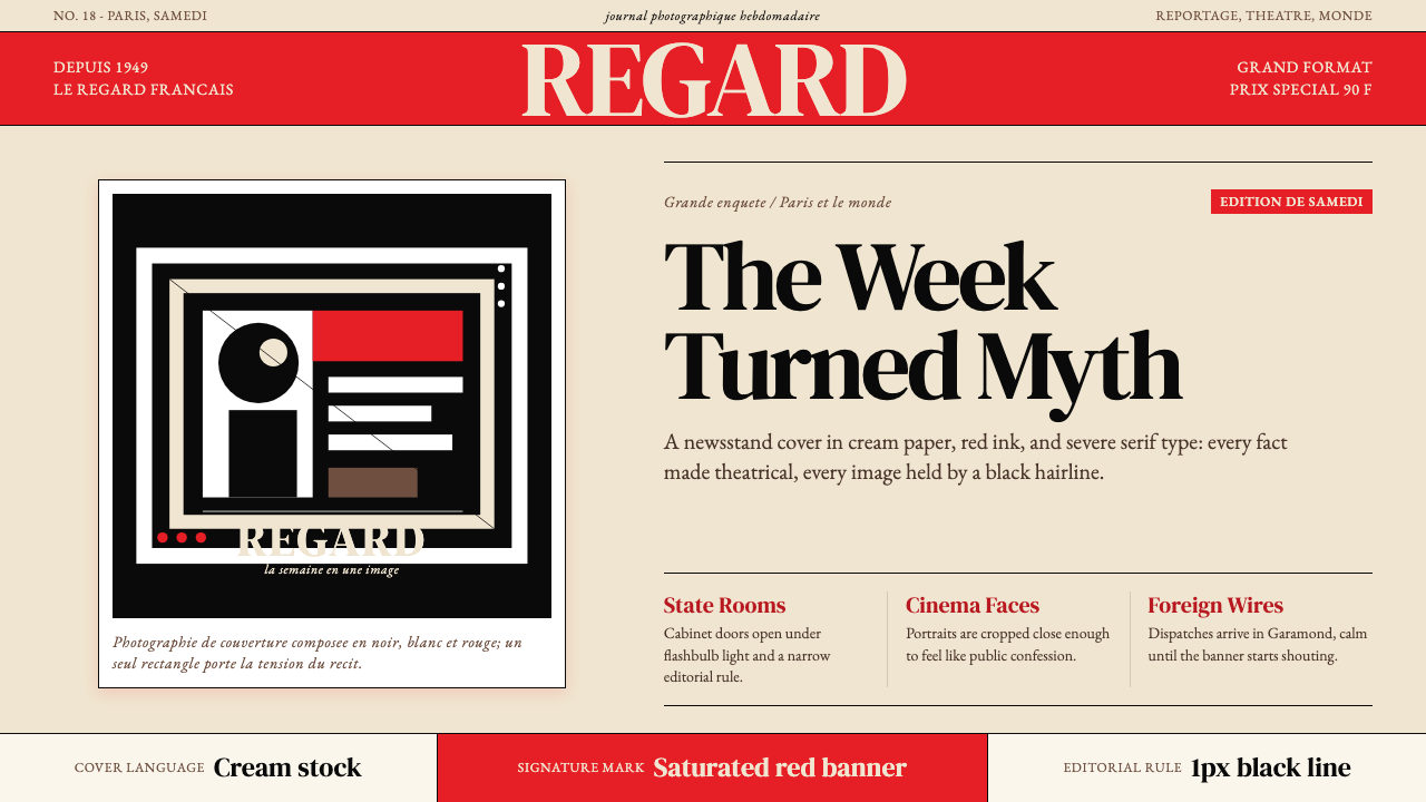 Paris MatchThe cover shouts in one red slab. Cream paper, serif headlines, and black rul…
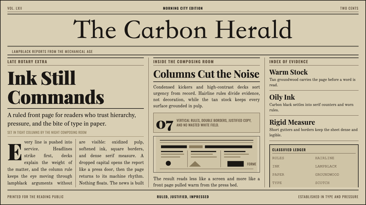 Broadsheet LetterpressAuthority in ink. Lampblack serif decks lock into tan paper with strict ruled…
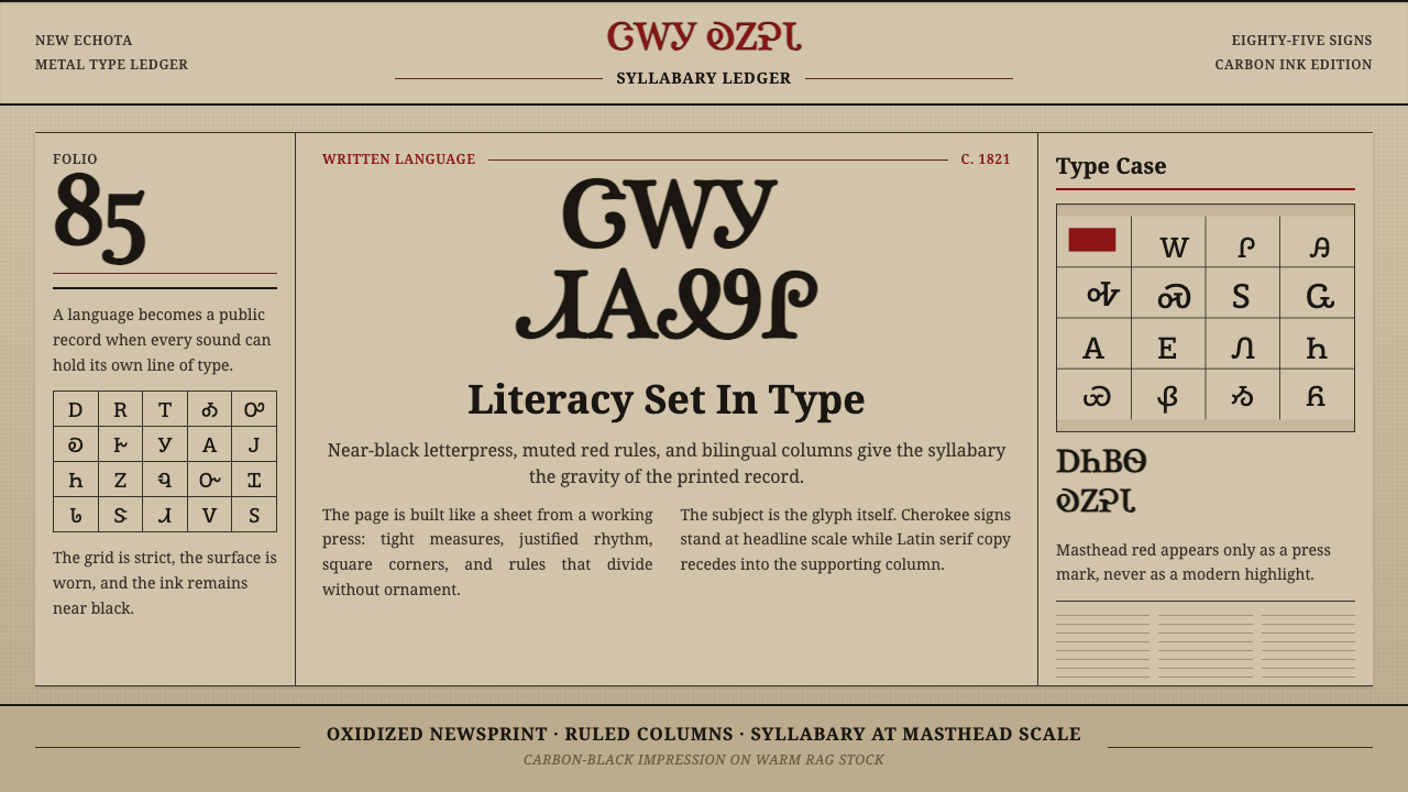 Cherokee SyllabaryLiteracy as inked record. Carbon type, muted red rules, and syllabary on tan…