What is Czechoslovak New Wave Cinema?
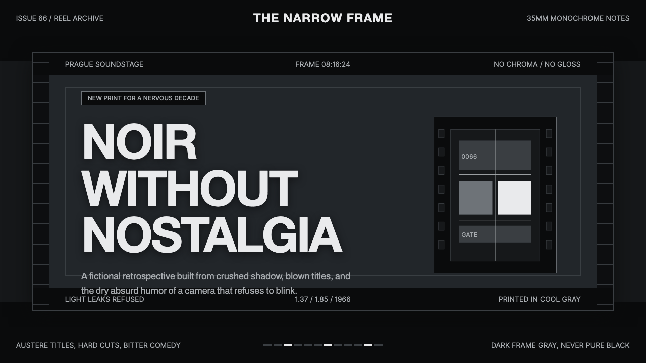
Czechoslovak New Wave Cinema turns the screen into a strip of exposed film — dark but never empty, grainy but never nostalgic, and framed with the severe intelligence of an art-house title card.
Czechoslovak New Wave Cinema in brief
Czechoslovak New Wave Cinema is a dark, monochrome design language distilled from the Czechoslovak New Wave of the 1960s and the wider field of European art cinema around it. Its defining references are the high-contrast, visibly grainy black-and-white images associated with films such as Věra Chytilová's Daisies and Miloš Forman's Black Peter. It does not imitate a generic old movie. It treats the physical and compositional qualities of film as a complete system for presenting information.
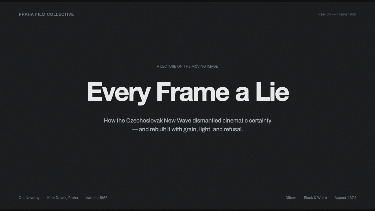
The central visual idea is that the frame should read as film stock. Darkness is expressed through cool, desaturated charcoal and gray rather than absolute black, while titles and body text appear in chalky off-white rather than brilliant white. Grain remains visible across backgrounds, images, panels, and transitions, binding otherwise separate surfaces into one photographic field. Letterbox bars establish a cinematic boundary and make the composition feel deliberately cropped rather than merely contained.
Its typography behaves like titling: stark neo-grotesque letterforms, decisive changes of scale, restrained alignment, and little ornamental intervention. The system is entirely greyscale, so hierarchy must emerge through luminance, proportion, framing, density, and rhythm. The resulting atmosphere is austere but not sterile. Imperfect film texture keeps the geometry human, while the absence of chroma makes every cut, caption, and patch of negative space carry greater weight.
Where does Czechoslovak New Wave Cinema come from?
The source of this visual language is the Czechoslovak New Wave, or Nová vlna, located in Eastern Europe and identified most strongly with the 1960s. The broader era attached to the style extends from 1950 to 1990, but its visual center of gravity remains the New Wave's peak decade. It belongs to the larger territory of 1960s European art cinema, where the framed image could function not only as narrative illustration but also as an expressive surface shaped by contrast, texture, cropping, and duration.
The supplied cinematic references establish the style's essential vocabulary. Věra Chytilová's Daisies, released in 1966, and Miloš Forman's Black Peter represent a cinema associated here with high-contrast, grainy black-and-white photography on 35mm film. Cool, desaturated grays prevent the image from collapsing into a simple binary of black and white. Midtones remain active, faces and objects emerge from textured darkness, and the visible grain reminds the viewer that the image has passed through a material recording process.
The FAMU generation forms part of the movement's collective identity alongside individual figures such as Chytilová, Forman, and Jiří Menzel. In design terms, that collective designation matters because this is not a style reducible to one director's signature. It is better understood as a shared field of cinematic attitudes: confidence in monochrome imagery, willingness to let framing become conspicuous, and acceptance of photographic irregularity as part of the image rather than a defect to be polished away.
When translated from cinema into contemporary graphic and interface design, the moving image becomes a spatial grammar. Letterbox bars become persistent framing devices; off-white titles inherit the authority of screen credits; cool gray grounds take the place of literal film stock; and grain spreads across every surface to preserve material continuity. The adaptation is therefore not a decorative collage of reels, projectors, or retro props. Its historical reference survives through the behavior of the frame itself.
What defines the Czechoslovak New Wave Cinema look?
Monochrome Tonality
The palette is exclusively greyscale. Deep charcoal establishes the film-frame ground, cool middle grays preserve photographic detail, and muted off-white carries titles and essential information. Neither endpoint should feel digitally absolute: the dark retains a faint material presence, while the light feels aged by projection and stock. Hierarchy comes from controlled changes in luminance, not from introducing accent colors.
Film Grain
Grain is a continuous environmental texture rather than an isolated effect placed over a hero image. It should remain perceptible across empty backgrounds, photographic areas, cards, and typographic fields, though its intensity may recede where reading requires calm. Irregular and fine-grained variation is preferable to a repeated decorative pattern. The purpose is to make the whole interface feel exposed on one strip of 35mm stock.
Letterboxed Framing
Heavy horizontal bands above and below the active field create the sensation of a projected cinematic frame. Within that field, images may be cropped firmly, titles may sit near an edge, and empty darkness may occupy a substantial portion of the composition. The frame is never neutral: it directs attention, withholds peripheral information, and turns every section into a chosen shot.
Titling Typography
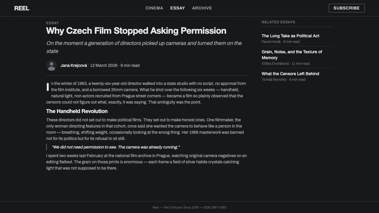
Neo-grotesque sans-serif type supplies a blunt, contemporary voice that avoids theatrical period styling. Headlines behave like film titles or intertitles: concise, prominent, and separated from supporting copy by a decisive shift in scale or placement. Body text remains restrained and highly legible. Italics, ornamental scripts, and decorative display faces would weaken the style's documentary severity.
Contrast and Midtones
High contrast gives titles, faces, and silhouettes immediate force, but the composition still depends on a broad family of cool midtones. Those grays hold atmosphere, separate overlapping planes, and keep black regions from becoming featureless voids. Effective work alternates moments of stark graphic opposition with passages of quieter tonal ambiguity, much as a film sequence alternates emphatic shots with observational ones.
Photographic Cropping
Images are treated as fragments selected by a camera, not as complete illustrations placed politely inside containers. A face may be partially withheld, an object may continue beyond the frame, and empty gray space may carry as much tension as the subject. Cropping should feel intentional and slightly disruptive. Conventional centered thumbnails and evenly padded image cards tend to dissolve the cinematic pressure.
Material Restraint
The style permits one dominant material signal: film. Glossy glass effects, colorful light leaks, polished metallic surfaces, and soft atmospheric gradients introduce competing visual stories. Panels should feel cut from the same dark stock as the background, distinguished through framing and tone rather than simulated substance. Restraint keeps grain meaningful and prevents cinematic texture from becoming generic retro decoration.

Who shaped Czechoslovak New Wave Cinema?
Chytilová is a central named figure in the Czechoslovak New Wave reference set. Daisies, released in 1966, provides the theme with one of its clearest historical anchors. Within this design system, her importance lies in the permission to treat cinematic form as something conspicuous rather than invisible: framing, tonal rupture, texture, and visual interruption can carry meaning instead of merely supporting a seamless narrative surface.
Forman enters the style through Black Peter, one of the supplied works defining its cinematic source. The film's place in this reference set reinforces an observational interpretation of monochrome imagery: ordinary figures and spaces can remain visually compelling when contrast, grain, and framing are allowed to organize attention. For designers, that supports layouts built from candid photographic fragments rather than polished spectacle.
Menzel is identified among the movement's key figures and helps establish that the Czechoslovak New Wave was a field of multiple filmmakers rather than a single-author aesthetic. His inclusion cautions against turning the style into a direct visual quotation from only Daisies or Black Peter. A faithful design language should synthesize the movement-level qualities supplied here: monochrome tonality, cinematic framing, grain, and art-film restraint.
The FAMU generation names the collective dimension of the movement. In this theme, it functions as a reminder that a cinematic language can emerge from shared formation and historical proximity without becoming visually uniform. The corresponding design system should therefore be coherent without feeling templated: every composition may choose a different crop or tonal balance while remaining bound by the same monochrome stock, letterboxed frame, and typographic discipline.
How do you use Czechoslovak New Wave Cinema today?
For presentation slides, the style is strongest when the deck is treated as a sequence of shots. A cover can use a nearly empty dark frame, one off-white title, and a sharply cropped monochrome still, with letterbox bands establishing the cinematic field. Content slides should alternate between restrained text frames and image-led frames rather than forcing every page into the same arrangement. Section dividers can behave like intertitles, allowing a brief phrase and grainy darkness to reset the rhythm.
Data slides require special discipline because color cannot separate categories. Use changes in gray value, fill density, outline treatment, and direct labeling to make comparisons readable. Charts should remain stark and photographic in spirit, with a clear focal series and quieter supporting information. Avoid filling every region with similar middle gray. A decisive contrast between the subject and its context will make the data feel edited and directed rather than merely placed.
For web interfaces, Czechoslovak New Wave Cinema suits dashboards, media catalogs, archives, and pricing pages that benefit from a serious editorial voice. Dashboard modules can read as adjacent film frames, separated by dark gutters and shifts in luminance. On pricing pages, one tier may receive the brightest title treatment while others recede into cooler gray. Buttons and active states must be distinguished through contrast, borders, labels, and placement because chromatic emphasis is unavailable.
Editorial and marketing layouts should use photography as narrative evidence rather than decoration. An article can open with a letterboxed image, a compact title block, and metadata placed like a credit line. Long passages need calmer grain and generous dark breathing room so that atmosphere does not compromise reading. Marketing pages can build momentum through a sequence of close crop, intertitle, testimonial, and wide frame, producing the sense of a deliberately edited trailer without imitating literal film equipment.
The most common mistake is equating cinematic darkness with a black background plus a noise filter. That shortcut misses the active middle grays, off-white highlights, controlled cropping, and typographic restraint that give the style its identity. Another error is adding sepia, neon accents, colored light leaks, or distressed retro lettering. Those devices turn the result into generalized nostalgia, whereas this system is explicitly noir without nostalgia: cool, monochrome, materially grainy, and compositionally alert.
Czechoslovak New Wave Cinema — FAQ
Is this style simply a black-and-white version of a modern dark interface?
No. A conventional dark interface often uses a smooth, neutral background and relies on colored accents to communicate status and interaction. Czechoslovak New Wave Cinema treats darkness as photographic material. Its charcoal ground contains grain and tonal variation, its highlights are off-white, and its hierarchy is constructed through framing, cropping, luminance, and titling. Removing color from an ordinary interface will not automatically produce those relationships.
Why should the background avoid pure black and the text avoid pure white?
Because the frame is meant to read as film stock rather than an abstract digital canvas. Cool charcoal retains visible substance and allows grain to live inside the dark areas. Off-white titling feels recorded or projected instead of emitted by a pristine display. The softened endpoints also create room for meaningful tonal hierarchy: selected highlights can still advance, while secondary text and photographic midtones can recede without disappearing.
Can the style use color for calls to action or data categories?
The supplied system is explicitly greyscale only, so chromatic accents would break its central rule. Calls to action can be made prominent through brighter value, stronger framing, isolation, or typographic emphasis. Data categories can use distinct gray values, patterns, outlines, and direct labels. If color is essential to the product's meaning, this theme may be the wrong system rather than a system that should be casually modified.
How much grain is appropriate in text-heavy layouts?
Grain should remain perceptible enough to unify the surface, but it must recede around long body copy. The cinematic identity does not depend on making every area equally noisy. Keep stronger texture in empty fields, image regions, and section transitions, then allow reading zones to become calmer while retaining slight material variation. If letters begin to shimmer, fragment, or compete with the background, the texture is no longer supporting the system.
What separates this style from generic retro cinema design?
Generic retro cinema often depends on nostalgic symbols and surface effects: projectors, film perforations, faded sepia, theatrical lettering, or decorative scratches. Czechoslovak New Wave Cinema is more structural and less sentimental. Its identity comes from cool monochrome tonality, visible 35mm grain, off-white neo-grotesque titling, conspicuous cropping, and letterboxed space. It evokes cinema by organizing the viewer's attention as a frame would, not by displaying memorabilia.
Related design styles
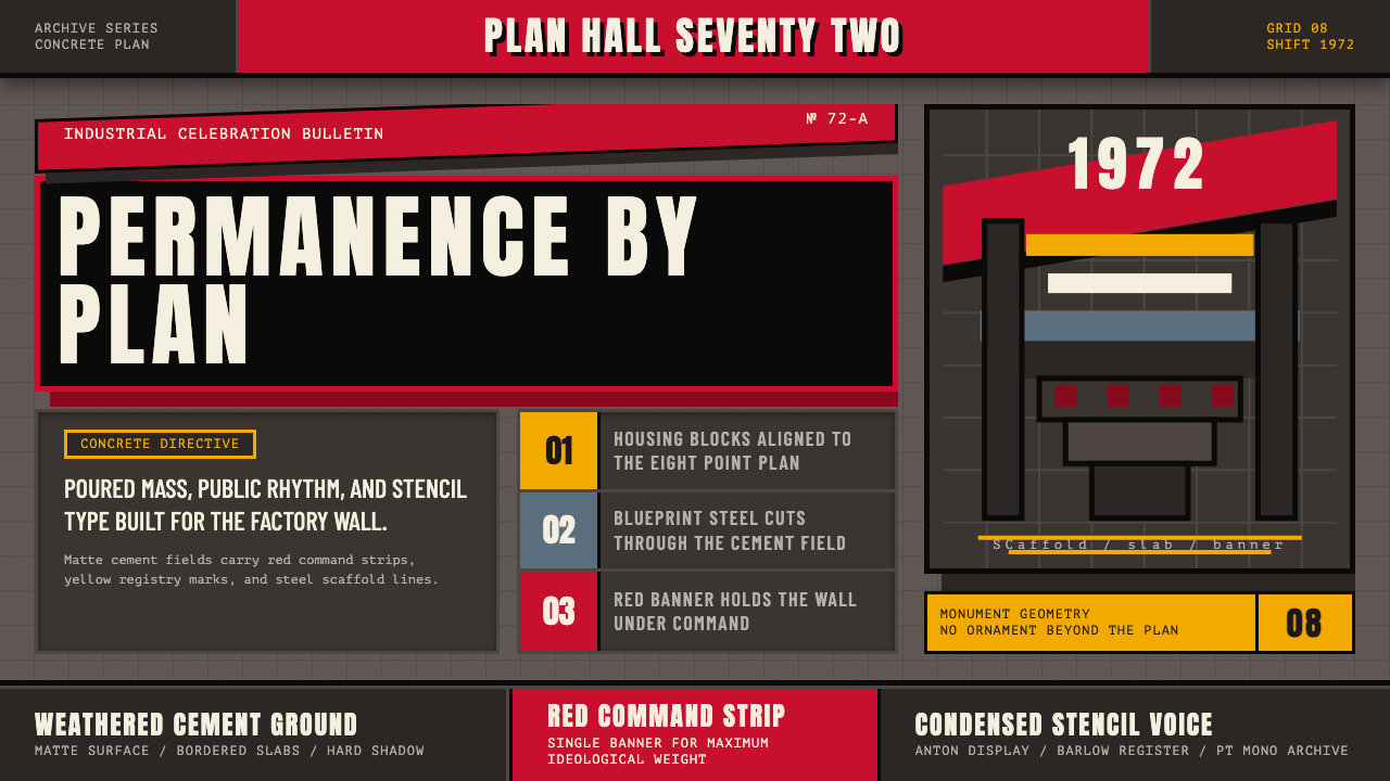 Soviet Brutalism (1972)Concrete refuses to breathe. Cement gray, Soviet red banners, and Anton stenc…
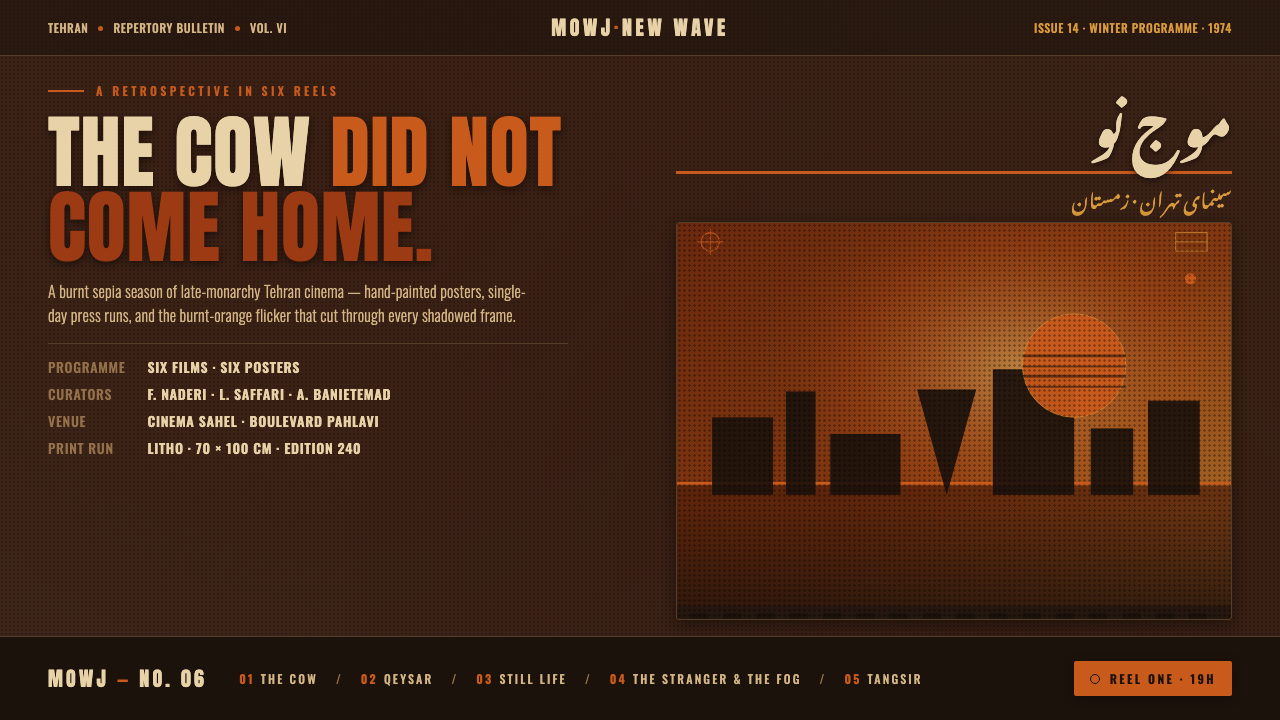 Iranian New Wave PosterPre-revolution Tehran cinema, burnt. Grainy ochre duotone over dark sepia, st…
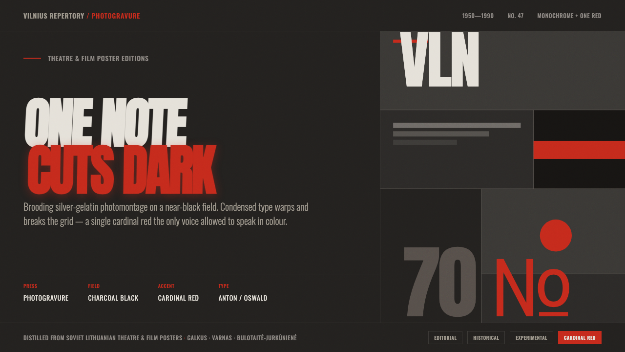 Lithuanian Poster ArtMonochrome plus one red. Charcoal photogravure field, warped Anton type, a lo…
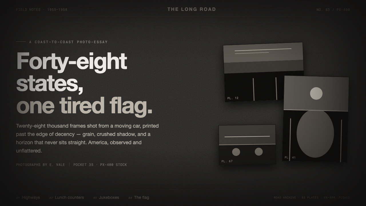 Robert Frank The AmericansReportage, polish stripped off. Warm sooty charcoal, crushed near-black shado…
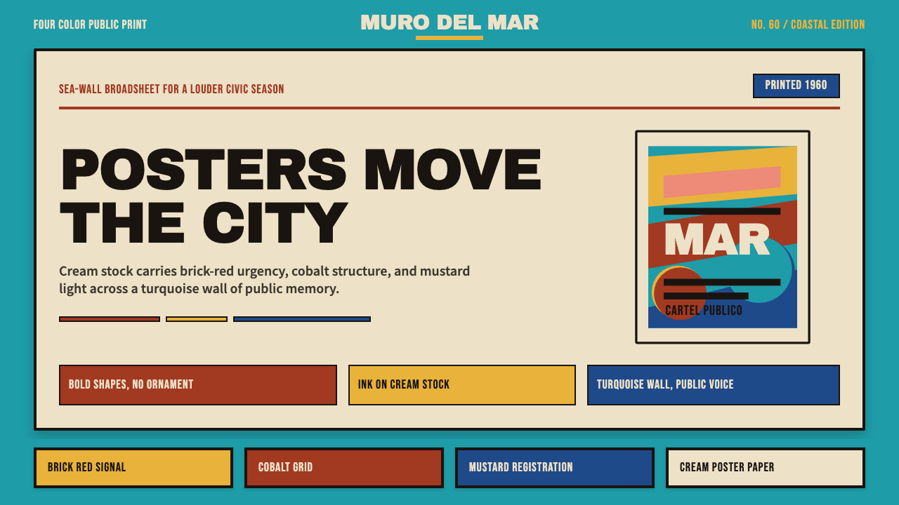 Cuban Malecón 1960 PosterPublic voice in flat ink. Turquoise wall, cream stock, brick red and cobalt b…
 Paris MatchThe cover shouts in one red slab. Cream paper, serif headlines, and black rul…