What is Lithuanian Poster Art?
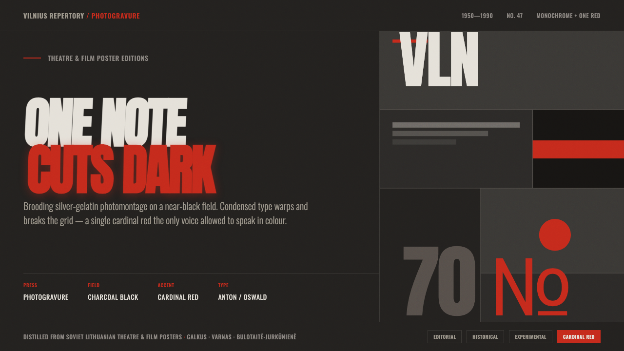
Lithuanian Poster Art turns darkness into theatre: grainy monochrome, warped lettering, and a single red signal cutting through the field.
Lithuanian Poster Art in brief
Lithuanian Poster Art describes the Soviet-era theatre and film posters associated with Lithuania, especially Vilnius and the wider Soviet-bloc context of Eastern Europe. Its visual language is built from brooding monochrome photomontage: charcoal and silver-gelatin greys pressed into a dense, photogravure-like darkness rather than placed on a light paper ground. The result feels less like an illustration than a fragment of a scene recovered from shadow.
Color is deliberately scarce. A single cardinal red cuts through the charcoal field, giving the composition an emotional and directional charge without breaking its monochrome discipline. Red can mark a decisive word, a visual wound, a signal, or the point where the eye should stop. Everything around it remains restrained, dark, and tonal. The contrast comes from value, texture, scale, and cropping rather than from a broad palette.
Typography is the style’s most rebellious element. Condensed dramatic display type, including the warped character of Anton, echoes the expressive hand-drawn lettering of the originals. Letters bend, stretch, fracture, and push beyond their expected alignment; they do not simply label the image but become part of its atmosphere. This system translates that grainy, high-contrast mood into digital design through a near-black field, one chromatic accent, and type that is allowed to disturb the grid.
Where does Lithuanian Poster Art come from?
The source places the style between 1950 and 1990, with its strongest period running from the late 1960s through the 1980s. Its regional center is Lithuania, particularly Vilnius, within the cultural geography of Soviet-bloc Eastern Europe. The principal subjects are theatre and film, which explains the system’s dramatic intensity: these posters are not neutral announcements but compressed invitations into a world of performance, image, and mood.
Lithuanian Poster Art belongs to the field identified here as Soviet Lithuanian graphic design, while also standing alongside the Polish poster school. Those two references establish its cultural position without reducing the style to a generic Eastern European poster look. The Lithuanian expression is defined by the specific combination of dark photomontage, dense tonal printing, expressive lettering, and the disciplined intrusion of red.
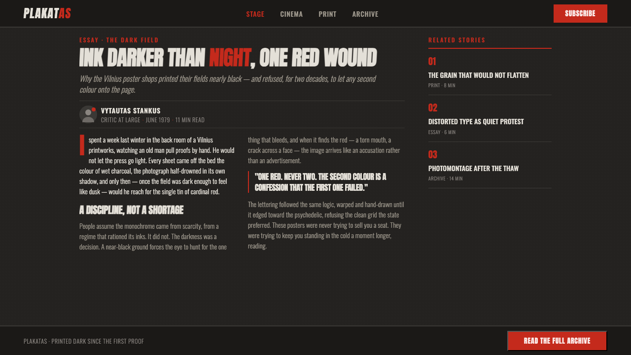
The historical period matters because the visual system carries both restraint and experimentation. The dark monochrome ground establishes seriousness and enclosure; the distorted letterforms introduce instability; the isolated red accent creates a sudden point of urgency. Together, these choices make the poster feel theatrical even before its subject is read. The image does not merely contain information. It stages a confrontation between shadow, type, and attention.
In digital use, the tradition is best understood as a translation rather than a literal reconstruction. The source describes a system built from a near-black field, one chromatic accent, and condensed dramatic display type that recalls the psychedelic, rule-breaking lettering of the originals. Grain, high contrast, and deliberate disruption carry the historical mood, while the digital interface supplies a new setting for the same visual logic.
What defines the Lithuanian Poster Art look?
Monochrome Field
The dominant ground is charcoal, near-black, and silver-gelatin grey. It should feel printed deep into the surface, with tonal density carrying more authority than brightness. A light background immediately changes the character of the work; the style depends on darkness as an active compositional material, not as empty space behind the image.
Photomontage
Imagery is assembled from photographic fragments rather than presented as a clean, singular scene. Cropping can be severe, forms can dissolve into shadow, and several visual clues may occupy the same dark field. The image feels psychological and theatrical because it withholds a complete explanation, asking the viewer to reconstruct the scene through contrast and association.
Grain and Print Depth
Texture should suggest charcoal and photogravure rather than polished digital smoothness. Grain gives the dark field physical weight, while uneven tonal transitions keep the image close to its printed origins. The texture is not a decorative filter applied afterward; it is part of the atmosphere and helps unify type, image, and background.
Single Red Accent
Red is rare precisely so that it can be forceful. A cardinal red mark, word, shape, or image fragment should cut through the monochrome field with unmistakable intent. Additional bright colors weaken the premise. The accent works best when it has a structural or emotional role, creating a point of danger, emphasis, interruption, or direction.
Warped Display Type
Typography behaves like an image. Condensed display letters carry dramatic pressure, while warping, stretching, breaking, and irregular alignment make the title feel performed rather than typeset. Anton can provide the narrow, forceful starting point, but the surrounding treatment must echo hand-drawn expression. The distortion should intensify the message without making every word impossible to read.
Broken Grid
The composition may begin with an underlying order, but lettering and image are allowed to violate it. A title can lean into a photograph, cross an edge, or break a clean reading path. This is not random disorder. The grid remains perceptible as a tension that the poster actively resists, giving the work its sense of motion and psychological pressure.
Theatrical Contrast
Hierarchy is created through the collision of near-black shadow, silver-grey image, forceful type, and the isolated red accent. The effect is high contrast without becoming visually noisy. Every element should feel as though it has entered under a spotlight, even when the spotlight is represented only by a sudden tonal break or a sharp interruption in the field.
Who shaped Lithuanian Poster Art?
Juozas Galkus is identified in the source as one of the key figures of Lithuanian Poster Art. His inclusion anchors the style in a named Lithuanian design history rather than treating the dark photomontage and distorted lettering as an anonymous aesthetic recipe. For designers, the useful lesson is to preserve that sense of authorship: the system should feel intentional, authored, and dramatically composed.
Vytautas Varnas appears in the supplied material among the movement’s key figures. The source does not assign him a separate biography or signature work, so his relevance should be understood within the shared visual field: dense monochrome imagery, expressive display lettering, and a controlled red interruption. His presence reinforces the collective character of the Lithuanian poster tradition.
Bulotaitė-Jurkūnienė is likewise named as a key figure in the source. Without inventing an individual practice beyond the approved record, her place can be read as part of the authorship behind this distinctly Lithuanian poster language. The name is a reminder that the system’s roughness is not accidental; its grain, darkness, and typographic disruption belong to a deliberate design culture.
How do you use Lithuanian Poster Art today?
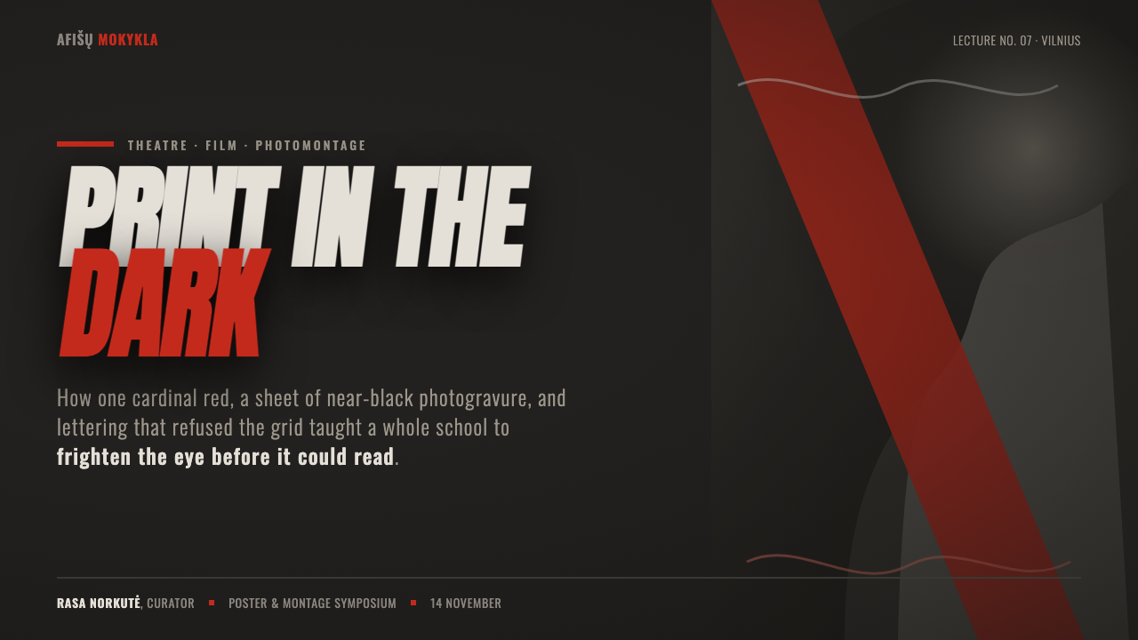
For presentation covers, Lithuanian Poster Art supports a dramatic entrance. Use a near-black field, let a cropped photographic fragment emerge from charcoal and silver-grey, and place the title as a condensed block whose edges do not behave too politely. The lone red accent can identify the central subject or cut across the composition like a stage cue. The cover should feel like a poster before it feels like a slide.
Content slides should preserve the same atmosphere while restoring enough order for sustained reading. Keep body copy in a calmer typographic zone, then allow the display title, image crop, or red mark to introduce tension. Data slides can become stark visual scenes: a chart or diagram may sit within the dark field, with red reserved for the decisive value or category and grey carrying the supporting information. The hierarchy should come from contrast and placement rather than a collection of colorful labels.
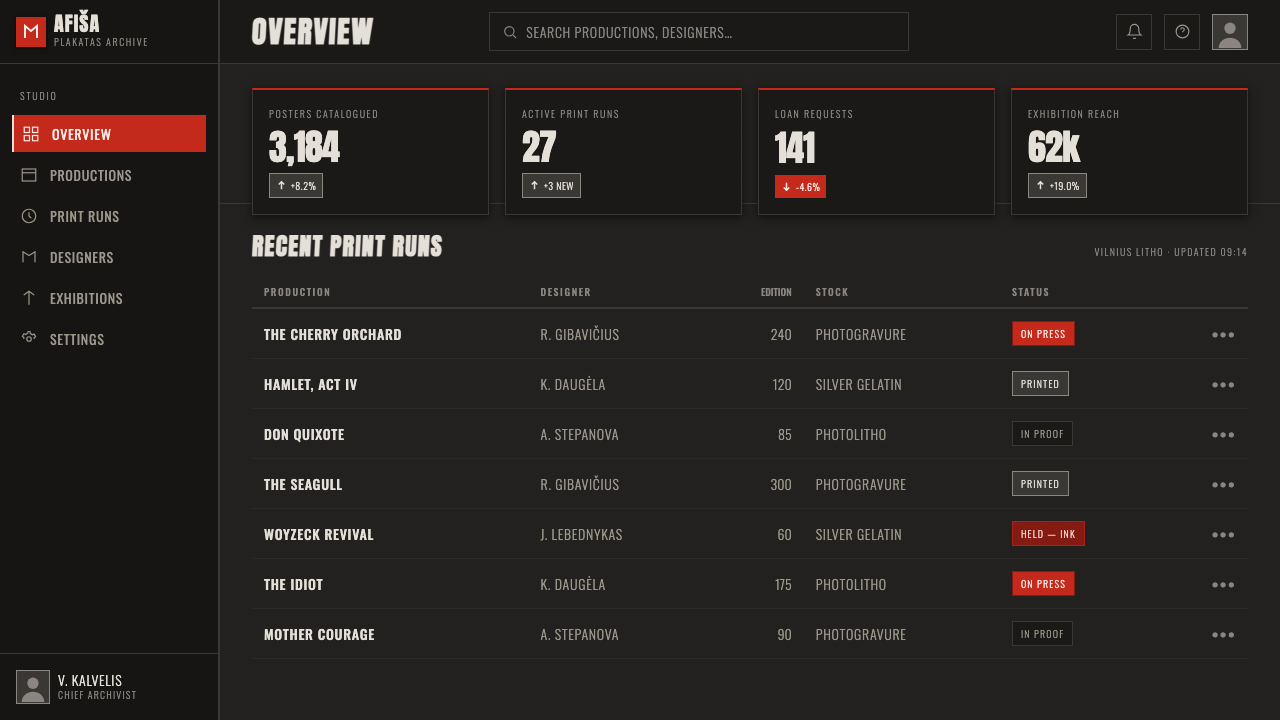
For web interfaces, the system is especially effective for dashboards, analytical tools, and pricing pages that want to feel serious, cinematic, or culturally distinctive. A dark surface can hold dense information without becoming generic when photographic grain, silver-grey hierarchy, and a single red action state are used consistently. Cards should feel like clipped poster panels, while navigation can use condensed display type sparingly. The interface must remain legible; atmosphere should shape the hierarchy, not obscure it.
Editorial and marketing work can use the style to turn information into an event. An article may pair a narrow reading measure with a large, disrupted title and a dark image field that continues across section breaks. Campaign pages can treat calls to action as the single red interruption in an otherwise monochrome composition. Theatre, film, music, cultural programming, and other mood-led subjects are natural fits because the visual language already understands suspense, framing, and staged attention.
The most common mistake is confusing darkness with the style itself. A black background, random grain, and red buttons do not create Lithuanian Poster Art if the image remains polished, the type stays perfectly obedient, and every accent competes for attention. Another failure is using red everywhere until it becomes ordinary. The system works when darkness has density, lettering has expressive pressure, and red remains rare enough to feel like an event.
Lithuanian Poster Art — FAQ
Is Lithuanian Poster Art simply a black-and-red design style?
No. Black and red are only the most visible shorthand. The system also depends on photomontage, charcoal and silver-gelatin tonal depth, grain, high contrast, condensed display type, and lettering that can warp or break the grid. Remove those structural qualities and the palette becomes a generic dark interface rather than a Lithuanian poster-derived language.
Why must the background stay so dark?
The darkness is part of the style’s material and emotional identity. The source describes the posters as printed dark as photogravure and never on light paper. A near-black ground gives the monochrome image density, allows silver-grey forms to surface gradually, and makes the isolated red accent feel decisive. A light ground may be attractive, but it belongs to a different visual argument.
How much distortion can the typography take?
It can bend, stretch, fracture, and cross expected alignments, because the lettering is meant to echo expressive hand-drawn forms. The limit is communication. Distortion should create dramatic pressure or visual movement, while the essential words remain recoverable through context, hierarchy, or supporting text. Use the strongest disruption for display moments and a calmer treatment for sustained reading.
Can another accent color replace the red?
A contemporary adaptation could experiment, but it would no longer preserve the central logic as clearly. The source defines the system as monochrome plus one cardinal red, with that red cutting through the gloom. If another color is introduced, it should remain singular and purposeful; a broad accent palette would undermine the style’s disciplined tension.
Is the style limited to theatre and film?
Its historical home is theatre and film, but its visual principles can transfer to other contexts that benefit from atmosphere, suspense, and strong attention control. Editorial features, cultural campaigns, music programming, dashboards, and pricing pages can all use the language. The important condition is that the product or message can support its severity, darkness, and deliberately unsettled typography.
Related design styles
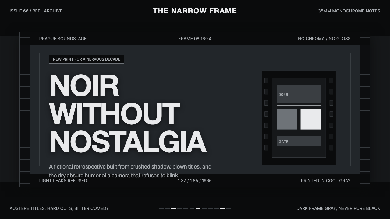 Czechoslovak New Wave CinemaNoir without nostalgia. Letterbox bars, off-white titling, and 35mm grain do…
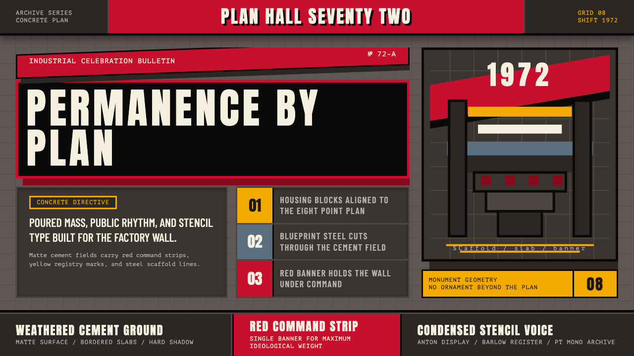 Soviet Brutalism (1972)Concrete refuses to breathe. Cement gray, Soviet red banners, and Anton stenc…
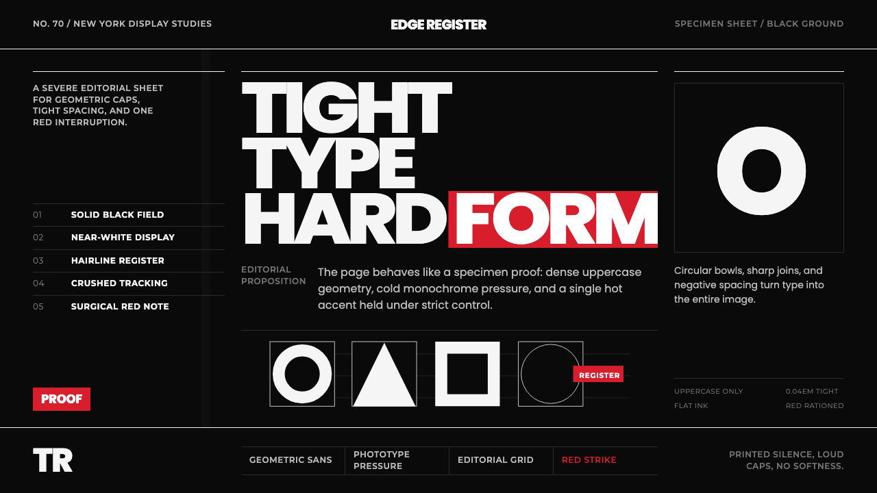 Avant Garde GothicType is the image. Tight white caps on black, ruled grids, one hot red strike.
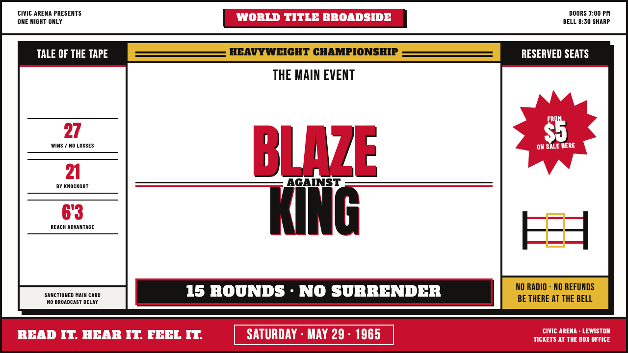 Muhammad Ali Fight Poster (1965)Type does the fighting. Blood red and dead black collide in a stacked letterp…
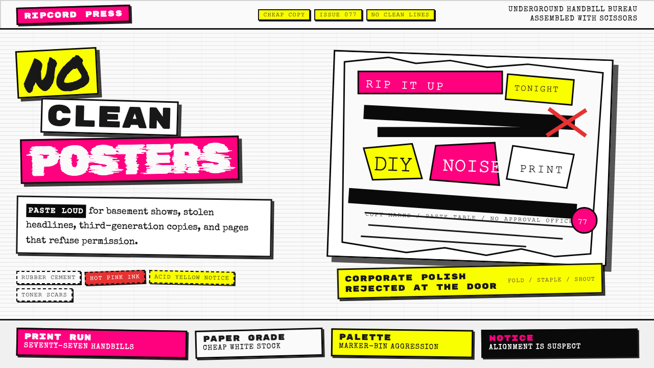 Punk Xerox 1977Anti-design shouts. Hot pink and acid yellow collide with ransom type on Xero…
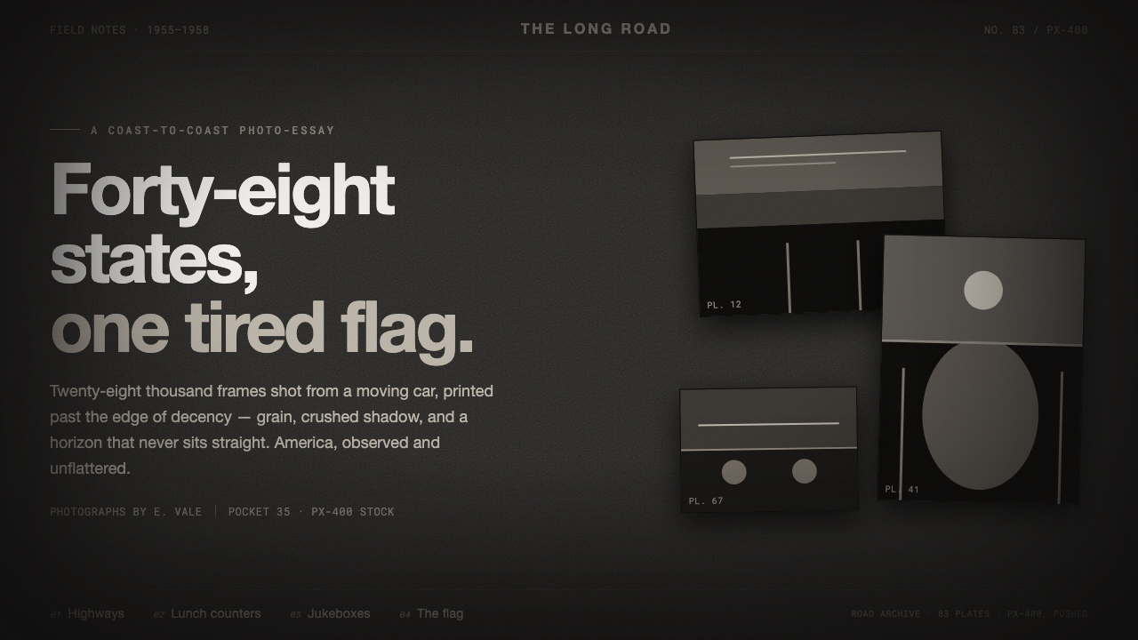 Robert Frank The AmericansReportage, polish stripped off. Warm sooty charcoal, crushed near-black shado…