What is Avant Garde Gothic?
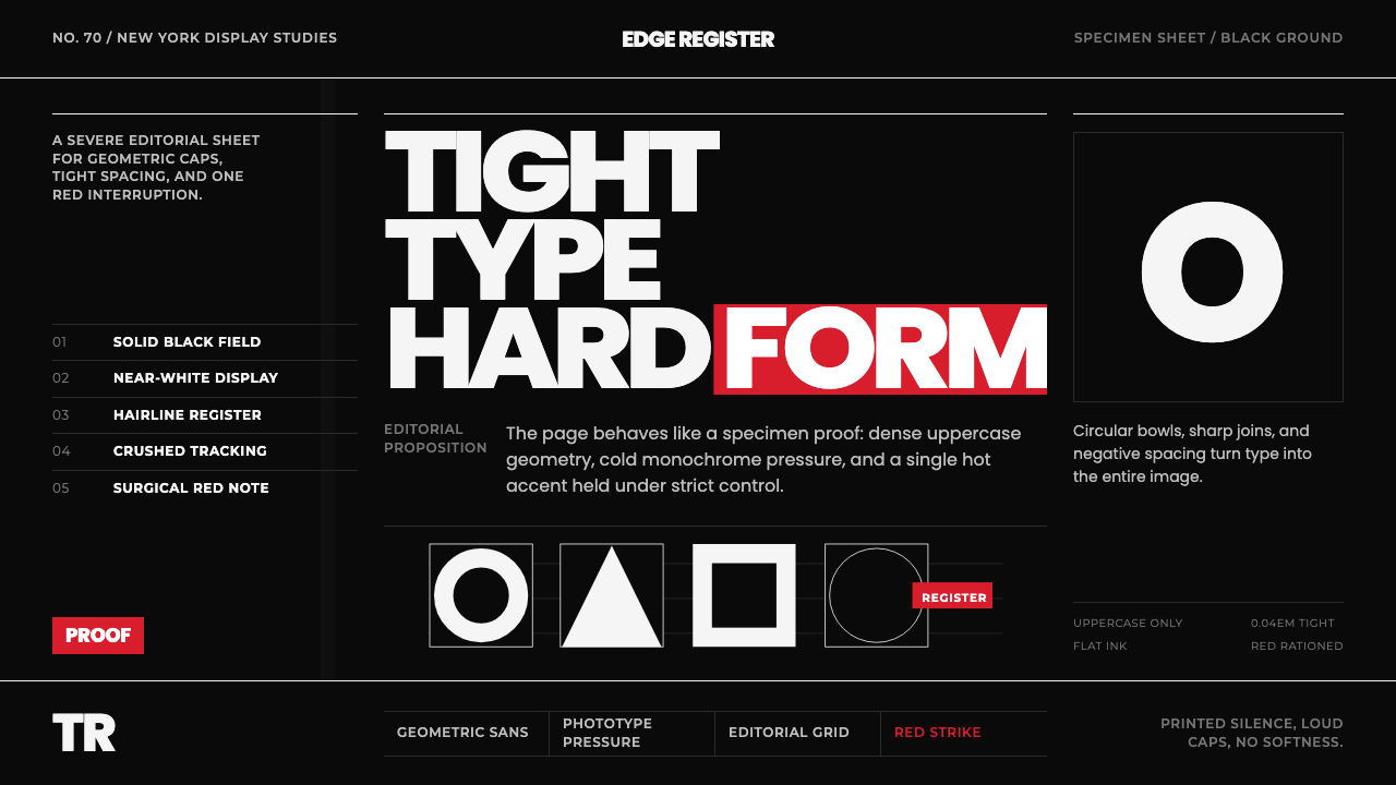
Avant Garde Gothic turns a 1970s magazine masthead into a full visual system: oversized geometric capitals locked edge to edge on black, with exactly one red mark allowed to break the silence.
Avant Garde Gothic in brief
Avant Garde Gothic is a stark, all-capitals editorial style drawn from the masthead of Ralph Ginzburg and Herb Lubalin's short-lived magazine Avant Garde and the ITC typeface that grew out of it. Every letter is a geometric capital — circles, straight verticals, and hard diagonals with almost no variation in stroke weight — set so tightly that adjacent letters often appear to touch or overlap. The page itself behaves like a type specimen sheet: a disciplined grid of letters, near-white against a solid black ground, with a single hot red used only where it counts.
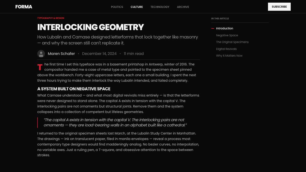
What separates this from an ordinary geometric sans is its ligature system. Because tight, uniform tracking creates awkward gaps wherever two diagonal strokes meet — a capital A next to a capital V, a T crashing into an A — the typeface includes a second set of interlocking alternate characters designed specifically to close those gaps into single continuous shapes. The result reads less like a sentence built from separate letters and more like a machine-cut plate: forms fuse, corners lock, and the whole line behaves as one rigid object rather than a string of glyphs.
The mood is clinical and confident rather than warm. There is no hand-lettering quality, no organic variation, and no ornament beyond the ligatures themselves — the ligatures are functional, not decorative. Against that severity, the red accent operates like a single spoken word in an otherwise silent room: it appears once, maybe twice, on a rule, a small mark, or a single word of emphasis, and never spreads across a composition. The overall effect sits somewhere between a corporate identity manual and an art-magazine cover — instructional in its precision, but unmistakably a design statement.
Where does Avant Garde Gothic come from?
The style begins with Herb Lubalin, one of the most influential American graphic designers and typographers of the twentieth century, celebrated for logotypes and headline treatments in which letters were kerned so tightly that they began to interact — overlapping, sharing strokes, forming small pictures out of pure typography. In 1968 Lubalin partnered with the editor and publisher Ralph Ginzburg, a controversial figure already known for the erotica-adjacent quarterly Eros and the political magazine Fact, both of which had drawn lawsuits and, in Ginzburg's case, a prison sentence for mailing obscene material. Their new venture, Avant Garde, was conceived as a large-format cultural and political magazine for a countercultural, anti-establishment readership.
Lubalin designed the magazine's masthead himself, working with the lettering artist Tom Carnase, who executed and refined Lubalin's rough sketches into finished letterforms. The masthead logotype packed the words 'Avant Garde' into tight geometric capitals with several letters fused into single interlocking shapes — a treatment striking enough that readers and other designers began asking where they could buy the alphabet as a usable typeface, not just a one-off logo.
Avant Garde the magazine folded after roughly fourteen issues between 1968 and 1971, undone by financial pressure and the fallout from Ginzburg's legal troubles. But the typeface outlived it. In 1970, Lubalin and Carnase formalized the masthead letters into a full alphabet and released it through the International Typeface Corporation, or ITC — a licensing foundry Lubalin had just co-founded with Aaron Burns and Ed Rondthaler specifically to give type designers royalties and legal protection in an era when phototypesetting made it trivially easy to copy a typeface without paying its creator anything.
ITC Avant Garde Gothic became one of the young foundry's flagship releases, promoted through the kind of oversized specimen broadsides and trade-magazine spreads that ITC and Lubalin's own publication, U&lc (Upper and lower case), used to sell new typefaces to the design trade. The interlocking ligatures that had made the original masthead so distinctive were expanded into dozens of alternate characters, giving working designers a real toolkit for reproducing that seamless, plate-cut look at any scale — and cementing a typeface born from a controversial, short-lived magazine into one of the most recognizable geometric sans faces of the phototype era.
What defines the Avant Garde Gothic look?
Color
The palette is reduced to three roles: a near-black ground, near-white display type, and a single hot red held in reserve. Red never functions as a second body color — it marks one word, one rule, one small object, and stops. The restraint is the point: a system with only one accent color forces every use of that color to be a deliberate act of emphasis rather than decoration.
Typography
All-capitals geometric letterforms carry the entire system — there is effectively no lower case in the display vocabulary, and body copy plays a strictly secondary, quiet role beneath it. Letters are built from true circles and hard verticals rather than the humanist curves of a text face, giving every headline the flat, stamped quality of a specimen plate rather than the warmth of handset type.
Ligatures and Alternates
Where two diagonal or curved strokes would collide at extreme tight tracking, purpose-built ligature characters fuse them into one continuous shape instead of leaving an awkward gap or an accidental overlap. These are not decorative flourishes — they exist to solve a specific structural problem, and their presence is what separates an authentic execution of this style from a generic tightly-tracked sans.
Tracking and Grid
Letters and words sit on a tight, disciplined grid with tracking pushed to the point of near-collision. This is not a casual choice — it is the organizing logic of the whole system, treating a headline the way a printer treats a set plate: fixed, dense, and engineered to fill its allotted space with no loose ends.
Contrast
The system depends on maximum tonal contrast — near-black against near-white — rather than a mid-tone palette. This is what allows the type to read instantly at a glance, the same way a magazine masthead has to register on a newsstand from several feet away. Softening the contrast breaks the effect entirely.
Composition
Pages are organized like specimen sheets rather than narrative layouts: a grid of type samples, rules, and labeled blocks, each element given its own cell of space. There is little interest in flowing, organic composition — the appeal is in the orderly display of the alphabet itself as the subject of the page.
Restraint as Ornament
Because the letterforms and ligatures already carry the entire visual interest of the system, nothing else is permitted to compete — no textures, no secondary illustration, no decorative borders. The single red accent and the fused ligatures are the only 'ornament' the style allows, and both are functional rather than applied.
Who shaped Avant Garde Gothic?
Lubalin designed the original Avant Garde magazine masthead and, with Tom Carnase, formalized it into the ITC typeface in 1970. Renowned for logotypes and headlines built from extremely tight, interactive kerning, he co-founded the International Typeface Corporation the same year specifically to give type designers royalties in the piracy-prone phototypesetting era, and he edited the trade publication U&lc, which became a showcase for this and other ITC releases.
Carnase was the lettering artist who translated Lubalin's rough sketches into finished, production-ready letterforms, first for the magazine masthead and then for the full ITC alphabet. His precise hand-drawn execution — especially the interlocking ligature characters — is what made the typeface reproducible and usable by other designers rather than remaining a one-off logo.
Ginzburg was the editor and publisher who co-founded Avant Garde magazine with Lubalin in 1968. His reputation as a provocateur, built on earlier controversial titles, shaped the magazine's confrontational, countercultural editorial identity — the same defiant spirit that the masthead's severe, uncompromising type design was built to visually announce.
Founded in 1970 by Lubalin with Aaron Burns and Ed Rondthaler, ITC licensed and promoted new typefaces — including Avant Garde Gothic — at a moment when phototypesetting made unlicensed copying rampant. ITC's oversized specimen broadsides and trade advertising were central to how this style, and geometric sans display type generally, spread through the design profession of the 1970s.
How do you use Avant Garde Gothic today?
Avant Garde Gothic reads as an instruction, not a suggestion, which makes it a strong choice wherever a message needs to feel absolute rather than approachable. It works best as a display treatment layered over restraint elsewhere in the composition — the type is the event, and everything around it should behave like negative space built to support it.
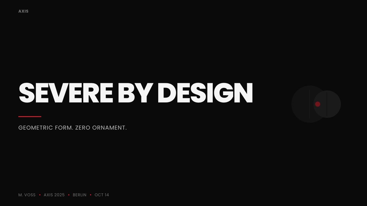
In presentation slides, the style is naturally suited to cover pages: a black ground, one or two words in tight geometric capitals filling most of the frame, and a single red rule or mark placed with precision rather than decoration. Content slides should keep the same discipline — one geometric headline per slide, body copy set quietly and small beneath it, and no more than the single accent color used anywhere on the page. Data slides work well as stark, high-contrast charts: white or red bars on black, labeled in the same all-caps type, avoiding any soft gradient fills that would undercut the flat, plate-cut feel.
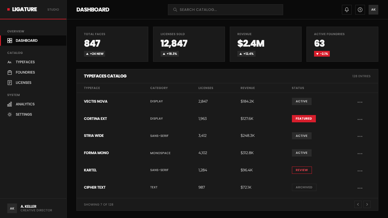
For web interfaces, the style suits dashboards and pricing pages that want to project authority and precision rather than friendliness. Headings and section labels should be set in tight, all-capitals type against a dark ground; body text should drop into a quieter, more conventional face so the display type keeps its exclusivity. The single red accent is best reserved for one interactive signal — a primary action, an alert state, a single highlighted price tier — never spread across multiple UI elements at once.
In editorial and marketing contexts, the style performs like a poster even at magazine-page or landing-page scale: a dominant black field, an oversized geometric headline doing most of the communicative work, and a tight column of body copy treated as secondary material. Marketing pages benefit from full-bleed black sections with the geometric headline as the sole hero element, reserving red exclusively for the call to action so it cannot be missed.
The most common mistake is treating the red as a general accent color rather than a rationed one — spreading it across icons, links, buttons, and backgrounds until it loses its impact. A second common error is softening the tight tracking into comfortable, readable spacing; the near-collision of letterforms is not a flaw to be corrected but the entire mechanism that gives the style its plate-cut authority. Loosen the tracking and the system stops reading as Avant Garde Gothic at all.
Avant Garde Gothic — FAQ
Is Avant Garde Gothic the same as Futura or other geometric sans faces?
They share a family resemblance — both build letters from near-perfect circles and straight lines — but they come from different eras and serve different purposes. Futura was a 1920s German type designed for continuous reading at moderate sizes. Avant Garde Gothic was built four decades later specifically as a display face for extremely tight tracking, and its defining feature — the interlocking ligature system that fuses colliding letterforms — has no equivalent in Futura. Treat the two as cousins with very different jobs, not interchangeable choices.
Why is the tracking pushed so tight that letters nearly touch?
The tight tracking is the entire mechanism of the style, not an incidental choice. It originated from the need for a magazine masthead to feel dense and unmissable at newsstand distance, and it is precisely what necessitated the ligature system in the first place — without those extra-tight gaps, there would have been no awkward collisions to solve, and no reason for the interlocking alternates to exist. Loosening the tracking to conventional, comfortable spacing removes the very tension that makes the style recognizable.
What is the practical purpose of the ligature and alternate characters?
At extreme tight tracking, certain letter pairs — a capital A next to a V or W, a T crashing into an A — would either leave an awkward triangular gap or overlap in an ugly, accidental way. The ligature and alternate characters were purpose-drawn to replace those problem pairs with a single fused shape that looks intentional rather than broken. They are a structural fix drawn by a letterer, not a decorative flourish, and their presence is the clearest sign of an authentic execution of the style.
Can this style work with a light background instead of black?
A light-ground version is possible but changes the character significantly. The style's severity depends on maximum contrast and on the type reading as near-white ink stamped into a dark field — an association carried over directly from the magazine's own newsstand masthead. Inverting it to dark type on a pale ground can still work for print-adjacent or editorial contexts, but the red accent will need to shift toward a deeper, more grounded register to avoid feeling decorative rather than surgical, and the overall effect will read closer to a conventional type specimen than to the original magazine identity.
What kinds of products or brands does this style suit, and where does it struggle?
It suits brands that want to project confidence, precision, and a slightly confrontational edge — publishing platforms, design and typography tools, portfolio sites, and any product that benefits from feeling authoritative rather than friendly. It struggles in contexts that need warmth, approachability, or a sense of human touch — wellness products, community platforms, anything aimed at first-time or anxious users — because the tight, high-contrast severity can read as cold or intimidating rather than confident. It also loses most of its impact at very small sizes, where the tight tracking that defines it becomes illegible rather than striking.
Related design styles
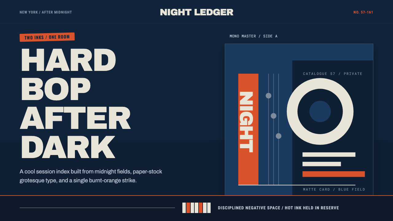 Blue Note JazzCool intelligence, printed flat. Midnight blue, paper type, and one burnt-ora…
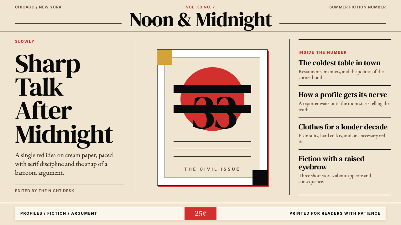 Esquire MagazineConceptual punch on paper. Cream stock, black hairlines, and one saturated re…
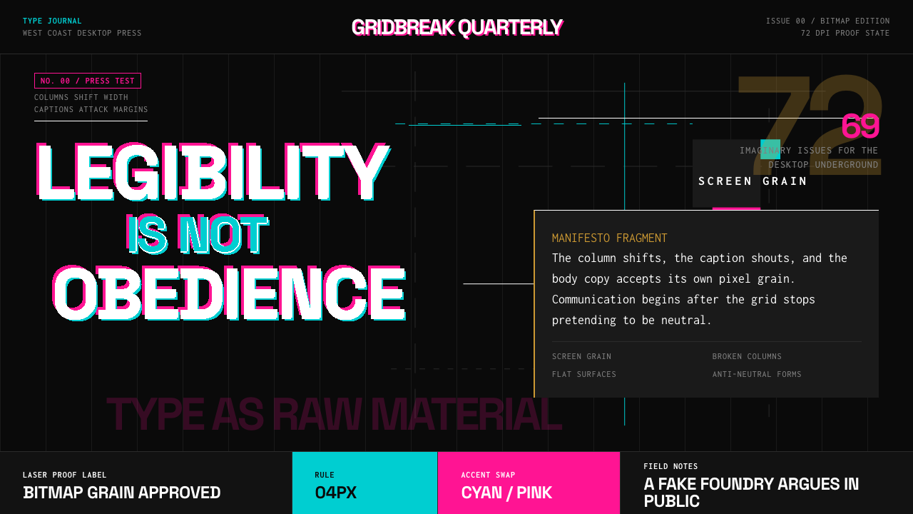 Emigre Magazine (1984–2005)Defies the tidy grid. Cyan, ochre, and hot-pink bitmap type collides on black.
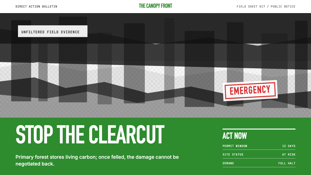 Greenpeace (Activist Poster)Protest without softness. Forest-green caps over monochrome newsprint, one de…
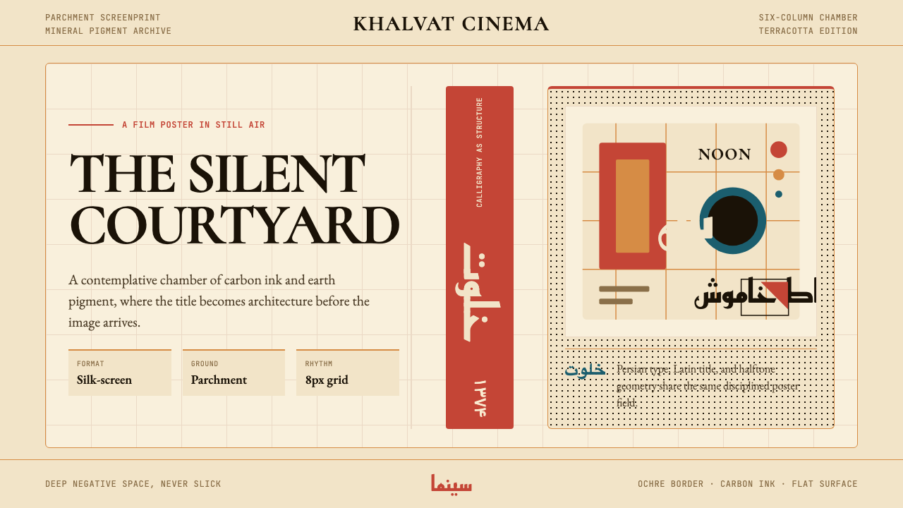 Iranian Modernist Cinema PosterStillness becomes monumental. Terracotta Kufi type breathes inside a Swiss pa…
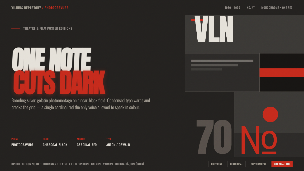 Lithuanian Poster ArtMonochrome plus one red. Charcoal photogravure field, warped Anton type, a lo…