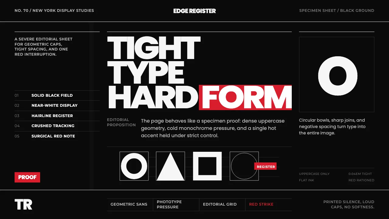
About Avant Garde Gothic
Avant Garde Gothic is the stark black-and-white display environment of Herb Lubalin's Avant Garde magazine (1968–71) and the ITC specimen pages — an upper-case geometric sans born from a magazine masthead, carrying interlocking ligatures and tight alternates.
This system distills that severe editorial voice: oversized geometric caps set impossibly tight on a solid black ground, near-white display type, and a single hot-red accent used with surgical restraint. The page is the specimen sheet.
- Origin
- North America (New York City)
- Era
- 1950–1990 (typeface 1970; Avant Garde magazine 1968–71)
- Key figures
- Herb Lubalin · Tom Carnase · ITC
- Movements
- 1970s typographic experimentation · Magazine / editorial display design · Phototypesetting geometric sans
Avant Garde Gothic design spec
Colors
Background
Surface
Primary
Secondary
Accent
Text
Typography
TeX Gyre AdventorHeadings
PoppinsBody
MontserratMono
Unlock for 1 credit
The other 11 sections — buttons, cards, spacing, motion, techniques and more — open once you unlock. Download the DESIGN.md or send it to your AI in one click. Unlock once, yours forever.
Sign up nowHave an account? Sign in
Styles similar to Avant Garde Gothic
Also inspired by print & type, with a close feel.
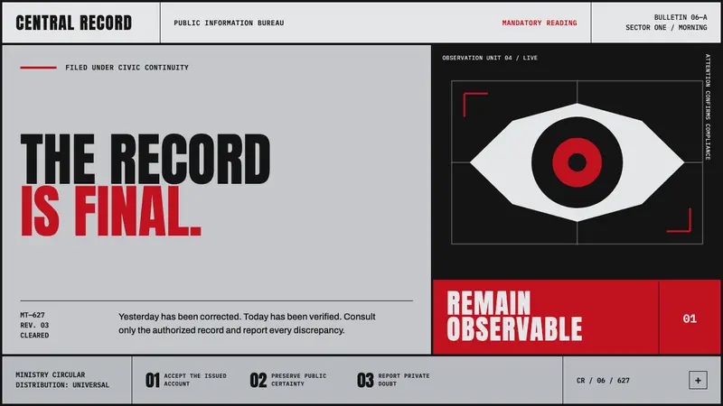 Orwell 1984 (Ministry Propaganda)Authority never blinks. Monumental black type and rationed red ink command a cold gray grid.
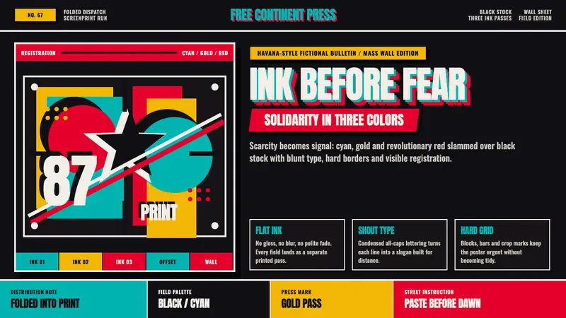 OSPAAAL TricontinentalUrgency from scarcity. Cyan, gold and red slam over black in blunt silkscreen blocks.
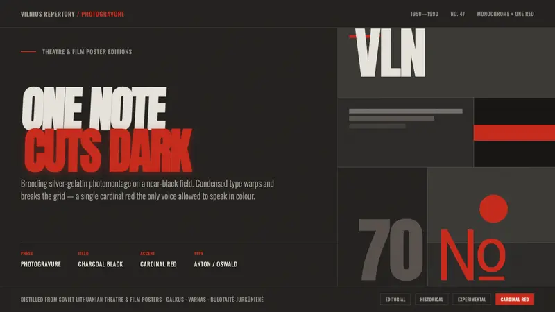 Lithuanian Poster ArtMonochrome plus one red. Charcoal photogravure field, warped Anton type, a lone red cuts the dark.
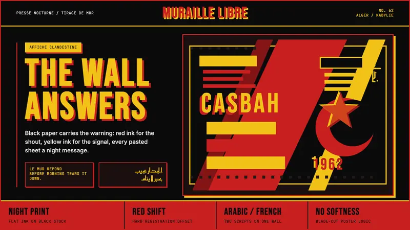 Algerian Casbah Poster (1954–1962)Every surface is a manifesto. Blood red, warning yellow, and stencil type hit black newsprint.