What is Robert Frank — The Americans?
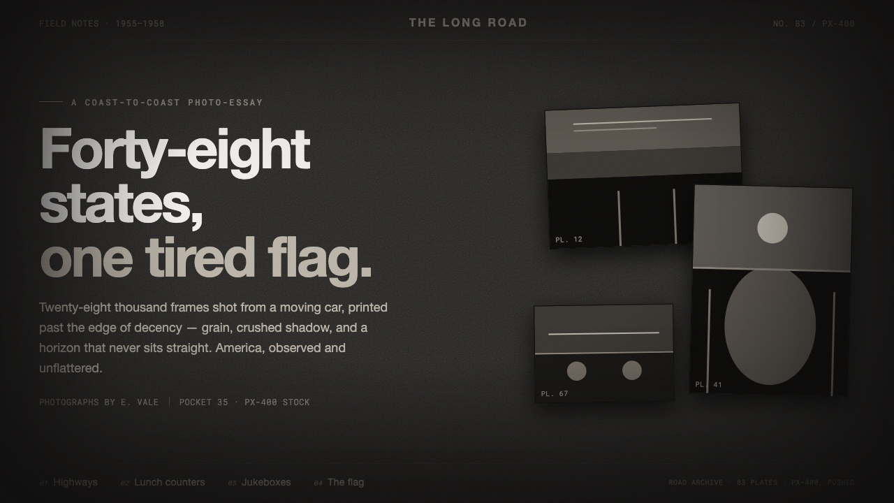
Robert Frank stripped documentary photography of its polish — warm soot, crushed shadow, grain, and a crooked frame turning everyday America into something raw and estranged.
Robert Frank — The Americans in brief
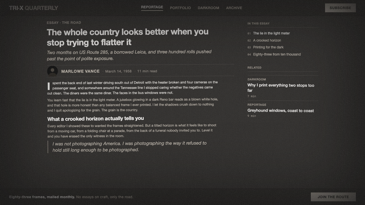
Robert Frank’s 1958 photobook The Americans is a landmark of postwar documentary photography: grainy, high-contrast street images of the United States made on a Leica with Tri-X film. Its America is not polished, heroic, or ceremonially composed. It is smoky, interrupted, tilted, and emotionally distant — a country glimpsed through windows, crowds, signs, uniforms, cars, and passing bodies.
This design system translates that photographic attitude into an interface language. The field is dark charcoal sliding toward near-black, with a faint warm sooty cast rather than a clean neutral black. Film grain sits over the surface. Shadows are deliberately crushed. Captions use plain grotesque lettering, treated as evidence labels rather than elegant editorial display. The result is reportage with the finish removed.
The system depends on controlled imperfection. Frames may feel slightly crooked, images may be cropped without ceremony, and motion may remain blurred instead of being corrected into clarity. Contrast is decisive rather than balanced: bright areas register as exposed fragments, while dark areas become dense blocks of atmosphere. Nothing should feel glossy, weightless, or digitally pristine.
Where does Robert Frank — The Americans come from?
The Americans belongs to the period from the postwar years through the broader late twentieth-century documentary tradition, with the book published in 1958 and 1959. Its geographic subject is North America, specifically the United States as observed by Robert Frank, a Swiss-born photographer. The work sits at the meeting point of postwar documentary photography, the street tradition, and the Beat era.
Frank’s method is central to the style. He used a Leica and 35mm Tri-X film to move through public life with the speed and discretion of a street photographer. The camera does not impose a polished studio order on its subjects. Instead, it catches fragments: people caught between gestures, vehicles cutting through a view, architecture becoming a barrier, and ordinary scenes acquiring an unexpected emotional charge.
The book’s visual force comes from its refusal of conventional tonal beauty. Frank printed with deliberately extreme contrast, allowing smoky shadows to collapse toward near-black and accepting grain, blur, and uneven visual information as part of the image. The point was not to preserve a “good” tonal range, but to communicate a raw and alienated documentary truth. Imperfection therefore becomes evidence of proximity to life.
The design system extracts this logic rather than reproducing individual photographs. Warm charcoal, compressed darkness, grain, crooked framing, and blunt captions become a vocabulary for screens, pages, and presentation surfaces. The historical reference remains visible in the mood and structure: an observer moving through a society, recording what is present without adding polish that the scene itself does not possess.
What defines the Robert Frank — The Americans look?
Sooty Tonal Field
The base is a warm charcoal-to-black field, never a pristine digital black. Its faint brown or smoky cast gives the darkness a material, photographic presence. Light surfaces should feel exposed against it, not softly illuminated.
Crushed Contrast
Dark values gather into dense masses while highlights appear as abrupt fragments. The system does not seek a complete range of intermediate tones. Strong contrast creates emotional pressure and makes every visible detail feel selected.
Film Grain
Grain is a persistent surface texture rather than a decorative filter. It breaks digital smoothness, gives flat fields tactile noise, and reminds the viewer that the image has passed through a physical recording process.
Crooked Framing
Alignment is allowed to lean. Image blocks, captions, and rules can sit slightly off-axis, producing the sense of a hurried observation rather than a measured studio composition. The irregularity should feel intentional and restrained.
Blurred Motion
Movement is permitted to smear at the edges. Blurred figures, passing lights, and incomplete gestures preserve the temporal character of street photography. Clarity is not automatically treated as accuracy.
Plain Grotesque Captions
Typography is blunt, functional, and unembellished. Plain grotesque captions behave like field notes or archive labels, creating a verbal counterweight to the images’ ambiguity. Hierarchy comes from scale, spacing, and placement rather than typographic ornament.
Who shaped Robert Frank — The Americans?
Frank is the defining author of The Americans and the source of its visual attitude. A Swiss-born photographer documenting the United States, he used a Leica and Tri-X film to observe postwar public life through grain, extreme contrast, crooked framing, and blurred motion. His refusal of polished tonal beauty gives the design system its central ethic: reportage should retain the pressure and incompleteness of experience.
Kerouac represents the Beat-era literary context attached to the project. His presence places The Americans within a wider atmosphere of movement, estrangement, and direct encounter with contemporary life. In design terms, that context supports captions and editorial framing that feel immediate and observational rather than institutional or polished.
The movement is a key figure in the system’s intellectual lineage. It supplies the commitment to public life, observed detail, and unvarnished evidence. The design borrows its discipline of attention: what matters is not visual prettiness, but whether the frame makes the surrounding reality feel present.
How do you use Robert Frank — The Americans today?
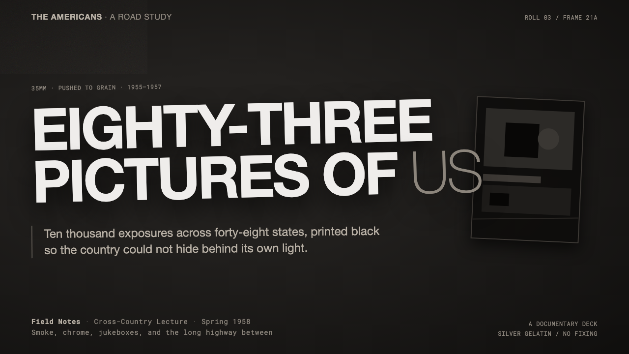
For presentation slides, use the system most strongly on the cover and opening divider: a nearly black field, a grainy photographic fragment, a slightly tilted crop, and a blunt caption that feels like a field note. Content slides should remain editorial rather than decorative, with image and text allowed to sit in a tense, uneven relationship. Data slides can use dense dark fields and stark light marks, but charts should feel like evidence extracted from a report, not polished dashboard ornaments.
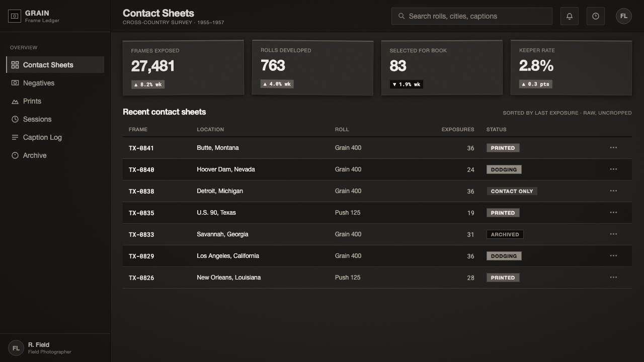
For web interfaces, the style suits investigative dashboards, archives, cultural projects, and pricing pages that want to communicate seriousness and independence. Keep navigation plain and caption-like, use warm charcoal as the dominant ground, and reserve brighter surfaces for moments that need attention. Pricing tiers can be differentiated through cropping, tonal density, and restrained accents rather than glossy cards, gradients, or celebratory effects.
For editorial and marketing work, build pages around the feeling of an annotated contact sheet or field report. Let photographs carry ambiguity, place metadata close to the image, and use rules or captions as documentary devices. Campaign pages can alternate between dense dark image fields and quieter text passages, preserving grain and irregular alignment so the work feels observed rather than staged.
The common mistake is confusing grit with visual chaos. Adding random rotation, excessive noise, illegible type, and indiscriminate blur produces a costume of authenticity rather than Frank’s disciplined observation. Every rough element should support the sense of a recorded encounter; where grain, darkness, or crookedness does not strengthen attention, remove it.
Robert Frank — The Americans — FAQ
Is this style simply a dark photographic theme?
No. Darkness is only the surface condition. The deeper system is built from documentary attention: extreme contrast, accepted imperfection, physical grain, observational captions, and framing that feels encountered rather than staged. A clean dark interface with polished photography may be atmospheric, but it does not carry the same Frank-derived logic.
Why are the shadows allowed to become nearly black?
Because the source material deliberately disregards ideal tonal range. Crushed shadow creates density, uncertainty, and emotional distance, while the remaining highlights feel like fragments pulled from a passing scene. The treatment should be used with intention: darkness is valuable when it carries atmosphere or directs attention, not when it merely hides information.
Can the system use clean, sharp images?
It can, but sharpness should not erase the system’s sense of encounter. A clean image may work when the crop is direct, the contrast remains decisive, and the surrounding typography preserves the field-report tone. If every image is perfectly corrected, evenly lit, and carefully centered, the visual language will drift toward polished editorial design.
Where does this style work best, and where does it struggle?
It works best for documentary, cultural, editorial, archival, investigative, and independent projects whose values include observation and seriousness. It struggles when the product depends on softness, luxury polish, cheerful reassurance, or highly ornamental expression. The style’s alienation is a strength only when the audience understands why distance and roughness belong to the subject.
Related design styles
 Rauschenberg Combine (1955)Street debris becomes syntax. Ink black, torn type, red-blue-yellow scraps co…
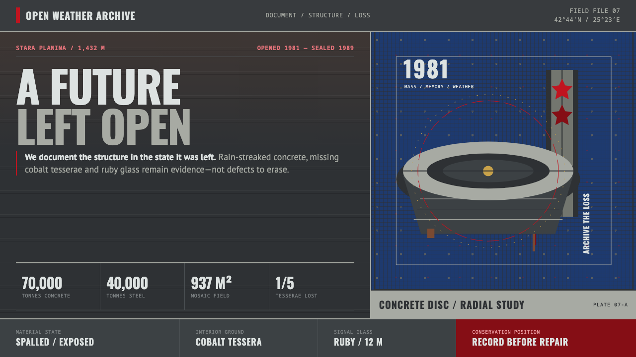 Buzludzha MonumentMonumentality without repair. Stained concrete frames cobalt tesserae, ruby g…
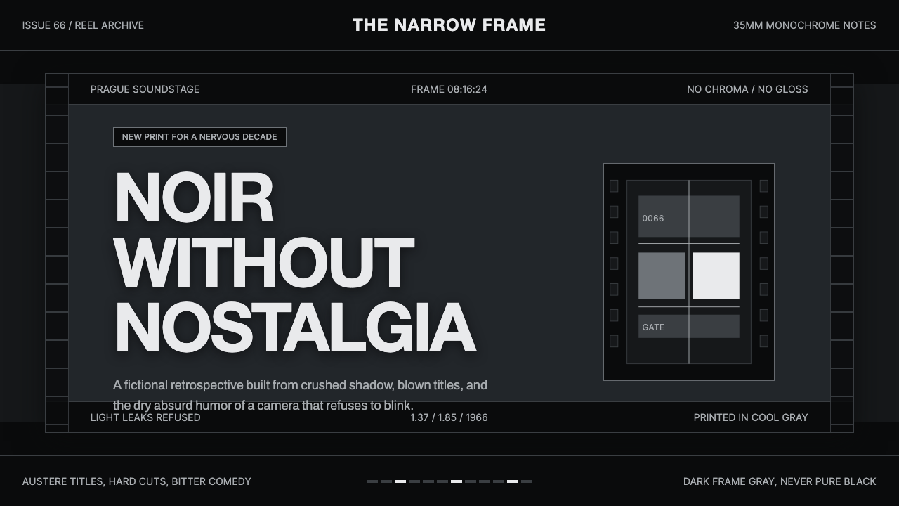 Czechoslovak New Wave CinemaNoir without nostalgia. Letterbox bars, off-white titling, and 35mm grain do…
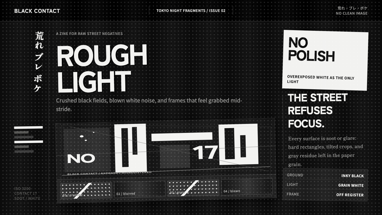 Daido Moriyama Are-Bure-BokeNothing is clean. Inky black, blown white grain, and tilted frames make the i…
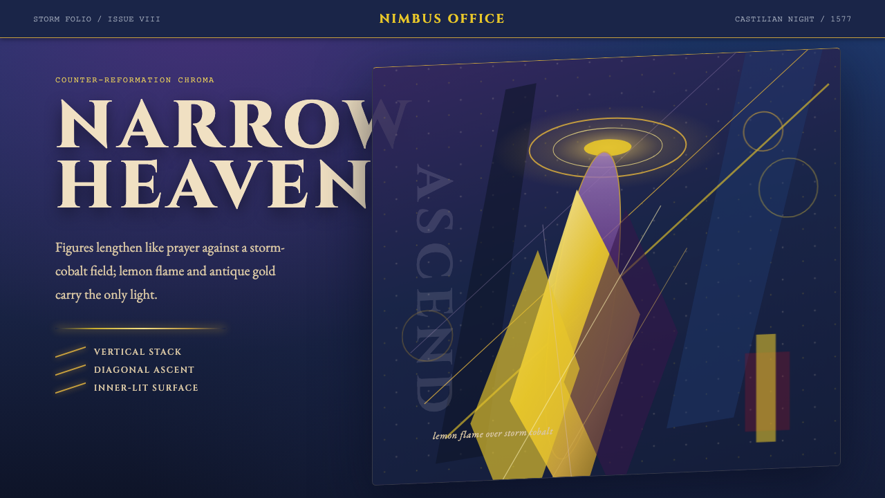 El Greco — Toledo MannerismMysticism strains upward. Storm cobalt, lemon flame, and gold halos pull the…
 Goya — Disasters of WarWitness without ornament. Cream paper, umber line, aquatint shadow, italic ca…