What is Daido Moriyama Are-Bure-Boke?
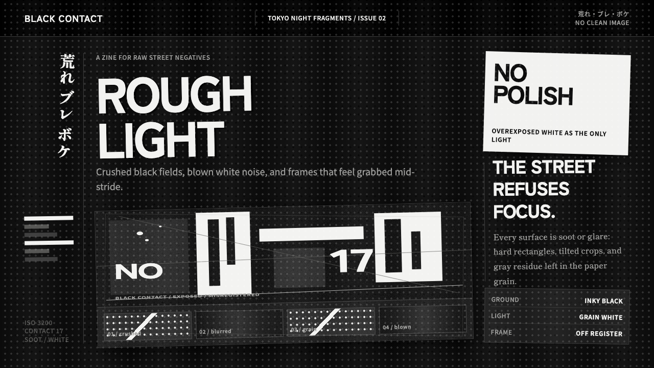
Daido Moriyama’s are-bure-boke turns photographic failure into visual truth — grain, blur, soot-black shadow, and blown light make the city feel immediate, unstable, and alive.
Daido Moriyama Are-Bure-Boke in brief
Daido Moriyama are-bure-boke is a black-and-white visual language rooted in postwar Japanese street photography and closely identified with the Provoke era of late-1960s Tokyo. Its name describes the image as grainy, blurry, and out of focus. Instead of correcting those conditions, the style makes them its subject. Shadows collapse into inky masses, highlights break into abrasive white grain, and recognizable scenes hover at the edge of dissolution.
The aesthetic is anti-clean and anti-pictorial. A street image does not behave like a transparent window onto Shinjuku; it arrives as a physical trace of movement, exposure, printing, and hurried attention. Tilted frames interrupt stable orientation. Motion blur stretches bodies, lights, and vehicles into uncertain forms. Cropping withholds context, while extreme contrast removes the comfortable middle tones that would ordinarily explain depth and detail.
Translated into a design system, are-bure-boke uses near-black space as an active field rather than a neutral background. Grainy white becomes its principal light, photography carries the emotional burden, and typography behaves like a terse annotation or urgent interruption. The result should not resemble a polished monochrome luxury brand. Its darkness is dirty, its brightness is overexposed, and its roughness must feel structurally embedded rather than added as decorative distress.
Where does Daido Moriyama Are-Bure-Boke come from?
The theme spans postwar Japanese street photography from 1950 to 1990, with its decisive concentration in the Provoke era of the late 1960s. Its geographic center is Tokyo, particularly the streets of Shinjuku. That setting matters because the style is inseparable from unstable urban perception: passing figures, artificial light, dense surfaces, sudden encounters, and fragments glimpsed before they can settle into orderly description.
Provoke provides the movement context, while are-bure-boke names the visual condition most strongly associated with it. The image rejects smooth documentary neutrality. Blur records the camera or subject in motion; grain makes the photographic surface impossible to ignore; loss of focus denies the viewer effortless identification. These qualities make seeing feel provisional. The photograph does not claim to master the street but admits that the street exceeds calm observation.
Daido Moriyama’s Shinjuku photography gives the theme its defining intensity. His black-and-white images force shadows toward soot and highlights toward blown, granular white. The tonal middle is compressed, so the scene becomes a collision between darkness and exposure. Tilt, fragmentation, and uncertain focus do not merely dramatize the subject; they communicate a restless way of moving through the city, where perception is bodily, incomplete, and repeatedly interrupted.
The source material places Moriyama alongside Takuma Nakahira, Yutaka Takanashi, and Takahiko Okada as key figures within this historical field. Together, their presence situates the style beyond a personal signature: it belongs to the broader conversation of Provoke, are-bure-boke, and postwar Japanese street photography. Its later design relevance comes from this shared refusal of visual composure. The vocabulary can migrate from photographic prints to screens, but its underlying tension must remain intact.
What defines the Daido Moriyama Are-Bure-Boke look?
Crushed Monochrome
The palette is nearly binary: inky black confronts blown, grainy white, while middle gray survives only in unstable fragments. Black should swallow detail rather than merely darken it, and white should feel exposed rather than pristine. The power comes from tonal collision, not from a broad, elegantly balanced grayscale.
Grain as Surface
Grain is not a nostalgic filter placed above an otherwise polished composition. It is the visible substance of the image, breaking smooth fields into restless matter and making light feel abrasive. It may gather differently across shadows and highlights, but it should always participate in the image rather than float over it as a uniform texture.
Blur and Lost Focus
Blur communicates bodily movement, hurried looking, and the inability to hold the street still. Lost focus loosens the boundary between figure and environment, allowing faces, vehicles, signs, and reflections to become unstable presences. The subject should remain emotionally legible even when it is no longer descriptively complete.
Tilted Fragmentation
Frames lean, crops cut through subjects, and image edges refuse to behave like calm boundaries. A tilted photograph creates directional unease, while partial bodies and interrupted objects imply a world continuing beyond the composition. The goal is not random disorder but sustained instability: every cut should make the viewer feel caught inside an unfinished encounter.
Photography-Led Hierarchy
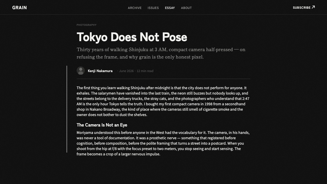
The photograph is the primary structural and emotional element. Type should identify, interrupt, or intensify it without domesticating it. Headlines may be blunt and condensed in feeling, while supporting text remains restrained and highly readable. Excessive typographic variety competes with the image’s noise and turns tension into clutter.
Roughness Without Decoration
Authentic roughness emerges from contrast, reproduction, cropping, blur, and the pressure between elements. Scratches, dust, torn edges, or distressed lettering become false when added merely to announce rebellion. The style is strongest when its damage appears consequential — evidence of looking, movement, and material process — rather than a collection of grunge symbols.
Who shaped Daido Moriyama Are-Bure-Boke?
Moriyama is the defining figure of this theme. His restless black-and-white photographs of Shinjuku turn crushed shadow, blown highlight, grain, blur, and unstable framing into a coherent language. The images do not smooth Tokyo into an orderly record; they preserve the shock of encountering it in fragments. His work supplies both the historical anchor and the practical visual grammar for translating are-bure-boke into contemporary design.
Nakahira is identified among the key figures surrounding Provoke and are-bure-boke. Within this theme, his significance lies in locating rough, uncertain imagery inside a broader photographic movement rather than treating it as an isolated visual trick. His inclusion reinforces the idea that blur, grain, and unstable description formed part of a shared challenge to composed photographic clarity.
Takanashi belongs to the source material’s central group of figures in Provoke-era and postwar Japanese street photography. His place in the theme broadens its frame beyond Moriyama while keeping Tokyo and street perception at the center. For designers, that context is a reminder that the aesthetic concerns ways of encountering an urban environment, not simply techniques for making photographs look damaged.
Okada is named as another key figure in the historical field from which the theme emerges. His inclusion helps establish are-bure-boke as part of a connected photographic conversation spanning Provoke and postwar Japanese street work. In a design interpretation, that collective setting discourages imitation of a single famous image and encourages attention to the underlying principles of instability, fragmentation, and harsh reproduction.
How do you use Daido Moriyama Are-Bure-Boke today?
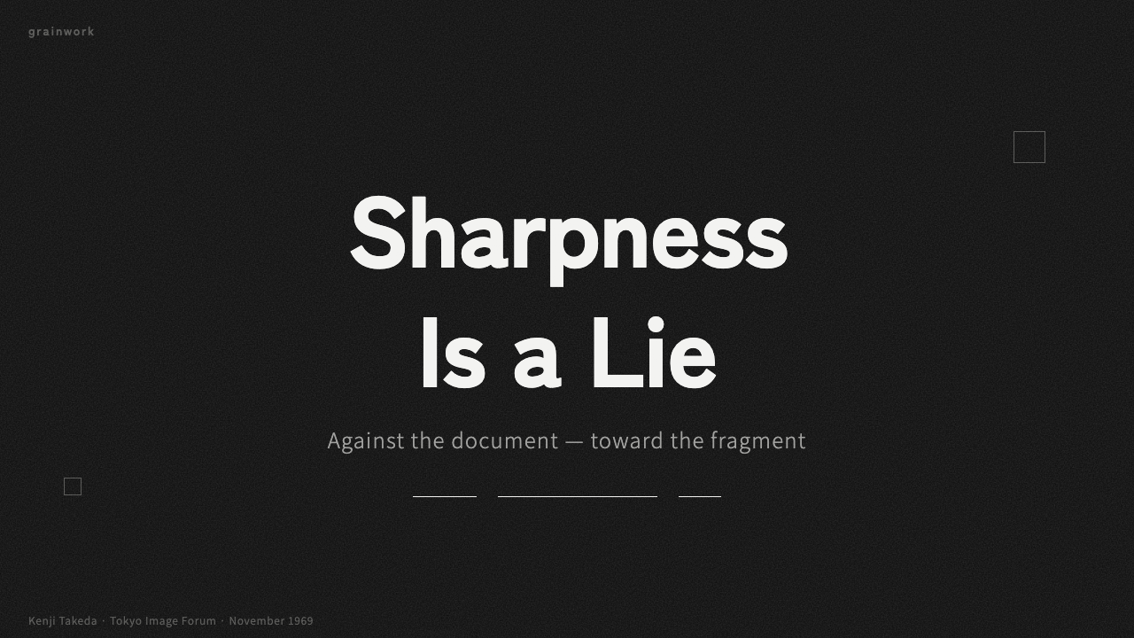
For presentation covers, begin with a single confrontational photograph rather than a collage of equal images. Let it bleed into near-black space, tilt it slightly, or crop it until the subject becomes a charged fragment. Set the title as a blunt interruption in grainy white. A small line of context may sit apart like a caption, but the cover should feel encountered in motion, not carefully centered and ceremonially introduced.
Content slides require more restraint because sustained reading cannot survive continuous visual assault. Keep a stable text zone against darkness, then allow one cropped photograph or blown detail to disturb its edge. Hierarchy should come from clear contrast between headline, annotation, and body copy. On data slides, use stark light-and-dark marks, direct labels, and rough photographic fields sparingly; the information must remain legible even when the surrounding atmosphere feels volatile.
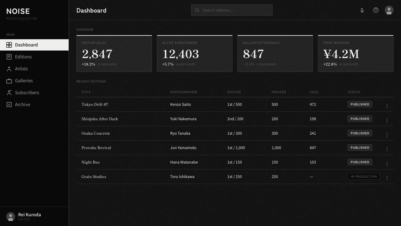
For web dashboards and pricing interfaces, reserve the strongest are-bure-boke gestures for hierarchy and state changes. A dashboard can use black fields, severe white dividers, grainy image headers, and cropped activity imagery, while tables and controls remain disciplined. Pricing pages benefit from confrontational plan names and abrupt tonal blocks, but comparison details need quiet alignment. The style should make decisions feel urgent without making essential actions ambiguous.
Editorial and marketing work can embrace the language more fully. Lead an article with an image that behaves like evidence rather than illustration, then alternate narrow reading passages with full-field photographs, contact-like fragments, or isolated captions. Campaign pages can use motion-blurred streets and tilted crops to produce momentum, while short statements puncture the imagery. Repetition should establish rhythm through recurring darkness, grain, and interruption rather than decorative motifs.
The common mistake is confusing are-bure-boke with generic grunge. Adding uniform noise, distressed lettering, random rotation, and artificial scratches to every surface produces costume rather than conviction. The system needs contrast between agitation and control: photography may be unstable, but navigation must remain understandable; highlights may blow out, but text must remain readable. Roughness earns its place when it expresses perception, movement, or reproduction, not when it merely fills empty space.
Daido Moriyama Are-Bure-Boke — FAQ
Is are-bure-boke simply a set of photographic defects?
No. Grain, blur, and lost focus are the visible means, but the style depends on what they communicate. They make perception feel hurried, partial, bodily, and unable to stabilize the street. If those effects are applied while the composition remains polished and emotionally neutral, they become filters. Are-bure-boke begins when apparent failure changes the viewer’s relationship to the subject.
Does the style require black-and-white photography?
Within the supplied theme, black and white are foundational rather than optional. Near-black ground, blown grainy white, and brutal tonal contrast establish its identity. Introducing color would redirect attention away from the defining collision of shadow, exposure, and photographic surface. A faithful design translation therefore treats monochrome not as a fashionable treatment but as the medium through which the style thinks.
How is this different from a polished dark-mode aesthetic?
A polished dark interface usually seeks smooth depth, controlled highlights, clean surfaces, and a calm premium atmosphere. Are-bure-boke does the opposite: black consumes information, white feels overexposed, imagery tilts or breaks, and grain makes the surface insistently visible. The darkness is not a neutral stage for luminous components; it is an active pressure that destabilizes everything placed within it.
Can are-bure-boke support readable interfaces?
Yes, if instability is concentrated rather than universal. Photography, transitions between sections, campaign statements, and selected headers can carry blur, tilt, grain, and blown contrast. Navigation, body copy, form labels, data, and purchasing details should retain firm alignment and clear separation. The productive tension comes from orderly information confronting disorderly imagery; making every element unstable removes both usability and drama.
Where does the style struggle?
It struggles wherever reassurance, visual softness, or effortless comparison is the dominant need. Dense administrative tools, long reference texts, and delicate transactional flows cannot sustain constant blur and fragmentation. It may also overwhelm imagery that depends on accurate tonal detail. In such contexts, use are-bure-boke as an editorial frame or campaign layer, while allowing the functional core to adopt a quieter monochrome discipline.
Related design styles
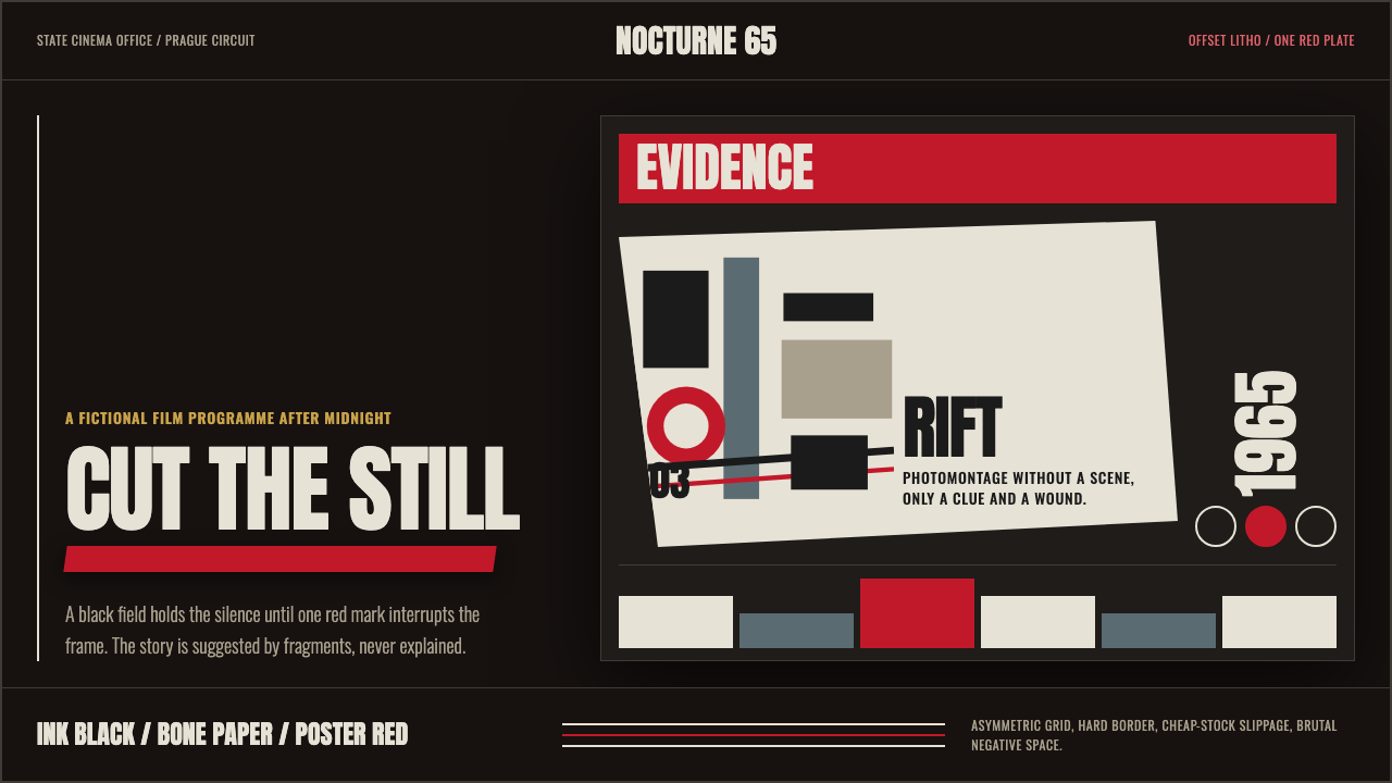 Czech New Wave PosterConcept before spectacle. Ink black, bone type and one poster-red incision fr…
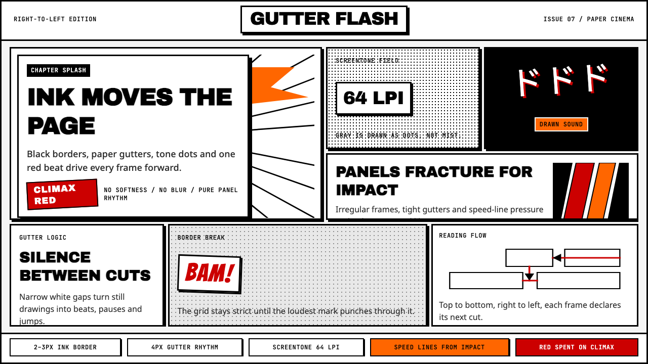 Manga Panel LayoutCinema in ink. Black panels, screentone dots, speed lines, and one red strike.
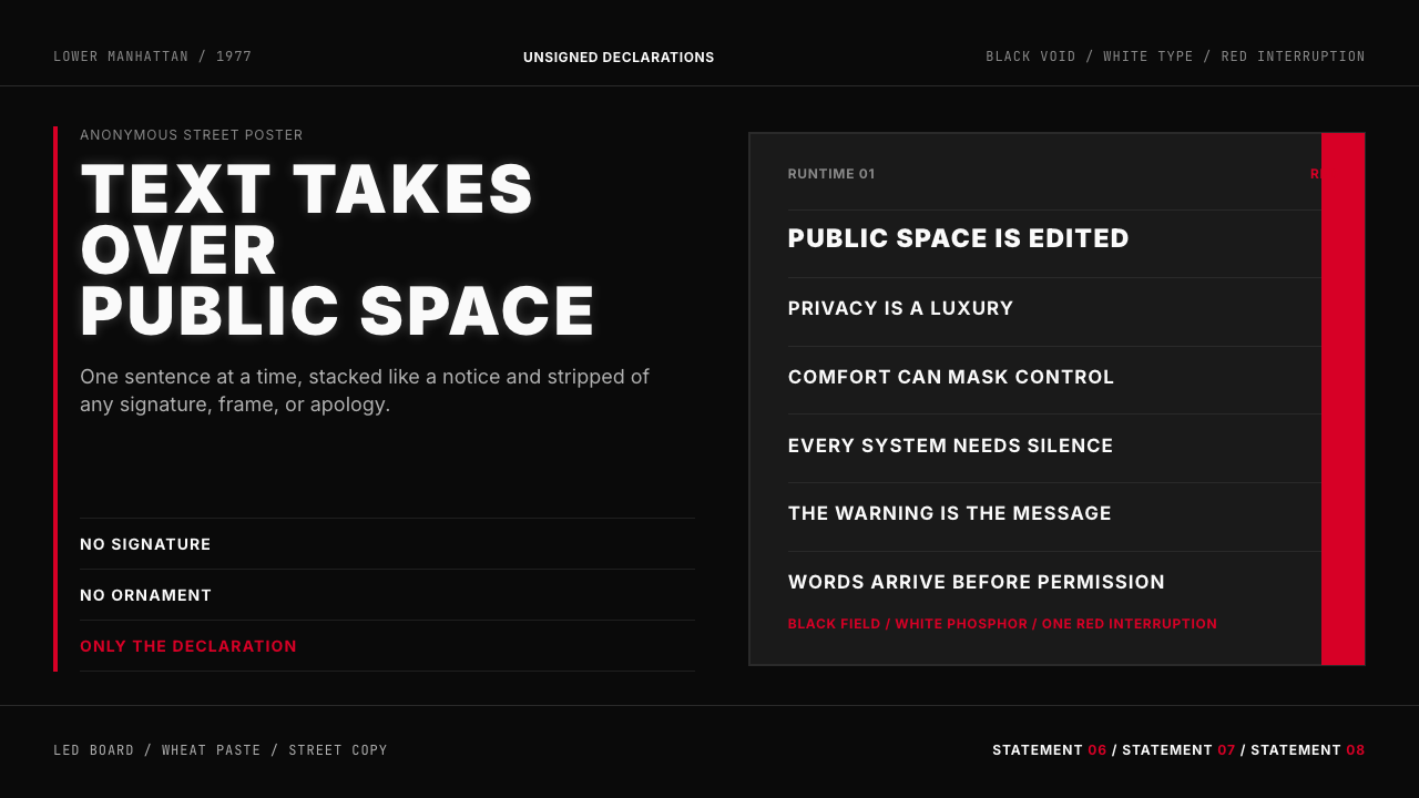 Jenny Holzer Truisms (1977)Austere declarations. White all-caps on black, cut by a single red warning.
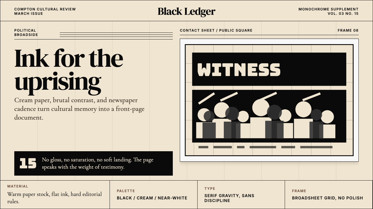 Kendrick — To Pimp a ButterflyPolitical weight, printed cold. Cream paper, hard serif type, monochrome crow…
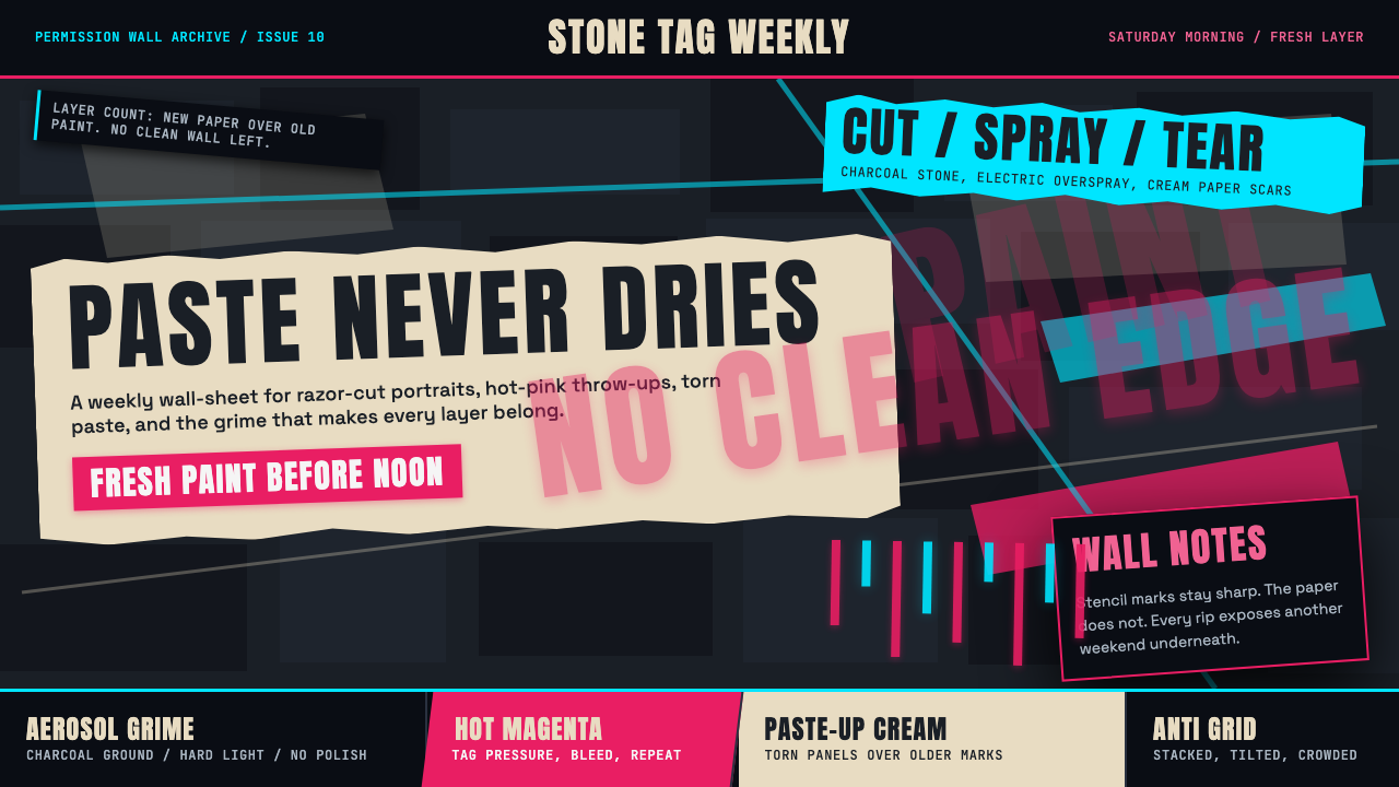 Melbourne Laneway Stencil (Hosier Lane)Permission-wall maximalism. Magenta tags slash charcoal bluestone and cream p…
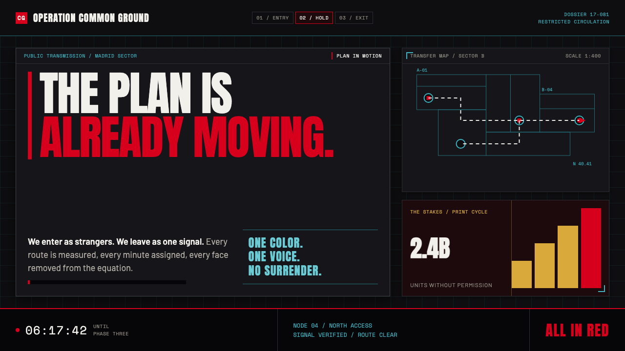 Money Heist (La Casa de Papel)Resistance becomes spectacle. Arterial red cuts through graphite grids and ta…