What is Money Heist (La Casa de Papel)?
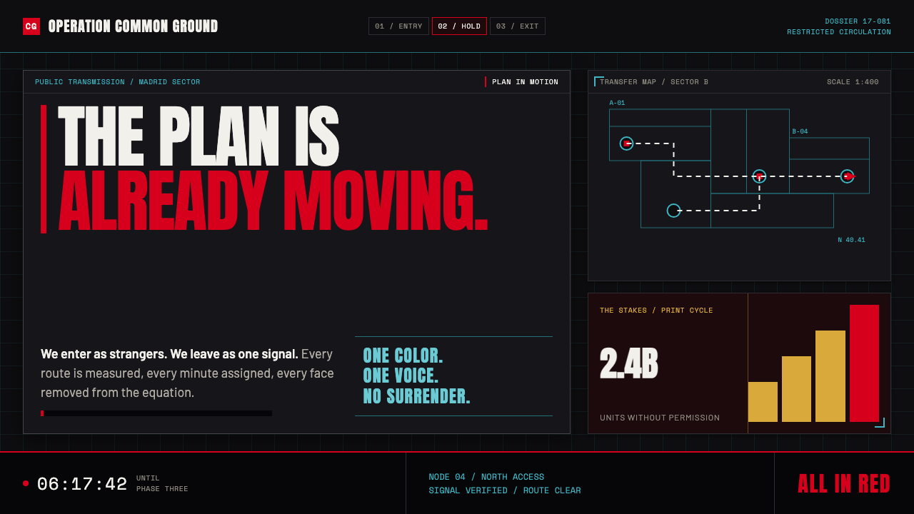
Money Heist turns a robbery into resistance theater: arterial red, erased faces, and a white blueprint pressed against darkness.
Money Heist (La Casa de Papel) in brief
Money Heist, also known as La Casa de Papel, builds its visual identity around a deliberately public contradiction: a covert operation presented with the force of a protest poster. Red jumpsuits make the group impossible to ignore, while Dalí masks remove individual identity. The image is both theatrical and tactical, asking the viewer to read the heist as a collective gesture rather than a private crime.
The palette is governed by maximum contrast. Arterial red breaks through the graphite darkness of the Royal Mint interior, while white schematic marks describe routes, plans, transfers, and points of pressure. Darkness is not used for mystery alone; it becomes the wall on which the operation is made legible.
This is resistance graphics translated into a heist-thriller language. Stenciled marks, urgent arrows, floorplans, timelines, and the persistent suggestion of a countdown make every scene feel like a briefing board under pressure. The system is loud, declarative, and graphic: the plan is visible, the faces are hidden, and red is the shared uniform.
Where does Money Heist (La Casa de Papel) come from?
The visual world belongs to Money Heist’s original 2017 Antena 3 broadcast and its later Netflix global run from 2017 to 2021. Its setting in Madrid, Spain matters because the style is not framed as polished international luxury. It is urban, confrontational, and staged around public institutions, especially the dark interior of the Royal Mint.
Its listed movements explain the collision at the center of the look. Spanish TV noir contributes graphite darkness, pressure, concealment, and a sense of enclosed danger. Heist-thriller conventions contribute plans, routes, transfer arrows, deadlines, and the graphic pleasure of watching a complicated operation become visible.
Protest and resistance iconography gives those tactical devices their emotional charge. The red uniform functions like a shared banner, while repeated masks turn separate people into a single symbolic body. The style does not quietly imply dissent; it makes dissent legible at a distance, with the visual force of a stencil, placard, or public wall.
Dalí surrealism enters through the melting-mustache mask and through the broader tension between the familiar and the unsettling. A face should identify a person, yet here the face becomes a repeated emblem. That inversion lets the series combine noir concealment, tactical planning, and theatrical defiance without reducing any of them to simple decoration.
What defines the Money Heist (La Casa de Papel) look?
Arterial Red
Red is the primary signal, carried by jumpsuits and used as an immediate interruption within dark space. It reads less like a decorative accent than a public declaration: visible, collective, and impossible to neutralize. The strongest applications let red concentrate around identity, urgency, or action rather than spreading it evenly across every surface.
Graphite Darkness
The dark ground has the density of a noir interior and the practical role of a briefing-room wall. It holds white diagrams, red clothing, and masked faces in high relief. This darkness should feel architectural and enclosed, not atmospheric or dreamy; it is a surface for strategy, not a backdrop for softness.
White Schematics
Floorplans, route marks, timelines, transfer arrows, and operational diagrams are treated as the core graphic vocabulary. White linework cuts through the dark field with the clarity of a plan pinned to a wall. It should explain movement and pressure, not merely decorate a composition with technical-looking detail.
Masked Collectivity
The Dalí mask erases the ordinary social function of the face. Repetition matters: the mask transforms a group of distinct people into a shared image of defiance. In design terms, faces become emblems, and identity is communicated through silhouette, costume, posture, and collective placement rather than personal expression.
Tactical Typography
Type should feel directive, compressed, and operational rather than literary or ornamental. Labels, alerts, route names, and fragments of instruction work best when they resemble information issued under pressure. The hierarchy comes from contrast, alignment, and interruption, making language behave like part of the operation.
Countdown Pressure
The visual system implies that time is always narrowing. Timelines, sequential arrows, dense annotations, and partial plans create forward pull even when no literal clock is shown. A composition should feel as though the next decision is already due, with information arranged as evidence of an operation in motion.
Who shaped Money Heist (La Casa de Papel)?
Álex Pina is identified in the supplied source material as a key figure connected to Money Heist. Within this style reading, the name belongs to the project’s larger authorship: a world where a bank robbery is organized as public spectacle, tactical plan, and declaration of resistance.
Jesús Colmenar appears among the source material’s key figures. The visual system associated with the series depends on a tightly staged relationship between dark institutional space, red uniform, white planning marks, and the mounting pressure of an operation made visible.
Cecilia Krull is named as a key figure in the provided record. Her inclusion belongs to a project identity that is intentionally performative: resistance is not kept private, but presented through repeated symbols, urgent contrast, and a theatrical sense of collective presence.
Salvador Dalí is the explicit surrealist reference in the source material. The melting-mustache mask gives the visual language its most memorable contradiction: a recognizable face that refuses recognition. It makes anonymity theatrical and turns concealment into a public icon.
How do you use Money Heist (La Casa de Papel) today?
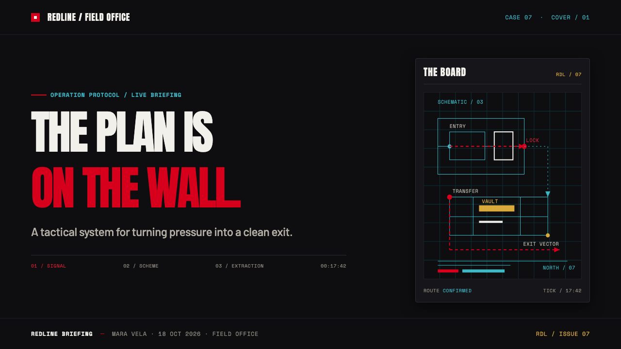
For presentation covers, use a dark field as the planning wall and establish a single red interruption with a masked silhouette, garment-like block, or urgent marker. Let the title behave like an operational label, then use white linework sparingly to suggest a route, boundary, or target. The cover should announce pressure before it explains content.
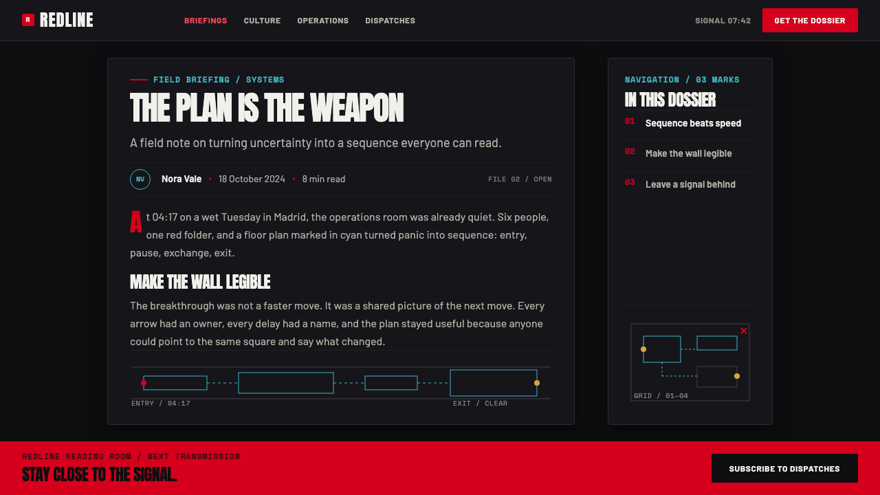
For content and data slides, treat diagrams as narrative devices rather than neutral decoration. Timelines can become escape routes, process flows can become transfer paths, and directional marks can guide attention through evidence. Keep body material highly legible against the dark ground, reserve red for the decisive moment, and let white structure carry most explanatory information.
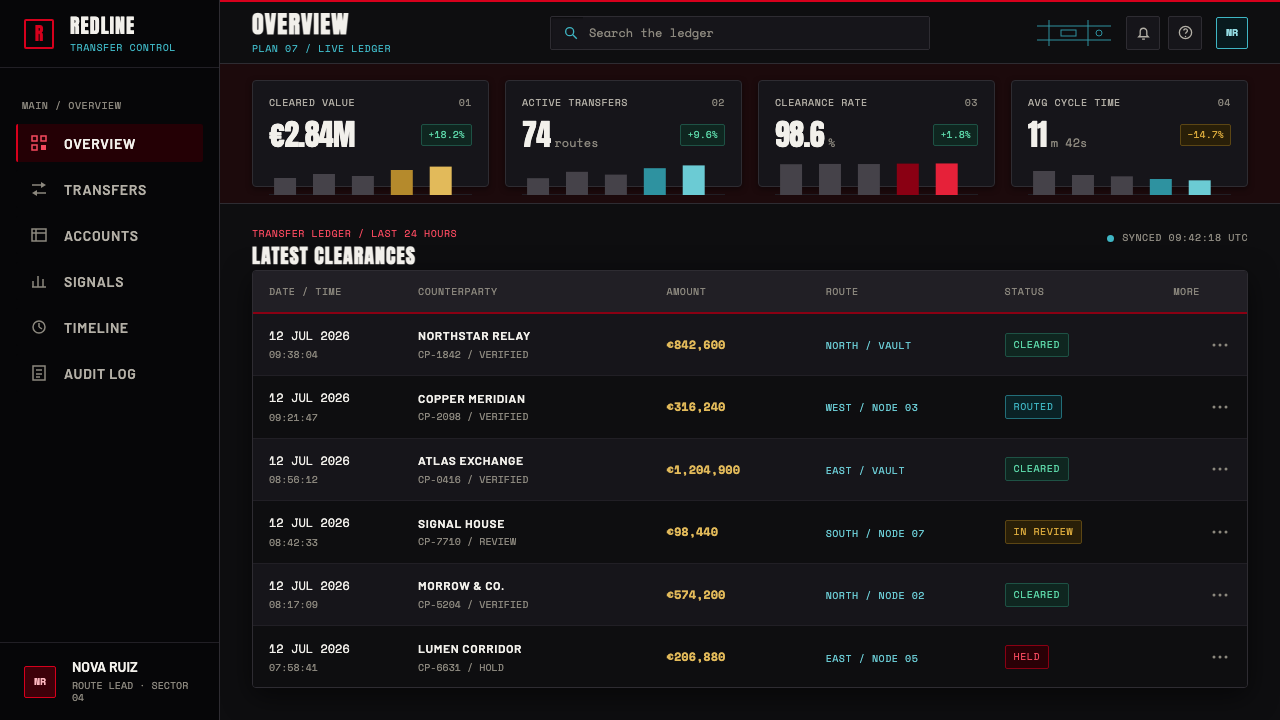
For web interfaces, this approach suits dashboards, command centers, monitoring views, and pricing or conversion pages that need high contrast and clear action states. Organize panels as parts of a visible operation: status, route, alert, decision, result. Red should signal commitment, escalation, or a selected action; it loses force when every control competes for urgency.
For editorial and marketing work, the style supports launch pages, campaign stories, event graphics, and manifesto-like product narratives. Use cropped masks, dark architectural fields, blunt headlines, and schematic fragments to frame a message as a public intervention. The design is strongest when copy and graphic marks share the same rhetorical force.
The common mistake is copying red jumpsuits, masks, and blueprint lines without the underlying tension between secrecy and spectacle. A page overloaded with red, arrows, and faux technical marks becomes costume-like. Preserve the system by giving darkness room to hold the scene, allowing white diagrams to communicate something real, and making each red element feel consequential.
Money Heist (La Casa de Papel) — FAQ
Is the Money Heist look simply a red-and-black palette?
No. Red and graphite darkness are the most immediate signals, but the style depends on a system of roles. Red represents collective visibility and defiance, darkness holds institutional pressure, and white schematic marks make the plan readable. Remove the tactical diagrams and masked collectivity, and the palette alone becomes generic dramatic styling.
Why are the white floorplans and arrows so important?
They turn suspense into visible structure. A heist is normally defined by hidden preparation, but Money Heist repeatedly makes routes, transfers, and sequences appear on the wall. The white diagrams create clarity inside darkness and let the audience feel both the confidence of the plan and the pressure of everything that could disrupt it.
How should the Dalí mask be used in a design inspired by this theme?
Treat it as a symbol of anonymity and collective identity, not as a novelty graphic. It works best when repetition, cropping, silhouette, or partial concealment supports a larger idea about shared action. A single decorative mask detached from tactical context usually weakens the resistance logic that makes the image meaningful.
Can this style work outside crime or entertainment projects?
Yes, when a project genuinely needs urgency, collective action, visible process, or a campaign-like public voice. It can support operational storytelling, event communications, activist-adjacent narratives, and high-stakes product launches. It is less suitable for work that needs quiet reassurance, softness, or a neutral institutional tone, because its visual language is built to confront.
Related design styles
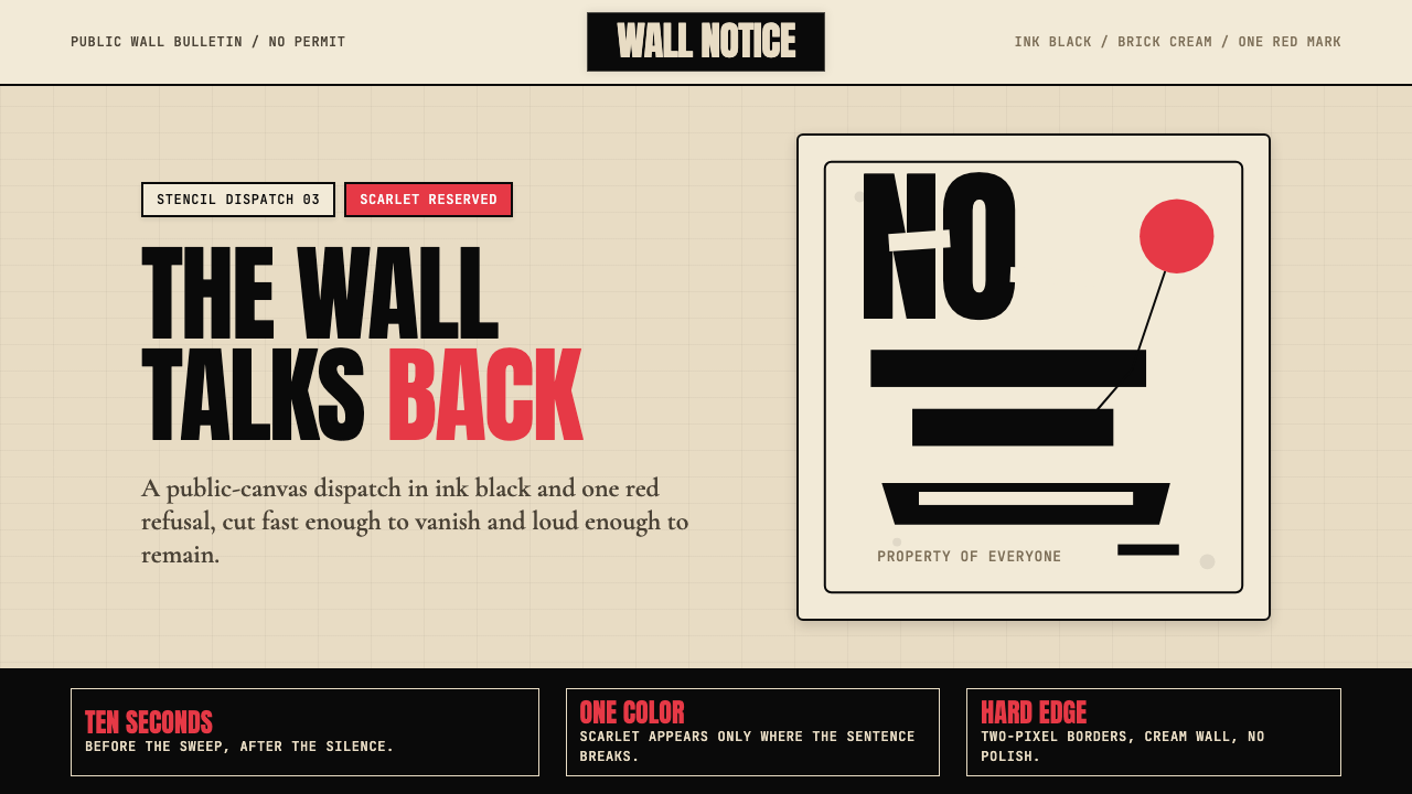 Banksy Stencil GraffitiProtest is reduced to a cut mark. Anton black on brick cream, one scarlet red…
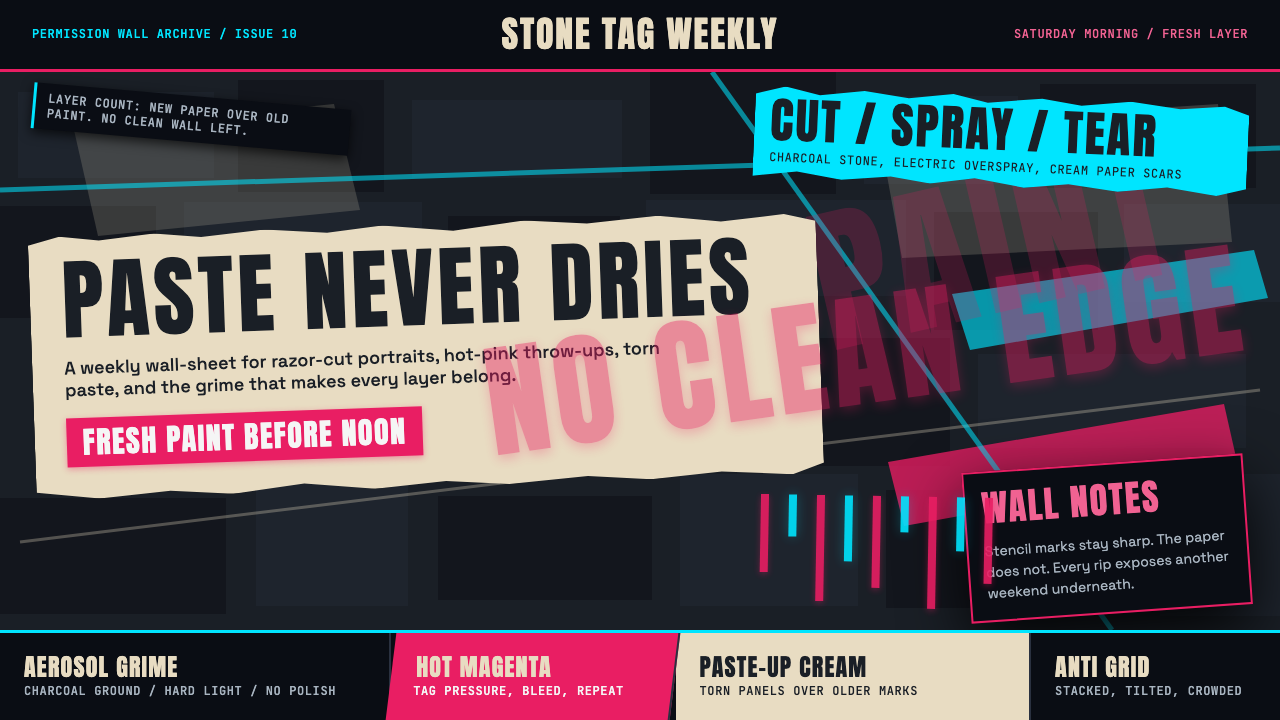 Melbourne Laneway Stencil (Hosier Lane)Permission-wall maximalism. Magenta tags slash charcoal bluestone and cream p…
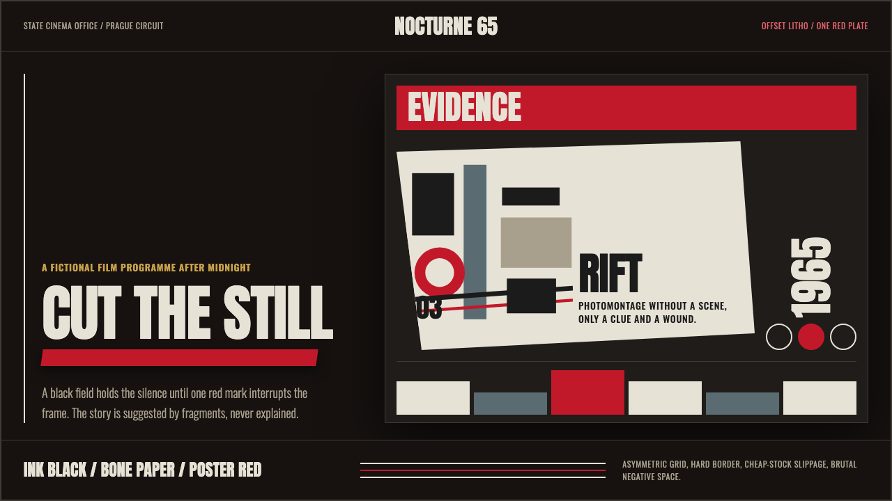 Czech New Wave PosterConcept before spectacle. Ink black, bone type and one poster-red incision fr…
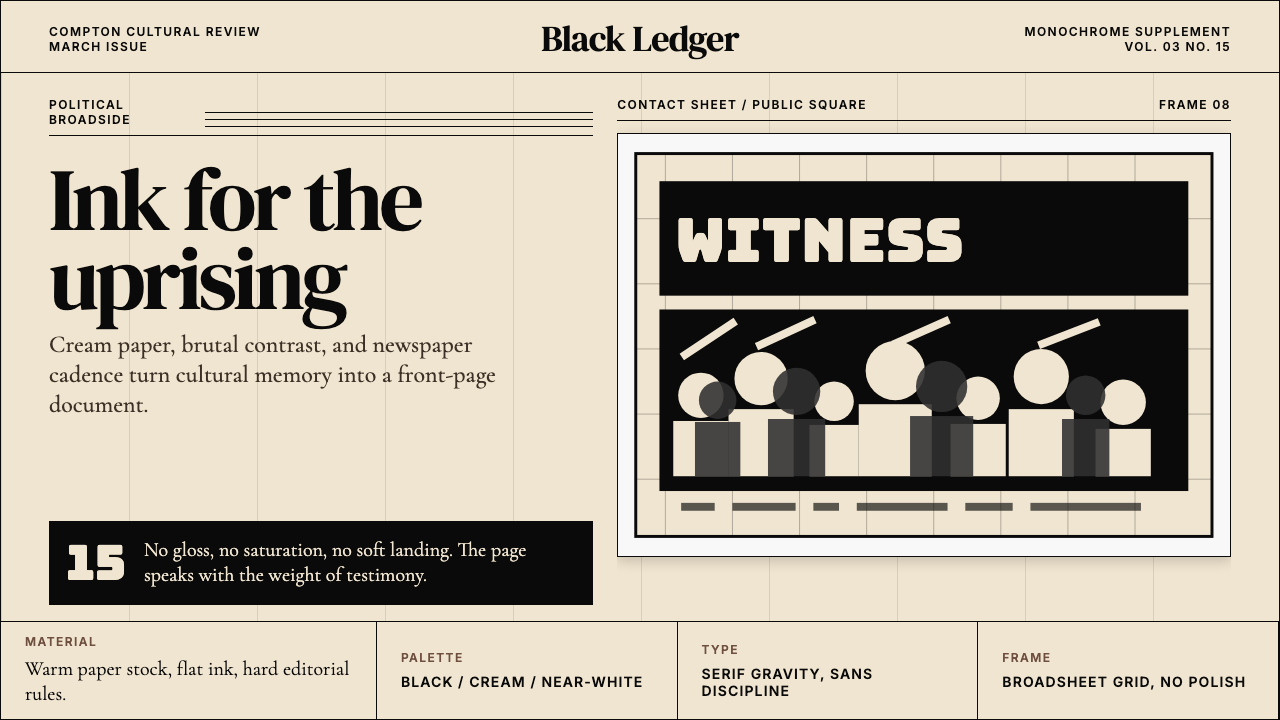 Kendrick — To Pimp a ButterflyPolitical weight, printed cold. Cream paper, hard serif type, monochrome crow…
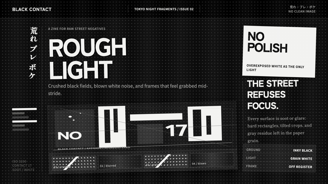 Daido Moriyama Are-Bure-BokeNothing is clean. Inky black, blown white grain, and tilted frames make the i…
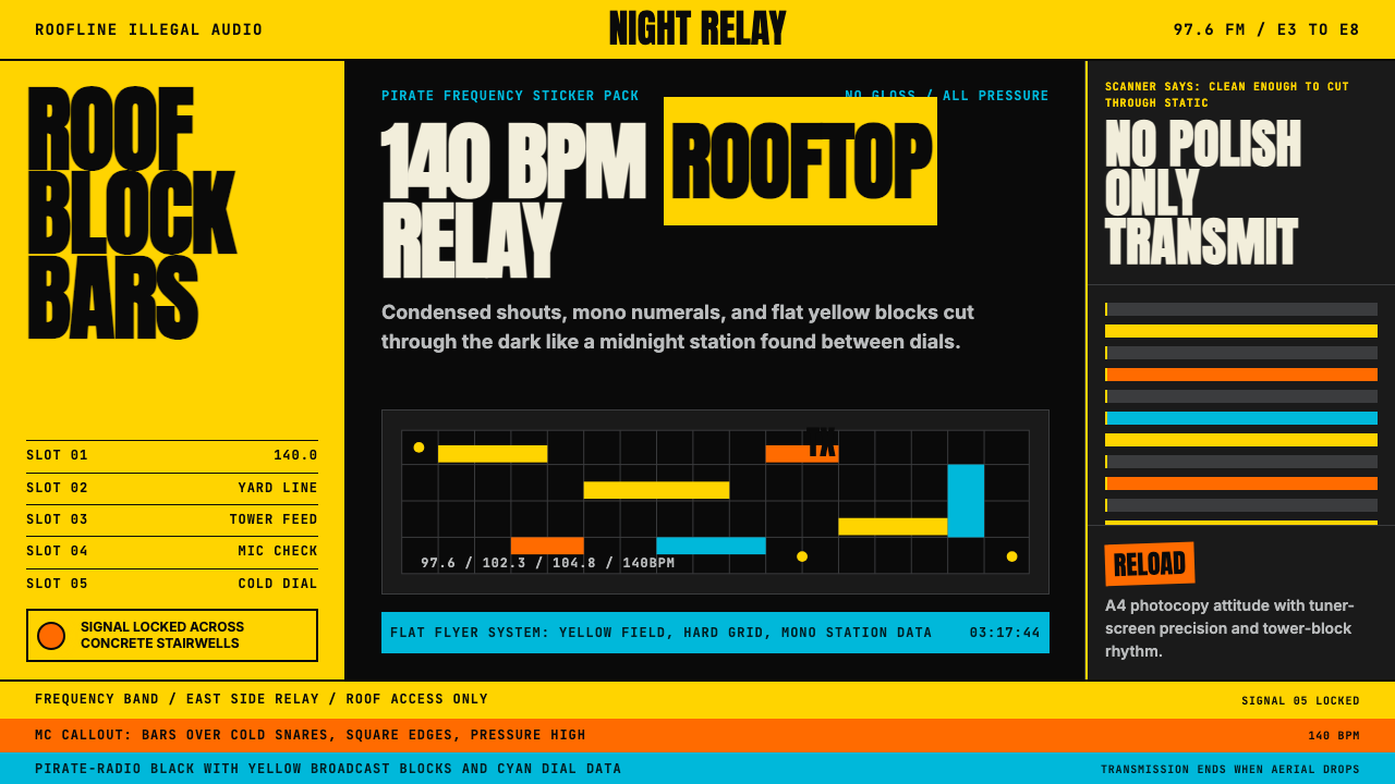 Grime London Pirate Radio (2003)Pirate signal, flat and urgent. Yellow blocks, mono FM numerals, hard flyer g…