What is Buzludzha Monument?
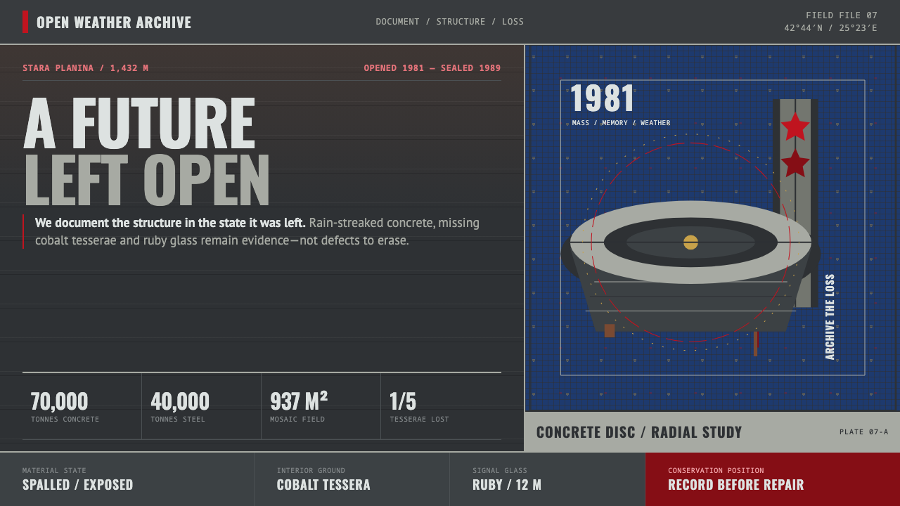
Buzludzha turns political monumentality into a study of decay: a concrete flying saucer on a Balkan peak, its Byzantine mosaic interior still burning with cobalt and gold even as a fifth of it falls away.
Buzludzha Monument in brief
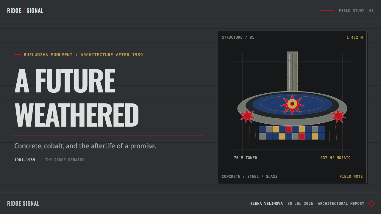
The Buzludzha Monument is a former Bulgarian Communist Party congress hall built as a concrete saucer and a seventy-metre tower on a levelled mountain peak in the Balkan range. It belongs to the architectural vocabulary of socialist modernism and Brutalism — poured concrete forms scaled to the landscape rather than to the human body, built to be seen from the surrounding valleys as much as to be entered.
Inside, the saucer opens into a domed hall lined with roughly 937 square metres of Byzantine-technique mosaic: small hand-set glass tesserae, heavy in cobalt blue, with gold concentrated at the centre of the dome. Outside, two ruby glass stars twelve metres across cap the tower, visible for kilometres. The building was engineered on an industrial scale — tens of thousands of tonnes of concrete and steel, thousands of tonnes of gilded glass — and built by thousands of workers over more than a decade of design and construction.
What makes Buzludzha a distinct visual system today is that it has never been repaired. Since it was sealed in 1989, rain, frost and looting have stripped away roughly a fifth of its mosaic and streaked its concrete shell with rust and lichen. This system takes the monument exactly as it now stands — stained, spalled, partially lost — rather than reconstructing an imagined pristine 1981 opening-day version. Monumentality and ruin are treated as a single condition, not two.

Where does Buzludzha Monument come from?
Buzludzha was designed in the 1970s and opened in 1981 on a peak in the Stara Planina — the Balkan mountain range that runs through central Bulgaria — at an elevation of 1,432 metres. The architect Georgi Stoilov gave it its saucer-and-tower silhouette, a form drawn from the same mid-century vocabulary of monumental state architecture that produced Brutalist civic buildings across the socialist world: raw concrete, dramatic massing, and a scale meant to dominate the landscape rather than blend into it.
Construction consumed resources on a scale matched to its ambition: roughly seventy thousand tonnes of concrete, forty thousand tonnes of steel, three thousand tonnes of gilded glass, six thousand workers, and fourteen million leva. Inside, the mosaic program followed Byzantine small-tessera technique but repurposed it for a socialist iconographic subject — fourteen panels depicting ordinary labor alone consumed some thirty-five tonnes of cobalt glass, and a gilded hammer-and-sickle medallion at the dome's zenith remains intact today. The building honored Karl Marx, Friedrich Engels, and Vladimir Lenin as the ideological lineage its propaganda program was built to enshrine.
The building's active life was short. Opened in 1981, it was already sealed off by 1989, when Bulgaria's socialist government fell and the structure lost both its function and its maintenance. What followed was three decades of exposure: theft of interior fittings, cracking of the concrete shell, and the loss of roughly a fifth of the mosaic surface to water damage and vandalism. Bulgarian authorities eventually judged the structure unsafe to enter.
This history places Buzludzha within three overlapping movements: socialist modernism as an architectural style, Brutalism as a material discipline, and monumental mosaic propaganda as a specific genre of interior decoration that fused Byzantine craft technique with twentieth-century political messaging. The building's current condition — monumental but unmaintained — is now as much a part of its identity as its original design intention.
What defines the Buzludzha Monument look?
Weathered Concrete Ground
The base surface reads as poured concrete left exposed for decades: a gray-green field streaked with rust bleeding down from embedded steel, spalled patches where the surface has broken away, and the faint horizontal lines left by the original formwork panels. This is treated as the primary ground color of the system, not as a texture layered on top of something cleaner.
Cobalt Mosaic Field
Wherever the interior mosaic is referenced, cobalt blue dominates in small, hand-set units rather than broad flat fields — a texture built from thousands of individual tesserae rather than a single wash of color. The blue is deep and slightly uneven in tone, consistent with glass set by hand rather than printed or rendered smooth.
Gold as Sparing Accent
Gold appears only at points of maximum symbolic weight — historically, the center of the dome — and nowhere else. It functions as a single hot accent against the cool cobalt field, never as a supporting or background tone. Overusing gold breaks the hierarchy this system depends on.
Ruby Glass as Signal Color
Red is reserved for the two star forms that cap the tower and functions as a light source rather than a fill — a glowing, saturated accent against an otherwise muted, weathered palette. Like the gold, it is used sparingly and at a single scale: it marks a focal point, not a supporting element.
Landscape-Scale Proportion
Every form in this system is proportioned to be read from a distance across open terrain, not from arm's length. Elements sit large, isolated, and few in number rather than dense and detailed — a single tower silhouette, a single dome curve, a single star, each legible against open sky or empty ground.
Damage as Pattern
Loss is treated as a legitimate visual element rather than something to be concealed: missing tesserae, cracked panels, and stripped fittings appear as irregular voids within the mosaic field, their edges hard and their placement unpredictable. The system does not simulate an intact, restored version of the interior.
Hard Edges, No Softness
Nothing in this system fades, blurs, or gradients. Concrete edges are cast, not carved; mosaic edges are the hard boundary of one tessera against the next; shadow, where it appears, is the flat shade of an overcast Balkan sky rather than a directional studio light. Every boundary is a decision, not a transition.

Who shaped Buzludzha Monument?
Stoilov designed Buzludzha's saucer-and-tower form, working within the vocabulary of socialist modernism and Brutalism to give the monument a silhouette that would dominate the Stara Planina ridge rather than sit quietly within it. His design paired a domed assembly hall with a freestanding tower topped by twin glass stars — a composition built for maximum visibility across the surrounding valleys.
Marx is one of the three thinkers the monument's mosaic program was built to enshrine, part of the ideological lineage that the building's socialist propaganda decoration was designed to present to visiting party delegates.
Engels appears alongside Marx and Lenin in the hall's ideological program, part of the same lineage the monument's interior decoration was designed around.
Lenin completes the trio honored within the mosaic hall, his image part of a decorative program that has, like the rest of the interior, been left to weather rather than be restored since the building's 1989 closure.
How do you use Buzludzha Monument today?
Because Buzludzha's visual system is built from weathered concrete, cobalt mosaic, and two hot accent colors held in reserve, it works best in contexts that call for gravity rather than approachability — sites and decks about history, memory, infrastructure, or institutions where a sense of scale and permanence matters more than warmth.
For presentation slides, the system favors a dark, near-monochrome ground with cobalt and gold reserved for the moment that needs emphasis: a cover slide can use the gray-green weathered field for its full background, with a single gold or ruby accent marking the title or a key figure. Content slides should keep most of the frame in that muted concrete tone, breaking it only for one focal data point or quotation rendered in the reserved accent colors.
For web interfaces, the palette suits long-form editorial pages, archival or documentary sites, and dashboards for infrastructure or heritage-preservation contexts, where a serious, slightly somber tone reinforces the subject matter. Navigation and structural elements should stay in the concrete gray-green range; the cobalt and gold should be reserved for a small number of interactive or highlighted states so they keep their symbolic weight.
For editorial and documentary layouts, this system rewards restraint: large photographic or textural fields of the weathered concrete ground, narrow columns of body text, and section breaks marked by a hard rule rather than a decorative element. Damage and irregularity — cracks, voids, staining — can be used deliberately as compositional elements rather than smoothed away.
The most common mistake is treating this as a generic dark theme and brightening it with saturated color across many elements. The system depends on scarcity: gold and ruby only work because they appear almost nowhere else. Spreading warm color liberally across a layout collapses the hierarchy and turns a monument into a decoration.
Buzludzha Monument — FAQ
Does using this style mean endorsing the politics the monument was built to promote?
No. The system is drawn from the building's present physical condition — its concrete, its surviving mosaic, its damage — rather than from its original propaganda function. Applying it to a project says nothing about the ideology it was built to serve; it borrows a visual language of monumental scale, weathered material, and restrained color, the same way a designer might borrow the geometry of a cathedral without endorsing the theology behind it.
Why keep the damage instead of designing around a restored, pristine version of the monument?
Because the damage is now as historically true as the original design. Buzludzha was maintained for less than a decade before being abandoned for three, and the condition it has settled into — partial mosaic loss, rust-streaked concrete, a hammer-and-sickle medallion still intact amid the loss around it — is a more honest subject than an imagined day-one appearance that no living visitor can verify against.
Why is the mosaic mostly blue instead of the gold that Byzantine mosaics are known for?
The technique is Byzantine — small hand-set glass tesserae — but the color program was chosen for this building's own iconographic subject, and cobalt dominates the surviving panels, with gold concentrated only at the dome's center. The result is a distinct palette from historic Byzantine church mosaics: cooler, more restrained, with gold functioning as a single accent rather than a general ground.
Can this system work without any literal reference to the building itself?
Yes. The transferable part is the relationship between elements — a weathered, muted ground; a small number of saturated accent colors held in reserve; hard edges with no gradients; large, sparse, landscape-scale forms — rather than any specific photograph of the saucer, the tower, or the mosaic. A project can use this logic entirely abstractly and still read as belonging to the same visual family.
What kinds of projects should avoid this style?
Anything that needs to feel warm, playful, or approachable will fight against this system's core logic. Consumer products aimed at everyday delight, children's content, and lighthearted marketing all rely on qualities — bright evenly-lit color, soft shadow, rounded forms — that this palette deliberately withholds. The style works because it commits fully to gravity; diluting it to make it friendlier removes the reason to use it at all.
Related design styles
 Soviet Brutalism (1972)Concrete refuses to breathe. Cement gray, Soviet red banners, and Anton stenc…
 Hurufiyya Letter ArtArabic letters as pure gesture. Ochre and crimson strokes dissolve across oil…
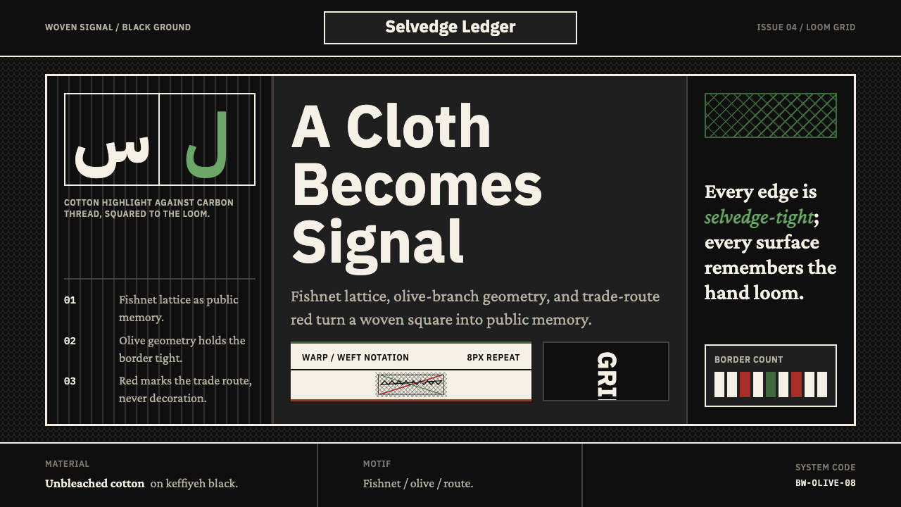 Levantine Keffiyeh Black & WhitePolitical textile, not ornament. Cotton type and fishnet lattice cut through…
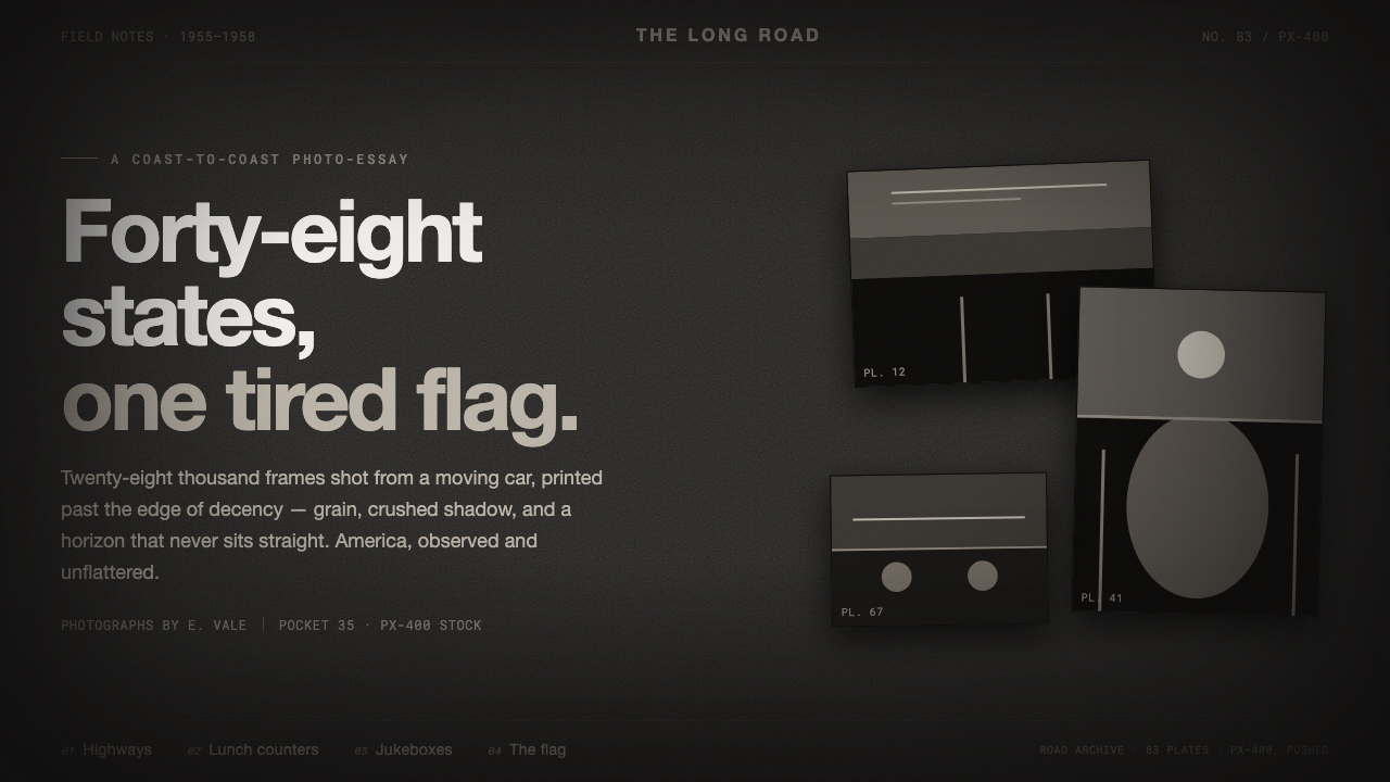 Robert Frank The AmericansReportage, polish stripped off. Warm sooty charcoal, crushed near-black shado…
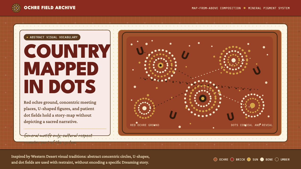 Aboriginal Dot PaintingAncient story-map energy. Red ochre, bone dots, concentric circles, and U-mar…
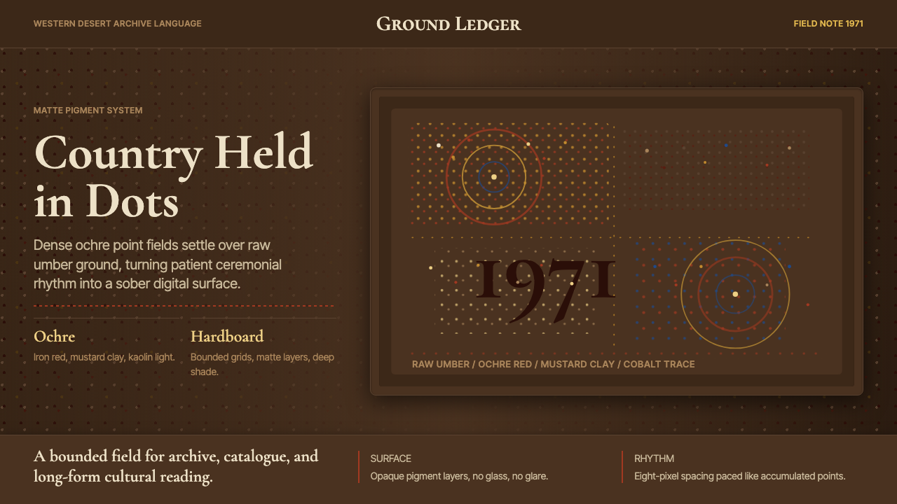 Aboriginal Dot Painting (Papunya 1971)Ochre memory, held steady. Raw umber ground, Cormorant type, disciplined dot-…