What is Hurufiyya Letter Art?
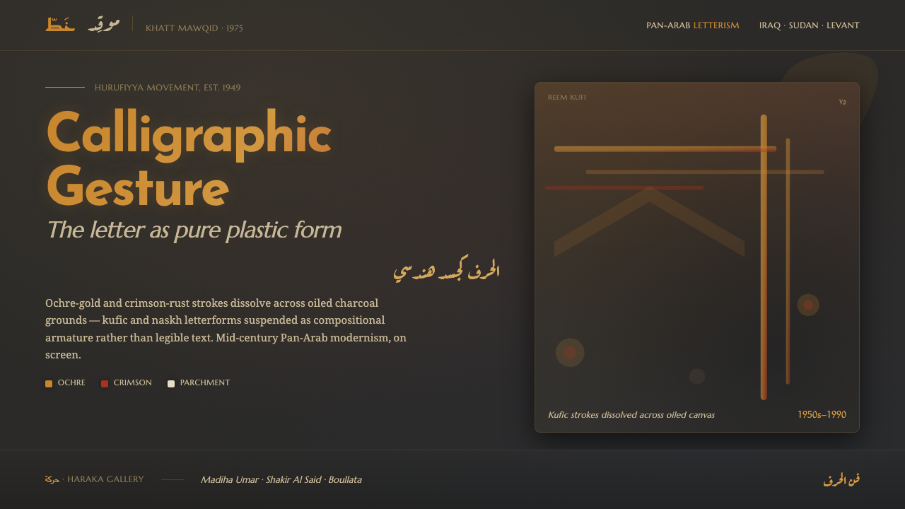
Hurufiyya turns Arabic letters into pure gesture—ochre and crimson strokes hovering over oiled charcoal grounds until script becomes composition rather than language.
Hurufiyya Letter Art in brief
Hurufiyya was a mid-20th-century Pan-Arab art movement that transformed Arabic calligraphic script into modernist painting. Across Iraq, Sudan, Palestine, and the wider Middle East, artists treated Kufic and Naskh forms as material for abstraction: letters were stretched, dissolved, layered, and released from their obligation to remain readable. The result was not typography applied to a painting, but writing converted into line, rhythm, mass, and gesture.
This design system carries that visual logic onto the screen. Deep charcoal and dark indigo form the ground, enriched with canvas grain and an oily painted surface. Against it, luminous ochre-gold, crimson-rust, and parchment-gold strokes hover as compositional structures. They may resemble letters, but they do not behave like ordinary text. Their purpose is to establish movement, tension, and visual memory.
The central idea is that a letter can be experienced before it is understood. A curved stroke may suggest breath, a vertical mark may create architectural weight, and a broken form may leave an intentional pause. Hurufiyya-derived work should therefore feel painterly, deliberate, and slightly enigmatic: a dark field animated by signs that carry the history of writing without becoming a banner of literal words.
Where does Hurufiyya Letter Art come from?
The term Hurufiyya, also written al-hurufiyya, names a movement centered on the Arabic letter as an artistic form. Its principal era is described as 1950–1990, with its strongest momentum in the mid-20th century. It belongs to the Pan-Arab world and is closely associated with the intertwined fields of Hurufiyya, Iraqi modernism, and letterist abstraction.
The movement emerged across a region rather than from a single school or city. Iraq, Sudan, Palestine, and Lebanon form the principal geographic frame of this account, while the movement’s wider identity is Pan-Arab. That breadth matters: Hurufiyya does not reduce Arabic script to a fixed national emblem. It treats the shared visual power of the letter as a field for modernist experimentation.
Its decisive break from conventional calligraphy was not a rejection of the script’s history, but a change in what the script was allowed to do. Kufic and Naskh could be approached as reservoirs of shape, pressure, rhythm, and proportion. Once abstracted, they could float across a painted ground as autonomous forms. The letter retained cultural resonance even when its verbal meaning became secondary.
The screen adaptation follows this historical reading without pretending to reproduce a painting. Charcoal and dark indigo provide the deep ground; canvas grain and oily surface imply a tactile field; ochre-gold, crimson-rust, and parchment-gold strokes supply the signs. The result is a visual system built around the movement from language to gesture, from inscription to composition.
What defines the Hurufiyya Letter Art look?
Charcoal Ground
The background is deep, matte, and atmospheric rather than flatly black. Charcoal and dark indigo create the sensation of an oiled painted ground, giving the luminous marks somewhere to emerge from. The field should feel weighty and absorbent, like canvas holding pigment, while remaining quiet enough for the letter gestures to command attention.
Luminous Pigment
Color appears as pigment suspended against darkness. Ochre-gold carries warmth and age, crimson-rust introduces heat and interruption, and parchment-gold softens the system with a dry, archival light. These hues should feel rubbed, painted, or illuminated from within rather than digitally polished. The palette is dramatic because the ground is restrained.
Letter as Gesture
Arabic letterforms are treated as moving marks rather than readable sentences. Curves, stems, hooks, and interruptions can be enlarged, fragmented, or layered until their visual force exceeds their linguistic function. The strongest compositions preserve the memory of script while allowing the viewer to encounter line, pressure, and rhythm before meaning.
Suspended Composition
Forms should appear to hover over the painted ground instead of sitting inside rigid boxes. A stroke may drift across an open field, gather into a dense knot, or dissolve at the edge of visibility. Space is not empty decoration; it is the interval that lets each gesture breathe and gives the composition its meditative tension.
Painterly Depth
Depth comes from surface variation, tonal absorption, and the relationship between glowing marks and dark matter. It should suggest oil, canvas, and layered pigment without becoming a literal texture effect. Soft atmospheric edges may surround a stroke, but the mark itself needs enough firmness to remain a deliberate sign.
Meaning Held in Reserve
Hurufiyya-derived design should resist the urge to explain every mark. The viewer may recognize Arabic script without being offered a complete verbal reading. This reserve creates cultural depth and keeps the system from becoming decorative lettering. Legibility can return in supporting text, but the central gestures should remain open, suggestive, and formally autonomous.
Who shaped Hurufiyya Letter Art?
Madiha Umar is named among the key figures of Hurufiyya in the supplied account. Her place in the movement’s constellation reinforces its central proposition: Arabic script can move from the page into modernist painting without losing its cultural charge. Within this design language, her name belongs beside the idea of the letter as an independent visual event.
Shakir Hassan Al Said appears in the source as a key figure within the movement’s modernist field. His inclusion helps locate Hurufiyya alongside Iraqi modernism and letterist abstraction, rather than treating it as a purely calligraphic revival. The system therefore approaches script as a living material capable of abstraction, tension, and painterly transformation.
Kamal Boullata is one of the named figures in the Pan-Arab Hurufiyya account. His inclusion broadens the movement beyond a single regional vocabulary and supports a reading of the Arabic letter as shared cultural form. In application, that means avoiding literal national symbolism and allowing the script to operate through structure, rhythm, and atmosphere.
Wasma'a Chorbachi is also identified as a key figure in the supplied material. Her presence confirms that Hurufiyya is best understood as a field of related practices rather than one fixed formula. The design system honors that openness by keeping its strokes variable: they can gather, disperse, overlap, or fade while remaining recognizably rooted in Arabic letter gesture.
How do you use Hurufiyya Letter Art today?
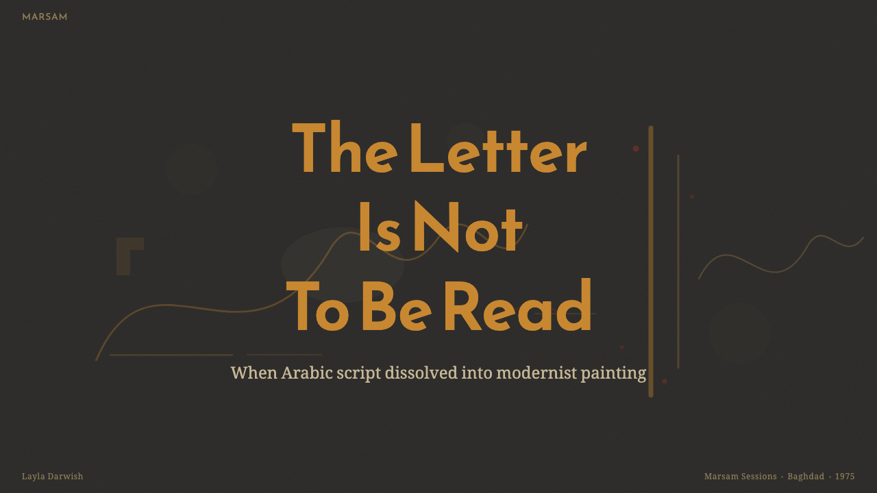
For presentation slides, use the style most decisively on the cover: a deep painted ground, a single dominant calligraphic gesture, and a restrained title with generous surrounding darkness. Content slides should keep explanatory text calm and legible while allowing a cropped letterform or pigment field to act as a visual anchor. Data slides can treat charts as marks in the same composition, using ochre-gold for the primary signal and crimson-rust for emphasis rather than filling every available surface with color.
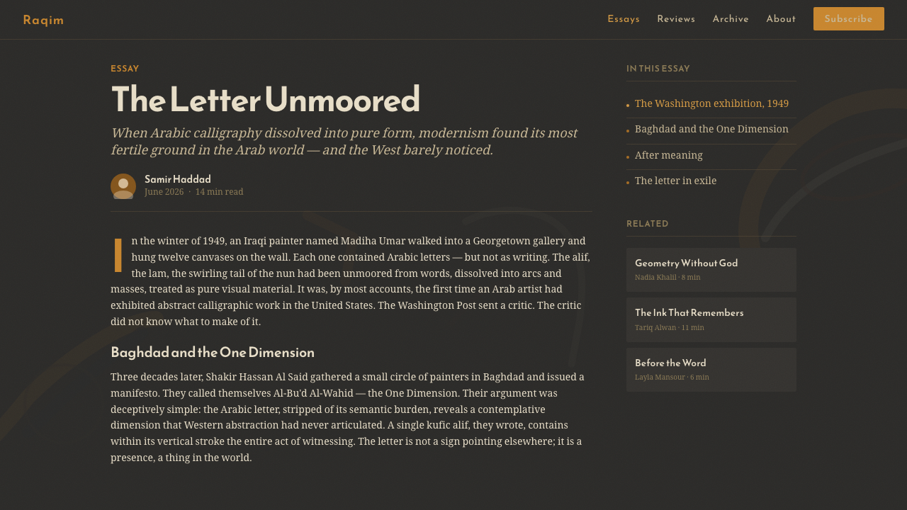
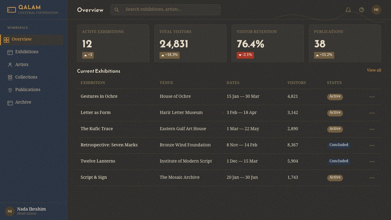
For web interfaces, Hurufiyya suits dashboards and pricing pages that want to feel cultural, editorial, and atmospheric rather than purely technical. Keep the interface field dark and use painted texture as a quiet layer behind structured information. Cards should feel like clear planes emerging from the ground, with ochre-gold reserved for active emphasis and crimson-rust used sparingly for warnings or decisive states. Supporting labels should remain straightforward so the abstract script can remain expressive without compromising navigation.
For editorial work, use calligraphic gestures as section markers, marginal presences, or large cropped fields around the article rather than replacing the body text. A narrow reading column can sit inside a broad charcoal expanse, allowing a luminous stroke to create rhythm between passages. Quotes, captions, and metadata should use parchment-gold sparingly, preserving the sense that every mark has been placed rather than merely styled.
For marketing, the system supports cultural institutions, publishing, art programming, and products that want to communicate depth, heritage, and modern abstraction. A campaign can build recognition through a recurring gesture whose shape changes across applications while the dark ground and warm pigment family remain consistent. The strongest executions feel like fragments of a larger painted language, not like generic luxury graphics with Arabic decoration added afterward.
The common mistake is treating Hurufiyya as ornamental Arabic typography. Filling a dark page with many readable words, glowing flourishes, or equally bright colors makes the work illustrative and noisy. Another mistake is using a perfectly flat black background, which removes the oiled ground that gives the strokes their atmosphere. Keep the letter gestures selective, let texture remain subtle, and preserve a clear distinction between expressive script and functional text.
Hurufiyya Letter Art — FAQ
Is Hurufiyya simply a style of Arabic typography?
No. Hurufiyya abstracts Arabic script into modernist painting, so the letter is treated as an image-making element rather than only a carrier of readable language. A design may preserve the memory of Kufic or Naskh through curves, stems, rhythm, and proportion, but its central gestures do not need to form a complete sentence. Functional text can remain clear elsewhere; the expressive letterform occupies a different role.
Can this system work on a light background?
It can, but the dark ground is central to the supplied design language. Charcoal and dark indigo create the depth from which ochre-gold, crimson-rust, and parchment-gold marks appear to rise. A light background changes the relationship from emergence to inscription and can make the work feel more like conventional calligraphy. If a light variation is necessary, retain the painterly surface and the sense of suspended gesture.
How should the colors be balanced?
Let the dark ground carry most of the visual weight, then establish a clear lead color among the warm pigments. Ochre-gold can create continuity, crimson-rust can interrupt or signal importance, and parchment-gold can provide a quieter contrast. The colors work best when they behave like separate strokes of pigment, not like a complete spectrum competing for attention.
How much texture should be visible?
Texture should be felt before it is noticed. Canvas grain and oily variation are important because they turn the background into a material ground, but a conspicuous texture overlay can compete with the letters. Use surface variation to support depth, absorption, and atmosphere. The viewer should sense painted matter behind the gesture without seeing a repeated digital pattern.
Related design styles
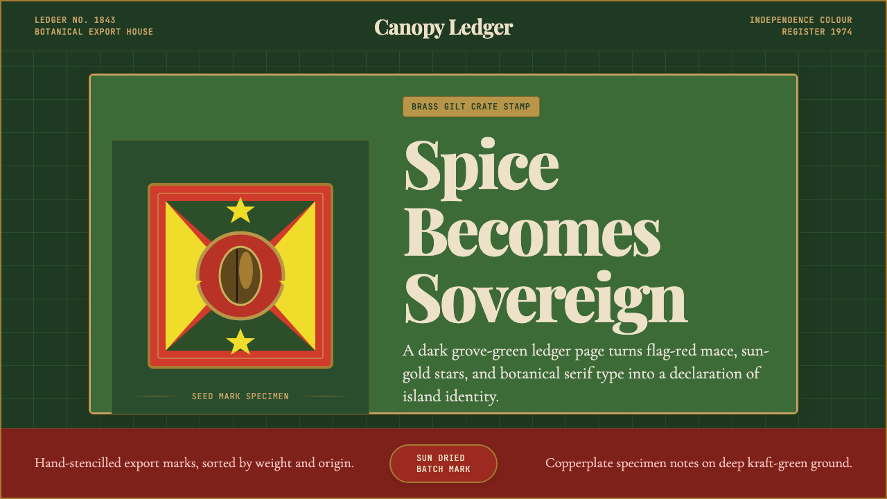 Grenadian Spice & Nutmeg FlagSpice becomes sovereign. Grove green, flag red, brass borders, and serif ledg…
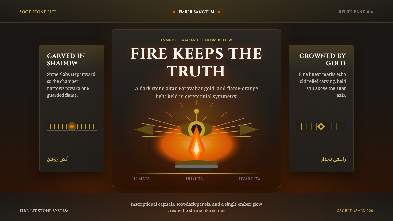 Zoroastrian Fire TempleSacred fire in stone darkness. Cinzel capitals, ember orange, and gold relief…
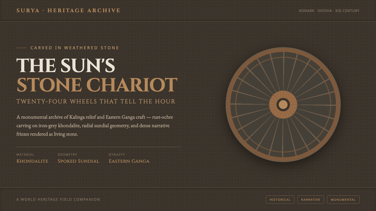 Konark Sun Temple WheelHeavy as carved stone. Rust-ochre sundial wheels and Cinzel inscription on ir…
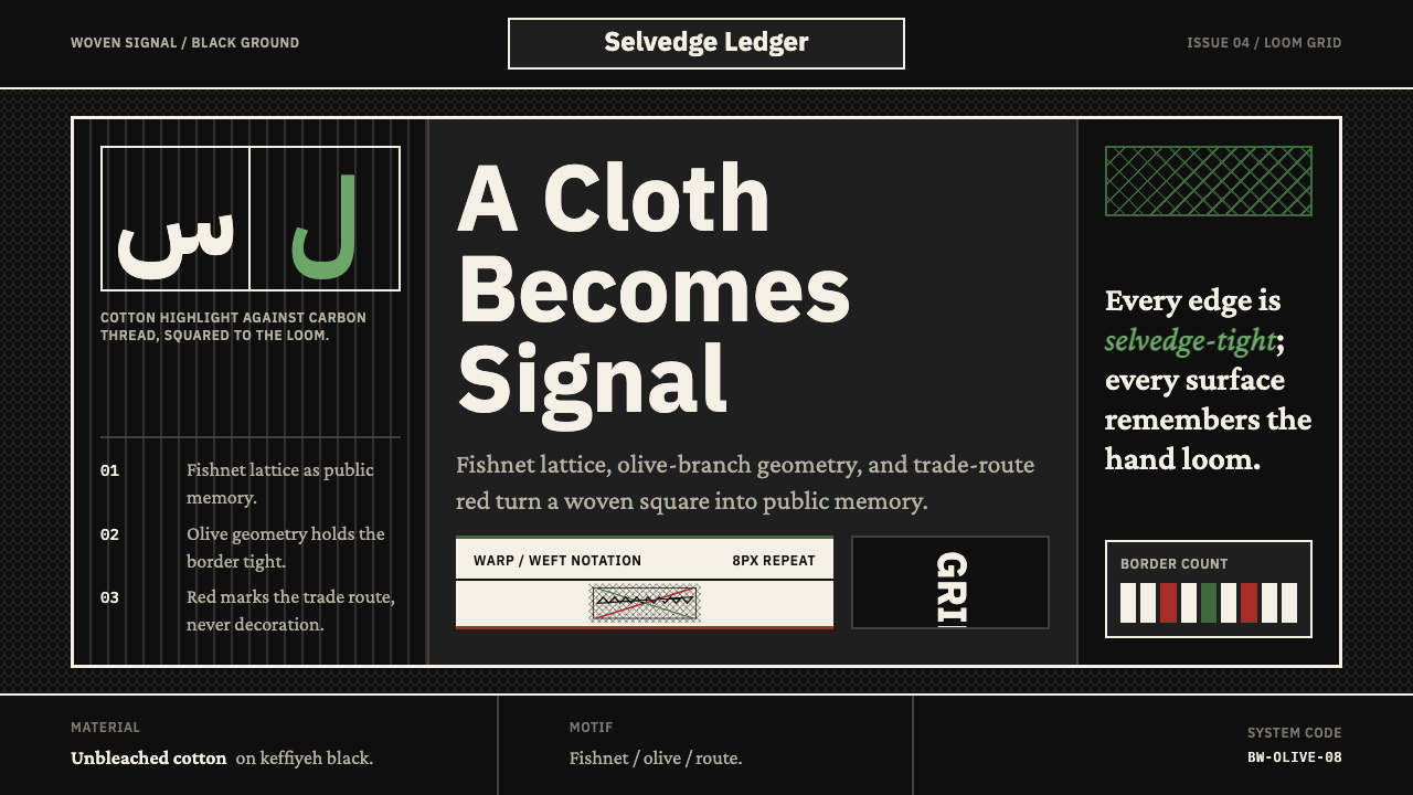 Levantine Keffiyeh Black & WhitePolitical textile, not ornament. Cotton type and fishnet lattice cut through…
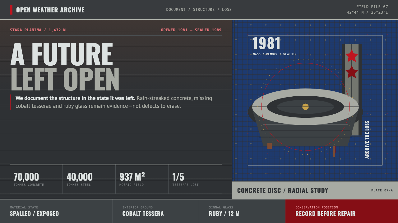 Buzludzha MonumentMonumentality without repair. Stained concrete frames cobalt tesserae, ruby g…
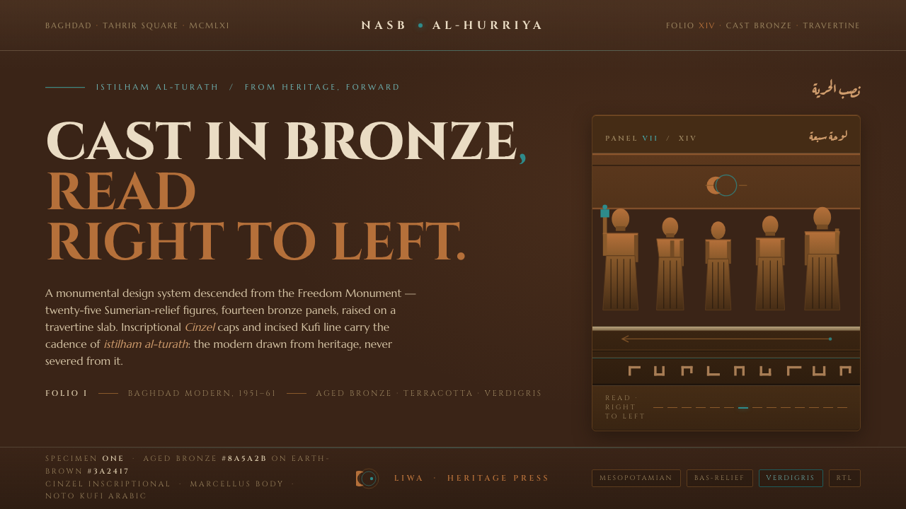 Jewad Selim Baghdad ModernCast in bronze, read right to left. Aged-bronze grounds, incised Kufi line, v…