What is Konark Sun Temple Wheel?
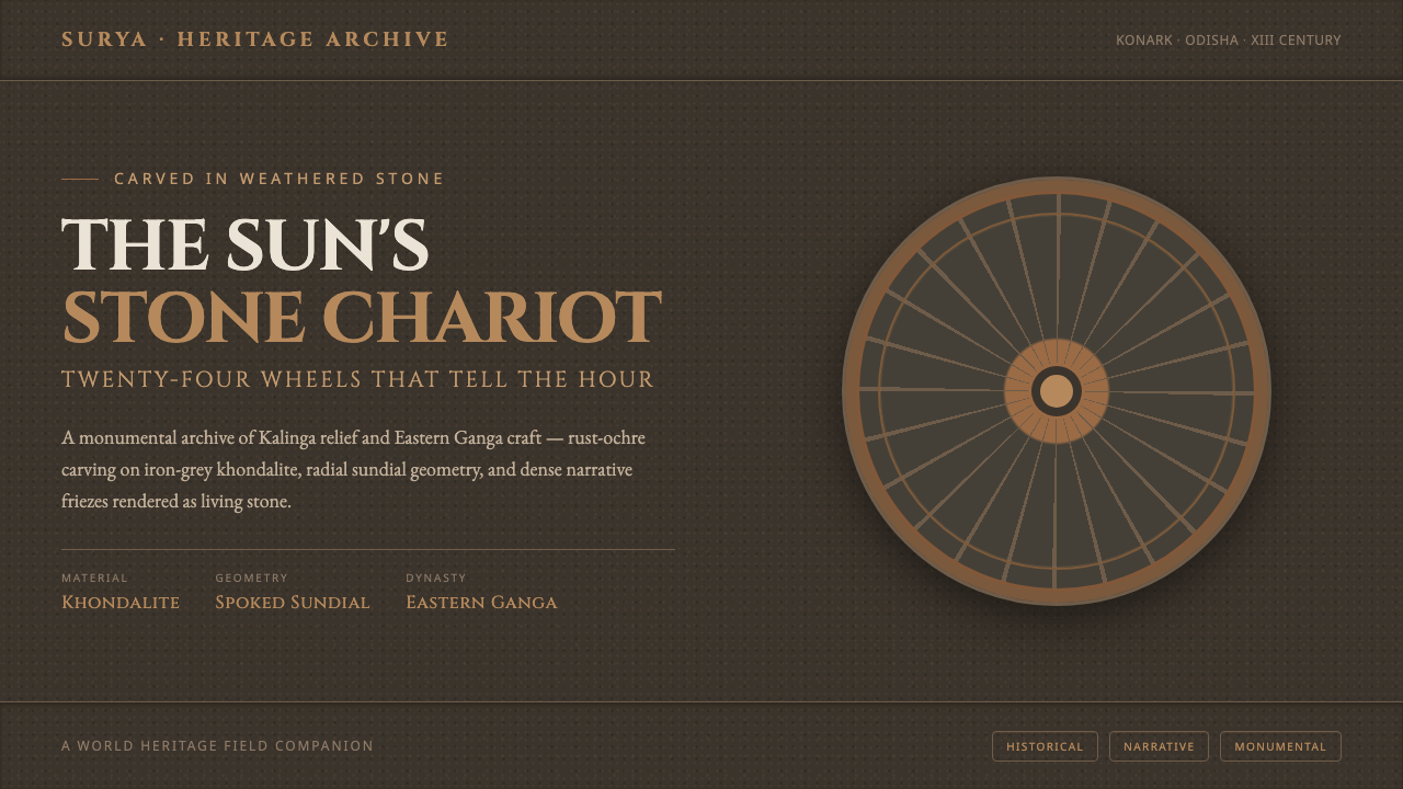
The Konark Sun Temple Wheel makes digital space feel carved rather than rendered — iron-grey stone, rust-ochre relief, and radial geometry carrying the weight of an ancient sun chariot.
Konark Sun Temple Wheel in brief
The Konark Sun Temple Wheel is a dark, monumental design language distilled from the Sun Temple at Konark in eastern India. Its foundation is a weathered-stone ground in iron-grey tones, overlaid with rust-ochre accents, carved-looking relief bands, and the radial geometry of the temple’s wheels. The mood is solemn, tactile, and architectural rather than sleek or weightless.
The system depends on contrast between mass and incision. Large dark surfaces establish the sense of khondalite stone, while warm rust and ochre mark the places where information has been cut, raised, or brought forward. Color is not used as decoration scattered across a page; it behaves like mineral pigment preserved in a monumental surface. The result should feel aged, durable, and quietly illuminated from within.
Its central organizing image is the wheel: a circular form divided by spokes, repeated as a structural device for navigation, data, progress, or emphasis. Around that geometry, dense narrative friezes and layered relief bands create rhythm without introducing softness. Cinzel inscriptional lettering completes the vocabulary, giving titles and labels the character of text carved into stone.
Where does Konark Sun Temple Wheel come from?
The Konark Sun Temple was built in the thirteenth century at Konark, in Odisha in eastern India. It is conceived as the colossal stone chariot of Surya, the sun god, with its plinth ringed by twenty-four carved wheels. These wheels are not merely ornamental symbols: they also function as working sundials, joining monumental form to the measurement of light and time.
The temple was built around 1250 under King Narasimhadeva I of the Eastern Ganga dynasty. Its visual identity belongs to the Kalinga temple architecture and Eastern Ganga relief-sculpture traditions named in the source material. In this context, architecture is not a neutral container. Stone, image, rhythm, and narrative are fused into a single surface whose authority comes from accumulation and craft.
The material palette is equally important. Khondalite, chlorite, and laterite formed the temple’s physical substance, and centuries of weathering shifted the stone from iron-grey toward warm rust and ochre-brown. This change is not treated as damage to be concealed. It becomes the design system’s emotional register: dark mineral mass holds the composition, while rust and ochre suggest age, exposure, and the persistence of carved marks.
The digital interpretation keeps the temple’s monumental logic while translating it into interface language. A dark weathered-stone ground replaces the literal wall; rust-ochre marks become accents and relief; wheel-and-spoke geometry becomes a system for organizing attention; and dense friezes are reimagined as layered bands, borders, and narrative interruptions. The goal is not a decorative reconstruction of the temple, but a usable visual system shaped by its material and architectural character.
What defines the Konark Sun Temple Wheel look?
Weathered Stone Ground
The ground should read as iron-grey khondalite: dark, matte, and slightly irregular in impression. It is not a flat black field and not a polished charcoal surface. The darkness carries mass, while subtle grain and tonal variation imply a wall exposed to weather. Light elements should appear placed against stone, as though their edges were carved, raised, or worn into visibility.
Rust-Ochre Relief
Rust, ochre, and red-brown accents act like exposed mineral pigment or carved stone warmed by age. They should be concentrated at moments of emphasis: a wheel rim, an active state, an important label, or a narrative band. The palette feels strongest when dark stone remains dominant and warm color appears as a deliberate incision rather than a general wash.
Wheel-and-Spoke Geometry
The wheel is the system’s primary structural metaphor. Circles establish continuity and recurrence; spokes divide space into readable segments and direct the eye toward a center. Used in moderation, this geometry can organize navigation, progress, data, or featured content. It should feel engineered and carved, with clear radial relationships rather than loose decorative circles.
Layered Relief Bands
Horizontal or circular bands provide the dense narrative quality associated with relief sculpture. Their role is to separate, frame, and sequence information without relying on soft shadows or glossy panels. Bands may carry labels, secondary navigation, or visual pauses, but they should remain integrated with the surface. Each layer feels like a plane cut into the same architectural mass.
Grain and Material Honesty
Texture is useful here because it reinforces the source material, but it must remain coarse and restrained. The surface should suggest grainy stone, not fabric, paper, or brushed metal. Material honesty means that relief, edge, and contrast do the work of depth. The interface does not need to imitate a photograph of a temple; it needs to preserve the sensation of durable matter.
Inscriptional Typography
Cinzel supplies the system’s inscriptional voice. Its presence should make headings feel engraved, ceremonial, and tied to architecture. Lettering works best when given room to stand against the dark ground, with hierarchy created through scale, placement, and spacing rather than competing type families. Supporting text should remain quiet enough for the carved quality of the principal lettering to retain authority.
Monumental Contrast
The visual tension comes from placing restrained, precise marks inside a heavy field. Small inscriptions, radial divisions, and narrow relief lines gain significance because they sit within substantial darkness. Contrast should be structural rather than flashy: warm against cool, raised against recessed, sharp lettering against grainy stone. The interface feels imposing because every visible mark appears intentional.
Who shaped Konark Sun Temple Wheel?
Surya, the sun god, is the central divine subject of the temple’s conception as a colossal stone chariot. In the design system, Surya is represented indirectly through radiance, wheel geometry, and the sense of a structure oriented around light. The reference is strongest when it remains architectural and symbolic rather than becoming literal illustration.
King Narasimhadeva I is identified in the source as the ruler under whom the temple was built around 1250. His place in the system is historical rather than ornamental: he anchors the design in a specific period, region, and architectural commission. References to him should therefore support provenance, context, and the temple’s monumental ambition.
The Eastern Ganga dynasty forms the dynastic context named by the source material. It connects the temple to the political and cultural setting in which its stone architecture and relief sculpture were produced. In a design application, that context can guide the use of monumental framing, carved narrative bands, and a sense of inherited visual authority without inventing additional historical detail.
How do you use Konark Sun Temple Wheel today?
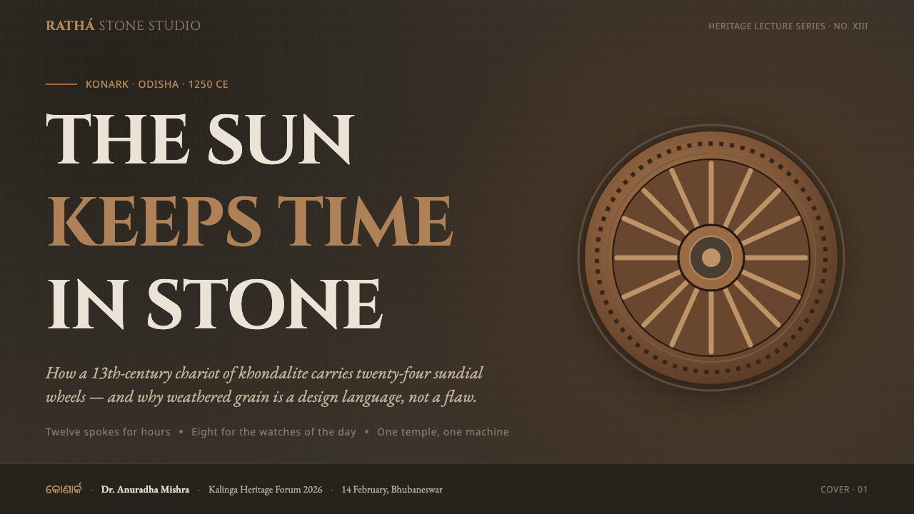
For presentation work, let the cover behave like a carved monument: a dark stone field, a strong Cinzel title, and one dominant wheel or radial form establishing the composition. Content slides should use relief bands and restrained rust-ochre marks to separate sections, with text hierarchy carried by placement and scale. Data slides can turn charts, cycles, and progress indicators into wheel-based diagrams, keeping the radial logic visible without filling every surface with ornament.
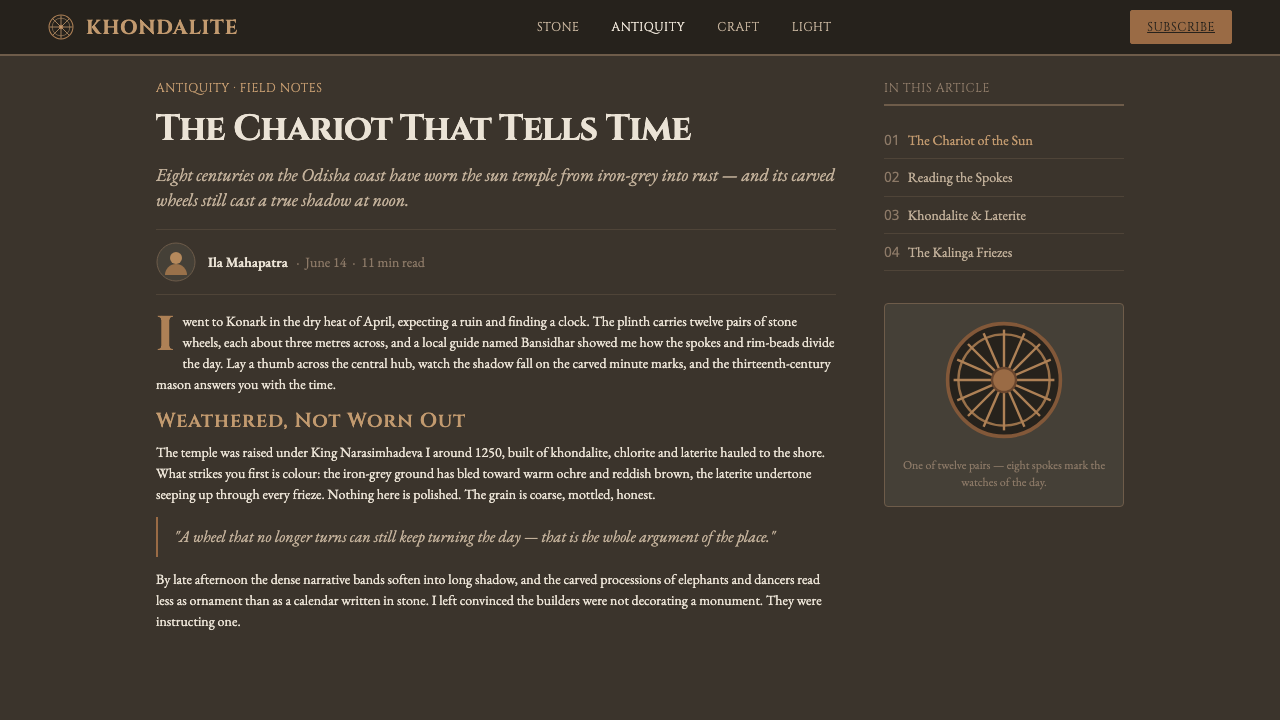
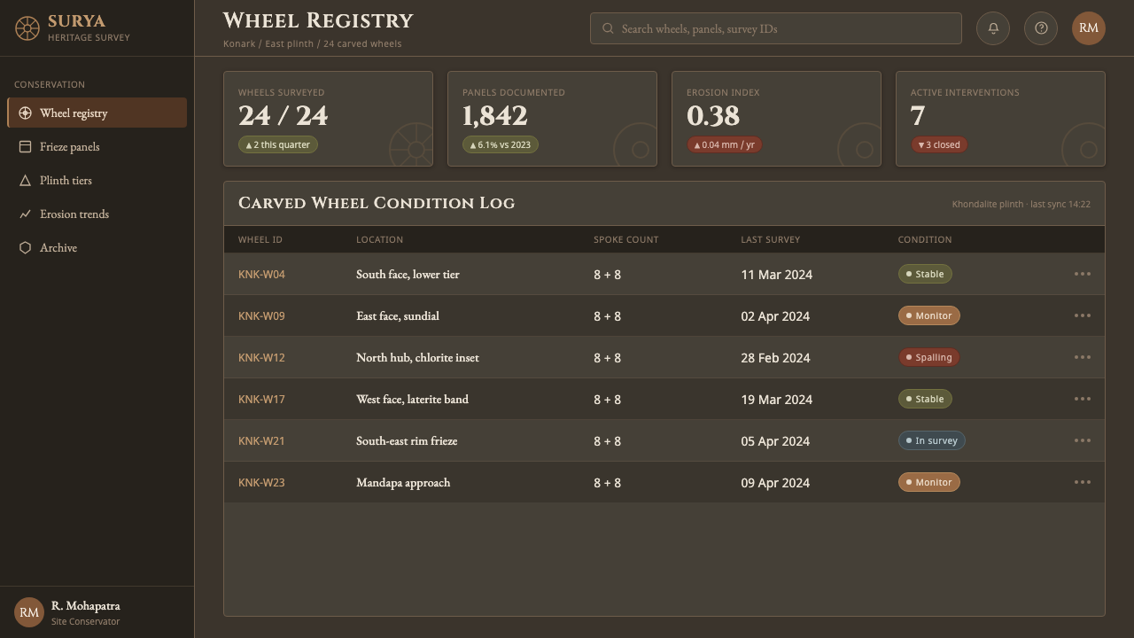
For web interfaces, the style suits dashboards, analytical tools, and pricing pages that need authority and clear hierarchy. Use the stone ground as the stable field, reserve rust and ochre for active states or important distinctions, and use wheel geometry to organize categories, progress, or recurring metrics. Cards should feel inset or carved into the surface rather than floating above it. Navigation benefits from inscriptional labels and geometric indicators instead of unrelated pictorial icons.
For editorial and marketing work, the system supports a strong sense of provenance. Articles can pair quiet, dense body copy with broad dark margins, framed pull quotes, and relief-like section bands. Marketing pages can treat the wheel as a recurring emblem across hero areas, product stories, and calls to action. The palette works especially well when a single warm accent carries through the page, making continuity feel like a material property rather than a branding overlay.
The common mistake is to confuse monumentality with visual overload. Covering every region in texture, radial lines, borders, and rust color destroys the hierarchy that gives the system its weight. Another failure is using generic medieval ornament or glossy faux-stone effects; those gestures weaken the specific Konark reference. Keep the dark ground dominant, make the wheel geometry legible, and allow a limited number of carved marks to carry the narrative.
Konark Sun Temple Wheel — FAQ
Is this a literal recreation of the Konark Sun Temple?
No. It is a digital design system distilled from the temple’s stated material, architectural, and sculptural vocabulary. The reference is carried through weathered stone, rust-ochre relief, wheel-and-spoke geometry, layered bands, and inscriptional typography. A literal reconstruction would risk turning a coherent visual language into surface decoration. The strongest application preserves the temple’s sense of weight and structure while remaining clearly contemporary and usable.
Why is the background dark instead of stone-colored and light?
The dark ground translates the source’s iron-grey weathered stone into a stable digital field. It also gives the rust and ochre accents the concentrated force of exposed relief. The darkness should not become pure black emptiness; grain, tonal variation, and carved-looking edges keep it material and architectural. Its purpose is to create mass and contrast, not simply to make the interface look dramatic.
How should the wheel motif be used without becoming repetitive?
Treat the wheel as a structural metaphor rather than a stamp placed on every component. Its circular continuity can organize recurring information, while spokes can divide categories or guide attention toward a focal point. Elsewhere, use partial rims, radial cuts, or relief bands that recall the wheel without reproducing it fully. Variation should come from function and cropping, while the underlying geometry remains recognizable.
What role does Cinzel play in the system?
Cinzel provides the inscriptional register named in the source material. It makes prominent text feel carved, ceremonial, and architectural, which helps connect the interface to the temple reference. It should be used as a voice of emphasis, not as a license to make every line of text monumental. Supporting copy needs enough quiet contrast that the principal lettering retains its authority and the page remains readable.
Where does this style work best, and where can it struggle?
It works best where durability, authority, historical depth, and structured information are valuable: dashboards, analytical interfaces, cultural projects, editorial systems, and identity-led marketing. It can struggle when a product depends on softness, casual warmth, or playful lightness. The dark stone field and inscriptional voice naturally create gravity. If the product does not want that gravity, the system should be adapted carefully or used only in selected moments rather than imposed everywhere.
Related design styles
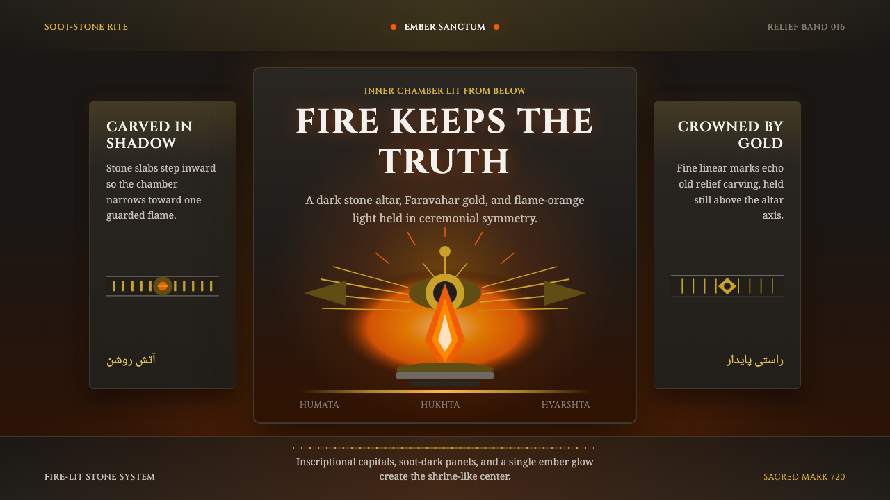 Zoroastrian Fire TempleSacred fire in stone darkness. Cinzel capitals, ember orange, and gold relief…
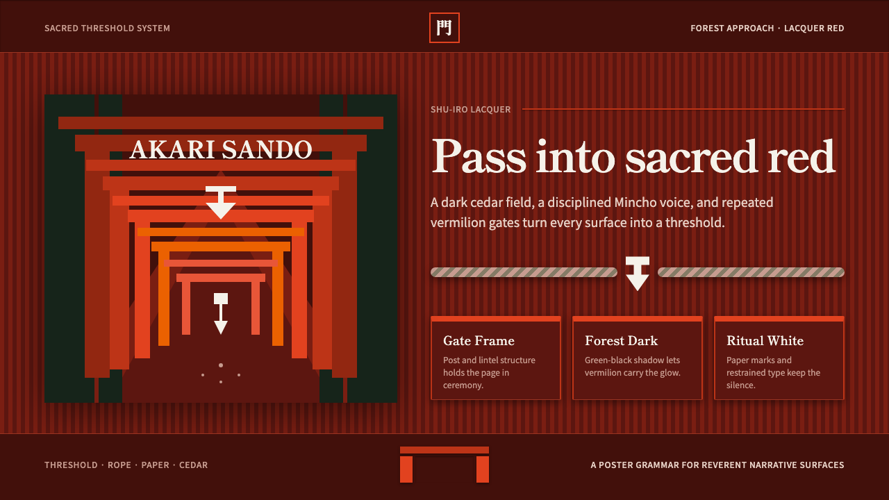 Shinto ToriiSacred red holds the dark. Vermilion gates, Mincho type, and shide white fram…
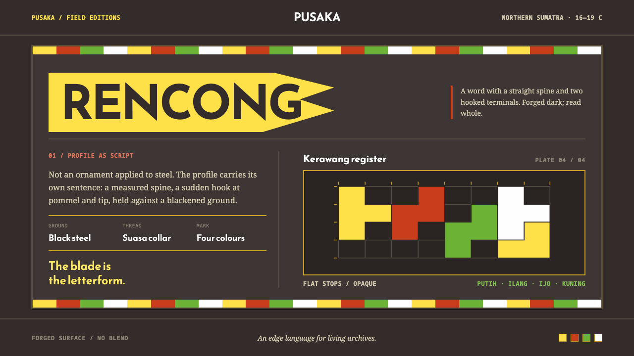 Acehnese Rencong MotifA blade that reads as a word. Flat kerawang red, white, green and yellow lock…
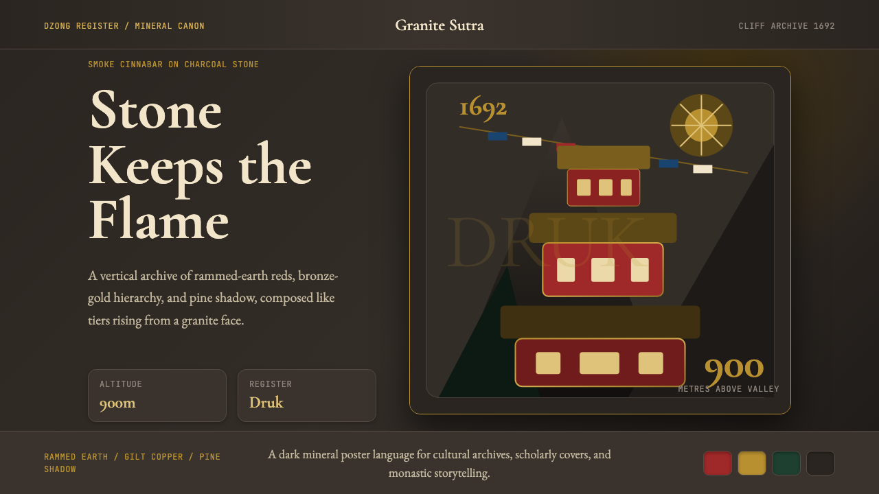 Bhutanese Tiger's Nest Cliff MonasterySacred altitude, mineral-dark. Cinnabar tiers and bronze rules climb charcoal…
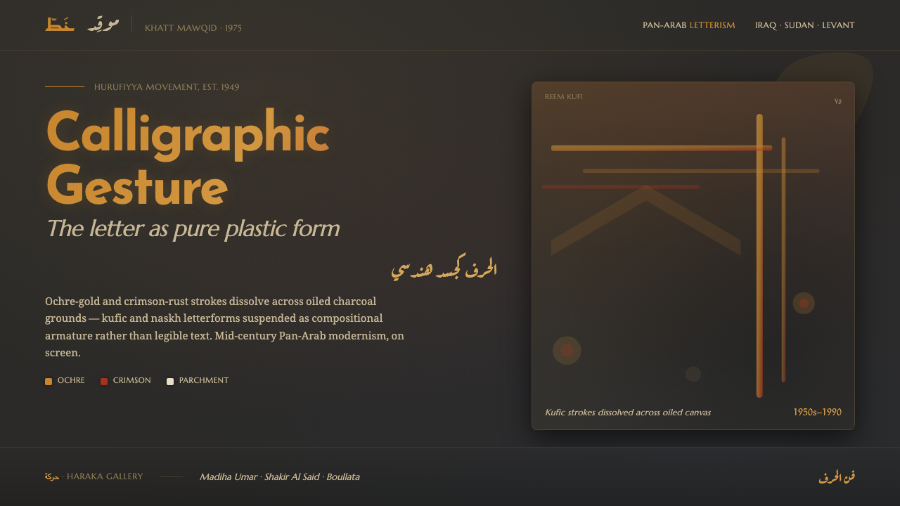 Hurufiyya Letter ArtArabic letters as pure gesture. Ochre and crimson strokes dissolve across oil…
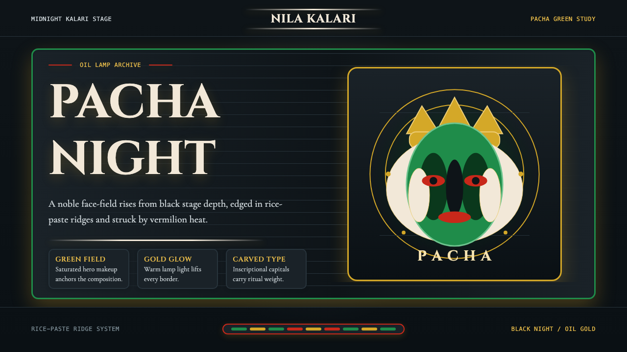 Kerala Kathakali (Pacha Green Makeup)Fierce ceremonial night. Pacha green, vermilion, and oil-gold frame monumenta…