What is Coffee-House Painting?
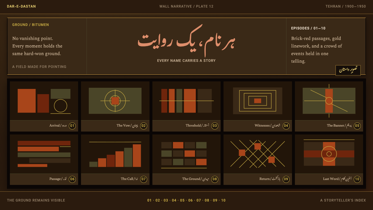
Coffee-house painting turns a whole story into a single wall: dozens of episodes pressed edge to edge on a dark ground, every figure named and every scene numbered, with no corner left empty.
Coffee-House Painting in brief
Coffee-house painting (naqqashi-ye qahveh-khaneh) is an Iranian oil-painting tradition of the first half of the twentieth century. The pictures were painted on stretched canvas, sometimes as much as three metres wide, and hung on the walls of Tehran coffee houses as the backdrop for a professional storyteller. Their subjects were the martyrdom at Karbala and the heroic tales of the Shahnameh, the Persian epic of kings, shown not as one dramatic moment but as a crowd of episodes.
The paintings were working tools before they were decoration. The storyteller, called a naqqal, stood in front of the canvas and pointed at each figure and scene as he narrated, so the picture had to function as an index that an audience could follow with the eye: who is this, what happened here, what comes next. That function explains nearly everything about the look. Figures keep the same height whether they are near or far, names are written beside the people they identify, and the sequence of scenes is marked so the speaker never loses his place.
Visually the style is dense, flat and warm against dark. A bitumen-brown ground shows through everything painted on top of it. Brick-red panels divide the episodes, gold numbered lines hold the order of events, and Nastaliq calligraphy writes names directly onto the image. As an interface language it inverts most modern habits: the surface is filled rather than composed around whitespace, depth is refused, and labels are content rather than captions.

Where does Coffee-House Painting come from?
The tradition grew out of pardeh-khani, the art of storytelling with a painted cloth. A storyteller carried a cloth scroll, the pardeh, from place to place, unrolled it, and used its pictures as the visual spine of a recitation. Coffee-house painting is that portable scroll enlarged, fixed to a wall and rendered in oil. It shares a root with Ta'zieh, the Shi'i passion play that dramatises the Karbala story, and it belongs to the same family of public, communal forms in which image, voice and audience occupy one room.
The setting mattered. In the early twentieth century a Tehran coffee house was a neighbourhood meeting place where people came to drink tea, exchange news and listen to recitation, and a large painting on its wall turned the room into a stage. The pictures were made for use: a narrator could point at them, a listener could read them at a glance, and the stories were familiar enough that people could recognise a favourite episode from across the room. The tradition's strongest period, roughly 1900 to 1950, was concentrated in the coffee houses of Tehran.
Hossein Qollar-Aghasi and Mohammad Modabber are the painters most closely associated with the tradition, and the Qollar-Aghasi name appears again in 'Ali-Reza Qollar-Aghasi. Their canvases are the reference points for the conventions described below: the dark ground, the division of the surface into episodes, the equal treatment of every figure, and the habit of naming everyone. Because the form served a spoken performance, it was shaped by its audience's expectations rather than by a gallery's, and it favoured clarity over refinement.
Set beside the Persian miniature, coffee-house painting is close to an inversion. The miniature is made small, for the hands of one reader, usually composed around a single scene. The coffee-house canvas is made large, for a room of listeners, with dozens of scenes at once. Its ground is the dark bitumen of the oil medium rather than a luminous page, it has no vanishing point, and its names are written in Nastaliq because the storyteller needed to point at them. Understanding that this logic comes from a performance, not from a taste for ornament, is what makes the style transferable to a screen.
What defines the Coffee-House Painting look?
Bitumen Ground
Everything sits on a deep brown-black ground, the colour of bitumen, and that ground is never covered over completely. It shows through the paint laid on top, so reds and golds seem to glow out of the darkness rather than sit on a white sheet. The effect is warm rather than neutral: a darkness closer to a coffee-house interior than to a technical dark mode.
Brick-Red Panels
The episodes are divided by brick-red fields, an earthy red that reads as architecture rather than alarm. These panels act as rooms or stages for individual scenes, and they stay in strict conversation with the dark ground and the gold lines. Colour is limited and functional; its job is to separate one event from the next so the whole composition can be read as a set of distinct episodes.
Gold Numbered Lines
Gold appears as thin lines and numerals that thread through the picture, giving each episode a number and the whole a reading order. They are the equivalent of a table of contents laid directly on the artwork. Gold here is a navigation colour rather than a luxury colour: it marks sequence, not status, and it is rationed so that it keeps that job.
Flat Space, No Depth
There is no vanishing point and no atmospheric distance. Figures near and far are drawn at the same height, so importance is carried by position, number and inscription rather than by perspective. The surface is a flat plane on which events are laid out, closer to a diagram or a map of a story than to a window into a scene.
A Filled Surface
Nothing is left blank. Dozens of episodes fill the canvas edge to edge, and what separates them is a line or a change of field, not an empty margin. Density is the organising principle, and it works because every part is ranked by the same system of panels and numbers. Whitespace, the usual sign of calm in modern design, plays almost no role here.
Names as Content
Every person and event is named in Nastaliq, the flowing, downward-sloping Persian script, written directly on or beside the figure it identifies. The words are not captions attached afterwards; they are part of the picture and part of how the storyteller finds his way. Text and image have equal standing, which is why labels in this style must be legible, correctly spelled and placed with care.

Who shaped Coffee-House Painting?
One of the two painters most often named as representative of the tradition. His canvases, with Karbala and Shahnameh scenes in oil on stretched canvas, show the typical coffee-house arrangement: a bitumen-dark ground, many episodes unfolding at once, and figures identified by written names. He is the natural reference for anyone who wants to see the style at full density.
Named alongside Hossein Qollar-Aghasi as a representative painter of the coffee-house tradition. Together they stand for the period when the form was at its height in Tehran. Looking at two painters who worked under the same conventions shows how a shared system of panels, numbers and labels can vary from hand to hand while staying readable.
His name carries the same Qollar-Aghasi surname and is recorded among the tradition's key figures. The shared surname points to a family line within the craft, a common pattern among Iranian painters and artisans. The style is better understood as a shared workshop vocabulary than as the invention of one hand, which is also a useful way to think about adopting it.
How do you use Coffee-House Painting today?
Coffee-house painting is a style for density, sequence and naming. It is most useful when the subject is a story, or a process with many parts, and the audience benefits from seeing all of it at once with a guide pointing the way. Applying it well means copying the logic of the performance, with numbered episodes, labelled figures and a flat, fully used surface, rather than borrowing surface motifs.
For presentation slides, the style suits talks that behave like storytelling. A cover can be a single full-bleed dark canvas with the title written large across a red panel and one gold numeral, as though the speaker were about to point at it. Content slides work as boards of numbered panels: the whole argument of a talk can sit on one slide as episodes one to six, and the presenter literally points. Data slides should label the marks directly, with names written on the bars and lines instead of in a separate legend, and with gold numerals tying each chart to its place in the sequence.
For web interfaces, coffee-house painting fits timelines, changelogs, event programmes, documentation maps, onboarding journeys and archives, anything that is a sequence of named things. Dashboards can adopt the panel logic: abutting red-brown panels on a dark ground, divided by thin gold rules rather than soft shadows, every metric directly named. Pricing pages can present plans as numbered panels with the feature lists written out in full. Navigation should be textual and numbered, so users always know which episode they are in.
For editorial and marketing work, the style gives long-form storytelling a strong shape: the history of a company, a case study told as episodes, a festival programme, a book jacket for an epic retelling. A single page can hold the whole journey, and each panel can carry a headline, a short text and a number. Because the subjects of the original tradition are religious and national epics, use the borrowed visual language with respect, and avoid attaching it to sacred imagery as casual decoration.
The commonest mistake is tidying the style into something modern: adding generous margins, soft shadows, floating cards and fading gradients, all of which destroy its filled, flat logic. The second is treating gold as general decoration and spraying it everywhere, so it no longer works as the sign of order. The third is exoticism, piling on arabesques or faux-calligraphic display fonts without a single label anyone can actually read. Keep the numbering honest, the names legible and the ground dark, and the style carries itself.

Coffee-House Painting — FAQ
What is a naqqal, and why does the painting depend on him?
A naqqal is a professional storyteller who recites epic and religious narratives, here the Karbala story and the Shahnameh, to a live audience. The painting hung behind him so he could point at the scene he was describing. That is why every episode is numbered and every figure named, and why the design reads like a guided index rather than a single picture. In an interface, the equivalent of the naqqal is the guide: a presenter, or the reader's own eye moving from one numbered panel to the next.
How is coffee-house painting different from Persian miniature painting?
They are close to opposites in how they organise a picture. Miniatures are small, made for one reader's hands, and usually composed around a single scene. Coffee-house paintings are large, made for a room of listeners, and hold dozens of episodes at once on a dark bitumen ground with no vanishing point, equal figure heights and names written in Nastaliq. In interface terms, the miniature suggests a curated, spacious composition, while the coffee-house canvas suggests an annotated, fully used working surface.
Is this a dark mode style?
It is dark by nature, but not in the sense of an interface theme. The ground is a warm bitumen brown that stays visible beneath everything on top of it, and the brick reds and golds seem to glow out of it. A neutral grey-black with white text and thin outlines misses the point. Think of a lit room with a painted wall, not of a screen switched to night.
Is a style this dense usable on modern screens, and is it accessible?
Yes, when the density is ordered. The original works because everything is ranked by panels, numbers and labels, so the eye always has a route through. On screens, protect the same route: keep the numbering consistent, give gold text and lines enough contrast against the dark ground, keep text large enough to read in the busiest areas, and let panels stack or collapse on narrow displays. Density is the style's feature, but it should never become noise.
Can the style be used outside Iranian or religious subjects?
Its structure can travel: numbered episodes, named figures, a flat and fully used surface, a dark ground. Those are solutions to a general problem, how to show a long story all at once. The iconography is different. It belongs to specific stories and communities, and in the case of Karbala to a sacred commemoration. Borrow the logic freely, credit the tradition, and avoid using its religious imagery as a decorative skin.
Related design styles
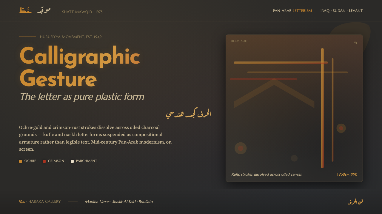 Hurufiyya Letter ArtArabic letters as pure gesture. Ochre and crimson strokes dissolve across oil…
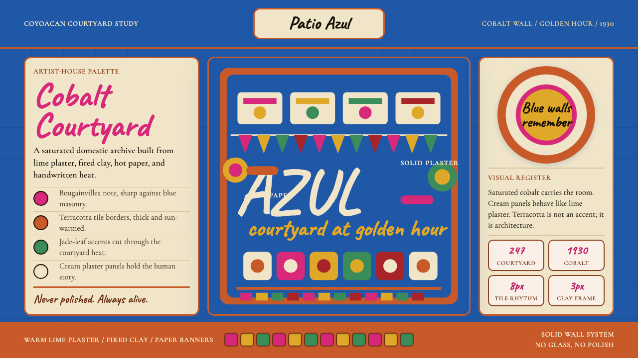 Mexican Frida Blue House (Coyoacán 1930)Maximum color, intimate walls. Cobalt, cream panels, terracotta grid, cut-pap…
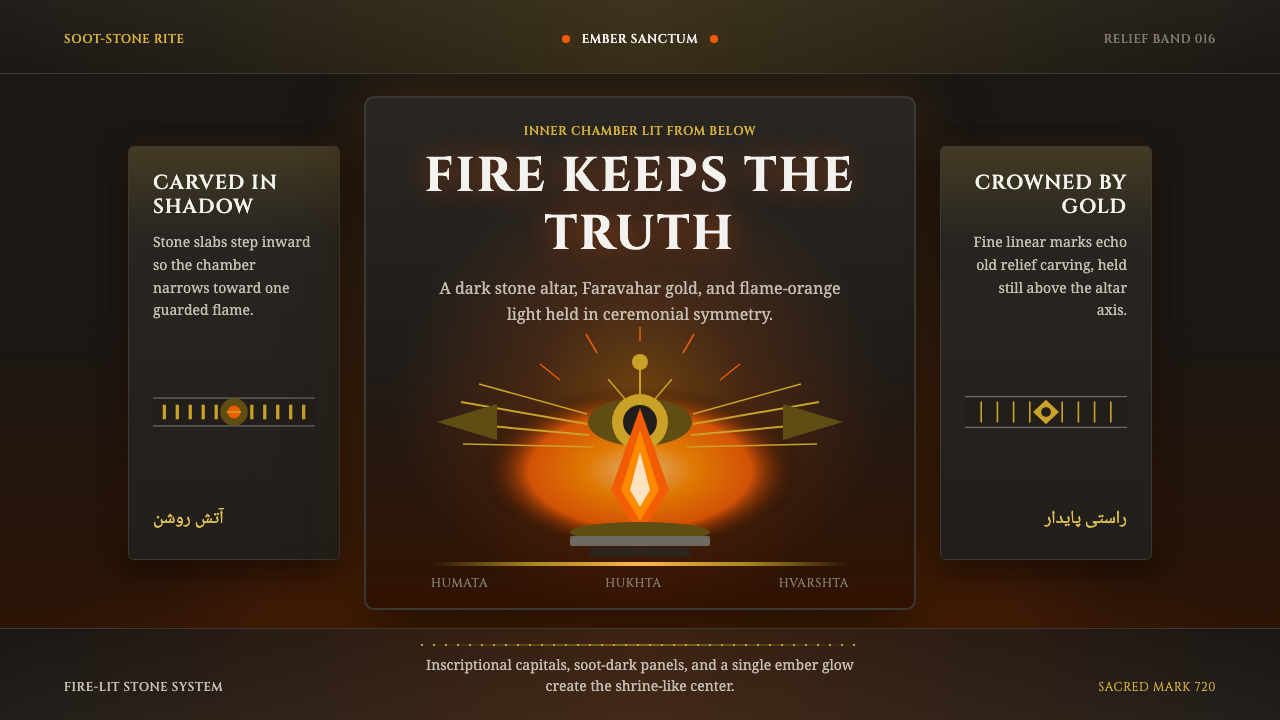 Zoroastrian Fire TempleSacred fire in stone darkness. Cinzel capitals, ember orange, and gold relief…
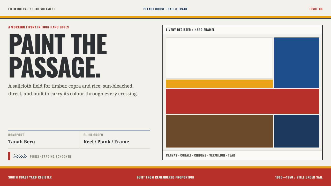 Bugis PinisiSailcloth made resolute. Vermilion, chrome and cobalt bands cut a warm white…
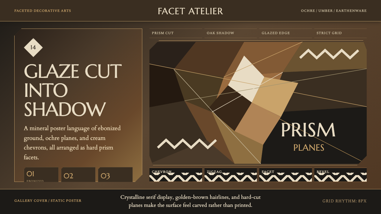 Czech Cubist Decorative ArtsGlazed geometry feels carved. Umber ground, ochre facets, and cream chevrons…
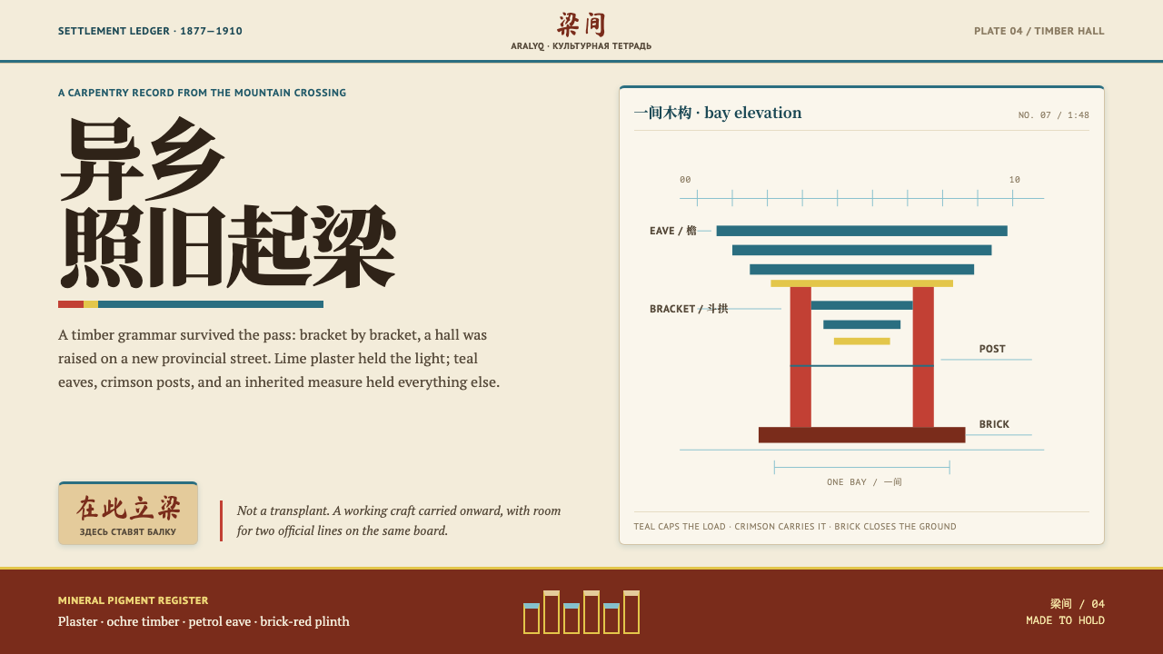 Dungan Settlement CraftCarpentry holds its ground. Teal eaves and crimson posts frame sunlit plaster…